6 UI mistakes that are killing your conversion rates
Original Source: http://feedproxy.google.com/~r/CreativeBloq/~3/udcQc7p8dak/6-ui-mistakes-that-are-killing-your-conversion-rates
Effective UI design can, without a doubt, improve your conversion rate. However, there are at least three criteria that your user interface needs to satisfy in order to attract, convert, and retain visitors to your site or app: it has to be engaging, captivating, and it needs to trigger an emotional response.
Read on for six of the most most commonly made app and website layout mistakes that are sure to turn your customers off and kill your conversion rates.
01. Unresponsive design
It's no secret that people now regularly use a range of different devices to complete a task. That means your website needs to be responsive in order to engage the audience no matter how they access your site. A poor user experience caused by a site that hasn't been optimised for mobile or tablet users is sure to dissuade potential customers.
If that doesn't convince you, complying with Google’s ranking requirements is another major reason to consider placing a lot of emphasis on responsive web design principles. Back in 2015, the search giant released an algorithm that prioritises mobile-friendly pages.
02. Uninviting CTAs
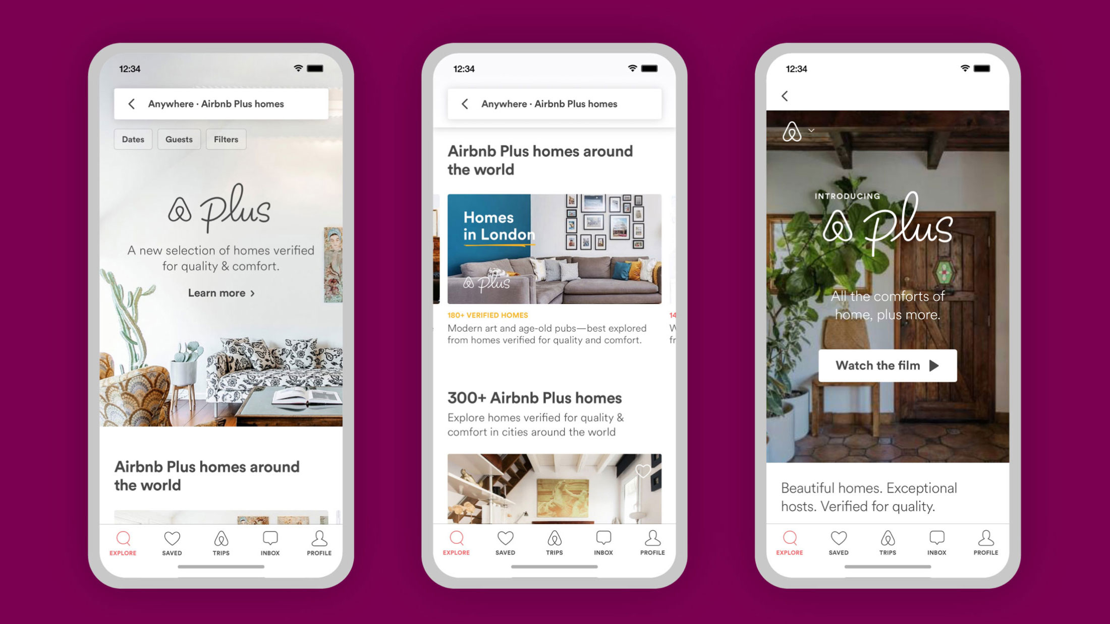
Koto created an inviting look for Airbnb Plus
It’s impossible to over-stress the importance of calls to action. Not giving your CTAs the love they deserve is one of the most commonly made UI mistakes. To help up your clicks, these are the things you should be considering:
Shape: Clickable buttons are usually rectangular and surrounded by white space, to help define them and make them stand outLocation: Position CTAs right next to the main proposal – this is the most logical next step in your customer’s journeyColour: There isn’t a universal 'best' colour for CTAs – aim to fit with your site's colour scheme, but ensure these elements stand out the mostSize: Make your CTAs large enough to stand out, yet not overwhelming
03. Lack of social proof
Customers trust other customers. A recent survey showed that 60 per cent of consumers look for Google reviews before putting their trust in a business. Not only should you definitely consider displaying positive reviews of your product or service, but you also need to make sure they're positioned properly. Customer reviews can help reassure potential customers of your brand's credibility, if you display them somewhere towards the beginning of your sales pitch.
04. Too much of everything
A cluttered layout is one of the most off-putting things a user can come across. While it’s understandable that you want to display as much information as you can, this approach won’t get you far in terms of conversions.
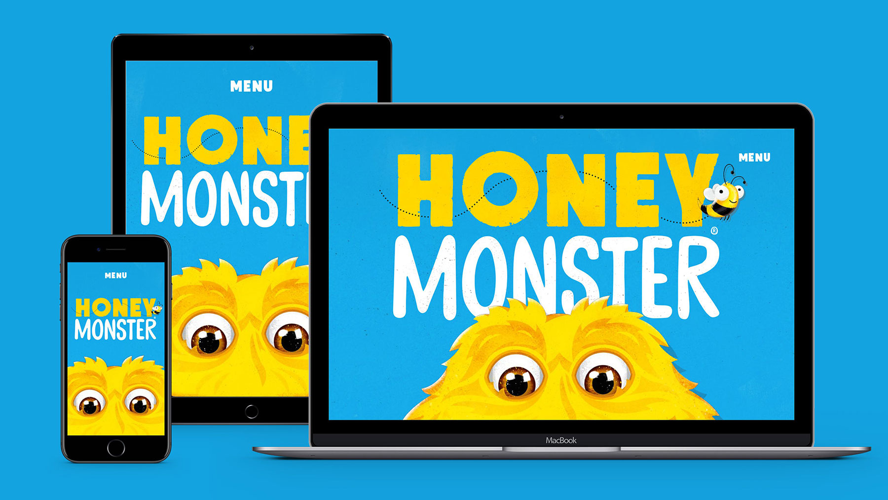
Robot Food created a simple but appealing UI for this cereal
Here are some good rules of thumb to get you started. First, the design scheme that you choose shouldn’t contain more than three main colours and more than two font types. For more advice, take a look at this article on how to choose the perfect colour palette.
Second, you need to guarantee that the imagery you do use is of top quality. Avoid using low-resolution videos, photos and illustrations. If you can't afford to shell out for a pro, don't worry – there are plenty of places you can find good quality free vector art online.
UI animations have been a growing trend for some time time. They can help guide your users and create interest, while also ensuring your interface stands out (want to get started? Here are some CSS animation examples you can recreate yourself).
05. Slow loading pages
Did you know that one of the most common reasons for abandoned ecommerce shopping carts is slow page load time? Data shows that 40 per cent of people abandon a website that takes more than three seconds to load.
But loading speed isn’t just important for conversions – it’s important for your overall site discovery, especially in 2019. In the video above, marketing expert Neil Patel revealed that page loading speed is going to be an increasingly important factor for SEO in 2019 (jump to just after the 3 minute mark for Patel's advice on this).
06. Little to no video content
Our brains process videos about 60,000 times faster than they process text. Videos can entertain and explain in a visual way. And they're incredibly underused. Take a look at the explainer video for Young Alfred by Fireart Studio below as an example.
Here are a couple of quick tips you might want to consider if you’re using video content already.
First, it’s a good idea to insert some sort of the lead capture elements in the video. For example, remind people to subscribe at the beginning of the video or thank them for watching and liking at the end of the video. Second, it’s also very important to make use of customised thumbnails – you need to encourage people to watch your video in the first place.
Read more:
20 best UI design tools8 imaginative ways to use animation in mobile appsTop UI trends for 2019


Leave a Reply
Want to join the discussion?Feel free to contribute!