3 Essential Design Trends, March 2019
Original Source: https://www.webdesignerdepot.com/2019/02/3-essential-design-trends-march-2019/
 Typography, color and distinct layouts are all elements that contribute to any design project. They are also elements of design that can trend over time.
That’s exactly what we are seeing this month as bold design elements are just the things that are making certain website designs come to the forefront. Here’s what’s trending in design in this month.
Bold Serifs
Big, thick lettering can draw attention and tell a story. And that’s just what designers are doing with the use of more bold, thick serifs in projects.
Thicker letterforms are a good choice for reverse typography or in situations where there is a lot going on to compete with the words. The challenge is that bold typography can be a little overwhelming when there’s a lot of it to read.
So, you have to balance viewability with readability.
When picking a bold serif, look for something that’s a mid-range weight and not overly thick. Look for letters with a more round shape; not too tall or condensed either, to encourage reading.
While many the examples below are focused on bold serifs only, the best advice is to pair them with a less heavy option as well. (Maybe mix and match the bold and regular weights of a typeface.)
Some users will equate bold type in the same manner as all caps, assuming that it is screaming at them. You can avoid this by using bold serifs with purpose for just a few key words or phrases and balance other screen elements so that it’s not a weighty aesthetic.
While this can be a somewhat tricky trend to use, you can see from the examples below that it can work rather nicely. There’s nothing wrong with going bold when it contributes to the overall meaning and content in the rest of the design.
Red Text and Accents
It’s like I blinked and red text and accents were suddenly everywhere.
This is an accent color choice that was wildly popular at one time and quickly faded out of fashion about the time flat and material colors emerged. (Brighter reds clashed with all the other bright color options.)
But red is back.
This color choice is interesting because it is so attention-grabbing. It can also create quite an emotional bond with users. Just be aware that people can really like red or really hate it; there’s not a lot of middle ground when it comes to a color that’s connected to passion, love, anger and fear.
In each of the examples below, red is the thing that draws you into the design.
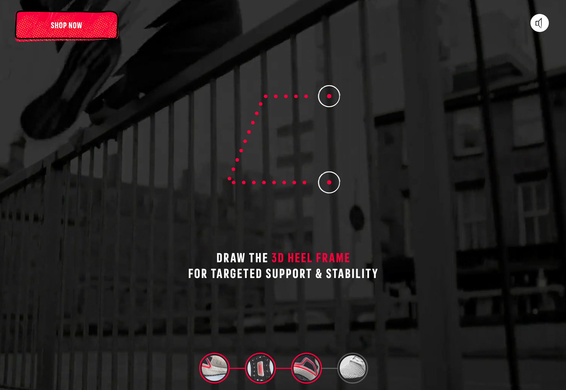
With the interactive Adidas website for Footlocker, red elements tell you where to click and engage with the game. The colors seem to “lift” right off of the movie-style video playing in the background.
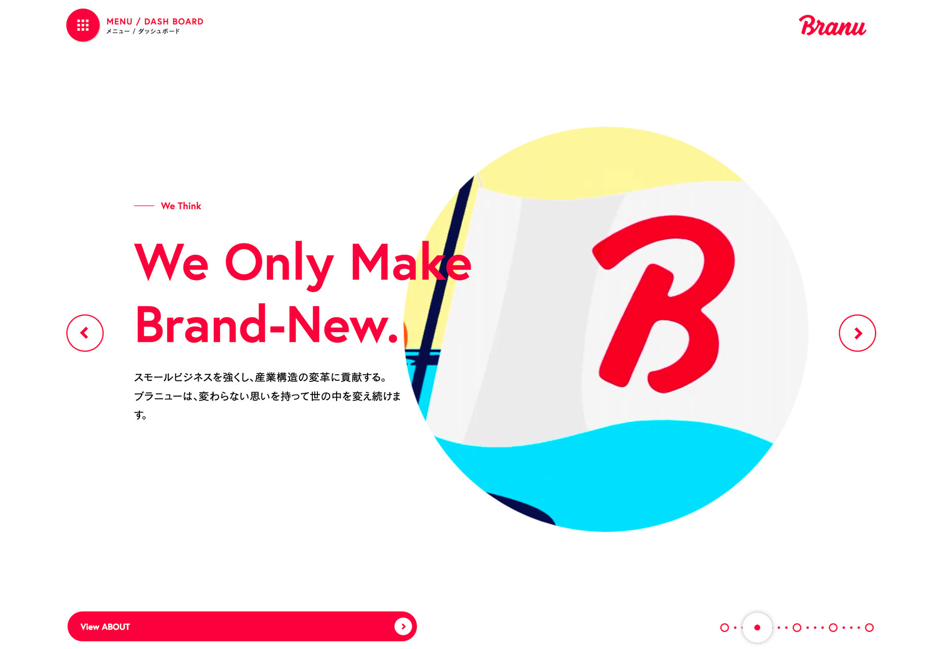
Branu uses red lettering to draw you in. On a stark white background with a simple video element, it’s just sharp enough to make you stop and look.
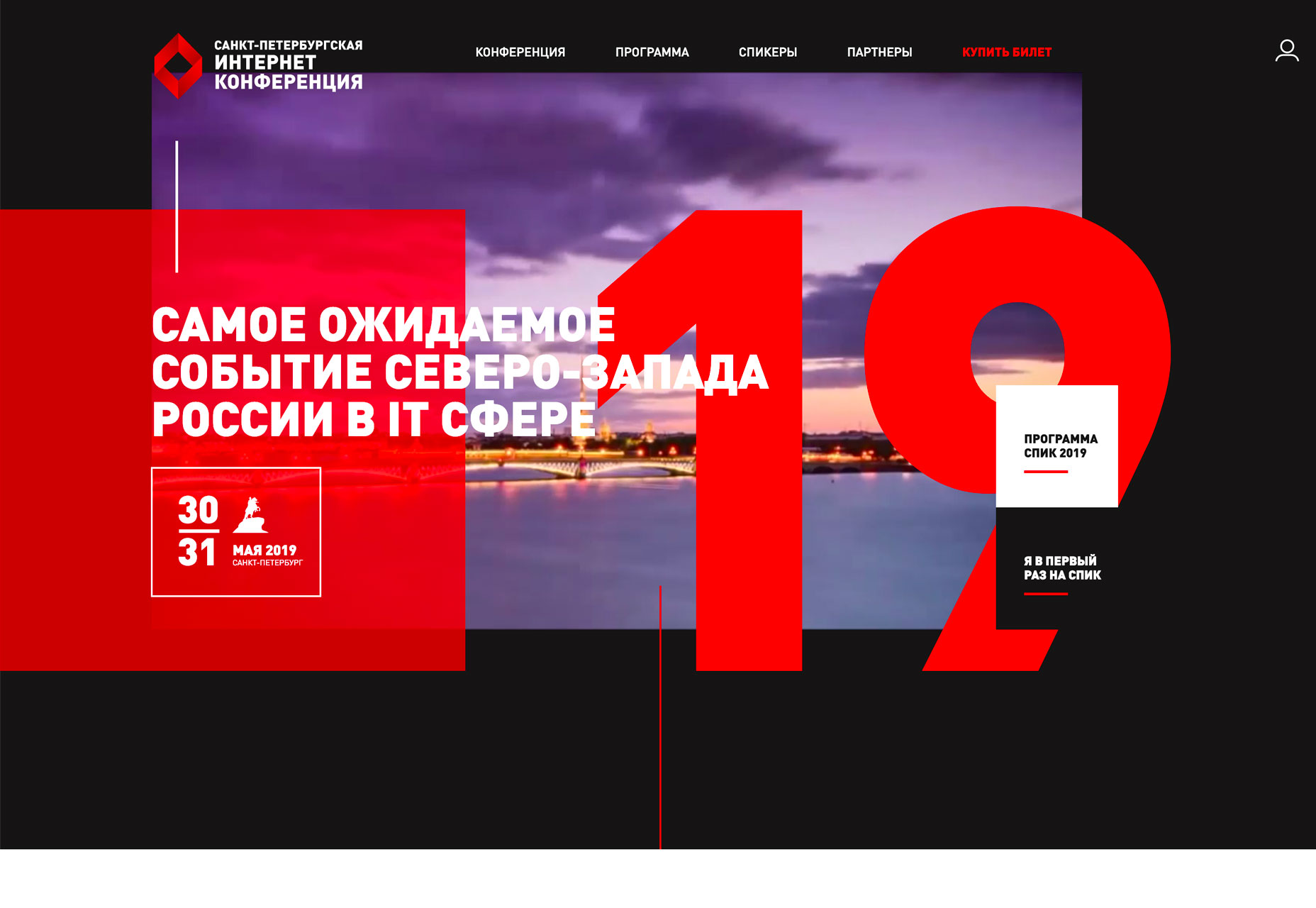
Finally, the conference website uses red to give you the information you need over a loop of b-roll in the background. The color helps you find the event dates quickly and pinpoints a key element in the main navigation.
While all three shades of red are a bit different, they aren’t that far apart on the color spectrum. Use of red is bright and saturated. It’s the hue you think of first and that toddlers first learn to color with. (There’s no softening this color trend right now.)
More Split Screens
At a glance split screens aren’t new. We’ve been talking about – and loving on – this website design trend for a while now. And this is one concept that seems to keep getting better with time.
The latest iterations of split screen designs are more aesthetic than stacked for responsive functionality (although that’s a distinct bonus).
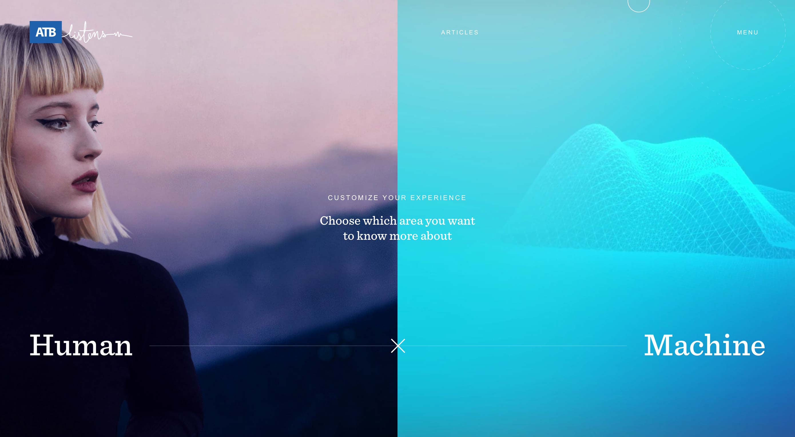
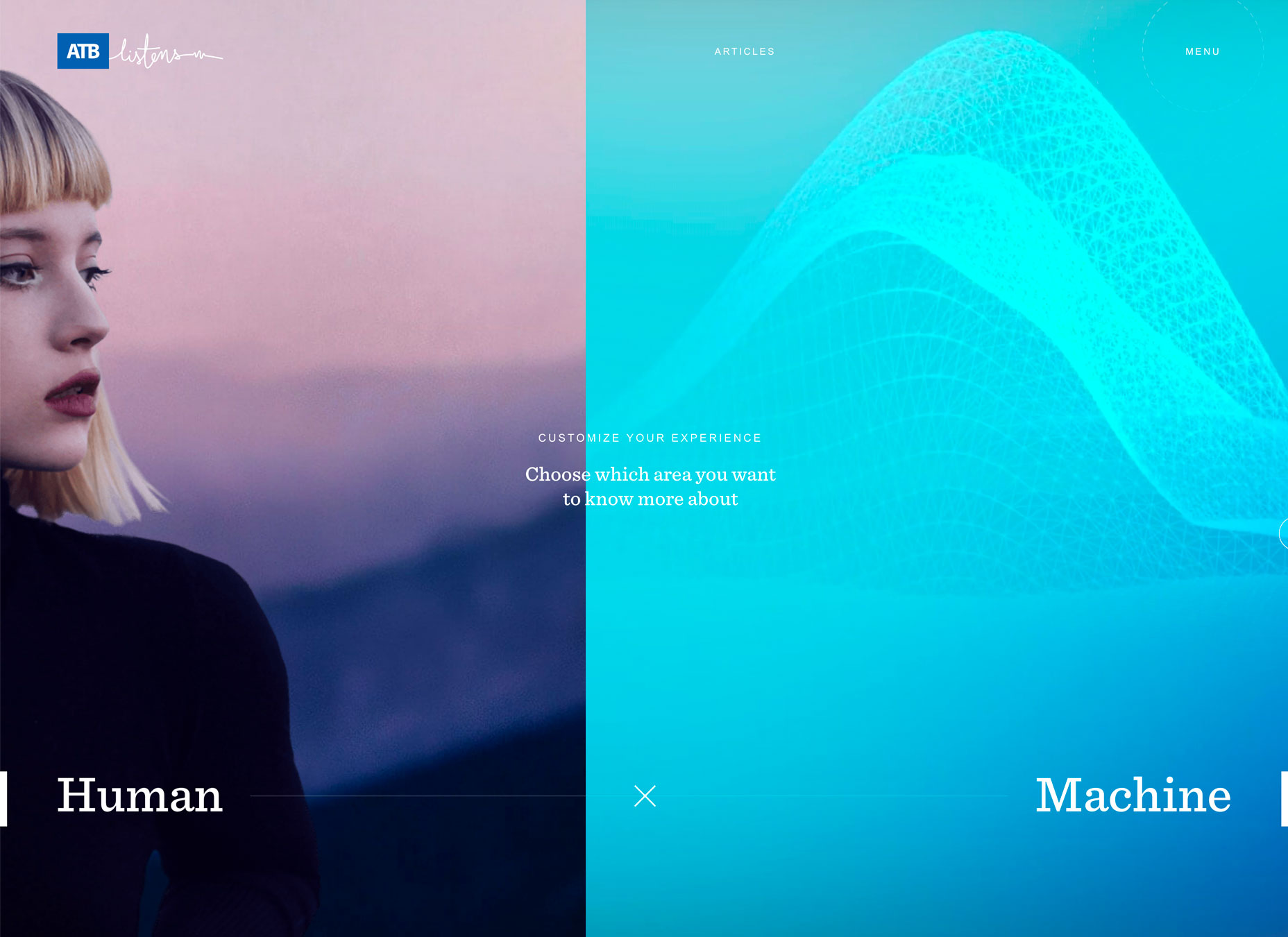
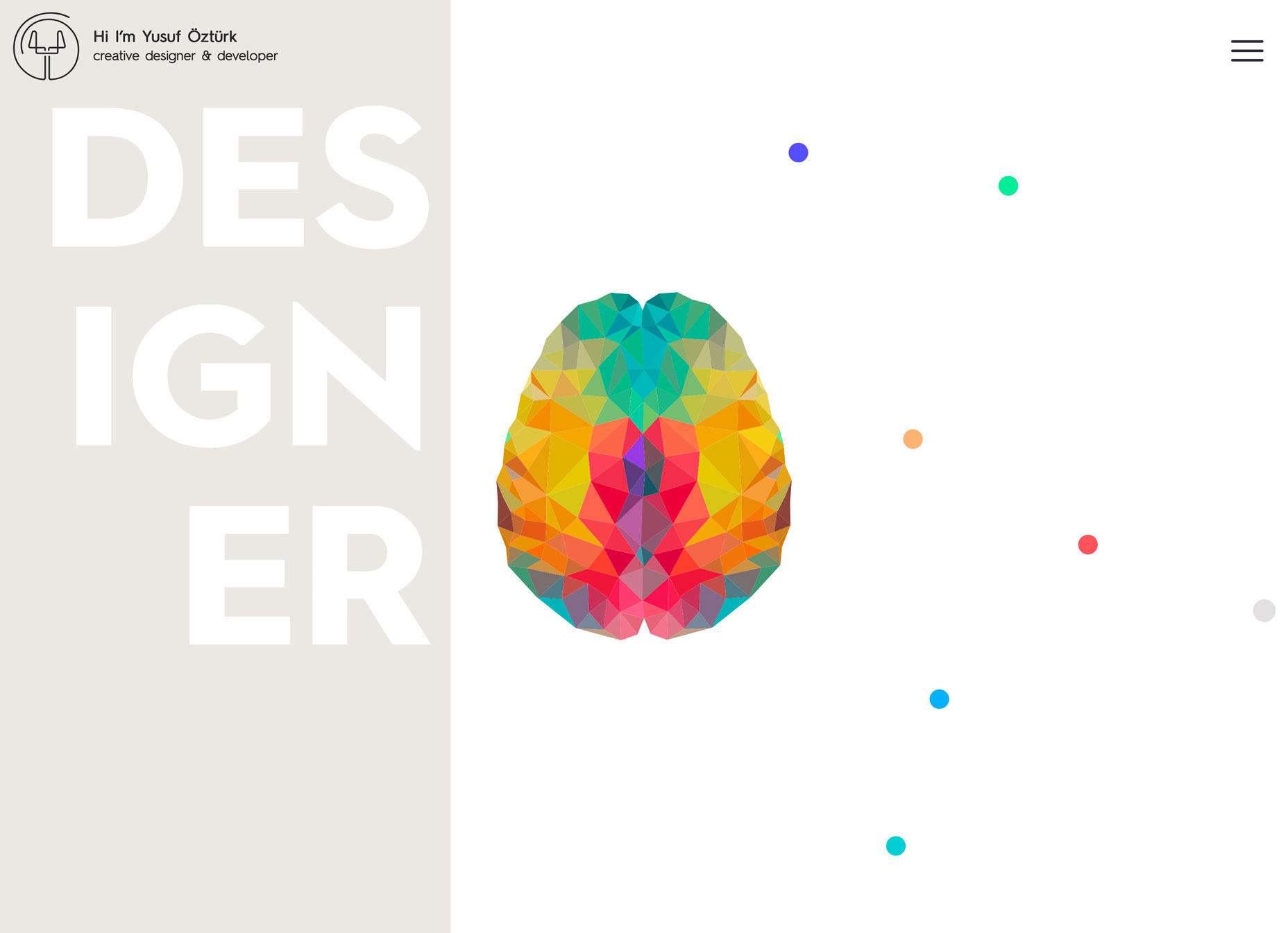
Split screens aren’t stuck in perfectly symmetrical patterns either. None of the examples below features a perfect split – unless it is part of another element. Both ATB and Yusuf Ozturk’s sites feature animations within the split screen so that the screen elements actually shift to highlight content or interactivity.
ATB use hover action to move the screen left and right as users choose which path to take with the design. It’s a clever way to connect the human or machine learning experience.
Ozturk’s site opens with a center split screen with a brain in the middle; hover actions revel design on one side of the brain and development on the other to showcase what’s you’ll find in the portfolio site. The animation is clean and sharp, and you can actually get caught playing with it for a while.
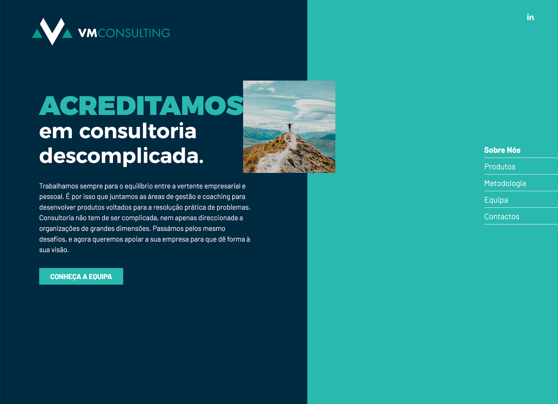
VM Consulting has a more traditionally designed split screen but uses the right side as a giant navigation menu. The heavy blue side paired with the lighter navigation is brilliantly balanced and easy to understand. (The color palette helps make this design shine as well.)
Conclusion
Are these design trends just right or too bold for your projects? While I love everything about split screen designs, I’m not 100 percent convinced when it comes to thick serifs and red accents. (These just seem to need more sparing use to me.) What do you think? Let’s start a conversation.
What trends are you loving (or hating) right now? I’d love to see some of the websites that you are fascinated with. Drop me a link on Twitter; I’d love to hear from you.
Add Realistic Chalk and Sketch Lettering Effects with Sketch’it – only $5!
Source
p img {display:inline-block; margin-right:10px;}
.alignleft {float:left;}
p.showcase {clear:both;}
body#browserfriendly p, body#podcast p, div#emailbody p{margin:0;}


Leave a Reply
Want to join the discussion?Feel free to contribute!