3 Essential Design Trends, January 2019
Original Source: https://www.webdesignerdepot.com/2019/01/3-essential-design-trends-january-2019/
 New year, new design trends!
While everyone is talking about big-picture trends such as designing for voice and virtual reality, there are more immediate design elements that you can see (and deploy) right now for a more on-trend website.
From websites without images above the scroll, to ecommerce that disguises itself as content, to bright blue everything, here’s a look at what’s trending this month.
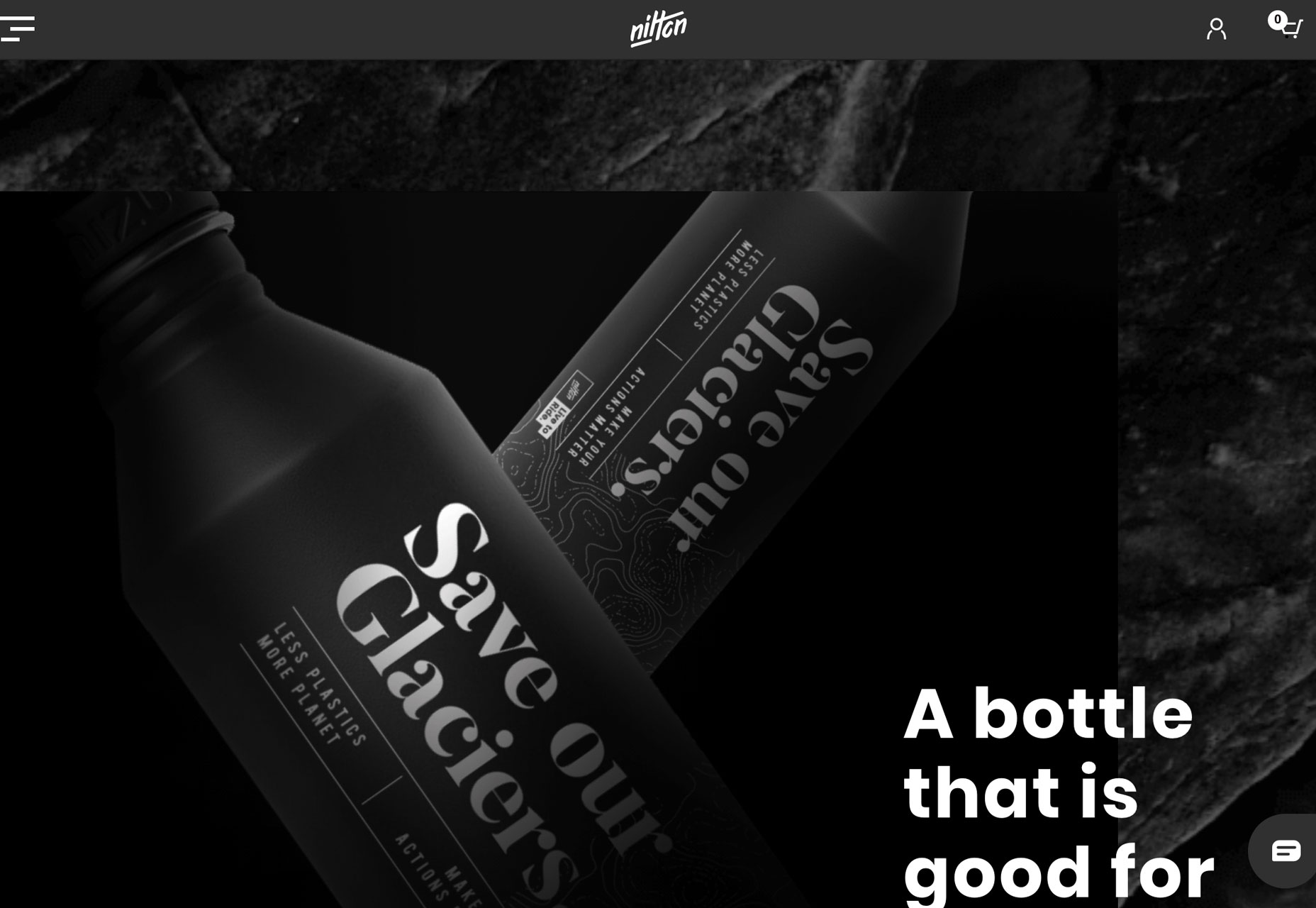
1. No “Art” Above the Scroll
Have you noticed how many websites don’t have images or video above the scroll? This no “art” design style used to be reserved for coming soon or construction pages that didn’t have images, but it’s trending even for website designs with plenty of other imagery.
If you have a message or statement that is the most important thing for users to know right away, this can be an effective design technique. It works because there’s nothing else to see. (Unless the user refuses to read the words and abandons the design, which can be a risk with this style.)
Make the most of a no art design with beautiful typography and strong color choices.
These design elements can serve as art on their own and help add visual interest to the words on the screen.
Each of the three examples below does this in a slightly different way.
We Are Crowd uses a strong serif-sans serif typography pair on a bright colored background. Users are enticed to delve into the design thanks to an animated scroller on the homepage. The no “art” design actually alternates between image and non-image panels, showing users there is something to look at.
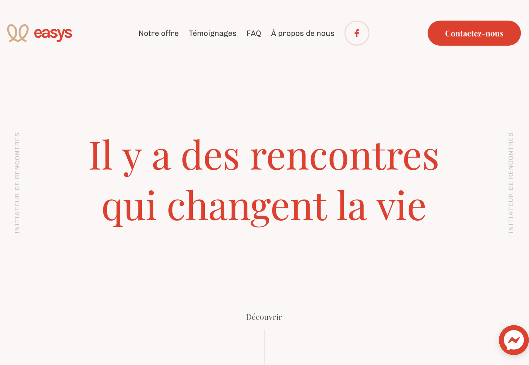
Easys uses a simple serif in the center of the screen to draw the eye. Bright red text on a stark background draws you right to the lettering. There’s also a call to scroll, where the design fills with more color, images and interesting shapes.
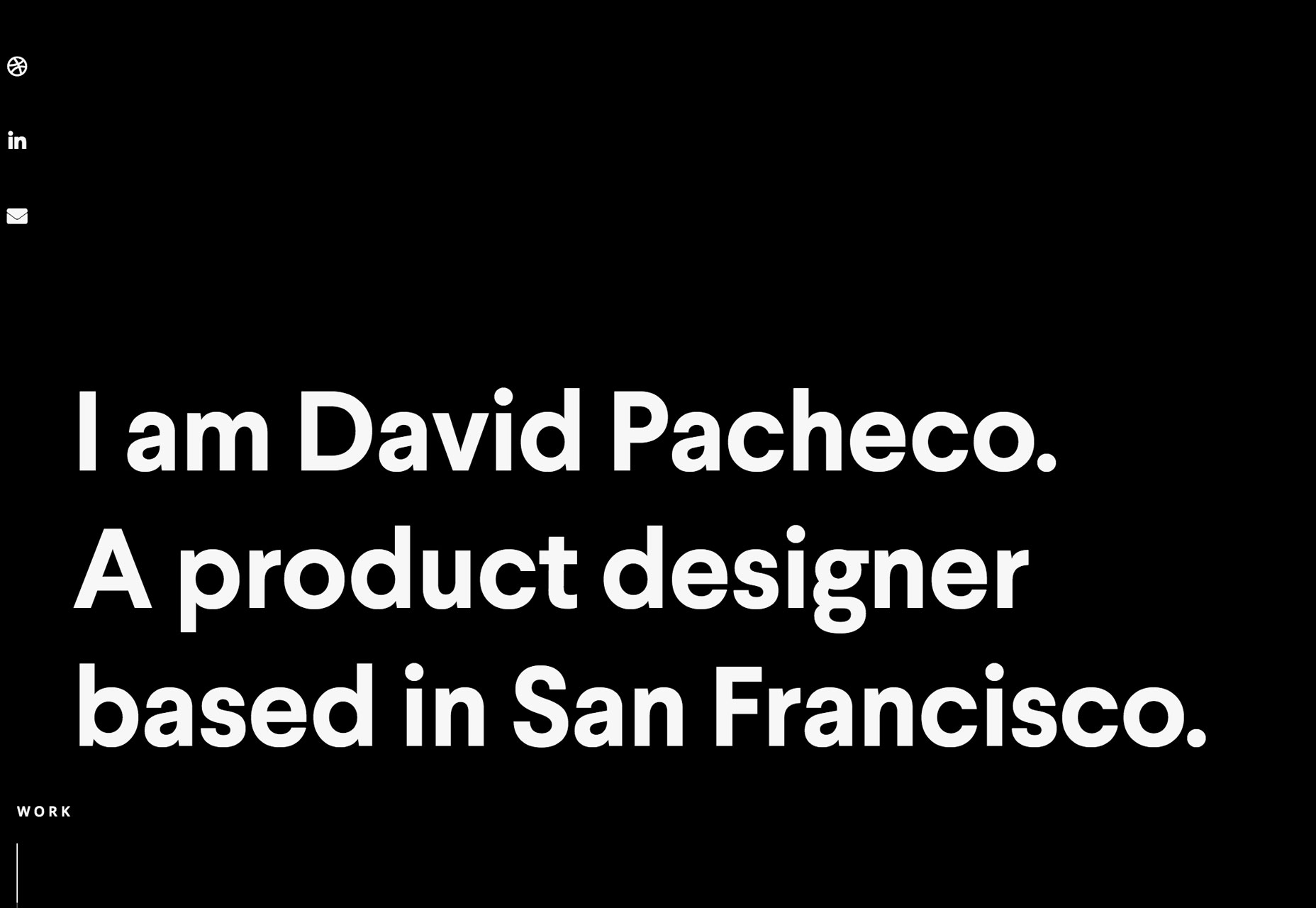
David Pacheco’s portfolio takes a more minimal approach to the no art aesthetic. With simple, but oversized sans serif typography and a black background, there’s no way not to know what the website is about. The stark nature of the design makes the small, animated scroller at the bottom left more obvious, and it’s worth the effort with great images of his projects.
2. Bright Blue
It might not come as a surprise that a bright color is trending. But the hue might surprise you. Even though a bright coral was named color of the year by Pantone, bright blue is trending.
Bright blue backgrounds, text elements, overlays and more are everywhere. The color, which has roots in the Material Design palette, is rather cheerful and works with almost any content type. These are reasons why it might be so popular.
Blue is traditionally one of the most used colors among all website designs. Mostly because of associations that are harmonious, pleasing and trustworthy. This brighter blue adds to that with a somewhat lighter feel.
The best part of a website design trend that’s rooted in color is that it’s easy to use. Designers don’t have to overhaul a brand color palette to incorporate bright blue into the design. Sneak it in for accents or in images.
This is also a trend that you can add to a project quickly and without a lot of planning for a modern flair that can be deployed (and even removed) with minimal effort.
Like the blues you see in the examples below? Try these color mixes to replicate the hues:
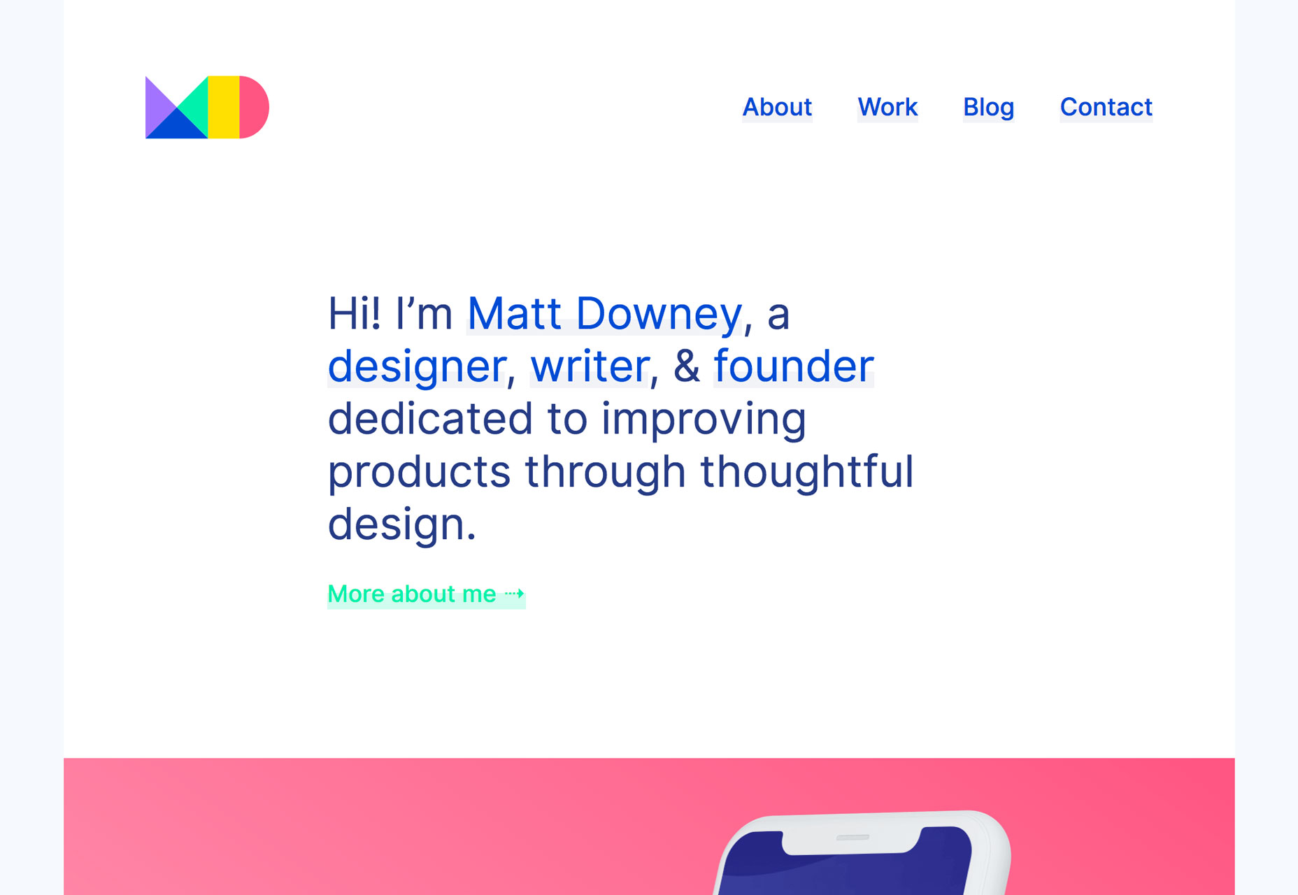
Matt Downey uses a bright blue with an almost purple undertone; hex #263d83.
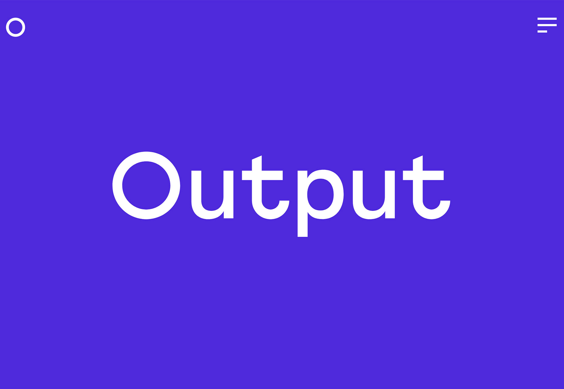
Output scrolls trough plenty of bright blue options on the homepage with more purple (hex #4d34d8) and brighter sky blue (hex #3a63d8) options.
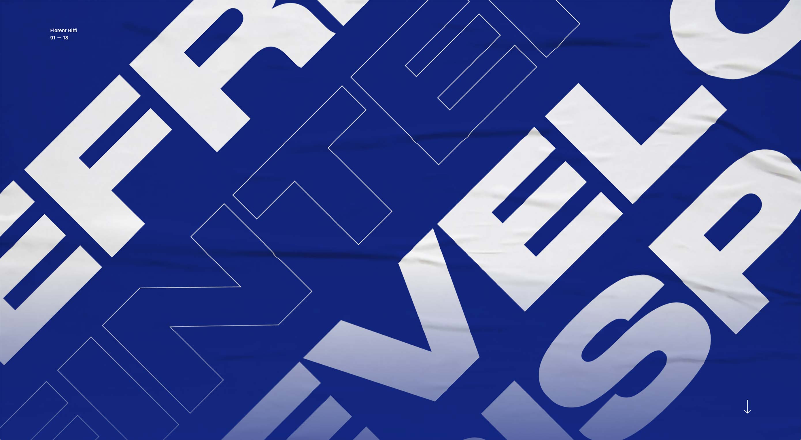
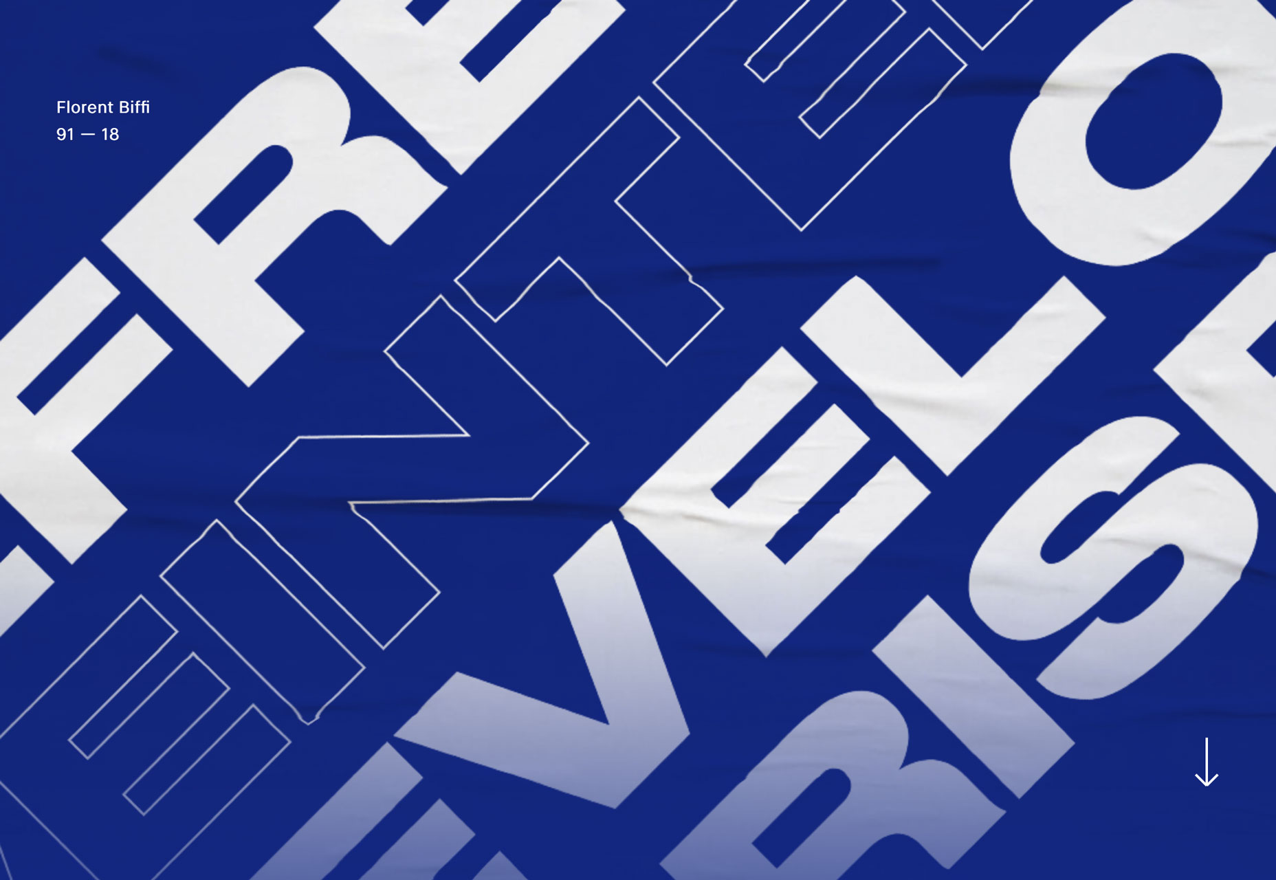
Florent Biffi puts a new spin on navy with a brighter tone; hex #142877.
3. Ecommerce That Looks Like Content
Content is king…even when it comes to online sales.
Maybe as a design trend that’s a carryover from social media or maybe just to try something that’s a little more engaging, more ecommerce websites are deploying site architectures that look less like pages of items for sale and more like integrated content elements with a “buy it” button included.
This idea makes sales more about lifestyle and uses a product placement philosophy to sell items. This design concept can take a lot of time to plan out and design effectively, but it can be worthwhile if it resonates with a new customer or shopper base.
It’s likely that it takes a certain type of product as well. Ecommerce websites that use a lot of content and that look more like content that product sales or information tend to be lifestyle brands such as clothing or home textiles. This is because these items don’t need a lot of explanation–most shoppers know what size shirt they wear–and create a sense of urgency in the desire to buy. A customer sees the shirt and want it because of the associated sense of style or connection to brand.
It’s an interesting way to create a more authentic connection with users–a key marketing concept, particularly among millennial shoppers and audiences. It’s one of those design trends that has a lot of potential to grow, but only if designers and developers are willing to commit the time and resources to overhaul their ecommerce projects in this manner.
Conclusion
When it comes to using website design trends, the ones that come and go the quickest are the ones that are most deployable. Some of those–such as color–are on this list. Others, like ecommerce that looks like content, takes a lot more strategy to do well. Which type of trend are you most likely to try?
What trends are you loving (or hating) right now? I’d love to see some of the websites that you are fascinated with. Drop me a link on Twitter; I’d love to hear from you.
Add Realistic Chalk and Sketch Lettering Effects with Sketch’it – only $5!
![]()
Source
p img {display:inline-block; margin-right:10px;}
.alignleft {float:left;}
p.showcase {clear:both;}
body#browserfriendly p, body#podcast p, div#emailbody p{margin:0;}


Leave a Reply
Want to join the discussion?Feel free to contribute!