Original Source: https://smashingmagazine.com/2024/04/desktop-wallpaper-calendars-may-2024/
Inspiration lies everywhere, and as a matter of fact, we discovered one of the best ways to spark new ideas: desktop wallpapers. Since more than 13 years already, we challenge you, our dear readers, to put your creative skills to the test and create wallpaper calendars for our monthly wallpapers posts. No matter if you’re into illustration, lettering, or photography, the wallpapers series is the perfect opportunity to get your ideas flowing and create a small artwork to share with people all around the world. Of course, it wasn’t any different this month.
In this post, you’ll find desktop wallpapers created by artists and designers who took on the creativity challenge. They come in versions with and without a calendar for May 2024 and can be downloaded for free. As a little bonus goodie, we also compiled a selection of favorites from our wallpapers archives at the end of the post. Maybe you’ll spot one of your almost-forgotten favorites from the past in here, too? A big thank-you to everyone who shared their designs with us this month! Happy May!
You can click on every image to see a larger preview,
We respect and carefully consider the ideas and motivation behind each and every artist’s work. This is why we give all artists the full freedom to explore their creativity and express emotions and experience through their works. This is also why the themes of the wallpapers weren’t anyhow influenced by us but rather designed from scratch by the artists themselves.
Submit a wallpaper!
Did you know that you could get featured in our next wallpapers post, too? We are always looking for creative talent.
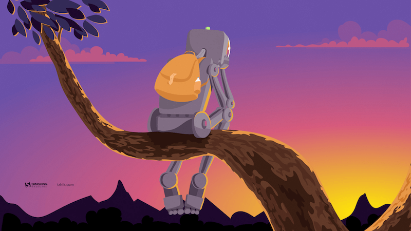
A Symphony Of Dedication On Labour Day
“On Labour Day, we celebrate the hard-working individuals who contribute to the growth of our communities. Whether in busy urban areas or peaceful rural settings, this day recognizes the unsung heroes driving our advancement. Let us pay tribute to the workers, craftsmen, and visionaries shaping our shared tomorrow.” — Designed by PopArt Studio from Serbia.

preview
with calendar: 320×480, 640×480, 800×480, 800×600, 1024×768, 1024×1024, 1152×864, 1280×720, 1280×800, 1280×960, 1280×1024, 1400×1050, 1440×900, 1600×1200, 1680×1050, 1680×1200, 1920×1080, 1920×1200, 1920×1440, 2560×1440
without calendar: 320×480, 640×480, 800×480, 800×600, 1024×768, 1024×1024, 1152×864, 1280×720, 1280×800, 1280×960, 1280×1024, 1400×1050, 1440×900, 1600×1200, 1680×1050, 1680×1200, 1920×1080, 1920×1200, 1920×1440, 2560×1440
Navigating The Amazon
“We are in May, the spring month par excellence, and we celebrate it in the Amazon jungle.” — Designed by Veronica Valenzuela Jimenez from Spain.

preview
with calendar: 640×480, 800×480, 1024×768, 1280×720, 1280×800, 1440×900, 1600×1200, 1920×1080, 1920×1440, 2560×1440
without calendar: 640×480, 800×480, 1024×768, 1280×720, 1280×800, 1440×900, 1600×1200, 1920×1080, 1920×1440, 2560×1440
Popping Into Spring
“Spring has sprung, and what better metaphor than toast popping up and out of a fun-colored toaster!” — Designed by Stephanie Klemick from Emmaus Pennsylvania, USA.

preview
with calendar: 320×480, 640×480, 800×480, 800×600, 1024×768, 1024×1024, 1152×864, 1280×720, 1280×800, 1280×960, 1280×1024, 1400×1050, 1440×900, 1600×1200, 1680×1050, 1680×1200, 1920×1080, 1920×1200, 1920×1440, 2560×1440
without calendar: 320×480, 640×480, 800×480, 800×600, 1024×768, 1024×1024, 1152×864, 1280×720, 1280×800, 1280×960, 1280×1024, 1400×1050, 1440×900, 1600×1200, 1680×1050, 1680×1200, 1920×1080, 1920×1200, 1920×1440, 2560×1440
Duck
Designed by Madeline Scott from the United States.

preview
with calendar: 320×480, 640×480, 800×480, 800×600, 1024×768, 1024×1024, 1152×864, 1280×720, 1280×800, 1280×960, 1280×1024, 1400×1050, 1440×900, 1600×1200, 1680×1050, 1680×1200, 1920×1080, 1920×1200, 1920×1440, 2560×1440
without calendar: 320×480, 640×480, 800×480, 800×600, 1024×768, 1024×1024, 1152×864, 1280×720, 1280×800, 1280×960, 1280×1024, 1400×1050, 1440×900, 1600×1200, 1680×1050, 1680×1200, 1920×1080, 1920×1200, 1920×1440, 2560×1440
Cruising Into Spring
“When I think of spring, I think of finally being able to drive with the windows down and enjoying the fresh air!” — Designed by Vanessa Mancuso from the United States.

preview
with calendar: 320×480, 480×800, 1024×768, 1024×1024, 1152×864, 1280×720, 1280×800, 1280×960, 1400×1050, 1440×900, 1600×1200, 1680×1050, 1680×1200, 1920×1080, 1920×1440, 2560×1440
without calendar: 320×480, 480×800, 1024×768, 1024×1024, 1152×864, 1280×720, 1280×800, 1280×960, 1400×1050, 1440×900, 1600×1200, 1680×1050, 1680×1200, 1920×1080, 1920×1440, 2560×1440
Lava Is In The Air
Designed by Ricardo Gimenes from Sweden.

preview
with calendar: 640×480, 800×480, 800×600, 1024×768, 1024×1024, 1152×864, 1280×720, 1280×800, 1280×960, 1280×1024, 1366×768, 1400×1050, 1440×900, 1600×1200, 1680×1050, 1680×1200, 1920×1080, 1920×1200, 1920×1440, 2560×1440, 3840×2160
without calendar: 640×480, 800×480, 800×600, 1024×768, 1024×1024, 1152×864, 1280×720, 1280×800, 1280×960, 1280×1024, 1366×768, 1400×1050, 1440×900, 1600×1200, 1680×1050, 1680×1200, 1920×1080, 1920×1200, 1920×1440, 2560×1440, 3840×2160
Love Myself
Designed by Design-Studio from India.

preview
with calendar: 1440×900, 1600×1200, 1680×1050, 1680×1200, 1920×1080, 1920×1200, 1920×1440, 2560×1440
without calendar: 1440×900, 1600×1200, 1680×1050, 1680×1200, 1920×1080, 1920×1200, 1920×1440, 2560×1440
Bat Traffic
Designed by Ricardo Gimenes from Sweden.

preview
with calendar: 640×480, 800×480, 800×600, 1024×768, 1024×1024, 1152×864, 1280×720, 1280×800, 1280×960, 1280×1024, 1366×768, 1400×1050, 1440×900, 1600×1200, 1680×1050, 1680×1200, 1920×1080, 1920×1200, 1920×1440, 2560×1440, 3840×2160
without calendar: 640×480, 800×480, 800×600, 1024×768, 1024×1024, 1152×864, 1280×720, 1280×800, 1280×960, 1280×1024, 1366×768, 1400×1050, 1440×900, 1600×1200, 1680×1050, 1680×1200, 1920×1080, 1920×1200, 1920×1440, 2560×1440, 3840×2160
Springtime Sips
“May is a month where the weather starts to warm and reminds us summer is approaching, so I created a bright cocktail-themed wallpaper since sipping cocktails in the sun is a popular warm weather activity!” — Designed by Hannah Coates from Baltimore, MD.

preview
with calendar: 320×480, 640×480, 800×480, 800×600, 1024×768, 1024×1024, 1152×864, 1280×720, 1280×800, 1280×960, 1280×1024, 1400×1050, 1440×900, 1600×1200, 1680×1050, 1680×1200, 1920×1080, 1920×1200, 1920×1440, 2560×1440
without calendar: 320×480, 640×480, 800×480, 800×600, 1024×768, 1024×1024, 1152×864, 1280×720, 1280×800, 1280×960, 1280×1024, 1400×1050, 1440×900, 1600×1200, 1680×1050, 1680×1200, 1920×1080, 1920×1200, 1920×1440, 2560×1440
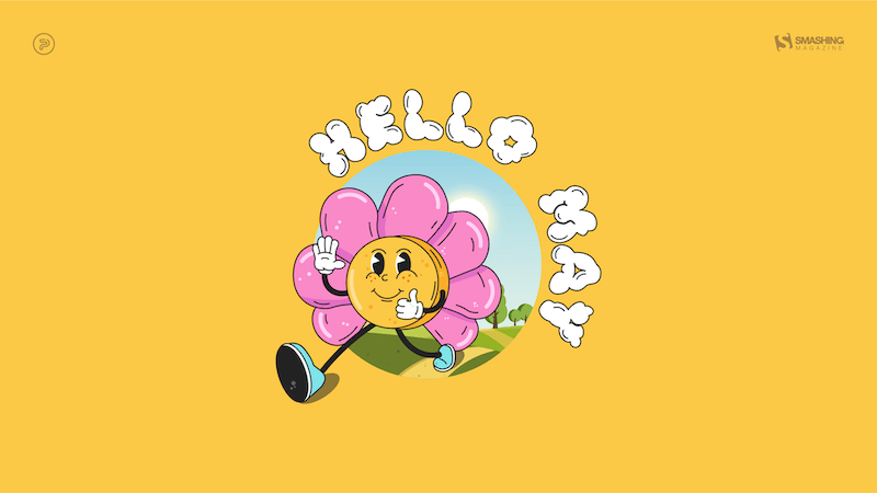
Hello May
“The longing for warmth, flowers in bloom, and new beginnings is finally over as we welcome the month of May. From celebrating nature on the days of turtles and birds to marking the days of our favorite wine and macarons, the historical celebrations of the International Workers’ Day, Cinco de Mayo, and Victory Day, to the unforgettable ‘May the Fourth be with you’. May is a time of celebration — so make every May day count!” — Designed by PopArt Studio from Serbia.
preview
without calendar: 320×480, 640×480, 800×480, 800×600, 1024×768, 1024×1024, 1152×864, 1280×720, 1280×800, 1280×960, 1280×1024, 1366×768, 1440×900, 1440×1050, 1600×1200, 1680×1050, 1680×1200, 1920×1080, 1920×1200, 1920×1440, 2560×1440
ARRR2-D2
Designed by Ricardo Gimenes from Sweden.

preview
without calendar: 640×480, 800×480, 800×600, 1024×768, 1024×1024, 1152×864, 1280×720, 1280×800, 1280×960, 1280×1024, 1366×768, 1400×1050, 1440×900, 1600×1200, 1680×1050, 1680×1200, 1920×1080, 1920×1200, 1920×1440, 2560×1440, 3840×2160
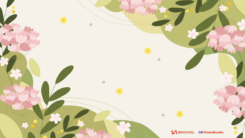
May Your May Be Magnificent
“May should be as bright and colorful as this calendar! That’s why our designers chose these juicy colors.” — Designed by MasterBundles from Ukraine.

preview
without calendar: 320×480, 640×480, 800×480, 800×600, 1024×768, 1024×1024, 1152×864, 1280×720, 1280×800, 1280×960, 1280×1024, 1366×768, 1400×1050, 1440×900, 1600×1200, 1680×1050, 1680×1200, 1920×1080, 1920×1200, 1920×1440, 2560×1440
The Monolith
Designed by Ricardo Gimenes from Sweden.

preview
without calendar: 640×480, 800×480, 800×600, 1024×768, 1024×1024, 1152×864, 1280×720, 1280×800, 1280×960, 1280×1024, 1366×768, 1400×1050, 1440×900, 1600×1200, 1680×1050, 1680×1200, 1920×1080, 1920×1200, 1920×1440, 2560×1440, 3840×2160
Blooming May
“In spring, especially in May, we all want bright colors and lightness, which was not there in winter.” — Designed by MasterBundles from Ukraine.
preview
without calendar: 320×480, 640×480, 800×480, 800×600, 1024×768, 1024×1024, 1152×864, 1280×720, 1280×800, 1280×960, 1280×1024, 1366×768, 1400×1050, 1440×900, 1600×1200, 1680×1050, 1680×1200, 1920×1080, 1920×1200, 1920×1440, 2560×1440
The Mushroom Band
“My daughter asked me to draw a band of mushrooms. Here it is!” — Designed by Vlad Gerasimov from Georgia.

preview
without calendar: 800×480, 800×600, 1024×600, 1024×768, 1152×864, 1280×720, 1280×800, 1280×960, 1280×1024, 1366×768, 1400×1050, 1440×900, 1440×960, 1600×900, 1600×1200, 1680×1050, 1680×1200, 1920×1080, 1920×1200, 1920×1440, 2560×1440, 2560×1600, 2880×1800, 3072×1920, 3840×2160, 5120×2880
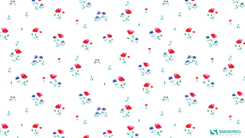
Poppies Paradise
Designed by Nathalie Ouederni from France.
preview
without calendar: 320×480, 1024×768, 1280×1024, 1440×900, 1680×1200, 1920×1200, 2560×1440
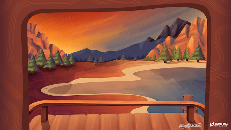
Lake Deck
“I wanted to make a big painterly vista with some mountains and a deck and such.” — Designed by Mike Healy from Australia.
preview
without calendar: 1280×960, 1440×900, 1680×1050, 1920×1080, 2560×1440, 2560×1600, 2880×1800
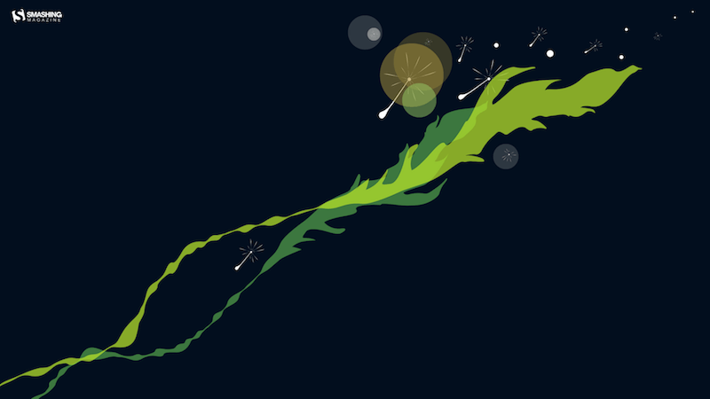
Make A Wish
Designed by Julia Versinina from Chicago, USA.
preview
without calendar: 320×480, 640×480, 800×480, 800×600, 1024×768, 1024×1024, 1152×864, 1280×720, 1280×800, 1280×960, 1280×1024, 1440×900, 1600×1200, 1680×1050, 1680×1200, 1920×1080, 1920×1200, 1920×1440, 2560×1440
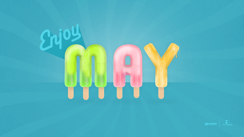
Enjoy May!
“Springtime, especially Maytime, is my favorite time of the year. And I like popsicles — so it’s obvious isn’t it?” — Designed by Steffen Weiß from Germany.
preview
without calendar: 320×480, 640×480, 800×480, 800×600, 1024×768, 1024×1024, 1152×864, 1280×720, 1280×800, 1280×960, 1280×1024, 1400×1050, 1440×900, 1600×1200, 1680×1050, 1680×1200, 1920×1080, 1920×1200, 1920×1440, 2560×1440
Celestial Longitude Of 45°
“Lixia is the 7th solar term according to the traditional East Asian calendars, which divide a year into 24 solar terms. It signifies the beginning of summer in East Asian cultures. Usually begins around May 5 and ends around May 21.” — Designed by Hong, Zi-Cing from Taiwan.

preview
without calendar: 1024×768, 1080×1920, 1280×720, 1280×800, 1280×960, 1366×768, 1400×1050, 1680×1050, 1920×1080, 1920×1200, 2560×1440
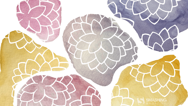
Stone Dahlias
Designed by Rachel Hines from the United States.
preview
without calendar: 320×480, 640×480, 800×480, 800×600, 1024×768, 1024×1024, 1152×864, 1280×720, 1280×1024, 1366×768, 1400×900, 1400×1050, 1600×1200, 1680×1050, 1680×1200, 1920×1080, 1920×1200, 1920×1440, 2560×1440
Understand Yourself
“Sunsets in May are the best way to understand who you are and where you are heading. Let’s think more!” — Designed by Igor Izhik from Canada.
preview
without calendar: 1280×720, 1280×800, 1280×960, 1280×1024, 1400×1050, 1440×900, 1600×1200, 1680×1050, 1680×1200, 1920×1080, 1920×1200, 1920×1440, 2560×1440
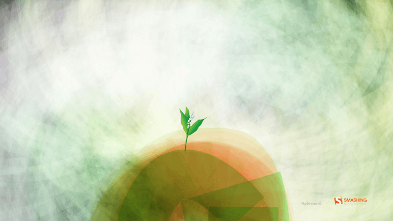
Sweet Lily Of The Valley
“The ‘lily of the valley’ came earlier this year. In France, we celebrate the month of May with this plant.” — Designed by Philippe Brouard from France.
preview
without calendar: 800×480, 1024×768, 1024×1024, 1280×720, 1280×1024, 1440×900, 1920×1080, 1920×1440, 2560×1440
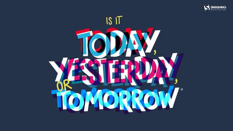
Today, Yesterday, Or Tomorrow
Designed by Alma Hoffmann from the United States.
preview
without calendar: 1024×768, 1024×1024, 1280×800, 1280×1024, 1366×768, 1440×900, 1680×1050, 1920×1080, 1920×1200, 2560×1440
Add Color To Your Life!
“This month is dedicated to flowers, to join us and brighten our days giving a little more color to our daily life.” — Designed by Verónica Valenzuela from Spain.
preview
without calendar: 800×480, 1024×768, 1152×864, 1280×800, 1280×960, 1440×900, 1680×1200, 1920×1080, 2560×1440
The Green Bear
Designed by Pedro Rolo from Portugal.

preview
without calendar: 1024×768, 1280×800, 1440×900, 1680×1200, 1920×1080, 2560×1440
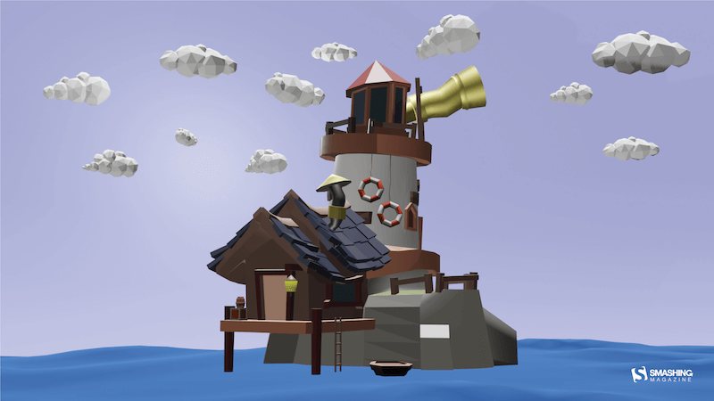
Lookout At Sea
“I wanted to create something fun and happy for the month of May. It’s a simple concept, but May is typically the time to adventure out into the world and enjoy the best of Spring.” — Designed by Alexander Jubinski from the United States.
preview
without calendar: 320×480, 640×480, 800×480, 800×600, 1024×768, 1024×1024, 1152×864, 1280×720, 1280×800, 1280×960, 1280×1024, 1366×768, 1400×1050, 1440×900, 1600×1200, 1680×1050, 1680×1200, 1920×1080, 1920×1200, 1920×1440, 2560×1440
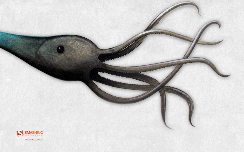
Tentacles
Designed by Julie Lapointe from Canada.
preview
without calendar: 320×480, 1024×768, 1280×800, 1280×1024, 1440×900, 1680×1050, 1920×1200
Spring Gracefulness
“We don’t usually count the breaths we take, but observing nature in May, we can’t count our breaths being taken away.” — Designed by Ana Masnikosa from Belgrade, Serbia.
preview
without calendar: 320×480, 640×480, 800×480, 800×600, 1024×768, 1024×1024, 1152×864, 1280×720, 1280×800, 1280×960, 1280×1024, 1400×1050, 1440×900, 1600×1200, 1680×1050, 1680×1200, 1920×1080, 1920×1200, 1920×1440, 2560×1440
Geo
Designed by Amanda Focht from the United States.
preview
without calendar: 320×480, 640×480, 800×480, 1024×768, 1024×1024, 1152×864, 1280×720, 1280×800, 1280×960, 1280×1024, 1366×768, 1400×1050, 1440×900, 1680×1200, 1920×1080, 1920×1440, 2560×1440
Blast Off!
“Calling all space cadets, it’s time to celebrate National Astronaut Day! Today we honor the fearless explorers who venture beyond our planet and boldly go where no one has gone before.” — Designed by PopArt Studio from Serbia.

preview
without calendar: 320×480, 640×480, 800×480, 800×600, 1024×768, 1024×1024, 1152×864, 1280×720, 1280×800, 1280×960, 1280×1024, 1400×900, 1400×1050, 1680×1050, 1680×1200, 1920×1080, 1920×1200, 1920×1440, 2560×1440
Colorful
Designed by <a href=https://www.lotum.de>Lotum from Germany.
<a href=https://archive.smashing.media/assets/344dbf88-fdf9-42bb-adb4-46f01eedd629/e8daeb22-0fff-4b2a-b51a-2a6202c6e26e/may-12-colorful-31-full.png>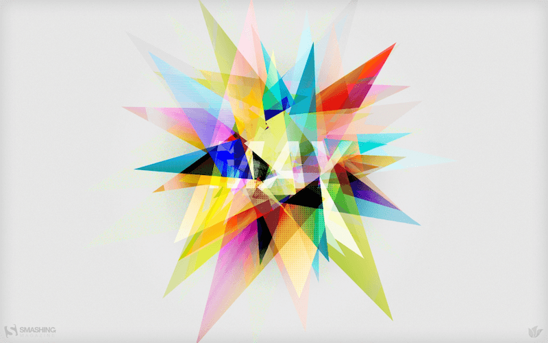
<a href=https://archive.smashing.media/assets/344dbf88-fdf9-42bb-adb4-46f01eedd629/5fbaaed8-cc91-407e-911b-95c851771e57/may-12-colorful-31-preview-opt.png>preview
without calendar: <a href=https://smashingmagazine.com/files/wallpapers/may-12/may-12-colorful__31-nocal-320×480.jpg>320×480, <a href=https://smashingmagazine.com/files/wallpapers/may-12/may-12-colorful__31-nocal-640×960.jpg>640×960, <a href=https://smashingmagazine.com/files/wallpapers/may-12/may-12-colorful__31-nocal-1024×1024.jpg>1024×1024, <a href=https://smashingmagazine.com/files/wallpapers/may-12/may-12-colorful__31-nocal-1280×800.jpg>1280×800, <a href=https://smashingmagazine.com/files/wallpapers/may-12/may-12-colorful__31-nocal-1280×1024.jpg>1280×1024, <a href=https://smashingmagazine.com/files/wallpapers/may-12/may-12-colorful__31-nocal-1440×900.jpg>1440×900, <a href=https://smashingmagazine.com/files/wallpapers/may-12/may-12-colorful__31-nocal-1680×1050.jpg>1680×1050, <a href=https://smashingmagazine.com/files/wallpapers/may-12/may-12-colorful__31-nocal-1920×1200.jpg>1920×1200
Who Is Your Mother?
“Someone who wakes up early in the morning, cooks you healthy and tasty meals, does your dishes, washes your clothes, sends you off to school, sits by your side and cuddles you when you are down with fever and cold, and hugs you when you have lost all hopes to cheer you up. Have you ever asked your mother to promise you never to leave you? No. We never did that because we are never insecure and our relationship with our mothers is never uncertain. We have sketched out this beautiful design to cherish the awesomeness of motherhood. Wishing all a happy Mothers Day!” — Designed by Acodez IT Solutions from India.
preview
without calendar: 320×480, 640×480, 800×480, 800×600, 1024×768, 1024×1024, 1152×864, 1280×720, 1280×960, 1280×1024, 1366×768, 1400×1050, 1440×900, 1600×1200, 1680×1050, 1680×1200, 1920×1080, 1920×1200, 1920×1440, 2560×1440
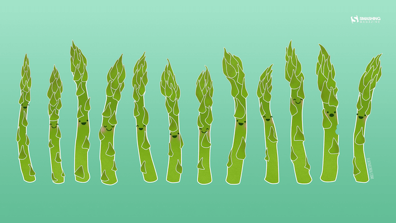
Asparagus Say Hi!
“In my part of the world, May marks the start of seasonal produce, starting with asparagus. I know spring is finally here and summer is around the corner when locally-grown asparagus shows up at the grocery store.” — Designed by Elaine Chen from Toronto, Canada.
preview
without calendar: 320×480, 800×480, 800×600, 1024×768, 1024×1024, 1152×864, 1280×720, 1280×800, 1280×960, 1280×1024, 1366×768, 1400×1050, 1440×900, 1600×1200, 1680×1050, 1680×1200, 1920×1200, 1920×1440, 2560×1440
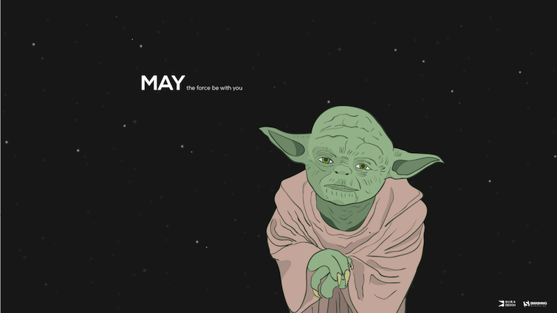
May The Force Be With You
“Yoda is my favorite Star Wars character and ‘may’ has funny double meaning.” — Designed by Antun Hirsman from Croatia.
preview
without calendar: 1280×800, 1280×1024, 1440×900, 1680×1050, 1680×1200, 1920×1080, 1920×1440, 2560×1440
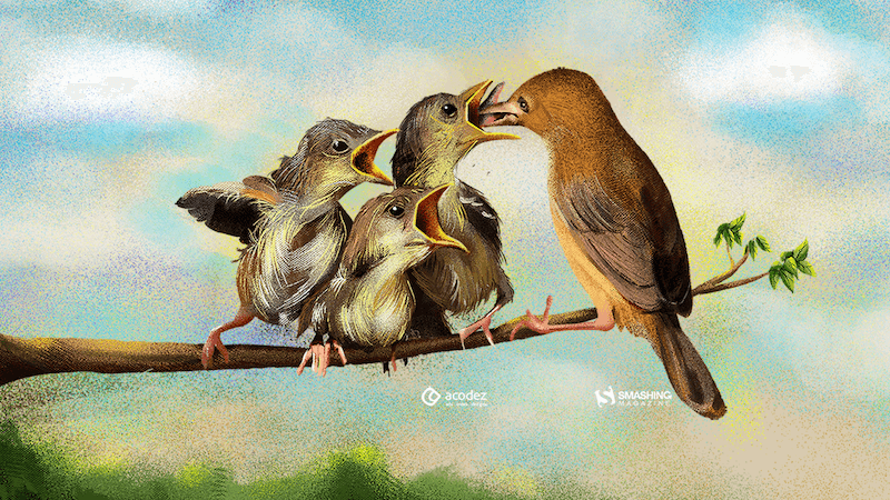
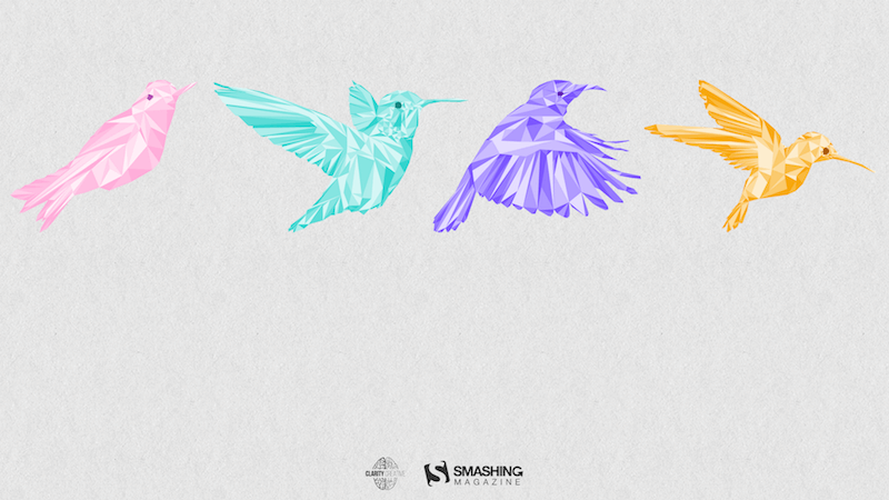
Birds Of May
“Inspired by a little-known ‘holiday’ on May 4th known as ‘Bird Day’. It is the first holiday in the United States celebrating birds. Hurray for birds!” — Designed by Clarity Creative Group from Orlando, FL.
preview
without calendar: 320×480, 640×480, 640×960, 640×1136, 800×480, 800×600, 1024×768, 1024×1024, 1152×864, 1280×720, 1280×800, 1280×960, 1280×1024, 1400×1050, 1440×900, 1600×1200, 1680×1050, 1680×1200, 1920×1080, 1920×1200, 1920×1440, 2560×1440