Best Backend as a Service (BaaS) in 2023

Original Source: https://www.sitepoint.com/best-backend-as-a-service-baas-in-2023/?utm_source=rss

Best Backend as a Service (BaaS) in 2023

Learn about the best BaaS solutions, including free and open-source options, their pros and cons, how to choose the best one for your project.

Continue reading
Best Backend as a Service (BaaS) in 2023
on SitePoint.

Making an Underwater CSS Text Effect

Original Source: https://1stwebdesigner.com/underwater-css-text-effect/

Web design can serve as a playful exploration ground for learning new techniques. In today’s guide, we’ll dive into the creation of an underwater CSS text effect, not just for the visual outcome, but to deepen our understanding of how different CSS properties harmonize to create dynamic text effects.

Your Web Designer Toolbox

Unlimited Downloads: 500,000+ Web Templates, Icon Sets, Themes & Design Assets
Starting at only $16.50/month!


DOWNLOAD NOW

Setting up the Structure

Our journey into the deep sea starts with a simple HTML structure: a div element with the class underwater, wrapping around an h1 tag.

<div class="underwater">
<h1>1stWebDesigner</h1>
</div>

Achieving the Underwater Effect

For our underwater CSS text effect, we introduce a range of CSS properties such as background-image, animation, and -webkit-background-clip.

@import url('https://fonts.googleapis.com/css2?family=Maven+Pro:wght@700&amp;display=swap');

body{
/* Using a dark background color for optimal contrast */
background-color: #000;
font-family: 'Maven Pro', sans-serif;
}

.underwater h1{
/* Font settings: sizing and a semi-transparent color */
font-size: 2.5rem;
color: #2c3e5010;

/* Assigning an underwater image as the background */
background-image: url('https://w7.pngwing.com/pngs/183/509/png-transparent-under-water-scenery-sunlight-underwater-ray-star-ocean-atmosphere-cloud-computer-wallpaper.png');

/* Clipping the background image to the outline of the text */
-webkit-background-clip:text;

/* Setting a 10s infinite animation for a dynamic effect */
animation: waterEffect 10s infinite;
}

/* Animation to simulate flowing water */
@keyframes waterEffect {
0% { background-position: left 0 top 0; }
100% { background-position: left 100% top 0; }
}

Explaining Key CSS Properties and Values

Breaking down our CSS code, the first point of interest is the background-image property. By setting an underwater image as the background, we immediately set the tone for our effect.

The -webkit-background-clip:text property clips the background image to the shape of the text. It allows the underwater image to fill the text, setting the stage for our effect.

The color property plays a vital role as well. We’re using a semi-transparent color (color: #2c3e5010;), where the last two digits 10 represent the alpha channel in hexadecimal format, controlling the transparency. This enables the background image to shine through, enhancing the underwater illusion.

The animation property sets our waterEffect animation into motion. Defined by the @keyframes rule, it continuously shifts the background-position from left 0 top 0 to left 100% top 0, creating the illusion of water flowing over the text.

The Result

See the Pen
Underwater Text Effect by 1stWebDesigner (@firstwebdesigner)
on CodePen.0

Exploring Other Methods

Different methods can achieve similar effects. An alternate approach involves utilizing the clip-path property with CSS animations, yielding a wavy text appearance akin to an underwater CSS text effect. This method manipulates the clip region of an element over time, evoking a dynamic sense of movement reminiscent of water’s rhythmic flow. In addition, the technique doesn’t necessitate a background image, instead, it transforms the appearance of the text directly. By turning to this method, you’re exposed to yet another aspect of CSS and its potential for dynamic text effects.

Brown Branding Mockup Series: A Designer's Dream Come True

Original Source: https://abduzeedo.com/brown-branding-mockup-series-designers-dream-come-true

Brown Branding Mockup Series: A Designer’s Dream Come True
Brown Branding Mockup Series: A Designer's Dream Come True

abduzeedo0808—23

As someone who has been in the design world for 20 years, I can testify to the importance of having the right tools at your disposal. The latest offering that has captured my professional interest is the Brown Branding Mockup Series by Showcase Mockups. I’m thrilled to share some insights into why this series is a must-have for any serious designer, regardless of their specialization.

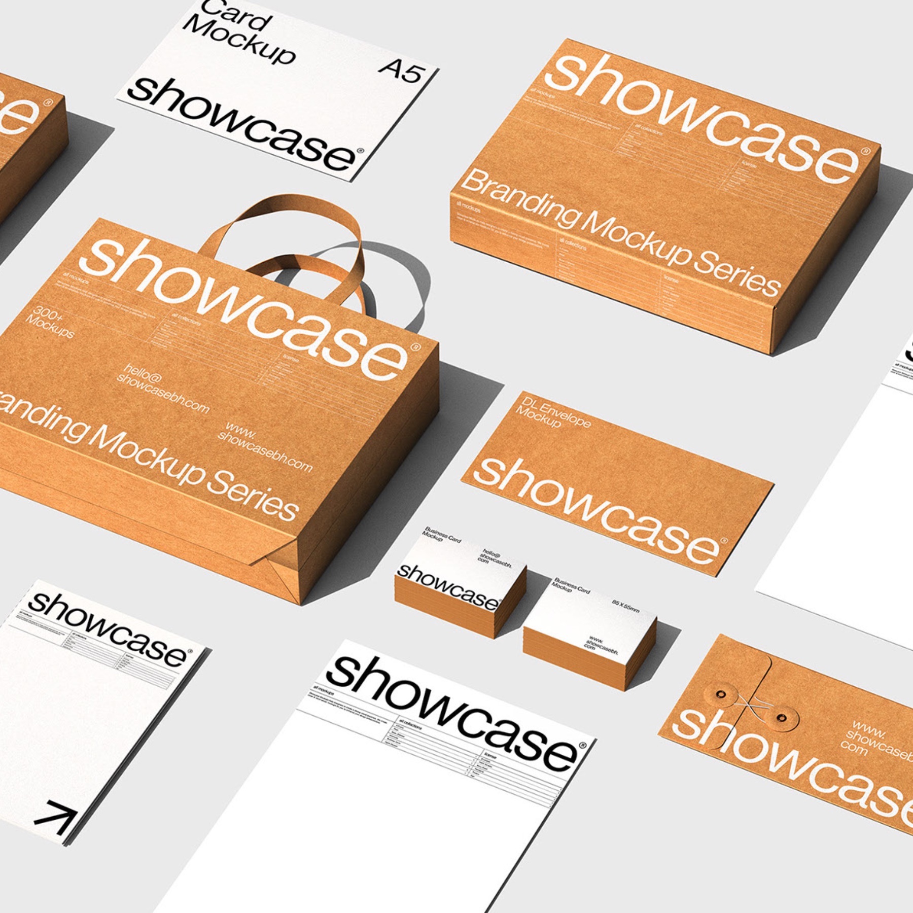
The Brown Branding Mockup Series is an array of elegantly crafted mockups that showcase various objects including paper bags, boxes, envelopes, letterhead, and business cards. These items are integral to building and representing a brand’s identity, and what better way to present them than with highly realistic and customizable mockups?

Versatility: The series caters to a broad spectrum of design needs, be it branding for a start-up or rebranding for an established organization. The different objects provided allow for a complete and cohesive presentation.
Quality: Created by Showcase Mockups, the team behind renowned design resources, the quality is impeccable. Every detail, texture, and shadow has been meticulously crafted to produce a lifelike replica of the real thing.
Ease of Use: Even though I have two decades of experience, I appreciate tools that simplify my workflow. These mockups are easy to work with and allow for quick adjustments, making them suitable for designers at any stage of their career.

Including the Brown Branding Mockup Series in your portfolio isn’t just about aesthetics; it’s about demonstrating your ability to create cohesive brand identity across various mediums. It exhibits your understanding of how each element, from business cards to packaging, plays a role in brand perception.

I wholeheartedly recommend taking advantage of this offering by Showcase Mockups. Whether you’re presenting a concept to a client or enhancing your portfolio, the Brown Branding Mockup Series is an invaluable asset that highlights the nuanced craft of branding.

In my extensive career, I have rarely come across a set of mockups so finely tuned to the needs of modern designers. Don’t miss out on this exceptional opportunity to elevate your work. Visit showcasebh.com  and enrich your design toolkit today.

Branding mockup examples

branding  brand identity Logo Design Mockup psd mockup template box mockup Packaging visual identity

branding  brand identity Logo Design Mockup psd mockup template box mockup Packaging visual identitybranding  brand identity Logo Design Mockup psd mockup template box mockup Packaging visual identitybranding  brand identity Logo Design Mockup psd mockup template box mockup Packaging visual identitybranding  brand identity Logo Design Mockup psd mockup template box mockup Packaging visual identitybranding  brand identity Logo Design Mockup psd mockup template box mockup Packaging visual identitybranding  brand identity Logo Design Mockup psd mockup template box mockup Packaging visual identitybranding  brand identity Logo Design Mockup psd mockup template box mockup Packaging visual identitybranding  brand identity Logo Design Mockup psd mockup template box mockup Packaging visual identitybranding  brand identity Logo Design Mockup psd mockup template box mockup Packaging visual identitybranding  brand identity Logo Design Mockup psd mockup template box mockup Packaging visual identitybranding  brand identity Logo Design Mockup psd mockup template box mockup Packaging visual identitybranding  brand identity Logo Design Mockup psd mockup template box mockup Packaging visual identity

DOWNLOAD HERE

Using Friction As A Feature In Machine Learning Algorithms

Original Source: https://smashingmagazine.com/2023/08/friction-feature-machine-learning-algorithms/

A common assumption in user experience design is less friction makes apps more delightful. But in practice, the happy path isn’t always the smoothest. The term “friction” in the digital sense usually refers to anything that makes experiences cumbersome. It’s an analogy to the physical resistance that occurs when objects interact. Digital friction comes in many forms, from frustrating flows to confusing copy. But plenty of scenarios actually benefit with a bit of resistance. Its killer feature is mitigating unintended consequences, such as an accidental Alexa shopping spree.

You’ve likely already encountered intentional friction many times. Most apps leverage it for destructive actions, account security, and error handling, as recommended by experts from Norman Nielsen Group to the magazine you’re currently reading.

Yet friction has found a new calling in the age of artificial intelligence. When implemented correctly, it can improve the efficiency of AI systems such as machine learning algorithms. These algorithms are often used to personalize experiences through predictive recommendations. Some applications incorporating these algorithms realize that adding a bit of friction to their interface can turn each user interaction into an opportunity to improve algorithmic quality.

While less friction makes an app smoother, a bit more may make it even smarter.

Friction As A Feature

Before venturing down the AI rabbit hole, let’s explore some simple examples showcasing the basic benefits of friction in UX. These are a helpful foundation to build off as we ascend into more complex applications for machine learning algorithms. Regardless of your familiarity, this will ground the following lessons in first principles.

Preventing Unintended Consequences

A common use for friction is error prevention, the fifth entry in Jakob Nielsen’s list of usability heuristics. In scenarios with the potential for high-cost errors, such as irreversible deletion, apps often request confirmation before executing requests. Confirmations often display in a modal, locking the rest of the screen to increase focus on copy explaining an action’s implications. This extra step provides some extra time to consider these ramifications.

“By forcing us to slow down and think at this exact moment, we’re kept from making potentially disastrous decisions by accident.”

— Archana Madhavan in Amplitude’s “Onboarding With The IKEA Effect: How To Use UX Friction To Build Retention”

Sometimes more resistance is present when the consequences can be catastrophic. For instance, a confirmation may involve cognitive work such as typing “DELETE” to submit a deletion request. This level of resistance makes sense when considering the humbling fact of life from Steve Krug’s classic UX book Don’t Make Me Think, which states, “We don’t read pages. We scan them.” This makes it easy to imagine how a streamlined design can make it too easy to overlook the consequences of a click.

While these tactics may look comically cumbersome, they mitigate devastating downsides. This use of friction is like a train’s brakes screeching to a halt right in time to avoid a collision — everyone breathes a sigh of relief, crisis averted. This also outlines the basic framework for understanding when to add friction. It boils down to a cost-benefit analysis: do the rewards of streamlining outweigh the risk? If not, slow it down. Now let’s move on from a black & white example to venture into a grayer area.

Nudging Toward Healthy Behavior

Some problems aren’t classifiable as errors but still aren’t in anyone’s best interest. Trying to solve them becomes wicked because there is no right or wrong solution. Yet that doesn’t make failing to address them any less of an existential risk. Consider social media’s medley of knee-jerk, tribalistic behavior. It has led many to question the value of these apps altogether, which isn’t good for business, or society at large. In an attempt to encourage more thoughtful discourse, these platforms turn to friction.

Twitter explored adding an extra step that asks people to read articles before retweeting them. This nudge aims to craft a more trustworthy experience for everyone by slowing the spread of misinformation. According to their reporting, people shown the prompt opened articles 40% more often, and some decided not to retweet it after all. They built on this success by showing a warning before users post messages which include harmful language.

Instagram also implemented a similar feature in its fight against online bullying. Adam Mosseri, the Head of Instagram, published a blog post stating that this “intervention gives people a chance to reflect.” Although specific data isn’t provided, they suggest it had promising results in cultivating a more humane experience for their communities.

These examples show how faster is not always better. Sometimes we need restraint from saying things we don’t mean or sharing things that we don’t understand. Friction helps algorithms in a similar manner. Sometimes they also need more information about us so they don’t recommend things we won’t appreciate.

Understanding Preferences & Objectives

Let’s shift focus to AI with a simple example of how friction plays a role in machine learning algorithms. You’ve probably signed up for an app that begins by asking you a bunch of questions about your interests. Behind the scenes, an algorithm uses these answers to personalize your experience. These onboarding flows have become so common over the past decade that you may have forgotten a time before apps were smart enough to get to know you.

You may have never even questioned why you must go through a preference capture flow before getting to explore content. The value is obvious because no one wants the quickest path to something irrelevant. Many apps are simply in the business of making relevant connections, and these personalization tactics have been one of the best ways to do so. A McKinsey report illuminates this further by reporting that “35 percent of what consumers purchase on Amazon and 75 percent of what they watch on Netflix come from product recommendations based on such algorithms.”

“The top two reasons that customers churn are 1) they don’t understand your product, and 2) they don’t obtain any value from it. Customer onboarding can solve both of these issues.”

— Christina Perricone in HubSpot’s “The Ultimate Guide to Customer Onboarding”

Perhaps these onboarding flows are so familiar that they don’t feel like friction. They may seem like necessary steps to unlock an app’s value. However, that perspective quickly changes for anyone designing one of these flows. The inherent tension lies in attempting to balance the diametrically opposite needs of two parties. On the one hand, an algorithm provides better output relative to its input (although asymptotes exist). Success is a function of maximizing data collection touchpoints, but this tends to result in more steps with more complex questions.

In short, the quicker an app makes a recommendation, the more likely it will be wrong. On the other hand, an extremely long onboarding flow is unlikely to make an amazing first impression on new users. I had the pleasure of walking this tightrope when designing the onboarding flow at Headliner. Each new step we added always felt like it would be the straw that broke the camel’s back. We nervously monitored our activation reports for signs we went too far but surprisingly saw no meaningful dropoff. Yet, even a slight decrease would easily be worth the improved retention that personalization yielded.

This is thanks to some clever interface innovations. TikTok’s design turns user engagement into clear signals they use to tweak their algorithms. Content recommendation quality is a direct function of this, which some refer to as an algorithm’s vision.

Optimizing an app’s key interactions to understand implicit signals makes an explicit means of capturing preferences unnecessary.

Engagement Signals

Every interaction is an opportunity to improve understanding through bidirectional feedback. An interface should provide system feedback to the user engaging with it while also reporting to the system how performance meets user expectations. Everything from button taps to the absence of action can become a signal. Interfaces that successfully incorporate this are referred to as algorithm-friendly.

A study by Apple’s Machine Learning Research Department details their success in leveraging engagement signals, which they believe “provide strong indications of a user’s true intent,” to efficiently train a machine learning model through a process called Reinforcement Learning from Human Feedback. Their results documented “significant accuracy gains in a production deep learning system,” meaning that an interface designed well enough to analyze naturally occurring user behavior is all that is needed to create personalization that feels like mind reading.

Instagram actually employs this strategy as well, although its approach is a bit less cohesive since they seem to be in a perpetual state of transition.

TikTokification

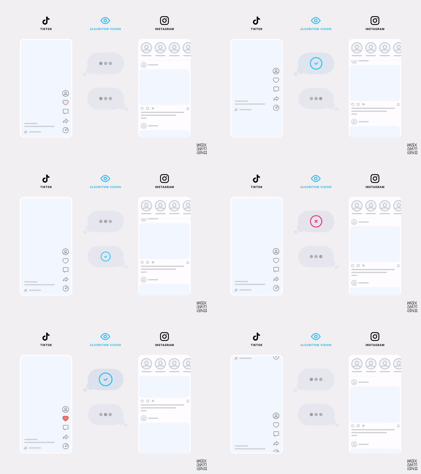
But what exactly makes an interface algorithm-friendly? In TikTok’s case, it was the design decision to only show one video at a time. That’s right, friction! By decreasing the information density in the viewport at any given time, they increased their understanding of a user’s focus. This localizes interactions (or lack thereof) to specific content as quality measures.

Gustav Söderström, the Co-President, CPO & CTO at Spotify has referred to this approach as “giving the algorithm glasses.” Compare this to the medley of distractions in other feeds, and it’s easy to imagine which one is better at collecting data.

Using friction as a tool allows designers to craft an interface that separates engagement signals from noise.

Algorithmic visibility comparison of TikTok & Instagram’s home feeds. (Source: Maximillian Piras) (Large preview)

As we return to my aforementioned framework for evaluating when to add friction, we can understand how it makes sense in this scenario. While each interaction may take slightly longer, relevant content can be found quicker. The trade-off makes sense since relevance sits atop a user’s hierarchy of needs.

Additionally, if you were to measure friction over a longer time horizon, you likely would find an experience with better personalization feels more frictionless. This is because the efficiency in helping users find what they’re looking for would consistently compound (although, again, asymptotes exist). So each subsequent visit theoretically requires less work on the user’s part, which makes the alternate approach look like the cumbersome one.

“The secret of why some of these products are so good at recommendations is not actually that they have better algorithms. It’s the same algorithms with a more efficient user interface.”

— Gustav Söderström in The Verge’s “Why Spotify wants to look like TikTok”

While TikTok popularized this interface, anybody who was single in the last decade may notice a similarity to dating apps. Using directional gestures as engagement signals dates back to the swipeable card paradigm Tinder introduced in 2012. They, too, limited the viewport to one result at a time and used actions to inform subsequent recommendations. But TikTok took it mainstream since not everyone needs a dating app, and those who do will churn once they’ve met someone.

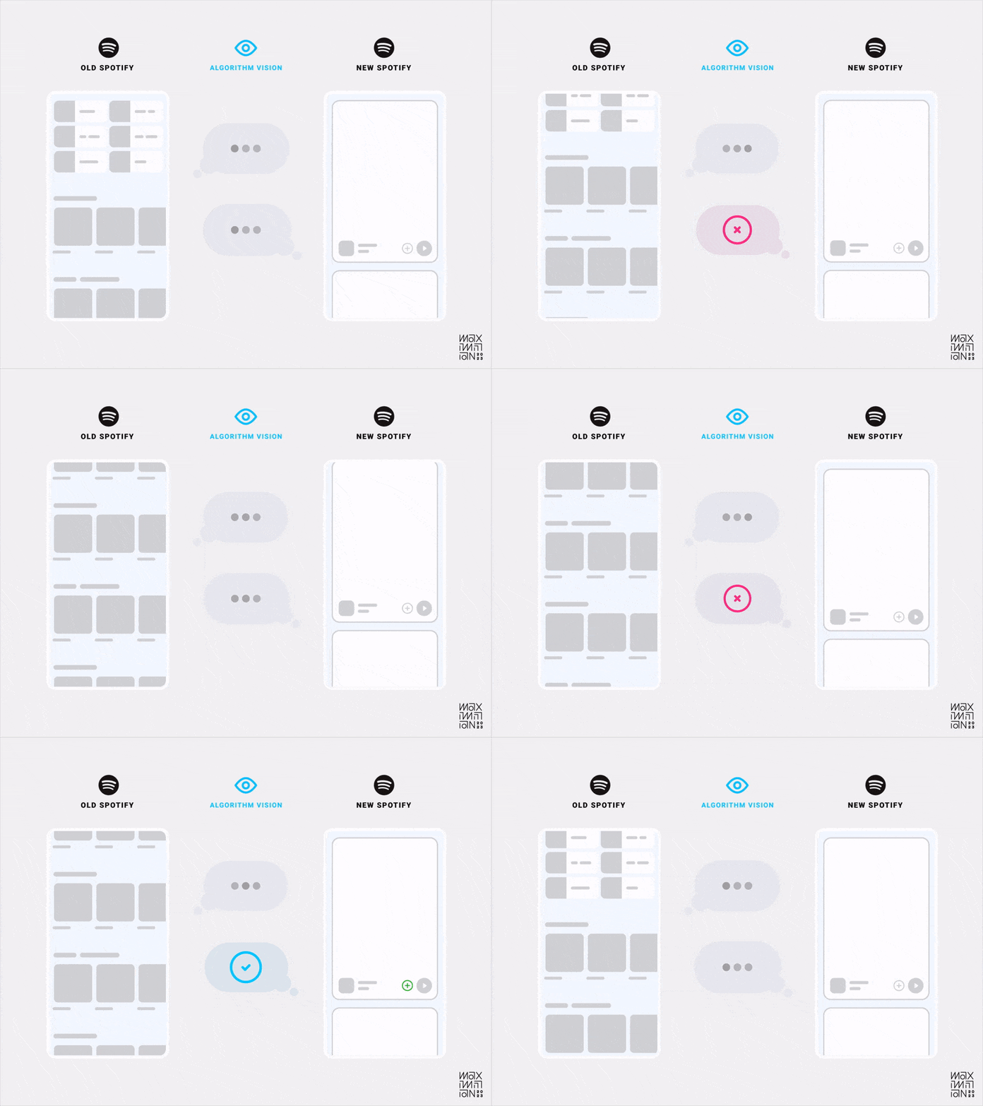
The results of using this paradigm in everyday entertainment led many platforms to copy it in hopes of the same algorithmic gains. The latest to embark on this journey is Spotify, much to the chagrin of their users. In fact, this decision even landed it on Mashable’s list of worst app updates in 2023. But Söderström says they don’t have a choice, and he believes in the long run, the signal clarity will make up for any interim backlash because of how much quicker it can learn user preferences. Critics fail to realize how important these changes are for Spotify’s future.

In the machine learning age, apps with inefficient interfaces for signal analysis risk becoming uncompetitive.

Algorithmic visibility comparison of Spotify’s old & new home feeds. (Source: Maximillian Piras) (Large preview)

Making Lemonade

The reason this approach is so powerful is due to the compounding nature of good data. Optimizing signals for any individual user creates a data network effect that benefits everyone else. It even turns negatives into positives! An individual bad experience can mitigate others from encountering the same, making the system antifragile.

This approach dates back to 2003 with the introduction of Amazon’s item-to-item collaborative filtering. You may know it as “customers who viewed this also viewed this.”

This type of filtering produces high-quality recommendations with limited user data. It does so by building relationships between items to proxy user preferences. With only two to three data points, an algorithm can draw connections across the entire dataset. It effectively piggybacks off previous patterns that are similar enough.

This means an app like TikTok only needs a few swipes before it can make high-probability assumptions about your preferences. That’s why friction is so useful in algorithm-friendly interfaces. If the initial interactions send clean signals, then an algorithm can graph a user’s interests almost immediately.

Friction In The Future

We began in the past by reviewing how friction found its way into UX toolkits through error prevention and healthy nudges. Then we moved on to its ability to help algorithms learn user preferences and objectives. While explicit onboarding flows are still in vogue, TikTok is popularizing an interface that makes them unnecessary by using implicit engagement signals leading to significant algorithmic gains. Yet the machine learning age is just beginning, and friction is only accelerating its evolution.

Inverting The Pareto Principle

We’ve focused on algorithms that recommend content, but more diverse uses of personalization may emerge due to the newfound capabilities of Large Language Models. These models unlock the ability to manipulate unstructured data at scale. This allows engagement patterns of greater complexity to be analyzed and productized. The result is algorithms can recommend much more than media and metadata.

Perhaps they can craft completely personalized feature sets based on our preferences and objectives. Imagine selecting effects in Photoshop and seeing suggestions such as “Creators who used this effect also used this one.” These capabilities could increase the usage of buried features that only power users tend to find.

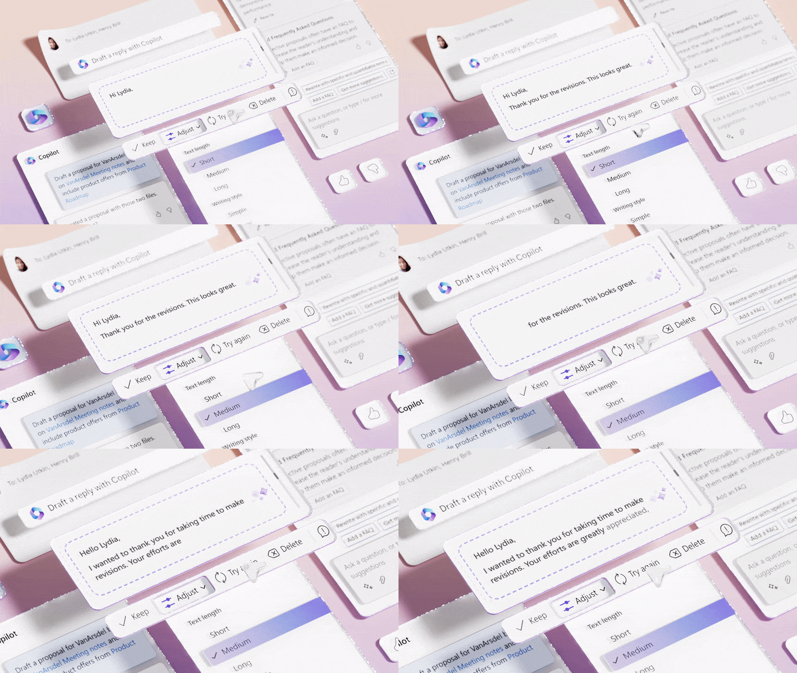
Microsoft is exploring this by adding Copilot to its products. They claim the “average person uses less than 10% of what PowerPoint can do,” but AI will unlock all that latent value.

Microsoft Copilot uses LLMs in an attempt to unlock the 90% of features that most users don’t know exist. (Source: Microsoft Design) (Large preview)

Using LLMs to create feature recommendation engines is a fascinating idea. It would allow developers to stop relying on the Pareto Principle for prioritization. Especially because Joel Spolsky claims the 80/20 rule is actually a myth.

“A lot of software developers are seduced by the old “80/20” rule. It seems to make a lot of sense: 80% of the people use 20% of the features… Unfortunately, it’s never the same 20%. Everybody uses a different set of features.”

— Joel Spolsky in “Strategy Letter IV: Bloatware and the 80/20 Myth”

It would be nice if irreducible simplicity in interface design were only a power law away, but feature creep is hard to combat when different people find value in different options. It’s unrealistic to believe that there is some golden 20% of features driving 80% of value. If there was, then why isn’t the Pareto Principle ever applied to content?

I can’t imagine a team at YouTube suggesting that removing 80% of videos would improve the service. Instead, it’s viewed as a routing problem: find the right piece of content for the right person. If machine learning algorithms can recommend features, I hope the value of friction goes without saying at this point. The efficiency gains unlocked by algorithm-friendly interfaces absolutely apply.

Hallucinations Or Creations

The recent inflection point in the capability of LLMs unlocks an entirely new computing paradigm. The legendary UX researcher Jakob Nielsen believes it introduces the first new UI paradigm in 60 years, which he calls Intent-Based Outcome Specification. Instead of telling computers what to do, we now explain an outcome so they can determine how to achieve it.

Using machine learning algorithms to recommend features is one example. Another fairly new example that you’re likely familiar with is chatbots like ChatGPT. Hundreds of millions of people already use it, which is a testament to how out of this world the experience is. Yet therein lies a problem: sometimes its responses literally aren’t grounded in reality because it has a tendency to make them up! This isn’t obvious to those unfamiliar with the technology’s inner workings since there aren’t many safeguards. As a result, some people become dangerously overreliant on its unverified output.

In one case, a lawyer based legal arguments on research from ChatGPT only to find out in court that multiple cited sources turned out to be completely nonexistent. The lawyer’s defense was that he was “unaware of the possibility that its content could be false.” Examples like this reinforce the importance of friction in preventing unintended consequences. While ChatGPT’s empty state mentions its limitations, they obviously aren’t stated explicitly enough for everyone.

Extra steps and prompts, such as those mentioned earlier, could better educate users about what is referred to as a “hallucination.” It’s a phenomenon of chatbots confidently outputting responses that don’t align with their training data. Similar to telling a lie when you don’t have a correct answer, although that characterization overly anthropomorphizes the software.

Yet some see hallucinations as more of a feature than a bug. Marc Andreessen, the co-founder of Netscape, states during an interview that “another term for hallucination is just simply creativity.” He views it as a significant evolution from the hyperliteral systems of the past because they can now brainstorm and improvise.

The problem is that chatbot interfaces tend to be simplistic by attempting to be one size fits all. More controls or modes would educate users about available output types so they can specify which they expect. Sometimes we may want an imaginative response from a creative partner. Other times we want the hyper-accuracy of a deterministic calculator, such as ChatGPT’s Wolfram plugin.

Perhaps a creativity slider or persona selector similar to Maggie Appleton’s exploration will better align the system to user needs. However it’s implemented, a bit of friction can maximize benefits while minimizing risks.

Finding Your Friction

We’ve covered using friction for simple error prevention to complex algorithm optimizations. Let’s end with a few tips that make implementing it as smooth as possible.

Peak-End Rule

When adding resistance to an experience, the Peak-End Rule is a useful psychological heuristic to leverage. It’s rooted in studies by Daniel Kahneman & Amos Tversky, where they found that perception of painful experiences doesn’t tend to correlate with duration. It’s the peak & end of the experience that subjects recall.

In practice, experts suggest that delight is a function of positive emotional peaks and rewarding emotional payoffs. Optimizing for the peak & end provides room to shift focus from time spent and steps taken as performance indicators; long and complex experiences can still be delightful if designed correctly.

Maps Aren’t Territories

People experience friction emotionally, but developers see it as a value on a chart. In the same way that a map is not a territory, this ratio is only an approximation of the actual experience. It’s something to consider when evaluating any strategies for adding or removing friction. Since applications are complex ecosystems, any measurements should consider a holistic view. Every step has second-order effects, which makes one-dimensional measurements prone to blind spots.

For example, when a wrong file is deleted, the data can’t report people cursing at their computer screen. Nor is it likely to include the context of them opening a new file just to recreate their old file from scratch. The same subjectivity applies to all instances of friction. For instance, are your reports equipped to measure the trade-off of an action that takes longer but results in better data collection? It might increase algorithmic efficiency, which compounds across a neural network.

As we’ve discussed, better recommendations tend to yield better retention, which tends to yield more revenue if a business model aligns with usage. Myopic measurements will miss these types of gains, so make sure to analyze friction in a way that really matters.

Keep Pushing

As software is eating the world, AI is eating software. If it’s a paradigm shift as big as social, mobile, or even the web, then applications must adapt or die. If you want to remain competitive in the machine learning age, then don’t fear friction.

Further Reading on Smashing Magazine

“Using AI To Detect Sentiment In Audio Files,” Joas Pambou
“Modern Technology And The Future Of Language Translation,” Adriano Raiano
“Beyond Algorithms: Skills Of Designers That AI Can’t Replicate,” Lyndon Cerejo
“How To Use AI Tools To Skyrocket Your Programming Productivity,” Shane Duggan

18 Mobile Apps to Increase Your Productivity (2023)

Original Source: https://www.hongkiat.com/blog/productivity-mobile-apps/

Mobile phones, our ever-present companions, serve as vital tools in amplifying productivity through a myriad of apps crafted to simplify tasks and optimize time management. Whether you’re a bustling professional or someone aiming to streamline personal responsibilities, the right app can be a game-changer for those perpetually engaged with their phones or always on the move.

productivity mobile appsproductivity mobile apps

In this post, you’ll discover a curated selection of apps designed to elevate your efficiency. From tools that sharpen your focus during work to those that assist in document organization, expedite typing, or systematically manage tasks, our list encompasses them all. Explore these offerings and find the perfect fit to boost your daily productivity.

SyncplicitySyncplicity

Syncplicity

Facilitates seamless file sharing and management across devices for large teams.

Syncplicity is a comprehensive file-sharing and management application designed to facilitate seamless control of files across various devices. It enables users to effortlessly transmit and share substantial documents, images, and other files with collaborators, regardless of the device they are using. Tailored to suit the needs of large teams,

Syncplicity ensures the continuous sharing of a vast array of files, thus making it an essential tool for collaborative efforts. It is compatible with iOS devices, Android devices, Windows, and can also be accessed through a web app.

Related: 15 Websites to Send Big Files Online

iOS
Android

Pomodoro TimerPomodoro Timer

Pomodoro Timer

Implements the Pomodoro technique for focused work and breaks.

Pomodoro is an effective app designed to facilitate the implementation of the Pomodoro technique. The underlying principle of this method is straightforward: users set a timer, typically for 25 minutes, to focus on work and then take a 3-5 minute break each time the timer rings. After the completion of four cycles, a longer break is scheduled.

This tool is compatible with the iPhone and iPad (iOS 7 and above), as well as the Mac platform.

iOS
Android

SimplenoteSimplenote

Simplenote

Versatile note-taking app with automatic backups and version control.

Simplenote, as its name implies, is designed to facilitate the seamless recording of thoughts, ideas, tasks, and shopping lists, all within a single app.

This versatile tool offers native applications for iOS, Android, Mac, Kindle, and also provides a Web app version to cater to various user preferences. One of its key features includes automatic backups and synchronization, ensuring that your data is always up-to-date across different devices.

In addition, Simplenote offers version control, allowing users to revisit previous versions of their notes without concern over unintended modifications. However, it is worth noting that as of now, the application lacks built-in encryption, a potential consideration for those concerned with data security.

Related: 10 Best Free Note Taking Apps

iOS
Android

TimefulTimeful

Timeful

Enhances scheduling skills with personalized recommendations and integration with calendars.

Timeful offers an advanced level of scheduling assistance, designed to enhance organizational skills by learning individual habits and avoiding the risk of double booking appointments. By analyzing one’s time management patterns, it provides personalized recommendations to promote punctuality and efficiency.

The app integrates smoothly with Google Calendar, Apple Calendar, and Microsoft Exchange, making it a convenient solution for iOS users.

iOS

HoursHours

Hours

Intuitive time-tracking app with intelligent notifications and project monitoring.

Hours, a time-tracking application compatible with iOS (requires iOS 8 or higher), presents your daily schedule in the form of an intuitive timeline. Each event within the schedule is equipped with an individual timer, enabling you to easily start and stop tracking with a simple tap. Recognizing that users may sometimes forget to activate the tracking, Hours provides intelligent notifications as reminders.

The app’s capabilities extend to the monitoring of multiple projects, and it offers the functionality to generate comprehensive reports that can be conveniently sent via email.

Related: 15 Time Tracking Apps For Remote Workers

iOS
Android

Checkmark 2Checkmark 2

Checkmark 2

Sophisticated reminder app with location-based and recurring reminders.

Checkmark is a reminder app designed to assist you in managing and tracking all your necessary tasks. It offers the unique capability to create reminders based on location, allowing you to set timers for reminders that are triggered when arriving at a specific place, or even to specify reminders based on a particular date and location.

Additionally, tasks can be organized by distance, and recurring reminders may be established on a daily, weekly, monthly, or customized schedule. The app provides the option to categorize your reminders into various sections, such as Home, Shopping, and Groceries, enabling an efficient way to sort and manage your reminders.

iOS

AsanaAsana

Asana

Comprehensive project management with task assignments and communication features.

Asana enables comprehensive project management by consolidating your team’s planning and communication requirements. The platform allows users to create and assign tasks, establish deadlines, comment, and share files, thereby facilitating a streamlined workflow.

Through Asana, team members can effortlessly identify those responsible for specific tasks, monitor progress, exchange ideas and comments, and communicate efficiently with the entire team using either an iOS or Android smartphone.

Related: 10 Project Management Software for Remote Teams

iOS
Android

LastPassLastPass

LastPass

Password manager with automatic login and form completion.

The LastPass password-managing app eliminates the need to manually manage logins and passwords by combining the functionalities of a strong password generator, password vault, and browser into one streamlined smartphone application.

Users can synchronize their password vaults across devices, allowing the LastPass browser to automatically complete forms and login details when navigating the internet and accessing various sites. This can be done through the in-app browser or popular browsers such as Safari or Chrome.

Related: 10 Free Desktop Password Generators

iOS

NotabilityNotability

Notability

Note-taking app with multimedia integration and playback history.

Notability is a note-taking app available on iOS devices. It allows users to combine handwriting, photos, and typing in a single note to bring their projects to life. Users can annotate PDFs, make GIFs, and record lectures that sync with their notes. The app offers a wide range of writing tools, including various pen styles and colors.

Notability’s unique feature is the ability to play back users’ note-taking history, synced with an audio recording. It is widely used by students, professionals, and creatives for various purposes.

Related: 10 Tools to Help You Write Better Content

iOS

PaperPaper

Paper

Immersive sketching app with natural gestures and creative prompts.

Paper by WeTransfer is an immersive sketching app designed for iPhone and iPad. With Paper’s perfectly-tuned tools, users can sketch, collage, paint, and draw with ease. The app offers natural gestures to guide creativity without distracting menus.

Users can add multiple photos to a single page, create mood boards, and organize pages into beautiful journals. The Paper Store provides creative prompts, guides, and daily activities to inspire users. A subscription to Paper Pro unlocks more tools, features, and journals, enhancing the creative experience.

iOS

GoodNotes 5GoodNotes 5

GoodNotes 5

Natural writing experience with customizable pens and unlimited notebooks.

GoodNotes is yet another popular note-taking app that provides a natural writing experience, optimized by GoodNotes’ pioneering vector ink engine. Users can select and customize their pen’s color, thickness, and style, and write with compatible styluses.

The app allows unlimited notebook creation with various beautiful covers and paper templates. Features like the Lasso tool enable users to move, resize, and rotate their writing. The app also offers a dark mode for eye comfort.

iOS
Android

Microsoft WordMicrosoft Word

Microsoft Word

Create, edit, and share documents with collaboration features.

The Microsoft Word mobile app allows users to create, edit, view, and share documents with ease. With a touch-friendly interface, users can format text, insert images, and use various templates.

Collaboration features enable real-time editing with others, and cloud integration ensures access to documents from anywhere. It is a versatile tool for personal, academic, or professional writing tasks.

iOS
Android

Forest: Focus for ProductivityForest: Focus for Productivity

Forest: Focus for Productivity

Combats phone addiction and enhances focus with virtual tree planting.

Forest is a productivity app designed to help users overcome phone addiction and stay focused on essential tasks. By planting a virtual seed that grows into a tree, users commit to not using their phone for a set period. If they leave the app, the tree withers. Features include tracking focused moments, unlocking new tree species, and even planting real trees on Earth through partnerships.

The app also offers a Pro version with additional functionalities like custom whitelists, detailed time distribution statistics, and collaboration with friends.

iOS
Android

GrammarlyGrammarly

Grammarly

Writing assistant with real-time grammar and style checks.

Grammarly’s mobile app is a writing assistant that helps users compose mistake-free, clear, and effective text. It integrates with various apps and provides real-time grammar and spelling checks, suggestions for style and tone, and even plagiarism detection.

The app can be customized to specific writing goals and audience types, making it suitable for professional emails, social media posts, or academic essays. Grammarly offers both free and premium versions, with the latter providing more in-depth analysis and corrections.

Related: 50+ Useful AI Writing Tools to Know

iOS
Android

Documents: File Manager & DocsDocuments: File Manager & Docs

Documents: File Manager & Docs

Efficient file and document management with PDF support.

Document Manager is designed to help users manage their files and documents effectively. It allows users to quickly search, access, and manage all their files in one place, including PDFs, documents, and multimedia files.

The app supports various file formats and offers a user-friendly interface with easy navigation. It also includes a PDF viewer and reader, allowing users to read PDF files directly within the app. Document Manager supports cloud storage, enabling users to access their files from anywhere.

iOS
Android

Photo Widgets: SimplePhoto Widgets: Simple

Photo Widgets: Simple

Personalize home screen with custom photo widgets.

The Photo Widget app allows users to customize their device’s home screen with personal photos. It offers a simple and intuitive interface where users can select photos from their gallery and display them on their home screen as a widget.

The app supports multiple widgets, each of which can be customized with different photos. Users can also adjust the refresh interval to change the displayed photo at their preferred frequency.

iOS
Android

WidgetsmithWidgetsmith

Widgetsmith

Highly customizable widgets for home and lock screens.

Widgetsmith enables users to personalize their home screen and lock screen like never before. It offers a wide collection of highly customizable widgets, ranging from photos and dates to weather and astronomy.

Each widget can be adjusted precisely to best fit the user’s desired function and appearance. The app also includes a wide collection of tools, such as a weather app, a timezone converter, and a calendar, which can automatically launch based on the active widget tapped.

iOS

Seven: 7 Minutes WorkoutSeven: 7 Minutes Workout

Seven: 7 Minutes Workout

High-intensity workouts in 7 minutes for improved fitness.

The 7 Minutes Workout app is a fitness application designed to help users improve their physical health through short, high-intensity workouts. The app offers a variety of exercises that can be completed in just 7 minutes, making it a convenient option for those with busy schedules. It provides voice guidance, adjustable circuit times, and rest periods.

The app also includes a workout log to track progress and offers the option to pause or skip exercises.

iOS
Android

The post 18 Mobile Apps to Increase Your Productivity (2023) appeared first on Hongkiat.

How We Optimized Performance To Serve A Global Audience

Original Source: https://smashingmagazine.com/2023/08/optimize-performance-serve-global-audience/

I work for Bookaway, a digital travel brand. As an online booking platform, we connect travelers with transport providers worldwide, offering bus, ferry, train, and car transfers in over 30 countries. We aim to eliminate the complexity and hassle associated with travel planning by providing a one-stop solution for all transportation needs.

A cornerstone of our business model lies in the development of effective landing pages. These pages serve as a pivotal tool in our digital marketing strategy, not only providing valuable information about our services but also designed to be easily discoverable through search engines. Although landing pages are a common practice in online marketing, we were trying to make the most of it.

SEO is key to our success. It increases our visibility and enables us to draw a steady stream of organic (or “free”) traffic to our site. While paid marketing strategies like Google Ads play a part in our approach as well, enhancing our organic traffic remains a major priority. The higher our organic traffic, the more profitable we become as a company.

We’ve known for a long time that fast page performance influences search engine rankings. It was only in 2020, though, that Google shared its concept of Core Web Vitals and how it impacts SEO efforts. Our team at Bookaway recently underwent a project to improve Web Vitals, and I want to give you a look at the work it took to get our existing site in full compliance with Google’s standards and how it impacted our search presence.

SEO And Web Vitals

In the realm of search engine optimization, performance plays a critical role. As the world’s leading search engine, Google is committed to delivering the best possible search results to its users. This commitment involves prioritizing websites that offer not only relevant content but also an excellent user experience.

Google’s Core Web Vitals is a set of performance metrics that site owners can use to evaluate performance and diagnose performance issues. These metrics provide a different perspective on user experience:

Largest Contentful Paint (LCP)
Measures the time it takes for the main content on a webpage to load.
First Input Delay (FID)
Assesses the time it takes for a page to become interactive.
Note: Google plans to replace this metric with another one called Interaction to Next Paint (INP) beginning in 2024.
Cumulative Layout Shift (CLS)
Calculates the visual stability of a page.

While optimizing for FID and CLS was relatively straightforward, LCP posed a greater challenge due to the multiple factors involved. LCP is particularly vital for landing pages, which are predominantly content and often the first touch-point a visitor has with a website. A low LCP ensures that visitors can view the main content of your page sooner, which is critical for maintaining user engagement and reducing bounce rates.

Largest Contentful Paint (LCP)

LCP measures the perceived load speed of a webpage from a user’s perspective. It pinpoints the moment during a page’s loading phase when the primary — or “largest” — content has been fully rendered on the screen. This could be an image, a block of text, or even an embedded video. LCP is an essential metric because it gives a real-world indication of the user experience, especially for content-heavy sites.

However, achieving a good LCP score is often a multi-faceted process that involves optimizing several stages of loading and rendering. Each stage has its unique challenges and potential pitfalls, as other case studies show.

Here’s a breakdown of the moving pieces.

Time To First Byte (TTFB)

This is the time it takes for the first piece of information from the server to reach the user’s browser. You need to beware that slow server response times can significantly increase TTFB, often due to server overload, network issues, or un-optimized logic on the server side.

Download Time of HTML

This is the time it takes to download the page’s HTML file. You need to beware of large HTML files or slow network connections because they can lead to longer download times.

HTML Processing

Once a web page’s HTML file has been downloaded, the browser begins to process the contents line by line, translating code into the visual website that users interact with. If, during this process, the browser encounters a <script> or <style> tag that lacks either an async or deferred attribute, the rendering of the webpage comes to a halt.

The browser must then pause to fetch and parse the corresponding files. These files can be complex and potentially take a significant amount of time to download and interpret, leading to a noticeable delay in the loading and rendering of the webpage. This is why the async and deferred attributes are crucial, as they ensure an efficient, seamless web browsing experience.

Fetching And Decoding Images

This is the time taken to fetch, download, and decode images, particularly the largest contentful image. You need to look out for large image file sizes or improperly optimized images that can delay the fetching and decoding process.

First Contentful Paint (FCP)

This is the time it takes for the browser to render the first bit of content from the DOM. You need to beware of slow server response times, particularly render-blocking JavaScript or CSS, or slow network connections, all of which can negatively affect FCP.

Rendering the Largest Contentful Element

This is the time taken until the largest contentful element (like a hero image or heading text) is fully rendered on the page. You need to watch out for complex design elements, large media files, or slow browser rendering can delay the time it takes for the largest contentful element to render.

Understanding and optimizing each of these stages can significantly improve a website’s LCP, thereby enhancing the user experience and SEO rankings.

I know that is a lot of information to unpack in a single sitting, and it definitely took our team time to wrap our minds around what it takes to achieve a low LCP score. But once we had a good understanding, we knew exactly what to look for and began analyzing the analytics of our user data to identify areas that could be improved.

Analyzing User Data

To effectively monitor and respond to our website’s performance, we need a robust process for collecting and analyzing this data.

Here’s how we do it at Bookaway.

Next.js For Performance Monitoring

Many of you reading this may already be familiar with Next.js, but it is a popular open-source JavaScript framework that allows us to monitor our website’s performance in real-time.

One of the key Next.js features we leverage is the reportWebVitals function, a hook that allows us to capture the Web Vitals metrics for each page load. We can then forward this data to a custom analytics service. Most importantly, the function provides us with in-depth insights into our user experiences in real-time, helping us identify any performance issues as soon as they arise.

Storing Data In BigQuery For Comprehensive Analysis

Once we capture the Web Vitals metrics, we store this data in BigQuery, Google Cloud’s fully-managed, serverless data warehouse. Alongside the Web Vitals data, we also record a variety of other important details, such as the date of the page load, the route, whether the user was on a mobile or desktop device, and the language settings. This comprehensive dataset allows us to examine our website’s performance from multiple angles and gain deeper insights into the user experience.

The screenshot features an SQL query from a data table, focusing on the LCP web vital. It shows the retrieval of LCP values (in milliseconds) for specific visits across three unique page URLs that, in turn, represent three different landing pages we serve:

Bangkok to Chiang Mai in Thailand,
Hvar to Split in Croatia,
Bol, Brac Island to Split in Croatia.

These values indicate how quickly major content items on these pages become fully visible to users.

Visualizing Data with Looker Studio

We visualize performance data using Google’s Looker Studio (formerly called Data Studio). By transforming our raw data into interactive dashboards and reports, we can easily identify trends, pinpoint issues, and monitor improvements over time. These visualizations empower us to make data-driven decisions that enhance our website’s performance and, ultimately, improve our users’ experience.

Looker Studio offers a few key advantages:

Easy-to-use interface
Looker Studio is intuitive and user-friendly, making it easy for anyone on our team to create and customize reports.
Real-time data
Looker Studio can connect directly to BigQuery, enabling us to create reports using real-time data.
Flexible and customizable
Looker Studio enables us to create customized reports and dashboards that perfectly suit our needs.

Here are some examples:

This screenshot shows a crucial functionality we’ve designed within Looker Studio: the capability to filter data by specific groups of pages. This custom feature proves to be invaluable in our context, where we need granular insights about different sections of our website. As the image shows, we’re honing in on our “Route Landing Page” group. This subset of pages has experienced over one million visits in the last week alone, highlighting the significant traffic these pages attract. This demonstration exemplifies how our customizations in Looker Studio help us dissect and understand our site’s performance at a granular level.

The graph presents the LCP values for the 75th percentile of our users visiting the Route Landing Page group. This percentile represents the user experience of the “average” user, excluding outliers who may have exceptionally good or poor conditions.

A key advantage of using Looker Studio is its ability to segment data based on different variables. In the following screenshot, you can see that we have differentiated between mobile and desktop traffic.

Understanding The Challenges

In our journey, the key performance data we gathered acted as a compass, pointing us toward specific challenges that lay ahead. Influenced by factors such as global audience diversity, seasonality, and the intricate balance between static and dynamic content, these challenges surfaced as crucial areas of focus. It is within these complexities that we found our opportunity to refine and optimize web performance on a global scale.

Seasonality And A Worldwide Audience

As an international platform, Bookaway serves a diverse audience from various geographic locations. One of the key challenges that come with serving a worldwide audience is the variation in network conditions and device capabilities across different regions.

Adding to this complexity is the effect of seasonality. Much like physical tourism businesses, our digital platform also experiences seasonal trends. For instance, during winter months, our traffic increases from countries in warmer climates, such as Thailand and Vietnam, where it’s peak travel season. Conversely, in the summer, we see more traffic from European countries where it’s the high season for tourism.

The variation in our performance metrics, correlated with geographic shifts in our user base, points to a clear area of opportunity. We realized that we needed to consider a more global and scalable solution to better serve our global audience.

This understanding prompted us to revisit our approach to content delivery, which we’ll get to in a moment.

Layout Shifts From Dynamic And Static Content

We have been using dynamic content serving, where each request reaches our back-end server and triggers processes like database retrievals and page renderings. This server interaction is reflected in the TTFB metric, which measures the duration from the client making an HTTP request to the first byte being received by the client’s browser. The shorter the TTFB, the better the perceived speed of the site from the user’s perspective.

While dynamic serving provides simplicity in implementation, it imposes significant time costs due to the computational resources required to generate the pages and the latency involved in serving these pages to users at distant locations.

We recognize the potential benefits of serving static content, which involves delivering pre-generated HTML files like you would see in a Jamstack architecture. This could significantly improve the speed of our content delivery as it eliminates the need for on-the-fly page generation, thereby reducing TTFB. It also opens up the possibility for more effective use of caching strategies, potentially enhancing load times further.

As we envisage a shift from dynamic to static content serving, we anticipate it to be a crucial step toward improving our LCP metrics and providing a more consistent user experience across all regions and seasons.

In the following sections, we’ll explore the potential challenges and solutions we could encounter as we consider this shift. We’ll also discuss our thoughts on implementing a Content Delivery Network (CDN), which could allow us to fully leverage the advantages of static content serving.

Leveraging A CDN For Content Delivery

I imagine many of you already understand what a CDN is, but it is essentially a network of servers, often referred to as “edges.” These edge servers are distributed in data centers across the globe. Their primary role is to store (or “cache”) copies of web content — like HTML pages, JavaScript files, and multimedia content — and deliver it to users based on their geographic location.

When a user makes a request to access a website, the DNS routes the request to the edge server that’s geographically closest to the user. This proximity significantly reduces the time it takes for the data to travel from the server to the user, thus reducing latency and improving load times.

A key benefit of this mechanism is that it effectively transforms dynamic content delivery into static content delivery. When the CDN caches a pre-rendered HTML page, no additional server-side computations are required to serve that page to the user. This not only reduces load times but also reduces the load on our origin servers, enhancing our capacity to serve high volumes of traffic.

If the requested content is cached on the edge server and the cache is still fresh, the CDN can immediately deliver it to the user. If the cache has expired or the content isn’t cached, the CDN will retrieve the content from the origin server, deliver it to the user, and update its cache for future requests.

This caching mechanism also improves the website’s resilience to distributed denial-of-service (DDoS) attacks. By serving content from edge servers and reducing the load on the origin server, the CDN provides an additional layer of security. This protection helps ensure the website remains accessible even under high-traffic conditions.

CDN Implementation

Recognizing the potential benefits of a CDN, we decided to implement one for our landing pages. As our entire infrastructure is already hosted by Amazon Web Services (AWS), choosing Amazon AWS CloudFront as our CDN solution was an immediate and obvious choice. Its robust infrastructure, scalability, and a wide network of edge locations around the world made it a strong candidate.

During the implementation process, we configured a key setting known as max-age. This determines how long a page remains “fresh.” We set this property to three days, and for those three days, any visitor who requests a page is quickly served with the cached version from the nearest edge location. After the three-day period, the page would no longer be considered “fresh.” The next visitor requesting that page wouldn’t receive the cached version from the edge location but would have to wait for the CDN to reach our origin servers and generate a fresh page.

This approach offered an exciting opportunity for us to enhance our web performance. However, transitioning to a CDN system also posed new challenges, particularly with the multitude of pages that were rarely visited. The following sections will discuss how we navigated these hurdles.

Addressing Many Pages With Rare Visits

Adopting the AWS CloudFront CDN significantly improved our website’s performance. However, it also introduced a unique problem: our “long tail” of rarely visited pages. With over 100,000 landing pages, each available in seven different languages, we managed a total of around 700,000 individual pages.

Many of these pages were rarely visited. Individually, each accounted for a small percentage of our total traffic. Collectively, however, they made up a substantial portion of our web content.

The infrequency of visits meant that our CDN’s max-age setting of three days would often expire without a page being accessed in that timeframe. This resulted in these pages falling out of the CDN’s cache. Consequently, the next visitor requesting that page would not receive the cached version. Instead, they would have to wait for the CDN to reach our origin server and fetch a fresh page.

To address this, we adopted a strategy known as stale-while-revalidate. This approach allows the CDN to serve a stale (or expired) page to the visitor, while simultaneously validating the freshness of the page with the origin server. If the server’s page is newer, it is updated in the cache.

This strategy had an immediate impact. We observed a marked and continuous enhancement in the performance of our long-tail pages. It allowed us to ensure a consistently speedy experience across our extensive range of landing pages, regardless of their frequency of visits. This was a significant achievement in maintaining our website’s performance while serving a global audience.

I am sure you are interested in the results. We will examine them in the next section.

Performance Optimization Results

Our primary objective in these optimization efforts was to reduce the LCP metric, a crucial aspect of our landing pages. The implementation of our CDN solution had an immediate positive impact, reducing LCP from 3.5 seconds to 2 seconds. Further applying the stale-while-revalidate strategy resulted in an additional decrease in LCP, bringing it down to 1.7 seconds.

A key component in the sequence of events leading to LCP is the TTFB, which measures the time from the user’s request to the receipt of the first byte of data by the user’s browser. The introduction of our CDN solution prompted a dramatic decrease in TTFB, from 2 seconds to 1.24 seconds.

Stale-While-Revalidate Improvement

This substantial reduction in TTFB was primarily achieved by transitioning to static content delivery, eliminating the need for back-end server processing for each request, and by capitalizing on CloudFront’s global network of edge locations to minimize network latency. This allowed users to fetch assets from a geographically closer source, substantially reducing processing time.

Therefore, it’s crucial to highlight that

The significant improvement in TTFB was one of the key factors that contributed to the reduction in our LCP time. This demonstrates the interdependent nature of web performance metrics and how enhancements in one area can positively impact others.

The overall LCP improvement — thanks to stale-while-revalidate — was around 15% for the 75th percentile.

User Experience Results

The “Page Experience” section in Google Search Console evaluates your website’s user experience through metrics like load times, interactivity, and content stability. It also reports on mobile usability, security, and best practices such as HTTPS. The screenshot below illustrates the substantial improvement in our site’s performance due to our implementation of the stale-while-revalidate strategy.

Conclusion

I hope that documenting the work we did at Bookaway gives you a good idea of the effort that it takes to tackle improvements for Core Web Vitals. Even though there is plenty of documentation and tutorials about them, I know it helps to know what it looks like in a real-life project.

And since everything I have covered in this article is based on a real-life project, it’s entirely possible that the insights we discovered at Bookaway will differ from yours. Where LCP was the primary focus for us, you may very well find that another Web Vital metric is more pertinent to your scenario.

That said, here are the key lessons I took away from my experience:

Optimize Website Loading and Rendering.
Pay close attention to the stages of your website’s loading and rendering process. Each stage — from TTFB, download time of HTML, and FCP, to fetching and decoding of images, parsing of JavaScript and CSS, and rendering of the largest contentful element — needs to be optimized. Understand potential pitfalls at each stage and make necessary adjustments to improve your site’s overall user experience.
Implement Performance Monitoring Tools.
Utilize tools such as Next.js for real-time performance monitoring and BigQuery for storing and analyzing data. Visualizing your performance data with tools like Looker Studio can help provide valuable insights into your website’s performance, enabling you to make informed, data-driven decisions.
Consider Static Content Delivery and CDN.
Transitioning from dynamic to static content delivery can greatly reduce the TTFB and improve site loading speed. Implementing a CDN can further optimize performance by serving pre-rendered HTML pages from edge servers close to the user’s location, reducing latency and improving load times.

Further Reading On SmashingMag

“Optimizing The Image Element LCP,” Eloïse Martin
“Five Data-Loading Patterns To Boost Web Performance,” Agustinus Theodorus
“Exploring The Potential Of Web Workers For Multithreading On The Web,” Sarah Oke Okolo
“Boost Resource Loading With fetchpriority, A New Priority Hint,” Adrian Bece

Capturing California: A Summer Break Photography Journey

Original Source: https://abduzeedo.com/capturing-california-summer-break-photography-journey

Capturing California: A Summer Break Photography Journey
Capturing California: A Summer Break Photographic Journey

abduzeedo0802—23

This summer I went on a road trip and I’m excited to share with you a series of photography work that I captured during my summer break in the beautiful state of California. From the scenic landscapes of Bakersfield to the enchanting coastal views stretching from Malibu to Pismo Beach, my lens was eager to capture every unforgettable moment.

California’s diverse landscapes have always been a source of inspiration for artists, and this summer was no exception. I wanted to focus on preserving classic moments that truly embody the essence of this remarkable state. Simple palm trees standing tall against a pristine blue sky, seemingly eternal golden sunsets gracing the horizon along the Pacific coast – these sights are the epitome of California’s allure.

In today’s digital age, generative AI has revolutionized the way we create images, simplifying the process through writing prompts and predefined explanations. While this technology undeniably has its place in the creative world, it is vital for artists not to forget the value of translating their vision directly from the environment before them.

Embracing the art of photography means allowing ourselves to observe, interpret, and connect with the world around us. It requires honing our skills in composition, colors, and the understanding of natural light – elements that can only be mastered through consistent practice and dedication. As artists, we must strive to maintain the intimate connection between our craft and the environment that fuels our creativity.

For those interested, I am excited to offer Lightroom presets that I personally used for some of the images in this collection – Urbano and Escuro. These presets were designed to complement the distinct tones and atmospheres present in California’s diverse locales.

As we continue to embrace technology in our creative endeavors, let us not forget the importance of preserving the essence of artistry. Let’s never forget that the true magic of photography lies in the connection we foster with our surroundings, and the endless possibilities that arise when we take the time to interpret and express our vision through our lenses.

So, let’s pick up our cameras and immerse ourselves in the world around us, practicing our craft with passion and dedication. Here’s to capturing timeless moments, and may our love for photography never wane.

Photography examples

Photography by Fabio Sasso using Lightroom presets Urbano and EscuroPhotography by Fabio Sasso using Lightroom presets Urbano and EscuroPhotography by Fabio Sasso using Lightroom presets Urbano and EscuroPhotography by Fabio Sasso using Lightroom presets Urbano and EscuroPhotography by Fabio Sasso using Lightroom presets Urbano and EscuroPhotography by Fabio Sasso using Lightroom presets Urbano and EscuroPhotography by Fabio Sasso using Lightroom presets Urbano and EscuroPhotography by Fabio Sasso using Lightroom presets Urbano and EscuroPhotography by Fabio Sasso using Lightroom presets Urbano and EscuroPhotography by Fabio Sasso using Lightroom presets Urbano and Escuro

For more photos check out my Unsplash profile. Download the Lightroom presets Urbano and Escuro.

Amac’s Creative Phone Repair Advertisement Leaves the Design Community in Awe

Original Source: https://www.webdesignerdepot.com/2023/08/amacs-creative-phone-repair-advertisement-leaves-the-design-community-in-awe/

A Dutch Redditor posted a phone repair company’s creative advertisement last week, and designers were blown away by its ingenious double meaning.

How to Establish Yourself as a Leader in Design Thinking

Original Source: https://www.hongkiat.com/blog/becoming-design-thought-leader/

What does it take to emerge as a thought leader in the design community? By ‘thought leader’, I refer to an individual who can voice an opinion about design or designers that resonates, gets blogged about, retweeted, and sparks debates among thousands of professional designers and others in related fields.

We will delve into some common characteristics of such individuals and discuss ways you can potentially reach that stature.

How to Quit Acting Like an Amateur Designer

.no-js #ref-block-post-18880 .ref-block__thumbnail { background-image: url(“https://assets.hongkiat.com/uploads/thumbs/250×160/quit-amateur-designer.jpg”); }

How to Quit Acting Like an Amateur Designer

Everyone has at least one designer friend who just gives off an air of unprofessionalism. Perhaps it’s even… Read more

Excel as a Designer

Producing high-quality work is the primary key to becoming a leader in any industry, particularly in the design field. Your work should essentially speak for itself. No one will heed a designer whose work lacks quality. While not everyone may agree that your design solutions are the best for the problems you address, almost everyone can acknowledge a high-quality design when they see one.

product designerproduct designer

The significance of this trait cannot be overstated. Designers can be a very discerning, highly critical group – it’s part of the job. Getting unanimous agreement that your work is “good” may never happen. However, they can concur that you’re a seasoned professional who is proficient in tools like Photoshop or Illustrator.

Mastering your craft and honing it to perfection is crucial if you aspire to lead others in the industry.

How to Become A High-Demand Designer

.no-js #ref-block-post-15021 .ref-block__thumbnail { background-image: url(“https://assets.hongkiat.com/uploads/thumbs/250×160/high-demand-designers.jpg”); }

How to Become A High-Demand Designer

Discover the high demand for designers in today’s job market. Learn which skills are most sought after and… Read more

Be Visible

To be heard, you need to be visible to others in the design world – not just within your specific niche, but anywhere your ideas can make an impact.

If you’re a web designer, this means print designers, software designers, product designers, and anyone else related to your industry should also be aware of you and able to engage with your ideas.

Strive to spread the word about yourself and get people talking about you. This could be through blogging, social media, or even going viral on YouTube.

networking as designernetworking as designer

Promoting yourself is a constant challenge that every designer could do more of, but it’s particularly crucial if you want to be a thought leader. If no one knows who you are, then your words will only matter to you. And perhaps your parents.

Be Accountable

Your credibility as someone worth listening to is built on how accountable you are for your words. If you voice opinions anonymously and never respond to challenges to your ideas, people will notice, and at best, you’ll be ignored in the design world, or at worst, ridiculed.

This doesn’t mean you have to disclose every single thought you have on every topic. In fact, that’s likely an imprudent strategy if you’re trying to build a reputation as someone worth listening to. However, you should aim to own your ideas and make it clear to others that you can support and defend them if necessary.

Continually strive to raise the standard, not just with your work, but also with what you communicate to fellow designers. Once people recognize you as someone who always fosters engaging conversations, they will be inclined to participate and respect your ideas.

Have an Opinion

This is a given. If you don’t have any opinions about design or designers, or if you never express them, you’ll remain in obscurity.

It doesn’t matter if your opinion is controversial or even upsets some people – the design community needs to be continually challenged and introduced to new ideas for designers to maintain their “edge”. Even – no, especially – if those ideas provoke them or make them think.

As I mentioned earlier, designers can be judgmental and somewhat harsh at times. And honestly, you wouldn’t want it any other way. If the design community passively accepted every idea with equal regard, the quality of the designs being created would significantly decline.

express your opinionexpress your opinion

Designers need some resistance for their ideas; constructive criticism makes youa stronger and more innovative designer. As a thought leader, when you voice a controversial opinion, designers will either strive to prove you right, or they’ll attempt to prove you wrong. Either way, they won’t remain idle.

Be Patient

Lastly, remember that becoming a thought leader in the design community is not an overnight process. It will take years of building your reputation and becoming widely recognized enough to not only be heard but also respected by your fellow designers. Remember, being an exceptional designer comes first, and everything else follows.

The post How to Establish Yourself as a Leader in Design Thinking appeared first on Hongkiat.

How to Send Emails with React Using Resend

Original Source: https://www.sitepoint.com/react-email-resend/?utm_source=rss

Sending Emails with React Using Resend

Learn how to quickly and easily create and send emails with React Email and Resend, and build a contact form for sending emails with Next.js.

Continue reading
How to Send Emails with React Using Resend
on SitePoint.