Collective #695

Original Source: https://tympanus.net/codrops/collective/collective-695/

Collective 695 item image

Inspirational Website of the Week: re_

This design got us howling! Beautiful typography and colors make it a true gem. Our pick this week.

Get inspired

Collective 695 item image

This content is sponsored via BuySellAds
Put the “Flow” in Your Workflows with Shortcut

Shortcut is fast and intuitive project management built for developers. We put the “can” in Kanban. Delight the scrum gods and try it for free!

Try it free

Collective 695 item image

CSS Speedrun

A small fun app to test your CSS knowledge. Find the correct CSS selectors for the 10 puzzles as fast as possible.

Play it

Collective 695 item image

Building UI Components With SVG and CSS

Ahmad Shadeed shows how to use SVG and CSS to build UI components.

Read it

Collective 695 item image

Faker

Generate massive amounts of fake data in the browser and node.js. Initially deleted by its owner, the project is again available on npm under new management.

Check it out

Collective 695 item image

Boolean attributes in HTML and ARIA: what’s the difference?

Some attributes in ARIA are boolean(-like) and may seem a lot like boolean attributes in HTML. Hidde de Vries explains some important differences to be aware of.

Read it

Collective 695 item image

How to Make a Pure CSS 3D Package Toggle

A fantastic tutorial by Jhey Tompkins on how to rock CSS and create a 3D package toggle.

Read it

Collective 695 item image

State of the Web: Deno

What is Deno, why does it matter, and how is it currently used for server-side JavaScript?

Read it

Collective 695 item image

A Guide to Building a Blog in Eleventy

A guide that walks folks through the process of building a blog with Eleventy. By Raymond Camden.

Read it

Collective 695 item image

Essence

A desktop operating system built from scratch, for control and simplicity.

Check it out

Collective 695 item image

Designing a modern UI theme with Open Props

A tutorial on Open Props, the open source, color scheme-optimized CSS library that provides fast, consistent, customized design options.

Read it

Collective 695 item image

Time to say goodbye to Webpack?

Gaurav Behere writes about Vite and how it could be an interesting alternative to Webpack.

Read it

Collective 695 item image

Tidy Free: HTML, React and Vue template

Tidy is the free version of the namesake premium template built by Cruip, available in HTML, React and Vue.js.

Check it out

Collective 695 item image

Simple.css

A classless CSS framework that makes semantic HTML look good.

Check it out

Collective 695 item image

How not to learn TypeScript

A great article by Stefan Baumgartner on how not to approach TypeScript learning.

Read it

Collective 695 item image

Comparing CSS Specificity values

Kilian Valkhof writes how to go about comparing CSS specificity values.

Read it

Collective 695 item image

CSS Cascade Layers: An overview of the new @layer and layer() CSS primitives

A great video by Una Kravets on CSS cascade layers and the @layer property, coming to browsers soon.

Watch it

Collective 695 item image

Turning a GitHub page into a Progressive Web App

Christian Heilmann explains how to turn a GitHub page into a PWA.

Read it

Collective 695 item image

Magical Reflections: a virtual art experience

Visit our virtual gallery and discover the world inside a painting. Made by the folks of makemepulse.

Check it out

Collective 695 item image

Form Validation Using JavaScript’s Constraint Validation API

Learn how to use JavaScript’s Constraint Validation API to perform form validations in this article by
Craig Buckler.

Read it

The breakpoints we tested in 2021, and the ones to test in 2022

Learn which screen sizes to design for with different approaches all updated to be relevant in 2022.

Check it out

Collective 695 item image

From Our Blog
Case Study: Anatole Touvron’s Portfolio

A practical case study of Anatole Touvron’s Portfolio where you’ll get some insight on the process and some valuable tips.

Check it out

Collective 695 item image

From Our Blog
Animate Anything Along an SVG Path

Learn how to code creative animations with JavaScript using SVG paths and the getPointAtLength() function.

Check it out

Collective 695 item image

From Our Blog
Inspirational Websites Roundup #33

A very special selection of the most inspiring website designs from the past couple of weeks to keep you up-to-date with the latest trends.

Check it out

The post Collective #695 appeared first on Codrops.

How to Use Different CSS Color Values (RGB, Keywords, HSL)

Original Source: https://1stwebdesigner.com/how-to-use-different-css-color-values-rgb-keywords-hsl/

This article was originally posted at https://christinatruong.medium.com/how-to-use-different-css-color-values-rgb-keywords-hsl-a6b09dc1061 and was kindly shared by Christina Truong. Check out more of her work at https://christinatruong.com.

One of the properties that are used quite often in CSS is color. It can be used with many different types of values such as RGB, HSL and keywords.

Prefer to watch a video? This article is a companion piece to my Decoded by Christina series on YouTube. Or refer to the Codepen snippet to follow along with the examples.

UNLIMITED DOWNLOADS: 500,000+ WordPress & Design Assets

Sign up for Envato Elements and get unlimited downloads starting at only $16.50 per month!

DOWNLOAD NOW

RGB color values

RGB values are defined according to its red, green, and blue components. There are two types of RGB values: hexadecimal and functional.

Hexadecimal RGB values

Hexadecimal RGB values, or hex for short, begin with a number sign followed by six characters, using a combination of numbers from 0–9 and the letters A-F. The first two values represent the red component, followed by the green and blue component values. 0 represents black, F represents white. All other colors are a combination of the numbers and letters.

color: #rrggbb;
color: #000000; /* black */
color: #ffffff; /* white */
color: #ff0000; /* red */
color: #00ff00; /* green */
color: #0000ff; /* blue */

The letters in the hexadecimal notation are case-insensitive so whether you use all lowercase, uppercase or both, they will be read as the same color by the browser.

color: #ffffff;
color: #FFFFFF;
color: #FFFfff;

The hex value can also be abbreviated if the RGB pairs are the same letters or numbers. For example, #f00 is the same color as #ff0000 and #000000 is the same as #000.

color: #f00; /* shorthand */
color: #ff0000; /* longhand */

color: #000; /* shorthand */
color: #000000; /* longhand */

Functional rgb() values

The functional rgb() value is defined by using 3 comma-separated numbers between a set of parentheses. The numbers range from 0 to 255 or a percentage between 0-100% to represent the red, green and blue color channels.

color: rgb(0, 0, 0); /* black */
color: rgb(0%, 0%, 0%); /* black */

color: rgb(255, 255, 255); /* white */
color: rgb(100%, 100%, 100%); /* white */

color: rgb(0, 128, 0); /* green */
color: rgb(0%, 50%, 0%); /* green */

The spaces between the commas are not a requirement but can be added for readability.

color: rgb(0, 0, 0);
color: rgb(0,0,0);

An optional alpha channel can also be added by using the rgba() function instead. This fourth value is defined with a number between 0 and 1, or a percentage between 0 to 100% to change the opacity level and add transparency to the color.

color: rgba(r, g, b, a);
color: rgba(0, 0, 0, 0); /* black with 0% opacity */
color: rgba(0, 0, 0, 0.5); /* black with 50% opacity */
color: rgba(0, 0, 0, 1); /* black with 100% opacity */

Keyword color values

Another color value type are keywords which are predefined values and include most basic colors like red, black, or yellow. But there are also other keywords that may not immediately come to mind such as lavenderblush or skyblue.

So how do we know which keywords are valid?

One place to find all the keyword values is in the official W3C documentation, which is the organization is responsible for developing the web standards. But it’s pretty barebones in terms of visuals so I usually go to another website I’ve mentioned before in other posts: colours.neilorangepeel.com. You can sort by different color categories and see their corresponding rgb values.

color: red;
color: #FF0000;
color: rgb(255,0,0);

color: lime;
color: #00FF00;
color: rgb(0,255,0);

color: blue;
color: #0000FF;
color: rgb(0,0,255);

All keywords have a corresponding RGB value but there are a finite number of keywords. So using RGB values will provide a wider range of color options.

HSL color values

Another functional color value is hsl() which defines a color by its hue, saturation, and lightness.

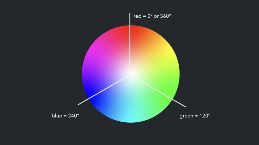
The hue is specified as an angle within the color wheel, relative to red. So that means the color red is equal to 0° or 360° while all the other colors are spread around the circle/color wheel. For example, green equals 120°, blue equals 240° and so on.

CSS color values (hue)

Saturation and lightness are represented by the second and third value and are defined using percentages.

100% is full saturation, and 0% is a shade of gray
100% lightness is white, 0% lightness is black

The hue can be defined with or without the degree unit but the saturation and lightness is defined with a percentage.

hsl(270, 60%, 70%)
hsl(270deg, 60%, 70%)

An optional alpha channel component can also be added using the hsla() function to add a fourth value, represented as a number between 0 and 1 or a percentage. 1 or 100% is full opacity.

hsla(270, 60%, 50%, .15)
hsla(270, 60%, 50%, 15%)

Resources

These different types of color values can be found in image or graphics editing software like Photoshop and Illustrator or with online platforms like Canva.

There are also online tools such as CSS Tricks HSLa Explorer and coolors.co for inspiration and to generate color palettes. randoma11y.com is another great resource for creating high contrast color combinations for those with color blindness.

In case you missed it, the links to the Codepen examples used in this tutorial can be found here. To see a more detailed breakdown of the techniques mentioned in the article, check out the corresponding video.

The next iPhone and iPad could arrive much sooner than you think

Original Source: https://www.creativebloq.com/news/ipad-air-iphone-se

Apple is making moves.

Upcoming Online Workshops: January – May 2022

Original Source: https://smashingmagazine.com/2022/01/smashingconf-workshops-january-may-2022/

You might already know it: We regularly run friendly online workshops around front-end and UX. And, well, we have a couple of exciting new ones coming up in the next few months. You can join us right from the comfort of your own desk, and to make sure the workshops fit into your busy schedule, we break each one of them down into 2.5h-long sessions across several days. This way, you always have enough time to take it all in, try things out, rewatch a session, and think of questions you’d like to get answered when we meet again.

We are super thrilled to announce what’s awaiting you in the coming months. So, may we present…

Accessible Front-End MasterclassCarie Fisher5 sessions Jan 20 – Feb 3 devNew Adventures In Front-End, 2022 EditionVitaly Friedman5 sessions Feb 3 – Feb 17 devFront-End Testing MasterclassGleb Bahmutov4 sessions Feb 8 – Feb 16 devEarly birds!Building Modern HTML EmailsRémi Parmentier4 sessions Feb 24 – Mar 4 devEarly birds!Ethical Design MasterclassTrine Falbe5 sessions Mar 1 – 15 uxEarly birds!Architecting Design SystemsNathan Curtis4 sessions Mar 3 – 11 workflowEarly birds!DevOps MasterclassDenys Mishunov5 sessions April 4 – 18 devEarly birds!Designing For Complex UI MasterclassVitaly Friedman4 sessions April 6 – 14 uxEarly birds!Deep Dive On Accessibility TestingManuel Matuzović5 sessions April 7 – 21 devEarly birds!Creating and Maintaining Successful Design SystemsBrad Frost5 sessions April 18 – May 2 workflowEarly birds!The TypeScript MasterclassStefan Baumgartner5 sessions April 19 – May 3 devEarly birds!Data Visualization MasterclassAmelia Wattenberger5 sessions April 21 – May 5 uxEarly birds!Smart Interface Design Patterns, 2022 EditionVitaly Friedman5 sessions May 2 – 16 ux5× Tickets BundleSave $500 off the price.5 tickets No expiry Smashing!

What Smashing Workshops Are Like

There are plenty of things to expect from a Smashing workshop, but the most important one is focusing on practical examples and techniques. The workshops aren’t talks; they are interactive live sessions, with conversations with you, the attendees, and sometimes with challenges, homework and teamwork.


No matter if you’re at the office, at your kitchen table, or on the couch, in our workshops, everybody is a slightly blurry rectangle on the screen; everybody is equal and invited to participate.

In every session, there is always enough time to bring up your questions or just get a cup of tea. We don’t rush through the content but try to create a welcoming friendly and inclusive environment for everyone, with time to think, discuss, and get feedback. Of course, you get all workshop materials and video recordings as well, so if you miss a session you can re-watch it anytime.

Jump to all workshops →

TL;DR

Workshops span multiple days, split into 2.5h-sessions.
Enough time for live Q&A every day.
Dozens of practical examples and techniques.
You’ll get all workshop materials & recordings.
All workshops are focused on front-end & UX.
Get a workshop bundle for 3, 5, or 10 tickets and save between $255 and $1250.

Thank You!

A sincere thank you for your kind, ongoing support — for being smashing, now and ever. We’d be honored to meet you in one of the upcoming workshops.

The Case Against UX Testing

Original Source: https://www.webdesignerdepot.com/2022/01/the-case-against-ux-testing/

Picture a dark office, blinds drawn. Picture a UX designer smoking a cigar. See the light filtered through the smoke whipped to fog by a spinning ceiling fan. Watch as the UX designer sits at a desk and considers the website.
The UX designer has devised a series of tests to determine if a green button is better than a red button. One of them involves tipping a tortoise onto its back. He looks the website over carefully and says, “Describe in single words, only the good things that come to mind about your mother.”

The website pauses, sweating under pressure, then replies, “Let me tell you about my mother…”

BLAM! The website pulls the trigger of an unseen gun, and the UX designer collapses, leaving the project to be rebuilt from scratch in Material by Harrison Ford, with overuse of Post-its delegated to Edward James Olmos.

Who Does UX Testing Actually Serve?

In the past’s bleak dystopian future (1982’s Blade Runner was set in 2019) no one benefitted from asking the wrong questions. And little has changed.

Designing any test to verify UX is fraught with as many complications as administering the test. Questions are skewed by bias, conscious or otherwise, and competing agendas. Even with something as apparently simple as a split test, the potential for distortion is immense.

When planned by a designer, a UX test offers little benefit to a client; the benefit is to the designer, who can then say their ideas are validated (or not).

Imagine hiring a developer to code a website, only to discover that the developer didn’t know CSS and expected to be paid to learn it before completing the work. You would hire someone else because that developer isn’t qualified.

From a client’s perspective, a UX designer should know, through experience, whether a green button is better than a red button. Designing an elaborate test to split-test the button color serves little purpose other than indemnifying the designer against mistakes.

The ROI of UX Testing

It’s widely accepted that there is substantial ROI (Return On Investment) from UX testing. We’ve all heard apocryphal stories about sites that split-tested their checkout and improved retention by 5%.

I’m going to go out on a limb and say that without user testing, that site could have improved its checkout retention by 4.9% simply by hiring a competent, experienced designer. But what about the remaining 0.1%? Well, for most sites, 0.1% represents very little profit. And the cost of recovering it via testing far exceeds the benefits.

When a company the size of Amazon, Netflix, Spotify, or Google split tests a website, it can afford to allocate $25k for user testing because it stands to gain 0.1%, and that represents far more than $25k. To meet the same 0.1% improvement, a small business has to design and run the same tests, incurring the same costs. But in the case of a small business, $25k could eat up all of its profits.

UX testing almost always works. But it is only profitable at scale.

If a good UI designer with a grounding in UX can improve checkout retention by 4.9%, tripling the project budget for just 0.1% more is a tough sell. Bluntly, that $25k is better spent on advertising.

What UX Designers Can Learn From Psychiatry

We all have the tendency to think we’re unique. It’s a survival trait attributed to our prehistoric brain. That belief in uniqueness is particularly strong in highly competitive people. We all think our site, our side-project, our approach are original. And we’re all wrong.

When a psychiatrist sits down with a patient, they have two immediate goals: categorize that patient into an established diagnosis, and assess the severity of the condition. It may be that the patient is depressed or anxious or even suffering from a potentially more debilitating condition like schizophrenia. What the psychiatrist is not trying to do, is define a new illness.

Occasionally — perhaps once per decade — a genuinely unusual patient will present themselves, and a new form of illness is considered. New treatments are found and tested. These treatments are rarely developed on behalf of individual patients; doctors work with grants from governments, medical schools, or the pharmaceutical industry and publish their results.

The vast majority of websites face similar problems. They deal with similar demographics, work within a similar culture, and deal with similar technology. As such, they can be categorized in the same manner a psychiatrist categorizes patients.

The key to delivering successful UX solutions is not UX testing in individual cases, but rather UX research, examining similar projects, and cribbing their solutions. If you categorize a project accurately, you’ll find a solution readily available.

Replacing User Testing With UX Best Practices

Your client doesn’t need to pay for UX testing to benefit from it. Enterprise sites, government sites, and even personal projects will test UX patterns. Sites like Shopify or Stripe will user-test their checkout processes at scale and enable companies to benefit from the results by adopting their platforms.

If you’re currently testing designs for small business, one of two things is true: either you’re wasting your client’s money investigating a problem someone else has already solved, or you’re designing something so original that it has no precedent (and you probably shouldn’t be).

Designers should be opinionated. Designers should know UX best practices and how they apply to a range of scenarios. Designers should be capable of making an educated guess. Designers should be self-validating.

Once or twice in your career, you may find a legitimate need to test something. However, the vast majority of the time, the correct answer is to tip the tortoise back onto its feet and choose whichever color button has the higher contrast.


Featured image: Still of Brion James in Blade Runner. Copyright Warner Bros. Entertainment

Source

p img {display:inline-block; margin-right:10px;}
.alignleft {float:left;}
p.showcase {clear:both;}
body#browserfriendly p, body#podcast p, div#emailbody p{margin:0;}

The post The Case Against UX Testing first appeared on Webdesigner Depot.

Daily NFT Spotlight — Jeff Aphisit

Original Source: https://abduzeedo.com/daily-nft-spotlight-jeff-aphisit

Daily NFT Spotlight — Jeff Aphisit

AoiroStudio0111—22

We would like to introduce a new series titled: ‘Daily NFT Spotlight’. For those, who remember this is an experimental shift from the popular ‘Daily Inspirations’ that we used to publish a couple of years ago. As you have probably noticed, NFTs are booming. We have been boiling up the ‘Weekly Spotlight’ and the ‘NFTs of the Week’ but they are so many projects, artists out there. With this massive avalanche, how about we rework the ‘daily inspiration’ into the ‘Daily NFT Spotlight’ where we would feature projects, artists that we would like to mention on a day-to-day basis. With no further due, let’s kick it off with Jeff Aphisit and his insane illustrations style that super inspiring and colorful.

Daily NFT Spotlight


Jeff Aphisit is an artist and illustrator based in Bangkok, Thailand. Make sure to follow his work at his Foundation.

Foundation
Makerplace
Instagram
Behance

Best Watercolor Paper Reviews

Original Source: https://designrfix.com/reviews/best-watercolor-paper

Choosing the best watercolour paper is critical when you are experimenting with painting. The ideal water colour paper able to handle moist substances and offers multiple vibrant colors. Papers are normally substantial, weighing roughly within 300gsm/140lbs, however, the student pages are thin. A plenty of water reduces colour materials, particularly ones that are just too…

The post Best Watercolor Paper Reviews appeared first on DesignrFix.

Apple's AirPods Pro 2 could look (and sound) incredible

Original Source: https://www.creativebloq.com/news/airpods-pro-2

Game-changing new features just emerged.

Best Graphics Card for Photo Editing Reviews

Original Source: https://designrfix.com/reviews/best-graphics-card-for-photo-editing

If you are a professional photo editor, you need the best graphics card for photo editing. You’ll need to work with different programs like Photoshop, Paint Shop, photo director, and many more. However, if you want to know the best model to use on your PC, we have highlighted 10 graphics cards for photo editing…

The post Best Graphics Card for Photo Editing Reviews appeared first on DesignrFix.

This playing card design secret is hiding in plain sight

Original Source: https://www.creativebloq.com/news/card-deck-design-secret

Did you spot it?