Splitting Large XML File into Multiple Smaller Files

Original Source: https://www.hongkiat.com/blog/split-large-xml/

Many users have encountered issues with huge XML files and look for ways to lower the size of the XML files. The best way to solve this problem is to split XML files into smaller ones. In this…

Visit hongkiat.com for full content.

How to Sync MetaMask Mobile App With Chrome Extension

Original Source: https://www.hongkiat.com/blog/sync-metamask-mobile-and-browser/

MetaMask, if you don’t already know, is a private crypto wallet to store and swap your cryptocurrencies and NFTs. It is available as a browser extension (for Chrome, Firefox, Brave, and Edge),…

Visit hongkiat.com for full content.

Best Print on Demand Sites for Artists

Original Source: https://ecommerce-platforms.com/articles/best-print-on-demand-sites-for-artists

The best print on demand sites for artists provide creative professionals with everything they need to turn their talent into a profession. Rather than having to produce prints, canvasses, and countless other products manually, artists can use print on demand solutions to minimize costs and stress.

Print on demand sites for artists are ideal for keeping costs low, and helping professionals to reach a range of people, thanks to their flexible shipping solutions. The question is, which POD sites are best-suited to the needs of an artistic professional?

Today, we’re going to be looking at some of the best print on demand sites artists can use for their business needs.

1. Printful

printful - Best print on demand sites for artists

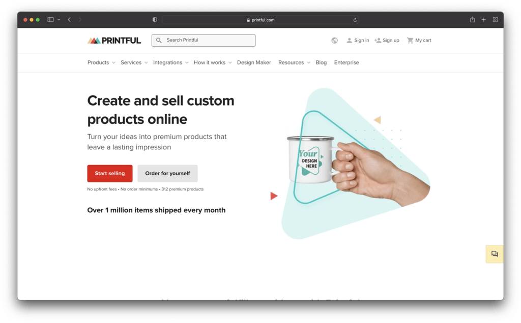
As one of the better-known print on demand solutions on the web today, Printful is a top choice for all kinds of creative professionals. With this POD technology, artists can turn their creations into a wide range of products, with the opportunity to visualize what those items might look like in advance with a handy mock-up generator.

One of Printful’s major selling points is its versatility. Artists can create everything from mugs and prints, to clothing, with production tools like cut and sew, embroidery, and sublimination. At the same time, you also get a super-simple backend environment to make starting up your business simple.

Printful integrates easily with your existing online store, and you can add branded labels and unique packaging inserts into your product shipments. Overall, the experience is straightforward, flexible, and perfect for business leaders of all sizes.

Pricing

Printful keeps things simple with absolutely no monthly or setup fees to worry about, and no unexpected expenses. The amount you spend depends on what kind of products you’re making for your customers. It’s worth considering the branding options you choose as carefully as possible, as different customizations can lead to extra expenses.

Pros 👍
Cons 👎

Pros 👍

Tons of branding and customization options.
Excellent range of products for artists.
Handy mock-up generator built-in.
Worldwide fulfilment centers with great support.
Integrates easily with existing website builders.

Cons 👎

Slight learning curve initially.
Profit margins could be higher in some cases.

Further reading 📚

Printful Review (Apr 2022): Higher Quality Printing and Dropshipping

Printful Alternatives (Apr 2022): Best Solutions Reviewed

Printful Pricing (Apr 2022): How Much Does Printful Cost?

How to Start a POD Store with Shopify and Printful – Step by Step Guide

Go to the top

illustration of a cat climbing a ladder

2. Printify

printify - Best print on demand sites for artists

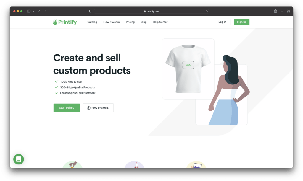
Printify often ranks among the likes of Redbubble and Printful as a well-known solution for POD selling. If you’re looking for Print on Demand companies with a wide range of product options to offer, Printify is a great choice. You can use this providers tools to add your art to a range of everything from knitted beanies, to bobble hats, and shirts.

Printify makes it quick and easy to add customizations to wall art and clothing on-demand products, with a range of production processes. You can also order samples at a discount to check the quality of anything you produce, before selling it online.

Printify can integrate with a range of storefront platforms and website builders and allows you to sell your product across a variety of channels. The back-end is also extremely easy to use, so you don’t have to spend days learning before you can design your custom products.

Printify is a straightforward and powerful tool for independent artists who want to add POD functionality to their own store.

Pricing

Printify’s free version works just like other POD solutions. Rather than paying monthly subscription fees or set up prices, you just pay for the base price of your items, like a tote or sweater, as well as the costs of accessing a quality printing partner to produce your items.

There is a “Premium” service from Printify, however, if you want to add creations from other artists to your own designs. You can also get discounts on the base price of your products with this service, which means you can make more profit by setting your own prices. Premium starts at $29 per month.

Pros 👍
Cons 👎

Pros 👍

Excellent premium service
Great for adding POD to your own website
Lots of product options
Fantastic quality for the variety of products
Great for high-volume selling

Cons 👎

Some limitations on t-shirt design branding
Some vendors may be less reliable

Further reading 📚

Printify Review (Apr 2022): Easy and Quick Way to Create Products With Your Designs

How to Use Printify With Shopify (The Ultimate Guide)

The Best Printify Alternatives for Print on Demand in 2022

Go to the top

illustration of a cat climbing a ladder

3. Print Aura

print aura - Best print on demand sites for artists

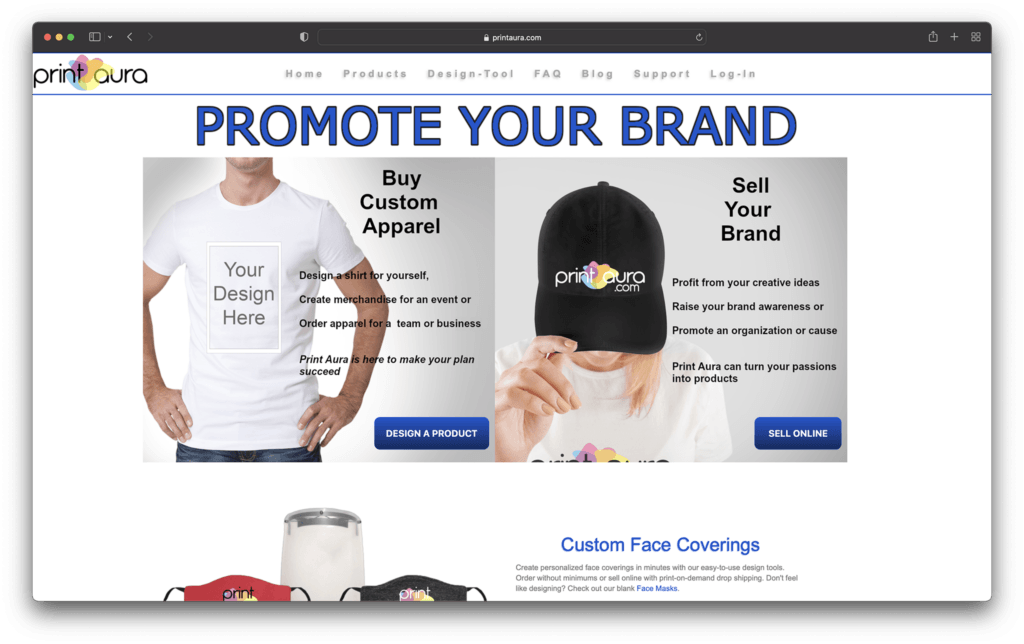
A leading innovator in print on demand technology, Print Aura is excellent for artists looking to monetize their works online. The affordable and easy-to-use software is great for beginners, with lots of product options to choose from, including aprons, mugs, hats, and prints.

Print Aura creates your items in as little time as possible, usually within 5 days, so you can get your items to customers as quickly as possible. There’s also a very straightforward back-end environment, so you won’t have to spend forever learning how to use the technology.

While Print Aura doesn’t have quite as many advanced tools as some other market leaders, it’s still a great pick for artists looking to grow online. There’s global and US shipping, as well as fantastic order support, and a mock-up tool for your designs. Print Aura also has a wide range of how-to guides, and amazing customer support options available.

Pricing

Similar to most POD services for artists, the price you pay for your Print Aura creations will depend on the kind of items you’re going to be shipping to customers. Simpler items with basic customizations are far less expensive than complex designs.

Pros 👍
Cons 👎

Pros 👍

Plenty of branding and customization options.
Mockup generator to help you see what your designs will look like.
Track customer items easily for better service.
No minimum order requirements.
High quality range of product options.

Cons 👎

Slightly slow customer service.
Higher shipping costs for some items.

Go to the top

illustration of a cat climbing a ladder

4. Gooten

gooten - Best print on demand sites for artists

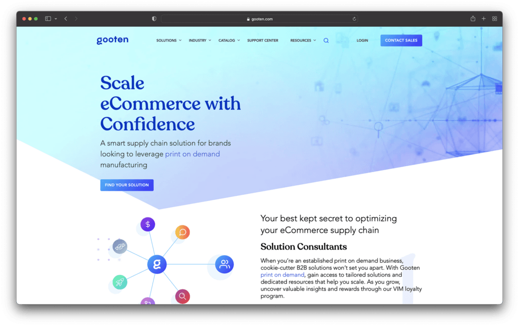
Another example of a popular and easy-to-use solution for print on demand selling, Gooten offers a range of services to get you started online. You can add your artistic designs to a range of attractive products and sell your art to other creators to use on their products too. Alternatively, you could partner with other artists to create a larger portfolio.

Gooten makes it quick and simple to start selling, with plenty of tools, like a convenient mockup generator to show you what products will look like when they’re done, and automated order tracking. There are over 150 product options to choose from, and you can integrate the app with leading website designing tools like WooCommerce and Shopify.

As an extra bonus, Gooten offers some fantastic service. You can send your products to over 70 global routing locations, and access production times as low as two days. You’ll also be able to get quick assistance from the team if anything goes wrong.

Pricing

Like the majority of POD solutions, pricing for Gooten depends almost exclusively on what you want to sell. There aren’t any set-up fees or monthly expenses. However, you will need to pay for the price of the item, the shipping costs, and the extra costs of branding and customization.

Pros 👍
Cons 👎

Pros 👍

Excellent range of products to choose from
Lots of great tools like a mockup generator
Global shipping and fast shipping times.
Automated order tracking.
Integration with top website builders.

Cons 👎

Some product prices can be high.
No marketing tools available.

Further reading 📚

Gooten Review (Apr 2022): Everything You Need to Know

Gooten vs Printful (Apr 2022): The Battle of the POD Companies

Go to the top

illustration of a cat climbing a ladder

5. Teespring

teespring homepage - Best print on demand sites for artists

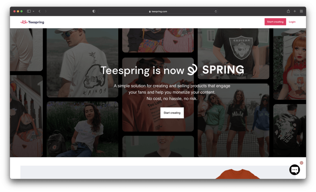
Excellent for artists looking to transform their designs into t-shirts, apparel, and other common items, Teespring is easy to use, and packed with famous brands and influencers already. To begin with, Teespring focused almost entirely on the creation of custom t-shirts. However, today’s users can access a wider selection of amazing products.

Like many POD companies, TeeSpring simplifies the process of building a great business. You can use your mock-up generator to estimate what items might look like before they reach your online store, and there are tons of ways to make your products stand out.

You can cross-sell your products across a variety of channels, download mockup images to use for your marketing and promotion, and even donate profits to charity. Users can also add multiple people to the same Teespring account, which is great if you want to get other people involved in selling your artwork online. Teespring also has access to a handy boosted network, which helps you reach existing customers.

Pricing: Teespring’s pricing will depend on the specific customizations you want to make to your products, what kind of items you’re selling, and where you’re going to be shipping too. Certain features, like ultra-fast shipping, do require a higher payment.

Pros 👍
Cons 👎

Pros 👍

Lots of product options to choose from.
Marketing assistance with the boosted network.
Straightforward ordering and fulfilment.
Easy to use mock-up generator.
Rush shipping options.

Cons 👎

Slight learning curve for beginners.
Limitations for customization.

Further reading 📚

Printful vs Teespring (Apr 2022): Which One Is the Absolute Best?

Go to the top

illustration of a cat climbing a ladder

6. Zazzle

zazzle homepage - Best print on demand sites for artists

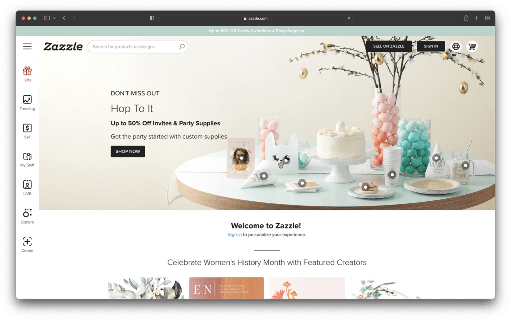
If creating your own website seems to come with too many upfront costs and stress, then you could take a different approach to selling your art online. Zazzle allows you to sell your solution to a range of potential customers through a convenient marketplace. You can design and sell products or you can simply upload your own designs into the marketplace for other people to use.

If the idea of creating unique products doesn’t appeal to you as much as simply selling your artwork, then Zazzle could be the ideal alternative. There are tutorials on the Zazzle website to help you understand how everything works. However, as an artist, you’ll essentially be charging other people to use your creations in their products.

There’s no need to spend time building your own storefront or designing phone cases and other custom products for your business model. Zazzle allows you to focus on simply bringing attention to your artwork, and helping other people sell their print on demand products.

Pricing:

For artists, graphic designers, and photographers, there’s no charge to get started with the Zazzle ecosystem. You can upload and sell your artwork on hundreds of products for free, or simply offer your products to other companies. The great thing about Zazzle is you have the freedom to set your own royalty rates, so there’s no limit on what you can earn.

Zazzle can help you to reach millions of shoppers worldwide, with minimal setup costs and stress.

Pros 👍
Cons 👎

Pros 👍

Excellent if you don’t want to make products
Choose your own royalties
Easy access to a huge audience
No upfront costs to sign up
Earn a reputation online

Cons 👎

No way to set up your own website
Can be confusing at first

Go to the top

illustration of a cat climbing a ladder

7. Society6

society6 - Best print on demand sites for artists

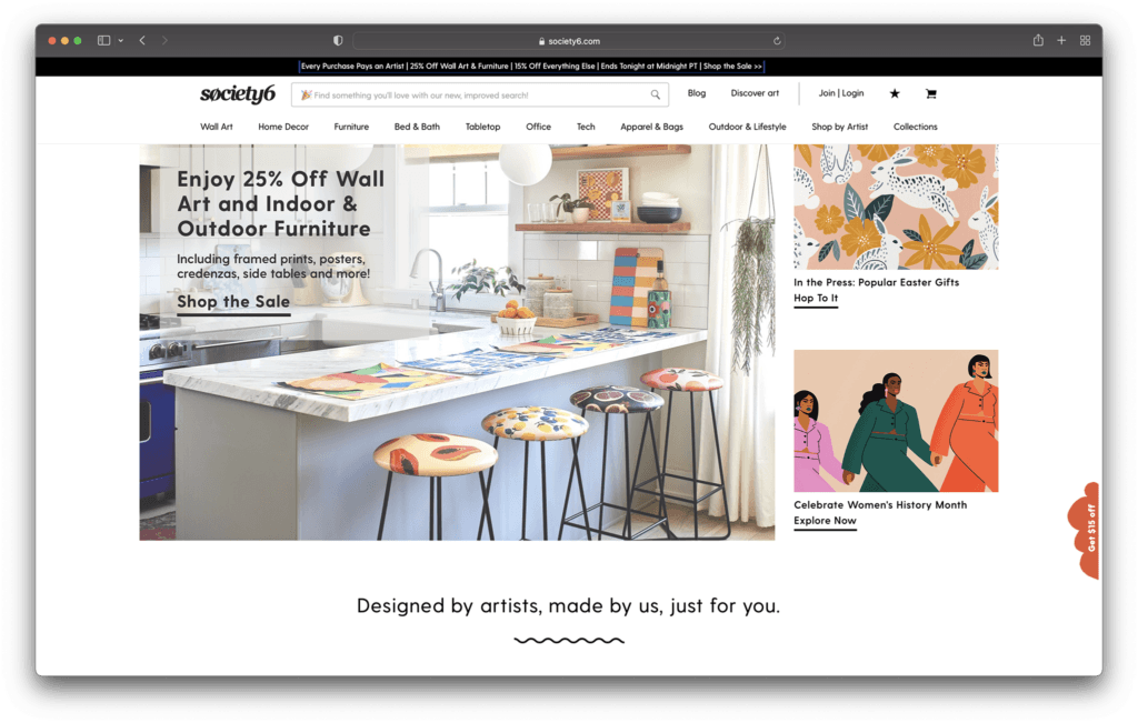
Finally, one of the top print on demand solutions for companies who want to sell high-quality products fast, without the fuss, Society6 is a great choice. This print on demand platform is actually a marketplace, similar to some of the other leading tools online today. You get your items listed alongside other professionals on the same platform.

The great thing about using an online marketplace, is you can focus more on building your dropshipping product portfolio, and less on attracting customers to your site through social media and content marketing. There’s already an audience waiting to access your products.

The pre-existing audience means you get an experience similar to selling on Etsy, but like with other print on demand services, you don’t have to make your products yourself. You can create everything from hoodies to stickers and art prints with the help of the available production marketplace.

Pricing:

While there’s no cost to sign up with Society6, it’s worth remembering that you will have limited access to the amount of cash you can make, Society6 determines your profit margin after taking their own cut of the profits. This means you usually end up with about 10% of the retail price overall.

Pros 👍
Cons 👎

Pros 👍

Easy to sell to a range of existing customers
Create everything from home décor to t-shirts
Sell to customers around the world
Free to upload and share your art with no monthly fees
High-quality products

Cons 👎

No brand building opportunities
Profit margins can be quite low

Further reading 📚

Society6 Review: Everything You Need to Know

Printful vs Society6: Which is Better? (Apr 2022)

Go to the top

illustration of a cat climbing a ladder

The Best POD for Artists

There are endless ways to sell your art online today, from tools like Sunfrog, Spreadhsirt, Cafepress, Threadless, and Teepublic, to marketplaces like eBay and Merch by Amazon. With print on demand websites, it’s never been easier to make a name for yourself as a professional artist. However, you will need to take your time to find the platform best suited to your needs.

Take a look at some of the options available online today, and consider experimenting with things like the mockup generators and free demos before you dive in. Remember, your POD provider will make a huge difference to how much of a profit you can make.

The post Best Print on Demand Sites for Artists appeared first on Ecommerce Platforms.

How to Write Good Code: 10 Beginner-friendly Techniques for Instant Results

Original Source: https://www.sitepoint.com/how-to-write-good-code/?utm_source=rss

As a beginner developer, improving your code skills is probably one of your top priorities. But where do you start? With so much information out there, it can be tough to know which techniques are worth learning and which ones will actually help you write better code.  In this blog post, we’ll share 10 beginner-friendly […]

Continue reading
How to Write Good Code: 10 Beginner-friendly Techniques for Instant Results
on SitePoint.

Case Study: Redesigning Todoist for Android

Original Source: https://www.webdesignerdepot.com/2022/04/case-study-redesigning-todoist-for-android/

Todoist is a to-do list app that 25 million people rely on every day to keep their lives organized. As part of the Doist design team’s goals for 2021, we aimed to redesign the Todoist Android app to take advantage of the latest Google Material Design guidelines.

In this post, we cover the design decisions and processes behind redesigning the Todoist Android app for Material Design. We explore the Design and Android team’s collaboration practices that brought the app update to life, which resulted in winning the Material Design Award 2021 in the large screen category. Let’s get started!

Opportunity

When we started the project, our design implementation on Android was ready for a major overhaul. The last milestone redesign on Android was initiated after the release of the first Material Design guidelines in 2016. Since then the team successfully worked on continuous improvements to the Android app, but we saw the opportunity to improve Todoist on Android on a more holistic level.

We set out to clean up instances of older UI components, colors, and text styles and update them with the latest Material Design components. We observed that some interactions and navigational patterns had become inconsistent with what users were expecting on newer Android devices and were eager to modernize this experience. With new hardware and software changes in mind, we set out to make the experience on larger phones and tablets even better, so Todoist could take full advantage of the latest generation of devices. Material 2 and 3 provided an incredible new framework to rethink the current app experience. With this in mind, we set out to challenge what a modern Android app should look like and innovate on top of the default user experience.

Solution

The team set itself the goal of redesigning our Todoist Android app and aspiring to make it the best-designed productivity app on Android. The project was ambitious and scheduled to take several months to complete. We set ourselves the following targets while working on the project:

Review the current implementation and older design specs.
Study the latest Material Design Guidelines and assess what is relevant for our project.
Research great Material Design apps and case studies and learn from their execution.
Define the new Todoist Android app design language and document the changes.
Design and development work together to assess the proposed solution and implementation.
Test an early version of the new app internally to gather feedback and make adjustments.
Invite beta testers to the new app to gather feedback and make adjustments.
Refine the app and address core issues before launching to the public.

Review

The project was kicked off by reviewing the current Todoist Android app implementation, noting down what areas needed to be fixed and what was up to date. While reviewing, we took screenshots of the app implementation for reference. This way we could easily see the current state of the app and compare it to the new design proposals that would be created. Once the review process was finalized, we had a comprehensive overview of the current state of the app and the layout, component, and styling changes we wanted to make.

Study

We continued the project by studying the latest Material Design Guidelines, assessing the components and practices that were most relevant to Todoist.

When the project kicked off in February 2021, Material 2 was the most recent version of their design system. Since Material 2 had already been released for quite some time, we anticipated that design changes to Material would be announced soon at the Google I/O event in May 2021. Rather than wait, because we expected the changes to be iterative, we pushed ahead with our work.

We identified 25 components and UI patterns that we wanted to change across the app. The changes included buttons, forms, menus, sheets, navigation drawer, app bar, system bars, text and color styles, and more. We started by creating a table view in a Dropbox Paper document with the component changes and references links to Google’s Material Design Guidelines.

This components list was a starting point for discussion to plan the scope and complexity of the changes. Close async discussions between the design and development team in Twist and Dropbox Paper comments helped us make decisions about scope and complexity early on and set a solid foundation for the project.

Research

In the initial Material Design study, we also researched inspiring Material Design apps, Material studies, Play Store apps, and Google Workspace apps to learn from their execution.

We started out by studying the Material Design Award Winners 2020 and tested out the products that were showcased. The showcased winners struck a good balance between implementing the Material Design Guidelines while maintaining their own product’s brand within the system. This balance between Google’s guidelines and the Todoist brand was also key for us to get right and so we strived to find this mix across the work we created and implemented in the project.

Along with the MDA winners, we researched the Material Studies that Google produced to showcase what apps could look like with branding and Material Design guidelines applied. It was a great reference to see how far components could be customized while maintaining the core platform principles. The Reply case study in particular offered valuable insight to us as its content type and layout came closest to Todoist. It showcased how components like the app bar, navigation drawer, and large screen layouts worked while being customized.

We continued our research by searching the Google Play store for inspiring app examples. Google Tasks, Press, Periodic Table, and Kayak stood out to us as the level of polish and quality of the apps were on par with the experience we were aspiring to create.

Sometime later in the project when Material You was released (more on that later), we stumbled upon the Google Workspace apps blog post which previewed Material 3 changes that Google was introducing to their own products. It offered a great glimpse at what was to come before the Material 3 Design Guidelines were officially released. This post sparked new internal discussions and further design explorations that we considered for future Todoist Android updates.

Design Spec

As we started to define the new Todoist Android app design language and document the changes, we opted to create a design framework, focusing on creating components rather than designing every screen in the app. This allowed us to consistently apply the design system in the app. We did so by using the previously defined component list that we created during the review and study process.

Core screens from different areas of the app were chosen to demonstrate how the components could be applied. We chose to mock up the Todoist project view, navigation drawer menu, project view edit screen, settings, and project detail view, among others. These screens gave us a good overview of how buttons, forms, drawers, lists, and other components would work together and in different states; selected, pressed, disabled, etc.

During the project, we were transitioning our Doist design system to Figma and started creating our first components in the new Doist Product Android Library. We started by using some components from the Material Design UI kit – Components library from the official Google Figma resource file and added them to our Doist design system. We then continued to build up the Product Android Library file with our Todoist-specific components such as task list & board views, detail views, sheets, colors, typography, etc.

We continued by documenting color and typography changes that were based on the Material Design guidelines. The design team opted to implement a new Design Token framework that would share the same values between our design system and the development implementation. The development team would output the values they had in the current implementation and the design team would analyze which values were needed and which could be merged, changed, or deleted. This informed the new Design Token color and typography system which we then documented and discussed with the team to implement. Later in the project, we were happy to see a similar token system introduced by Material 3 in the latest guidelines which validated our thinking and principles behind the new design system.

The design documentation expanded to hold other edge-case mockups that could sit alongside the design system. We documented different responsive screen experiences between phones and tablets against the previous implementation. Additional sections were created to document the motion that should be used for certain components and screens by referencing existing Material Design guidelines examples or prototyping custom motion in Principle and After Effects. The design spec also touched on haptic feedback that should appear on touch targets, how dark mode should work across the new components, documenting Todoist themes within the new design language, and more.

Design Implementation

At Doist, the benefit of the squad is that cross-team collaboration is built into the make-up of the team. Designers, developers, support, and product managers work together in a squad to deliver the project. This close collaboration from the start is key to bridging the gap between scope, estimations, design, development, and delivery. The squad discussed their findings on a daily basis and came up with the best plan of action together.

Designers started by creating components in Figma and shared them with developers in Dropbox Paper. We used screenshots to document the current implementation next to the new designs and linked to the default Google Material Design components. This allowed the team to compare all references in one place. Developers shared their feedback, adjustments would be brainstormed together as the designs were iterated.

Designers on the project would share their work in progress on a weekly basis with the rest of the design team in a design review Twist thread. Here details about the designs were discussed, alternatives mocked up and bigger picture plans made. Design reviews brought up topics like FAB (Floating Action Button) placement, theme options, accent color usage on components, consistency with other platforms, navigation options, and shadow elevation. After thorough discussions and alternative mockups were presented, the design team aimed to find the right balance between Material Design and Todoist brand guidelines. The development team, also part of the design reviews, gave their feedback on the solution and raised technical complexities early on.

Eventually, the design was stabilized and consistencies updated across components and mockups. The design spec was kept up to date so the development team could always review the latest designs in Figma.

Testing

As soon as the development process started, the Android team provided early screenshots and videos in Twist threads while they were implementing the design spec. This practice allowed us to review the app implementation early and often. Designers could review the development work and share feedback in Twist, which resulted in getting the implementation to a high quality. Alongside Twist discussions, the team set up a Todoist project to track ongoing issues and fix bugs. Designers logged new issues, developers would solve them and share the new implementation for designers to review.

When the team had the first stable version of the Android app, we shared it internally at Doist to get more insight and feedback. Other Doisters could access the redesign via a feature flag that could be turned on in the app settings and test the new version for however long they wanted. The feature flag system allowed people to give us early feedback on the design decisions we made and report bugs. Feedback was submitted by the wider team through a dedicated Twist thread and designers and developers could discuss how best to address the feedback during the active project implementation.

After we refined the app implementation further and addressed early feedback we opened up the app update to our beta users. Here users had access to the new Android redesign and were able to give us feedback. Our support team gathered feedback and shared it with us in a dedicated Twist thread. The squad aimed to analyze every comment and looked for patterns where we could make tweaks and improvements to the user experience.

As part of these tweaks, we made changes to how the bottom bar and navigation drawer worked. Some users reported frustrations with the way the new bottom navigation and menu drawer worked. In its first implementation, the drawer was half raised when opened and had to be swiped up to be raised again to see the full content list. This was an issue for some users as it was slower to get to the content below the list. So we decided to fully raise the drawer by default when opening. We also made it easier to open the navigation drawer by sliding up from the bottom app bar. This was a small shortcut but it enabled users to get to their content faster.

Material You

While we were in the testing phase and about to wrap up the project, Google unveiled Material You, and sometime later the Material 3 Guidelines were published. With the newly announced resources, we went back to study the latest guidelines and references we could find to see where the Todoist Android app redesign fits in and which adjustments we might need to make now or in the future.

Dynamic Color was a big new feature that was announced as part of the Material You update. As Todoist supports many different themes the Material You Dynamic Color feature seemed like a good fit for our product. We decided to prioritize this feature and implement Dynamic Color light and dark themes as part of our Todoist theme settings options.

To implement Dynamic Color, the development team started off by creating a demo prototype that utilized the Dynamic Color system and showcased how we could select from a range of color choices that the system defined based on the wallpaper choice. From there, we tried to incorporate system behavior in our design mockups. We designed a range of different color mockups and components to see which ones could fit with which components. We then came up with a color system that worked for the Todoist app and the new themes. These new Dynamic Color themes would sit alongside our current theme options in the Todoist app settings. From here users could choose between Dynamic Color Light and Dark themes.

Along with Dynamic Color, the team also created a customizable bottom app bar, allowing users to set up the app in a way that’s most convenient to their workflow. The location of the Dynamic Add Button can be changed to the center, left, or right corner of the screen. The order of the Menu, Search, and Notification buttons can be rearranged to best fit the ergonomics of the user’s dominant (left or right) hand and optimize their navigation patterns.

Launch

As critical beta feedback was addressed and stability tweaks were made, the squad felt ready to release the new Todoist Android app to the public. The team logged the issues that could not immediately be addressed for future reviews and updates.

The design and marketing team readied the launch by creating What’s New banner artwork and copy that are displayed within the app when launching the update. The Doist marketing team also created release notes and shared the app update announcements on our social channels. The brand and product design team worked together to create custom image assets and copy that summarised the project work in a simple and beautiful way.

What’s Next: Material 3

After a successful launch of the redesigned Todoist for Android app, Google contacted Doist to announce that Todoist was selected as the Material Design Award 2021 winner in the Large Screen category. The team was excited to be recognized for their hard work and it felt like we achieved the goal we had set out to accomplish.

Internally, designers and developers continued to study and discuss the Material 3 updates. The design team started exploring mockups and design changes inspired by Material 3 and Google’s Workspace app updates. Some of our current Todoist explorations include changing the FAB styling, updating the app bar, further removing elevation shadows, and more. Here is a preview of what a future Todoist update could look like.

We hope these insights into Doist’s design process and collaboration practices have sparked your interest. Thank you for reading and stay tuned for future design updates!

Takeaways

Study the Material guidelines, Material Design winners, Material studies, and Google Workspace apps to make informed design decisions when designing your next product or app update.
Evaluate which Material Design components and practices are right for you and implement them into your product.
Carefully balance the Material Design guidelines with your brand guidelines to create a unique and consistent experience between your product and the platform it lives on.
Collaborate with your Android developers early and often to ship app updates efficiently and increase the design implementation quality.
Use design components and build a design system along with practical mockups to create an efficient design spec.
Consider how the latest Android features fit into your product and which have the most impact on your users before deciding to implement them.
Test and review builds with your internal team and external beta users to get valuable feedback and make adjustments before releasing them to the public.
Create announcement artwork to showcase your latest app or feature update along with a clear description to share in-app and on social media.

Source

p img {display:inline-block; margin-right:10px;}
.alignleft {float:left;}
p.showcase {clear:both;}
body#browserfriendly p, body#podcast p, div#emailbody p{margin:0;}

The post Case Study: Redesigning Todoist for Android first appeared on Webdesigner Depot.

The best mouse in 2022: marvellous mice for happy clicking

Original Source: https://www.creativebloq.com/design-tools/mice-4132486

Find your perfect mouse for both work and play.

The best Cricut accessories in 2022

Original Source: https://www.creativebloq.com/buying-guides/best-cricut-accessories

Find the best Cricut accessories to get the most from your machine.

Creating a Fluid Distortion Animation with Three.js

Original Source: https://tympanus.net/codrops/2022/04/11/creating-a-fluid-distortion-animation-with-three-js/

In this new ALL YOUR HTML coding session you’ll learn how to code a water-like distortion animation as seen on the PixiJS website using Three.js. We’ll use shaders and render target to achieve the fluid effects.

Original website: https://pixijs.com/

This coding session was streamed live on April 10, 2022.

Support: https://www.patreon.com/allyourhtml

Setup: https://gist.github.com/akella/a19954…

The post Creating a Fluid Distortion Animation with Three.js appeared first on Codrops.

Inspirational Websites Roundup #36

Original Source: https://tympanus.net/codrops/2022/04/08/inspirational-websites-roundup-36/

Today we have a fresh new website collection for you! We have some beautiful brutalistic styling surfacing which enhances designs in a really bold way. Deep saturated colors are being used in more designs and typography excels with individualism through lovely unique details.

We hope you find some inspiration in this special set!

Alicia Moore

Victor Work

Belle Epoque

HAPE PRIME

UNITE DIVISION OF ME

John Beresford

Early Majority

Retro Electronic 3d Devices Illustrations

LE BAL Books

Jacques Marie Mage

True Staging

Laura Monin

Richard Ekwonye

Cody Townsend

EYEGUM

Instagram Summit 2022

Plasticbionic

Yannick Gregoire

Contra

Awwwards Conference

Spencer Lowell

Peter Tarka

David Kirschberg

CodeSandbox

Parker Studio

Frantoio Cavalli

Deidre Driscoll

Transmissions

The Fleur

AMBUSH® SILVER FCTRY

Uplinq

Blok Watches

The post Inspirational Websites Roundup #36 appeared first on Codrops.