Can Best Practice Replace Design Research?

Original Source: https://www.webdesignerdepot.com/2020/01/can-best-practice-replace-design-research/

Heart-warming or not, co-creation with a client—the utopian ideal of shared vision—has its drawbacks. There are only so many times you can hear the words “brand strategy” before actually chewing your own face off. In the age of WordPress, Drupal and, dare I say it, Wix, it’s never been more tempting to pay lip-service to research and consultation. Instead of building a principles framework from scratch, why not roll out something from a template in a fraction of the time?

Well, in fact, there probably are situations where a simple WordPress-type approach will work really well. The trick is knowing when.

What Is “Best Practice” Anyway?

Well, exactly.

Even if you slept through design school, or didn’t go at all, you probably know the fundamentals already. And it’s true. If you stick to first principles, you won’t go far wrong. Here are some examples:

Color and Contrast: 2-3 colors maximum, use contrast to highlight important elements;
White Space: Use plenty of it, be consistent with proportions above and below;
Layout: Symmetric Grid. Err…Always. Work ‘above the fold’;
Typography: No more than 2-3 typefaces;
Logo: Long, top left, always;
Compexity vs Simplicity: Look for balance and visual interest;
Visual Hierarchy: Use color, contrast, size and complexity to highlight important elements;
Consistency: With all of the above, whatever you decide, be consistent;
And so on…

One size, though, doesn’t fit all. By bending and even breaking the rules sometimes, you’ll create designs that stand out and, more importantly, meet the real requirements of the brief.

The One Unbreakable Rule

It’s pretty hard to find a “Best Practice” that really works in every situation, but here’s one:

No matter what you’re doing, make sure you know why you’re doing it.

And, just in case you were wondering, “err…because it looks pretty?” and “because it’s easier than what I probably ought to do instead…” aren’t really reasons.

There are clearly situations where a client—whatever they may think—is best served by a simple off-the-shelf approach. Particularly if their budget is more Scrooge than Soros. The thing is, you probably still need to go through a research process to find out whether that’s the case or not.

When And How To Go Off Piste

Before or just after accepting the job, you’ll likely need to do some research with the client. This process should focus on (you guessed it) brand strategy.

Ideally, in the first instance, you’ll build a design principles framework. Whatever decisions you make after that (whether you’re going to stick to the rules or break them) should be justified with reference to the framework.

Here are some examples of situations where you might consider deviating from “best practice”:

You Want to Send a Particular Message

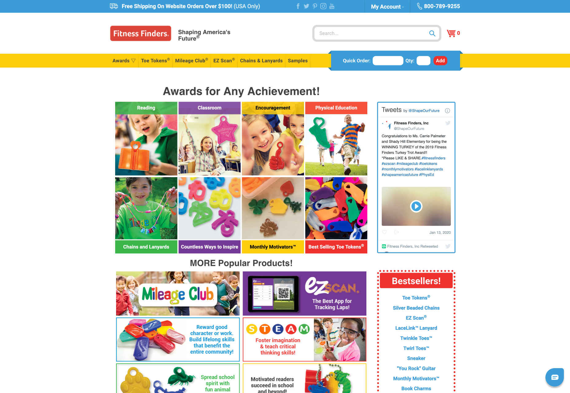
Take this site for a children’s fitness company, for example.

It clearly breaks all the rules about color and typeface, and a few more besides, but overall gives a sense of vibrance and playfulness, which of course is ideal for this market.

You Want to Draw Attention to Something

By ignoring the imperative to “work above the fold” and putting product and logo front and centre, candle manufacturer Waxxy draws the eye directly to their “product centred” philosophy and creates a sense of light and space:

Natale’s Clothing uses additional fonts and a broken grid layout to emphasise content and create a sense of being “out of the ordinary”.

You Want to Keep Things Clean

Legend has it, if you “put everything on the homepage” it’s good for SEO and easier for users. These days, though, there’s often a lot of information, and we prefer to have more space, even if it means a bit more browsing.

If you visit Toke’s site here, you’ll see that they break the animation taboo in a subtle and effective way as well.

These are just a few examples, there are many more. In each case the key questions to ask are:

How does it meet the brief?
How does it help brand strategy?

When To Stick To The Script

A big consideration here will likely be the client’s budget. With the best will in the world, you’re going to struggle to create a logo, design a custom typeface, and build a multi-page site from scratch on $800. If that’s what the client’s asking for, and can’t understand the limitations, maybe consider saying no!

If, on the other hand, there’s scope to negotiate, where budgets are small and, in situations where, for example, the client has a small number of products and/or services, a single page WordPress site will often be exactly what they need. Here it’s not a question of “doing the bare minimum” but rather “not doing too much”. Even so, there will probably be bespoke elements that you can change to better fit the strategy.

Another important moment to check yourself, is whenever you’re not sure if an idea works. If you can’t justify a decision with reference to your design principles framework—or at least with reference to the client’s brand strategy—then it’s probably best to err on the side of caution.

Research or Best Practice?

In a word, both.

There are definitely situations where a “first principles” approach will be exactly what the client needs. Particularly if their budget is small and their needs are simple. Even in this case, though, a great designer will take the time to understand (or help to develop) the brand strategy, and add whatever tweaks are necessary. Each client and each brand is unique, and a designer’s job, if you think about it, is to reflect just that.

When using a bespoke approach, breaking with convention can, as we’ve seen, produce interesting and stylish results. It’s important, though, that each decision makes sense, and can be linked back to the brand strategy. If it can’t, it probably shouldn’t be in the design.

And whatever you do, don’t chew your face off.


Featured image via Unsplash.

Source

p img {display:inline-block; margin-right:10px;}
.alignleft {float:left;}
p.showcase {clear:both;}
body#browserfriendly p, body#podcast p, div#emailbody p{margin:0;}

Collective #581

Original Source: http://feedproxy.google.com/~r/tympanus/~3/N-qK3a4dDyc/

Collective Item image

Inspirational Website of the Week: NT

On Nathan Taylor’s portfolio everything is interactive! A true digital pleasure. Our pick this week.

Get inspired

Collective Item image

Magical Rainbow Gradients with CSS Houdini and React Hooks

A great tutorial by Josh Comeau about a very creative way to animate magical gradients!

Read it

Collective Item image

Tiny Helpers

Easily find useful single-purpose online tools on this site made by Stefan Judis.

Check it out

Our Sponsor
Start your own freelance business by becoming a Divi developer

Learn how to develop websites with the most popular WordPress theme in the world and secure your success as a freelancer.

Start learning now

Collective Item image

Exploring the Web Animations API

Charlie Gerard walks us through a practical Web Animations API example.

Read it

Collective Item image

Free Font: JetBrains Mono

A really great looking monospace font made for developers by JetBrains.

Check it out

Collective Item image

An Introduction To React’s Context API

In this article, you will learn how to use React’s Context API which allows you to manage global application states in your React apps without resorting to props drilling.

Read it

Collective Item image

Design Password

A fun designer-friendly password generator.

Check it out

Collective Item image

Dark Isn’t Just a Mode

Steven Hoober takes a look at what it means to be in dark mode, why it exists, and what the research on dark mode says.

Read it

Collective Item image

Is reduce() bad?

Jake and Surma discuss the array function reduce() and answer the question if it’s good to use it.

Watch it

Collective Item image

The paradox at the heart of A/B testing

Matthew Ström writes about how the fundamental ideas of A/B tests contain a contradiction that calls their value into question.

Read it

Collective Item image

CSS4 is here!

Peter-Paul Koch proposes that web developers start saying “CSS4 is here!”, for the marketing effect.

Read it

Collective Item image

SVG Pattern Doodler

A fantastic demo by Niklas Knaack where unique art is generated by an algorithm.

Check it out

Collective Item image

Masonry layout

An exciting proposal to extend CSS Grid to support a masonry-type layout. By Mats Palmgren.

Check it out

Collective Item image

Adding separators to layouts with CSS-in-JS

Mandy Michael writes about how to add separators to a grid using a combination of :not and :nth-child with a pseudo-element.

Read it

Collective Item image

beedii

A hand-drawn Emoji set by Nitish Khagwal and Prafful Kumar.

Check it out

Collective Item image

I have been underestimating JS

Alfonso de la Rocha shares his experience with digging deeper into JavaScript to have better low-level control.

Read it

Collective Item image

Pure CSS dial button

A configurable CSS dial button demo by Jhey Tompkins.

Check it out

Collective Item image

Flexbox Responsive Form

Adam Argyle created this responsive form with four potential layouts that is powered by Flexbox.

Check it out

Collective Item image

30 seconds of code

What started with short JavaScript snippets has now grown into a snippet collection for all your development needs.

Check it out

Collective Item image

From Our Blog
3D Folding Layout Technique for HTML Elements

A tutorial on an experimental 3D layout technique for HTML elements with endless possibilities.

Check it out

Collective #581 was written by Pedro Botelho and published on Codrops.

The Mythical Mythical Man-Month

Original Source: https://www.smashingmagazine.com/2020/01/mythical-man-month/

The Mythical Mythical Man-Month

The Mythical Mythical Man-Month

John Foreman

2020-01-15T13:00:00+00:00
2020-01-16T21:09:01+00:00

As a product leader at a tech company, I am a bottomless pit of need. My job as the Chief Product Officer at Mailchimp is to bring the product to market that’s going to win in a very competitive space. Mailchimp’s aspirations are high, and to realize them we need to deliver a substantial amount of product to the market. Oftentimes to many at the company, it feels like we are doing too much. We’re always at the edge of the wheels coming off.

And when you’re doing too much and you decide to do more than even that, you will inevitably begin to hear The Mythical Man-Month referenced. It’s like one of those stress-relief balls where if you squeeze one end, then out pops the Mythical Man-Month at the other end.

Published by Frederick Brooks back in 1975 (you remember 1975, right? When software development 100% resembled software development in 2020?), this book is rather famous amongst software engineers. Specifically, there’s one point in the entire book that’s famous (I’m not convinced people read anything but this point if they’ve read the book at all):

“…adding more men lengthens, not shortens, the schedule.”

Easy fix. I’ll just staff women to projects from now on (see the Return of the King and the fight against the Witch King of Angmar).

But let’s assume that Brooks’ point holds regardless of the gender identification of the software engineers in question. Here’s the point: software is difficult to build with lots of complex interdependencies. And everyone needs to work together to get it done.

As I add people to a team, they need to be onboarded and grafted into the project. Someone’s gotta carve off the right work for them. The team has to communicate to make sure their stuff all works together, and each additional person increases that communication complexity geometrically. And at some point, adding people becomes a burden to the project — not a benefit.

Here’s the graph from the book illustrating that point:
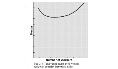
As you add people to tasks with complex interdependencies, progress grinds to a halt

Add people to go slow (Large preview)

This is absolutely a fair point. That’s why I hear it so much at work. Exhausted individual contributors and exhausted leaders alike will toss it out — we can’t go faster, we can’t do more, stop the hiring, read The Mythical Man-Month and despair! The only solution is apparently to stop growing and kill some projects.

When I as CPO say, “we’re going to do this thing!” the reply then is often, “OK, so then what are we going to kill?” The Mythical Man-Month turns product development into a zero-sum game. If we want one thing, we must stop another. Now, that’s an actual myth, and I call hogwash.

And taken to its pathologically misinterpreted (we’ll get to this) conclusion, the book apparently says that the fastest tech company is one that employs all of four people — four men, apparently. Anything more just slows it all down. Someone should send Amazon, Apple, and Google copies of the book, so they can fix their obviously bloated orgs.

The only problem with this approach is that in a space where the competition is growing and iterating and executing — merely tamping organizational growth — editing and focusing the workload to match can be a recipe for extinction. You’ll be more sane and less stressed — right until you’re out of a job.

And as the owner of product management for my company, I’m not unsympathetic with this need to slow down and focus. We must ruthlessly prioritize! No doubt. But running a product is an exercise in contradiction. I must prioritize what I’ve got while simultaneously scheming to get more done. But what am I to do in the face of the Mythical Man-Month?

Surprisingly, the answer to this question comes from Brooks’ same book. Here’s another graph in the same chapter:
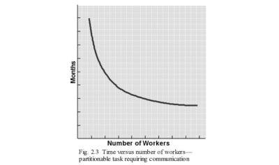
Partitionable tasks requiring communication can still add workers and go faster

(Large preview)

There is a battle in scaling product development. If the work you’re trying to accomplish is purely partitionable, then go ahead and add people! If your work is all connected, then at some point adding people is just wrong.

If someone says that I absolutely have to kill a project in order to start another one, that’s just not the case. If the two projects require very little communication and coordination, then we can scale away.

This is why adding cores to a CPU can increase the experienced speed of your computer or phone up to a point — something engineers should know all about. Sure, adding cores won’t help me complete a complex single-threaded computation. But it may help me run a bunch of independent tasks.

The conflict for a product executive then between scaling and ruthless prioritization can be managed.

You ruthlessly prioritize in places that are single-threaded (the backlog for a product team let’s say).
You scale by adding more cores to handle independent work.

Very rarely, however, is anything fully-independent of all else at a company. At the bare minimum, your company is going to centralize supporting functions (global IT, legal, HR, etc.) leading to bottlenecks.

It’s All About Dependency Management

The job of a product executive then becomes not only creating a strategy, but executing in a way that maximizes value for the customer and the business by ensuring throughput and reducing interdependency risk as much as possible. “As much as possible” being key here. That way you can make the company look as much like the latter graph rather than the former. Interdependency is a disease with no cure, but its symptoms can be managed with many treatments.

One solution is to assemble a strategic direction for the company that minimizes or limits dependency through a carefully-selected portfolio of initiatives. The funny thing here is that many folks will push back on this. Let’s say I have two options, one where I can execute projects A, B, and C that have very little coordination (let’s say they impact different products), and another option with projects D1, D2, and D3 that have tons of interdependencies (let’s say they all impact the same product). It’s often the case that the Mythical Man-Month will be invoked against the former plan rather than the latter. Because on paper it looks like more.

Indeed, it’s less “focused.” But, it’s actually less difficult from a dependency perspective and hence fairs better with added personnel.

Keep in mind, I’m not saying to choose a bunch of work for the company that’s not related. Mailchimp will not be building a microwave oven anytime soon. All work should drive in the same long-term direction. This approach can increase customer experience risk (which we’ll discuss later) as well as the burden on global functions such as customer research. Keep an eye out for that.

Another treatment is to create a product and program management process that facilitates dependency coordination and communication where necessary without over-burdening teams with coordination if not required. Sometimes in attempting to manage coordination so we can do more we end up creating such onerous processes that we end up doing less. It’s a balance between doing too little coordination causing the pieces to not inter-operate and doing too much coordination causing the pieces to never get built because we’re all in stand-ups for eternity.

The contention in the Mythical Man-Month is that as you add folks to a software project, the communication needs to increase geometrically. For example, if you have 3 people on the project, that’s 3 lines of communication. But if you have 4, that’s 6 lines of communication. One extra person, in this case, leads to double the communication! Fun. (This is, of course, an over-simplification of communication on software development projects.)

Different people have different roles and hence receive different amounts of autonomy. Perhaps the project manager needs to communicate with everyone on the team. But does an engineer working on the API need to communicate with the product marketer? Or can the marketer just go through the product manager? A good process and meeting cadence can then eliminate unnecessary communication and meetings. The point is that Brooks’ intercommunication formula is an upper bound on coordination, not a death sentence.

Finally, use tools, principles, and frameworks combined with independent work over actual collaboration to combat interdependency symptoms. For example, if I can coordinate two teams’ key performance indicators (KPIs, i.e. measurements of success) to incentivize movement in more-or-less the same direction, then their independent work is more likely to end up “closer together” than if their KPIs incentivize orthogonal movement. This won’t ensure things fit together perfectly, only that the work I need to do to make them fit together in the future is less than it might otherwise be. Other examples might include using “even-over” statements, design systems, and automated testing.

So there’s a start. But interdependencies take on lots of forms beyond code. Let me give an example from Mailchimp.

Customer Experience Risk: The Hidden (But Acceptable?) Cost Of Firewalling Work

Since Mailchimp’s customer is often a small business owner who’s a marketing novice (and there are millions of small business owners turned marketers worldwide), we must deliver an experience that is seamless and immediately understandable end-to-end. We’re not afforded the luxury of assembling a Frankenstein’s monster of clouds via acquisition the way that enterprise players can. We can’t paper over poorly-integrated software with consultants and account managers.

As a consumer product (think Instagram or a Nintendo Switch or a Roomba), we have to be usable out of the box. For an all-in-one marketing platform meant to power your business, that’s hard! And that means each thing Mailchimp builds must be seamlessly connected from an experience perspective.

But, perfectly partitioning projects then introduces experience risk. It’s not that the code can’t be written independently. That can be achieved, but there’s still a risk that the products will look like they’ve been built by different teams, and that experience can be really damn confusing for the user. We bump up against Conway’s law — our customers can tell where one team’s work ends and the other team’s work begins.

So you try to connect everyone’s work together — not just on the back-end but on the front-end, too. In the ecosystem era, dominated by CX excellence from players like Apple, this has become almost table stakes in the consumer space. But this is a Mythical Man-Month nightmare, though not from an engineering perspective this time. It’s from a service design perspective. As we add more people to all of this “end-to-end” connected work, everything slows to a collaborative crawl.

Other than the third fix I noted above, using tools and frameworks rather than over-watchers and stage-gates, there is another release valve: make some deliberate customer experience trade-offs. Specifically, where are we comfortable releasing an experience that’s disconnected from the rest (i.e. that’s sub-par)? Accepting risk and moving forward is the product leader’s job. And so you use some criteria to sort it out (perhaps it’s not holding new, low-traffic areas of the app to the same experience standards as your “cash cows”), and make a decision (e.g. iteration and learning over polish on adjacent innovations). This, of course, extends beyond design.

You can always short-circuit Brooks’ law by choosing to firewall efforts, including efforts that, in a perfect world, shouldn’t be firewalled!

I’ll caveat this by saying the software I build doesn’t kill anyone. I wouldn’t advocate this approach if I were building a medical device. But at a marketing software company, I can deliberately isolate teams knowing that I’ve increased the odds of incompatibility as a trade-off for scaling up personnel and moving faster.

I’m sad to admit that the Mythical Man-Month is a reality at my company, and I suspect at yours as well. But it’s manageable — that’s the bottom line. Parallelization and dependency mitigation offer us a way out that limits the near-mythical status of the Mythical Man-Month. So the next time the stark dichotomy is raised at your company (scale to go slower or give up your aspirations) remember that if you’re smart about how you line up the work, you can still grow big.

Don’t Forget About The Softer Side Of Scaling

Keep in mind that managing the Mythical Man-Month will not stop engineers from invoking it like dark magic. They’re invoking the principle not only because there’s some truth in it, but because scaling just sucks (always) from an emotional and cognitive perspective. If I think I’m paid to write code and solve customer problems, the last thing I wanna do is change up my routine and figure out how to work with new people and a larger team.

As you scale your company, remember to empathize with the pain of scaling and change. A team that adds even a single member becomes a whole new team from a trust and cultural perspective. People are tired of this change. That means that while you go about managing and mitigating the Mythical Man-Month, you’ll need to manage the emotions surrounding growth. That’s perhaps the most critical task of all.

Strong belief in the Mythical Man-Month by a team in and of itself can bring its conclusions into reality. It’s basically the equivalent of the belief in flying in Peter Pan. If the team believes that scaling will slow them and they don’t buy into the change, they will indeed slow down.

So as you work to manage dependencies and introduce tools to help scale, make sure you clearly communicate the why behind the practices. Get folks involved in selecting the work and processes that mitigate man-month issues, because when they’re part of the change and their outlook changes, suddenly scaling becomes at least culturally possible.

Smashing Editorial
(ra, il)

15 Top WordPress Themes to Use in 2020

Original Source: https://www.sitepoint.com/top-wordpress-themes/?utm_source=rss

15 Top WordPress Themes to Use in 2020

This sponsored article was created by our content partner, BAW Media. Thank you for supporting the partners who make SitePoint possible.

Overworked, overstressed, and flat out fed up with starting every website design from scratch? Here are some WordPress theme solutions you’ll appreciate.
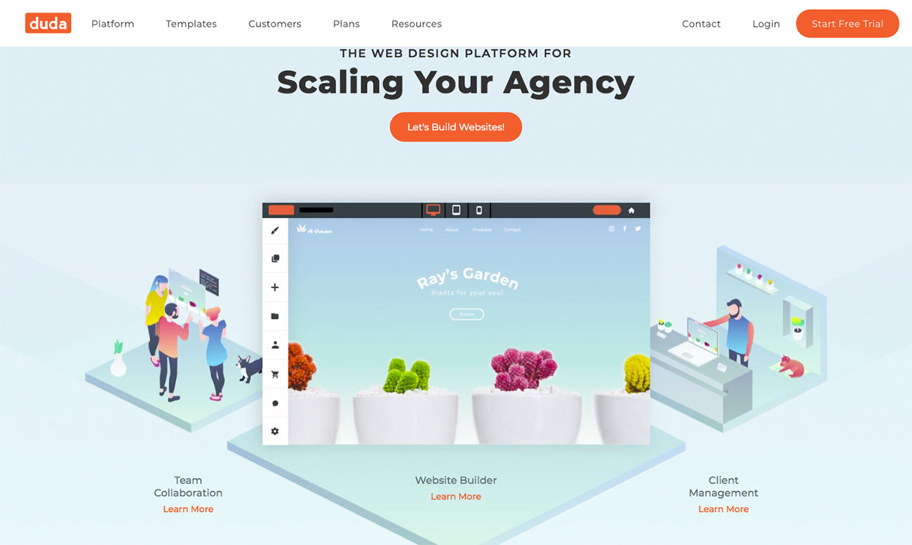
Maybe you need to switch to an easy-to-use theme — a WordPress theme that’s crazy-fast and gives you reliable performance may be your cup of tea.

Tired of having to build your websites from scratch? It’s totally unnecessary unless for some reason you absolutely want to.

Before you blame yourself for the situation you find yourself in, consider this: maybe it’s the tools you’re using. You may be trying to build a house without the use of power tools, scaffolding, or helpful aids.

One of the following 15 top WordPress themes should prove to be the solution to your problem. In fact, more than one of them could probably serve quite nicely.

Grab a cup of coffee and let’s get started.

1. BeTheme: Responsive, Multi-purpose WordPress Theme

BeTheme: Responsive, Multi-purpose WordPress Theme

This biggest-of-them-all multipurpose WordPress theme can’t be beaten in terms of the huge array of “power” tools and design elements it places at your disposal. BeTheme is fast and flexible. It’s easy for beginners to work with. If trying to satisfy multiple clients has become more stressful than rewarding, BeTheme has a solution for that as well.

Be’s selection of 500+ customizable, responsive pre-built websites is the highlight and a proven stress reducer. These professionally crafted, pre-built websites cover 30 industry sectors, all the common websites, and an impressive range of business niches.

They also have UX features and functionalities built into them, potentially saving you a ton of design time.

BeTheme uses the popular Muffin Builder 3 page builder, with WPBakery as an option.
There’s a Layouts Configurator if you really want to, or absolutely have to, build a page from scratch.
It has a Shortcode Generator and a large selection of shortcodes that, together with Be’s drag and drop features, eliminates the need for coding.
Be’s powerful Admin Panel provides unmatched flexibility.

I have purchased 4 of these themes at this point. Love the speed and build of them. Only wish list item would be a way to categorize and tag pages like you can with posts. — sharkyh2o

Click here and browse Be’s impressive collection of pre-built websites.

2. Total Theme

Total Theme

Total is another stress-reducing theme. This flexible and easy-to-use WordPress theme has been around for a while and has amassed a user base of 41,000 happy customers.

Total is drag and drop and it doesn’t require coding to build exactly the type of website you have in mind.
Total is also developer friendly thanks to its system of hooks, filters, and snippets.
There are more than 500 advanced customizing options available, plus 100+ page-builder elements and design modules to work with and 40+ pre-built demos to get any project off to a solid start.
You won’t be burdened by third-party plugins either, since this WooCommerce-ready theme is compatible with all WordPress plugins.

Very Friendly
Very Simple
Clean Code
Good Flexibility
Cool Elements
Excelent custom panel
Good integration with WooCommerce

Love this theme, it can do everything I need including shops, in a very good and easy way. — soswebdesign

Click here to discover if Total is the solution you’ve been looking for.

3. Avada

Avada

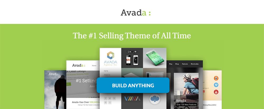
If you choose a best-selling theme, chances are it’s going to relieve rather than add to any stress you may be encountering. Avada is such a theme.

Its Dynamic Content System provides unmatched flexibility.
Avada integrates totally with WooCommerce and includes product design drag and drop capabilities.
55+ pre-built websites are included to get you off to a fast start.

Great theme! As my first WordPress theme, it offers many options and continues to improve! — nwilger

Click here to find out more about this best-seller.

4. TheGem: Creative, Multi-Purpose, High-Performance WordPress Theme

TheGem

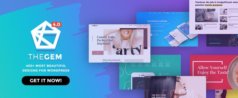
Featuring the most beautiful designs for WordPress is what many web designers will tell you about TheGem. What really gets them excited, however, are the tools that come with the package.

Those same designers will tell you that TheGem is the ultimate WordPress toolbox. To name but just a few of the goodies, you’ll find:

plenty of pre-built, one-click installable websites
over 400 modern and trendy design templates
a ready-to-go fashion store

Great theme and great service. — bepreoo

Your very own ultimate toolbox is just a click or two away.

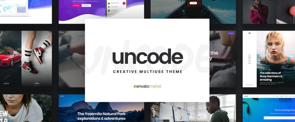
5. Uncode: Creative, Multiuse WordPress Theme

Uncode

Bloggers, freelancers, and creatives of all types, plus small businesses and agencies, will benefit from making this ThemeForest bestseller with its 60K+ sales their theme of choice. This is doubly true if you need to create a portfolio or magazine-style website or any type or style of a page.

Features include:

a powerful front-end editor
adaptive image and advanced grid systems
WooCommerce compatibility and single product design and display features.

The star of the show is Uncode’s showcase of user-created websites. They tell a story of what Uncode could do for you, plus they are a source of inspiration.

Nice code, good support, design possibilities are endless. — zoutmedia

Visit Uncode and browse its showcase of user-built websites.

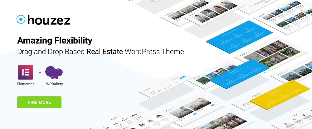
6. Houzez: Highly Customizable Real Estate WordPress Theme

Houzez

There are some website types that a multi-purpose theme simply can’t help you with — usually because of unique and special features that are required. For the realestate sector, as an example, using a theme like Houzez is a must. Houzez’ unique functionalities include:

advanced property searching
flexible property listings formatting
a property management system

In addition, this drag and drop theme can easily be customized to match a realtor’s business model.

I really love the function and the appearance of the theme. — stuffmartusa2

If you happen to have a realtor for a client, look no further.

The post 15 Top WordPress Themes to Use in 2020 appeared first on SitePoint.

Lisbon 2049 series by Max Bedulenko

Original Source: http://feedproxy.google.com/~r/abduzeedo/~3/SvHlX-Km-pA/lisbon-2049-series-max-bedulenko

Lisbon 2049 series by Max Bedulenko

AoiroStudioJan 13, 2020

As currently living in Europe, it totally brings some sense of quirkiness when you start envisioning ‘cinematic scenes’ from popular cult movies like 1982’s Blade Runner movie for example. It’s hard not good and it’s at the same time a fun photo challenge. This is the feeling I get when I am looking at the ‘Lisbon’ series by Max Bedulenko. Seriously there is some resemblance shown in both worlds so that’s why I added the ‘2049’ to the title. Hope you will dig it.

Digital Art

About Max Bedulenko

Max is a visual artist based in Minsk, Belarus. His work is mainly related to ‘visual development’ conceptualize into a glimpse of the modern future. Make sure to follow his social links.

Artstation
Behance


2020 New Year’s Resolutions For Web Designers

Original Source: http://feedproxy.google.com/~r/1stwebdesigner/~3/Z6tIJZ4xUPM/

A new year is upon us and that means many people take a moment to pause and reflect on the goals they wish to achieve for themselves over the course of the next 12 months. Setting resolutions looks different for …


The best website builders in 2020

Original Source: http://feedproxy.google.com/~r/CreativeBloq/~3/Gi77nZfGPdE/best-website-builder-8133804

Looking for the best website builder? We're here to guide you through your options. There are plenty of different options available nowadays, which is great, but it can make it tricky when it comes to figuring out which is right for your needs. So if you're ready to get started with a new site, we're here to help. 

For a start you'll be looking for a website builder that can create your website in the latest version of HTML. And secondly, you'll want a tool that simplifies the web design process and enables you to create a site that looks slick and includes all the functionality you need, without requiring a lot of programming or coding knowledge.

We've scoured the web to find you the best website builders that fit these requirements and more. We'll start with our top picks, and we've also included a few free alternative options at the bottom. Alternatively, take a look at our roundup of the best web hosting services  – many of which have website builders included.

Promoted: Wix

Once based on Flash, but now HTML5, Wix is one the biggest and best-known website builders. Its unique template designs help it stand apart from the crowd, making it a great way to create eye-catching websites. Wix is primarily a paid service but if you're on a tight budget there's a free version with a limited number of features to get you started.

The best website builder 2020: Wix

Wix is the best website builder right now, offering great usability and precise control. The drag-and-drop editor is easy to get to grips with, and you can tweak and adjust just about anything once you've got the hang of things.

There are over 500 templates to choose from. If you're having trouble whittling down the options, there's a cool feature where you can type in your needs and Wix will suggests which templates might suit you. Another draw is Wix Turbo, a more recent addition to the website builder, which promises to significantly increase loading speed and site performance. Finally, there's built-in mobile optimisation, so you can be sure your site will look good on smaller screens. 

This popular service offers a variety of plans to fit different needs. There is a free version, which comes with limited bandwidth and storage space (500MB), and a Wix-branded domain name. Bump up to the Unlimited plan and you'll get an ad-free experience, unlimited bandwidth and 10GB storage, plus a free domain and Google Ad vouchers. For a little more again, the E-Commerce plan throws an online store into the mix.

The best website builders: Shopify

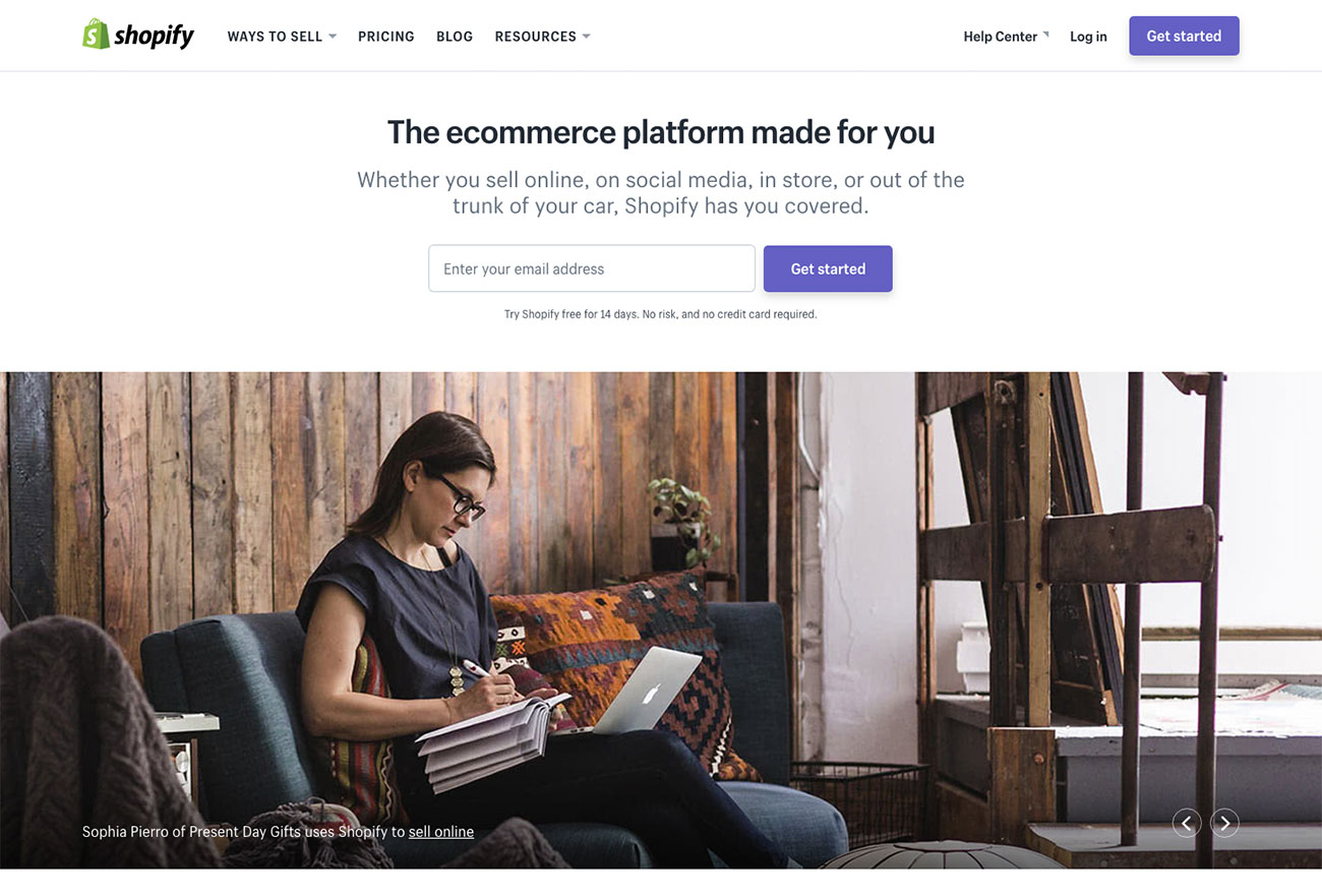
If you need to include an online store in your website, head to Shopify. Now one of the most popular services around, Shopify currently powers over 1,000,000 online shops. The pricing plans and features are flexible enough that it will work for you whether you have a tiny fledgling business or something much larger, and there's also a free 14-day trial so you can make sure it's what you want.

There are loads of templates and themes so you can put your store together exactly as you want, and if you think you might need something more advanced in the future, it's easy to find an expert to help you. 

Choose a website builder: Duda

Next on our list of the best website builders is Duda. Designed with online stores, business sites, blogs and one-pagers in mind, this quality responsive website builder has a stack of ready-made templates for you to choose from, and a drag-and-drop editor to make it easy to put your site together. It's optimised to provide the fastest and most efficient building experience, and features plenty of widgets to help turn visitors into paying customers. There's also integration with web-based solutions such as OpenTable, Disqus and PayPal, and also website personalisation tools that can trigger a variety of individualised actions that'll make your customers feel extra-special.

Best website builder: Voog

There are plenty of website builder options aimed at beginners, but if you've got some experience and are looking for something that offers more granular control, we'd recommend taking a look at Voog. 

This website builder does away with the basics designed to help beginners – so there aren't many templates and there's very little media support. Annoyingly, there's no global Undo function. However, what you do get is a clean drag-and-drop editor and powerful, low-level controls, some of which you won't find elsewhere. For example, click on a text box and you can insert a video, bullet-point list or table, and even customise the effects via the HTML source code. Multiple users can also collaborate on the same project. 

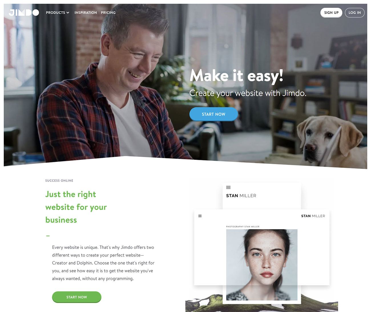
Choose a website builder: Jimdo

Jimdo isn't as full-featured as some other website builders here, but it is still worth a look. This slightly quirky website builder offers a range of different plans to suit your needs, although it's best suited to novices. The free Play option gives you 500MB storage, 2GB bandwidth, up to five website pages, and HTTPS security. Step up to one of its paid services and you'll get a free domain for a year, SEO help, stats and more.

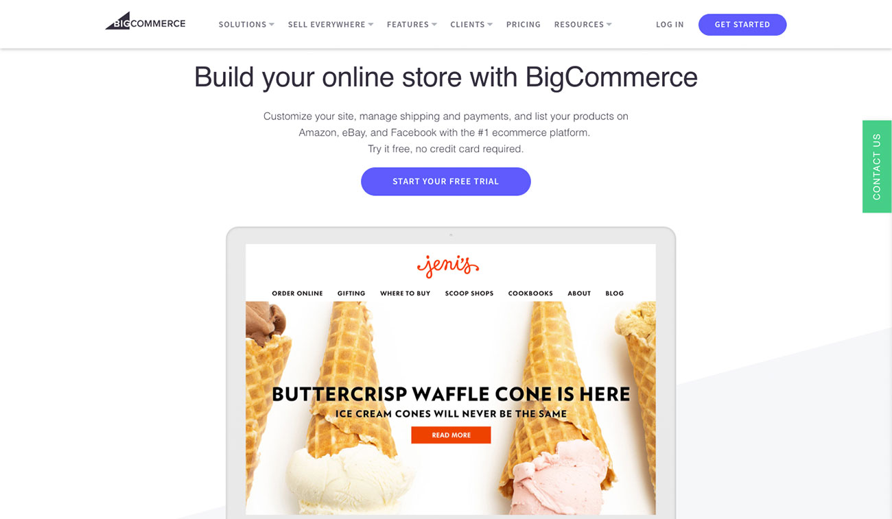
Choose a website builder: BigCommerce

Got something to sell? BigCommerce is aimed at small businesses that want to grow. There are three plans, Standard, Plus and Pro, and a custom Enterprise version, none of which charge additional transaction fees. All three plans enable you to connect your online store to other sales channels, including eBay and Amazon, and offer real time shipping quotes, and site-wide HTTPS security. Its storefront editor enables you to change your site's look without coding, while you can also go completely custom using HTML, CSS and other code libraries.

Prices are higher than you'd expect from a standard website builder, but roughly in line with what Shopify, its ecommerce competitor, charges. Annoyingly, most of the information about this website builder only becomes available once you've started your free trial, making it tricky to compare it with other services. 

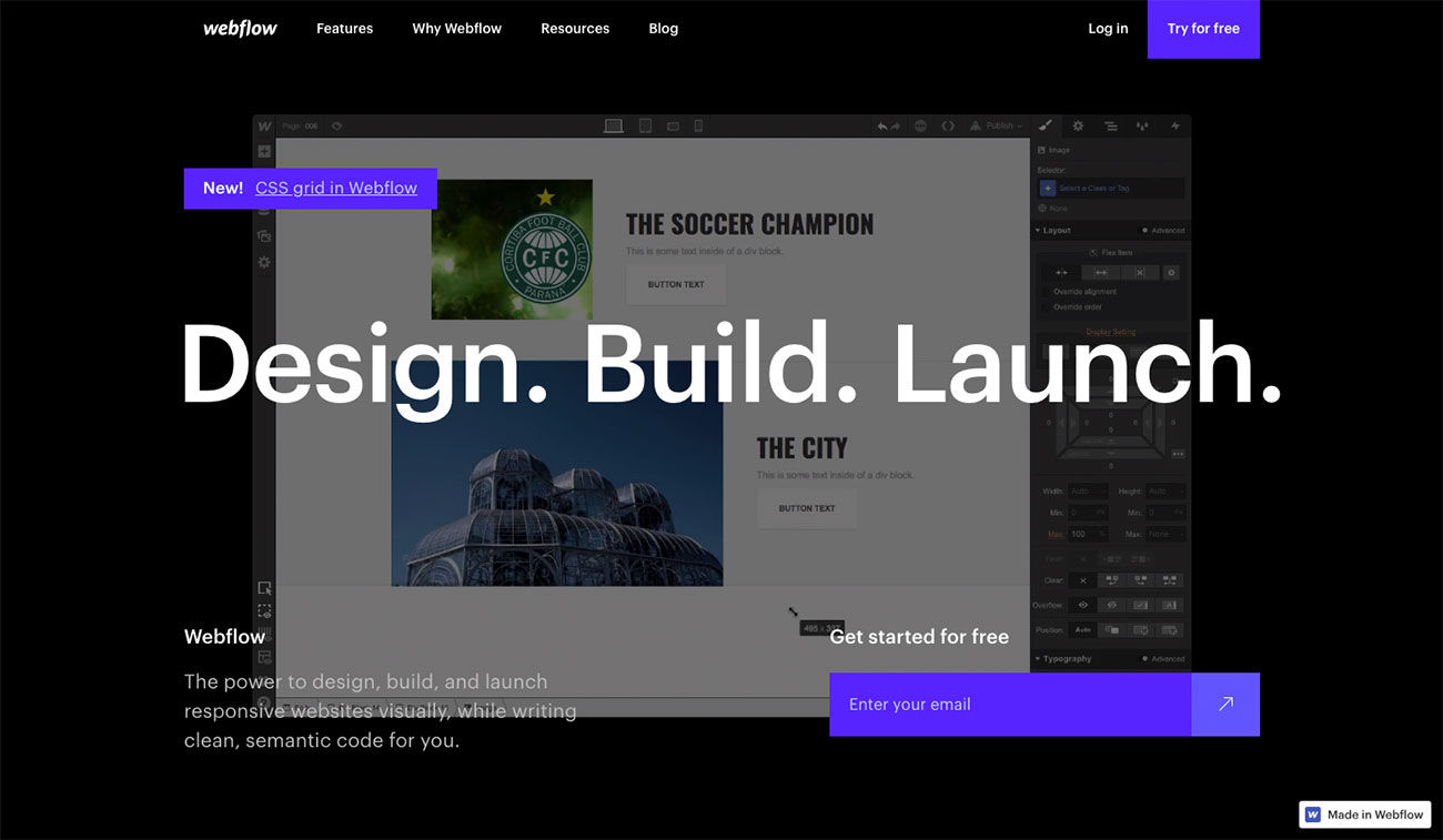
Choose a website builder: Webflow

If you're a design professional looking for a website builder that'll let you create a truly custom experience, we recommend Webflow. This California-based website building company is an astonishingly simple platform that gives everyone the power to build their perfect site across a range of devices. Suited to designers, creative professionals and entrepreneurs, Webflow is a web design tool, CMS and hosting platform all in one. It enables you to create your dream site and update it personally without having to touch a single line of backend code. Webflow is frequently adding new features – most recently, dedicated ecommerce functionality.

Visit the Webflow website

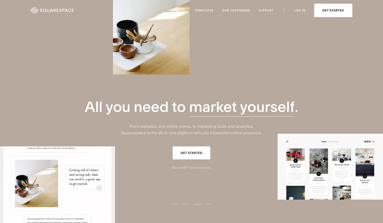
Choose a website builder: SquareSpace

SquareSpace offers a free trial so you can find out if it’s right for you

SquareSpace is a popular web-based website builder that will help you create beautiful sites in a matter of minutes. This platform really shines when it comes to themes – there's a massive range of ready-made website designs tailored for different occasions and industries. Or, if you're comfortable with code then you'll be able to customise your site or create a completely new design. 

All SquareSpaces's templates are compatible with mobile devices as well, and contain high-resolution images and graphics to add further colour to your website. SquareSpace is a paid application but you can also use its free trial with limited options.

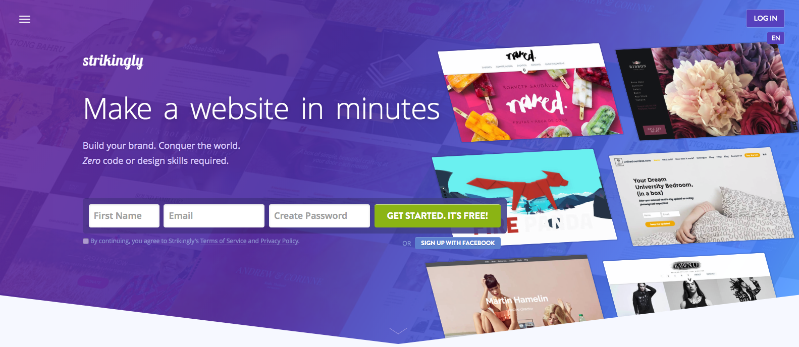
best website builder: Strikingly

As the name might suggest, you can use Strikingly to create beautiful websites, and do it quickly, too. It's promised that you can create a site in under 30 minutes, with no coding or design skills required. Strikingly's templates are not only eye-catching but are also completely responsive and compatible with major mobile platforms. Everything is optimised for SEO, with extremely quick load times, and Strikingly also offers in-depth analytics for every site you build with it.

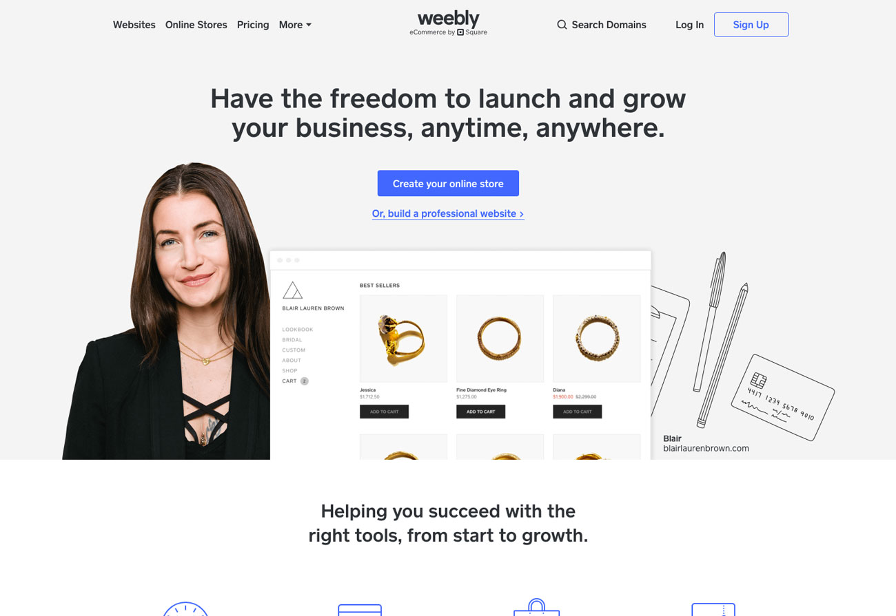
Choose a website builder: Weebly

Weebly is one of the pioneers in creating HTML5-based websites and templates. It's an entirely online website builder with lots of goodies for designers. Its designs are immaculate and its features are mind-blowing. Every template and website design created using Weebly is compatible with mobile devices and works smoothly on all major platforms. You can create websites with Weebly using either your own domain name or a Weebly subdomain.

Alternative free website builders to consider…

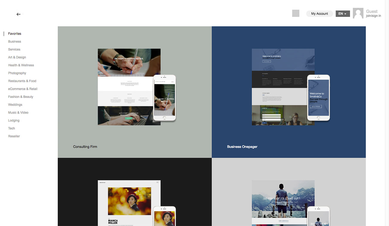
Choose a website builder: IMCreator

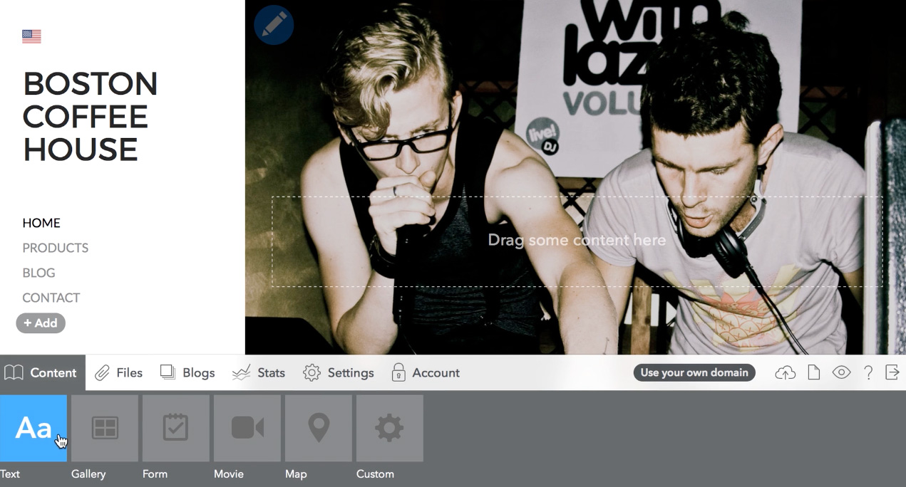
The IM Creator was introduced in 2011 and it quickly became one of the top HTML5 website builders online. It features a huge library of website templates in a long list of categories ranging from sports and medicine to business and academics; simply use one of these templates or start off with a blank page and create your own design. 

Students, artists and non-profits can apply for a free account, with unlimited hosting, no ads, and ecommerce capabilities. If you don't fall into one of those categories, you can opt for a Premium account, which does the same thing for a small monthly fee. There's also a higher-level option for those with more demanding needs.

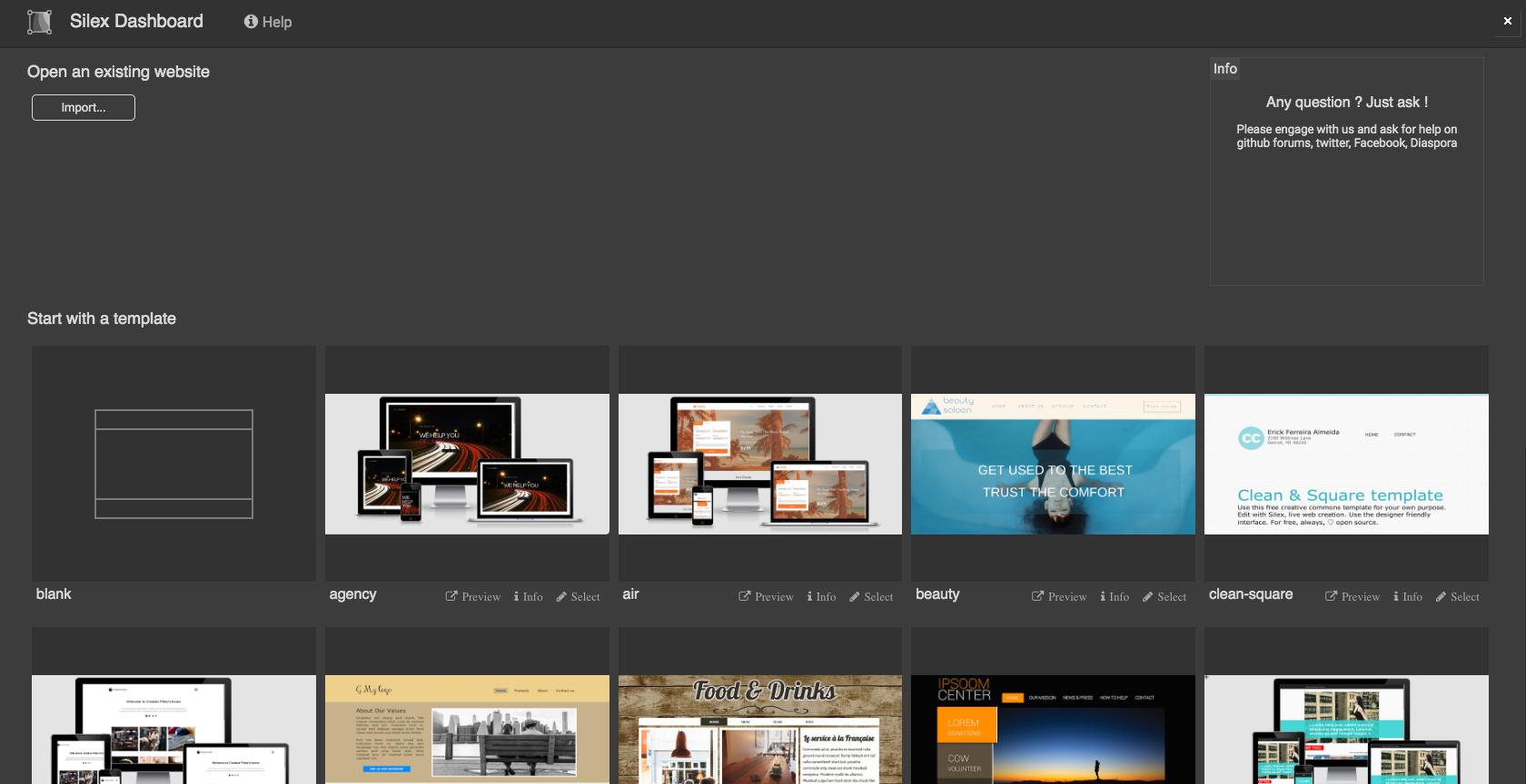
best website builder: Silex

Free and open source, Silex can be used entirely within the browser and works with you, whatever your skill level. There's a friendly WYSWIG editor, and drag and drop interface that you can use to put everything together, with all your changes visible immediately. If you're comfortable with CSS and JavaScript, then you'll find integrated editors that enable you to get down and dirty with code in order to add styles and interactivity to your elements.

There are plenty of templates – both free and paid – and widgets to choose from, plus built-in SEO. Bear in mind, though, that Silex won't host your site – for that, take a look at our guide to the best web hosting services.

Choose a website builder: Mobirise

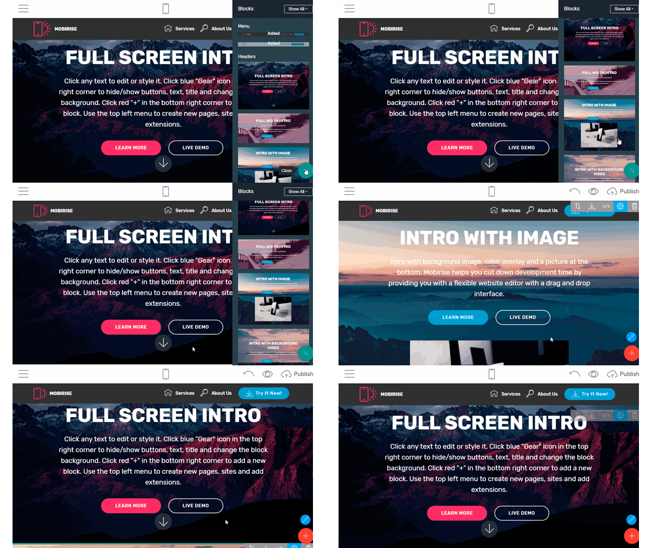
With a mobile-first approach and easy drag-n-drop interface, Mobirise has become one of the most popular offline website builders. Mobirise is available to download for Windows and Mac, and comes with over 1,800 assorted website blocks, as well as over 20,000 hi-res images and 6,000 icons. 

Mobirise Builder is free for commercial and non-profit use, and once you've built your site you get the option of publishing it to any hosting service, local drive or free Github page.

Related articles:

The best antivirus software in 2020Brilliant 404 error pagesSend large files: 12 free tools

Exciting New Tools for Designers, January 2020

Original Source: https://www.webdesignerdepot.com/2020/01/exciting-new-tools-for-designers-january-2020/

We typically start the month with a roundup of new tools and resources for designers, but with the start of a new year (and new decade), we thought a roundup of things to help you get more organized would be appropriate.
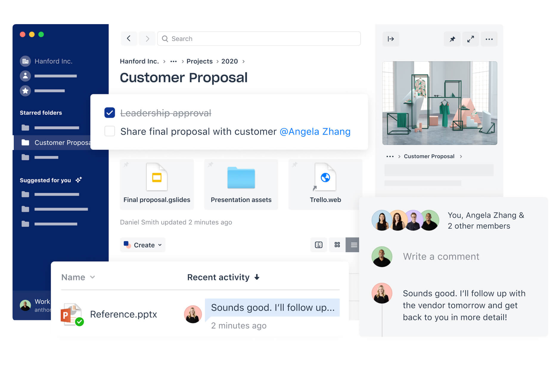
Some of these tools have been around for a while with features you might not be using. Other tools are on the new side and offer great functionality. How many of these tools are part of your kit? Which ones will you resolve to use this year?

Here’s what you need to get organized this month and start 2020 off right.

Dropbox

Dropbox is one tool that’s hard to live without. Not only can you use it to manage files and share, you can also use it to run presentations directly with Zoom conferencing or in Slack. Free plans are enough to get started and upgraded plans provide greater storage capability for individuals or teams.

Working from multiple locations with desktop sync and sharing client files are features that make this tool something I use every day.

Feature you need to be using: Shared link expiration dates. When you share files via link, set an expiration date to ensure files aren’t hanging out with access indefinitely.

Slack

Slack is probably a tool that you are already using, but are you making the most of it? Channels, hashtags, and integrations are the key to ensuring that Slack works for you in the way you need it. Take the time to set these up for an efficient, and organized, workflow across multiple teams.

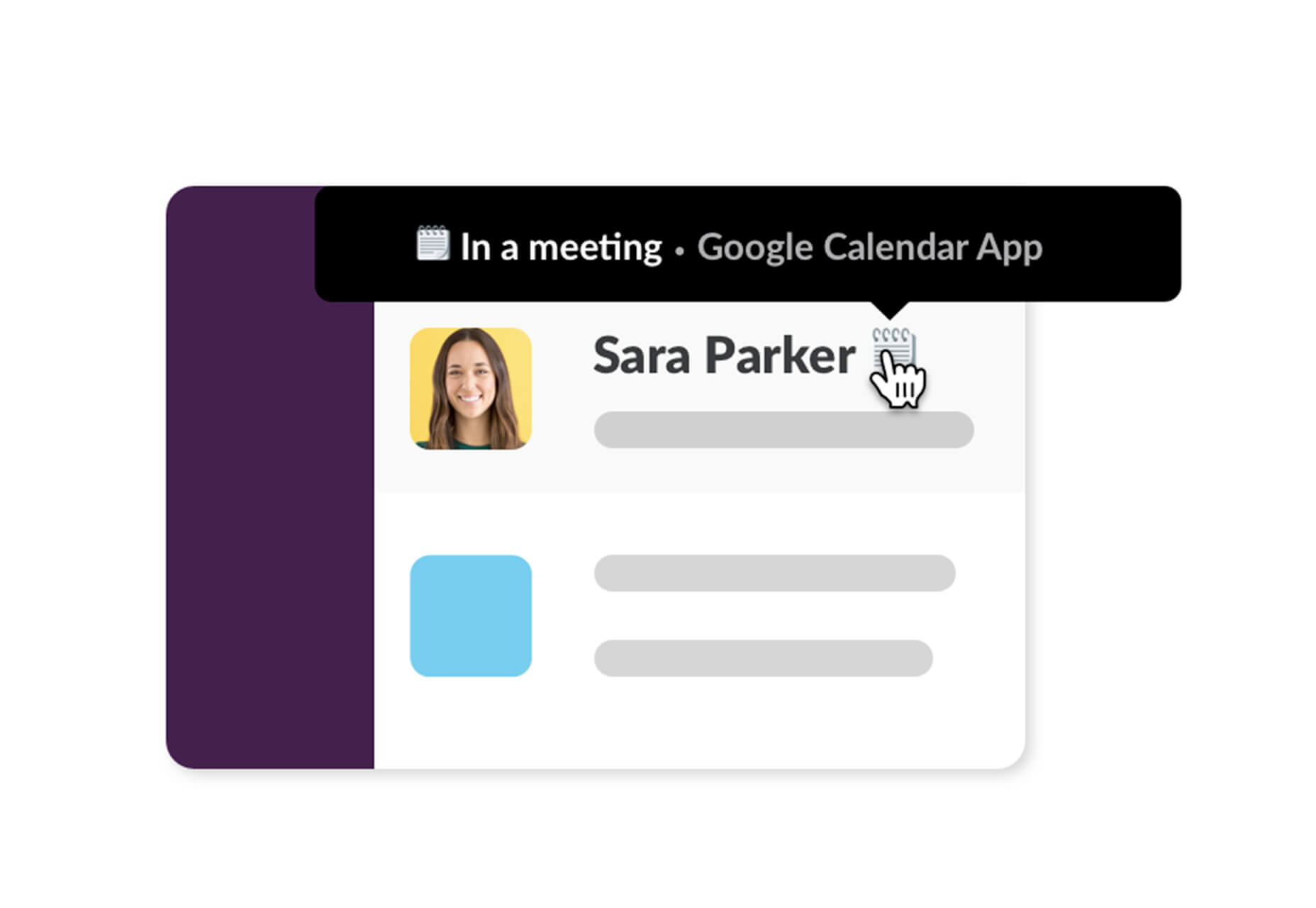
Feature you need to be using: Sync Slack and your Google Calendar for real-time away statuses that work for you.

Cloud Libraries

We all work from a variety of locations—home, work, on desktops and laptops—so cloud-based libraries are a must. Save common files in a location that you can access from anywhere.

Feature you need to be using: Adobe Creative Cloud comes with a place to save libraries, but you can save and connect library files from any cloud-based tool.

Trello

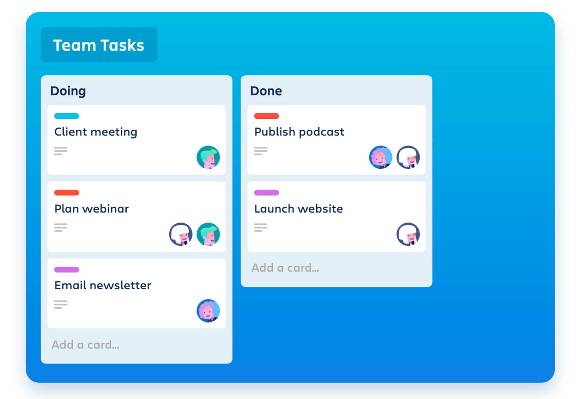
Trello is a free organization and collaboration tool for just about any project. Think of it as a giant project checklist that allows you (or other team members) to keep an eye on how anything from a website build to planning a trip. It works cross devices and isn’t hard to figure out.

Feature you need to be using: Workflow automatons with due date commands and rule-based triggers to make tedious processes happen on their own.

Google Keep

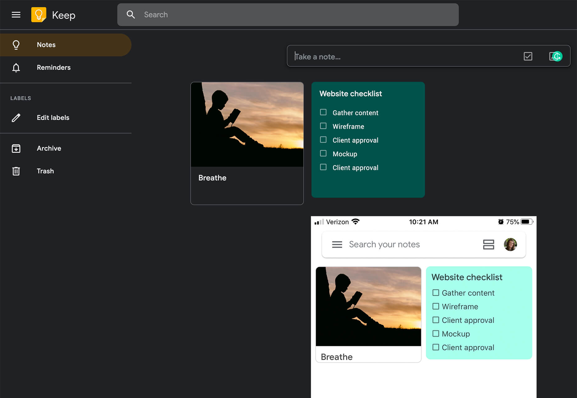
Google Keep is the notetaking app you always wanted. Take notes from any device—sync across all devices—and share or keep notes to yourself. You can take notes by typing, with photos or audio (and it will transcribe messages for you). The best part is this notes app is free and pretty much makes anything else you are using obsolete.

Feature you need to be using: Location, and time-based reminders help keep you on task just when you need it.

Grammarly

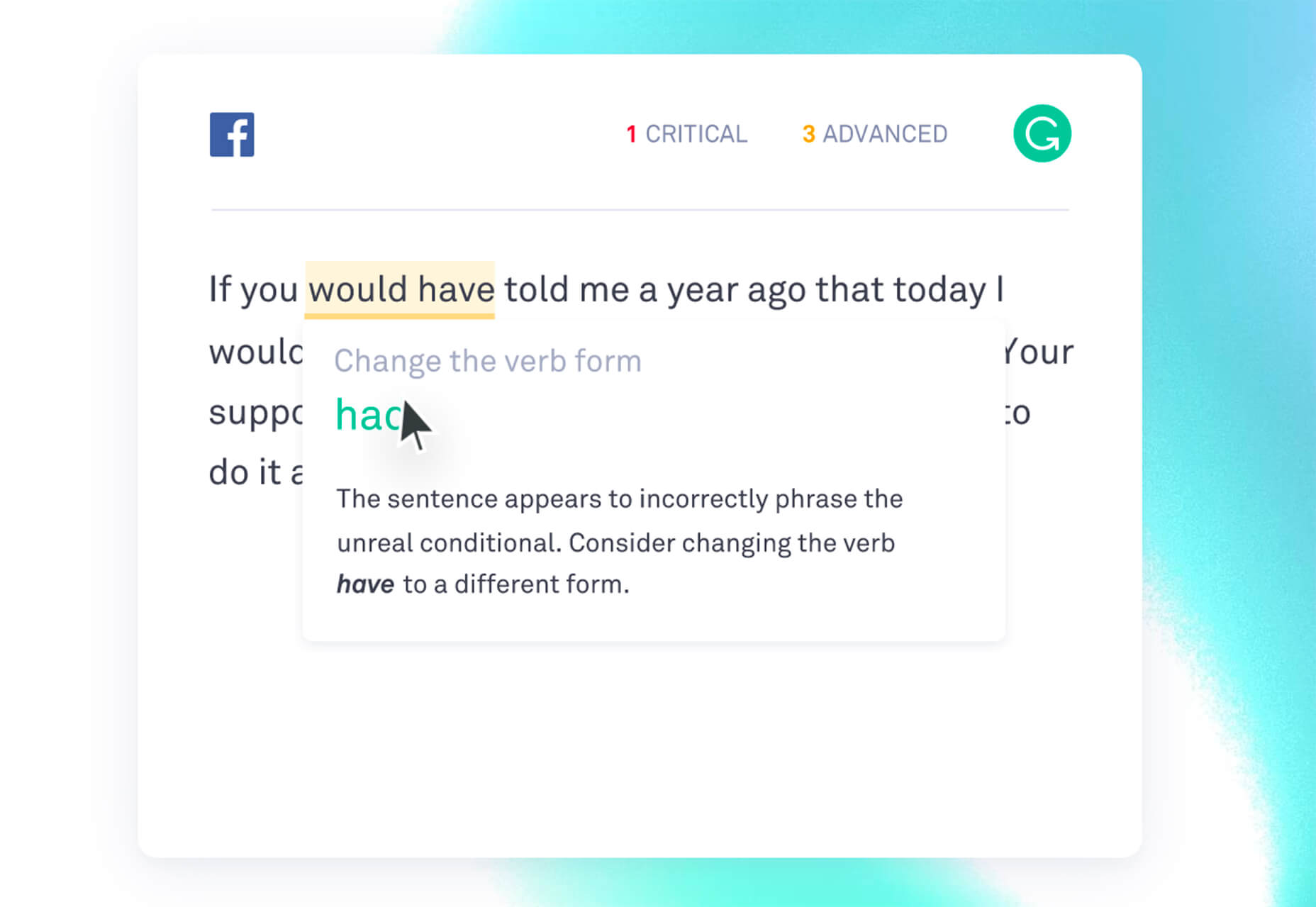
Grammarly saves time and effort by checking your messages, everything from documents to website content to emails or social media posts, as you type. Use it to avoid embarrassing mistakes in your writing.

Feature you need to be using: Emojis help you track the tone of your message so that it’s on point and audience-appropriate.

ClickUp

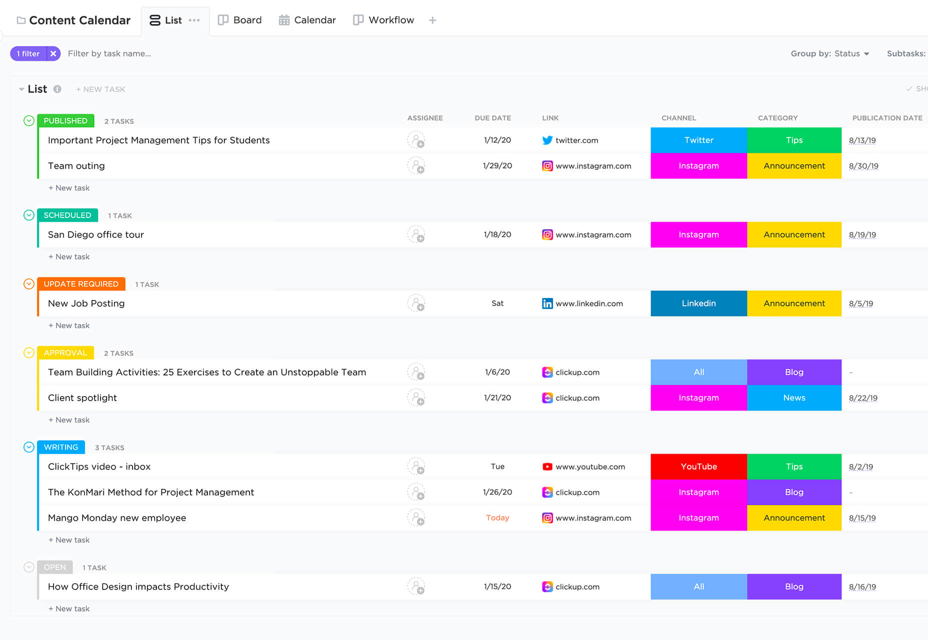
ClickUp takes all your other apps and merges them into a single location and dashboard for easy organization. You can use it to manage your own workspace (free) or collaborate with teams (paid plan). There are multiple views—I’m a big fan of the list option—and templates help jumpstart using the tool.

Feature you need to be using: Use the messages option to create tasks or comments. Boom!

Filing System

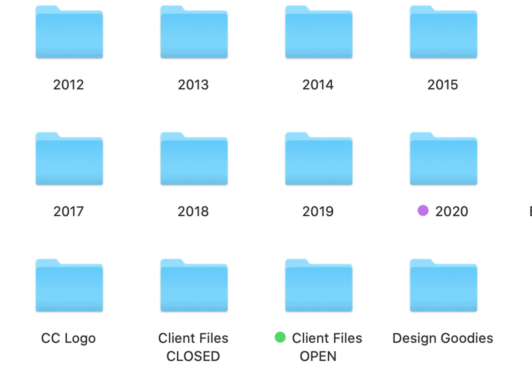
Nothing beats a solid filing system. The key benefit of a system is that you store files and folders in the same way every time, making it easier to find things later.

I keep folders first by year. Within annual folders are folders by client name. Then by project name. When projects are complete, I end up with two folders: WORKING and FINAL. Use the same format for naming files. (I use Client Name-Project-Year.)

Feature you need to be using: Date project files. Relying on “date modified” settings isn’t enough if you resave an old file by mistake.

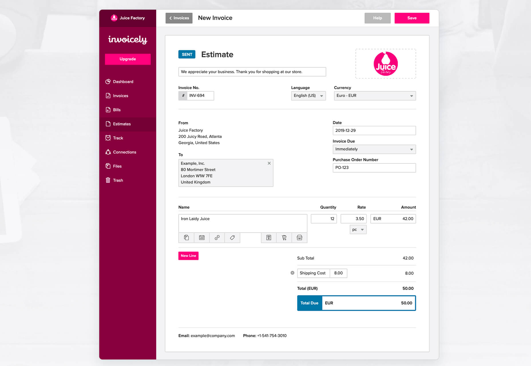
Invoicely

Invoicely makes it easy to work as a freelance designer. The platform is made for sending invoices, managing clients, and allows you to accept online payments. It’s secure and offers a free plan (as well as a paid option).

Feature you need to be using: If you are trying to get organized, time tracking tools help you know just what an individual client costs. You can enter time, expense per client, and mileage so you can get a realistic picture of revenue by project.

HelloSign

HelloSign is for anyone dealing with documents that need signatures. Send and sign online with a platform that’s secure and easy for users to understand. Plus, you can sign items right from common tools such as Gmail or other G-Suite apps.

Feature you need to be using: Store all your signed documents in the interface so you can find them later. (HelloSign will also automatically send reminders if someone hasn’t signed a form.)

Traditional Planner + Online Calendar

Pair a paper planner with your online calendar to keep track of tasks (paper planner as a checklist) as well as events and appointments (online calendar). Daily deadlines are best managed when you can jot them down and check them off throughout the day. Plus, that note is right in front of you to stay focused.

Feature you need to be using: Try a weekly paper planner, tear off sheets, or a dry erase board for task management that doesn’t seem overwhelming.

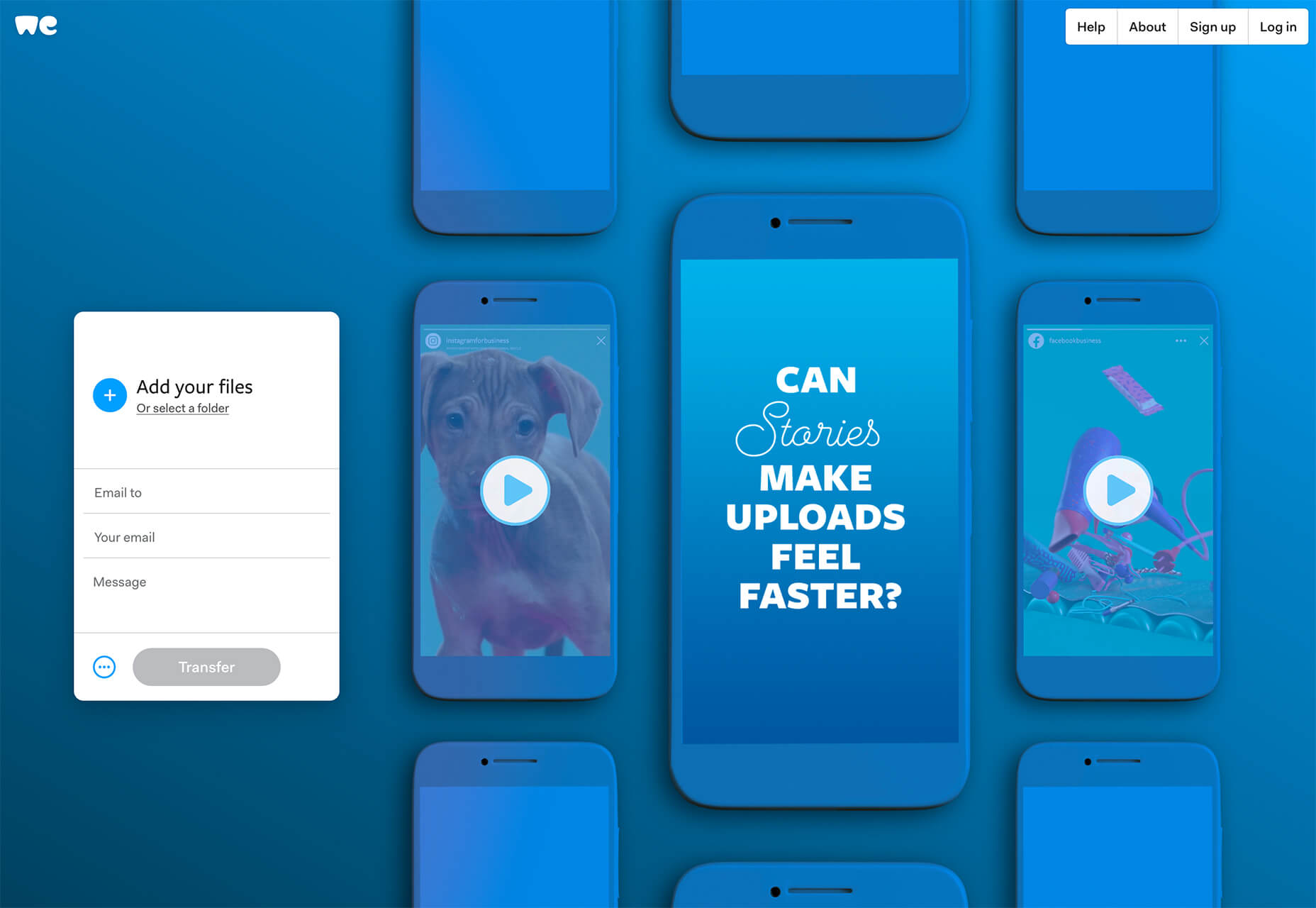
WeTransfer

WeTransfer makes sending large files a lot easier. There’s nothing worse than a file getting lost in cyberspace because it’s too big for email. WeTransfer allows you to send and receive big files with just a click. (And you don’t have to have an account to download files.)

Feature you need to be using: Integrate WeTransfer with other tools such as Slack, Sketch or Chrome for direct sharing from wherever you are working.

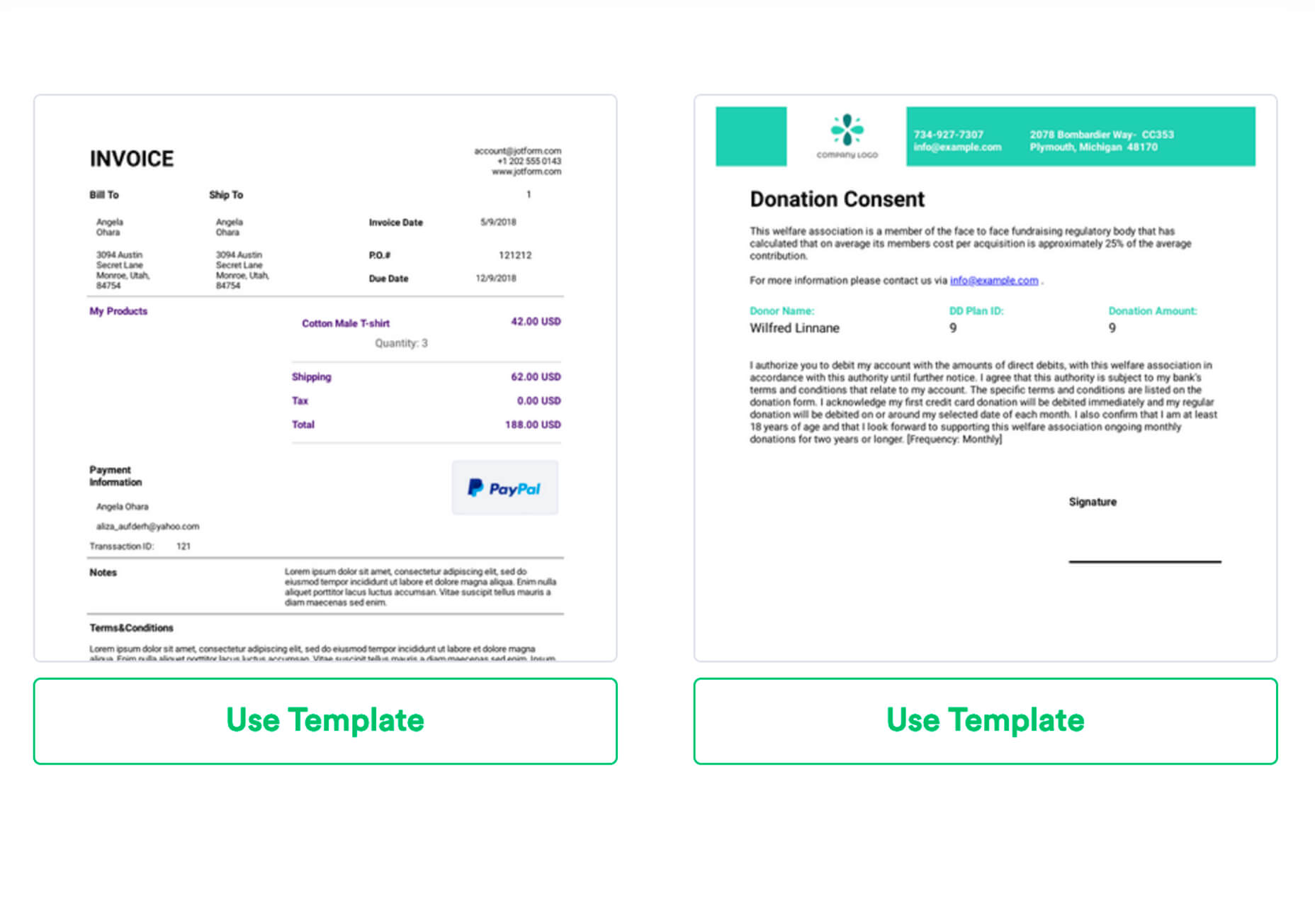
JotForm

JotForm is the ultimate tool for creating any type of online form, from simple surveys to signups to payment collection or image uploads. The service has free and paid plans, depending on usage and everything is customizable, so forms can be branded with ease.

Feature you need to be using: PDF Templates are ready-made forms for everything from a simple invoice to contracts or photo waivers. Start with a PDF and tweak as you need. Plus, you can set it up to be filled out digitally and returned to you. This is a huge timesaver, and you can save custom forms in your account to use over and over again.


Featured image via Unsplash.

Source

p img {display:inline-block; margin-right:10px;}
.alignleft {float:left;}
p.showcase {clear:both;}
body#browserfriendly p, body#podcast p, div#emailbody p{margin:0;}

Worthy Steps in Signing up for Trading set ups

Original Source: http://feedproxy.google.com/~r/Designrfix/~3/T9Q-M8VKZnY/worthy-steps-in-signing-up-for-trading-set-ups

There are a lot of different ways to make money in our everyday lives. We work all day to make a wage, we can sell clothes and other items, and we can even take out loans and make other financial investments. Another increasingly popular way to make a little bit of extra money, however, has […]

The post Worthy Steps in Signing up for Trading set ups appeared first on designrfix.com.

Collective #579

Original Source: http://feedproxy.google.com/~r/tympanus/~3/Z1lfhz4c038/

Collective item image

Inspirational Website of the Week: Obys

A combination of unique layouts, beautiful elements and smooth animations make Obys stand out.

Get inspired

Collective item image

This content is sponsored via Thought Leaders
Manage projects better in 2020 – Clubhouse.io

“Clubhouse is like a fast and delightful version of Jira, a more purposeful version of Trello.” Free for up to 10 users.

Check it out

Collective item image

The End of Indie Web Browsers: You Can (Not) Compete

Samuel Maddock’s sobering article on the detrimental consequences of the introduction of Encrypted Media Extensions (EME) by the W3C, bringing with it the end of competitive Indie web browsers.

Read it

Collective item image

Smaller HTML Payloads with Service Workers

Philip Walton shares a great technique leveraging Service Workers to decrease HTML payloads.

Read it

Collective item image

All Design Conferences

A great project by Pablo Stanley: a list of all design and front-end conferences around the world in 2020.

Check it out

Collective item image

calcolor.co

A fantastic new way to find, modify and share digital colors. Created by Timon Weber.

Check it out

Collective item image

Let’s Learn Eleventy!

In this episode of “Learn With Jason”, Zach Leatherman shows how Eleventy makes building static sites fast and fun.

Watch it

Collective item image

Why You Should Choose HTML5 <article> Over <section>

In this article, Bruce Lawson explains what use we have of <section> and how authors should mark up headings that are hugely important to AT users.

Read it

Collective item image

EscherSketch

A really nice tool for drawing and exploring symmetrical patterns and designs. It can export pictures, pattern tiles for fabric and wallpaper design, and SVG for further editing.

Check it out

Collective item image

Awwwards Nominees of the Year 2019

Vote for the best of the web in the annual awards by Awwwards.

Check it out

Collective item image

Fun with CSS Motion Path

Michelle Barker shares some fun animations you can do with the new CSS Motion Path properties.

Check it out

Collective item image

Publish

A static site generator built specifically for Swift developers. It enables entire websites to be built using Swift, supporting themes, plugins and more customization options.

Check it out

Collective item image

Whack-a-mole!

Andrew Burton coded this offline-first PWA version of Whack-a-mole for his children. The source code can be found here.

Check it out

Collective item image

Mailchimp’s 2019 Annual Report

The beautiful annual report by Mailchimp that highlights some interesting stats.

Check it out

Collective item image

Multi-Thumb Sliders: Particular Two-Thumb Case

In this two part article, Ana Tudor makes her own version of a multi-thumb slider.

Read it

Collective item image

The Solar System 2010 – 2020

Rob DiMarzo explores the changes the solar system has gone through in the past decade.

Check it out

Collective item image

22120

An archivist browser controller that caches everything you browse, a library server with full text search to serve your archive.

Check it out

Collective item image

The Jam – Swissted

A fantastic GSAP 3 powered demo by Pete Barr where he brings a poster to life.

Check it out

Collective item image

7 CSS properties you had no idea about

A compilation of some really interesting and lesser known CSS properties.

Read it

Collective item image

13 ways to vertical center in 2020

The team of LogRocket shows 13 ways to vertically center an element in CSS. Check out the demos here.

Watch it

Collective item image

From Our Blog
Awesome Demos Roundup #12

A hand-picked collection of fantastic web experiments for your inspiration.

Check it out

Collective item image

From Our Blog
Playing with Texture Projection in Three.js

In this tutorial, you’ll learn how to project a texture onto an object in Three.js with some interesting examples.

Check it out

Collective #579 was written by Pedro Botelho and published on Codrops.