Tips To Improve Your E-Commerce Website Design

Original Source: http://feedproxy.google.com/~r/Designrfix/~3/h63YsixEjlA/tips-to-improve-your-e-commerce-website-design

Is your e-commerce web design no more interesting? Is it not earning revenues as earlier?  What does it indicate?  The time has come to improve your e-commerce website design. You need to consider what to include in your e-commerce website design so that your business stands out from the crowd.  It is a big concern […]

The post Tips To Improve Your E-Commerce Website Design appeared first on designrfix.com.

How to Prototype a Web App with Django and Vue.js

Original Source: https://www.sitepoint.com/web-app-prototype-django-vue/?utm_source=rss

Prototyping a Web App with Django and Vue.js

Wouldn’t it be cool if you could prototype a custom web application that’s responsive (mobile-ready), reactive (light-speed fast), with a full-featured admin interface to manage the content — all in no time? Actually, using Django and Vue.js, you can! ?

0. Introduction: Full Stack Development 101

I’ll cover how to prototype a custom web app, and to keep it as short and sweet as possible, the context information here will be rather brief. However, I will provide — hopefully — enough resources so that you know where to go should you need more information.

To this end I’ll fully mash up data management, presentation, and routing between Django and Vue.js — so get ready!

About Django

You may know of Django, the Python-based web framework for perfectionists with deadlines that’s ridiculously fast, reassuringly secure, and exceedingly scalable. But if you don’t know much about it, this article will serve as an extremely fast hands-on introduction.

About Vue.js

Same deal with Vue.js, the progressive JavaScript framework that’s approachable, versatile, and performant. If you aren’t familiar with it, here you’ll get a quick-and-dirty introduction.

I’ll also cover two official Vue.js libraries:

Vue Router for route/view mapping
Vuex for state management

Python + JavaScript = WIN!

For this article, we’ll set a publishing project with a basic database schema to save authors and articles, and a minimal user interface (UI) to interact with them.

Hopefully, this will serve as a toy program to understand how to integrate Django using Python code on the back end with a JavaScript framework on the front end, that you can adapt later to your own needs.

1. Setting Up a Django Project

Very quickly, we’ll set up a project from scratch. If you already know how to handle Django projects, you can skip this section. We’ll assume you already have Python installed.

For a more in-depth guide, see How to install Django on the Django documentation site.

Python Virtual Environment

Let’s open a console and create a virtual environment (see Virtual Environments and Packages for more info):

$ virtualenv myenvironment

Using base prefix ‘c:\users\luzdealba\appdata\local\programs\python\python37’
New python executable in C:UsersluzdealbaDevelopmentmyenvironmentScriptspython.exe
Installing setuptools, pip, wheel …
done

Don’t mind the paths, as these will change from system to system.

Let’s access and activate the virtual environment.

On Windows:

$ cd myenvironment
$ Scriptsactivate

On macOS and Linux:

$ cd myenvironment
$ source bin/activate

Django Package

Let’s install Django:

(myenvironment) $ pip install django

Collecting django
Downloading Django-3.0.3-py3-none-any.whl (7.5 MB)
Collecting sqlparse>=0.2.2
Downloading sqlparse-0.3.1-py2.py3-none-any.whl (40 kB)
Collecting pytz
Using cached pytz-2019.3-py2.py3-none-any.whl (509 kB)
Collecting asgiref~=3.2
Downloading asgiref-3.2.3-py2.py3-none-any.whl (18 kB)
Installing collected packages: sqlparse, pytz, asgiref, django
Successfully installed asgiref-3.2.3 django-3.0.3 pytz-2019.3 sqlparse-0.3.1

One more time, don’t mind about program versions and file sizes as these will vary.

The Project

Let’s start a project called myproject:

(myenvironment) $ django-admin startproject myproject

Let’s access the project:

(myenvironment) $ cd myproject

The App

Start an app called myapp:

(myenvironment) $ django-admin startapp myapp

And add myapp.apps.MyappConfig to the INSTALLED_APPS constant list in myproject/settings.py to enable the app.

2. Setting Up the Database with Django

Here we’ll define the back-end database with Django, which we’ll later integrate with a front-end storage with Vuex.

Django Models

Models are Django’s way to implement an object-relational database management system (ORDBMS). In other words, plain text files where you can define database tables and fields, and from where these will propagate to the application layer and the DB engine.

Let’s code the following models for our app in myapp/models.py:

from django.db import models

class Article(models.Model):
“””Table schema to store articles.”””
name = models.CharField(max_length=64)
author = models.ForeignKey(‘myapp.Author’, on_delete=models.CASCADE)
content = models.TextField()
slug = models.CharField(default=”, max_length=64)

def __str__(self):
return ‘%s’ % self.name

class Author(models.Model):
“””Table schema to store auhtors.”””
name = models.CharField(max_length=64)
slug = models.CharField(default=”, max_length=64)

def __str__(self):
return ‘%s’ % self.name

Notice that we implemented a URL slug for both articles and authors.

For more information, see Model API reference on the Django documentation site.

Django Admin

Before we can manage these models through the admin site, we’ll first need to register them so that Django makes them available to us.

Let’s simply edit myapp/admin.py so that it looks like this:

from django.contrib import admin

from .models import Article
from .models import Author

# register models to use in admin site
admin.site.register(Article)
admin.site.register(Author)

Read more about the Django admin site on the Django documentation site.

Django Migrations

From the Django’s Migrations documentation:

Migrations are Django’s way of propagating changes you make to your models (adding a field, deleting a model, etc.) into your database schema.

In short: migrations do everything; no SQL commands required.

First, let’s create the migration files:

(myenvironment) $ python manage.py makemigrations

Migrations for ‘myapp’:
myappmigrations001_initial.py
– Create model Author
– Create model Article

Now let’s use that information to update the database:

(myenvironment) $ python manage.py migrate

Operations to perform:
Apply all migrations: admin, auth, contenttypes, myapp, sessions
Running migrations:
Applying contenttypes.0001_initial… OK
Applying auth.0001_initial… OK
Applying admin.0001_initial… OK
Applying admin.0002_logentry_remove_auto_add… OK
Applying admin.0003_logentry_add_action_flag_choices… OK
Applying contenttypes.0002_remove_content_type_name… OK
Applying auth.0002_alter_permission_name_max_length… OK
Applying auth.0003_alter_user_email_max_length… OK
Applying auth.0004_alter_user_username_opts… OK
Applying auth.0005_alter_user_last_login_null… OK
Applying auth.0006_require_contenttypes_0002… OK
Applying auth.0007_alter_validators_add_error_messages… OK
Applying auth.0008_alter_user_username_max_length… OK
Applying auth.0009_alter_user_last_name_max_length… OK
Applying auth.0010_alter_group_name_max_length… OK
Applying auth.0011_update_proxy_permissions… OK
Applying myapp.0001_initial… OK
Applying sessions.0001_initial… OK

Don’t mind the long list. That’s because that was our first migration, so not only our Author and Article tables were created, but also all of Django’s default schemas.

For more info, see Migration operations in the Django documentation site.

3. A Basic Interface with Vue Components in a Django Template

Here’s one of the most interesting parts of the mashup, as we’ll mix closely related tools from different technologies.

Django View
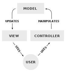
Django goes by the model–view–controller (MVC) software design pattern, which divides the related program logic into three interconnected elements.

We’ll code the following view in myapp/views.py:

Continue reading
How to Prototype a Web App with Django and Vue.js
on SitePoint.

Building and Hiring an Awesome Team

Original Source: https://www.hongkiat.com/blog/hiring-awesome-team/

At some point in your design career, you’ll likely be placed in charge of other people. These might include writers, marketers, programmers, engineers, and other corporate employees. This can…

Visit hongkiat.com for full content.

Apple sale: 13-inch MacBook Pro gets HUGE $300 price cut

Original Source: http://feedproxy.google.com/~r/CreativeBloq/~3/_uUVs4PgW3c/apple-sale-may-2020

What with Apple's new 13-inch MacBook Pro 2020 released earlier this month, we're now seeing some great deals on last year's version of the awesome laptop. The best deal right now is from B&H Photo, where it has the 256GB 13-inch MacBook Pro reduced to $1,199 – an impressive $300 off.

A slightly lower priced deal is on 2019's 128GB model of the 13-inch MacBook Pro on sale for $1,149. That's an impressive $150 saving, and currently the lowest price around. 

The MacBook Pro is one of the most powerful laptops, something that makes it a favourite for creatives. It's 13.3-inch Retina display allows you to see and show off design work in all its glory, and the 8th Gen Intel Core processor can handle even the most complex of creative tasks. 

Over at B&H Photo there are also some great discounts on iPads. The best deal sees a late 2018 11-inch iPad Pro on sale for just $799 (a $150 saving). These deals are only on until stocks lasts, so don't delay. Also, if you love a good deal, be sure to bookmark our Amazon Prime Day 2020 hub, where we hope to see even more great Apple offers. 

Browse MacBooks and iPads at Apple.com
MacBook deals:
iPad deal:

Outside the US? Here are the best offers on these and similar devices in your area:


Passive Income Methods for Designers

Original Source: http://feedproxy.google.com/~r/Designrfix/~3/vcznuGc6ZAg/passive-income-methods-for-designers

Image source: Pixabay.com If you are a designer who is looking to increase his or her revenue, finding extra work or creating a project of your own should not be that big of a problem. It all comes down to your experience and willingness to learn new things, but you already have a big advantage […]

The post Passive Income Methods for Designers appeared first on designrfix.com.

Folding iPhone concept is jaw-droppingly good

Original Source: http://feedproxy.google.com/~r/CreativeBloq/~3/nAqhbJibgSE/foldable-iphone-flip

An avalanche of iPhone 12 leaks has got everyone talking this week, and the specs for the new models are pretty exciting, to say the least. But one noticeable omission from Apple's proposed plans is the intention to follow in the footsteps of its rivals and release a foldable phone. 

YouTube account iOS beta news wondered what that might look like, and created a sleek concept video to give us an idea of a foldable iPhone 12 design. Enter, the iPhone Flip. The concept applies the leaked iPhone 12 design specs (including that super-charged new camera that will definitely make this phone one of the best camera phones) to the real-life Samsung Galaxy Z flip or the rebooted Motorola Razr. Check out the video below.

iOS beta news' video shows the handset closing into a tidy little square, with the hinge sitting on the horizontal, just like the Samsung Galaxy Z. But unlike the Z, there is no crease present on the screen. We're not quite sure how that would work, to be honest, but we're happy to glide over it in much the same way the video glides over showing us the screen in a half-folded state.

A new camera is on the back of the handset, with a pin-hole mounted lens rather than the usual notch, and below it (or on the front when the phone is folded) is a secondary screen – for notifications, the time and so forth. This means you wouldn't have to flip open your iPhone to find out if you had a new message, for example.

iPhone Flip and Samsung Z

The concept iPhone Flip (left) next to the Samsung Galaxy Z (right)

Samsung, Motorola and Nokia are a few of the brands that have already brought the flip phone out of the vault. In fact, YouTube user SkullCandy091 points out that Apple is often somewhat late to the party with certain new features, and "it'll take three years before they catch up and make a folding phone. The same thing happened with Face ID and swipe keyboard."

But are foldable smartphones here to stay? Some commenters on the video seem to think they're a novelty that don't stand up to current user needs, which may be why Apple hasn't leapt at the idea. It is true that they aren't all that convenient – now that we perform most of our daily tasks on our phones, do we really want to be opening and closing them all the time? 

And, although the best flip phones certainly have their uses, and do have good capability – especially as a second phone – they come with some inherent design flaws (namely, fragile hinges) that mean the handsets can't yet house all the high-tech features users want from their phones nowadays. Perhaps Apple is waiting for the technology to create something as truly special as this concept model, or maybe it predicts the new rise of the flip phone will swiftly, well, flip away.

Read more:

Is this skateboard with Apple's Mac Pro wheels as ridiculous as it sounds?The best Apple Watch apps in 2020The 14 best iPad apps for designers

These hand exercises will keep tired hands happy

Original Source: http://feedproxy.google.com/~r/CreativeBloq/~3/llbqTvTwSYk/hand-exercises

Hand exercises often get overlooked. We're all used to the idea that other parts of our body need regular movement to keep them nice and healthy, but we often forget our wrists, hands and fingers when designing exercise routines.

But hands that spend all day doing repetitive movements such as typing or drawing can benefit from just a few hand exercises, which only take a few minutes. Just make sure that you wash your hands before and afterwards.

For other exercises for those sitting all day, see our desk exercises, and avoid back problems by making sure you've got the best office chair you can afford.

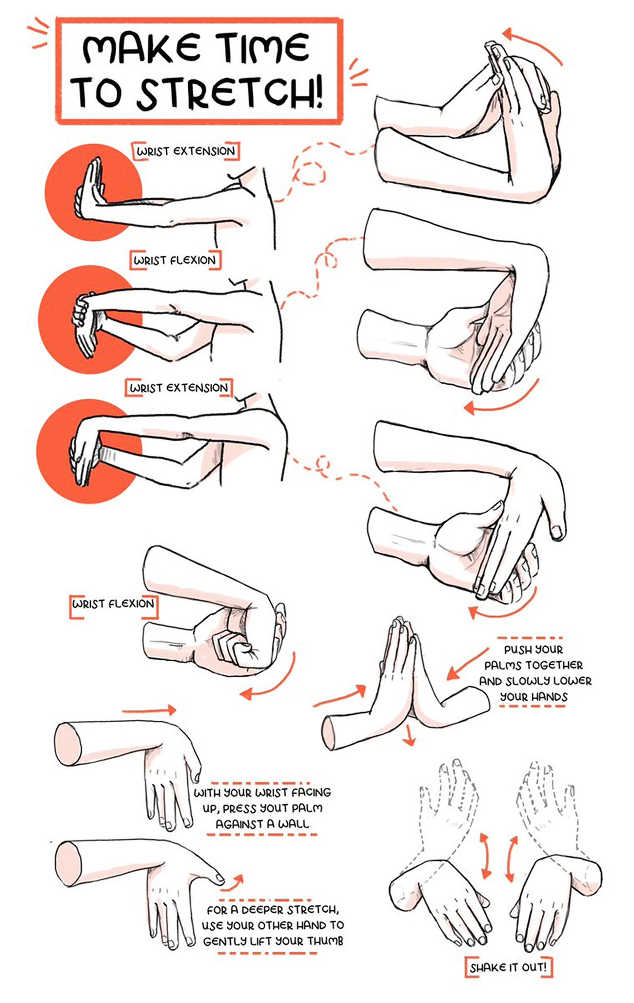
To help keep your paws in tip-top shape, comic artist Kaitlin Bruder has put together the infographic below, detailing a number of hand and wrist stretches that she does regularly, especially when she's drawing or has been on her phone of computer for a while.

hand exercises infographic

Click the infographic to enlarge it

Kaitlin recommends these exercises for before and after heavy or repetitive hand, wrist or arm activity; "As a baseline i usually do ‘em when I wake up and before I sleep and then as needed through the day," she explains.

If you find these exercises useful and need a more permanent reminder of them, Kaitlin has put them on Redbubble for you to buy them as a poster or a T-shirt, so there's no excuse for having ruined hands.

If this has inspired you to put together your own data visualisation, take a look at our roundup of the best infographic makers around.

Related articles:

The best desks available nowThe best mindfulness appsHow to make a face mask

20 Unmissable Websites, May 2020

Original Source: https://www.webdesignerdepot.com/2020/05/20-unmissable-websites-may-2020/

The world is a strange place at the moment, but design moves on apace, and sites are still being launched.
Every month we post a roundup of the freshest sites we’ve come across in the previous four weeks. This month we’ve included some exciting portfolio sites, a strong selection of health and beauty sites, and some fabulous new takes on technology. Enjoy!

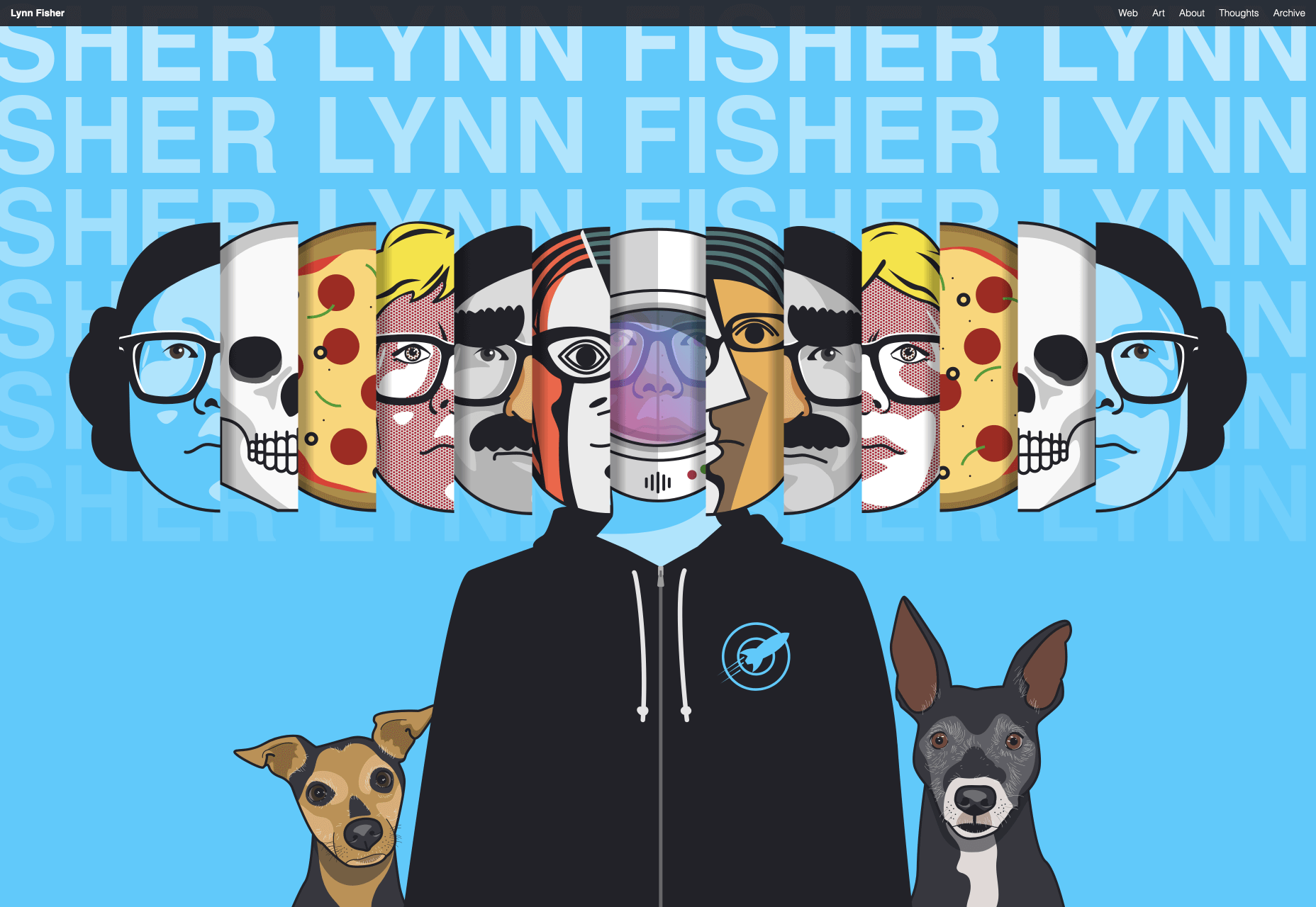
Lynn Fisher

We love the homepage illustration on Lynn Fisher’s website. It’s pretty cool right? Now try resizing your browser window and see what happens. Hats off to her, it’s not often we find such a knowing, humorous, responsive site.

Sonantic

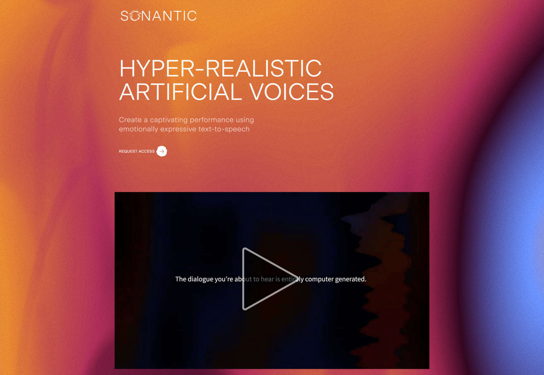
We’ve seen a few sites in the last few months that have tried to present sound visually. Sonantic does a great job of doing exactly that, with an awesome animated logo, gradients, and random texture.

Zand Harirchi Architects

Based in Tehran, Iran, Zand Harirchi is a modern architecture firm with a confidently modern website to match. We can’t get enough of its thumbnails, which as well as piquing interest, are reminiscent of small windows.

Amino Mason

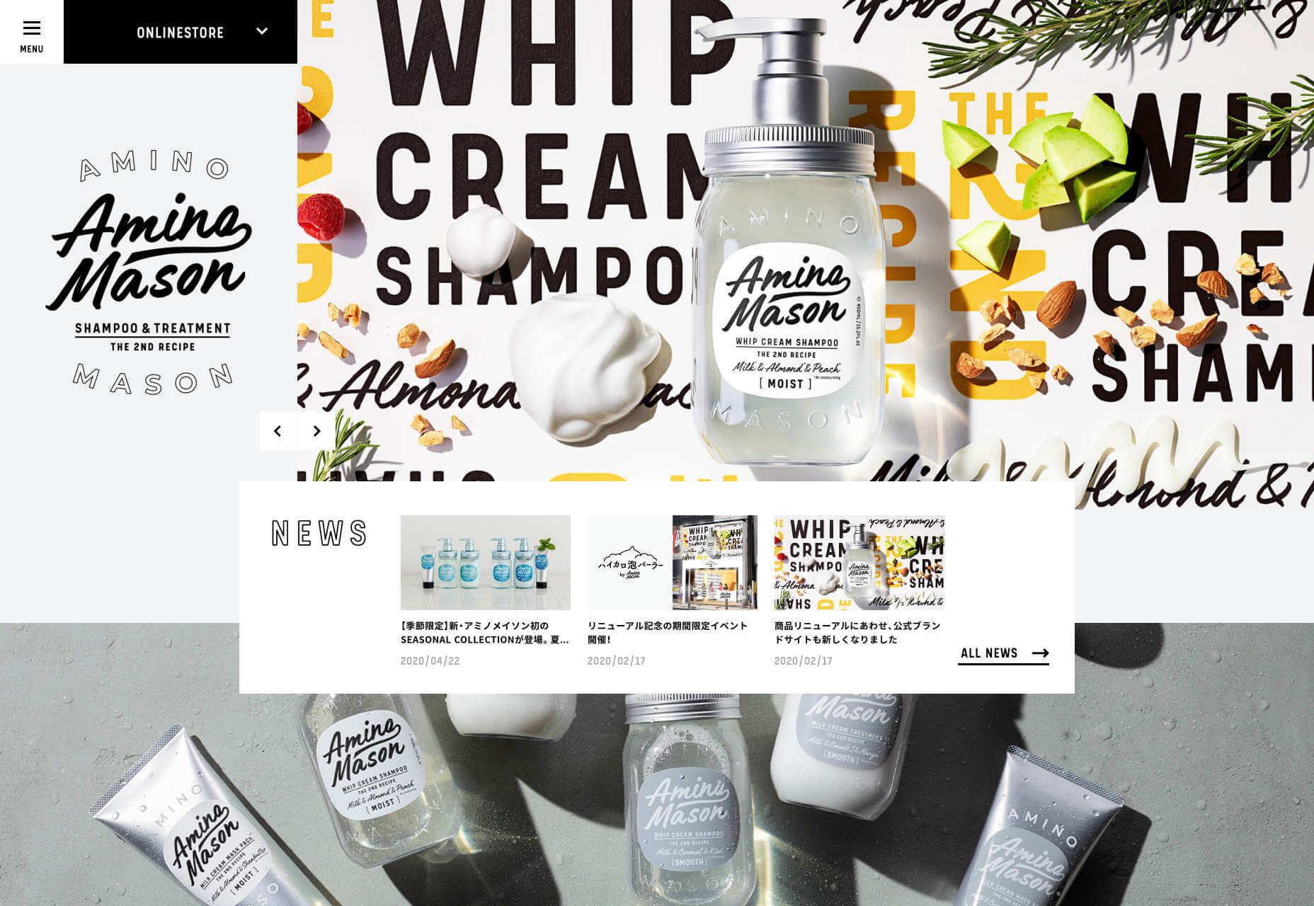
If you’re designing for a health & beauty product, the obvious route is clean and minimal. Amino Mason has gone the other route, producing a site that screams energy. It’s the epitome of modern Japanese design.

Cone

How many sites have you seen for apps that feature a small demo of the app inside a hastily debranded iPhone window? Now look at how expansive, and how filled with potential Cone feels precisely because it isn’t confined.
Queen Garnet

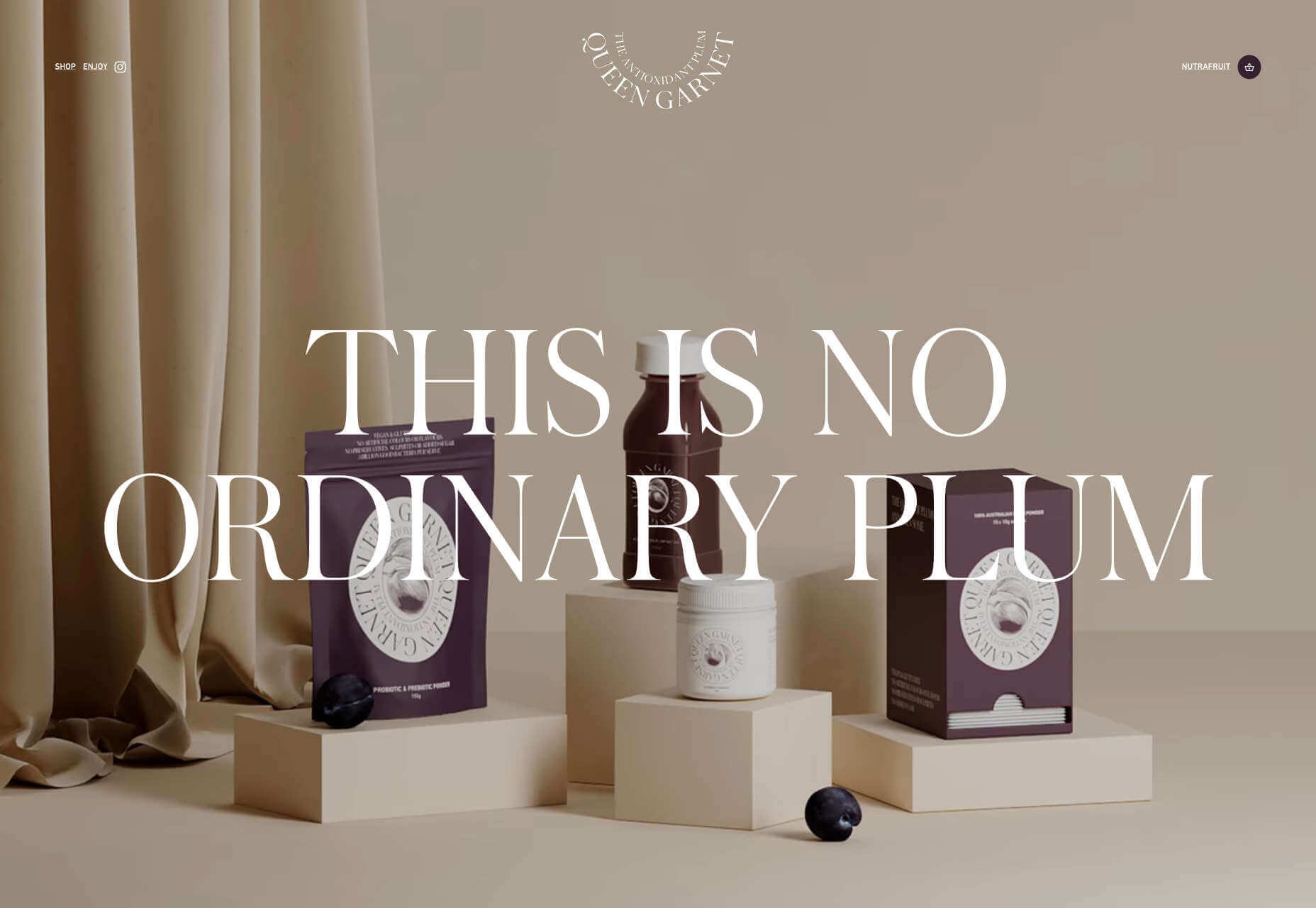
There are two things that make Queen Garnet stand out in its market. The first thing is the excellent brand typography that is completely different to the usual choice of sans-serif. The second thing is the beautiful product photography.

Mike John Otto

Mike John Otto is a designer, creative director, and artist. His portfolio leans towards high-end sound clients, which helps to explain the hypnotic wave form that fluctuates behind the content of this beautifully designed site.

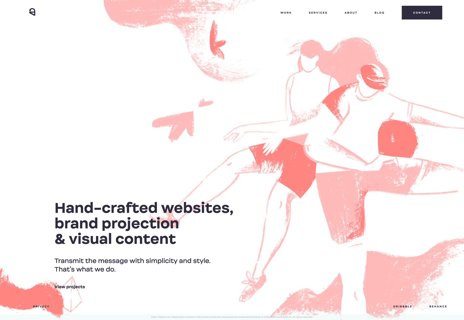
Ester

We love the hand-drawn quality of the illustrations and animations on Ester’s site. The color scheme feels modern and suitably unisex, and we like the way its portfolio is presented in a straightforward, no-nonsense manner.

Goodfish

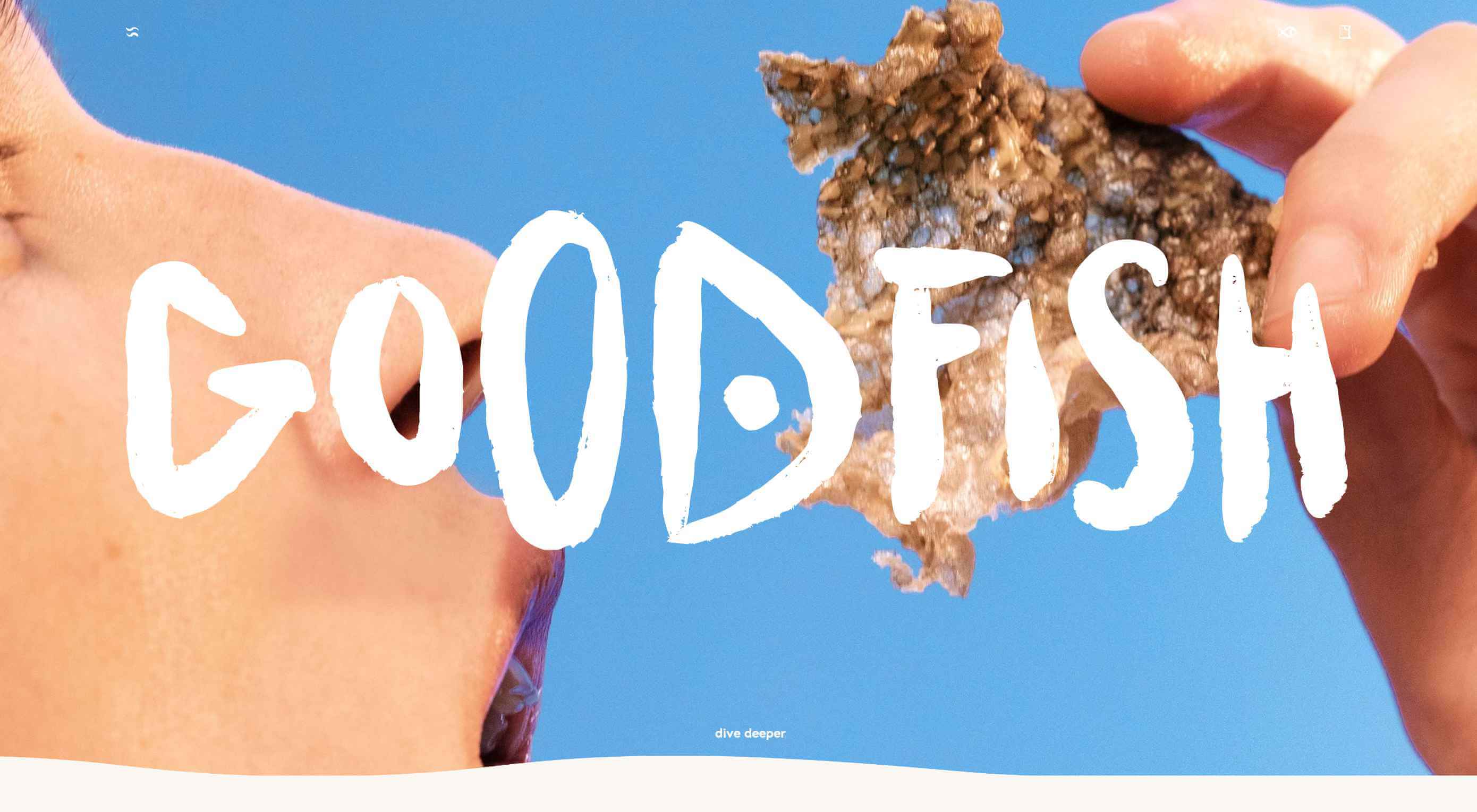
Crispy fish skins don’t leap to mind when we’re planning which chips to buy, but that’s what Goodfish is selling. The lettering, artwork, and copy are all enough to make us at least try it. Who knows, perhaps the taste matches the health benefits.

Limnia

Limnia is a making a name for itself in fashion circles for its modular jewellery. Its site does a great job of showcasing its product range with fullscreen video, and we love the way the content is divided up with a strong grid to mimic the product’s modularity.

Outer Reach

Stretching is so important for our physical, and mental health, but so many of us get it wrong, or don’t bother at all. Outer Reach is aiming to change that, and we love the way its hero video rotates through perspectives, as if we were already stretching.

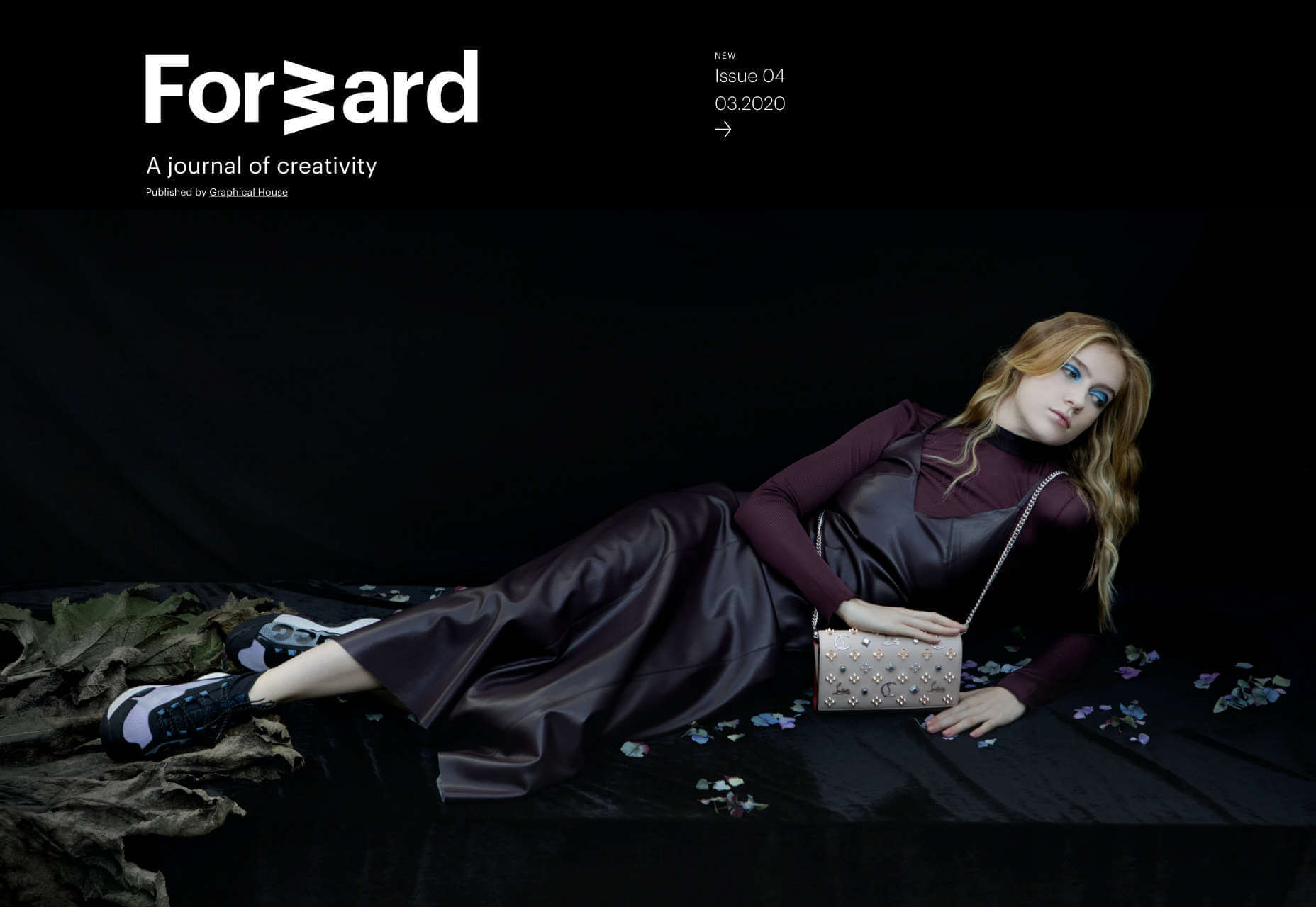
Forward

Forward Journal is an online magazine dedicated to creativity. Unlike most blogs out there, it publishes rarely, and in editions, giving it the feel of a traditional print magazine and heightening the sense of occasion by limiting availability.

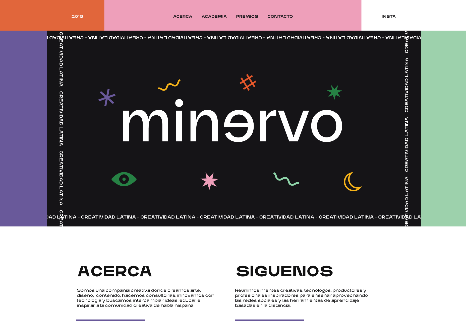
Minervo

There’s a distinctly latin feel to the Minervo website from Ecuador. The hot pinks and the sun-blasted desaturation of the color scheme feels suitably South American. We love the cropping on the custom typeface.

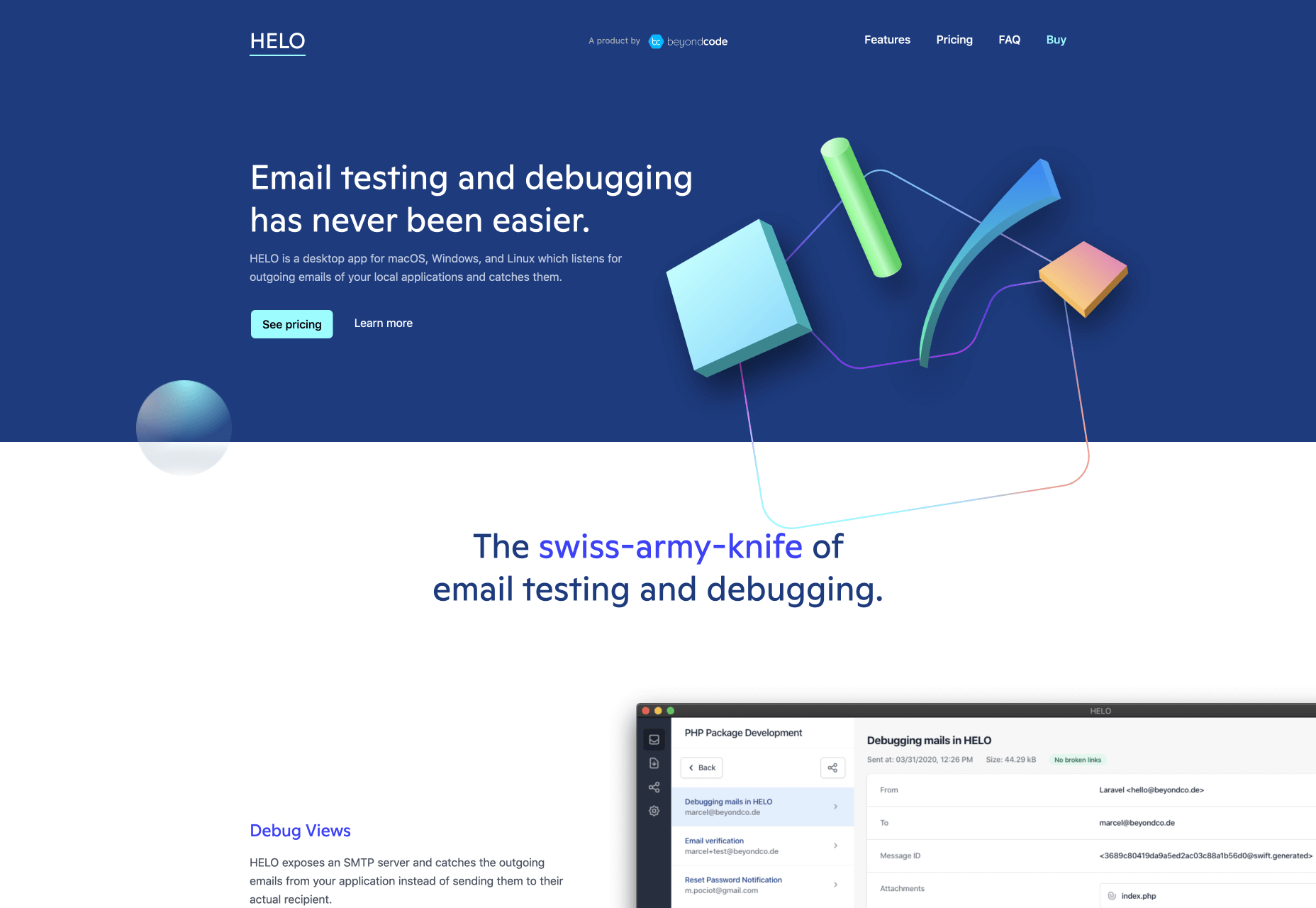
Helo

If there’s one thing we hate more than coding for IE, it’s coding for email. Helo is an email testing and debugging tool. Its site is an excellent example of how to do responsive design right.

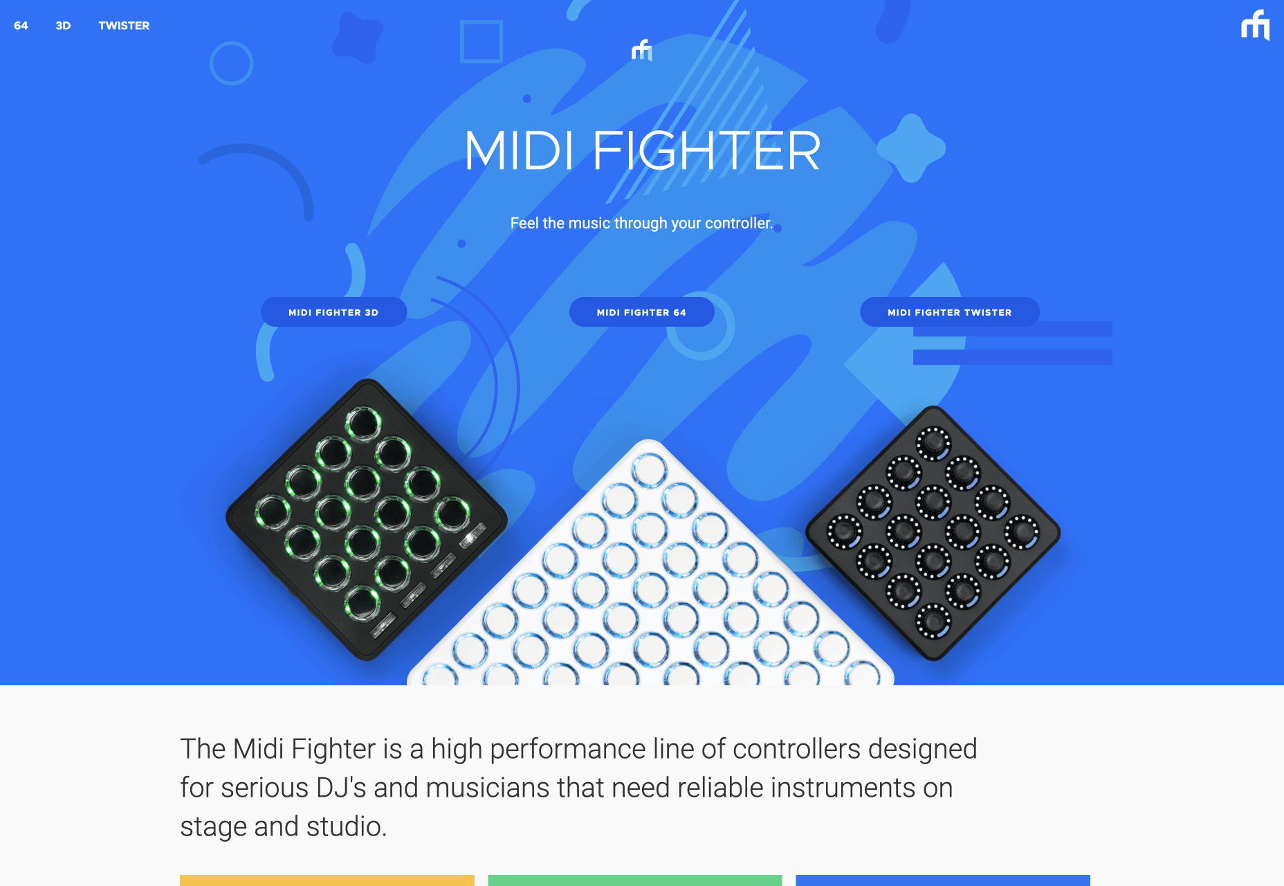
Midi Fighter

Midi Fighter make a range of physical inputs for DJs and musicians who need reliable, and fun equipment for performing. The colorful site uses subtle illustration to expertly add dynamism to otherwise static product shots.

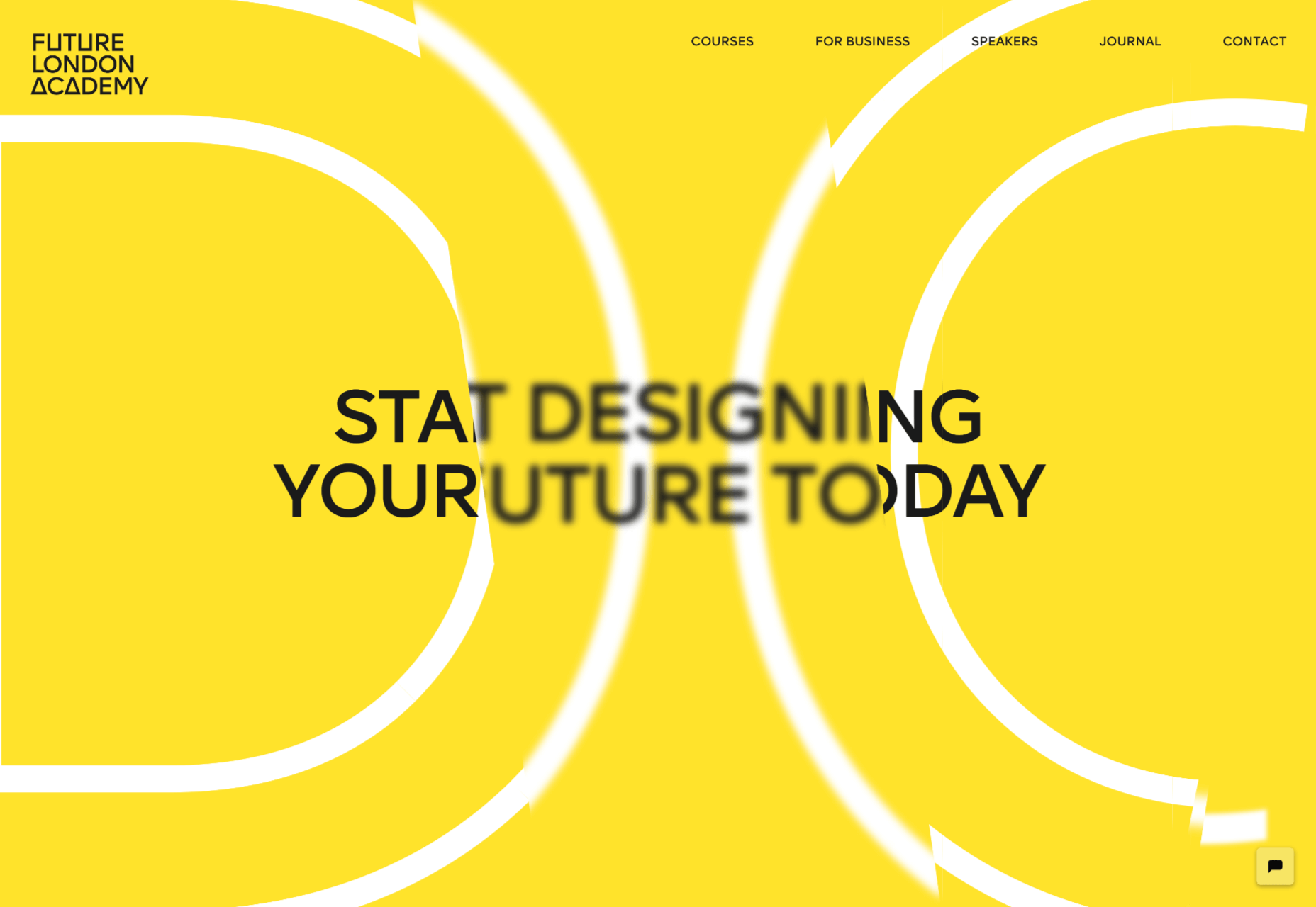
Future London Academy

There’s a long-standing, and highly respected tradition in this blog series that anyone who makes good use of yellow gets in. Future London Academy certainly does that, but what we really love here is the depth created by the typography.

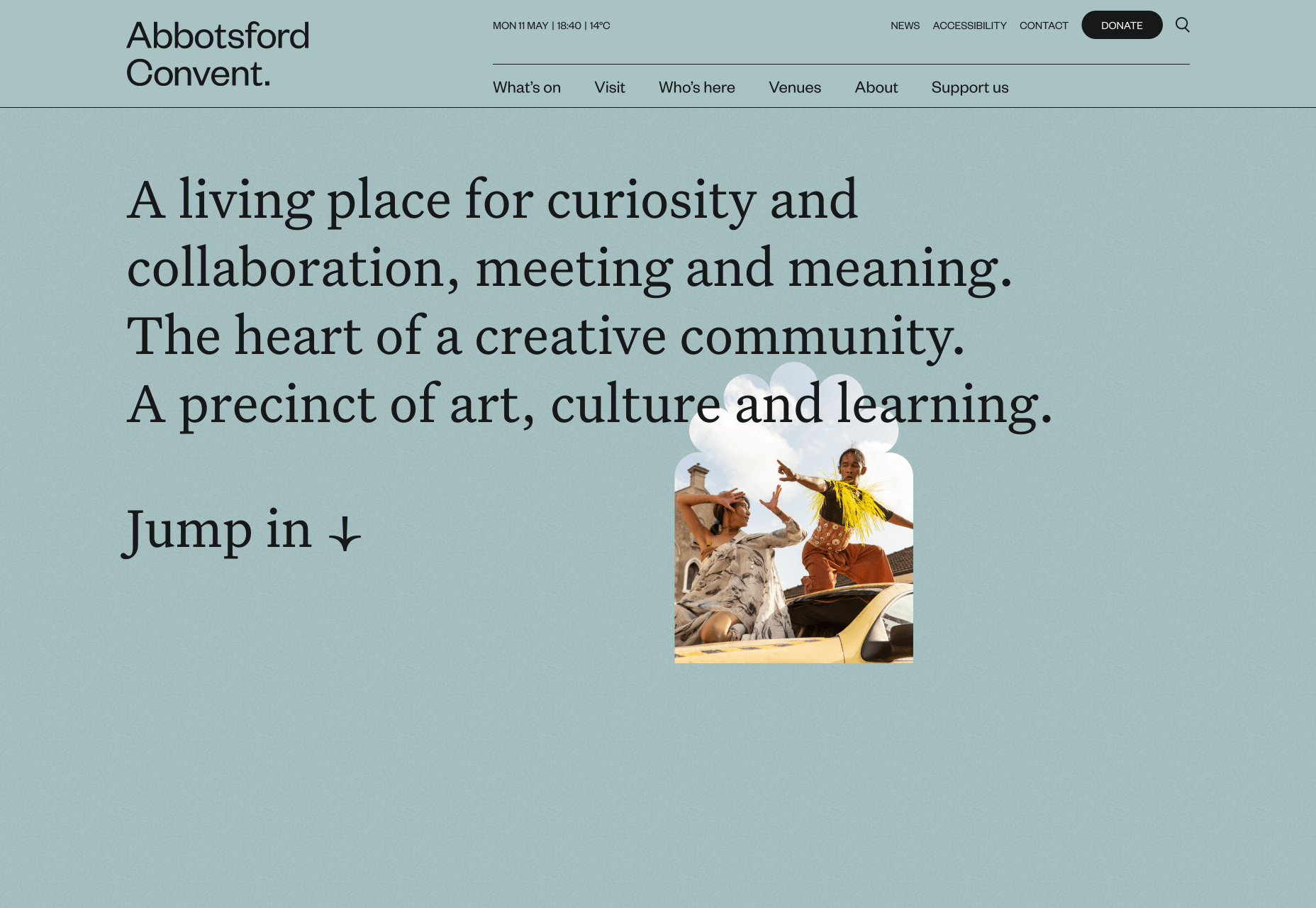
Abbotsford Convent

Abbotsford Convent is a creative arts venue in Melbourne, Australia, situated in a former convent building. To honor the heritage the shapes employed in the UI blend creative motion, with architectural forms.

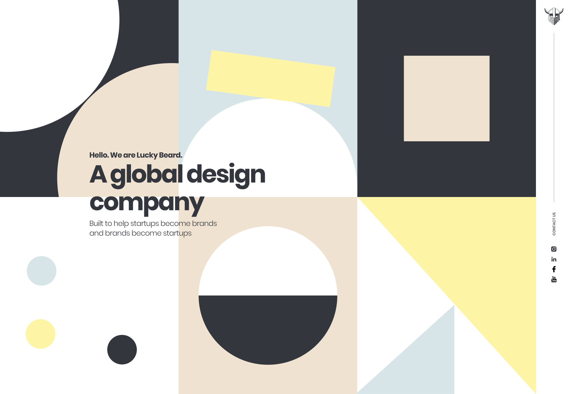
Lucky Beard

Lucky Beard has a surprisingly restrained color palette considering its penchant for bold statements. It’s hard to go wrong with animated geometry, and we really like the fact that the navigation has been relocated to the right.

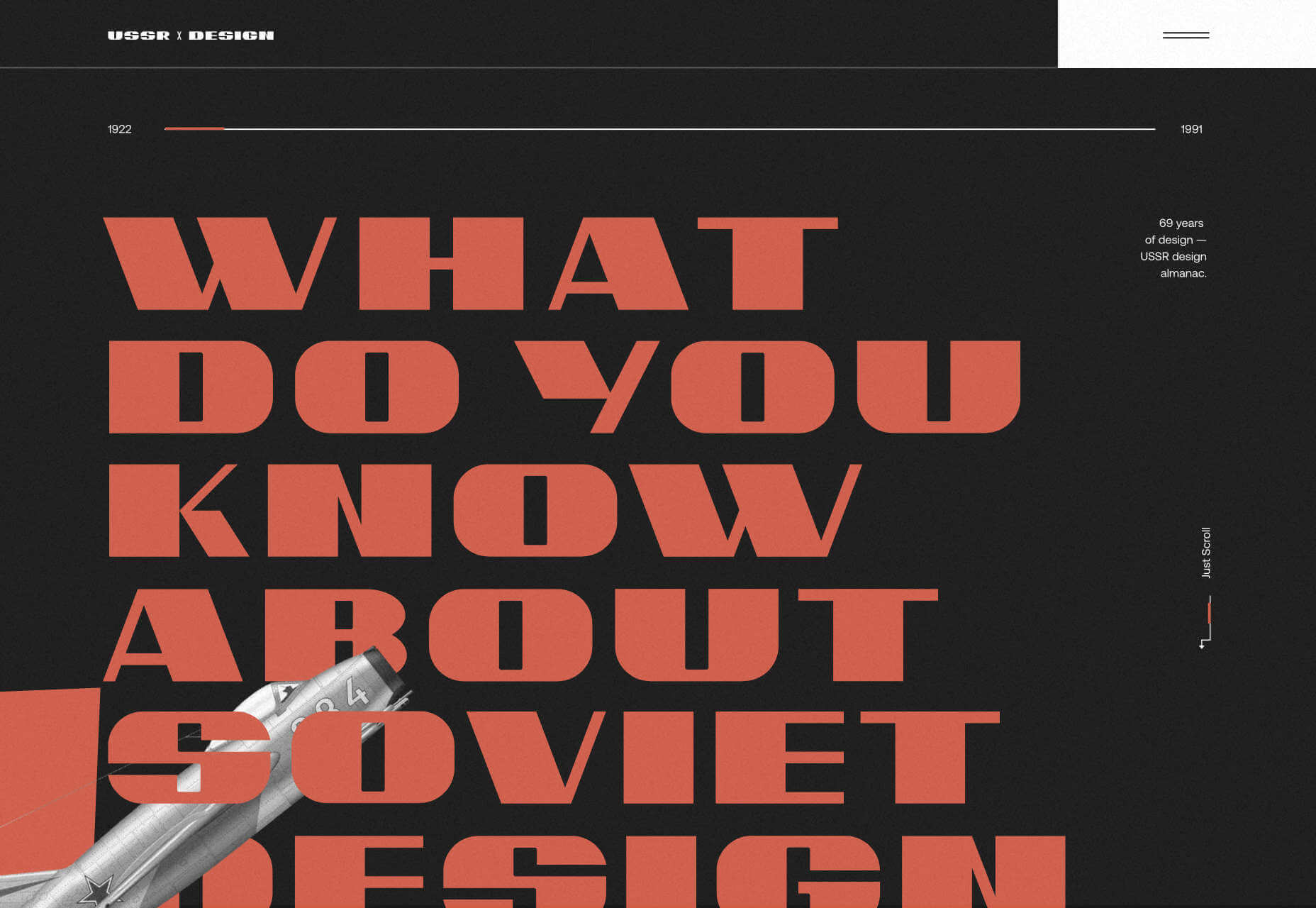
USSR Design Almanac

The Soviet Union was, for a brief period — before Stalin denounced modernism as decadent — the world’s first design super-power. The USSR Design Almanac is a fascinating overview of this extraordinary, and often overlooked history.

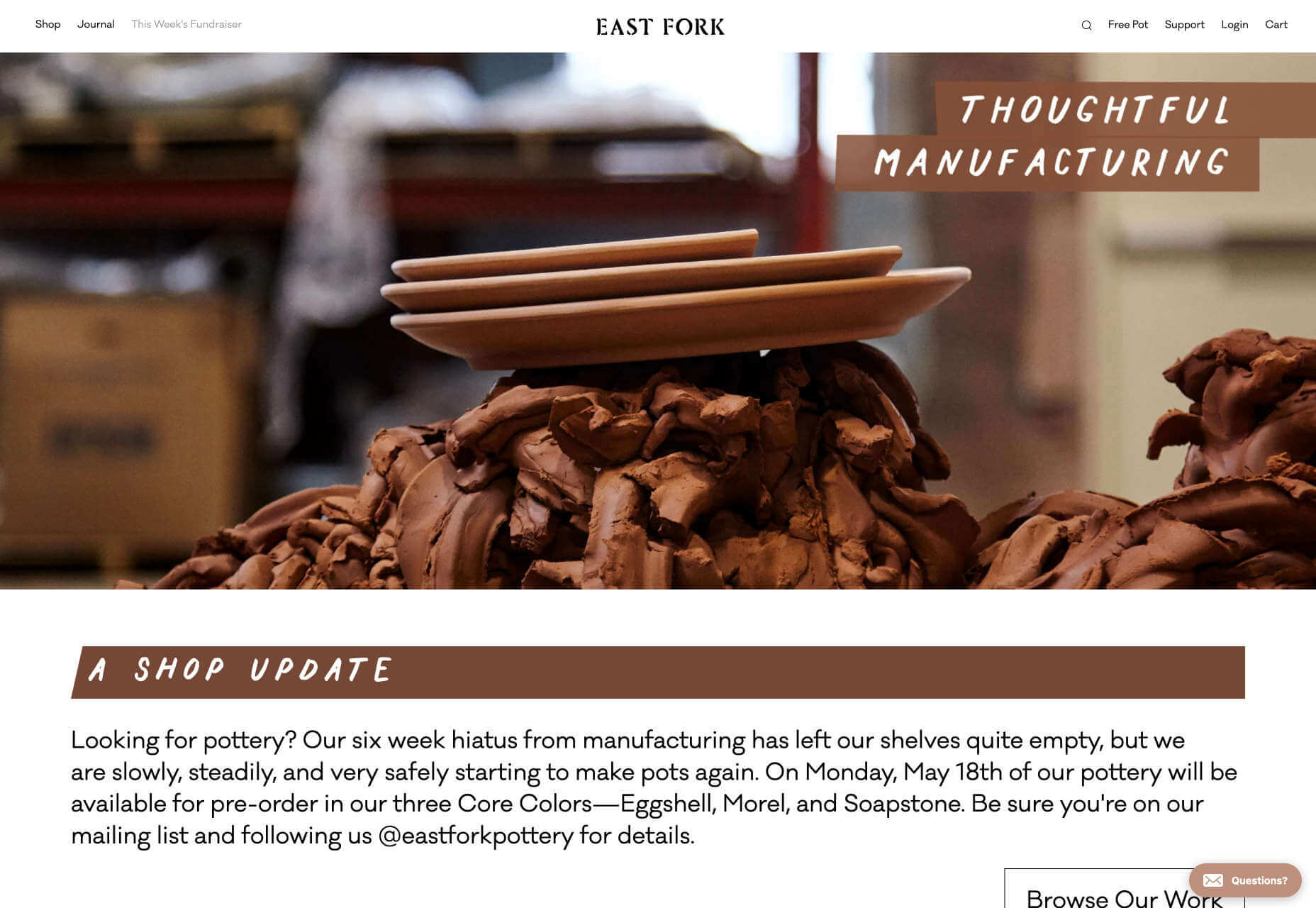
East Fork

Okay we admit it, when we first came across East Fork’s website we thought it was about chocolate. Look closer and you’ll see these guys offer some really high-class home products, not least their unique pottery.

Source

p img {display:inline-block; margin-right:10px;}
.alignleft {float:left;}
p.showcase {clear:both;}
body#browserfriendly p, body#podcast p, div#emailbody p{margin:0;}

8 Top WordPress Multipurpose Themes and Their Cool Features

Original Source: https://www.sitepoint.com/top-wordpress-multipurpose-themes/?utm_source=rss

8 Top WordPress Multipurpose Themes and their Cool Features

This sponsored article was created by our content partner, BAW Media. Thank you for supporting the partners who make SitePoint possible.

Some look upon multipurpose WordPress themes as website building tools that can accomplish a lot but that also have their limitations.

Their argument is that multipurpose themes spread themselves too thin. It’s like saying that if you can do one thing very well, you can do two things only half as well.

That simply doesn’t hold water. Today’s multipurpose themes — especially the top-tier themes like those described below — can manage virtually any website building challenge you throw at them and meet your grandest expectations — every time.

Since doing is believing, we suggest you give the following themes a closer look and give one or two a try!

You won’t be disappointed.
1. BeTheme – Responsive Multi-Purpose WordPress Theme
BeTheme – Responsive Multi-Purpose WordPress Theme

We’ll start with the biggest WordPress theme of them all. Any of BeTheme’s library of 500+ websites can get a website building project off the ground in nothing flat. They are customizable, so once you’ve substituted your own content the website-building job is nearly done.

These pre-built websites

are customizable
cover 30+ industry sectors, a host of business niches, and every website type
are attractive and feature professionally designed layouts
have built-in UX functionality that subscribes to the latest UX trends

The pre-built website collection is only one of BeTheme’s 40+ core features that give users a power-packed design toolbox to work with, which includes:

the Layout Generating tool for creating a layout of your own design
the powerful drag and drop Muffin Builder/editor
an Admin/Options panel that gives users maximum design flexibility and eliminates any need for coding
header, footer, and grid options, color palettes, and a host of design options and elements including shortcodes
blog, portfolio, and shop page layouts

BeTheme is one of the top three best-selling themes on the market. Click on the banner to learn more about this popular website-building tool.

2. Total WordPress Theme

Total WordPress Theme

A challenge multipurpose theme authors constantly face is that, when designing a sophisticated, multi-functional tool, they also have to make it reasonably easy to learn and use.

Total is truly feature-rich, but it has been designed in such a way that first-time users with little or no design experience have no trouble using it, while all the features and functionalities more advanced users would expect are there and ready to use.

Total effectively promotes a building block or modular design approach combined with an easy drag-and-drop page builder (WPBakery).
Users have ready access to all-inclusive selections of 40+ pre-made demos and 80+ building modules and 500+ styling options, in addition to unlimited colors and custom fonts and icons.
It includes WooCommerce, Revolution Slider, LayerSlider, and Templatera plugins with supportive building blocks.
You’ll also find shortcodes for forms and menus.
Total is responsive, translation ready, and child-theme ready.

Click on the banner to check out Total’s many other useful features.

3. Avada Theme

Avada Theme

Avada has been on the market long enough to become the world’s all-time best selling theme. The real reason for this isn’t the length of time it’s been available, but rather what it has to offer. Avada’s robust framework gives users the ability to design anything they want, the way they want it.

Avada is incredibly fast, offers front-end editing, and is packed with demos, partial demos, pre-built websites, and design elements.
Avada’s drag-and-drop builder of choice is Fusion Builder.
The Dynamic Content System provides unparalleled flexibility.
Theme and Page Options give you full control over your design and eliminate any need for coding.
The Fusion Core toolbox is Avada’s engine.
Avada is 100% WooCommerce ready.

Click on the banner to learn more.

4. Kalium

Kalium

Super easy to use and maintain, Kalium is a creative, multipurpose theme that’s particularly ideal for blog and portfolio website design.

Kalium is fast, 100% responsive to every screen size, and GDPR compliant.
Kalium supports all the popular WordPress plugins.
WPBakery Page Builder, Elementor, Slider Revolution, and WooCommerce plugins are included.
Users can expect first-class Customer Support.
It’s a favorite of 35,000 clients.

Click on the banner to learn more.

Continue reading
8 Top WordPress Multipurpose Themes and Their Cool Features
on SitePoint.

16 Pitch Deck Templates You Need to See

Original Source: http://feedproxy.google.com/~r/1stwebdesigner/~3/QTgx9Xm_JF0/

When you find the need to put together a presentation, it’s vital to have a solid template at your disposal. This is especially the case when preparing a pitch deck. After all, this is going to be someone’s first impression of you, your business, or your project. It’s key that whatever template you choose is high-quality and eye-catching.

That’s why we’ve done the hard part for you and sourced 16 pitch deck templates that offer real functionality and look great doing it. Each of these have a slightly different look that can be utilized for a wide range of businesses or projects.

Your Web Designer Toolbox
Unlimited Downloads: 500,000+ Web Templates, Icon Sets, Themes & Design Assets


DOWNLOAD NOW

Pitch Deck Keynote Presentation

Example of Pitch Deck Keynote Presentation

This pitch deck offers a clean layout with a definitive style that can serve your presentation well. It’s got a lot of whitespace but plenty of key feature sections that can make your content stand out.

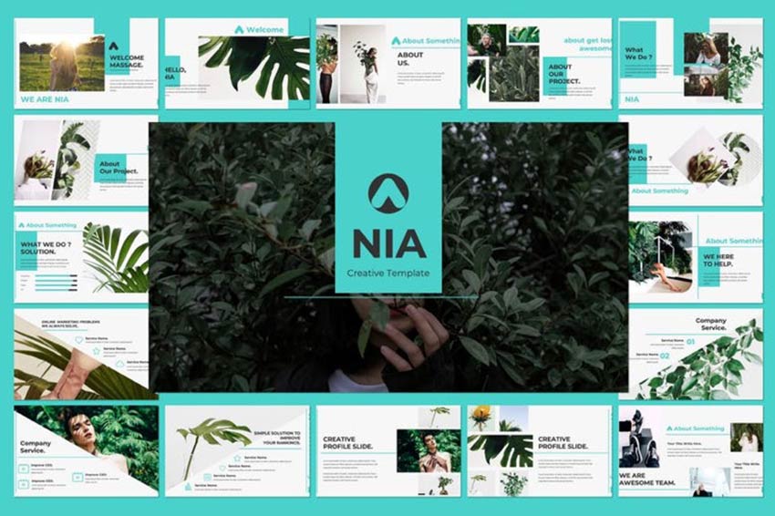
Nia Pitch Deck

Example of Nia Pitch Deck

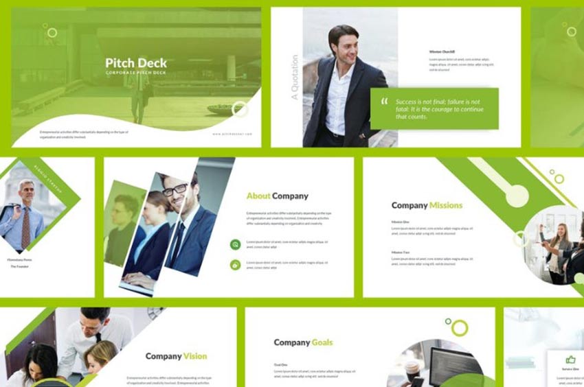
The Nia Pitch Deck is lovely to look at. The layouts utilize angles to stunning effect to make your content look unique. It can be used for corporate work but skips the traditional boxy design.

Business Pitch Deck Keynote

Example of Business Pitch Deck Keynote

Another option is the Business Pitch Deck Keynote. This one makes stunning use of a grayscale layout with colorful punctuation to make a statement.

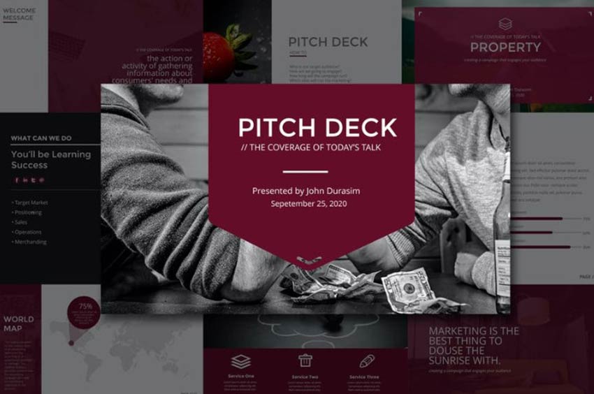
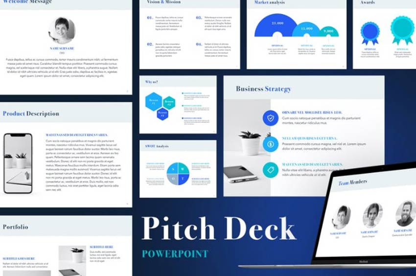
Pitch Deck Powerpoint Template

Example of Pitch Deck Powerpoint Template

If you’re looking for something clean, the Pitch Deck PowerPoint Template is a nice choice. Create bulleted lists, colorful charts, graphs, icons, and more.

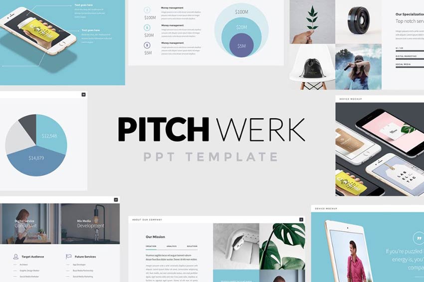
Pitch Werk

Example of Pitch Werk

Pitch Werk is another great option for making a presentation that makes an impact. Drop shadow effects on images, unique chart options, and image gallery layouts offer diversity in presentation.

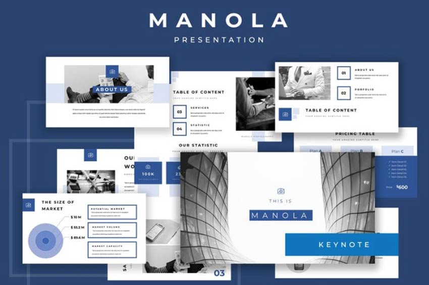
Manola Pitch Deck Keynote Presentation

Example of Manola Pitch Deck Keynote Presentation

Or you can use the Manola presentation that offers an all-business pitch deck layout that gets your point across without being boring.

Lyon – Presentation Deck Template

Example of Lyon - Presentation Deck Template

The Lyon pitch deck is super simple but has the benefit of offering plenty of color options for backgrounds, text, and charts.

Pitch Deck Powerpoint Template

Example of Pitch Deck Powerpoint Template

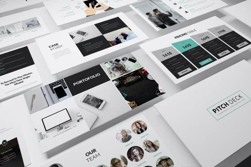
Your pitch deck will look professional and sophisticated if you use this option. It offers interesting design elements, however, that make it stand out. Check out the angular graphics on that pricing table slide, for instance.

Matrix – Minimal Powerpoint Presentation Template

Example of Matrix - Minimal Powerpoint Presentation Template

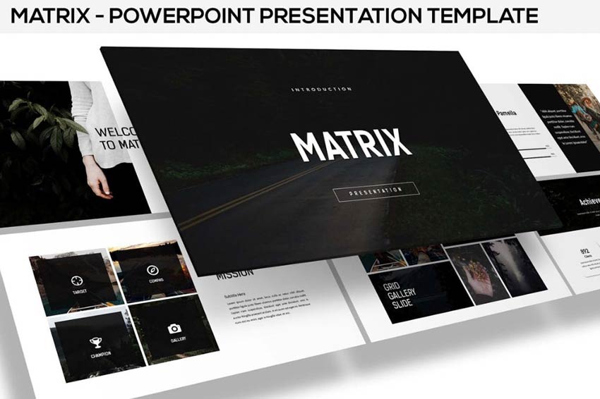
If a darker look is more your thing, the Matrix PPT is lovely. Use full-width images, add delicate overlaid text and icons and more to get the effect you want.

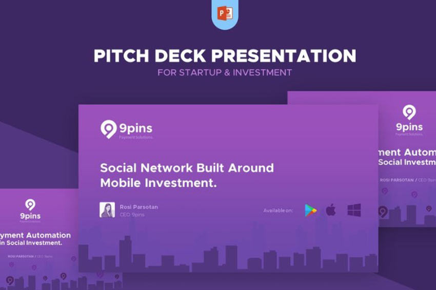
Startup Pitch Deck Presentation

Example of Startup Pitch Deck Presentation

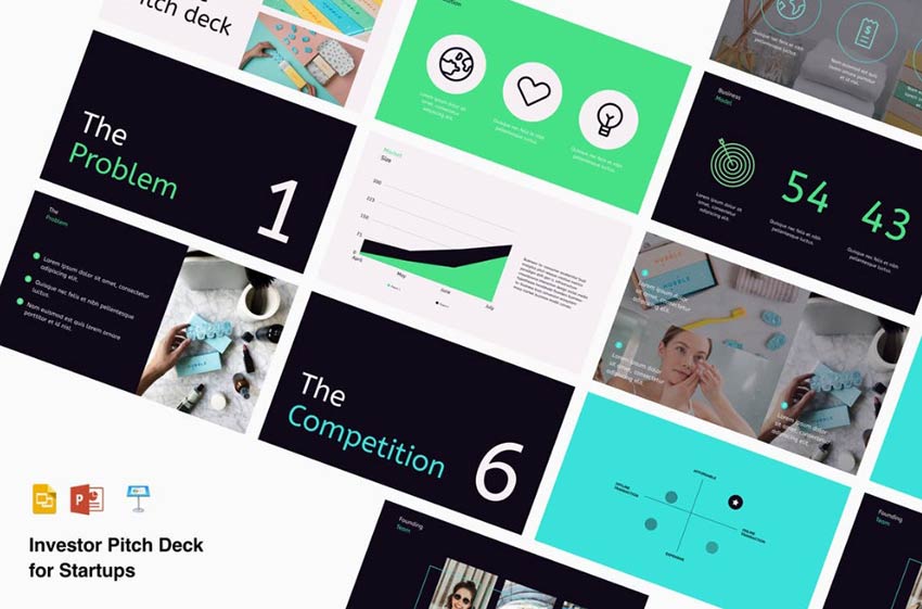
The Startup Pitch Deck Presentation offers plenty of colorful backgrounds, text options, and stylized numbering and graphics to keep your audience engaged.

Pitch Deck

Example of Pitch Deck

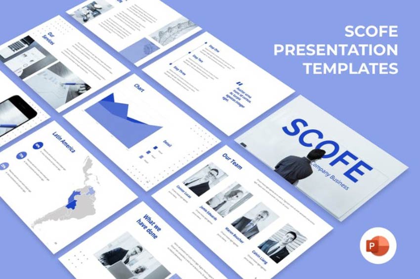
The Scofe Pitch Deck is corporate-looking, with lots of whitespace, room for charts and maps, as well as a unified color story.

Pitch Deck Powerpoint Template

Example of Pitch Deck Powerpoint Template

Another option worth checking out is this Pitch Deck PowerPoint Template. With curved graphical elements and interesting image segmentation, your presentation will be as engaging as it is informative.

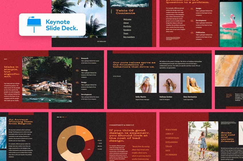
Pitch Deck Keynote Template

Example of Pitch Deck Keynote Template

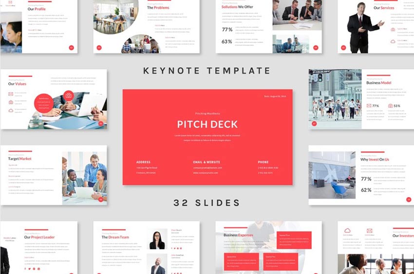
This option includes 32 slides with a variety of style and layout choices. Include images, statistics, maps, charts and graphs, image overlays, bullet points, and more.

Spielburg – Pitch Deck

Example of Spielburg - Pitch Deck

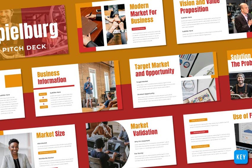
Still another choice is this Spielburg pitch deck. Its large, bold headings make it easy for your audience to stay abreast of the topic at hand. In addition, the easy flow of information is concise and attractive.

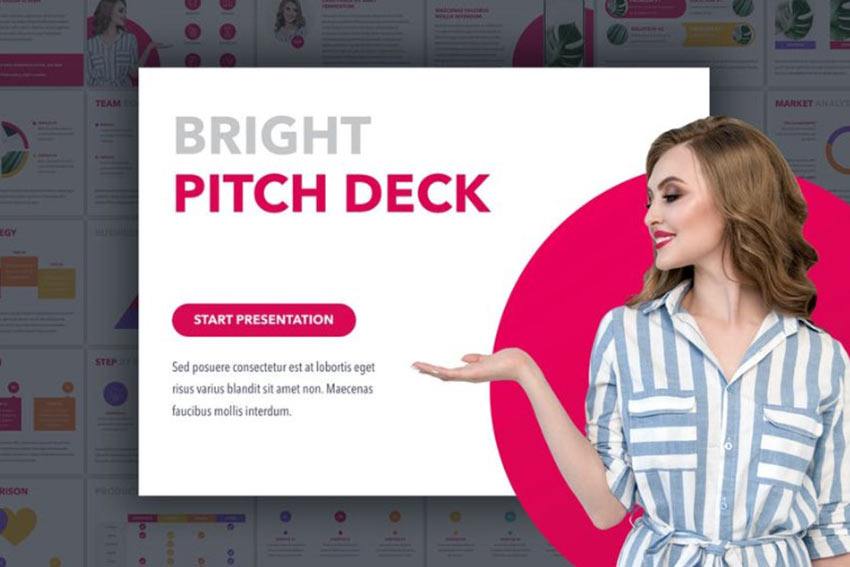
Bright Pitch Deck Keynote

Example of Bright Pitch Deck Keynote

You may also wish to consider the Bright Pitch Deck, which uses bold and bright colors to draw you in. Who ever said presentations have to be boring?

Fintech Startup Pitch Deck Presentation

Example of Fintech Startup Pitch Deck Presentation

Last on our list is the Fintech Startup Pitch Deck Presentation. This one offers bright, solid color to engage the eye, all while using subtle color variants to overlay text boxes, charts, and graphics. This one uses the best of web design to create a familiar presentation layout that works.

Getting Started with Pitch Deck Templates

Pitch deck templates can help you immensely when trying to put together a presentation that appeals to your target audience. Without it, you’ll be tasked with spending a lot of time custom designing something when you could be spending that time carrying out other operations of your company.

Hopefully, this collection of pitch deck templates will guide you toward an option that suits your needs and truly best represents what you’re about.