Why copywriting is more important than you think

Original Source: http://feedproxy.google.com/~r/CreativeBloq/~3/Gy-Y3KQjAb0/why-copywriting-matters

Copywriting in branding and advertising has always been an important part of the industry, and the role of words in advertising in particular has previously been recognised at the D&AD Awards, with its Writing for Advertising category. 

This year, that category is no more, and many have been left baffled by the decision, or are at least lamenting it. Creative director Jack Davey took to Twitter to show what some famous adverts would look like without the words (below). Spoiler: it's not good. See our favourite print ads for more examples of compelling copy in advertising.

As you can see, these ads are far less impactful without their accompanying copy. In recognition of the role of words in creating powerful branding, the Brand Impact Awards has this year launched a new craft category as part of its awards scheme: copywriting. Two other new craft categories have also been launched: typography and illustration – and you have until 26 June to enter the prestigious awards. 

Brand Impact Awards 2020

Enter your best branding now

Here, judges from the Brand Impact Awards' specialist copywriting panel share how copywriting can define and invigorate a brand, and how you can best use words to shape an identity.

01. Listen and learn

copywriting in branding

Identity for performance space The Roundhouse

"Sometimes we do little more than ask intelligent, informed, pointed questions – and then listen," explains Mike Reed. "Sometimes we use workshop exercises, like pulling up famous faces: one client described how they were currently Scotty (nervous, risk-averse, caught up in technicalities) and wanted to become more Kirk (confident, direct, visionary). Your ears, and what sits between them, are your most effective tools."

02. Don't obsess over tone

"The obsession with 'tone of voice' emphasises tone over content and message, and leads to a lot of wasted investment," argues Nick Asbury. "If you think about the brands who are known for their words – let’s say Jack Daniel's, Innocent and The Economist – then the effectiveness is rooted not so much in the tone, but the content. Given a limited budget, I’d advise any client to pay a good copywriter to write as much real stuff as possible. It's more useful than any tone of voice guidelines."

"Sometimes, brands get caught up in wanting to sound different or show loads of personality through their words, when what they actually need is to be clear and straightforward, and focus on writing well," suggests Kate van der Borgh. "Tone can come afterwards, and it might be very subtle."

03. Don't patronise your audience

copywriting in branding

Vikki Ross has crafted words for Paperchase

"We seem to be going through a phase of products talking to us in the first person," laments Vikki Ross. "You know, 'Fix me, I’m broken'; 'Take me home'; 'Buy me'. Grown-up products like machines, toiletries, champagne. Not stuff for kids, but copy like this looks like it's aimed at kids. Too twee for me."

04. Make the most of microcopy

copywriting in branding

Every word counts, as this work for Upcircle shows

"Turning an Innocent carton over to find ’Stop looking at my bottom’ remains a delight," says Reed. "But it doesn’t have to be silly. The little line of explanation under a data-entry field can be just as pleasing, if it perfectly anticipates the question forming in your head. Or if it adds a fun little twist to the process. Or – joy of joys – both."

05. Stay consistent

"Tricky things, like letters to customers apologising for something going wrong, are super important bits of brand writing," insists van der Borgh. "You see it all the time: a brand is all warm and friendly in its welcome email, but stern and overly-formal when something goes wrong. It's like a mask slipping, and it doesn't help build trust."

06. Consider something different

copywriting in branding

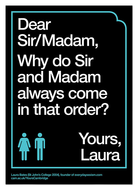
Part of a campaign for University of Cambridge

"Most brands stick to a narrow range in the tone of voice spectrum – somewhere around friendly, professional, warm, human," says Asbury. "But what would a sarcastic or miserable brand sound like? Could a brand be inexplicably angry with you? In a world of nice smoothies, a miserable or stoical one would stand out."

07. Stay in character

"Brands that stay true to their personality for years see results," says Ross. "Take the opportunity to make things like call-to-action buttons feel yours. For instance, Virgin Atlantic says 'Take me there' instead of 'Book now'. 'Book now' may result in more clicks, but that's for a newer brand that must be more direct with its audience at first. If brands start talking formally and functionally when they don’t usually, it puts usual customers off."

Submit your best copywriting in branding to the Brand Impact Awards by 26 June.

Read more:

5 steps to building a strong brand voiceBrand typography: a complete guideComputer Arts survived by the Brand Impact Awards

Better Reducers With Immer

Original Source: https://www.smashingmagazine.com/2020/06/better-reducers-with-immer/

Better Reducers With Immer

Better Reducers With Immer

Chidi Orji

2020-06-16T12:30:00+00:00
2020-06-16T13:04:33+00:00

As a React developer, you should be already familiar with the principle that state should not be mutated directly. You might be wondering what that means (most of us had that confusion when we started out).

This tutorial will do justice to that: you will understand what immutable state is and the need for it. You’ll also learn how to use Immer to work with immutable state and the benefits of using it.
You can find the code in this article in this Github repo.

Immutability In JavaScript And Why It Matters

Immer.js is a tiny JavaScript library was written by Michel Weststrate whose stated mission is to allow you “to work with immutable state in a more convenient way.”

But before diving into Immer, let’s quickly have a refresher about immutability in JavaScript and why it matters in a React application.

The latest ECMAScript (aka JavaScript) standard defines nine built-in data types. Of these nine types, there are six that are referred to as primitive values/types. These six primitives are undefined, number, string, boolean, bigint, and symbol. A simple check with JavaScript’s typeof operator will reveal the types of these data types.

console.log(typeof 5) // number
console.log(typeof ‘name’) // string
console.log(typeof (1 < 2)) // boolean
console.log(typeof undefined) // undefined
console.log(typeof Symbol('js')) // symbol
console.log(typeof BigInt(900719925474)) // bigint

A primitive is a value that is not an object and has no methods. Most important to our present discussion is the fact that a primitive’s value cannot be changed once it is created. Thus, primitives are said to be immutable.

The remaining three types are null, object, and function. We can also check their types using the typeof operator.

console.log(typeof null) // object
console.log(typeof [0, 1]) // object
console.log(typeof {name: ‘name’}) // object
const f = () => ({})
console.log(typeof f) // function

These types are mutable. This means that their values can be changed at any time after they are created.

You might be wondering why I have the array [0, 1] up there. Well, in JavaScriptland, an array is simply a special type of object. In case you’re also wondering about null and how it is different from undefined. undefined simply means that we haven’t set a value for a variable while null is a special case for objects. If you know something should be an object but the object is not there, you simply return null.

To illustrate with a simple example, try running the code below in your browser console.

console.log(‘aeiou’.match(/[x]/gi)) // null
console.log(‘xyzabc’.match(/[x]/gi)) // [ ‘x’ ]

String.prototype.match should return an array, which is an object type. When it can’t find such an object, it returns null. Returning undefined wouldn’t make sense here either.

Enough with that. Let’s return to discussing immutability.

According to the MDN docs:

“All types except objects define immutable values (that is, values which can’t be changed).”

This statement includes functions because they are a special type of JavaScript object. See function definition here.

Let’s take a quick look at what mutable and immutable data types mean in practice. Try running the below code in your browser console.

let a = 5;
let b = a
console.log(`a: ${a}; b: ${b}`) // a: 5; b: 5
b = 7
console.log(`a: ${a}; b: ${b}`) // a: 5; b: 7

Our results show that even though b is “derived” from a, changing the value of b doesn’t affect the value of a. This arises from the fact that when the JavaScript engine executes the statement b = a, it creates a new, separate memory location, puts 5 in there, and points b at that location.

What about objects? Consider the below code.

let c = { name: ‘some name’}
let d = c;
console.log(`c: ${JSON.stringify(c)}; d: ${JSON.stringify(d)}`) // {“name”:”some name”}; d: {“name”:”some name”}
d.name = ‘new name’
console.log(`c: ${JSON.stringify(c)}; d: ${JSON.stringify(d)}`) // {“name”:”new name”}; d: {“name”:”new name”}

We can see that changing the name property via variable d also changes it in c. This arises from the fact that when the JavaScript engine executes the statement, c = { name: ‘some name’ }, the JavaScript engine creates a space in memory, puts the object inside, and points c at it. Then, when it executes the statement d = c, the JavaScript engine just points d to the same location. It doesn’t create a new memory location. Thus any changes to the items in d is implicitly an operation on the items in c. Without much effort, we can see why this is trouble in the making.

Imagine you were developing a React application and somewhere you want to show the user’s name as some name by reading from variable c. But somewhere else you had introduced a bug in your code by manipulating the object d. This would result in the user’s name appearing as new name. If c and d were primitives we wouldn’t have that problem. But primitives are too simple for the kinds of state a typical React application has to maintain.

This is about the major reasons why it is important to maintain an immutable state in your application. I encourage you to check out a few other considerations by reading this short section from the Immutable.js README: the case for immutability.

Having understood why we need immutability in a React application, let’s now take a look at how Immer tackles the problem with its produce function.

Immer’s produce Function

Immer’s core API is very small, and the main function you’ll be working with is the produce function. produce simply takes an initial state and a callback that defines how the state should be mutated. The callback itself receives a draft (identical, but still a copy) copy of the state to which it makes all the intended update. Finally, it produces a new, immutable state with all the changes applied.

The general pattern for this sort of state update is:

// produce signature
produce(state, callback) => nextState

Let’s see how this works in practice.

import produce from ‘immer’

const initState = {
pets: [‘dog’, ‘cat’],
packages: [
{ name: ‘react’, installed: true },
{ name: ‘redux’, installed: true },
],
}

// to add a new package
const newPackage = { name: ‘immer’, installed: false }

const nextState = produce(initState, draft => {
draft.packages.push(newPackage)
})

In the above code, we simply pass the starting state and a callback that specifies how we want the mutations to happen. It’s as simple as that. We don’t need to touch any other part of the state. It leaves initState untouched and structurally shares those parts of the state that we didn’t touch between the starting and the new states. One such part in our state is the pets array. The produced nextState is an immutable state tree that has the changes we’ve made as well as the parts we didn’t modify.

Armed with this simple, but useful knowledge, let’s take a look at how produce can help us simplify our React reducers.

Writing Reducers With Immer

Suppose we have the state object defined below

const initState = {
pets: [‘dog’, ‘cat’],
packages: [
{ name: ‘react’, installed: true },
{ name: ‘redux’, installed: true },
],
};

And we wanted to add a new object, and on a subsequent step, set its installed key to true

const newPackage = { name: ‘immer’, installed: false };

If we were to do this the usual way with JavaScripts object and array spread syntax, our state reducer might look like below.

const updateReducer = (state = initState, action) => {
switch (action.type) {
case ‘ADD_PACKAGE’:
return {
…state,
packages: […state.packages, action.package],
};
case ‘UPDATE_INSTALLED’:
return {
…state,
packages: state.packages.map(pack =>
pack.name === action.name
? { …pack, installed: action.installed }
: pack
),
};
default:
return state;
}
};

We can see that this is unnecessarily verbose and prone to mistakes for this relatively simple state object. We also have to touch every part of the state, which is unnecessary. Let’s see how we can simplify this with Immer.

const updateReducerWithProduce = (state = initState, action) =>
produce(state, draft => {
switch (action.type) {
case ‘ADD_PACKAGE’:
draft.packages.push(action.package);
break;
case ‘UPDATE_INSTALLED’: {
const package = draft.packages.filter(p => p.name === action.name)[0];
if (package) package.installed = action.installed;
break;
}
default:
break;
}
});

And with a few lines of code, we have greatly simplified our reducer. Also, if we fall into the default case, Immer just returns the draft state without us needing to do anything. Notice how there is less boilerplate code and the elimination of state spreading. With Immer, we only concern ourselves with the part of the state that we want to update. If we can’t find such an item, as in the `UPDATE_INSTALLED` action, we simply move on without touching anything else.

The `produce` function also lends itself to currying. Passing a callback as the first argument to `produce` is intended to be used for currying. The signature of the curried `produce` is

//curried produce signature
produce(callback) => (state) => nextState

Let’s see how we can update our earlier state with a curried produce. Our curried produce would look like this:

const curriedProduce = produce((draft, action) => {
switch (action.type) {
case ‘ADD_PACKAGE’:
draft.packages.push(action.package);
break;
case ‘SET_INSTALLED’: {
const package = draft.packages.filter(p => p.name === action.name)[0];
if (package) package.installed = action.installed;
break;
}
default:
break;
}
});

The curried produce function accepts a function as its first argument and returns a curried produce that only now requires a state from which to produce the next state. The first argument of the function is the draft state (which will be derived from the state to be passed when calling this curried produce). Then follows every number of arguments we wish to pass to the function.

All we need to do now to use this function is to pass in the state from which we want to produce the next state and the action object like so.

// add a new package to the starting state
const nextState = curriedProduce(initState, {
type: ‘ADD_PACKAGE’,
package: newPackage,
});

// update an item in the recently produced state
const nextState2 = curriedProduce(nextState, {
type: ‘SET_INSTALLED’,
name: ‘immer’,
installed: true,
});

Note that in a React application when using the useReducer hook, we don’t need to pass the state explicitly as I’ve done above because it takes care of that.

You might be wondering, would Immer be getting a hook, like everything in React these days? Well, you’re in company with good news. Immer has two hooks for working with state: the useImmer and the useImmerReducer hooks. Let’s see how they work.

Using The useImmer And useImmerReducer Hooks

The best description of the useImmer hook comes from the use-immer README itself.

useImmer(initialState) is very similar to useState. The function returns a tuple, the first value of the tuple is the current state, the second is the updater function, which accepts an immer producer function, in which the draft can be mutated freely, until the producer ends and the changes will be made immutable and become the next state.

To make use of these hooks, you have to install them separately, in addition to the main Immer libarary.

yarn add immer use-immer

In code terms, the useImmer hook looks like below

import React from “react”;
import { useImmer } from “use-immer”;

const initState = {}
const [ data, updateData ] = useImmer(initState)

And it’s as simple as that. You could say it’s React’s useState but with a bit of steroid. To use the update function is very simple. It receives the draft state and you can modify it as much as you want like below.

// make changes to data
updateData(draft => {
// modify the draft as much as you want.
})

The creator of Immer has provided a codesandbox example which you can play around with to see how it works.

useImmerReducer is similarly simple to use if you’ve used React’s useReducer hook. It has a similar signature. Let’s see what that looks like in code terms.

import React from “react”;
import { useImmerReducer } from “use-immer”;

const initState = {}
const reducer = (draft, action) => {
switch(action.type) {
default:
break;
}
}

const [data, dataDispatch] = useImmerReducer(reducer, initState);

We can see that the reducer receives a draft state which we can modify as much as we want. There’s also a codesandbox example here for you to experiment with.

And that is how simple it is to use Immer hooks. But in case you’re still wondering why you should use Immer in your project, here’s a summary of some of the most important reasons I’ve found for using Immer.

Why You Should Use Immer

If you’ve written state management logic for any length of time you’ll quickly appreciate the simplicity Immer offers. But that is not the only benefit Immer offers.

When you use Immer, you end up writing less boilerplate code as we have seen with relatively simple reducers. This also makes deep updates relatively easy.

With libraries such as Immutable.js, you have to learn a new API to reap the benefits of immutability. But with Immer you achieve the same thing with normal JavaScript Objects, Arrays, Sets, and Maps. There’s nothing new to learn.

Immer also provides structural sharing by default. This simply means that when you make changes to a state object, Immer automatically shares the unchanged parts of the state between the new state and the previous state.

With Immer, you also get automatic object freezing which means that you cannot make changes to the produced state. For instance, when I started using Immer, I tried to apply the sort method on an array of objects returned by Immer’s produce function. It threw an error telling me I can’t make any changes to the array. I had to apply the array slice method before applying sort. Once again, the produced nextState is an immutable state tree.

Immer is also strongly typed and very small at just 3KB when gzipped.

Conclusion

When it comes to managing state updates, using Immer is a no-brainer for me. It’s a very lightweight library that lets you keep using all the things you’ve learned about JavaScript without trying to learn something entirely new. I encourage you to install it in your project and start using it right away. You can add use it in existing projects and incrementally update your reducers.

I’d also encourage you to read the Immer introductory blog post by Michael Weststrate. The part I find especially interesting is the “How does Immer work?” section which explains how Immer leverages language features such as proxies and concepts such as copy-on-write.

I’d also encourage you to take a look at this blog post: Immutability in JavaScript: A Contratian View where the author, Steven de Salas, presents his thoughts about the merits of pursuing immutability.

I hope that with the things you’ve learned in this post you can start using Immer right away.

Related Resources

use-immer, GitHub
Immer, GitHub
function, MDN web docs, Mozilla
proxy, MDN web docs, Mozilla
Object (computer science), Wikipedia
“Immutability in JS,” Orji Chidi Matthew, GitHub
“ECMAScript Data Types and Values,” Ecma International
Immutable collections for JavaScript, Immutable.js , GitHub
“The case for Immutability,” Immutable.js , GitHub

Smashing Editorial
(ks, ra, il)
25+ Best Business WordPress Themes In 2020

Original Source: http://feedproxy.google.com/~r/1stwebdesigner/~3/Nq9RQm313XU/

Trying to build a business website can feel daunting at times – especially if building websites is not how you make money. And yes, there are many business WordPress themes available you can use, but even that notion is overwhelming because there are so many to choose from. Lucky for you, we’ve taken some of the effort out of the ordeal by compiling a list of the best business WordPress themes right here.

All of these themes are sourced from Envato Elements and can be downloaded along with thousands more for a subscription starting at $16.50 per month.

UNLIMITED DOWNLOADS: 400,000+ Fonts & Design Assets

Starting at only $16.50 per month!

DOWNLOAD NOW

Pithree

Example of Pithree

The Pithree WordPress theme is fantastic for construction and building-related websites. It’s got a clean design and construction graphics that will suit your needs.

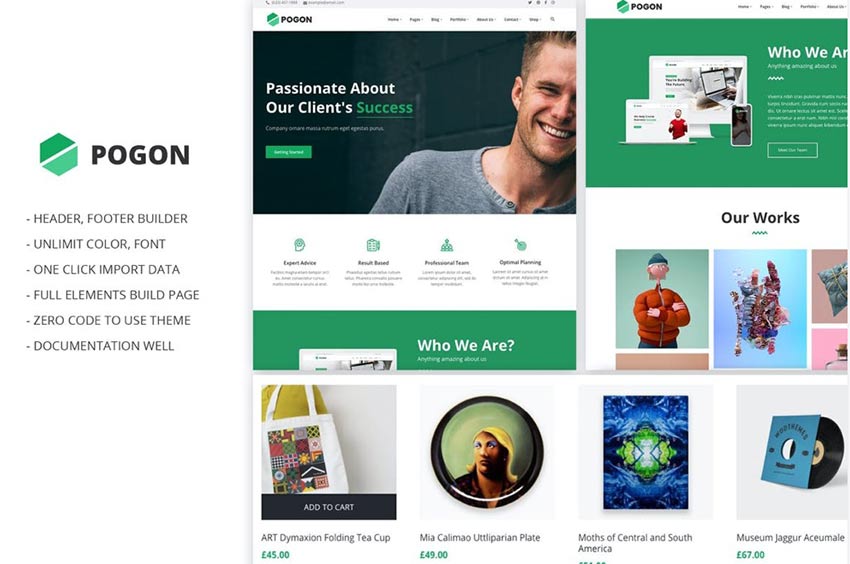
Pogon

Example of Pogon

Another solid choice is the Pogon theme. It’s built for business, finance, and corporate-style websites and has a clean layout that’s appealing to the eye.

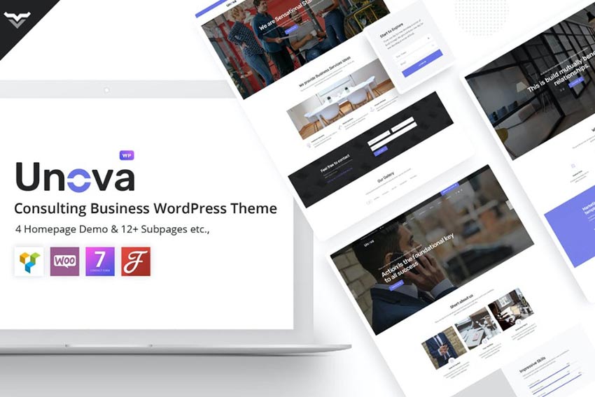
Unova

Example of Unova

Unova is another business theme for WordPress sites, this time with an emphasis on consulting practices. It comes with four homepage demos and 12 subpages, too.

WealthCo

Example of WealthCo

Or, you could opt for WealthCo, a WordPress theme that prioritizes financial websites. With a clean layout, it is actually defined as multipurpose and could be customized to suit any industry.

Busis

Example of Busis

Another option is the Busis WordPress theme. This one is chock full of business-related features and makes it easy to sell your services or products.

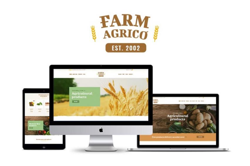
Farm Agrico

Example of Farm Agrico

If you’re in the farming, agricultural or food industries, the Farm Agrico theme is a good choice. With full-width sliders, compelling calls-to-action, and a responsive design, it’s a sure hit.

Morello

Example of Morello

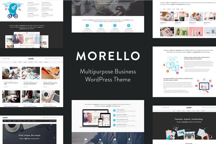
Morello is another business WordPress theme that could be a great fit for your website. It’s multipurpose and loaded with features, making it a solid choice.

Weberium

Example of Weberium

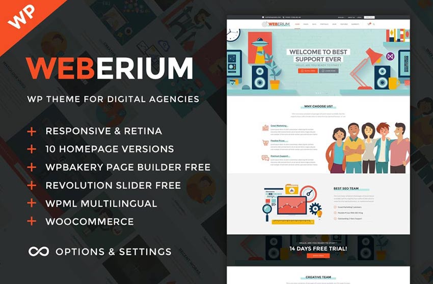
Weberium is still another WordPress theme that any business could use. However, this one is centered around digital agencies. It includes 10 homepage variations and has compatibility with top plugins, too.

Aspero

Example of Aspero

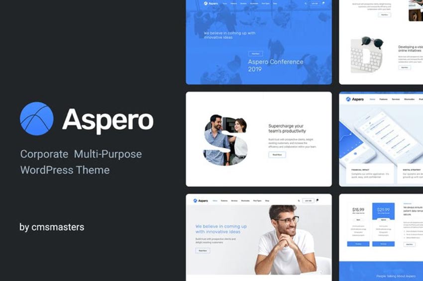
Aspero is a corporate-centered theme that offers a clean design, responsive layout, and key features businesses come to rely on like service widgets and pricing tables.

Dallas

Example of Dallas

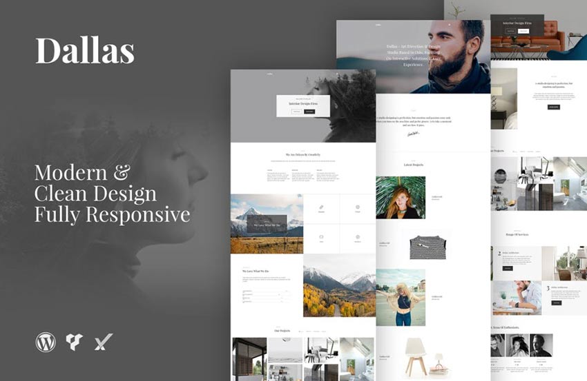
The Dallas theme is a responsive offering that maintains a clean and simple layout that can be customized in any number of ways. At the end of the day, it’s modern and a great compliment for any content you want to add.

Insugroup

Example of Insugroup

Insugroup is a theme with all the features you need for an insurance or finance website. With a stylish full-width layout, you’ll have ample opportunity to showcase your services.

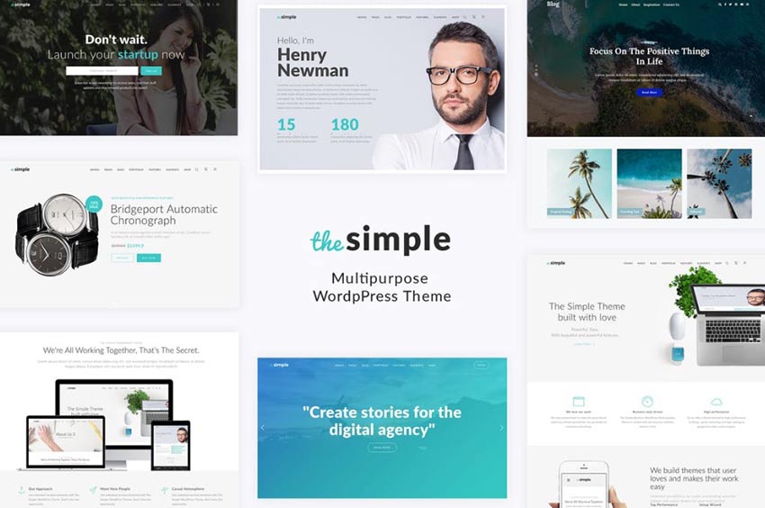
Simple

Example of Simple

Simple is a multipurpose WordPress theme that can work for any type of business or corporate website. It comes with several homepage options and is minimal yet professional.


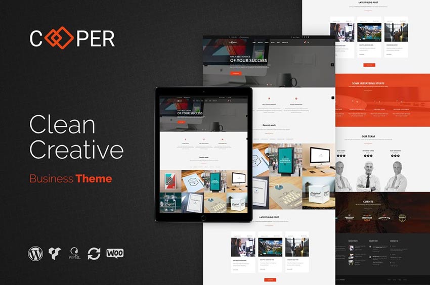
Cooper

Example of Cooper

Cooper is another great choice of theme that offers a straightforward layout with a few fun touches that level up the creativity factor considerably.

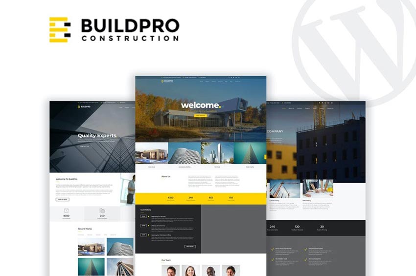
BuildPro

Example of BuildPro

Here’s another theme option for construction websites. BuildPro offers a wide range of features including 15 different homepages and compatibility with current top WordPress plugins and page builders.

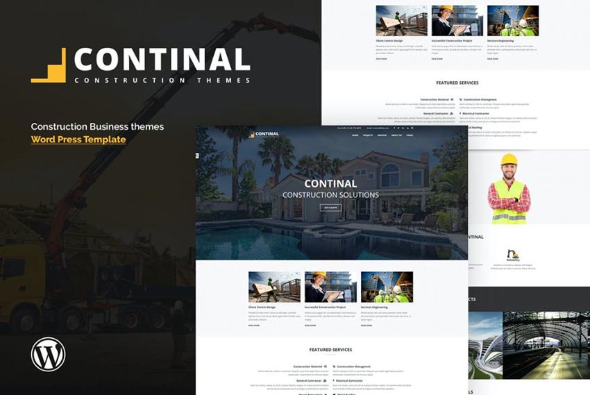
Continal

Example of Continal

The Continal WordPress theme is another choice for those in the construction industry, though you could easily customize it to suit a more corporate-leaning business, too.

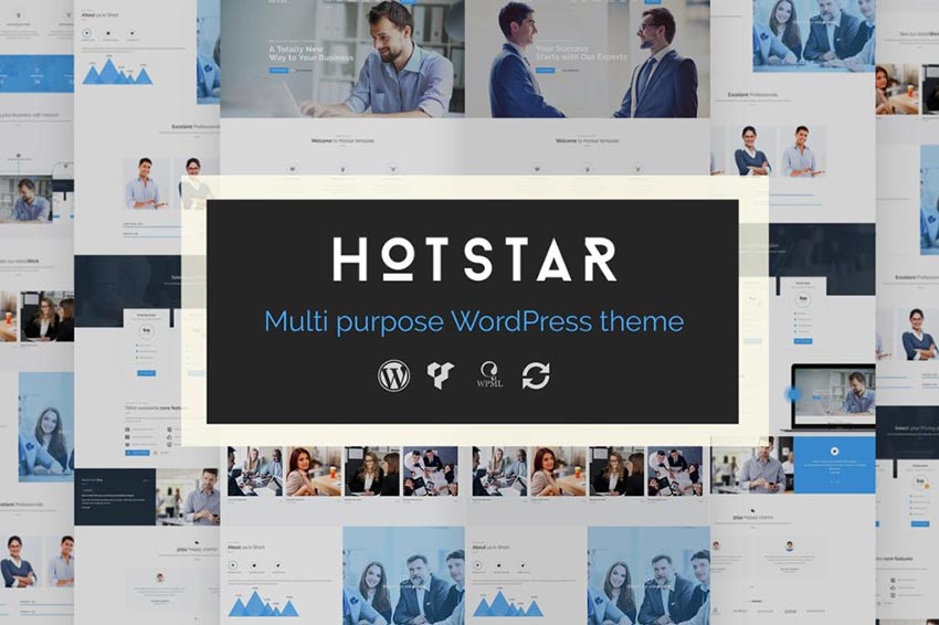
HotStar

Example of HotStar

And then there’s HotStar, which is a theme that promises to be multipurpose in its target audience and feature set. It’s also compatible with Visual Composer Page Builder.

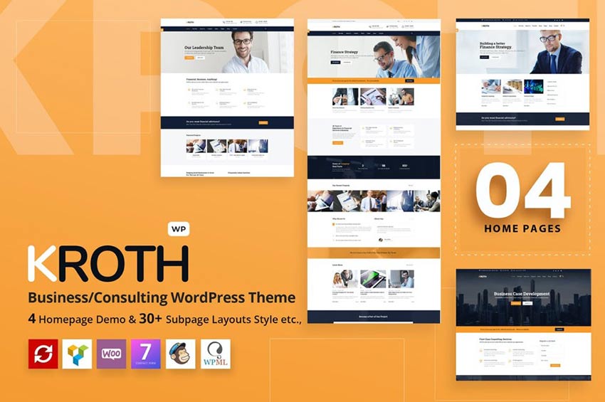
Kroth

Example of Kroth

Kroth is another business WordPress theme with a responsive layout and stylish design. And you can customize it any number of ways thanks to four homepage demos and 30+ page layouts.

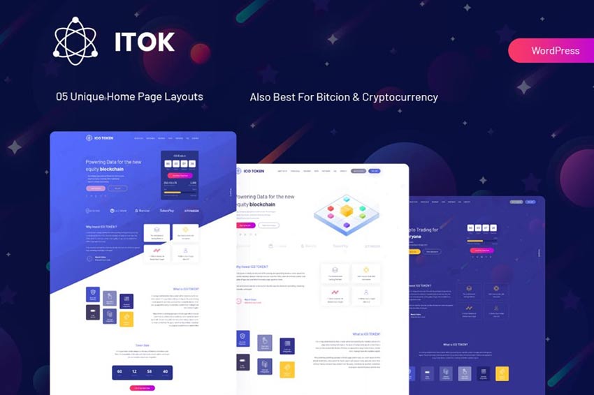
ITok

Example of ITok

ITok is a standout choice for any business website having to do with financial subjects, but its particularly geared toward bitcoin and cryptocurrency. This business WordPress theme includes 5 different homepage layouts and parallax effects that further engage visitors.

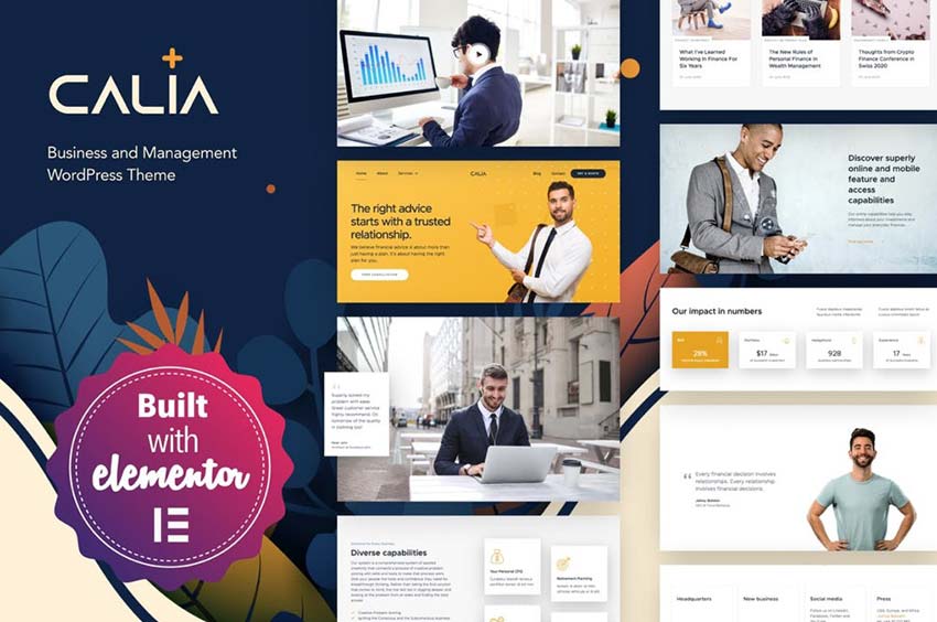
Calia

Example of Calia

Calia is another theme for businesses that offers a wide range of functionality. It’s customizable with Elementor and includes numerous homepages, subpages, widgets, and more to make building the site of your dreams easier.

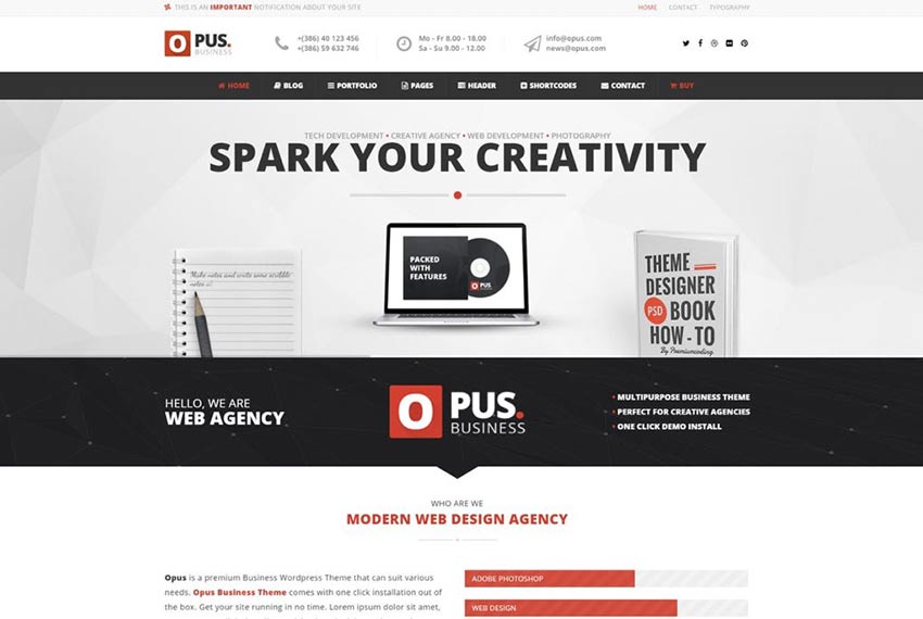
Opus

Example of Opus

Opus is another solid choice for businesses, specifically web design agencies. It includes features that make highlighting your company’s services easy.

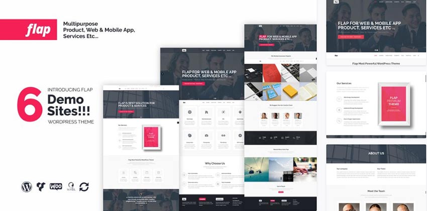
FLAP

Example of FLAP

Another option is FLAP. This WordPress theme is multipurpose and effective. It includes six demo site options to choose from and can be customized to sell products, apps, or services.

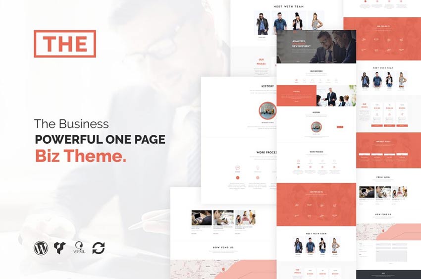
The Business

Example of The Business

The aptly named The Business theme is a minimal theme that offers a one-page scrolling experience to quickly get potential customers acquainted with what you’re offering.

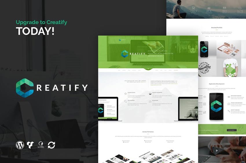
Creatify

Example of Creatify

The Creatify WordPress theme offers a sleek and professional design for any web agency, app, or tech industry website.

Onepage

Example of Onepage

As its name would suggest, Onepage is a WordPress theme that offers a one-page scrolling experience for your visitors. It’s perfect for selling a mobile app or for any service website.

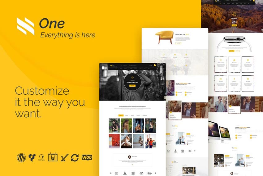
One

Example of One

Another one-page theme is One. This WordPress theme can be customized any number of ways to for any type of business. Whether you sell an app, service, or physical product, the galleries, social integration and interesting one-page scrolling effects are real winners.

ChainPress

Example of ChainPress

Last on our list is ChainPress. This WordPress theme is ideal for businesses that deal in cryptocurrency. However, with a few tweaks it could work for any sort of business or corporate site.

Launch Your Site with a Business WordPress Theme

Hopefully this collection of business WordPress themes will make it easier for you to select one and get your site up and running quickly. There’s a decent amount of variety represented here.

And remember, you can gain access to all of these themes from Envato Elements via a monthly subscription fee. This is especially helpful if you plan on building more than one website or you need additional graphics or digital collateral.

Best of luck!


Calmaria One Page Website Design

Original Source: http://feedproxy.google.com/~r/abduzeedo/~3/8aFGHkY47RI/calmaria-one-page-website-design

Calmaria One Page Website Design

abduzeedo06.15.20

I shared with you in the past about a new side project I am working on. It all started with me trying to find ways to cope with anxiety and stress. Access to information has helped us evolve rapidly but not without side effects. Misinformation and the strong polarization of opinions are amplified by our confirmation bias tendencies. What to believe, who is right, who is wrong? Questions with no answers inevitably create anxiety.

Questions with no answers inevitably create anxiety. The good news is that there is a simple way to reduce it, just breathe. It works! 

There are several different breathing techniques and exercises that are designed to bring your body to a deep relaxation state. Holding your breath for a period of time allows your body to better oxygenate. One of the simplest techniques is the 4-7-8 method which is simply inhaling for 4 seconds, holding your breath for 7 seconds and exhaling for 8 seconds.

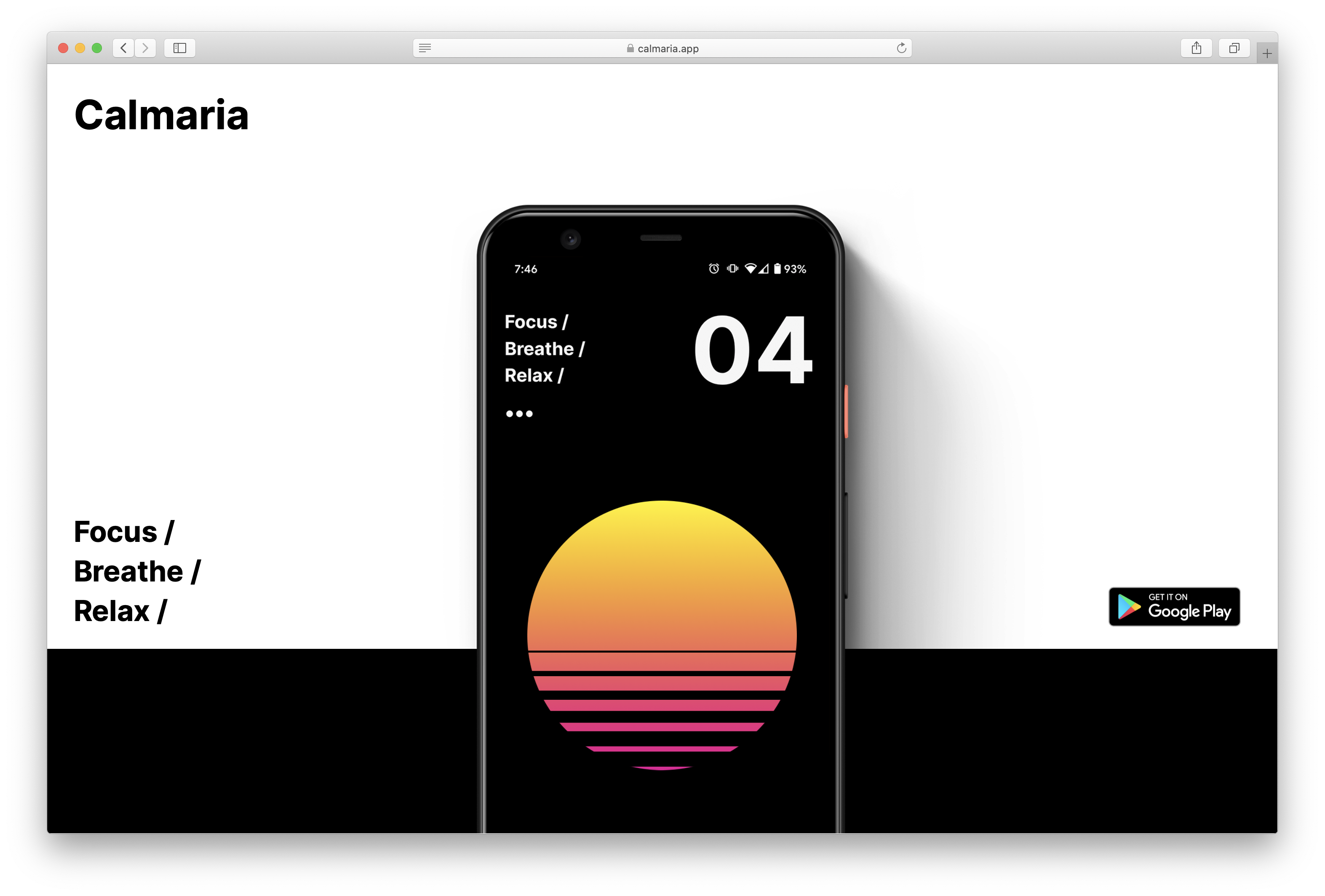
Here’s the website I created for Calmaria (https://calmaria.app)

Calmaria site

And very soon, there will be an Apple Watch version too.

Get the android app
Try the progressive web app


Exciting New Tools for Designers, June 2020

Original Source: https://www.webdesignerdepot.com/2020/06/exciting-new-tools-for-designers-june-2020/

The best new tools for designers are ones that make your life easier and your workflows faster. You’ll find some of those in this list this month for sure. From tools to help you capture and manage color palettes to AI-powered design analytics to simple animations, there’s something for almost every designer or developer.
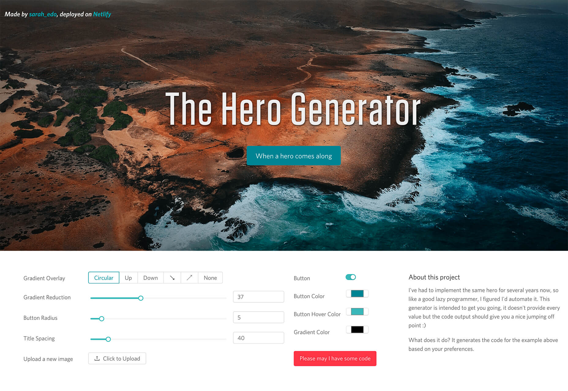
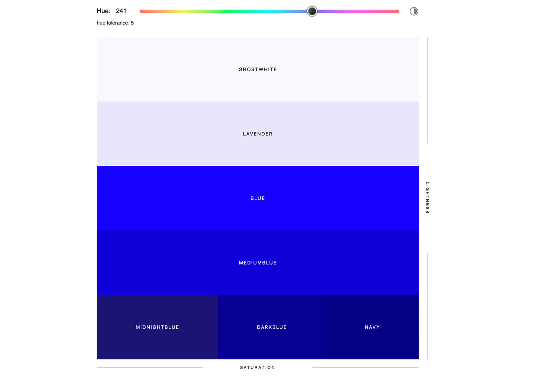
Here’s what new for designers this month.

The Hero Generator

The Hero Generator is a fun tool that will help you create just the right hero header without having to write the code yourself. Upload your image, set some specs for spacing and color, add a button, and out comes the code for an example that you can build right on the screen. Make sure to play with the gradient overlay to get just the right color and orientation to ensure that your hero header looks great and includes highly readable type.

Sorted Colors

Sorted Colors groups named CSS colors in a way that shows related colors together. It’s a nice way to check colors side by side when you are trying to make a final decision about a hue or color palette. You could also use it to create a monotone palette.

Attention Insight

Attention Insight is an AI-powered design analytics tool that allows you to compare multiple designs and to measure which object attracts the most attention. It uses a combination of heatmaps, percentage of attention metrics to help measure the overall clarity of your design. New features, such as a contrast checker, are also in the works. It works as a web app, plugin for popular software, or a Chrome extension.

Color Copy Paste

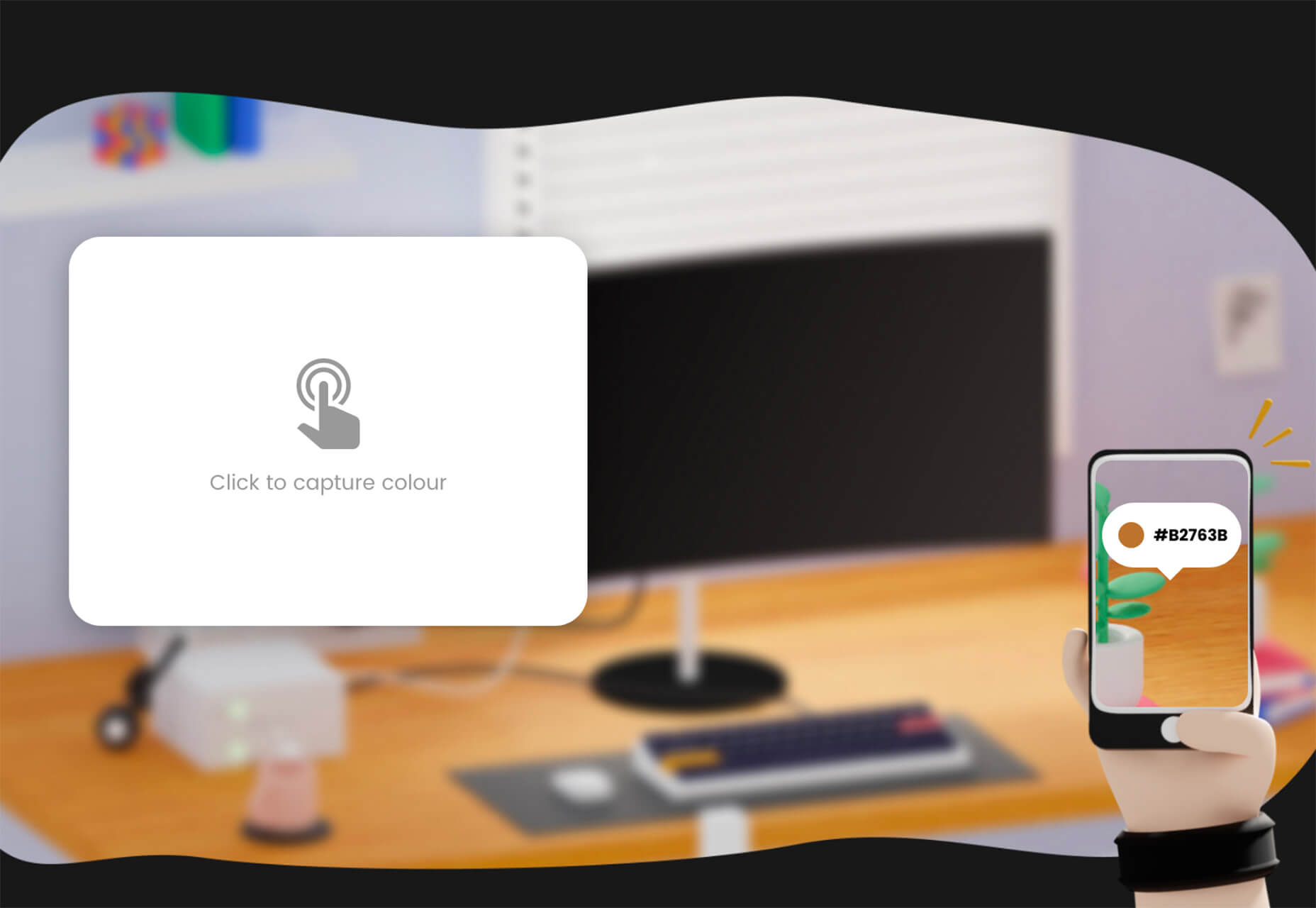
Color Copy Paste is an app that you can use to capture a color from practically anything and then paste it to Figma, Sketch, or a web browser. It’s a quick way to snag little bits of inspiration when you see them.

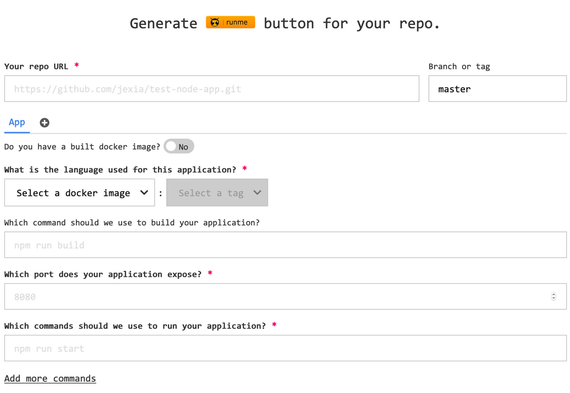
Runme

Runme, which is still in beta, allows you to build, deploy, and launch an application from any public Git-repo with one click. Enter a URL and a few commands and you are ready to go. This is an open-source tool and contributions are welcome.

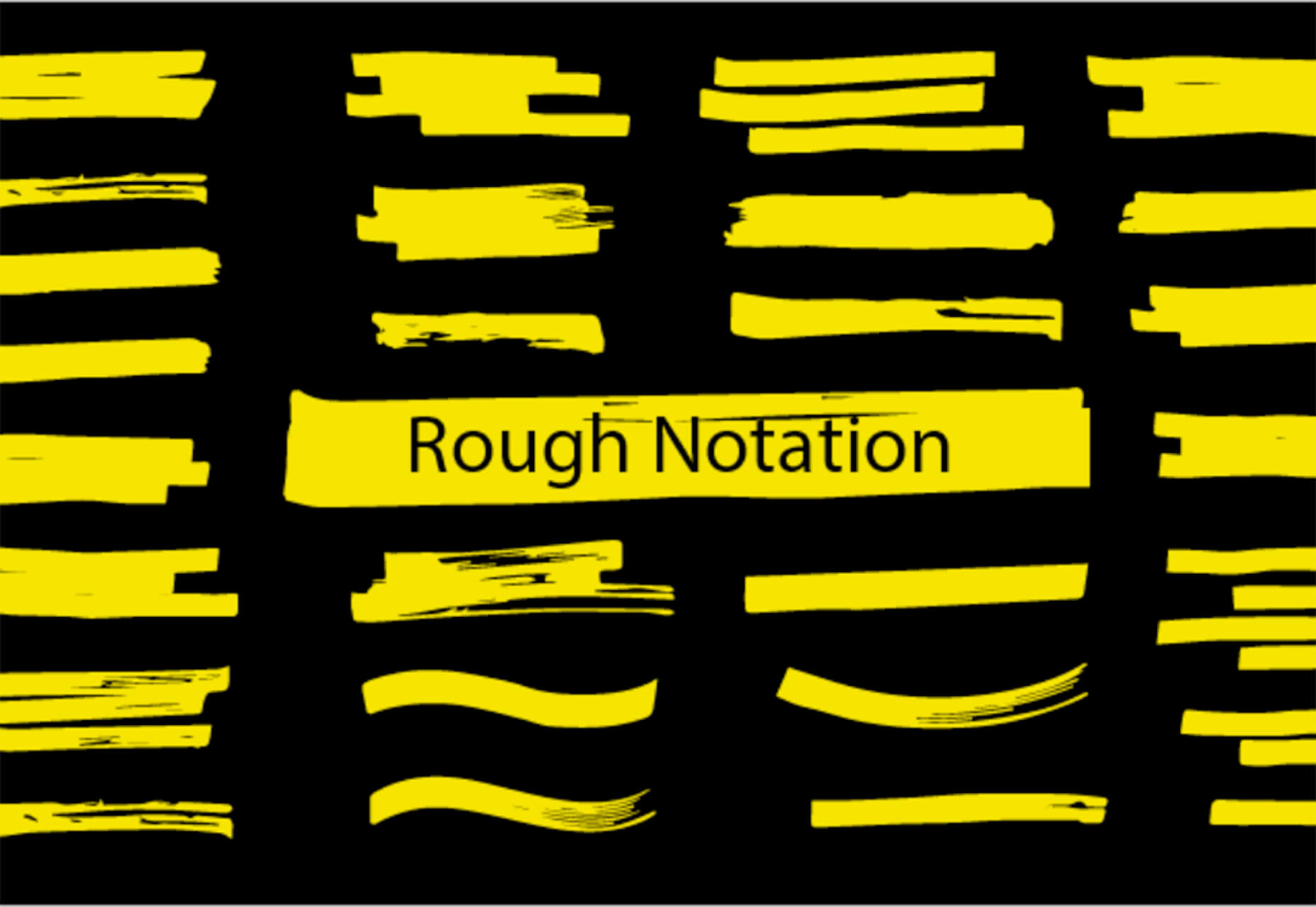
Rough Notation

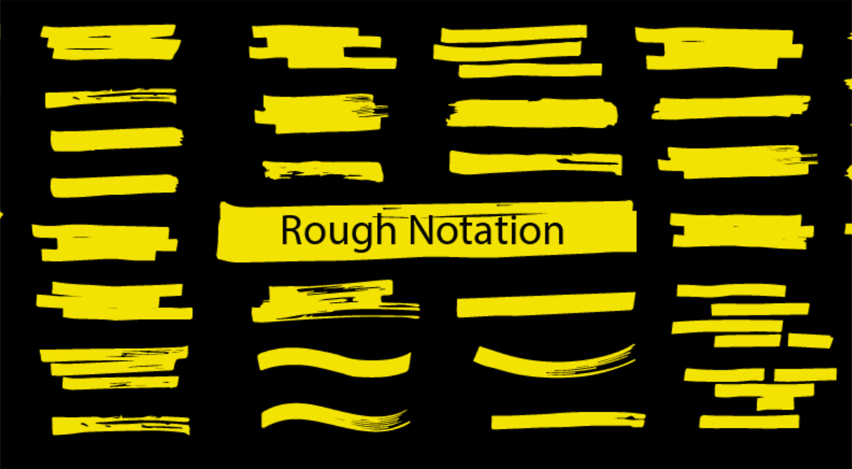
Rough Notation is a small JavaScript library to create and animate annotations on a web page. It uses RoughJS to create a hand-drawn look and feel. Elements can be annotated in a number of different styles. Animation duration and delay can be configured or turned off. Choose from options to underline, box, circle, highlight, cross off, strikethrough, group items, and more.

Trails

This is a simple, but useful goodie. Trails is a simple geometrical trail on an x and z axis that you can attach to Three.js objects. The simple animation is mesmerizing.

Pose Animator

Pose Animator takes a 2D vector illustration and animates its containing curves in real-time based on a recognition result from PoseNet and FaceMesh. It borrows the idea of skeleton-based animation from computer graphics and applies it to vector characters. (It’s a fast way to cartoonize yourself.) You can build from a webcam video or single image in Chrome or Safari.

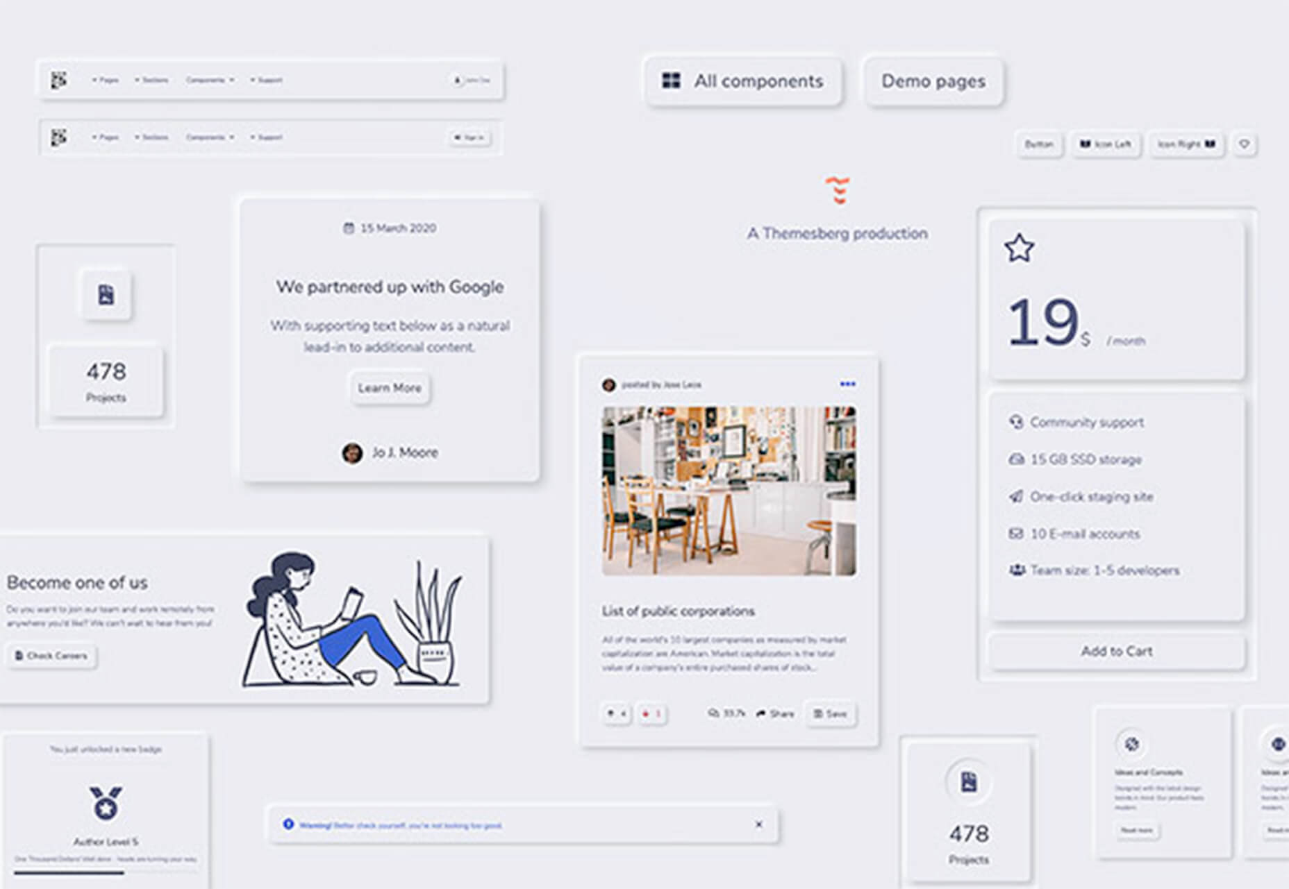
Neumorphism UI

Neumorphism UI is a user interface kit packed with components in the neumorphic style. It includes more than 200 components, 10 sections, and five example pages to build a website in this style.

3D Photography Using Context-Aware Layered Depth Inpainting

This project by a group of researchers proved that you can convert a single RGB-D image into a 3D photo, much like what you’d see from an iPhone. The included source code shows how to use a layered depth image as part of a learning-based model that creates a three-dimensional effect.

Meanderer

Meanderer is a micro-library for scaling CSS motion path strings. And it looks pretty nifty. All you need is an object with a path (typically an SVG) and you are ready to try it out.

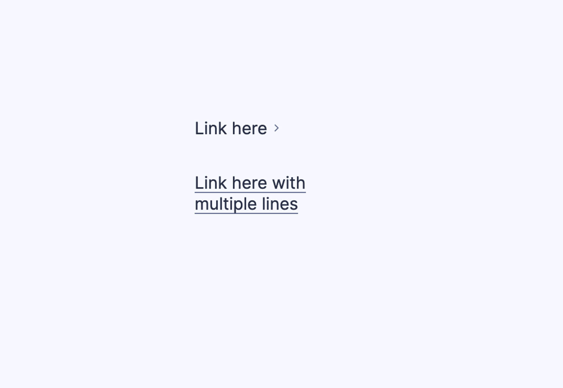
Underline Animation

Sometimes it is the most simple of animations that can have the greatest impact on a design. This Underline Animation pen from Aaron Iker is an example of that with a nifty little underline that moves to an arrow.

Create a Hamburger Menu in SVG & CSS

Love it or hate it, you’ll probably need to create a hamburger menu element at some point. This great tutorial from UX Collective explains how to do it from start to finish using an SVG icon and CSS. (This lesson is designed so almost anyone with a little dev knowledge can follow along with success.)

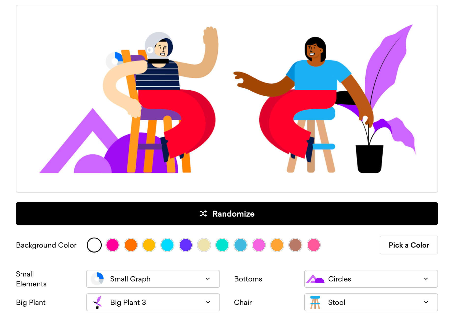
Blush

Blush is a fun, semi-custom illustration generator. It uses drawings from artists around the world with parts and color options that you can mix and match to get just the right illustration for your design project. Choose your specifications and download a PDF. It’s that easy.

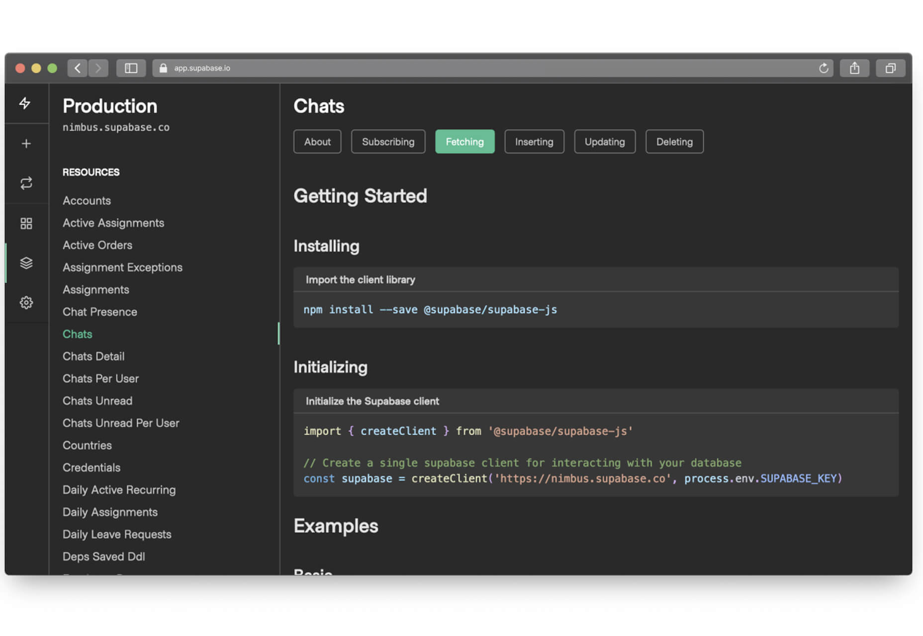
Supabase

Supabase in an open-source alternative to Firebase and adds real-time and restful APIs to Postgres without code. (It’s in Alpha and free to use during that time.)

Fluent Icons

Fluent Icons includes 965 icons in a Microsoft-esque style. These colorful and consistent icons are ideal for use across apps, presentations, websites, and infographics. (Free and paid options available.)

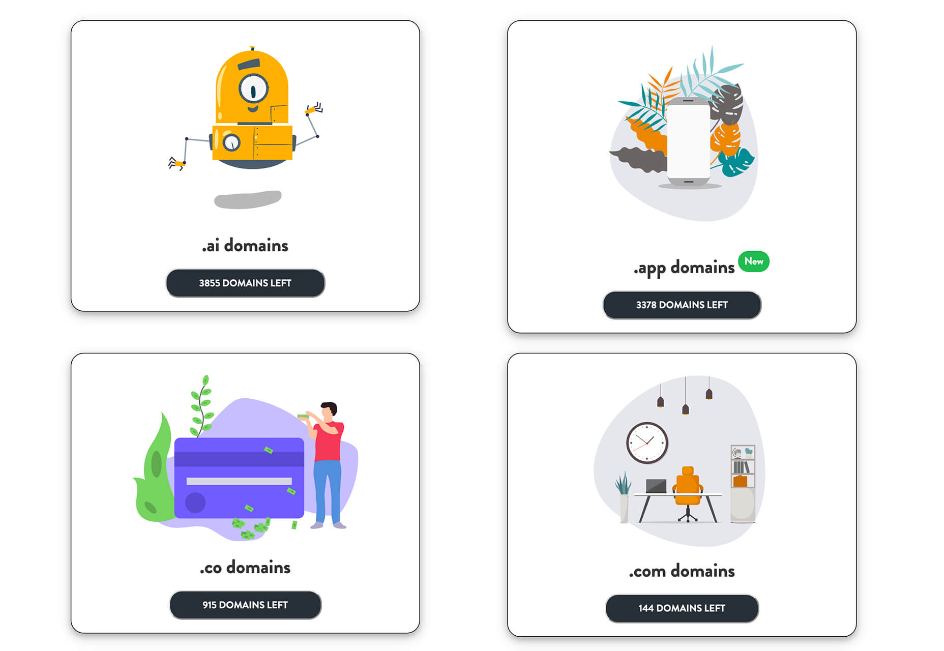
One Word Domains

Looking for a quick and easy to remember domain name? One Word Domains lets you search all the available one-word domains available for purchase.

Free Device Icons

This set of free device icons includes 67 elements that represent user interfaces and devices. They come in multiple file formats – SVG, EPS, PNG, and AI – as a line-style vector.

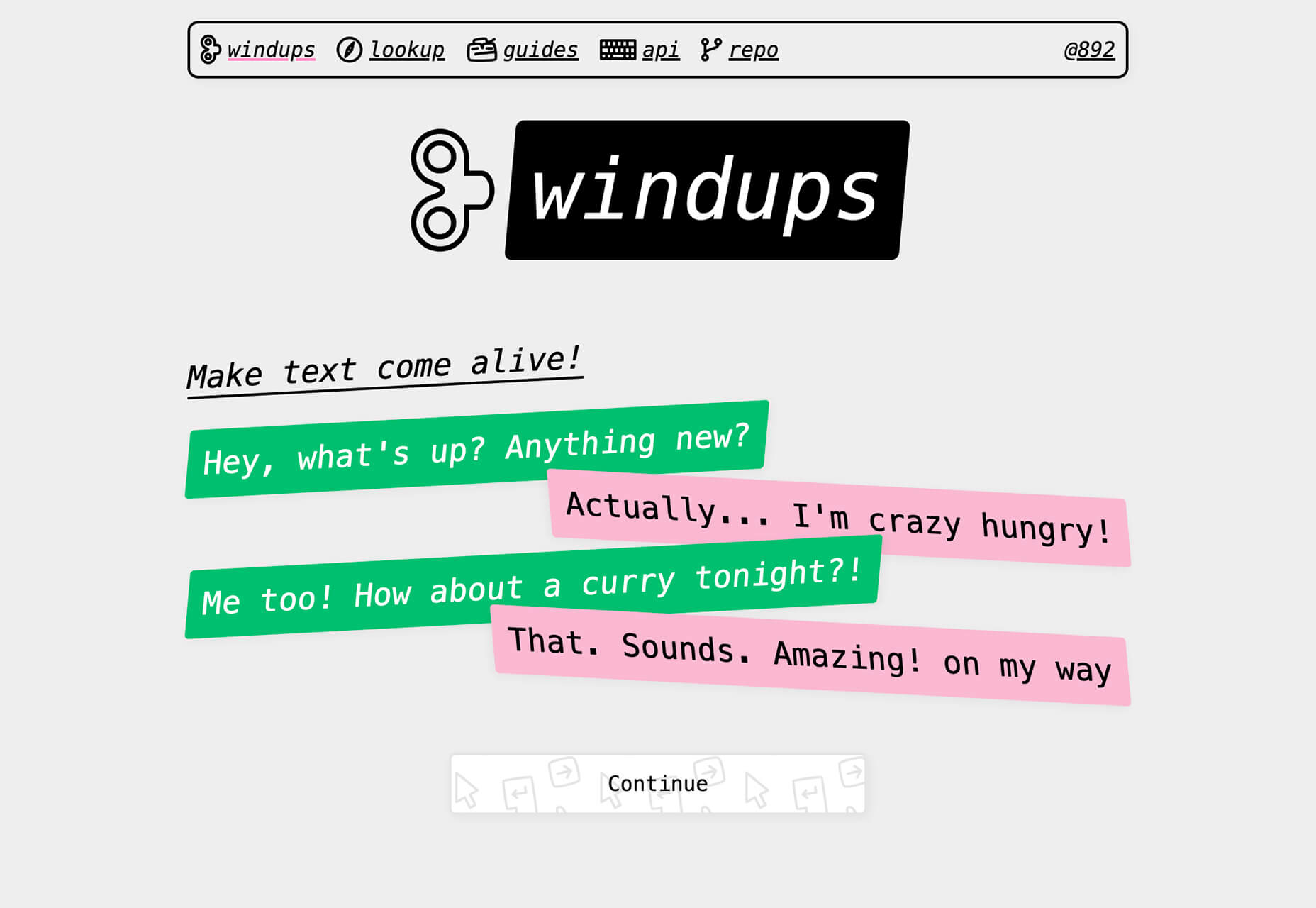
Windups

Windups is a tool to help you add a typewriter-style animation to text elements. It’s a fun way to help people through your design and build dynamic content. You can see how engaging it is by playing with the Windups site with building blocks of text and “continue” buttons.

Glorious Glyphs Game

Test your typography IQ with the Glorious Glyphs Game game from ILoveTypography.com. The game includes 30 questions about glyph characters, where you have to ID a font. It’s a lot tougher than you might think!

Cosmos

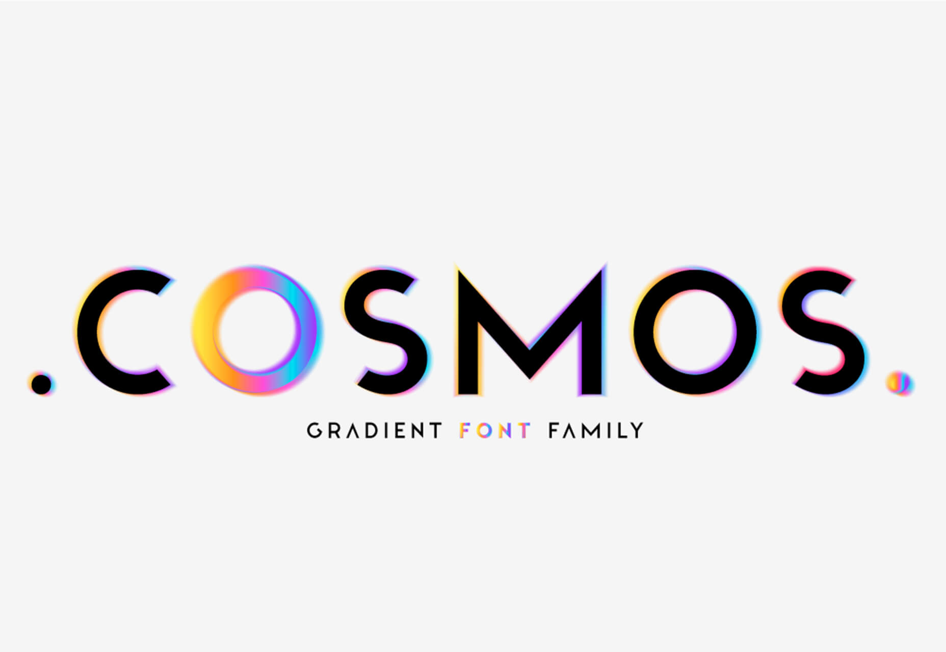
Cosmos is a beautiful and colorful gradient font family. It contains letterforms with hologram, multicolor, minimal, glitch, and blur options is a readable and trendy style. This premium font family is available by the style or altogether.

Ephemera

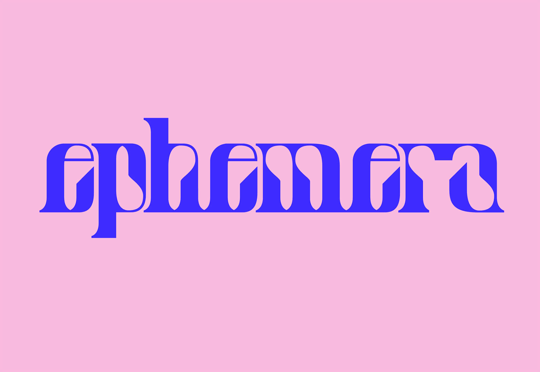
Ephemera is a groovy novelty-style typeface that has fun lines, plenty of common shapes and elements, and glyphs that pair for exceptional letter combinations. It could make a nice brand mark or an interesting display type element. It includes upper- and lowercase characters, numerals, and some extras.

Kavo Serif

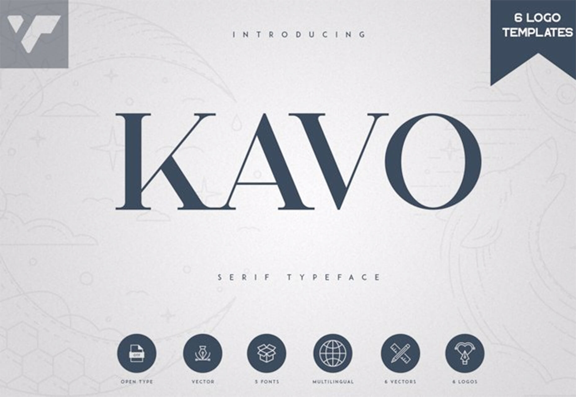
Kavo Serif is clean, modern typeface with five weights, and even includes logo templates. It’s a versatile font that works great in large and small sizes.

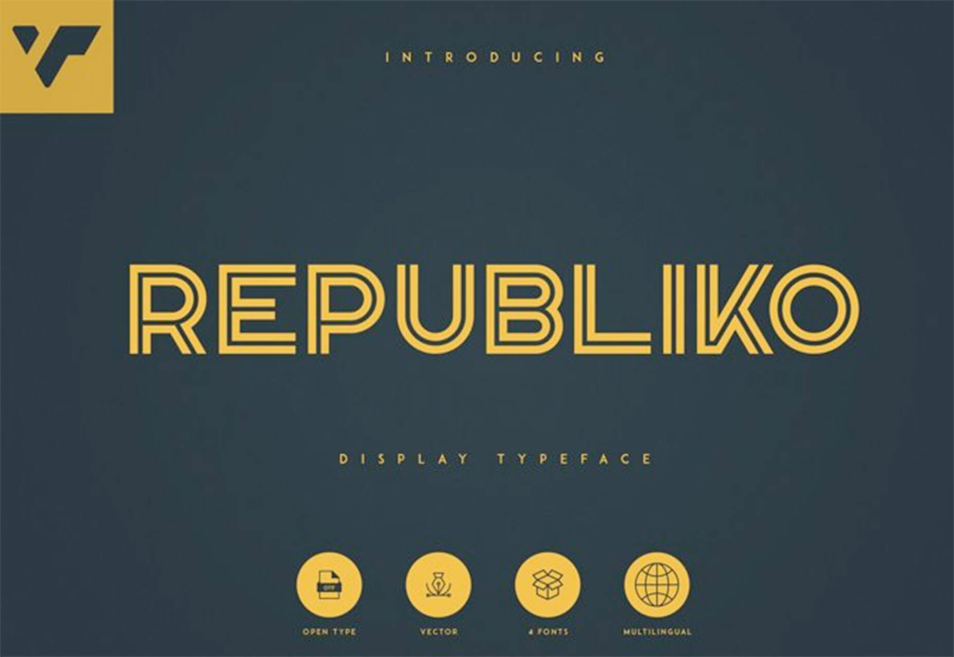
Republiko

Republiko is a modern display typeface with regular and outline styles. While it is designed for display, the characters remain readable at smaller sizes as well.

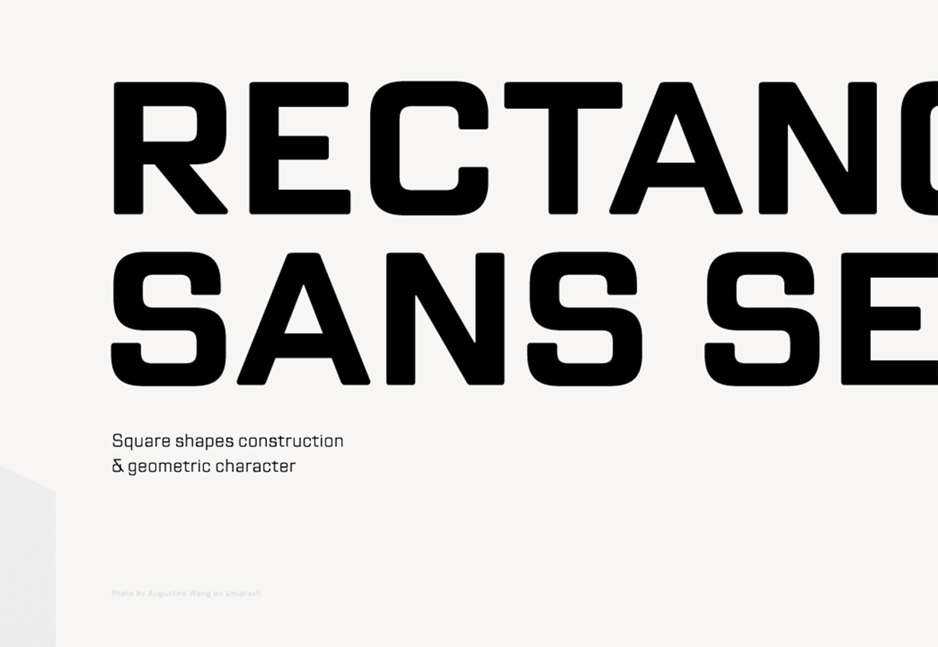
TT Lakes Neue

TT Lakes Neue is a font superfamily with 91 styles. It’s got a nice geometric shape and the package even includes a variable font. This is a premium typeface that you can buy individual styles or the complete package.

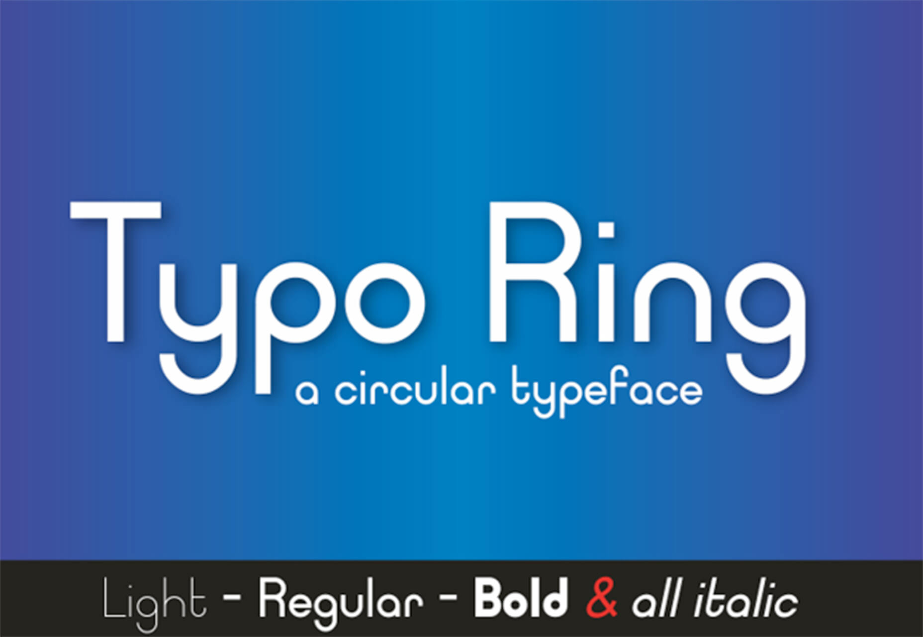
Typo Ring

Typo Ring is a super round typeface with plenty of weights (although the free version has limited character sets). It’s highly readable and includes upper- and lowercase letters.

XXIX

XXIX is a bold, futuristic slab with fun shapes and slants. It’s an all uppercase option with a limited set of numerals and glyphs.

Source

p img {display:inline-block; margin-right:10px;}
.alignleft {float:left;}
p.showcase {clear:both;}
body#browserfriendly p, body#podcast p, div#emailbody p{margin:0;}

This Week In Web Design – June 12, 2020

Original Source: http://feedproxy.google.com/~r/1stwebdesigner/~3/gSjMl-_NpE4/

Happy Friday, web designers and developers! Ready for another edition of “This Week In Web Design”? In this week’s roundup of articles related to web design and development that were published in the past seven days, we cover a variety of topics, including COVID-19 resources, JavaScript, CSS animations, WordPress, and much more. Without further ado, here we go!

UNLIMITED DOWNLOADS: 400,000+ Fonts & Design Assets

Starting at only $16.50 per month!

DOWNLOAD NOW


How to design a 404 error page that keeps users on your site

Turn lost visitors into loyal customers.

3 Cases of Effective Fusing Modern and Traditional Web Design Ideas

Take a look at practical tips and examples of mixing traditions and innovations in web design effectively.

Improve Web Design: 7 Site-Enriching Web Improvement Ideas

Although the results can take time to surface, the ideas we provide will immediately improve the overall look of your website.

Journey Mapping for Remote Teams: A Digital Template

A collaborative spreadsheet is an efficient, effective tool for virtual customer-journey mapping.

Collection of Free COVID 19 Resources for Designers

A collection of free COVID 19 resources created by the designer community.

How to Implement Smooth Scrolling With Vanilla JavaScript

Start with a common jQuery approach for creating this functionality. Then, we’ll get rid of jQuery and discuss two pure JavaScript solutions.

15+ Best Cross-Browser Testing Tools 2020

The best cross-browser tools that will help you improve your development workflow.

20 Unmissable Websites, June 2020

This month we’re seeing a lot of flamboyance, a lot of passion, and the color of the moment is (hooray!) yellow.

WordPress Plugins That Save You from Grunt Work

A selection of plugins that you can use to rip through those tasks with ruthless efficiency.

3 simple website tweaks to impress your customers

Do these three things to improve engagement and the bottom line.

How to Get All Custom Properties on a Page in JavaScript

We can use JavaScript to get the value of a CSS custom property.

6 easy ways to find a UX side project and strengthen your portfolio

Start by noticing problems and inconveniences in your daily life, and the lives of people around you.

Starting your journey to becoming design led

How to drive a design led culture within your business.

Dealing with the Low or No-Profit Areas of Your Freelance Web Design Business

First, we’ll look at how to identify areas of your business that are not doing much for you financially. From there, we can examine these areas to see if they should stay or go.

The Trickery it Takes to Create eBook-Like Text Columns

How do you set full-width columns that add columns horizontally, as-needed ?

How JavaScript Async/Await Works and How to Use It

This tutorial will help you learn about what async/await is and how it works.

Colors in UI Design: A Guide for Creating the Perfect UI

How to create a user interface that takes full advantage of color selection.

5 Myths About Jamstack

As with many myths, they are often based on a kernel of truth but lead to invalid conclusions.

12 Ways To Improve User Interview Questions

Pieces of advice that will help you to formulate questions that foster reliable answers from your users and clients.

Making My Netlify Build Run Sass

Let’s say you wanted to build a site with Eleventy as the generator…

Design centric business

What does design thinking mean to a business?

Cool Little CSS Grid Tricks for Your Blog

How I found a solution to a long-running problem using a modern CSS grid technique that, in the process, gave me even cooler results than I originally imagined.

How to Create a Motion Hover Effect for a Background Image Grid

A short tutorial on how to achieve a motion hover effect on a background image grid.

Is Your Website Stressing Out Visitors?

The very last thing you want is to design a website that stresses visitors out, leading them to dread the experience or abandon it entirely.

Creative Background Patterns Using Gradients, CSS Shapes, and Even Emojis

Let’s see how we can use gradients in other ways and toss in other things, like CSS shapes and emoji, to spice things up.

Web Design & Development Jargon that Should Never Be Used With Clients (& What to Say Instead)

While there is a lot we can do to ensure we will be hired, one of those tactics is to simply not make the client feel stupid.

How to Create an Ecommerce Site with React

Since most of the performance optimizations for ecommerce web applications are front-end related, the prominent, front-end centric framework React will be used in this tutorial.

Top 10 Web Design and UI Trends for 2020

These trends are important for a web and UI design to meet the ever-changing requirements in the modern world.

How to Reverse CSS Custom Counters

Because I wanted fully cross-browser compatible custom number styles, I went with custom counters.

Helping Your Clients Master eCommerce

Let’s take a look at some ways to help clients make sense of eCommerce.

On Adding IDs to Headers

It’s great if headings have IDs, because it’s often useful to link directly to a specific section of content.

Pure CSS Animation of Blog Post Excerpt on Hover

In this tutorial, we’ll make this cool animation of revealing the blog post excerpt on hover using pure CSS and no JavaScript.

Grid for layout, Flexbox for components

Dive into differentiating between CSS grid and flexbox, and when to use each one and why.

An Introduction to JavaScript Event Listeners for Web Designers

If you’re a web designer who’s yet to step into the world of JavaScript, or you’re just starting in front end development, this tutorial is the perfect way to begin.

How to Define Effective Milestones in Design Projects

When it comes to creating and launching a website, it’s important to deliver realistic time expectations to the client, and establish the different stages you can bill them for.


Web Design and Psychology

Original Source: http://feedproxy.google.com/~r/Designrfix/~3/L1ZDpTYQwDo/web-design-and-psychology

The true purpose of your website probably isn’t what you think the purpose of your website is. You imagine that it’s there to show off your products or services to potential customers. Whether it’s a humble poetry blog or a real-estate website, in your mind you probably believe that it’s a place where people can […]

The post Web Design and Psychology appeared first on designrfix.com.

How to Define Effective Milestones in Design Projects

Original Source: https://www.webdesignerdepot.com/2020/06/how-to-define-effective-milestones-in-design-projects/

When it comes to creating and launching a website, it’s important to deliver realistic time expectations to the client, and establish the different stages you can bill them for.

After all, creating a site is about so much more than putting some code together. From the initial brief to the launch of the site there are numerous stages in between. It can be natural to quote a lump price and charge it all at the end, or 50% upfront and 50% on completion. However, if there are snags along the way, unexpected delays, or if the client cancels last minute after you’ve nearly finished creating the site, you may be left out of pocket.

By charging stage by stage, you are getting the main chunks of what you are owed at the time you do it. While the exact web development phases differ slightly between clients and projects — and you should schedule, and bill for your specific situation — the basic steps pretty much stay the same.

Brief and Planning – Pay me ~20%

Whether your client has an existing site they are looking to re-do, or are starting from scratch, the initial brief and planning stage shouldn’t be underestimated.

This stage includes researching, finding out their requirements, and putting together a plan. You need to identify the scope of the project, the areas of main importance and the site’s purpose.

It’s at this stage you clarify what web pages and features are needed to fulfil this. You also need to define the software and any resource requirements as well as the estimated deadlines for the project. When deciding the budget, you need to remember to keep in mind any other aspects like heading to meetings.

Creating the Visuals – Pay me ~15%

The visual stage involves three main elements: wireframes, mock-ups, and prototypes.

Wireframes are simple sketches of the future website before any development or design elements (such as fonts and branding) are applied. It’s a basic backbone to base the future of the project on which allows you to see where key elements will be located.

The next stage is mock-ups which are high-fidelity statics of the future website and portray how things will look. Within this stage aspects such as colors, fonts, logos and images should be applied. This stage needs to be much more detailed and a well-thought out static version of the future site. It provides an opportunity to hone in on details and represent the suppositional final look of the site. Remember the end result will still be likely to change, but this should include all the elements needed that you could base the project on.

The third visual stage of the design is prototyping which is a highly detailed, dynamic version of the website which is due to be created. This is likely to be as similar as possible to the final system and will offer a comprehensive overview of the functionality of the site. It’s a great final chance to check out the website before it is built and make any last big tweaks.

Initial Build – Pay me ~15%

The next stage is to actually get creating the website. By utilising the previous visuals, you can get building according to the clients specifications.

It involves creating the initial home page and a “shell” for interior pages where content can be added later on. This process includes designing interactive forms, implementing payment getaways and confirming the CMS you will use. Here you will add in any custom coding too. Expect this to take up a significant amount of time depending on the level of complexity involved with the site.

Content Creation and SEO – Pay me ~15%

Once you have the main structure in place, it’s time to sort the content. By now you should have established if you are creating the content or if the client is sending elements such as text and images over themselves.

Keep in mind (and ensure the client is aware) that copy is designed to both drive engagement, and for search engine optimisation (SEO.) The style of writing is important and is something to certainly bill the client for. Content needs to be short, snappy and to the point, encouraging readers to both interact with it, and progress to other pages.

If pages require large chunks of information, it’s best to split it into manageable sections and supplement it with interesting visuals to keep them engaged. Identify search terms the client wants to rank for and check the text adheres to this. There are many SEO plugins and tools (such as Yoast) which you can use to easily check it’s optimised.

Beta Testing – Pay me ~15%

Once the design and functionality are complete, it needs to go through a beta testing stage. This is the initial test before it’s set live and promoted to the world.

The beta phase is important to iron out any errors and get feedback from the intended audience. It’s also the stage where you need to ensure proper functioning across multiple devices.

There are a number of sites and tools you can use to check how the site looks in the different mobile, tablet and desktop resolutions. The site needs to look and function as per the client’s specifications and ensure it matches their brief. Here you can see if there are any final amendments which need to be made following from feedback both from the audience and client.

Launch – Pay me ~20%

Once the site has passed the beta testing and the client is happy, it’s time to launch the site. This is the final billing stage for the client and should be a quick and simple step.

Discuss with the client when they want to launch it and get set up for then. You will need to connect any domains, check the DNS records and CNAME’s and get the site up and running. If it’s a large and complex site it can take a little longer than a smaller site, so ensure you plan for this.

Always be prepared that there could be teething problems on launch and that the client might want feedback and amendments based on how the site is used and interacted with. There are always ways to analyse user testing, monitor analytics and refine the site, so it could be worth going on some sort of retainer contract for future updates for the client.

These are the basic stages you can bill a client for. Try and decide how long each step with take and come up with pricing based on this. You can charge a deposit upfront and then always let the client know if certain steps are going to end up costing more than initially quoted.


Featured image via Unsplash.

Source

p img {display:inline-block; margin-right:10px;}
.alignleft {float:left;}
p.showcase {clear:both;}
body#browserfriendly p, body#podcast p, div#emailbody p{margin:0;}

Industrial Design: Geco Hub is a Smart and Stylish Storage System

Original Source: http://feedproxy.google.com/~r/abduzeedo/~3/pyMPOwdlUjU/industrial-design-geco-hub-smart-and-stylish-storage-system

Industrial Design: Geco Hub is a Smart and Stylish Storage System
Geco Hub is a Smart and Stylish Storage System

abduzeedo06.11.20

Have you ever experienced that last minute panic when you’re trying to leave the house and can’t find your phone/wallet/keys? Or not been able to find the TV remote or your reading glasses? Or perhaps forgotten to post a birthday card or letter that was waiting by the door?

Geco Hub is just the place for these items and more. It’s wall-mounted storage for the things you can’t afford to lose or forget, somewhere you can keep the often-needed stuff visible and easily accessible so it’s always there whenever and wherever you need it. All you have to do to store something in Geco Hub is push it in.

What’s more, Geco Hub is seamlessly modular, as you can tile multiple units together to create one giant storage space. You can even mix and match colours between units to create your own piece of ever-changing wall art.

Industrial Design 

It’s more compact than shelves and cabinets, so it can fit in small spaces around the home where other storage can’t. It can be installed in minutes without any screws too.

Geco Hub was recently 600% funded on Kickstarter and is currently available to preorder at a discount for a limited time here.


Cortex Bar Branding and Visual Identity by FatFaceStudio

Original Source: http://feedproxy.google.com/~r/abduzeedo/~3/P7L97ub87Ms/cortex-bar-branding-and-visual-identity-fatfacestudio

Cortex Bar Branding and Visual Identity by FatFaceStudio

abduzeedo06.11.20

FatFaceStudio shared an awesome branding and visual identity project for event producers from my hometown. Here’s how the awesome folks over at FatFaceStudio tell the story: When a duo of event producers from Porto Alegre, Brazil decided to open a new venue to celebrate the music from the good, not-so-old days of the early 2000’s, they named it Cortex – the part of the brain responsible for, among other things, storing memories.

These guys used to throw parties back in the day when My Chemical Romance, the Klaxons and Franz Ferdinand were banging loud in the years of 18 to 20 – somethings all over the place. 

The people that used to go to their parties are now working, have busy schedules, probably families. They end up choosing to Netflix and chill over going out to dance, till now. Cortex came to change that.

Branding and Visual Identity

Discovery

Most of the research came from Instagram. The clients had a solid username with followers who represented exactly who they wanted to attract to their new venue. We just had to gather the information about people’s lifestyles, music tastes and culture.

The research was quite fruitful. We identified the messages the brand needed to convey:

“Cortex know me from way back” – appeal to the nostalgic days of dancing and listening to loud music.
“Cortex and I share the same culture” – the audience likes specific genres, which come with specific lifestyles.
“Cortex and I are in the same vibe and in the same life stage” – even though the references are from the past, this is a place for young adults.
“Cortex want me to go out and have fun” – Cortex need to show the public there’s still a good, comfortable option for them to go out and listen to good music.

Concept

Based on the research we decided that:

We should use references from the past in a sophisticated way.
The public is open to a certain types of messaging that appeals to feelings.
The experience should be an escape from reality for an audience who often feels tired of the grind.

They explored several concepts with cerebral cortex theme/idea, memories and alternative music and presented three visual identity paths through moodboards with brief graphic explorations.

Visual identity

From the three paths we presented, the client chose to go for the one we nicknamed “Clean Punk Rocker” – a clean, indirect and grown-up assembly of elements from alternative rock music from the early 2000’s.

This definition paved the way for the visual language, since the color palette, typography and graphic elements were already approved.

As for the mark, it was discussed how to visually explore the cerebral cortex and decided to stay away from the anatomy of the brain and go for a more abstract approach.

During the research, it was frequently encountered the analogy of the mind as a labyrinth, and that was the chosen path to design de brand mark. The idea of labyrinth, mixed with symbols of rebellion used in the visual language, connected beautifully with the concept of escaping reality we previously identified.


For more information make sure to check out https://fatfacestudio.com/cortex-bar