Original Source: http://feedproxy.google.com/~r/CreativeBloq/~3/ePOM97yYZE4/choose-the-right-typeface-for-a-brand
Brand typography is key to the message being delivered. From a distinctive approach to using type, right through to a fully bespoke typeface, brands are exploiting the wide-ranging potential of typography to express themselves. There's no one-size-fits-all solution, but every brand should be aware of typography's power as a differentiator, and have a strategy for using it in the most appropriate way.
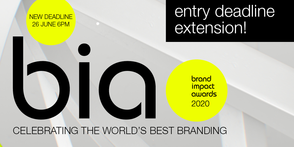
Typography in branding so important that it's recently been added as one of three new craft categories in our annual awards scheme, the Brand Impact Awards. Enter your best typography in branding by 26 June, and learn more about using type in visual identities below.
For this article, we talked to professionals who gave us five approaches to creating brand expression through typography – related to actual case studies. Then, (on page 2) we share five expert tips to help you to choose the perfect typeface for your brand. If it's resources you need, check out our list of top free fonts and italic fonts. Or, for tips on creating your own font, see our guide to font design.
Type is crucial to brand expression
"No matter the medium or the audience, type is everywhere that a written message needs to be conveyed," says Lukas Paltram, creative director at leading type design studio Dalton Maag. "Creating a unique expression at that essential level of communication is extremely powerful. It can be a big asset for brands to stand out, and it enables them to use a unique voice in their visual communication."
Creating bespoke typefaces is expensive and time-consuming, and may not always be worth the investment. However, the one-off cost for a truly ownable asset may be more attractive than buying multiple licenses to an existing typeface that others can use. For more on this, see our guide to font licensing.
How is personality conveyed through type?
When it comes to conveying personality through type, certain details within letterforms offer particularly rich opportunities. "Characters with more curvature are always easier to build a sense of personality into," says multi-disciplinary designer Caterina Bianchini, who has created many custom fonts for her clients. "For instance, a G, C or O lends itself nicely to having a more charismatic aesthetic," she continues. "Crossbars are also interesting: they can be manipulated even just a small amount to give a different feeling: perhaps they sit lower or higher, or have a curve added."
"Virtually anything is possible, as long as it looks good," agrees Pentagram partner Paula Scher. "Small customisations can make fonts more recognisable, such as filling in the inside of a lower case o, g, d or b, stencilling it in a creative way, or slicing parts of letterforms."
However, Paltram cautions that while certain characters have greater potential for personalisation – he adds the capital Q and ampersand to the list above – a typeface needs to be balanced across the entire character set. "It's not about individual letters that stand out, it's the entire system that needs to be convincing," he argues.
Read on to discover how to create brand expression through typography…
01. Put typography at the heart of brand expression: The Public
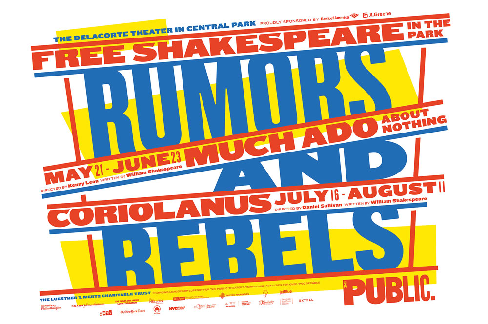
Much Ado About Nothing/King Lear (2014)
Typography has defined The Public Theatre's brand identity since 1994, when Scher crafted its logotype using original wood-block letters that had not yet been digitised. Fourteen years later, in 2008, Scher updated the logotype, setting it in six different weights of the Knockout typeface.
"I selected the wood fonts, and later Knockout, because they were used in newspapers in the late 1800s, and then in boxing posters in the 30s, 40s and 50s," she explains. "The type is populistic, so it was perfect for this not-for-profit, inclusive, and often groundbreaking theatre."
Each season, Scher collaborates with artistic director Oskar Eustis to agree a summer headline that captures the spirit of those productions – past examples have included Free Love and War and Love.
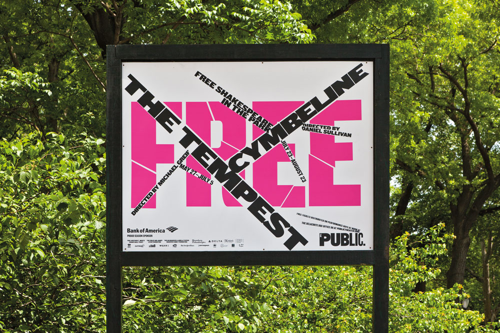
The Tempest/Cymbeline (2015)
Working primarily with different weights and colours of Knockout, with some creative tweaks to the typeface where necessary, Scher and her team at Pentagram design a distinctive look and feel for Shakespeare in the Park every season. This then serves as a creative framework for a range of other promotional material rolled out by The Public's in-house team.
"Generally, I try to design each season as a counter-balance to the one that came before it," says Scher. "The 2018-19 season used a gradated background and heavy black typography, where the left-hand side of a straight letterform, like an F or an L, might be extended by as much as an inch, giving the typography a rather heavy black appearance."
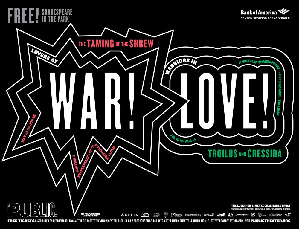
The Taming of the Shrew/Troilus & Cressida (2016)
The most recent 2019-20 season, meanwhile, is a riot of colour by contrast. "It has type at tangents using underlining bars," she continues. "The blue, red, and yellow is upbeat, influenced by the colours of Wonder Bread packaging and Bazooka gum."
Scher admits that each season some trial and error is required to achieve a suitably eclectic range of brand expression using the same typeface. "I'm trying to find the right eccentricity to build into the typography," she says. "Typefaces have spirit, and can be highly recognisable. If the typographic style used by an organisation has enough specific eccentricity, it can be recognised by the typeface alone – without a logo."
02. Build type on a versatile grid-based system: SKP Beijing
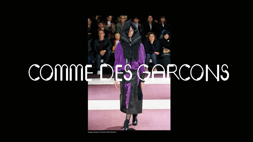
SKP wanted the font to have an edge
Designer and art director Bianchini worked with luxury Chinese department store SKP on a bespoke typeface that pushed the boundaries of convention. "A brand's typeface is usually one of the first things a consumer interacts with, and it's a very simple way to showcase a sense of feeling or character," Bianchini says. "SKP is streetwear focused, so it wanted the font to have an edge to it. "The overarching concept was a five-sided shape, which we named Wu. This became a visual metaphor to represent different parts of the store and SKP's brand, as well as touching on Chinese culture."
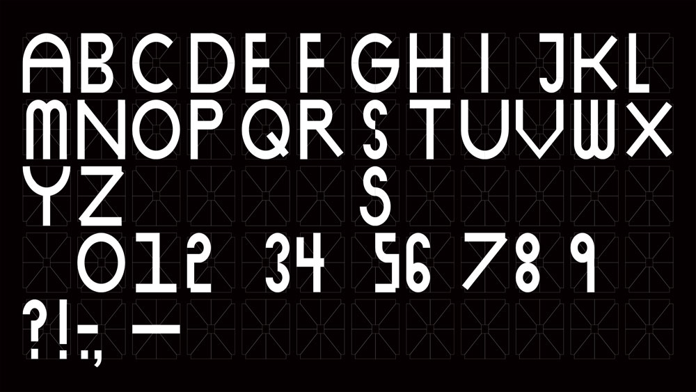
SKP Beijing’s typeface uses a grid based on a five-sided shape called Wu
This simple shape was the foundation of a grid, which in turn became the basis for the entire graphic system. Once the grid was established, it became a tool for building SKP's iconography and wayfinding systems.
"The result is something that feels quite multi-dimensional and multi-faceted," says Bianchini. "We developed three different weights: light, medium and finally faceted. The font is blocky and black, which gives it a distinct and instantly recognisable aesthetic."
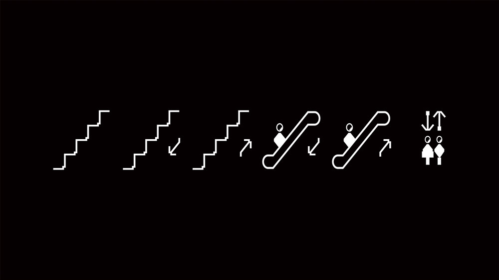
Each character is built from shapes defined by this grid, and the concept translates to iconography and signage
Bianchini adds that this multi-faceted approach helps establish a unique identity for the department store. "A lot of the time people try to create something more functional, with the idea that less is more," she says. "With this type we wanted to create more. We wanted it to feel like the pioneer, the one doing things differently. We also always try to build a sense of something being a little 'off' into our work, and I think the unbalanced feeling of the shape pieces when they come together gives the typeface that exact feeling."
Conscious of not creating something that felt too 'over-designed', Bianchini had to strike the right balance between intriguingly esoteric, and overly confusing. "The font is heavily rooted in the grid formation, which usually simplifies things, but in our case it created a complicated system that could have been pushed too far in the wrong direction," she says. "We pushed it just enough."
03. Provide ownable typographic personality: City of Vienna
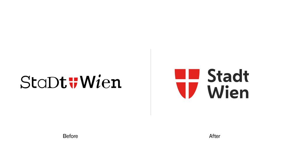
Vienna’s coat of arms was a key inspiration for its bespoke typeface: the curves of the t and W echo the shape of the shield. The typeface brings warmth and personality to the city’s marketing materials
Working alongside Saffron Brand Consultants, Dalton Maag put together a bespoke typeface for the City of Vienna entirely from scratch. The brief was for a contemporary sans-serif font family, with three weights, that could convey a uniquely 'Viennese' feeling across all media.
"We started by gathering inspiration from the city itself – its architecture, culture and history – and used these references to directly inspire the typeface's design language," explains creative director Paltram.
"It's this unique process that makes the typeface distinctive and ownable. The typeface is clean and mature enough to support the efficiency of the government, but it also embodies the diversity and humanity of Vienna and its residents."
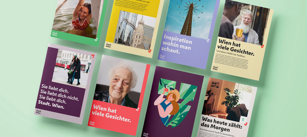
The typeface needed to be expressive – friendly yet confident
When Dalton Maag came on board, Saffron had already established the foundations of the visual identity, but the typeface remained a critical component. It needed to be expressive, giving the city a friendly yet confident tone of voice without compromising functionality or readability.
"Next to historic and cultural references, we used the long-established shape of the shield, the coat of arms of the city, as an inspiration," says Paltram, giving the example of the diagonal glyphs on the W and V.
"There's a specific tension in the curvature which is repeated across multiple characters, together with other unique elements such as the e with an inclined middle bar, and the simplified u shape," Paltram continues. "The softened diagonal strokes of the letters, round shapes and open counters give the typeface an approachable and warm expression throughout, but also deliver excellent legibility – even at smaller sizes."
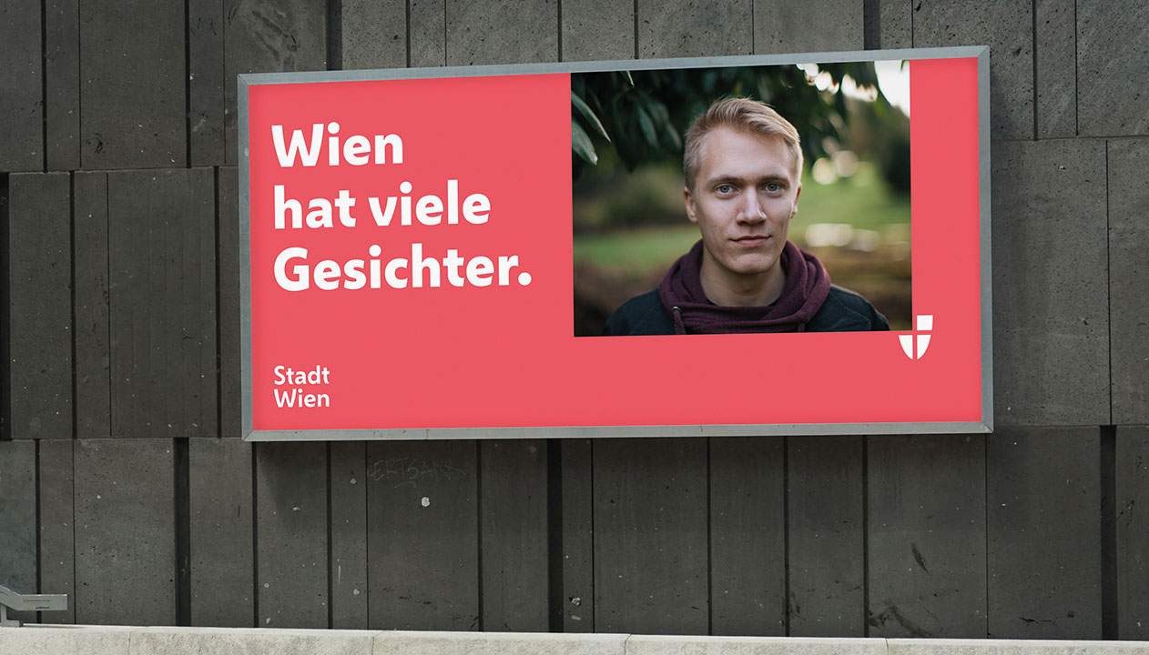
Vienna’s citizens are the ultimate end clients
As Paltram points out, the ultimate end clients are the citizens of Vienna. "In my opinion, Vienna is a modern and cosmopolitan place, but you can feel the history and tradition in the city," he says.
"Merging these elements and understanding the right level of influence to the typographic expression was key," continues Paltram. "Together with the working group of agencies, and the client's team, I'm confident we achieved something that doesn't just follow a fashion, but will last and find the right place in our time."
04. Create a cohesive design system driven by type: Top Gear
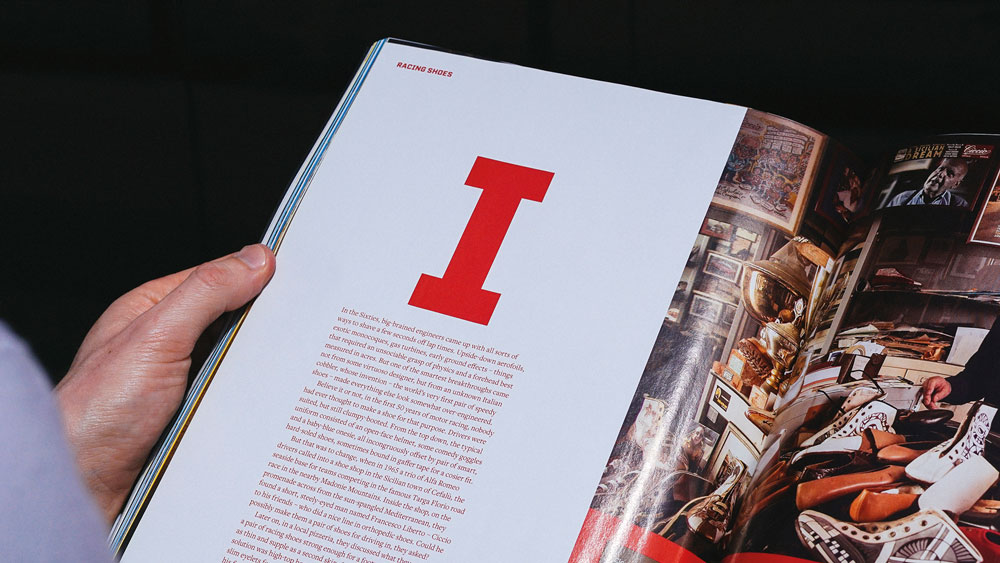
DixonBaxi collaborated with Fort Foundry to create the bold, dynamic brand typeface, TG Industry
To help drive brand recognition for BBC Top Gear, DixonBaxi developed TG Industry: a distinctive typeface designed to give the global motoring brand a consistent, ownable presence across its many platforms.
According to co-founder and creative director Dixon, an extensive range of weights was essential to create enough nuances to work with across print, broadcast and digital applications. "At times sleek and reductive with a cinematic quality, yet bold and expressive in other moments, it packs a punch for eye-catching headlines and iconic title sequences," says Dixon. "It's a digital-first typeface, crafted to remain highly legible on the smallest of screens."
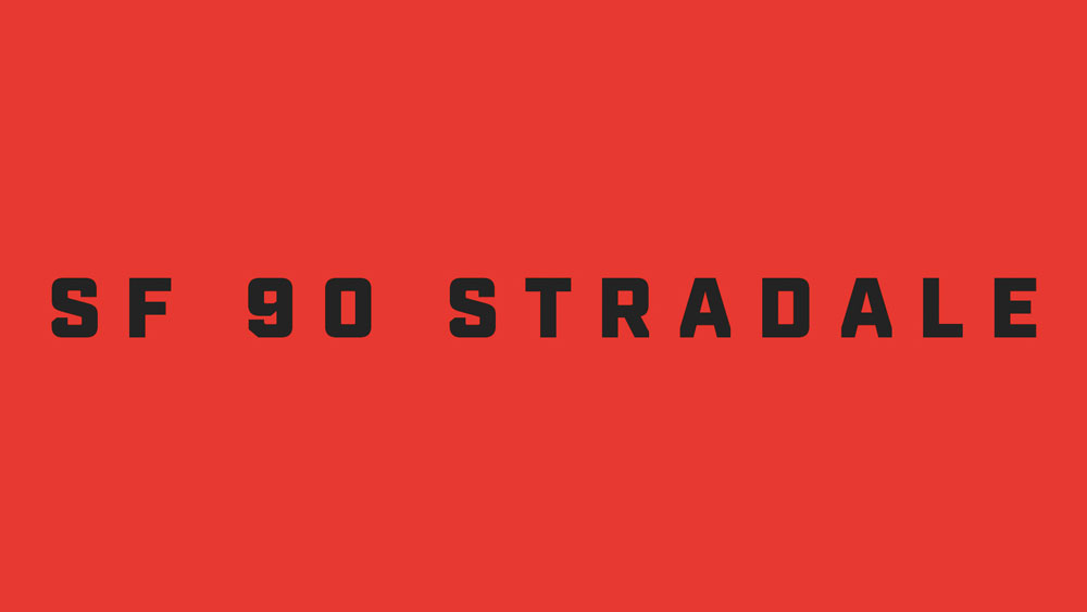
Its distinctive angular cuts are inspired by the teeth in Top Gear’s cog-based logo
Created in close collaboration with Mattox Shuler from Fort Foundry, the typeface is at the heart of a cohesive and creative design system for Top Gear – and clear visual signifiers emphasise its relationship to the main brand. "TG Industry is inspired by the angular cuts of the Top Gear cog, a core part of the logo," continues Dixon. "The blunt end of the uppercase A is a good example, or where the curved part of the lowercase b meets the upright stroke – this has been given an aggressive angular edge that is inspired by the shape of the teeth on the cog icon."
As Dixon points out, great branding tends to be in the detail. "It's the specifics that make the experience more relatable and ownable," he adds. "The tracking and kerning. The legibility and different sizes. The satisfying feel of a font that feels right in many applications."
Dixon's advice is to be clear from the outset why you're choosing to design a bespoke font. "It needs a clear rationale," he insists. "See the typeface as part of a larger design eco-system. The typeface is delivering the brand's voice. Look at the details: it's easy to skim through the finer points, so diligence pays off. It can't be rushed."
05. Evolve a full typeface from a logo design: Duolingo
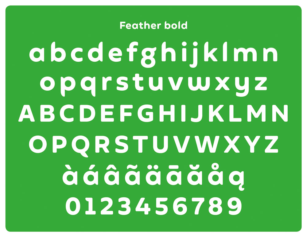
Duolingo’s feathery mascot Duo was the starting point for the brand’s own typeface, Feather Bold
Sometimes the development of a typeface evolves as part of the creative process, even if it wasn't originally part of the brief. That was the case with Johnson Banks' recent rebrand of language-learning platform Duolingo.
"The first type conversations stemmed from a desire to improve its logotype," reveals creative director Michael Johnson. "It was based on a typeface called Chalet, which we all felt wasn't fit for purpose."
Although discussions initially turned down the 'neutral' sans-serif route, Johnson pointed out the ubiquity of the style in the tech space. "We were keen that they had something more unique," he adds.
"As we experimented with juxtaposing the mascot with their name, a 'What if?' unlocked the solution," continues Johnson. "We redrew the logotype, drawing inspiration from Duo's feathery form to reflect the company's quirky personality."
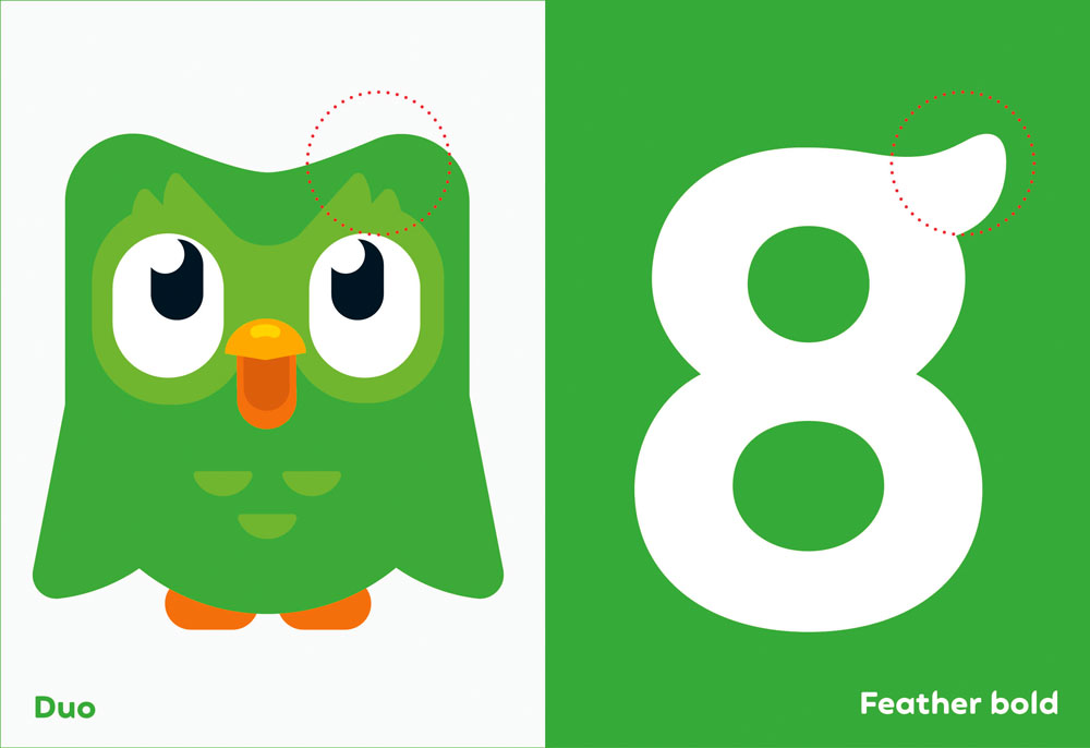
This included wing-inspired ascenders and descenders, and a flicked g that echoes the shape of Duo’s eyebrows
While he admits the first few attempts looked "very odd", as the concept was refined the potential emerged for a bespoke typeface – developed in partnership with Fontsmith. "A lot of the initial decisions stem from the logotype, where you have round characters (the d and two o's), a repeated character (the u and n) and the relatively neutral l and capital i," says Johnson. "Then you have the mnemonic character: the g. Little quirks, such as the flick of the lowercase g were used sparingly, beta versions were crash-tested, and eventually 'Feather Bold' was ready."
The Feather Bold typeface was reverse-engineered from the shapes used to draw Duolingo's mascot, Duo the owl. Johnson reveals that, "It finally let us put the word 'duolingo' next to their mascot without it looking like an unhappy marriage."
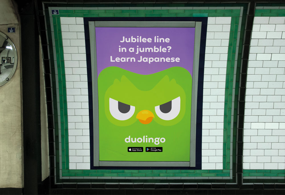
“We look for something that can encapsulate the unique feelings we’re trying to convey with the brand,” says Johnson
For Johnson, a brand's use of typography is interlinked with its tone of voice. "It's rare for us to use the same typeface from project to project," he says. "We're always looking for something that can encapsulate the unique feelings that we're trying to convey with the brand. Using 'generics' like Helvetica strikes me as a cop-out, unless there's a good reason to look and sound the same as others."
Next page: How to choose the right typeface for your brand
Make the right choice
Why do certain types of brands adopt certain types of fonts and font pairings? Partly, at least, this can be attributed to a ‘trend effect’. This is a collective interpretation of design, absorbed through our familiarity with – and understanding of – the culture we happen to be part of.
But there’s also the way brands from different industry sectors choose to position themselves. Trends within specific sectors don’t follow a strict rulebook, but certain styles of fonts represent specific emotional attributes.
For instance, geometric fonts with homogenised proportions tend to represent design purity, cleanliness and simplicity – values that many technology brands are currently keen to express.
Many fashion brands, on the other hand, have an ongoing love affair with high contrast modern designs with their elegant hairline strokes, bracketed serifs and smooth arching curves, expressing a timeless style.
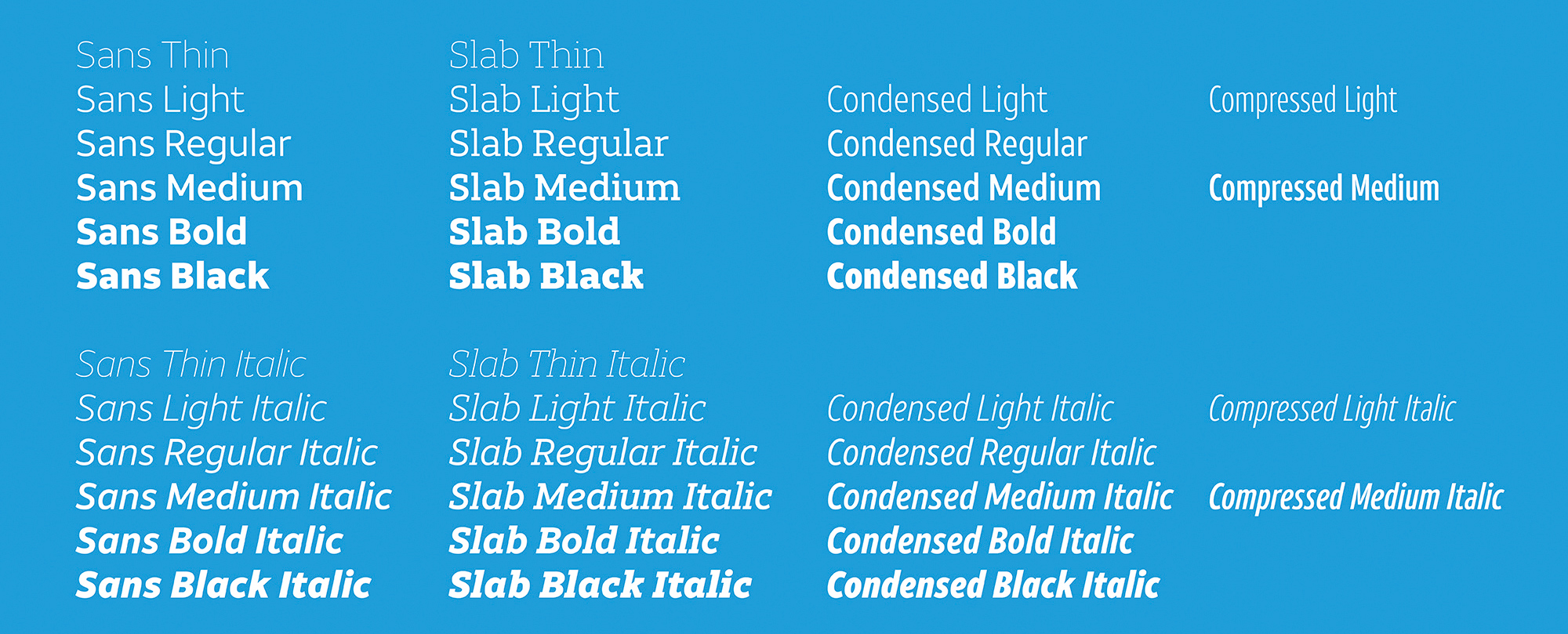
AT&T’s extensive brand font comes in a number of styles all built around the same humanist structure
Consumer banking also offers an interesting example, as these brands have been progressively moving away from authoritarian serif designs in favour of softer expressions, perhaps to appear more human and friendly as they aim to rebuild trust following the financial crisis.
In 1923, when Poffenberger & Franken conducted research into how readers perceive different typefaces used to advertise products, they discovered that people responded almost uniformly to typeface and product combinations, and mostly used similar adjectives to describe what they felt about the different fonts they were asked to comment on.
Subliminal messages
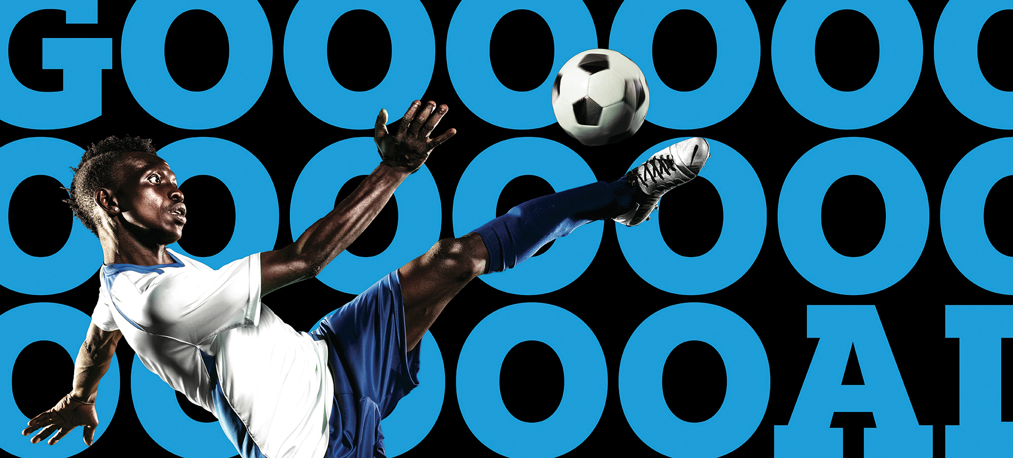
Slab Serifs are typographically strong and distinctive and usually stand up well individually
Through a lifetime of exposure we learn, or are prepared to be seduced by, the subliminal messages presented to us through branding and communication. Fonts, and typography in general, contain layers of subliminal communication, and carry a wealth of meaning, even for viewers who are not well-versed in typography.
The contrast and modulation of the strokes, how a stroke termination is shaped, and height to width proportions determine whether a design is perceived as warm and friendly, or cold and mechanical.
This is why picking the right font is key to a brand’s successful communication. Just like a logo or colour palette, the right font can help consumers identify the key characteristics behind a brand’s attitude and encourage them to make positive associations with its products and services.
Developing an ownable brand font
Typographic consistency across different communication channels establishes a sense of empathy and loyalty between the brand and its audience over time, and is an unquestionable asset in a brand’s toolkit. So how do we choose, or develop an ownable brand font? This is a question that we’re asked every day.
A multitude of parameters and features affect the stylistic and functional properties of a typeface: some are global, affecting all glyphs within a font family; some are specific to style variants, such as Regular, Italic, Bold, Bold Italic; others apply to shared elements within each style variant; while a few relate to just individual letters.
With the democratisation of type design tools and the boom of available designs you can pick from, there are a number of criteria to take into account if you choose to license a font family for a brand. Being aware of the conventions at play behind our interpretation of the emotional qualities conveyed by a typeface will always be helpful.
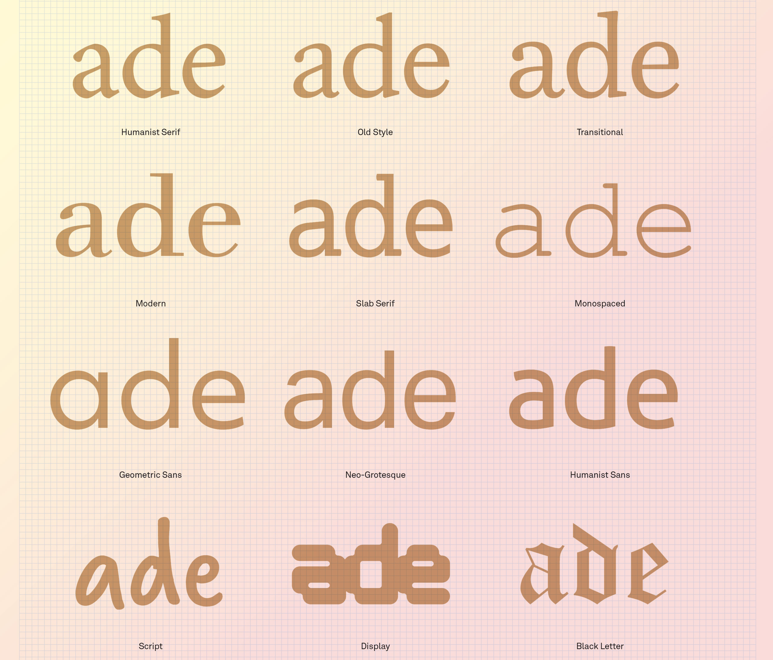
Use this handy reference guide as a reminder of the 12 main styles of typeface (click the top-right arrows icon to expand the image)
First off, you could start by considering whether a serif or sans serif design is suitable. Serifs originate from carved inscriptions, mostly from the Roman Imperial period, and while lowercase letters have since evolved into a variety of other letter shapes, capitals and their associated serifs have survived with very few fundamental changes.
This deep-rooted history brings with it an inescapable association between serifs and their antique origins, making serif fonts more suited to cultivated, academic and more thoughtful communication.
The advantage of serifed letters has been understood for hundreds of years of print-based typography: they help to combine or ‘glue’ letterforms together into word elements. The internal density that serifs provide also creates more clearly defined horizontal rows of text, making the process of switching from the end of one line of text to the beginning of the next more efficient.
The boom of screen-based technology over the last decade or so has brought a resurgence in the popularity of the sans serif.
Sans serifs, for their part, made their first appearance in the 19th century and were used initially for commercial headlines and advertisements. In the age of print, their low contrast and absence of serifs made most sans typefaces harder to follow for general reading and so they were not a suitable choice for the text of a book, magazine or newspaper.
But the boom of screen-based technology over the last decade or so has brought a resurgence in the popularity of the sans serif.
The complex texture and density of the serifed fonts did not always perform well in digital form, and screen resolutions were not sufficient to render as accurately the reading sizes we normally find comfortable in print media.
In this context, the monolinear stroke weight and functionality of the sans serif made it an appropriate choice for their association with a more rational and industrial ideology and their functionality in digital environments.
02. Consider the font contrast
Next, you should consider which contrast in a font will be more appropriate for your brand. Despite the passing of many generations, the same calligraphy inspired stroke modulation between thick and thin strokes that was incorporated into those earliest forms of movable type is still recognised today, informing the construction of digital type.
High contrast fonts generally are more effective when used at display sizes, where their elegance can be appreciated. However, their use for text can prove problematic due to the delicacy of their thin strokes, which have a fracturing effect at small sizes, reducing visual definition.
Low contrast fonts can also present limitations, but for different reasons. In display and larger text sizes they perform well, but for text use in general, their reduced internal space also reduces visual definition. Both extremes have an important role to play in display typography: high contrast designs can provide an impression of classical dignity and grace, while lower contrast designs can contribute a sense of robust solidity, confidence
and permanence.
03. Think about font stress
You should consider the stress or axis of the font, which refers to the angle at which contrast occurs in a letterform, usually ranging from vertical to a somewhat back-slanted diagonal. This can best be noted by looking at the letter ‘O’ and noting if the bottom left is thicker than the top left, and if the top right
is thicker than the bottom right.
If this difference exists, the letter has diagonal stress. The reason for this angled stress is due to calligraphic construction and principles applied to traditional Roman type styles we use for text copy. These ‘old style’ designs are generally considered warm and friendly with their angled stress providing a slightly coarse, organic texture on the page.
The flowing rhythm of the text, enhanced by naturally occurring oblique ascender and x-height serifs, serve to combine individual letters more readily into clearly defined word elements. The irregularity and down-to-earth familiarity of these designs seems to invite the reader to enter the text and read.
04. Don't forget vertical stress
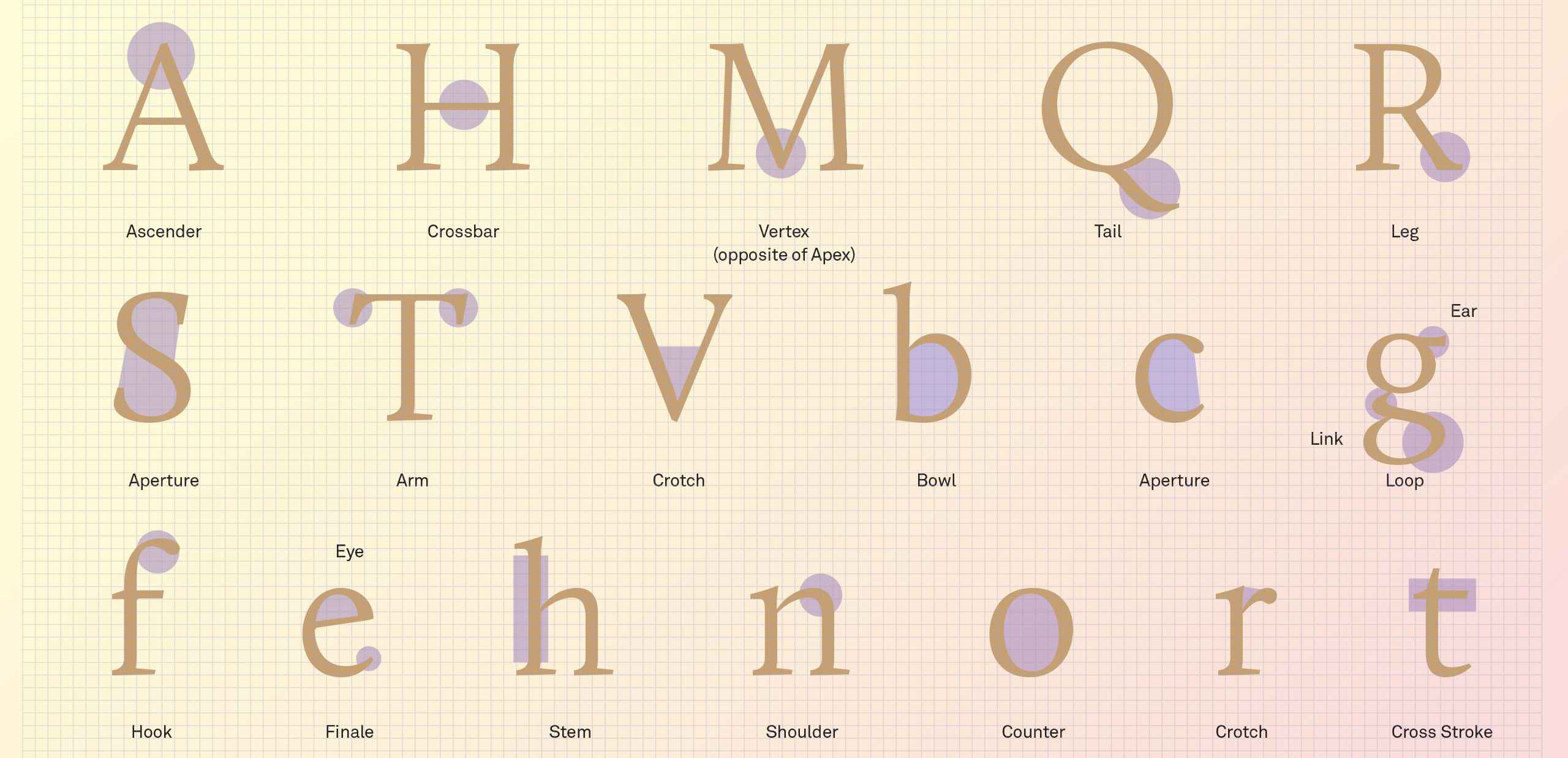
Letterform anatomy (click the top-right arrows icon to expand the image)
If the two halves of the ‘O’ are horizontal mirror images of each other, with the sides thicker than the top and bottom, then the letter has vertical stress. Unlike the Roman typefaces, which developed naturally over time, a more rational approach to verticality emerged in the 18th century with the development of typefaces we now call ‘modern’.
Aside from their functional properties, vertically stressed moderns have a more refined, austere elegance about them, qualities that are best appreciated when used at display sizes for magazines and posters. At text sizes, however, they seem to convey a sense of cool clinical detachment, inviting the reader to look at the text rather than read.
A tall high x-height will help maintain clarity of the characters, but this may come at the expense of word and line definition.
Another element that should influence your font choice is a font’s vertical parameters (ascender, x-height and descender). If we are familiar with most words we encounter, when our eyes scan the page we look for clues based around the context of the passage we are reading. This makes us able to guess collections of words within a phrase or sentence based on their length, architecture and context as our eye moves forward and backward in saccades.
A tall high x-height will help maintain clarity of the characters, but this may come at the expense of word and line definition. A short x-height will restrict definition within the x-height portion of a font, particularly in bolder weights, but will define more clearly the silhouette or shape of words within a text.
The ideal x-height for your brand font will allow sufficient space to build lowercase letters, including the more complex ‘a’, ‘e’, ‘s’ and ‘x,’ without compromising their definition at whatever range of sizes the font is designed to cover, as well as taking into account its relationship with the ascender height.
05. Counter balance
The architecture of the letters is also heavily influenced by whether the designer opted for open or closed counters. This is particularly relevant for corporate branding needs, where fonts are required to perform effectively over a wide range of media and sizes with an economy of space.
Since these fonts are often monolinear, the designer is required to ensure that there is sufficient internal space within the letterforms and
to consider restrictions to their width proportions. To overcome these constraints, designers will often resort to humanist designs, where the construction and architecture of the letters helps provide more internal space.
There is no overarching formula as to which designs are right or wrong.
Closed counter styles are available in the form of grotesque (grotesk) designs in which the outer loops of ‘a’, ‘c’, ‘e’ and ‘s’ are hooked in towards the middle of each letter. To maintain their flexibility and legibility at small sizes, these fonts are generally made with an enlarged x-height and with the widths of the enclosed characters increased but, as discussed earlier, there is a corresponding reduction in legibility at text sizes.
These are just a sample of the criteria that should be considered in your choice of a brand font and there are many features which will influence a decision that should be articulated around a solid understanding of the brand’s identity.
There is no overarching formula as to which designs are right or wrong and the most important thing is to thoroughly map the requirements and context in which the typeface will be used. This will very much be determined by how expressive or functional it should be, what it should look like, and in which digital environments, operating systems and screen resolutions it will be used.
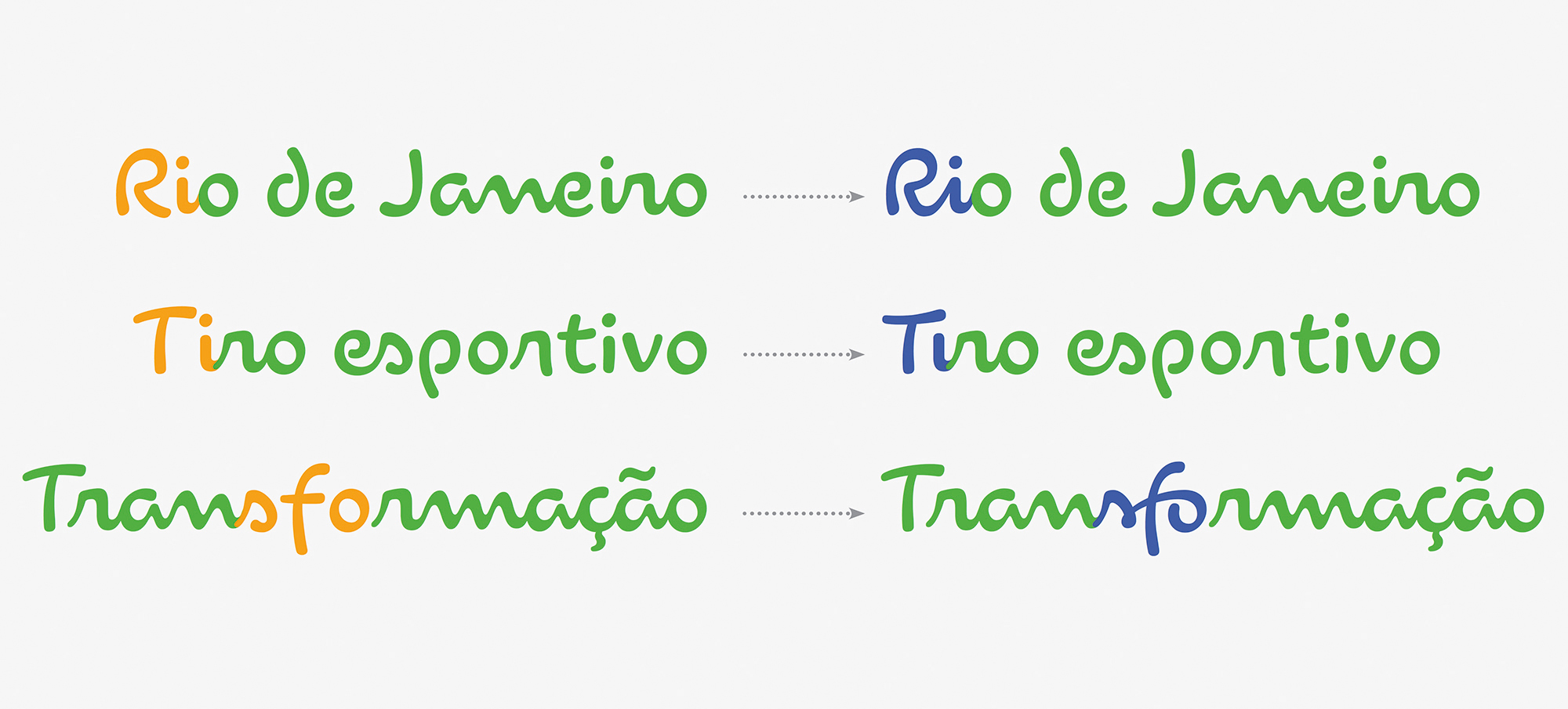
The nature of a script font requires several variants of each character if it is to reach its full potential, as with Dalton Maag’s brand font for the Rio Olympics
Considering which required writing systems will be needed at an early stage is also paramount. After all, it would be a shame to pick a font family that looks good, but doesn’t cover all the script systems that the brand will need to communicate in its other markets. It’s possible to pair or match a Latin font in another script system, but this is at the risk of diluting the brand’s expression.
In a nutshell, picking the right brand font should come from discussing emotional features, visual language, technical, linguistic and logistic requirements with the brand.
If possible, you should also liaise not only with the client’s design and marketing departments, but also with IT and legal, as each team often has different or additional needs. Ultimately, the sweet spot where brand expression and functionality meets is where you’ll find the right typeface for your brand.
This content originally appeared in Computer Arts magazine.
Related articles:
Font vs typeface: the ultimate guideHow to add fonts in Photoshop35 great free script fonts


 Every week users submit a lot of interesting stuff on our sister site Webdesigner News, highlighting great content from around the web that can be of interest to web designers.


 Web design clients come from a wide variety of backgrounds. One day, you’ll be designing a portfolio website for a voiceover artist, the next you’ll be creating a comprehensive ecommerce site for a leading retailer. In an ideal world, you’ll get to a point where you eventually specialize in a niche. However, you’ll need to master both avenues first.
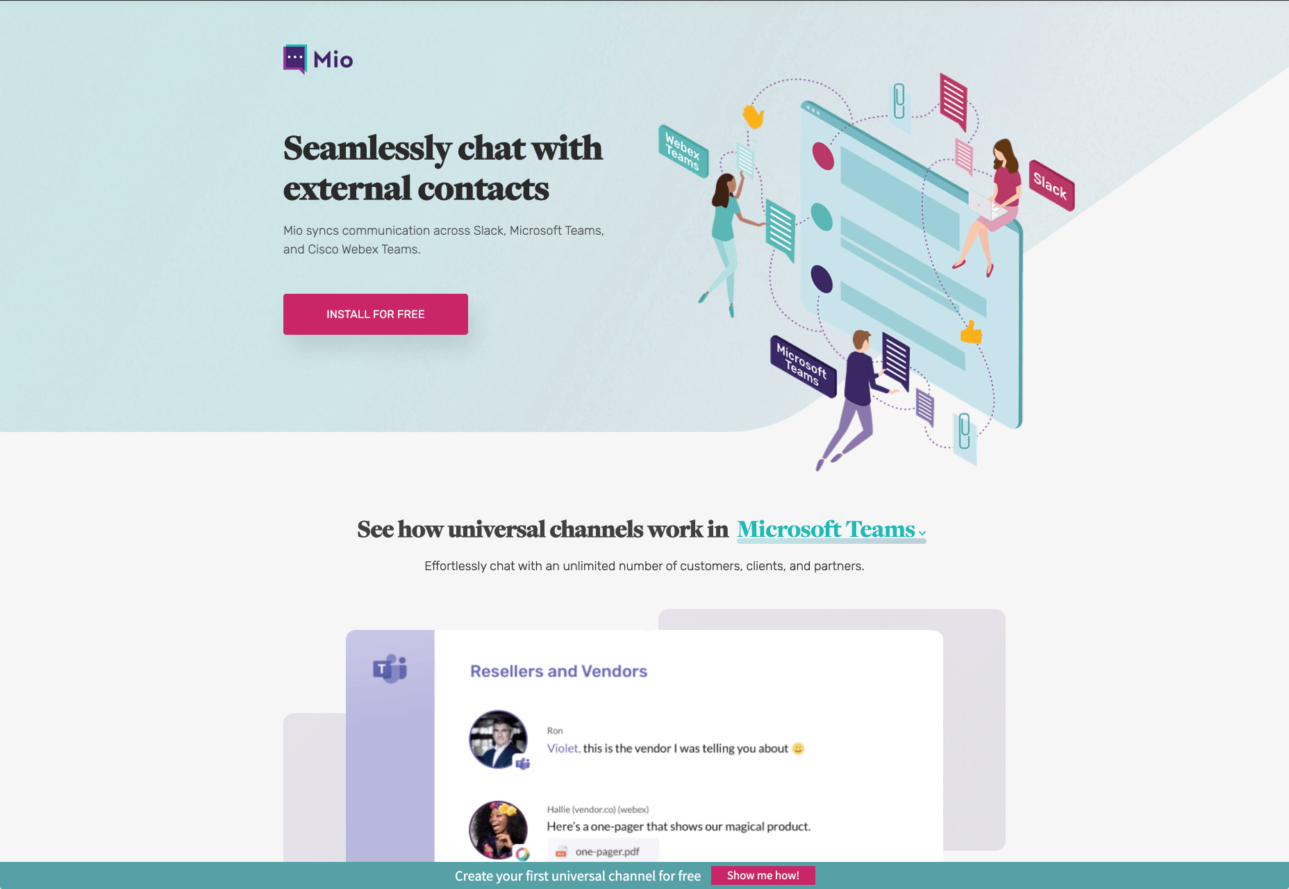
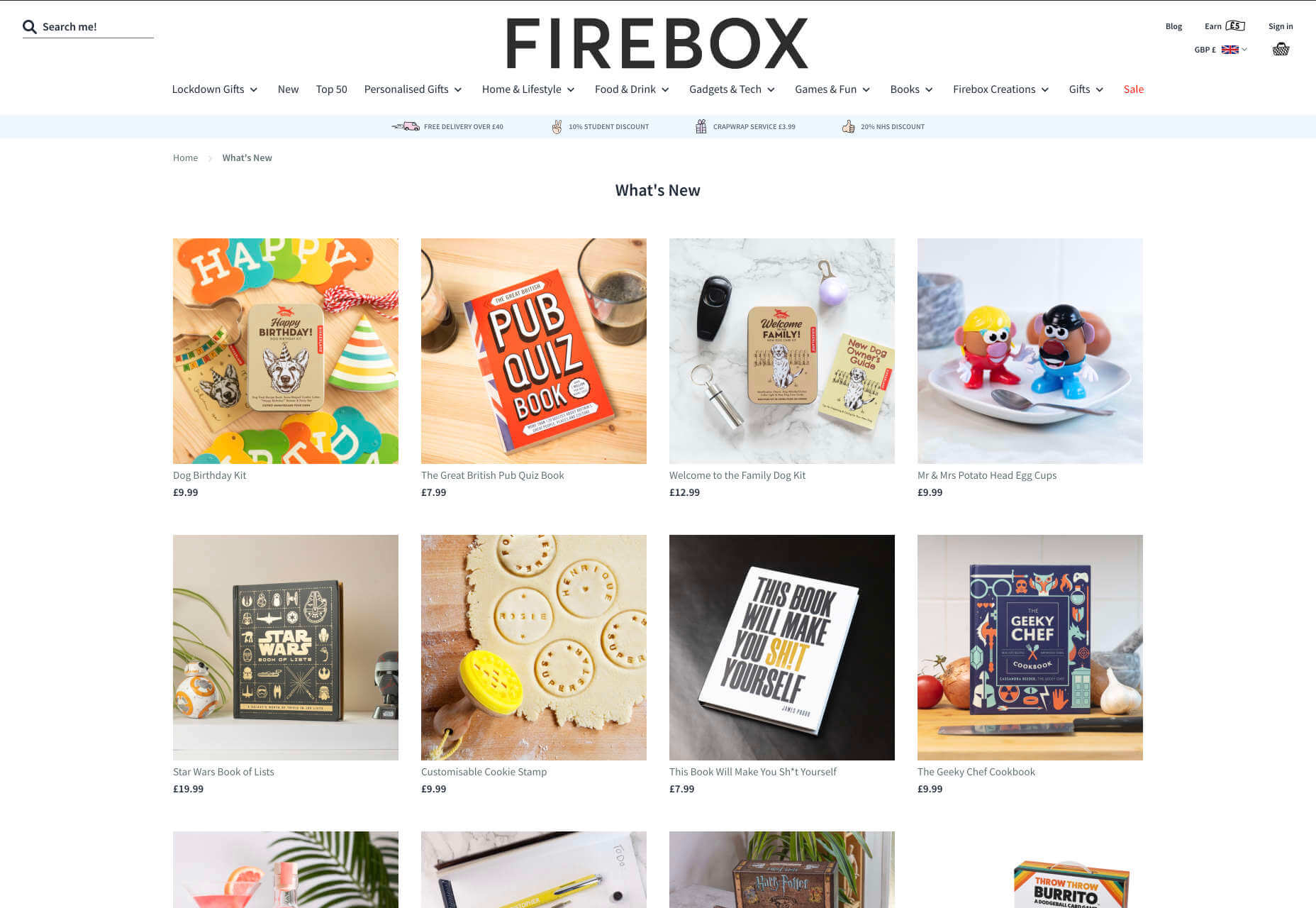

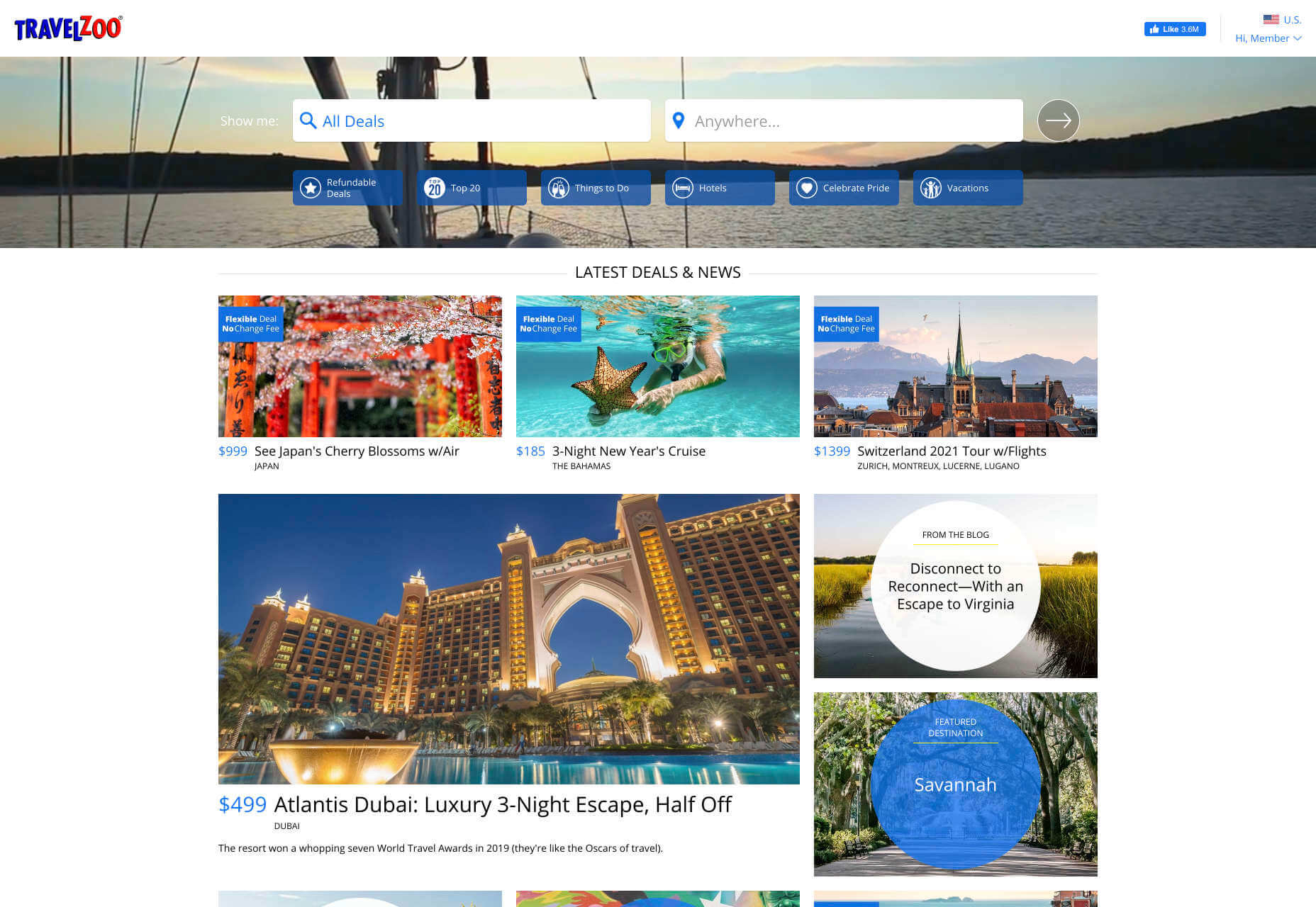
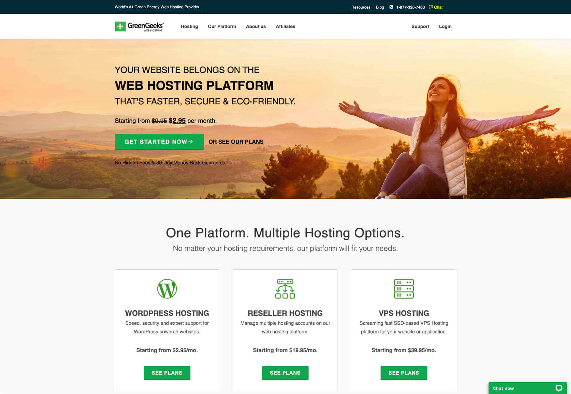

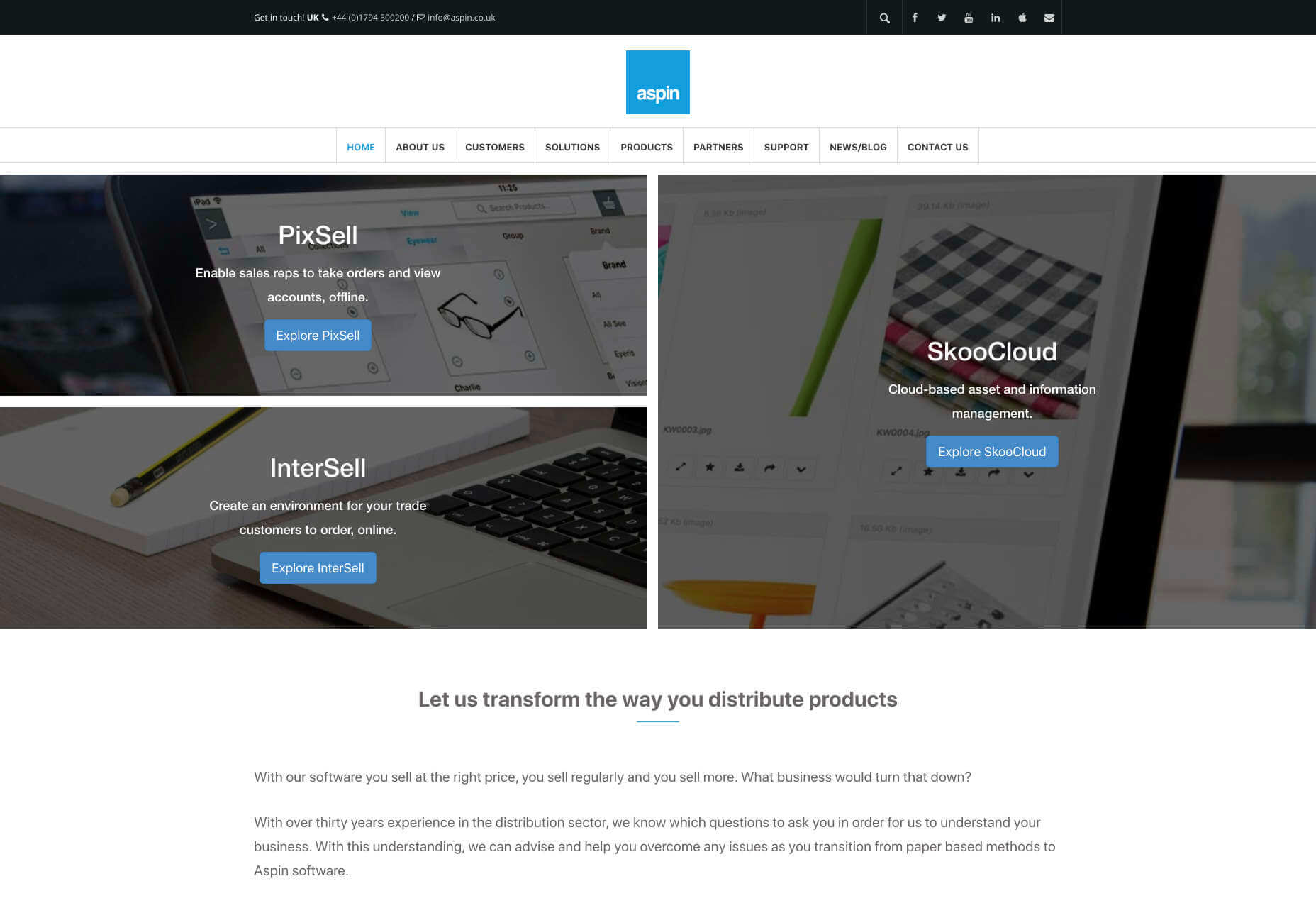

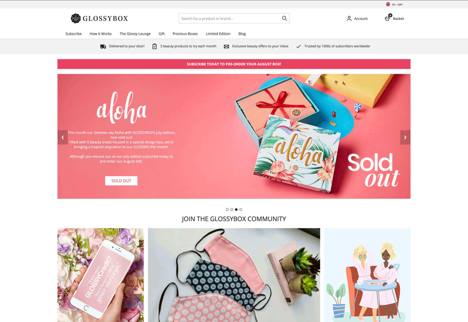
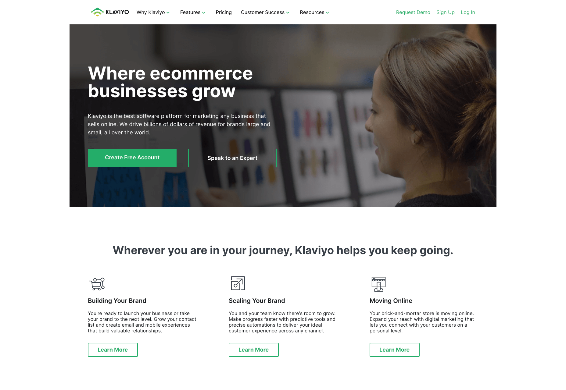
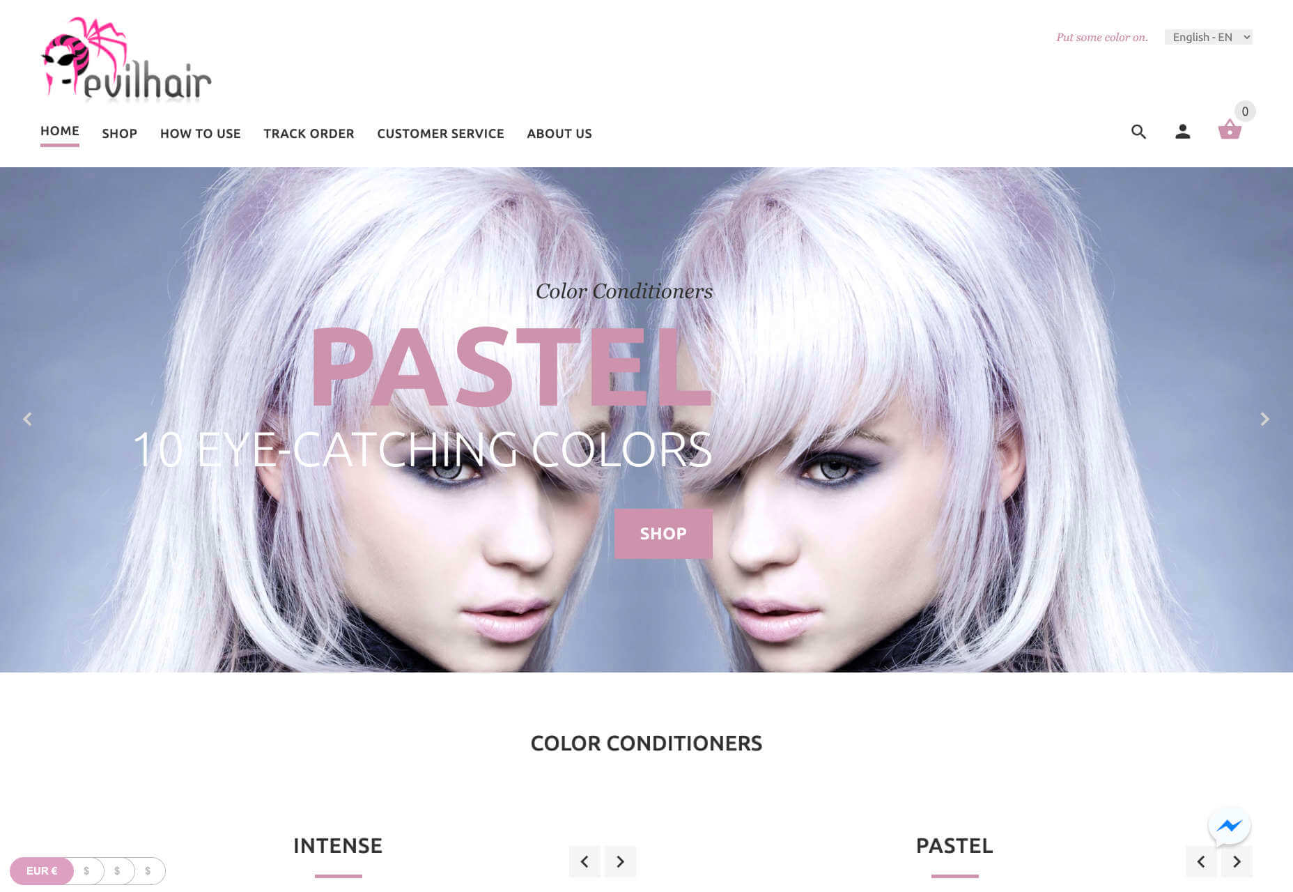
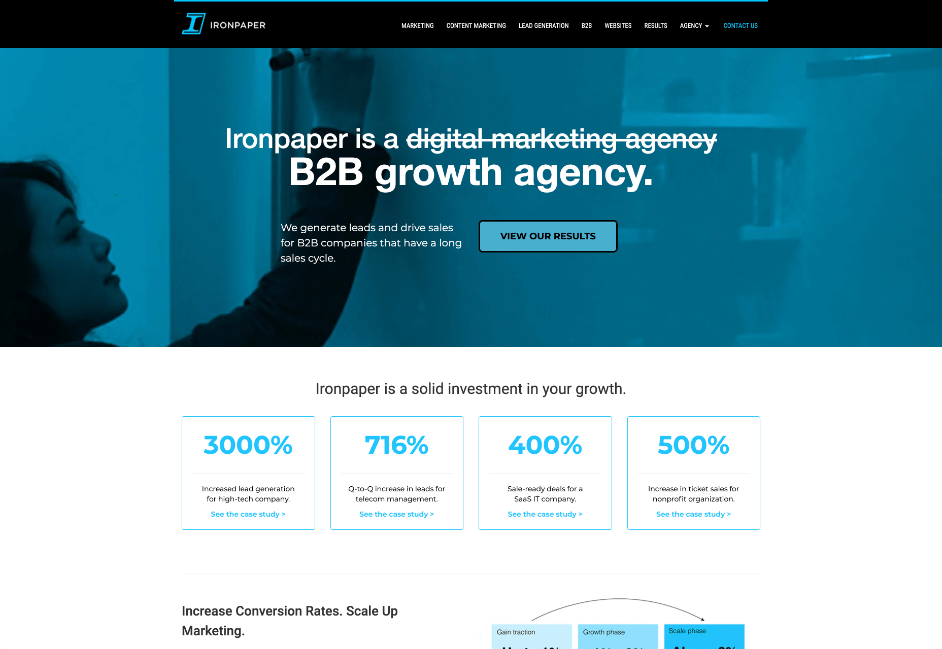
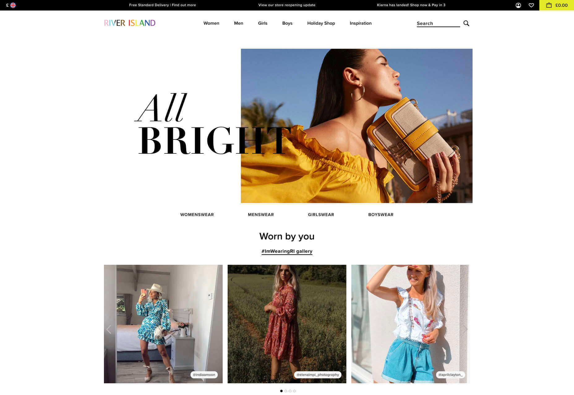
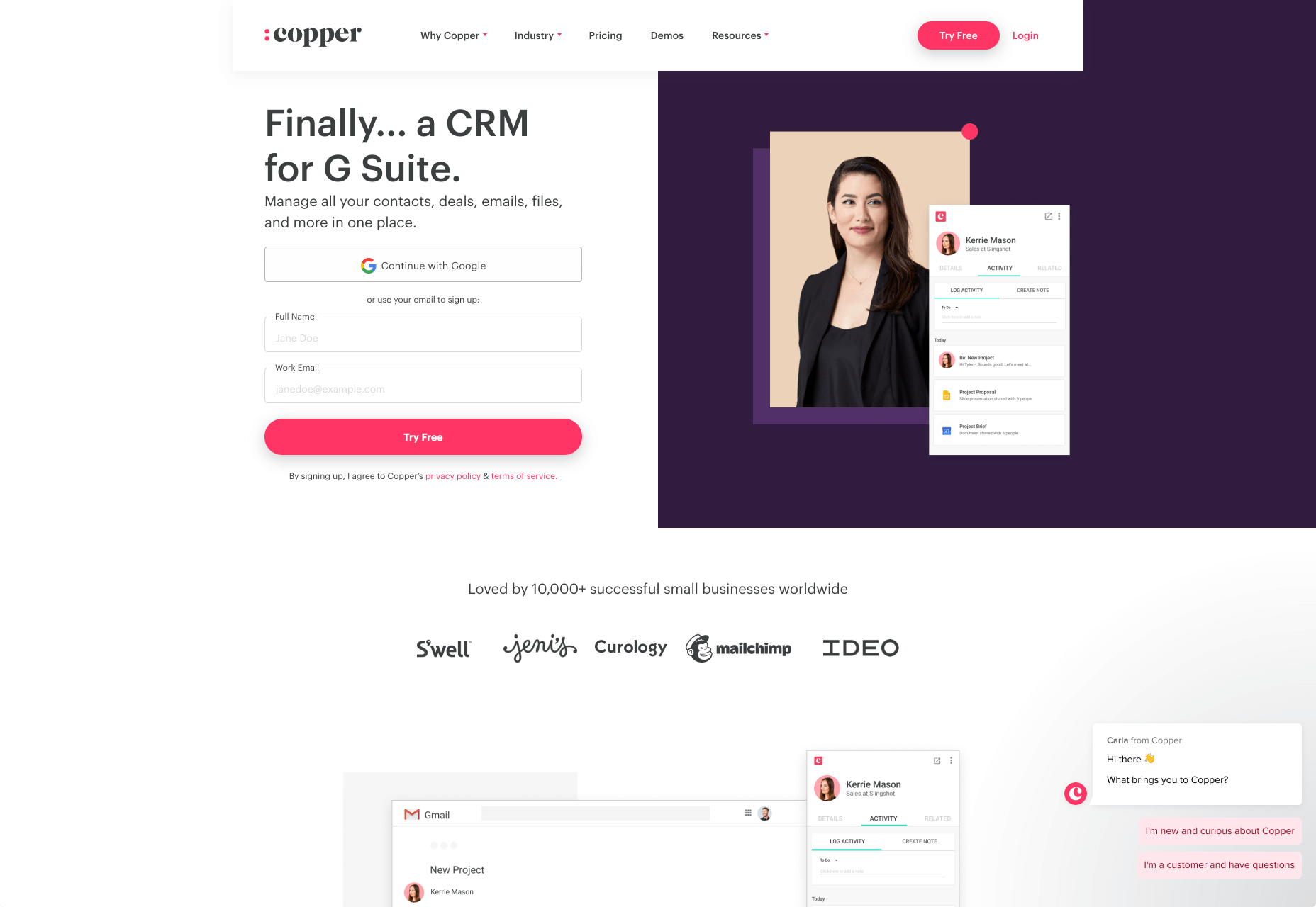
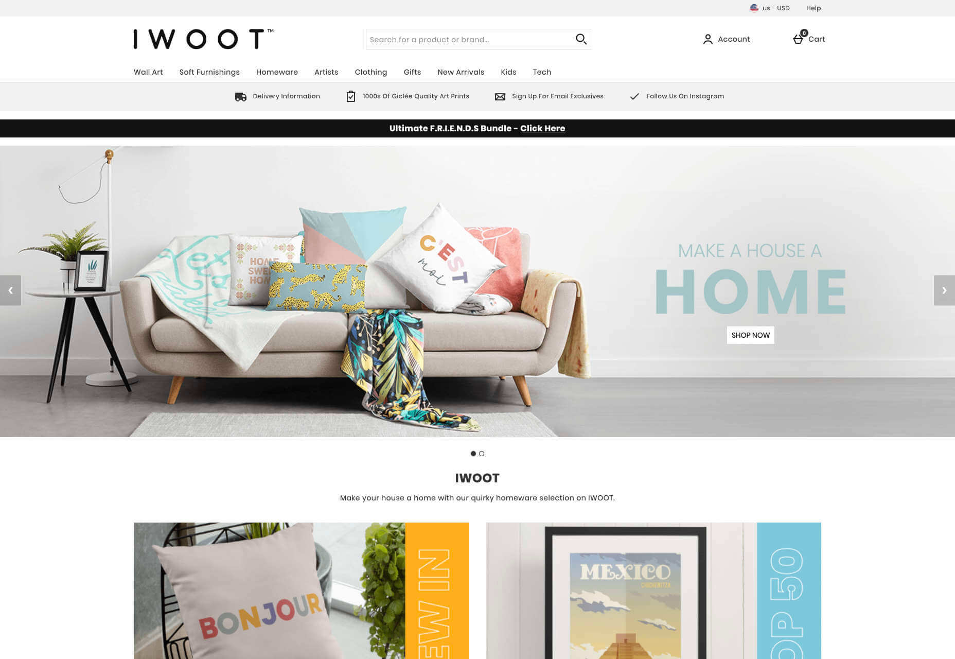

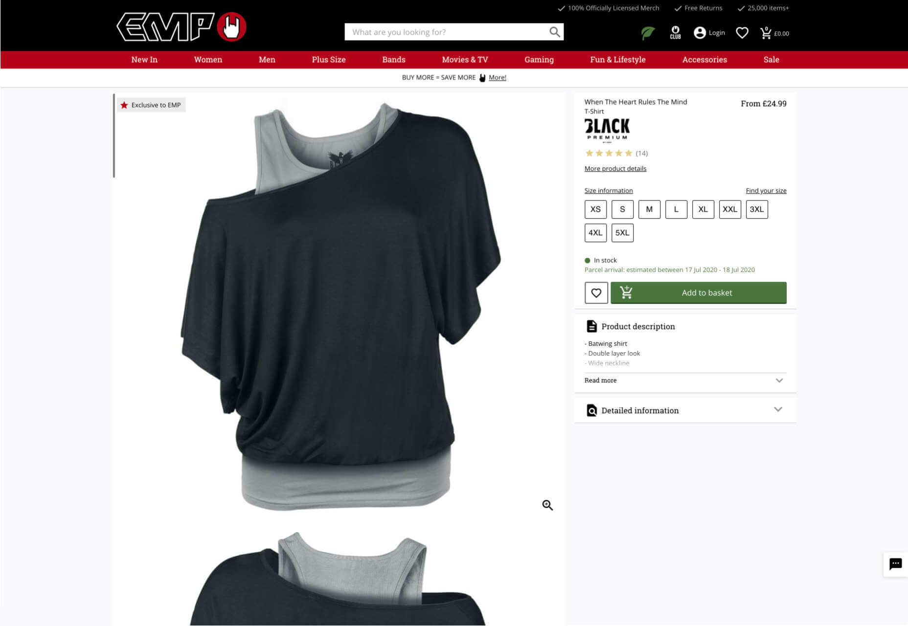
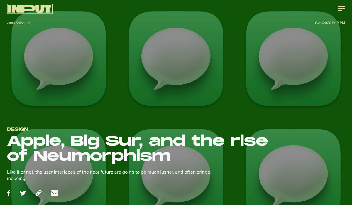
 If we don’t question this kind of design homogenization, do we put ourselves at risk of perpetuating the same mistakes in the years to come? Or is it even a mistake to begin with?