Collective #534

Original Source: http://feedproxy.google.com/~r/tympanus/~3/vMXM74abqzo/

C534_gradients

Gradient Magic

A collection of very modern and unique CSS gradients.

Check it out

C534_Bugherd

This content is sponsored via Syndicate Ads
Collect feedback and track website bugs visually with BugHerd

Capture, collaborate and communicate on visual feedback wherever you work with BugHerd. Collect and pin feedback, it’s like using sticky notes on a website.

Try it free

C534_grid

Intrinsically Responsive CSS Grid with minmax() and min()

Evan Minto shows how to pull off an intrinsically responsive grid without media queries using the new min() function.

Read it

C534_flawwwless

Flawwwless

Flawwwless is a coding education platform with easy to follow interactive tutorials.

Check it out

C534_refresh

Keeping things fresh with stale-while-revalidate

Learn about an additional tool to help you balance immediacy and freshness when serving your web app. By Jeff Posnick.

Read it

C534_docs

ImportDoc

With ImportDoc you can create a web page that updates dynamically with the content of a Google document.

Check it out

C534_cssload

The Simplest Way to Load CSS Asynchronously

Scott Jehl shows a simple HTML approach for loading CSS files asynchronously.

Read it

C534_gatsbythemes

Gatsby Themes

Exciting news for Gatsby users: With a Gatsby theme, all of your default configuration (shared functionality, data sourcing, design) is abstracted out of your site, and into an installable package.

Check it out

C534_fwa

The Cool Club FWA

The web presentation of The Cool Club FWA, a deck of cards displaying the 54 coolest websites in history, as featured in “Web Design, The evolution of the Digital World 1990-today”.

Check it out

C534_minecraft

Rendering a Minecraft terrain

Day 21 of the WebGL month by Andrei Lesnitsky will teach you how to create a Minecraft terrain.

Read it

C534_locoscroll

Locomotive Scroll

The freshly updated library for detecting if elements are in the viewport plus smooth scrolling with parallax effects.

Check it out

C534_seo

Understand the JavaScript SEO basics

A guide that describes how Google Search processes JavaScript and best practices for improving JavaScript web apps for Google Search.

Read it

C534_algebra

Algebraic Effects for the Rest of Us

Dan Abramov explains the beauty of algebraic effects in an easy to understand way.

Read it

C534_respvr

Foundational Ideas for Responsive Augmented Reality Content

Understand the mechanics of responsive AR in this article by Keith Hamilton.

Read it

C534_placeholder

The accessibility of placeholder links

Scott O’Hara goes into the specifics of how an anchor may be exposed to assistive technologies, such as screen readers.

Read it

C534_sideproject

Sidelist

A collection of side projects including web, mobile and desktop apps.

Check it out

C534_ps

Design History of Adobe Photoshop

A look back at 29 years of the design of the Adobe Photoshop application.

Check it out

C534_deepautocomplete

TabNine: Autocompletion with deep learning

TabNine is a deep learning powered autocompleter for code that was trained with about 2 million files from GitHub.

Check it out

C534_loader

Loader animation

An excellent loading animation demo by Aaron Iker.

Check it out

C534_private

ES proposal: private class fields

Axel Rauschmayer looks at private fields, a new kind of private slot in instances and classes, part of the ES proposal.

Read it

C534_clock

Analog Clock in Three.js

A Three.js analog clock made by Jon Kantner.

Check it out

C534_spreadsheets

Stein

With Stein you can use Google Sheets as your no-setup data store.

Check it out

C534_toast

Toast Pop!

Scroll down and press the toaster button to go back up in style!

Check it out

Collective #534 was written by Pedro Botelho and published on Codrops.

How to bring the energy of graffiti into typography

Original Source: http://feedproxy.google.com/~r/CreativeBloq/~3/VIp48dOnLoM/how-to-bring-the-energy-of-graffiti-into-typography

Us by Night is unique among creative events, not least because – as the title suggests – it's a nocturnal affair. After all, who wants to stumble into a conference centre early in the morning, bleary-eyed, when you could instead enjoy talks, networking and entertainment in the much more civilised evening?

Taking place in Antwerp, Belgium between 26 and 28 September, Us by Night features an arcade, a night market, a delicious selection of local food, and the extraordinary delights of fluorescent ping-pong.

But of course, the main reason to head to Us by Night are the inspirational speakers, and one of the top attractions this year will be the return of Tyrsa. 

Who is Tyrsa?

Tyrsa, aka Alexis Taïeb, first discovered graffiti in 1999, and fell in love. But unlike other graffiti enthusiasts, he decided not to pursue the route of 'pure artist', but instead went to study design and typography at the Gobelins School of Visual Communication and Arts in Paris.

Since graduating in 2007, Tyrsa carved out a rich and successful career as a freelance designer, with work ranging from murals, logos, posters and installations to packaging designs. His distinctive, hand-crafted typography has won him countless fans, and clients including Nike, Carhartt, Louis Vuitton, Timberland, Foot Locker, Issey Miyake and Childish Gambino.

We caught up with Tyrsa to find out what he'll be talking about at Us by Night, and why no one should miss it.

What will your talk at Us by Night be about?

Tyrsa in front of giant lettering that reads 'Cold as ice'

9.50 x 8.3m mural by Tyrsa for the Mr Freeze festival in Toulouse, France

Firstly, I should mention that I did a talk at Us by Night three years ago. But anyone who saw that should know that my 2019 talk is going to be pretty different.

I'll be discussing my work, of course, but I want to provide a perspective on it that can help people think about their own designs in a different way. I don’t like talks at creative events where it’s just people showing their portfolio and going through each project, one by one. After all, if you want to look at my work, you can go onto my website and just check out my portfolio!

Instead, I'm not just going to show the finished work, but also stuff from behind the scenes, to show how each project developed from start to finish. And I want to talk about the mistakes I made and the things that went wrong, as well as the things that went right. I think you can learn a lot more from that than just hearing about people’s successes.

Your style is pretty distinctive – how would you describe it?

Well, I started in graffiti and moved into typography, so I brought that street style and energy into my work in a way that seems to connect with people. But of course, I know that I’m not the only person who’s followed this path.

So I think one thing that helps make my work distinctive and different is that it’s underpinned by a proper understanding of the fundamental principles of typography, which I taught myself. In other words, it’s not just cool-looking lettering, it really follows the function of typography in an organised manner and I try to always do something appropriate to each project, each client.

Also, I’m always trying to take in new influences and develop my work, so it doesn’t stay looking the same but constantly evolves and improves over time.

You've done a lot of work for Childish Gambino, can you tell us a little about that?

Childish Gambino on stage, below stylised lettering of his name

After a rocky start, Tyrsa has established a strong working relationship with Childish Gambino

I've been working with Childish Gambino's team for about three years. In the beginning, I was working on an album cover, which was originally titled “Operation High Jump”.

I spent months working on getting type lettering for the title right. They were happy with what I’d done, but then at the last minute they decided to change the name of the album to "Awaken, My Love". That was very frustrating after I’d done so much work on it!

But we continued to work together, and I went on to design for other covers, merchandise, a wordmark, and typography for the ‘This is America’ music video. So it’s worked out really well in the long term.

I'd say that we’ve reached a point in our relationship where we know each other and understand each other’s perspective so well. So when they need something, they know I can create something they’ll be happy with. 

What else have you been working on lately?

Typography by Tyrsa

Art-directing the food court of the new Galeries Lafayette concept store has been Tyrsa’s biggest project to date

In the last year, I’ve been working on my biggest project to date, art-directing the design of the food court of the new Galeries Lafayette concept store, on the famous Champs-Élysées avenue in Paris.

This has been a big challenge, because it’s a huge area, with 10 different food stands, and each restaurant already has its own branding and identity. My job was to reinterpret each identities into a broader general branding, so there was an overall look and feel to the place as a whole.

I also did individual, two-metre tall illustrations for each of them, using mosaics, plus there's a lot of neon, a lot of signage… I’ve designed all of this, and it's been great because the client has given me a lot of freedom in how to approach it artistically.

How do you see your career developing in future?

I don’t have specific plans, to be honest. I just want to keep working and evolving my style. If you make too many plans, I think it just closes off a lot of potential opportunities to do new things and to grow. And really, I just feel blessed to be doing what I’m doing. 

My parents were very unhappy with me doing graffiti originally, so every day I feel blessed that I can work as a designer and keep creating cool new things.

And will you keep coming back to Us by Night?

Couple in bathing suits face each other in a bathroom, with knowing looks

Typography by Tyrsa for the Childish Gambino movie Guava Island 

I certainly will! This will be my fourth time at Us by Night, in fact. As I said, I did a talk three years ago, and for the last two times I did a mural there.

I really love the event: it has a great atmosphere and it’s such a great opportunity to meet other creative people and get inspired by them and their work… whether that’s photographers, designers, artists or whoever.

In fact, I think that if they carry on doing Us by Night for the next 20 years, I’ll want to go to every single one.

Us By Night takes place at Antwerp, Belgium from Thu, Sep 26, 2019 – Sat, Sep 28, 2019. Don't miss out: buy your tickets now!


An Introduction to Color Fonts + 16 Beautiful Examples

Original Source: http://feedproxy.google.com/~r/1stwebdesigner/~3/Q-tlzsTQQeA/

Are you ready to add some color to your website? Color fonts are revolutionizing web and graphic design spaces by bringing in effects that before required advanced editing to achieve.

Traditional fonts tend to be vectors; they sit on one layer and are made up of simple strokes and shapes. You can resize them, and add effects like colors and drop shadows using HTML or CSS, but that’s all. Bitmap fonts work similarly, except they can’t be resized.

Color fonts, also known as chromatic or OpenType-SVG fonts, are breaking those barriers. These fonts can contain shading, textures, bitmap images, and of course colors – even more than one color!

The results are a wide diversity of new typefaces, ranging from highly-detailed brush stroke fonts to multi-colored or gradient text to fonts that look metallic and shiny.

What’s the Big Deal?

Adding effects to text is nothing new for designers. Overlaying textures, images, or adding shading can be done in Photoshop. But what if you could just download a color font, type, and all those effects were right there in the first place?

The problem with simply adding effects to text in Photoshop is that the result must be displayed as an image online. That means that it can’t be highlighted, searched for, or indexed by search engines.

With OpenType-SVG fonts, it looks as fancy as anything you can make in an image editor, but it’s actual text on the page – not a PNG image. It can be resized if it’s a vector font, interacted with, and edited with HTML and CSS. This has huge implications for web designers and developers.

It also saves time. Instead of taking a normal font and adding effects to it, you can just find a color font that fits your needs.

While support for color fonts is currently spotty, most of these typefaces do come with fallback fonts. These are black and white versions of the font that will work on almost any browser or program.

Currently, color fonts are supported on Edge, Safari, and Firefox with Windows-only support for Opera and Internet Explorer. They’re also supported by most major image editors and design tools, except for Adobe XD, Premiere Pro, and After Effects.

The lack of Chrome support might make you wary, but it should be safe to use color fonts with fallbacks on your website.

Color Font Examples

Ready to add some color to your sites or graphic designs? We’ve compiled sixteen gorgeous color fonts here for you. All of these make full use of OpenType-SVG technology to create artistic type. See for yourself!

Bixa Color

Example of Bixa Color

Trend by Latinotype

Example of Trend by Latinotype

Pure Heart by Greg Nicholls

Example of Pure Heart by Greg Nicholls

Bungee

Example of Bungee

Dog Eared by Andy Babb

Example of Dog Eared by Andy Babb

Night Neon by Andrey Yaroslavtsev

Example of Night Neon by Andrey Yaroslavtsev

Pickley by Lef

Example of Pickley by Lef

Core Paint by S-Core

Example of Core Paint by S-Core

Yeah by Simon Stratford

Example of Yeah by Simon Stratford

Buckwheat

Example of Buckwheat

DeLittle Chromatic by Wood Type Revival

Example of DeLittle Chromatic by Wood Type Revival

Sansterdam Color Font by NREY

Example of Sansterdam Color Font by NREY

Macbeth by Pixel Surplus and Oghie Novianto

Example of Macbeth by Pixel Surplus and Oghie Novianto

Vaporfuturism by Ckybe’s Corner

Example of Vaporfuturism by Ckybe's Corner

Colortube by Neogrey

Example of Colortube by Neogrey

Timber Wolf by Greg Nicholls

Example of Timber Wolf by Greg Nicholls

Beautify Your Projects with Colorful Fonts

Technology is always bringing us forward. Now, you can do things and add features to a website that, a few years ago, seemed impossible.

All of these fonts look like they’ve been heavily edited in Photoshop, but in reality, you can type them out onto the screen and they’ll look just like they do in the preview. Not long ago, designers may never have thought directly adding effects and shading to fonts like this could be possible.

And now, font designers are revolutionizing the online world and showing off the full extent of their design skills with awesome color fonts. Though chromatic text remains unsupported in some places, with its recent popularity, the day shouldn’t be long off when all major browsers finally support color fonts.

UNLIMITED DOWNLOADS: 400,000+ Fonts & Design Assets

DOWNLOAD NOW


XD Guru – Resource Site All Adobe XD Users Should Know

Original Source: https://www.hongkiat.com/blog/xdguru-resource-site-adobe-xd-users/

I’ve lost track of how many freebie sites are online today. Most focus on traditional Adobe software such as Photoshop and Illustrator, but you can’t find much on Adobe’s newest…

Visit hongkiat.com for full content.

25 Free Business Newsletter Templates to Download

Original Source: https://www.hongkiat.com/blog/free-business-newsletter-templates/

An email newsletter is a great way to share your latest products and services, new blog posts, sales, and other updates with your subscribers. In this regard, your newsletter design should be simple,…

Visit hongkiat.com for full content.

20 Freebies for Aspiring UX Motion Designers

Original Source: https://www.hongkiat.com/blog/ux-motion-designer-freebies/

Interface designers are taking a greater interest in UX design with animated mockups that emulate user actions. These UX mockups rely on motion with animated effects to define how an interface should…

Visit hongkiat.com for full content.

œnotypo Exhibition Blending Typography and Wine

Original Source: http://feedproxy.google.com/~r/abduzeedo/~3/oNcutwcpVc0/oenotypo-exhibition-blending-typography-and-wine

œnotypo Exhibition Blending Typography and Wine

abduzeedoJul 17, 2019

Graphéine shared a super cool project on their Behance profile for œnotypo, an exhibition that blend typographic creation and South African wines.

In 2018, Graphéine freshen their designer minds with the Adobe Hidden Treasures Design Challenge, which allowed them to pay tribute to the Bauhaus by creating the most designer football team in the world, as well as reinventing the famous German sausage as a typographic hot dog.

This new season, they have taken up the invitation of Vinochromie to offer them a new atypical subject to test their creativity. “A short break between two customer briefs, since the graphic creations you are about to discover have been inspired by the tasting of four South African wines….” the designers added.

From this reflection was born the oenotypo concept which offers 20 creations to discover South African wines. A conceptual answer through typographic visuals. The word becomes image in each of the visuals created for the occasion. The result is a tasting of 20 creations in which it is a question of red wine, white wine, South African soil, barrels, letters, expressive character designs… In the same way that wine tasting delights the senses while inviting a specific and unsuspected vocabulary, we have decided through this exhibition to introduce our guests to the formal richness of typographical experimentation. œnotypo is a formal and poetic sensory initiation to typography that illustrates the qualities of South African wines.

Among the works created, four of them directly respond to the selection tasted. The other creations offer the team’s immersive readings to discover South African beverages. The opening provided an opportunity to confront these two worlds and share each other’s knowledge. A friendly experience that allowed the Vinochromie and Graphéine teams to meet their passions and share their interpretations. A very good creative experience that we will be pleased to repeat!

Photo credits: Bruno Aussillou

Discover more photos of the opening evening: https://myalbum.com/album/mvq2SXRnQHLF

All the artworks designed by Graphéine are exhibited until September at Les Caves du Louvre, 52 rue de l’Arbre Sec – Paris 2.


The Secrets to Keeping Your Clients Happy

Original Source: http://feedproxy.google.com/~r/1stwebdesigner/~3/OlROk8mKx_A/

When you start a web design business, there are so many unknowns and things you may not have even considered. Maybe you’re a talented designer or developer – but that’s only part of the equation.

After all, even the most talented among us aren’t going to be successful without the ability to recruit and retain paying customers. Otherwise, you career becomes one endless side project. It may sound fun, but it also leaves you wondering how you’ll pay the bills.

The future of your business depends on creating solid working relationships with your clients. In other words: You need to keep them happy. But how?

In my 20+ years as a freelance designer, I’ve had a number of experiences – both good and not-so-good. Here are a few things I’ve learned about retaining clients over the long haul.

Communication is Key

Having good communication skills is essential in this business – especially if you’re working directly with clients. But there are some misconceptions about what this entails.

First and foremost, communication during a project’s development phase is of the utmost importance. Keep in mind that no one wants to be left in the dark. Clients need to be kept abreast of progress and aware of any challenges you see in achieving project goals.

Once the project is launched, you still need to keep up with your clients. However, some designers take this to mean inundating them with upsells and other marketing. While it’s OK to send an occasional newsletter or social media post, don’t overdo it. Someone who just paid a good bit of money for your services doesn’t want be bothered with constant “offers”.

More important is to be proactive about things like software updates, security and third-party subscriptions. For example, if they’re using a commercial plugin on their website, you’ll want to let your client know when a license renewal is coming. Or perhaps a change to a search engine algorithm means that some adjustments to their content may be in order.

These may seem like little things, but they mean a lot. They show clients that you are looking out for them and aren’t simply out to take their money. In turn, this establishes a level of trust between you that bodes well for the future of your relationship.

A woman and man having a discussion.

Be Honest

Communication is only as good as its actual content. Just as it’s not wise to send a constant stream of sales pitches, dishonesty is also a huge turnoff (and, sooner or later, a deal-breaker).

It’s not that we necessarily start out with the intention of being dishonest. Often it can come from the fear of letting someone down. And it may not even be about anything very important with regards to the bigger picture. That’s all the more reason to just be honest.

Be truthful in your billing, your skills and your assessment of a situation. If you don’t know the answer to something – it’s OK. Let your client know that you need to do some further research and get back to them.

Perhaps most importantly, own up to a mistake. None of us are perfect and we’re all going to do something wrong from time-to-time. Refusal to admit mistakes can only serve to put you into a deeper hole, while harming your relationship.

Honesty has its consequences, as well. But they are often better than the alternative.

Man speaking on the phone.

Make Them a Priority

Everyone wants to feel like their needs are being attended to. As such, you’ll want to be as responsive as you can when it comes to handling client requests. Whether their site needs maintenance or they just have a question, it’s important to take care of things in a timely manner.

Once again, it always seems to come back to communication. Even if you aren’t able to get to something just that minute (not every request is that important), it’s helpful to let your client know when they can expect it done. Just as important is to make sure that it’s done within whatever time frame you’ve provided.

The idea here is to provide a first-class experience. It’s not about getting to each and every item on your to-do list immediately. Rather, it’s making sure that your clients feel good about you and your service.

Think of it this way: In a world that is often chaotic, clients will appreciate the fact that they can count on you to get the job done. Prove your reliability and you’ll be far ahead of most of your competitors.

Person holding a bumper sticker that reads "Practice Kindness".

Build Better Client Relationships

The great thing about all of this is that it’s not inherently difficult. The main challenge comes in finding consistency in your efforts. This can take a little time, but it’s very much worth doing.

Now, some of you may be thinking that being an outstanding communicator also means that you need to have a warm and fuzzy personality. That you need to be a social butterfly. However, that’s not the case.

The tips above don’t require the gift of gab or even a witty writing style. It’s more a matter of avoiding procrastination and letting clients know that you are there for them. You don’t need to win a personality contest to do it.

And now that you know what it takes to keep clients happy, you can put it into practice. The result will be better relations with your clients, year after year.


To celebrate #WorldEmojiDay ❤️, Adobe released its Emoji Trend Report

Original Source: http://feedproxy.google.com/~r/abduzeedo/~3/LVK7FNzPur8/celebrate-worldemojiday-adobe-released-its-emoji-trend-report

To celebrate #WorldEmojiDay ❤️, Adobe released its Emoji Trend Report

AoiroStudioJul 17, 2019

It’s #WorldEmojiDay! To celebrate this visual digital language that changed the way we communicate, Adobe shared it’s Emoji Trend report that can be viewed here. It’s basically the results from a survey they conducted with 1,000 users and you will be surprised by some of its results. We shared some of the highlights right in the article so give it a look and make sure to send an Emoji to that special someone (or more) today. ?

In their words

This World Emoji Day, we’re excited to unpack the cultural phenomenon of emoji with the release of our first-ever Emoji Trend Report. In this year’s report, we surveyed 1,000 emoji users in the U.S. to learn more about the impact of this emerging digital language….

To celebrate #WorldEmojiDay ❤️, Adobe released its Emoji Trend Report
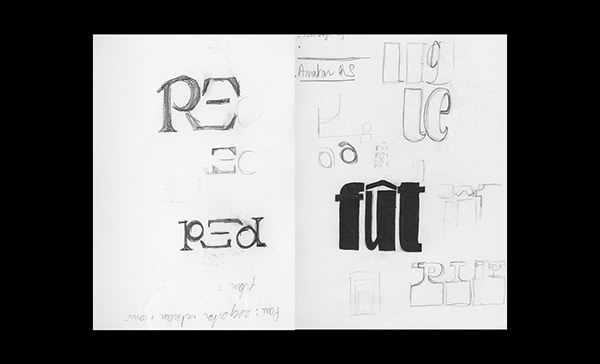
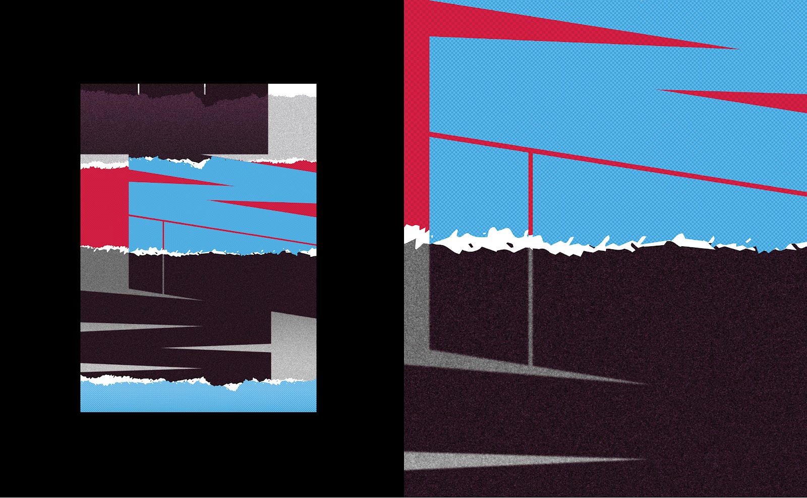
Image Courtesy by Adobe

Some highlights from Adobe’s Report:

Emoji users’ top three favorite emojis are ? (#1), ❤️ (#2), ? (#3). Love, happiness and sadness are the top three emotions users express through emojis.

81% believe those who use emojis are friendlier and more approachable.

65% of emoji users are more comfortable expressing their emotions through emojis than a phone call. This is especially true for Gen Z’ers (83%).

When emojis are used at work, the majority of emoji users feel they positively impact likability (78%), credibility (63%) and make positive news more sincere (74%).

Emojis’ greatest benefits include the ability to communicate across language barriers (94%) and instantly share thoughts and ideas (90%).

73% wish they had more emoji customization options to better reflect their personal appearance/identity.

64% are more likely to open an email from a brand with their favorite emoji in the subject line.

Full Report here
More on Adobe Blog


The Ultimate Guide To Graphic Design Basics For The Creative Eye

Original Source: http://feedproxy.google.com/~r/Designrfix/~3/mEdezLumZIU/the-ultimate-guide-to-graphic-design-basics-for-the-creative-eye

?If you have a creative eye and think you might enjoy working in art, a job in graphic design may be the best route for you. Learn everything you need to know, from the history of the industry to graphic design basics and design principles. We’ll show you how you can become a graphic designer […]

The post The Ultimate Guide To Graphic Design Basics For The Creative Eye appeared first on designrfix.com.