6 Ways to Let Your Users Customize Their Own UX

Original Source: https://www.webdesignerdepot.com/2018/03/6-ways-to-let-your-users-customize-their-own-ux/

“I am consumer, hear me roar!”

That’s a thing I actually wrote once, un-ironically, in a text conversation with a friend. I was looking for a product that would allow me to perform a particular task in a particular way. Unsatisfied with the options I’d found so far, I kept looking. My friend suggested using one of the products I had already decided to ignore, and just do things their way.

To hell with that. I’m the customer. I’m the guy with the money they want. I might only be one customer, but my money’s just as good as anyone else’s. Why shouldn’t I spend it on a product that does things the way I want to do them?

Some users look for the cheapest deal in terms of money. Others look for the cheapest deal in terms of time and mental effort.

Some users look for the cheapest deal in terms of money. Others look for the cheapest deal in terms of time and mental effort. This is why app makers build options and settings into their apps. They know not everyone does things the same way, so limiting their possible options limits their possible customers.

Web apps and sites are catching on to this idea, too, and I’m here to share some of the more common (and important) ways to let your users customize their own experience.

1. Language

I know I’ve addressed this before, but it’s still happening. So I’ll keep talking about it. I’m not saying every single site has to be multi-lingual. Some sites don’t need it, and proper localization can get quite expensive. I’m saying that if your site has multiple languages, you really need to let the user pick the language they want to use.

That sounds like common sense, but I keep running into sites where the language is chosen for me based on my location, and they won’t let me change it. I live in Mexico, and my first language is English. You can probably see the problem. But it’s not just edge cases like me. What about people using VPNs located in other countries? What about people traveling on vacation?

There’s no reason not to let your users set their language manually.

2. Light or Dark Themes

If your site requires (or even just encourages) its users to do a lot of reading there, then you should consider giving them at least one light theme, and one dark. I myself prefer to read with a light theme, and the room lights on. But others seem to get tired reading like that. They especially seem to like having a dark theme when reading in the dark, as it keeps the screen itself from nearly blinding them.

I know. This sounds a lot like I’m recommending that you maintain two separate versions of your site. Just note two things: One, most sites don’t require nearly enough reading that this sort of option would be necessary. Two, if you plan ahead, you could theoretically change all of the colors on your site with a few lines of CSS. That’s the beauty of the cascade.

3. How Information is Sorted

So if you’re looking at information in a table these days, it’s pretty reasonable to expect to be able to sort the information you’re looking at in various ways: alphabetically, numerically, by category, or what-have-you. You can apply pretty much the same approach to any other type of content, though.

Blogs have long been designed so that you could quickly filter out content you were less interested in, by employing tags, categories, and more. Social media sites have completely failed in this regard by increasingly trying to phase out reverse-chronological timelines, and even removing content from our view with algorithms. Listen, developers, just because I don’t interact with a bit of content doesn’t mean I don’t want to see it. I’m a lazy goddamn interactor, and I look at a lot of content. Stop hiding it from me!

4. Currency

I’m used to doing a mental conversion in my head from U.S. dollars to Mexican pesos. Sometimes I get the exchange rate wrong though, and something is more expensive than I expect. Sometimes I get it wrong the other way, and end up pleasantly surprised.

Either way, this could all be avoided if more online stores allowed me to choose my own currency. I admit that implementing this might indeed be a pain. I don’t know how many APIs there are out there for doing on-the-fly currency conversions with up-to-date conversion rates, but there’s got to be at least one, right?

5. Privacy

I for one am always glad when a socially-oriented site offers to let me decide exactly how much information I want to let everyone see. Required information (such as my e-mail address) is not always information I want to hand out to just anyone. I mean, if anyone wants to find out too much information about me, I’ve already given it all to Google and Facebook, but why make it too easy?

6. Social Interaction

Equally important to privacy features are the ones that allow me to decide exactly how social I want to be. Being able to block individual users is a good start, but what if platforms that have private messaging allowed us to simply turn it off?

Perhaps it seems contrary to the entire concept of the social web to allow people to limit the social features on their accounts. But there are many sites I use that have social features that I personally have no use for. And until they all get Gmail’s spam filtering technology, we might be better off without some of them altogether.

Add Realistic Chalk and Sketch Lettering Effects with Sketch’it – only $5!

Source

p img {display:inline-block; margin-right:10px;}
.alignleft {float:left;}
p.showcase {clear:both;}
body#browserfriendly p, body#podcast p, div#emailbody p{margin:0;}

Freebie: Designer Workspace Illustrations (AI, EPS, SVG, PNG)

Original Source: http://feedproxy.google.com/~r/tympanus/~3/KNXefUxGY60/

DesignerWorkspace_Featured

Today we’re very happy to share 10 unique illustrations with you. The set contains detailed and modern line illustrations of a designer’s workspace in two different views (top and frontal).

About the Designer Workspace Illustrations

This colorful set contains 10 line illustrations of a designer’s workspace in two views (top and frontal). A touch of Pantone’s color of the year 2018 “Ultra Violet” gives it a futuristic modern look, even more so when combined with vibrant gradients and light gray elements. Whatever you might need on your desk as a designer is included: technology, designer software, notebooks, pens, color swatches and even plants to brighten up your space.

The following files are included in the set:

5 top view illustrations
5 frontal view illustrations
Ai files
EPS10 files
PNG files (optimized)
SVG files

Preview

Check out a preview of the illustrations:

DesignerWorkspace_01

DesignerWorkspace_02

Download the Designer Workspace Illustrations for Free

You can download the freebie here:

Designer Workspace Illustrations by Polar Vectors (4.6 MB)

The illustrations are free for personal and commercial use. Please don’t resell or redistribute them.

If you are interested in more workspace themed line illustrations check out the Her Workspace Illustrated Instagram Pack:

Her-Workplace-illustrated-instagram-pack1

About Polar Vectors

Polar Vectors is a shop that provides a wide range of vector graphics collections for your creative needs; everything from illustrations, icons, textures, patterns to illustrated letters. For any updates on new releases and discounts follow Polar Vectors on Instagram.

We hope you enjoy this freebie and find it useful!

If you’d like to contribute and publish your exclusive freebie on Codrops just drop us a line.

Freebie: Designer Workspace Illustrations (AI, EPS, SVG, PNG) was written by Diana Hlevnjak and published on Codrops.

Create a vector displacement mesh brush

Original Source: http://feedproxy.google.com/~r/CreativeBloq/~3/UJeAtBYH8fM/zbrush-training-create-a-vector-displacement-mesh-brush

Don't miss Vertex 2018, our debut event for the CG community. Packed with inspiring talks from industry pros working in games, VFX and more, plus career advice, workshops, an expo and more, if you work – or play – in CG, it’s unmissable. Book your ticket now.

Vector Displacement Mesh (VDM) is a 3D sculpt, used as brush building blocks, that enables undercutting when drawing on a model’s surface. But what exactly does it mean? 

The simplest way to understand it is to start with alphas. Alpha textures are greyscale images that we often use for sculpting fine-detailed patterns like wrinkles and skin pores. Without them we would have to painstakingly draw the details on by hand, one by one. Alphas are awesome and quite efficient to use in combination with bushes, but they are basically flat images with black values, and they do not support undercuts and overhangs, which limits what can be done with them. 

However, Alpha 3D stores the information of all XYZ axes and does not have any vertical elevation restrictions. By definition, it is 3D as it uses VDM in its system. All you need to worry about is the polygon density to enable proper projection of the Vector Displacement Mesh onto your model. 

Create detailed 3D shapes with ease

Let’s look at an example of creating some highly detailed 3D art: imagine I want to model some dragon scales, but I don't want to use a 2D alpha because this way I would have to go back and sculpt them some more for extra depth. Scales do not just sit there side by side, they overhang and partially cover one another, so it takes a great deal of time making them look realistic. It is a long, tiring and very repetitive process, but there is a way to make it easier and quicker in the future. 

I can create a Vector Displacement Mesh, save it as a brush and simply draw my sculpt onto a model with a single stroke, as many times as my heart desires. Job done! I know that I still have to spend some time making those VDM brushes, of course, but once they are done, I will not have to go and create them again – they will be sitting in my brush library, waiting for the next time I need them. 

Here I will demonstrate how easy it is in these simple steps, making a swirl frosting for my 10-minute 3D cupcake.  

01. Start the swirl

With a clay brush selected, build a little hill in the middle of the canvas

To start off, we first need to get a canvas, so head to Lightbox> Project>MISC and select the Brush 3D template. With a clay brush selected, build a little hill in the middle of the canvas, more or less to the size of the swirl. Now, with the radial symmetry on and DamStandard brush selected, start sculpting the grooves and peaks of the swirl shape. 

02. Fix distorted edges

Make sure to stay away from the edges of the plane

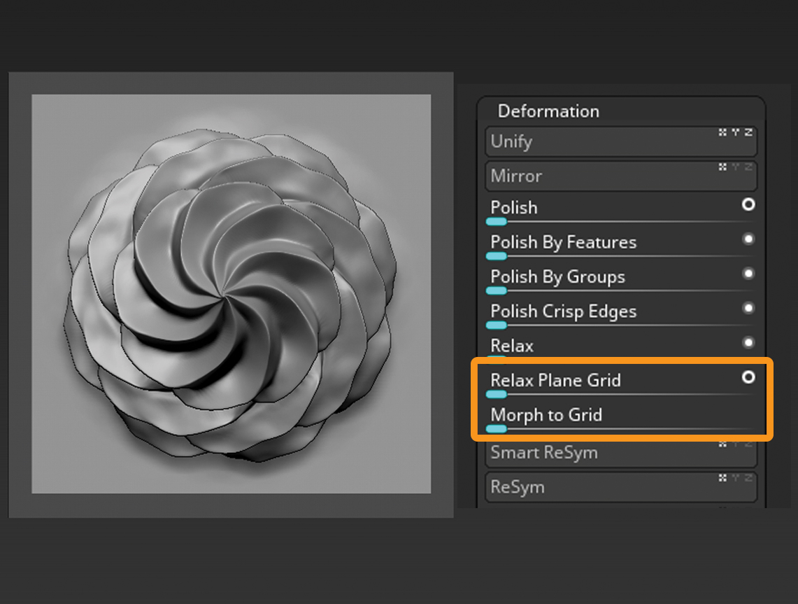
Make sure to stay away from the edges of the plane. If you accidentally mess up the edges, you have to fix them before saving the VDM: mask the edges, invert mask, go to Tool>Deformation>Relax Plane Grid or Morph to Grid, depending on the level of damage caused to your plane. This should reshape the edges and add more geometry.

03. Save out to the VDM

To save as a VDM, select a brush that can save all the information contained in your model

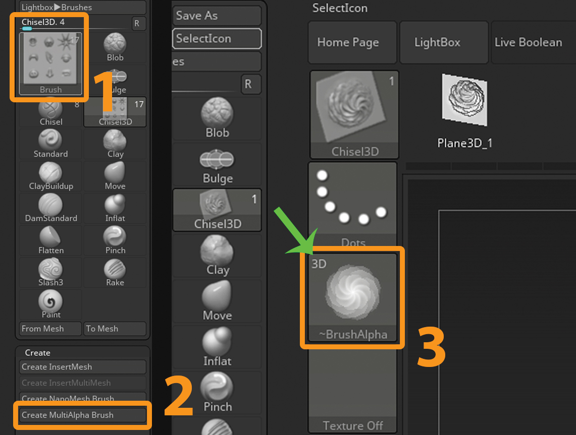
To save out your sculpt as a VDM, you need to select a brush that can save all the information contained in your model. With Chisel3D selected, open the Brush palette, select Create and click on Create MultiAlpha Brush. This automatically creates a new Chisel brush out of your model. Your current Alpha texture now contains a VDM of the sculpt with a 3D mark in top-left corner. 

04. Save out the brush

Last thing to do is create an icon for your brush and save it

In order to now save out the brush and create an icon for it, open a 3D sphere and turn it into a polymesh. Divide it a few times and drag out your VDM. Position the sphere to capture the icon, go to the Brush palette, hold down the Alt key and click on SelectIcon. With the icon generated, you can finally save it out with Brush>Save As. Rename your brand-new brush and it is done! 

This article was originally published in issue 230 of 3D World, the world's best-selling magazine for CG artists. Buy issue 230 or subscribe to 3D World here.

Book your Vertex 2018 ticket now

On 13 March we’re launching Vertex 2018: a one-day event in London for the CG community. Featuring a jam-packed schedule of inspiring talks from the industry’s most exciting practitioners, there will also be workshops, networking opportunities, a busy expo and lots more. Get your ticket to Vertex 2018 now. 

Related articles:

Behind the scenes on The Shape of WaterModel an alien pirate creature in ZBrushHow to master creature anatomy

Web Design Guide Even a Non-Designer Can Use

Original Source: http://feedproxy.google.com/~r/Designrfix/~3/q-r1ZH4PKrg/web-design-guide-nondesigner

Just like Entrepreneurship, good design principles can be exercised and learned by everyone. If you are a graphic designer who is willing to start his career or a novice who is willing to switch his field to designing here is a quote that can boost up your morale” “I never took lessons to play the […]

The post Web Design Guide Even a Non-Designer Can Use appeared first on designrfix.com.

One of These Site and Page Building Tools is Meant for You

Original Source: https://www.sitepoint.com/one-of-these-site-and-page-building-tools-is-meant-for-you/

This article was created in partnership with BAWMedia. Thank you for supporting the partners who make SitePoint possible.

Searching for precisely the right website builder to suit your needs can be a daunting chore. There are good ones and not-so-good ones on the market. The problem is that there are so many good website builders. Also, more than a few of them can legitimately claim to be top-of-the-line. Therefore, it can be awfully difficult to make a choice.

Is one of your requirements that the product must be free? Then, your search should narrow considerably. However, it still won’t necessarily be easy to find what you’re looking for.

The good news is — we’ve just made it an easy task. We’re delighted to be able to present the best of the best free website builders heading into 2018. You’ll find builders for creatives, for small businesses, and for personal use. All these builders will enable you to create awesome portfolios and galleries.

Take a break, grab a cup of coffee, and enjoy!

1. Mobirise Website Builder

Mobirise Website Builder

     Since the Mobirise Website Builder is free for both commercial and personal use, it would only make sense to download it to check it out. Mobirise isn’t just another copycat builder either. It takes somewhat of a different approach to creating a website (one that you’ll like) and you’re free to use any host you choose once your site is ready to launch.

Mobirise’s cool combination of a drag and drop builder and its cool selection of trendy pre-made building blocks really speeds up the building process and your workflow as well. A comprehensive set of design elements, together with Mobirise’s Bootstrap 4 templates also come with the package. The net result is your ability to easily add functionality to your sites that might otherwise require lots of time, effort, and coding. Coding is not necessary with the Mobirise Builder. It’s simply a matter of dropping blocks onto a page and adding, rearranging, and editing content as necessary. Once done, you’re ready to publish.

Download the Mobirise Website Builder for Mac OS or Windows and check it out!

2. Visual Composer Website Builder

Visual Composer website builder

     The Visual Composer Builder is the creation of WPBakery’s VC team. 5+ years of design and development experience have gone into this completely new type of WordPress builder. It is not to be confused with the WPBakery Builder.

The two builders are independent and completely different from one another, and we believe this would be a good time to give the Visual Composer Builder a try. Both free and Premium versions are available.

This website builder features a live drag and drop frontend editor, a backend editor, a host of advanced design options, WordPress shortcodes and widgets support, and much more. VC-created sites will be responsive, they can be tied into Social Media, and you can accomplish all of this without any need to write code.

We suggest checking out the free version and putting it through its paces and looking into the Premium version’s features later.

3. Portfoliobox

Portfoliobox

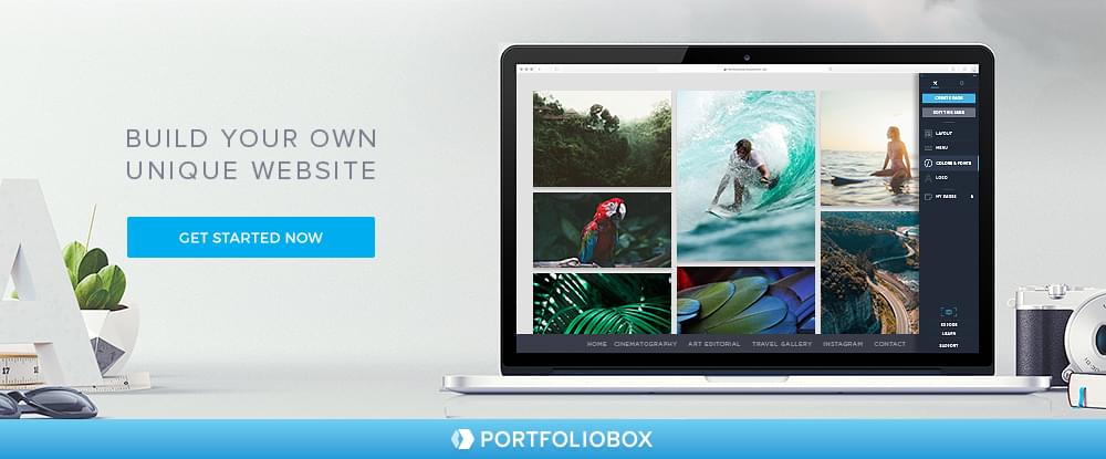
     Because it makes it so easy to build websites and professional-looking galleries and portfolios that are unique in all respects, Portfoliobox is an excellent choice for creatives, be they photographers, artists or designers of all types.

Portfoliobox is not theme-based, so you’re not constrained to using a standard theme. You can use any style you want for any page and do it from the comfort of your web browser. Web hosting comes with the package, and there’s never a need for coding.

Since this web building tool is responsive you can control the look of your website pages, portfolios, and galleries on mobile devices.

Hosting is included when you sign up for a free account. Portfoliobox’s Pro plan offers extended hosting capabilities and a free personalized domain. Another cool option to check – a student account offer from Portfoliobox. If your school supports this opportunity, do not miss it!

Continue reading %One of These Site and Page Building Tools is Meant for You%

Visual Ad Creation Workflow with Tumult Hype

Original Source: https://www.sitepoint.com/visual-ad-creation-workflow-with-tumult-hype/

This article was sponsored by Tumult. Thank you for supporting the partners who make SitePoint possible.

The goal of this article is to show how to create a rich media advertisement with Tumult Hype. It covers the basics of using the app in the context of building an ad and discusses ad-specific tips and tricks. By the end of reading you’ll be able to make HTML5 ads quickly and beautifully!

The Rise of HTML5 Ads

It is well known that adding animation and interactivity in digital advertising makes ads more effective. Beyond catching visitors’ eyes, rich media ads can better convey the product or branding as well as add engagements leading to more clicks.

As rich media ads are visual in nature, it makes sense to build them using visual tools. Changes are seen immediately. Adobe’s Flash reigned as king of the visual ad creation tools for years, but has been toppled by HTML5’s compatibility on mobile devices. As a technology, HTML5 ads have the additional advantage of often being more accessible while having lower power requirements. But HTML5 itself is just a markup language and has no inherently included visual tools, as Flash did with the Flash Professional app. Building ads via hand coding would be a laboriously slow process. Luckily, there are now sophisticated visual tools that can output HTML5.

Tumult Hype is Your Visual Design Tool

Tumult Hype is the leading HTML5 animation and interactivity app for macOS. Hype’s raison d’etre is to be easy to use and quick to learn. Layout is similar to Keynote, and per-property animation keyframes can be automatically created with its quick “Record” functionality. Hype provides a powerful set of animation features, such as animation along curved motion paths, customizable easings/timing functions, simultaneously running timelines, and encapsulated reusable symbols. Coding is not required for most common interactivity, although JavaScript actions can extend its capabilities by integrating with other libraries and services.

While Tumult Hype can be used for a wide range of HTML5 content, it is especially capable for rich media ad creation. A plug-in system, called “Export Scripts”, can integrate ad platform features and help package its export output for delivery. Advanced Export functionality can further help automate export tasks. Hype’s runtime library is very small with a compressed size of 25KB, giving plenty of room for your assets. This runtime drives the animations and manages browser compatibility issues (though the app still gives warnings if a feature won’t work on specific browsers).

The Ad Creation Workflow with Tumult Hype
Grab Tumult Hype and an Export Script

Step zero is to download Tumult Hype. The trial is fully functional for 14 days. Tumult Hype has two flavor modes: Standard and Professional. For ad creation (and following along with this article!), you’ll want to use Hype Professional.

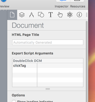
You can then optionally grab an Export Script, which will augment Hype with extra ad-related features. Currently there are scripts for Sizmek, DoubleClick Studio, and DoubleClick Campaign Manager. If you are using a different ad platform, the steps are usually straight forward to adapt the standard output.

You can verify an Export Script has been installed by looking within Hype’s Preferences. Export Scripts may also have options that are show in the Document Inspector.

Export Script options in the Document Inspector

Choosing an Ad Size

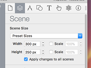
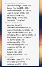
After launching Hype, you’ll want to set the scene size to match the ad you are creating. This can be done in the Scene Inspector by setting the width and height, or choosing one of the Preset Sizes. Hype contains presets for common ads banners and rectangles.

Scene Inspector Scene Inspector

If your ad will have different size representations, you could make use of the Responsive Layout and Flexible Layout systems. Responsive Layout allows different content that is shown on width-based breakpoints. They can later be individually exported. The Flexible Layout system will adjust element positions and sizes based on container dimensions.

Continue reading %Visual Ad Creation Workflow with Tumult Hype%

A Comprehensive Website Planning Guide (Part 3)

Original Source: https://www.smashingmagazine.com/2018/03/comprehensive-website-planning-guide-part3/

In Part 2, I covered the details of evaluating a plan, choosing web professionals, and determining your website structure. The question of why planning for the web is just as important as planning for anything else associated with your business was covered in Part 1, so head on back to read that part first in case you missed it. In today’s final part of this guide, I’ll start with a few of the most common approaches in any initial design.

Get a Lifetime of Microsoft Excel Training for Just $39

Original Source: https://www.sitepoint.com/get-a-lifetime-of-microsoft-excel-training-for-just-39/

Microsoft Excel is one of the most widely used office tools for organizing and crunching numbers, so having some know-how on its more advanced features is valuable (if not required) for nearly any job. eLearn Excel is a professional training resource featuring over 280 beginner to advanced Excel lessons to help you work towards a CPD (Continuing Professional Development) certification. Normally $999, they’re offering lifetime access to all of their Excel training courses for just $39 today.

Throughout eight different modules, Microsoft-approved experts will walk you through everything you need to know about this powerful tool, from fundamental skills to more advanced techniques with reporting and automation. You’ll be able to access your training 24/7, and best of all, you’ll get access to any new content added.

Whether you’re a complete Excel beginner or are looking to enhance your existing skills, eLearn Excel is a great training resource. Get lifetime access today for just $39, saving hundreds off its normal price. 

Continue reading %Get a Lifetime of Microsoft Excel Training for Just $39%

How to Generate Traffic to Your Website by Using Attractive Graphics Design

Original Source: http://feedproxy.google.com/~r/Designrfix/~3/sPFf5Y94rpE/generate-traffic-website-attractive-graphics-design

A thing of beauty is a joy forever. When given 15 minutes to spend on a web page, users will prefer to read something with beautiful design elements, rather than look at long chunks of text. If you run a business website, it must be your goal to attract more traffic to your website. Do […]

The post How to Generate Traffic to Your Website by Using Attractive Graphics Design appeared first on designrfix.com.

Company Structuring in the Age of Automation

Original Source: https://www.sitepoint.com/company-structuring-in-the-age-of-automation/

This article was originally published on OKTA Blog. Thank you for supporting the partners who make SitePoint possible.

When a bunch of ambitious people get together and decide to start a company, they often start out by deciding who owns what share of this new entity. Long before the invention of the “Limited company”, this sharing was directly proportional to the revenues of said company.

If you started a small bakery with a friend back in the 1800’s, the math was simple. Let’s assume the only one time cost for this bakery was an oven that cost $700. If the store made $1000 in revenue each month and the spend on yeast, flour, electricity and marketing was $300; then simply put – the store was at a $700 profit (we’re going to avoid talking about tax and a bunch of other concepts for simplicity here).

In the first month, neither you nor your friend would be able to take any money home, as you’d spend almost all of the profits on paying back the cost of the oven. In month two, you’d make a tidy profit which would’ve been split between both owners of the bakery. Assuming the split between both owners was 50–50, each owner would walk away with $350 month on month. If the business grew, that value increased. If the business did poorly, the take home amount for both owners dropped.

All the way back in 450 BC, the concept of a fixed salary was invented. At that time, salt production was strictly controlled by the monarchy or ruling elite. Salt from a person was synonymous with drawing sustenance, taking pay, or being in that person’s service. The Latin word salarium linked employment and salt. In the modern world, a salary is typically a fixed compensation given to an individual to perform certain duties.

In the scenario of your bakery, the concept of a fixed salary offers some advantages and disadvantages to you, the owner. As you scale and have more customers, it becomes imperative to:

a) Buy more ovens

b) Have enough staff on hand to serve customers

Ovens are machines and typically have a fixed cost (or if loaned, a significantly lower cost than a salaried employee). Ovens don’t need to eat, pay rent or watch movies, which is why they are significantly cheaper than hired hand. However, to add more staff, you’d need to convince your partner (and yourself) to distribute a share of the revenue to other people.

The problem with these potential hires was that they don’t particularly care about the business and want to work so that they can eat, pay rent and watch movies (movies didn’t exist in it’s current form back then, but you get the point). What ended up happening was that both your partner and you decided to not give a chunk of revenue share, but instead a salary — a fixed monthly expense, like rent. If the business grew, then the salaried employee would not benefit from that growth (because they had no stake in the business). If the business failed, then your partner and you would be in trouble because this was a fixed cost you would incur each month that had to be paid regardless of performance of the business.

Continue reading %Company Structuring in the Age of Automation%