Video Playback On The Web: Video Delivery Best Practices (Part 2)

Original Source: https://www.smashingmagazine.com/2018/10/video-playback-on-the-web-part-2/

Video Playback On The Web: Video Delivery Best Practices (Part 2)

Video Playback On The Web: Video Delivery Best Practices (Part 2)

Doug Sillars

2018-10-25T14:40:24+02:00
2018-10-29T16:03:22+00:00

In my previous post, I examined video trends on the web today, using data from the HTTP Archive. I found that many websites serve the same video content on mobile and desktop, and that many video streams are being delivered at bitrates that are too high to playback on 3G speed connections. We also discovered that may websites automatically download video to mobile devices — damaging customer’s data plans, battery life, for videos that might not ever be played.

TL;DR: In this post, we look at techniques to optimize the speed and delivery of video to your customers, and provide a list of 9 best practices to help you deliver your video assets.

Video Playback Metrics

There are 3 principal video playback metrics in use today:

Video Startup Time
Video Stalling
Video Quality

Since video files are large, optimizing the video to be as small as possible will lead to faster video delivery, speeding up video start, lowering the number of stalls, and minimizing the effect of the quality of the video delivered. Of course, we need to balance startup speed and stalling with the third metric of quality (and higher quality videos generally use more data).

Video Startup

When a user presses play on a video, they expect to be able to watch the video quickly. According to Conviva (a leader in video metric analysis), in Q1 of 2018, 14% of videos never started playing (that’s 2.4 Billion video plays) after the user pressed play.

Pie chart showing that nearly 15% of all videos fail to play

Video Start Breakdown (Large preview)

2.3% of videos (400M video requests) failed to play after the user pressed the play button. 11.54% (2B plays) were abandoned by the user after pressing play. Let’s try to break down what might be causing these issues.

Front-end is messy and complicated these days. That’s why we publish articles, printed books and webinars with useful techniques to improve your work. Even better: Smashing Membership with a growing selection of front-end & UX goodies. So you get your work done, better and faster.

Explore Smashing Membership ↬

Smashing Cat, just preparing to do some magic stuff.

Video Playback Failure

Video playback failure accounted for 2.3% of all video plays. What could lead to this? In the HTTP Archive data, we see 0.3% of all video requests resulting in a 4xx or 5xx HTTP response — so some percentage fail to bad URLs or server misconfigurations. Another potential issue (that is not observed in the HTTP Archive data) are videos that are blocked by Geolocation (blocked based on the location of the viewer and the licensing of the provider to display the video in that locale).

Video Playback Abandonment

The Conviva report states that 11.5% of all video plays would play, but that the customer abandoned the playback before the video started playing. The issue here is that the video is not being delivered to the customer fast enough, and they give up. There are many studies on the mobile web where long delays cause abandonment of web pages, and it appears that the same effect occurs with video playback as well.

Research from Akamai shows that viewers will wait for 2 seconds, but for each subsequent second, 5.8% of viewers abandon the video.

Chart displaying the abandonment rate as startup time is longer.

Rate of abandonment over time (Large preview)

So what leads to video playback issues? In general, larger files take longer to download, so will delay playback. Let’s look at a few ways that one can speed up the playback of videos. To reduce the number of videos abandoned at startup, we should ‘slim’ down these files as best as possible, so they download (and begin playback) quickly.

MP4: Video Preload

To ensure fast playback on the web, one option is to preload the video onto the device in advance. That way, when your customer clicks ‘play’ the video is already downloaded, and playback will be fast. HTML offers a preload attribute with 3 possible options: auto, metadata and none.

preload = auto

When your video is delivered with preload="auto", the browser downloads the entire video file and stores it locally. This permits a large performance improvement for video startup, since the video is available locally on the device, and no network interference will slow the startup.

However, preload="auto" should only be used if there is a high probability that the video will be viewed. If the video is simply resident on your webpage, and it is downloaded each time, this will add a large data penalty to your mobile users, as well as increase your server/CDN costs for delivering the entire video to all of your users.

This website has a section entitled “Video Gallery” with several videos. Each video in this section has preload set to auto, and we can visualize their download in the WebPageTest waterfall as green horizontal lines:

A WebPageTEst Waterfall chart

Waterfall of video preload (Large preview)

There is a section called “Video Gallery”, and the files for this small section of the website account for 14.6M (83%) of the page download. The odds that one (of many) videos will be played is probably pretty low, and so utilizing preload="auto" only generates a lot of data traffic for the site.
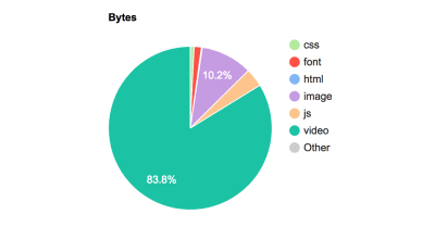
Pie Chart showing the high percentage (83%) of video usage.

Webpage data breakdown (Large preview)

In this case, it is unlikely that even one of these videos will be viewed, yet all of them are downloaded completely, adding 14.8MB of content to the mobile site (83% of the content on the page). For videos that are have a high probability of playback (perhaps >90% of page views result in video play) — preloading the entire video is a very good idea. But for videos that are unlikely to be played, preload="auto" will only cause extra tonnage of content through your servers and to your customer’s mobile (and desktop) devices.

preload="metadata"

When the preload="metadata" attribute is used, an initial segment of the video is downloaded. This allows the player to know the size of the video window, and to perhaps have a second or 2 of video downloaded for immediate playback. The browser simply makes a 206 (partial request) of the video content. By storing a small bit of video data on the device, video startup time is decreased, without a large impact to the amount of data transferred.

On Chrome, metadata is the default choice if no attribute is chosen.

Note: This can still lead to a large amount of video to be downloaded, if the video is large.

For example, on a mobile website with a video set at preload="metadata", we see just one request for video:

Webpage Test Waterfall chart

(Large preview)

And the request is a partial download, but it still results in 2.7 MB of video to be downloaded because the full video is 1080p, 150s long and 97 MB (we’ll talk about optimizing video size in the next sections).

Pie chart showing that 2.7 MB or 42% of data is still vide with preload=metadata.

KB usage with video metadata (Large preview)

So, I would recommend that preload="metadata" still only be used when there is a fairly high probability that the video will be viewed by your users, or if the video is small.

preload="none"

The most economical download option for videos, as no video files are downloaded when the page is loaded. This will potentially add a delay in playback, but will result in faster initial page load For sites with many videos on a single page, it may make sense to add a poster to the video window, and not download any of the video until it is expressly requested by the end user. All YouTube videos that are embedded on websites never download any video content until the play button is pressed, essentially behaving as if preload="none".

Preload Best Practice: Only use preload="auto" if there is a high probability that the video will be watched. In general, the use of preload="metadata" provides a good balance in data usage vs. startup time, but should be monitored for excessive data usage.

MP4 Video Playback Tips

Now that the video has started, how can we ensure that the video playback can be optimized to not stall and continue playing. Again, the trick is to make sure the video is as small as possible.

Let’s look at some tricks to optimize the size of video downloads. There are several dimensions of video that can be optimized to reduce the size of the video:

Audio

Video files are split into different “streams” — the most common being the video stream. The second most common stream is the audio track that syncs to the video. In some video playback applications, the audio stream is delivered separately; this allows for different languages to be delivered in s seamless manner.

If your video is played back in a silent manner (like a looping GIF, or a background video), removing the audio stream from the video is a quick and easy way to reduce the file size. In one example of a background video, the full file was 5.3 MB, but the audio track (which is never heard) was nearly 300 KB (5% of the file) By simple eliminating the audio, the file will be delivered quickly without wasting bytes.

42% of the MP4 files found on the HTTP Archive have no audio stream.

Best Practice: Remove the audio tracks from videos that are played silently.

Video Encoding

When encoding a video, there are options to reduce the video quality (number of pixels per frame, or the frames per second). Reducing a high-quality video to be suitable for the web is easy to do, and generally does not affect the quality delivered to your end users. This article is not long enough for an in depth discussion of all the various compression techniques available for video. In x264 and x265 encoders, there is a term called the Constant Rate Factor (CRF). Using a CRF of 23-28 will generally give a good compression/quality trade off, and is a great first start into the realm of video compression

Video Size

Video size can be affected by many dimensions: length, width, and height (you could probably include audio here as well).

Video Duration

The length of the video is generally not a feature that a web developer can adjust. If the video is going to playback for three minutes, it is going to playback for three minutes. In cases in which the video is exceptionally long, tools like preload="none" or streaming the video can allow for a smaller amount of data to be downloaded initially to reduce page load time.

Video Dimensions

18% of all video found in the HTTP Archive is identical on mobile and desktop. Those who have worked with responsive web design know how optimizing images for different viewports can drastically reduce load times since the size of the images is much smaller for smaller screens.

The same holds for video. A website with a 30 MB 2560×1226 background video will have a hard time downloading the video on mobile (probably on desktop, too!). Resizing the video drastically decreases the files size, and might even allow for three or four different background videos to be served:

Width
Video (MB)

1226
30

1080
8.1

720
43

608
3.3

405
1.76

Now, unfortunately, browsers do not support media queries for video in HTML, meaning that this just does not work:

<video preload=”auto” autoplay muted controls
source sizes=”(max-width:1400px 100vw, 1400px”
srcset=”small.mp4 200w,
medium.mp4 800w,
large.mp4 1400w”
src=”large.mp4″

</video>

Therefore, we’ll need to create a small JS wrapper to deliver the videos we want to different screen sizes. But before we go there…

Downloading Video, But Hiding It From View

Another throwback to the early responsive web is to download full-size images, but to hide them on mobile devices. Your customers get all the delay for downloading the large images (and hit to mobile data plan, and extra battery drain, etc.), and none of the benefit of actually seeing the image. This occurs quite frequently with video on mobile. So, as we write our script, we can ensure that smaller screens never request the video that will not appear in the first place.

Retina Quality Videos

You may have different videos for different device screen densities. This can lead to added time to download the videos to your mobile customers. You may wish to prevent retina videos on smaller screen devices, or on devices with a limited network bandwidth, falling to back to standard quality videos for these devices. Tools like the Network Information API can provide you with the network throughput, and help you decide which video quality you’d like to serve to your customer.

Downloading Different Video Types Based On Device Size And Network Quality

We’ve just covered a few ways to optimize the delivery of movies to smaller screens, and also noted the inability of the video tag to choose between video types, so here is a quick JS snippet that will use the screen width to:

Not deliver video on screens below 500px;
Deliver small videos for screens 500-1400;
Deliver a larger sized video to all other devices.

<html><body>
<div id=”video”> </div>
<div id=”text”></div>
<script>
//get screen width and pixel ratio
var width = screen.width;
var dpr = window.devicePixelRatio;
//initialise 2 videos —
//“small” is 960 pixels wide (2.6 MB), large is 1920 pixels wide (10 MB)
var smallVideo=”http://res.cloudinary.com/dougsillars/video/upload/w_960/v1534228645/30s4kbbb_oblsgc.mp4″;
var bigVideo = “http://res.cloudinary.com/dougsillars/video/upload/w_1920/v1534228645/30s4kbbb_oblsgc.mp4”;
//TODO add logic on adding retina videos
if (width<500){
console.log(“this is a very small screen, no video will be requested”);
}

else if (width< 1400){
console.log(“let’s call this mobile sized”);
var videoTag = “<video preload=”auto” width=”100%” autoplay muted controls src=”” +smallVideo +””/>”;
console.log(videoTag);
document.getElementById(‘video’).innerHTML = videoTag;
document.getElementById(‘text’).innerHTML = “This is a small video.”;
}
else{
var videoTag = “<video preload=”auto” width=”100%” autoplay muted controls src=”” +bigVideo +””/>”;
document.getElementById(‘video’).innerHTML = videoTag;
document.getElementById(‘text’).innerHTML = “This is a big video.”;

}

</script>
</html></body>

This script divides user’s screens into three options:

Under 500 pixels, no video is shown.
Between 500 and 1400, we have a smaller video.
For larger than 1400 pixel wide screens, we have a larger video.

Our page has a responsive video with two different sizes: one for mobile, and another for desktop-sized screens. Mobile users get great video quality, but the file is only 2.6 MB, compared to the 10MB video for desktop.

Animated GIFs

Animated GIFs are big files. While both aGIFs and video files compress the data through width and height dimensions, only video files have compression (on the often larger) time axis. aGIFs are essentially “flipping through” static GIF images quickly. This lack of compression adds a significant amount of data. Thankfully, it is possible to replace aGIFs with a looping video, potentially saving MBs of data for each request.

<video loop autoplay muted playsinline src=”pseudoGif.mp4″>

In Safari, there is an even fancier approach: You can place a looping mp4 in the picture tag, like so:

<picture>
<source type=”video/mp4″ loop autoplay srcset=”loopingmp4.mp4″>
<source type=”image/webp” srcset=”animated.webp”>
<src=”animated.gif”>
</picture>

In this case, Safari will play the animated GIF, while Chrome (and other browsers that support WebP) will play the animated WebP, with a fallback to the animated GIF. You can read more about this approach in Colin Bendell’s great post.

Third-Party Videos

One of the easiest ways to add video to your website is to simply copy/paste the code from a video sharing service and put it on your site. However, just like adding any third party to your site, you need to be vigilant about what kind of content is added to your page, and how that will affect page load. Many of these “simply paste this into your HTML” widgets add 100s of KB of JavaScript. Others will download the entire movie (think preload="auto"), and some will do both.

Third-Party Video Best Practice: Trust but verify. Examine how much content is added, and how much it affects your page load time. Also, the behavior might change, so track with your analytics regularly.

Streaming Startup

When a video stream is requested, the server supplies a manifest file to the player, listing every available stream (with dimensions and bitrate information). In HLS streaming, the player generally chooses the first stream in the list to begin playback. Therefore, the stream positioned first in the manifest file should be optimized for video startup on both mobile and desktop (or perhaps alternative manifest files should be delivered to mobile vs. desktop).

In most cases, the startup is optimized by using a lower quality stream to begin playback. Once the player downloads a few segments, it has a better idea of available throughput and can select a higher quality stream for later segments. As a user, you have likely seen this — where the first few seconds of a video looks very pixelated, but a few seconds into playback the video sharpens.

In examining 1,065 manifest files delivered to mobile devices from the HTTP Archive, we find that 59% of videos have an initial bitrate under 1.2 MBPS — and are likely to start streaming without any much delay at 1.6 MBPS 3G data rates. 11% use a bitrate between 1.2 and 1.6 MBPS — which may slow the startup on 3G, and 30% have a bitrate above 1.6 MBPS — and are unable to playback at this bitrate on a 3G connection. Based on this data, it appears that ~41% of all videos will not be able to sustain the initial bitrate on mobile — adding to startup delay, and possibly increased number of stalls during playback.
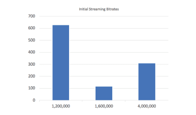
Column chart showing initial bitrates in streaming videos. Many videos have too high an initial bitrate to stream on mobile.

Initial bitrate for video streams (Large preview)

Streaming Startup Best Practice: Ensure your initial bitrate in the manifest file is one that will work for most of your customers. If the player has to change streams during startup, playback will be delayed and you will lose video views.

So, what happens when the video’s bitrate is near (or above) the available throughput? After a few seconds of download without a completed video segment ready for playback, the player stops the download and chooses a lower quality bitrate video, and begins the process again. The action of downloading a video segment and then abandoning leads to additional startup delay, which will lead to video abandonment.

We can visualize this by building video manifests with different initial bitrates. We test 3 different scenarios: starting with the lowest (215 KBPS), middle (600 KBPS), and highest bitrate (2.6 MBPS).

When beginning with the lowest quality video, playback begins at 11s. After a few seconds, the player begins requesting a higher quality stream, and the picture sharpens.

When starting with the highest bitrate (testing on a 3G connection at 1.6 MBPS), the player quickly realizes that playback cannot occur, and switches to the lowest bitrate video (215 KBPS). The video starts playing at 17s. There is a 6-second delay, and the video quality is the same low quality delivered to in the first test.

Using the middle-quality video allows for a bit of a tradeoff, the video begins playing at 13s (2 seconds slower), but is high quality from the start -and there is no jump from pixelated to higher quality video.

Best Practice for Video Startup: For fastest playback, start with the lowest quality stream. For longer videos, you might consider using a ‘middle quality’ stream at start to deliver sharp video at startup (with a slightly longer delay).

Thumbnails of 3 pages with video loading.

WebPage Test Thumbnails (Large preview)

WebPageTest results: Initial video stream is low, middle and high (from top to bottom). The video starts the fastest with the lowest quality video. It is important to note that the high quality start video at 17s is the same quality as the low quality start at 11s.

Streaming: Continuing Playback

When the video player can determine the optimal video stream for playback and the stream is lower than the available network speed, the video will playback with no issues. There are tricks that can help ensure that the video will deliver in an optimal manner. If we examine the following manifest entry:

#EXT-X-STREAM-INF:BANDWIDTH=912912,PROGRAM-ID=1,CODECS=”avc1.42c01e,mp4a.40.2″,RESOLUTION=640×360,SUBTITLES=”subs”
video/600k.m3u8

The information line reports that this stream has a 913 KBPS bitrate, and 640×360 resolution. If we look at the URL that this line points to, we see that it references a 600k video. Examining the video files shows that the video is 600 KBPS, and the manifest is overstating the bitrate.

Overstating The Video Bitrate

PRO
Overstating the bitrate will ensure that when the player chooses a stream, the video will download faster than expected, and the buffer will fill up faster than expected, reducing the possibility of a stall.
CON
By overstating the bitrate, the video delivered will be a lower quality stream. If we look at the entire list of reported vs. actual bitrates:

Reported (KBS)
Actual
Resolution

913
600
640×360

142
64
320×180

297
180
512×288

506
320
512×288

689
450
412×288

1410
950
853×480

2090
1500
1280×720

For users on a 1.6 MBPS connection, the player will choose the 913 KBPS bitrate, serving the customer 600 KBPS video. However, if the bitrates had been reported accurately, the 950 KBPS bitrate would be used, and would likely have streamed with no issues. While the choices here prevent stalls, they also lower the quality of the delivered video to the consumer.

Best Practice: A small overstatement of video bitrate may be useful to reduce the number of stalls in playback. However, too large a value can lead to reduced quality playback.

Test the Neilsen video in the browser, and see if you can make it jump back and forth.

Conclusion

In this post, we’ve walked through a number of ways to optimize the videos that you present on your websites. By following the best practices illustrated in this post:

preload="auto"
Only use if there is a high probability that this video will be watched by your customers.
preload="metadata"
Default in Chrome, but can still lead to large video file downloads. Use with caution.
Silent Videos (looping GIFs or background videos)
Strip out the audio channel
Video Dimensions
Consider delivering differently sized video to mobile over desktop. The videos will be smaller, download faster, and your users are unlikely to see the difference (your server load will go down too!)
Video Compression
Don’t forget to compress the videos to ensure that they are delivered
Don’t ‘hide’ videos
If the video will not be displayed — don’t download it.
Audit your third-party videos regularly
Streaming
Start with a lower quality stream to ensure fast startup. (For longer play videos, consider a medium bitrate for better quality at startup)
Streaming
It’s OK to be conservative on bitrate to prevent stalling, but go too far, and the streams will deliver a lower quality video.

You will find that the video on your page is streamlined for optimal delivery and that your customers will not only delight in the video you present but also enjoy a faster page load time overall.

Smashing Editorial
(dm, ra, il)

The CSS Working Group At TPAC: What’s New In CSS?

Original Source: https://www.smashingmagazine.com/2018/10/tpac-css-working-group-new/

The CSS Working Group At TPAC: What’s New In CSS?

The CSS Working Group At TPAC: What’s New In CSS?

Rachel Andrew

2018-10-26T22:30:30+02:00
2018-10-29T16:03:22+00:00

Last week, I attended W3C TPAC as well as the CSS Working Group meeting there. Various changes were made to specifications, and discussions had which I feel are of interest to web designers and developers. In this article, I’ll explain a little bit about what happens at TPAC, and show some examples and demos of the things we discussed at TPAC for CSS in particular.

What Is TPAC?

TPAC is the Technical Plenary / Advisory Committee Meetings Week of the W3C. A chance for all of the various working groups that are part of the W3C to get together under one roof. The event is in a different part of the world each year, this year it was held in Lyon, France. At TPAC, Working Groups such as the CSS Working Group have their own meetings, just as we do at other times of the year. However, because we are all in one building, it means that people from other groups can more easily come as observers, and cross-working group interests can be discussed.

Attendees of TPAC are typically members of one or more of the Working Groups, working on W3C technologies. They will either be representatives of a member organization or Invited Experts. As with any other meetings of W3C Working Groups, the minutes of all of the discussions held at TPAC will be openly available, usually as IRC logs scribed during the meetings.

The CSS Working Group

The CSS Working Group meet face-to-face at TPAC and on at least two other occasions during the year; this is in addition to our weekly phone calls. At all of our meetings, the various issues raised on the specifications are discussed, and decisions made. Some issues are kept for face-to-face discussions due to the benefits of being able to have them with the whole group, or just being able to all get around a whiteboard or see a demo on screen.

When an issue is discussed in any meeting (whether face-to-face or teleconference), the relevant GitHub issue is updated with the minutes of the discussion. This means if you have an issue you want to keep track of, you can star it and see when it is updated. The full IRC minutes are also posted to the www-style mailing list.

Here is a selection of the things we discussed that I think will be of most interest to you.

Web forms are such an important part of the web, but we design them poorly all the time. The brand new Form Design Patterns book is our new practical guide for people who design, prototype and build all sorts of forms for digital services, products and websites. The eBook is free for Smashing Members.

Check the table of contents ↬

Form Design Patterns — a practical guide for anyone who needs to design and code web forms

CSS Scrollbars

The CSS Scrollbars specification seeks to give a standard way of styling the size and color of scrollbars. If you have Firefox Nightly, you can test it out. To see the examples below, use Firefox Nightly and enable the flags layout.css.scrollbar-width.enabled and layout.css.scrollbar-color.enabled by visiting http://about:config in Firefox Nightly.

The specification gives us two new properties: scrollbar-width and scrollbar-color. The scrollbar-width property can take a value of auto, thin, none, or length (such as 1em). It looks as if the length value may be removed from the specification. As you can imagine, it would be possible for a web developer to make a very unusable scrollbar by playing with the width, so it may be better to allow the browser to decide the exact width that makes sense but instead to either show thin or thick scrollbars. Firefox has not implemented the length option.

If you use auto as the value, then the browser will use the default scrollbars: thin will give you a thin scrollbar, and none will show no visible scrollbar (but the element will still be scrollable).

A scrolling element with a thin scrollbar

In this example I have set scrollbar-width: thin.(Large preview)

In a browser with support for CSS Scrollbars, you can see this in action in the demo:

See the Pen CSS Scrollbars: scrollbar-width by Rachel Andrew (@rachelandrew) on CodePen.

The scrollbar-color property deals with — as you would expect — scrollbar colors. A scrollbar has two parts which you may wish to color independently:

thumb
The slider that moves up and down as you scroll.
track
The scrollbar background.

The values for the scrollbar-color property are auto, dark, light and <color> <color>.

Using auto as a keyword value will give you the default scrollbar colors for that browser, dark will provide a dark scrollbar, either in the dark mode of that platform or a custom dark mode, light the light mode of the platform or a custom light mode.

To set your own colors, you add two colors as the value that are separated by a space. The first color will be used for the thumb and the second one for the track. You should take care that there is enough contrast between the colors, as otherwise the scrollbar may be difficult to use for some people.

A scrolling element with a purple and white scrollbar

In this example, I have set custom colors for the scrollbar elements. (Large preview)

In a browser with support for CSS Scrollbars, you can see this in the demo:

See the Pen CSS Scrollbars: scrollbar-color by Rachel Andrew (@rachelandrew) on CodePen.

Aspect Ratio Units

We’ve been using the padding hack in CSS to achieve aspect ratio boxes for some time, however, with the advent of Grid Layout and better ways of sizing content, having a real way to do aspect ratios in CSS has become a more pressing need.

There are two issues raised on GitHub which relate to this requirement:

Aspect Ratio Units Needed
Aspect Ratio.

There is now a draft spec in Level 4 of CSS Sizing, and the decision of the meeting was that this needed further discussion on GitHub before any decisions can be made. So, if you are interested in this, or have additional use cases, the CSS Working Group would be interested in your comments on those issues.

The :where() Functional Pseudo-Class

Last year, the CSSWG resolved to add a pseudo-class which acted like :matches() but with zero specificity, thus making it easy to override without needing to artificially inflate the specificity of later elements to override something in a default stylesheet.

The :matches() pseudo-class might be new to you as it is a Level 4 Selector, however, it allows you to specify a group of selectors to apply some CSS, too. For example, you could write:

.foo a:hover,
p a:hover {
color: green;
}

Or with :matches()

:matches(.foo, p) a:hover {
color: green;
}

If you have ever had a big stack of selectors just in order to set the same couple of rules, you will see how useful this will be. The following CodePen uses the prefixed names of webkit-any and -moz-any to demonstrate the matches() functionality. You can also read more about matches() on MDN.

See the Pen :matches() and prefixed versions by Rachel Andrew (@rachelandrew) on CodePen.

Where we often do this kind of stacking of selectors, and thus where :matches() will be most useful is in some kind of initial, default stylesheet. However, we then need to be careful when overwriting those defaults that any overwriting is done in a way that will ensure it is more specific than the defaults. It is for this reason that a zero specificity version was proposed.

The issue that was discussed in the meeting was in regard to naming this pseudo-class, you can see the final resolution here, and if you wonder why various names were ruled out take a look at the full thread. Naming things in CSS is very hard — because we are all going to have to live with it forever! After a lot of debate, the group voted and decided to call this selector :where().

Since the meeting, and while I was writing up this post, a suggestion has been raised to rename matches() to is(). Take a look at the issue and comment if you have any strong feelings either way!

Logical Shorthands For Margins And Padding

On the subject of naming things, I’ve written about Logical Properties and Values here on Smashing Magazine in the past, take a look at “Understanding Logical Properties and Values”. These properties and values provide flow relative mappings. This means that if you are using Writing Modes other than a horizontal top to bottom writing mode, such as English, things like margins and padding, widths and height follow the text direction and are not linked to the physical screen dimensions.

For example, for physical margins we have:

margin-top
margin-right
margin-bottom
margin-left

The logical mappings for these (assuming horizontal-tb) are:

margin-block-start
margin-inline-end
margin-block-end
margin-inline-start

We can have two value shorthands. For example, to set both margin-block-start and margin-block-end as a shorthand, we can use margin-block: 20px 1em. The first value representing the start edge in the block dimension, the second value the end edge in the block dimension.

We hit a problem, however, when we come to the four-value shorthand margin. That property name is used for physical margins — how do we denote the logical four-value version? Various things have been suggested, including a switch at the top of the file:

@mode “logical”;

Or, to use a block that looks a little like a media query:

@mode (flow-mode: relative) {

}

Then various suggestions for keyword modifiers, using some punctuation character, or creating a brand new property name:

margin: relative 1em 2em 3em 4em;
margin: 1em 2em 3em 4em !relative;
margin-relative: 1em 2em 3em 4em;
~margin: 1em 2em 3em 4em;

You can read the issue to see the various things that are being considered. Issues discussed were that while the logical version may well end up being generally the default, sometimes you will want things to relate to the screen geometry; we need to be able to have both options in one stylesheet. Having a @mode setting at the top of the CSS could be confusing; it would fail if someone were to copy and paste a chunk of the stylesheet.

My preference is to have some sort of keyword value. That way, if you look at the rule, you can see exactly which mode is being used, even if it does seem slightly inelegant. It is the sort of thing that a preprocessor could deal with for you; if you did indeed want all of your properties and values to use the logical versions.

We didn’t manage to resolve on the issue, so if you do have thoughts on which of these might be best, or can see problems with them that we haven’t described, please comment on the issue on GitHub.

Web Platform Tests Discussion

At the CSS Working Group meeting and then during the unconference style Technical Plenary Day, I was involved in discussing how to get more people involved in writing tests for CSS specifications. The Web Platform Tests project aims to provide tests for all of the web platform. These tests then help browser vendors check whether their browser is correct as to the spec. In the CSS Working Group, the aim is that any normative change to a specification which has reached Candidate Recommendation (CR) status, should be accompanied by a test. This makes sense as once a spec is in CR, we are asking browsers to implement that spec and provide feedback. They need to know if anything in the spec changes so they can update their code.

The problem is that we have very few people writing specs, so for spec writers to have to write all the tests will slow the progress of CSS down. We would love to see other people writing tests, as it is a way to contribute to the web platform and to gain deep knowledge of how specifications work. So we met to think about how we could encourage people to participate in the effort. I’ve written on this subject in the past; if the idea of writing tests for the platform interests you, take a look at my 24 Ways article on “Testing the Web Platform”.

On With The Work!

TPAC has added to my personal to-do list considerably. However, I’ve been able to pick up tips about specification editing, test writing, and to come up with a plan to get the Multi-Column Layout specification — of which I’m the co-editor — back to CR status. As someone who is not a fan of meetings, I’ve come to see how valuable these face-to-face meetings are for the web platform, giving those of us contributing to it a chance to share the knowledge we individually are developing. I feel it is important though to then take that knowledge and share it outside of the group in order to help more people get involved with developing as well as using the platform.

If you are interested in how the CSS Working Group functions, and how new CSS is invented and ends up in browsers, check out my 2017 CSSConf.eu presentation “Where Does CSS Come From?” and the information from fantasai in her posts “An Inside View of the CSS Working Group at W3C”.

Smashing Editorial
(il)

Add a Powerful LMS to WordPress with Masterstudy Theme

Original Source: http://feedproxy.google.com/~r/1stwebdesigner/~3/_PfuxNGbso4/

Online education is incredibly useful and convenient. What’s more, it’s not just for schools. Both public and private organizations use online education to train employees and help members stay in the know. It transcends industry and can be utilized in any number of ways.

The great news is that adding this capability to your WordPress website is as easy as installing Masterstudy. It’s the theme that will turn your site into an LMS (Learning Management System). You can build, customize and manage online courses with ease.

Want to learn more? Let’s take a look at what makes this LMS so powerful.

Masterstudy Offline Course Demo Homepage

A Turnkey Solution for Online Education

Masterstudy is a WordPress theme built as a result of extensive research in online education. Every aspect has been carefully thought out, meaning that you’ll find all the features you need to run a full-fledged educational program.

Super-Fast, Thanks to Vue.js

The integrated Masterstudy LMS plugin offers several front and back-end features that are powered by Vue.js. The result is a UI that loads at blazing-fast speeds. Your students will spend more time learning and less time waiting for content to load.

Flexible Courses

The free Masterstudy LMS plugin is the perfect companion for Masterstudy theme. It gives you the power to create courses that match your specific needs. Build Text, Video and Slideshow lesson types. Whatever type of content you’re looking to present, Masterstudy has you covered.

Masterstudy Video Lesson

Powerful Online Quizzes

Use the built-in quiz capabilities to help students reinforce what they’ve learned. Quizzes feature the ability to use an online timer, results reporting and optional retakes. Certificates can be awarded based on the criteria you set.

Built in eCommerce

Masterstudy includes built-in support for PayPal and Stripe payment gateways. This provides you with the flexibility to offer courses as one-time payments or recurring subscriptions. Plus, support for Paid Memberships Pro offers you another way to sell online. Looking to sell offline courses? This capability is supported with the use of WooCommerce.

Encourage Communication

Students and instructors can easily stay in touch. Use the real-time question and answer feature during lessons to ensure that everyone is on the same page. And, the private messaging system facilitates easy communication between users, anytime.

Masterstudy Course Page

A Top-Quality WordPress Theme

With Masterstudy, you get a WordPress theme that is built to the highest standard. It’s been optimized for speed and will look pixel-perfect across all screens and devices. StylemixThemes, an Envato Power Elite Author, has gone to great lengths to ensure quality and ease of use.

Fully Customizable

Masterstudy empowers you with plenty of options to customize your site. The theme settings panel, powered by Redux framework, lets you tweak colors, fonts and more. Plus, you can choose from several header layouts for just the right look. The best part? You don’t need to touch any code!

Top Plugins Included

In addition to Masterstudy LMS Pro, you’ll enjoy free access to Visual Composer and Revolution Slider. They’ll help your site both look and function beautifully.

1-Click Demo Import

Want to get started quickly? Use Masterstudy’s 1-click demo import to start building immediately. There are currently six gorgeous demo layouts, with more in development.

24/7 Support

Don’t wait to get your questions answered. Masterstudy features extensive documentation and video tutorials. Or, take advantage of live chat or ticket-based support that is available 24/7.

Masterstudy Course Instructor Profile

Use Masterstudy to Open Your Own Online Education Hub

When it comes to online education, Masterstudy is the complete package. Create compelling courses and sell them online. The entire process is seamless and easy to customize.

You’ll also gain peace of mind in knowing that help is always just a click away. And, with free lifetime updates, you will always have the most stable and secure code, along with amazing new features.

Get started with Masterstudy today and bring the full LMS experience to your WordPress website.


Headless WordPress: The Ups And Downs Of Creating A Decoupled WordPress

Original Source: https://www.smashingmagazine.com/2018/10/headless-wordpress-decoupled/

Headless WordPress: The Ups And Downs Of Creating A Decoupled WordPress

Headless WordPress: The Ups And Downs Of Creating A Decoupled WordPress

Denis Žoljom

2018-10-26T13:45:46+02:00
2018-10-26T13:48:35+00:00

WordPress came a long way from its start as a simple blog writing tool. A long 15 years later it became the number one CMS choice for developers and non-developers alike. WordPress now powers roughly 30% of the top 10 million sites on the web.

Ever since REST API was bundled in the WordPress core, developers can experiment and use it in a decoupled way, i.e. writing the front-end part by using JavaScript frameworks or libraries. At Infinum, we were (and still are) using WordPress in a ‘classic’ way: PHP for the frontend as well as the backend. After a while, we wanted to give the decoupled approach a go. In this article, I’ll share an overview of what it was that we wanted to achieve and what we encountered while trying to implement our goals.

There are several types of projects that can benefit from this approach. For example, simple presentational sites or sites that use WordPress as a backend are the main candidates for the decoupled approach.

In recent years, the industry thankfully started paying more attention to performance. However, being an easy-to-use inclusive and versatile piece of software, WordPress comes with a plethora of options that are not necessarily utilized in each and every project. As a result, website performance can suffer.

Recommended reading: How To Use Heatmaps To Track Clicks On Your WordPress Website

If long website response times keep you up at night, this is a how-to for you. I will cover the basics of creating a decoupled WordPress and some lessons learned, including:

The meaning of a “decoupled WordPress”
Working with the default WordPress REST API
Improving performance with the decoupled JSON approach
Security concerns

Web forms are such an important part of the web, but we design them poorly all the time. The brand new Form Design Patterns book is our new practical guide for people who design, prototype and build all sorts of forms for digital services, products and websites. The eBook is free for Smashing Members.

Check the table of contents ↬

Form Design Patterns — a practical guide for anyone who needs to design and code web forms

So, What Exactly Is A Decoupled WordPress?

When it comes down to how WordPress is programmed, one thing is certain: it doesn’t follow the Model-View-Controller (MVC) design pattern that many developers are familiar with. Because of its history and for being sort of a fork of an old blogging platform called “b2” (more details here), it’s largely written in a procedural way (using function-based code). WordPress core developers used a system of hooks which allowed other developers to modify or extend certain functionalities.

It’s an all-in-one system that is equipped with a working admin interface; it manages database connection, and has a bunch of useful APIs exposed that handle user authentication, routing, and more.

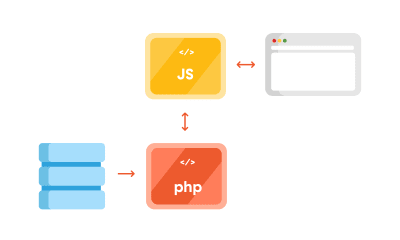
But thanks to the REST API, you can separate the WordPress backend as a sort of model and controller bundled together that handle data manipulation and database interaction, and use REST API Controller to interact with a separate view layer using various API endpoints. In addition to MVC separation, we can (for security reasons or speed improvements) place the JS App on a separate server like in the schema below:

Image depicting decoupled WordPress diagram with PHP and JS part separated

Decoupled WordPress diagram. (Large preview)

Advantages Of Using The Decoupled Approach

One thing why you may want to use this approach for is to ensure a separation of concerns. The frontend and the backend are interacting via endpoints; each can be on its separate server which can be optimized specifically for each respective task, i.e. separately running a PHP app and running a Node.js app.

By separating your frontend from the backend, it’s easier to redesign it in the future, without changing the CMS. Also, front-end developers only need to care about what to do with the data the backend provides them. This lets them get creative and use modern libraries like ReactJS, Vue or Angular to deliver highly dynamic web apps. For example, it’s easier to build a progressive web app when using the aforementioned libraries.

Another advantage is reflected in the website security. Exploiting the website through the backend becomes more difficult since it’s largely hidden from the public.

Recommended reading: WordPress Security As A Process

Shortcomings Of Using The Decoupled Approach

First, having a decoupled WordPress means maintaining two separate instances:

WordPress for the backend;
A separate front-end app, including timely security updates.

Second, some of the front-end libraries do have a steeper learning curve. It will either take a lot of time to learn a new language (if you are only accustomed to HTML and CSS for templating), or will require bringing additional JavaScript experts to the project.

Third, by separating the frontend, you are losing the power of the WYSIWYG editor, and the ‘Live Preview’ button in WordPress doesn’t work either.

Working With WordPress REST API

Before we delve deeper in the code, a couple more things about WordPress REST API. The full power of the REST API in WordPress came with version 4.7 on December 6th, 2016.

What WordPress REST API allows you to do is to interact with your WordPress installation remotely by sending and receiving JSON objects.

Setting Up A Project

Since it comes bundled with latest WordPress installation, we will be working on the Twenty Seventeen theme. I’m working on Varying Vagrant Vagrants, and have set up a test site with an URL http://dev.wordpress.test/. This URL will be used throughout the article. We’ll also import posts from the wordpress.org Theme Review Teams repository so that we have some test data to work with. But first, we will get familiar working with default endpoints, and then we’ll create our own custom endpoint.

Access The Default REST Endpoint

As already mentioned, WordPress comes with several built-in endpoints that you can examine by going to the /wp-json/ route:

http://dev.wordpress.test/wp-json/

Either by putting this URL directly in your browser, or adding it in the postman app, you’ll get out a JSON response from WordPress REST API that looks something like this:

{
“name”: “Test dev site”,
“description”: “Just another WordPress site”,
“url”: “http://dev.wordpress.test”,
“home”: “http://dev.wordpress.test”,
“gmt_offset”: “0”,
“timezone_string”: “”,
“namespaces”: [
“oembed/1.0”,
“wp/v2”
],
“authentication”: [],
“routes”: {
“/”: {
“namespace”: “”,
“methods”: [
“GET”
],
“endpoints”: [
{
“methods”: [
“GET”
],
“args”: {
“context”: {
“required”: false,
“default”: “view”
}
}
}
],
“_links”: {
“self”: “http://dev.wordpress.test/wp-json/”
}
},
“/oembed/1.0”: {
“namespace”: “oembed/1.0”,
“methods”: [
“GET”
],
“endpoints”: [
{
“methods”: [
“GET”
],
“args”: {
“namespace”: {
“required”: false,
“default”: “oembed/1.0”
},
“context”: {
“required”: false,
“default”: “view”
}
}
}
],
“_links”: {
“self”: “http://dev.wordpress.test/wp-json/oembed/1.0”
}
},

“wp/v2”: {

So in order to get all of the posts in our site by using REST, we would need to go to http://dev.wordpress.test/wp-json/wp/v2/posts. Notice that the wp/v2/ marks the reserved core endpoints like posts, pages, media, taxonomies, categories, and so on.

So, how do we add a custom endpoint?

Create A Custom REST Endpoint

Let’s say we want to add a new endpoint or additional field to the existing endpoint. There are several ways we can do that. First, one can be done automatically when creating a custom post type. For instance, we want to create a documentation endpoint. Let’s create a small test plugin. Create a test-documentation folder in the wp-content/plugins folder, and add documentation.php file that looks like this:

<?php
/**
* Test plugin
*
* @since 1.0.0
* @package test_plugin
*
* @wordpress-plugin
* Plugin Name: Test Documentation Plugin
* Plugin URI:
* Description: The test plugin that adds rest functionality
* Version: 1.0.0
* Author: Infinum
* Author URI: https://infinum.co/
* License: GPL-2.0+
* License URI: http://www.gnu.org/licenses/gpl-2.0.txt
* Text Domain: test-plugin
*/

namespace Test_Plugin;

// If this file is called directly, abort.
if ( ! defined( ‘WPINC’ ) ) {
die;
}

/**
* Class that holds all the necessary functionality for the
* documentation custom post type
*
* @since 1.0.0
*/
class Documentation {
/**
* The custom post type slug
*
* @var string
*
* @since 1.0.0
*/
const PLUGIN_NAME = ‘documentation-plugin’;

/**
* The custom post type slug
*
* @var string
*
* @since 1.0.0
*/
const POST_TYPE_SLUG = ‘documentation’;

/**
* The custom taxonomy type slug
*
* @var string
*
* @since 1.0.0
*/
const TAXONOMY_SLUG = ‘documentation-category’;

/**
* Register custom post type
*
* @since 1.0.0
*/
public function register_post_type() {
$args = array(
‘label’ => esc_html( ‘Documentation’, ‘test-plugin’ ),
‘public’ => true,
‘menu_position’ => 47,
‘menu_icon’ => ‘dashicons-book’,
‘supports’ => array( ‘title’, ‘editor’, ‘revisions’, ‘thumbnail’ ),
‘has_archive’ => false,
‘show_in_rest’ => true,
‘publicly_queryable’ => false,
);

register_post_type( self::POST_TYPE_SLUG, $args );
}

/**
* Register custom tag taxonomy
*
* @since 1.0.0
*/
public function register_taxonomy() {
$args = array(
‘hierarchical’ => false,
‘label’ => esc_html( ‘Documentation tags’, ‘test-plugin’ ),
‘show_ui’ => true,
‘show_admin_column’ => true,
‘update_count_callback’ => ‘_update_post_term_count’,
‘show_in_rest’ => true,
‘query_var’ => true,
);

register_taxonomy( self::TAXONOMY_SLUG, [ self::POST_TYPE_SLUG ], $args );
}
}

$documentation = new Documentation();

add_action( ‘init’, [ $documentation, ‘register_post_type’ ] );
add_action( ‘init’, [ $documentation, ‘register_taxonomy’ ] );

By registering the new post type and taxonomy, and setting the show_in_rest argument to true, WordPress automatically created a REST route in the /wp/v2/namespace. You now have http://dev.wordpress.test/wp-json/wp/v2/documentation and http://dev.wordpress.test/wp-json/wp/v2/documentation-category endpoints available. If we add a post in our newly created documentation custom post going to http://dev.wordpress.test/?post_type=documentation, it will give us a response that looks like this:

[
{
“id”: 4,
“date”: “2018-06-11T19:48:51”,
“date_gmt”: “2018-06-11T19:48:51”,
“guid”: {
“rendered”: “http://dev.wordpress.test/?post_type=documentation&p=4”
},
“modified”: “2018-06-11T19:48:51”,
“modified_gmt”: “2018-06-11T19:48:51”,
“slug”: “test-documentation”,
“status”: “publish”,
“type”: “documentation”,
“link”: “http://dev.wordpress.test/documentation/test-documentation/”,
“title”: {
“rendered”: “Test documentation”
},
“content”: {
“rendered”: “

This is some documentation content

n”,
“protected”: false
},
“featured_media”: 0,
“template”: “”,
“documentation-category”: [
2
],
“_links”: {
“self”: [
{
“href”: “http://dev.wordpress.test/wp-json/wp/v2/documentation/4”
}
],
“collection”: [
{
“href”: “http://dev.wordpress.test/wp-json/wp/v2/documentation”
}
],
“about”: [
{
“href”: “http://dev.wordpress.test/wp-json/wp/v2/types/documentation”
}
],
“version-history”: [
{
“href”: “http://dev.wordpress.test/wp-json/wp/v2/documentation/4/revisions”
}
],
“wp:attachment”: [
{
“href”: “http://dev.wordpress.test/wp-json/wp/v2/media?parent=4”
}
],
“wp:term”: [
{
“taxonomy”: “documentation-category”,
“embeddable”: true,
“href”: “http://dev.wordpress.test/wp-json/wp/v2/documentation-category?post=4”
}
],
“curies”: [
{
“name”: “wp”,
“href”: “https://api.w.org/{rel}”,
“templated”: true
}
]
}
}
]

This is a great starting point for our single-page application. Another way we can add a custom endpoint is by hooking to the rest_api_init hook and creating an endpoint ourselves. Let’s add a custom-documentation route that is a bit different than the one we registered. Still working in the same plugin, we can add:

/**
* Create a custom endpoint
*
* @since 1.0.0
*/
public function create_custom_documentation_endpoint() {
register_rest_route(
self::PLUGIN_NAME . ‘/v1’, ‘/custom-documentation’,
array(
‘methods’ => ‘GET’,
‘callback’ => [ $this, ‘get_custom_documentation’ ],
)
);
}

/**
* Create a callback for the custom documentation endpoint
*
* @return string JSON that indicates success/failure of the update,
* or JSON that indicates an error occurred.
* @since 1.0.0
*/
public function get_custom_documentation() {
/* Some permission checks can be added here. */

// Return only documentation name and tag name.
$doc_args = array(
‘post_type’ => self::POST_TYPE_SLUG,
‘post_status’ => ‘publish’,
‘perm’ => ‘readable’
);

$query = new WP_Query( $doc_args );

$response = [];
$counter = 0;

// The Loop
if ( $query->have_posts() ) {
while ( $query->have_posts() ) {
$query->the_post();

$post_id = get_the_ID();
$post_tags = get_the_terms( $post_id, self::TAXONOMY_SLUG );

$response[ $counter ][‘title’] = get_the_title();

foreach ( $post_tags as $tags_key => $tags_value ) {
$response[ $counter ][‘tags’][] = $tags_value->name;
}
$counter++;
}
} else {
$response = esc_html__( ‘There are no posts.’, ‘documentation-plugin’ );
}
/* Restore original Post Data */
wp_reset_postdata();

return rest_ensure_response( $response );
}

And hook the create_custom_documentation_endpoint() method to the rest_api_init hook, like so:

add_action( ‘rest_api_init’, [ $documentation, ‘create_custom_documentation_endpoint’ ] );

This will add a custom route in the http://dev.wordpress.test/wp-json/documentation-plugin/v1/custom-documentation with the callback returning the response for that route.

[{
“title”: “Another test documentation”,
“tags”: [“Another tag”]
}, {
“title”: “Test documentation”,
“tags”: [“REST API”, “test tag”]
}]

There are a lot of other things you can do with REST API (you can find more details in the REST API handbook).

Work Around Long Response Times When Using The Default REST API

For anyone who has tried to build a decoupled WordPress site, this is not a new thing — REST API is slow.

My team and I first encountered the strange WordPress-lagging REST API on a client site (not decoupled), where we used the custom endpoints to get the list of locations on a Google map, alongside other meta information created using the Advanced Custom Fields Pro plugin. It turned out that the time the first byte (TTFB) — which is used as an indication of the responsiveness of a web server or other network resource — took more than 3 seconds.

After a bit of investigating, we realized the default REST API calls were actually really slow, especially when we “burdened” the site with additional plugins. So, we did a small test. We installed a couple of popular plugins and encountered some interesting results. The postman app gave the load time of 1.97s for 41.9KB of response size. Chrome’s load time was 1.25s (TTFB was 1.25s, content was downloaded in 3.96ms). Just to retrieve a simple list of posts. No taxonomy, no user data, no additional meta fields.

Why did this happen?

It turns out that accessing REST API on the default WordPress will load the entire WordPress core to serve the endpoints, even though it’s not used. Also, the more plugins you add, the worse things get. The default REST controller WP_REST_Controller is a really big class that does a lot more than necessary when building a simple web page. It handles routes registering, permission checks, creating and deleting items, and so on.

There are two common workarounds for this issue:

Intercept the loading of the plugins, and prevent loading them all when you need to serve a simple REST response;
Load only the bare minimum of WordPress and store the data in a transient, from which we then fetch the data using a custom page.

Improving Performance With The Decoupled JSON Approach

When you are working with simple presentation sites, you don’t need all the functionality REST API offers you. Of course, this is where good planning is crucial. You really don’t want to build your site without REST API, and then say in a years time that you’d like to connect to your site, or maybe create a mobile app that needs to use REST API functionality. Do you?

For that reason, we utilized two WordPress features that can help you out when serving simple JSON data out:

Transients API for caching,
Loading the minimum necessary WordPress using SHORTINIT constant.

Creating A Simple Decoupled Pages Endpoint

Let’s create a small plugin that will demonstrate the effect that we’re talking about. First, add a wp-config-simple.php file in your json-transient plugin that looks like this:

<?php
/**
* Create simple wp configuration for the routes
*
* @since 1.0.0
* @package json-transient
*/

define( ‘SHORTINIT’, true );
$parse_uri = explode( ‘wp-content’, $_SERVER[‘SCRIPT_FILENAME’] );
require_once filter_var( $parse_uri[0] . ‘wp-load.php’, FILTER_SANITIZE_STRING );

The define( ‘SHORTINIT’, true ); will prevent the majority of WordPress core files to be loaded, as can be seen in the wp-settings.php file.

We still may need some of the WordPress functionality, so we can require the file (like wp-load.php) manually. Since wp-load.php sits in the root of our WordPress installation, we will fetch it by getting the path of our file using $_SERVER[‘SCRIPT_FILENAME’], and then exploding that string by wp-content string. This will return an array with two values:

The root of our installation;
The rest of the file path (which is of no interest to us).

Keep in mind that we’re using the default installation of WordPress, and not a modified one, like for example in the Bedrock boilerplate, which splits the WordPress in a different file organization.

Lastly, we require the wp-load.php file, with a little bit of sanitization, for security.

In our init.php file, we’ll add the following:

<?php
/**
* Test plugin
*
* @since 1.0.0
* @package json-transient
*
* @wordpress-plugin
* Plugin Name: Json Transient
* Plugin URI:
* Description: Proof of concept for caching api like calls
* Version: 1.0.0
* Author: Infinum
* Author URI: https://infinum.co/
* License: GPL-2.0+
* License URI: http://www.gnu.org/licenses/gpl-2.0.txt
* Text Domain: json-transient
*/

namespace Json_Transient;

// If this file is called directly, abort.
if ( ! defined( ‘WPINC’ ) ) {
die;
}

class Init {
/**
* Get the array of allowed types to do operations on.
*
* @return array
*
* @since 1.0.0
*/
public function get_allowed_post_types() {
return array( ‘post’, ‘page’ );
}

/**
* Check if post type is allowed to be save in transient.
*
* @param string $post_type Get post type.
* @return boolean
*
* @since 1.0.0
*/
public function is_post_type_allowed_to_save( $post_type = null ) {
if( ! $post_type ) {
return false;
}

$allowed_types = $this->get_allowed_post_types();

if ( in_array( $post_type, $allowed_types, true ) ) {
return true;
}

return false;
}

/**
* Get Page cache name for transient by post slug and type.
*
* @param string $post_slug Page Slug to save.
* @param string $post_type Page Type to save.
* @return string
*
* @since 1.0.0
*/
public function get_page_cache_name_by_slug( $post_slug = null, $post_type = null ) {
if( ! $post_slug || ! $post_type ) {
return false;
}

$post_slug = str_replace( ‘__trashed’, ”, $post_slug );

return ‘jt_data_’ . $post_type . ‘_’ . $post_slug;
}

/**
* Get full post data by post slug and type.
*
* @param string $post_slug Page Slug to do Query by.
* @param string $post_type Page Type to do Query by.
* @return array
*
* @since 1.0.0
*/
public function get_page_data_by_slug( $post_slug = null, $post_type = null ) {
if( ! $post_slug || ! $post_type ) {
return false;
}

$page_output = ”;

$args = array(
‘name’ => $post_slug,
‘post_type’ => $post_type,
‘posts_per_page’ => 1,
‘no_found_rows’ => true
);

$the_query = new WP_Query( $args );

if ( $the_query->have_posts() ) {
while ( $the_query->have_posts() ) {
$the_query->the_post();
$page_output = $the_query->post;
}
wp_reset_postdata();
}
return $page_output;
}

/**
* Return Page in JSON format
*
* @param string $post_slug Page Slug.
* @param string $post_type Page Type.
* @return json
*
* @since 1.0.0
*/
public function get_json_page( $post_slug = null, $post_type = null ) {
if( ! $post_slug || ! $post_type ) {
return false;
}

return wp_json_encode( $this->get_page_data_by_slug( $post_slug, $post_type ) );
}

/**
* Update Page to transient for caching on action hooks save_post.
*
* @param int $post_id Saved Post ID provided by action hook.
*
* @since 1.0.0
*/
public function update_page_transient( $post_id ) {

$post_status = get_post_status( $post_id );
$post = get_post( $post_id );
$post_slug = $post->post_name;
$post_type = $post->post_type;
$cache_name = $this->get_page_cache_name_by_slug( $post_slug, $post_type );

if( ! $cache_name ) {
return false;
}

if( $post_status === ‘auto-draft’ || $post_status === ‘inherit’ ) {
return false;
} else if( $post_status === ‘trash’ ) {
delete_transient( $cache_name );
} else {
if( $this->is_post_type_allowed_to_save( $post_type ) ) {
$cache = $this->get_json_page( $post_slug, $post_type );
set_transient( $cache_name, $cache, 0 );
}
}
}
}

$init = new Init();

add_action( ‘save_post’, [ $init, ‘update_page_transient’ ] );

The helper methods in the above code will enable us to do some caching:

get_allowed_post_types()
This method lets post types know that we want to enable showing in our custom ‘endpoint’. You can extend this, and the plugin we’ve actually made this method filterable so that you can just use a filter to add additional items.
is_post_type_allowed_to_save()
This method simply checks to see if the post type we’re trying to fetch the data from is in the allowed array specified by the previous method.
get_page_cache_name_by_slug()
This method will return the name of the transient that the data will be fetched from.
get_page_data_by_slug()
This method is the method that will perform the WP_Query on the post via its slug and post type and return the contents of the post array that we’ll convert with the JSON using the get_json_page() method.
update_page_transient()
This will be run on the save_post hook and will overwrite the transient in the database with the JSON data of our post. This last method is known as the “key caching method”.

Let’s explain transients in more depth.

Transients API

Transients API is used to store data in the options table of your WordPress database for a specific period of time. It’s a persisted object cache, meaning that you are storing some object, for example, results of big and slow queries or full pages that can be persisted across page loads. It is similar to regular WordPress Object Cache, but unlike WP_Cache, transients will persist data across page loads, where WP_Cache (storing the data in memory) will only hold the data for the duration of a request.

It’s a key-value store, meaning that we can easily and quickly fetch the desired data, similar to what in-memory caching systems like Memcached or Redis do. The difference is that you’d usually need to install those separately on the server (which can be an issue on shared servers), whereas transients are built in with WordPress.

As noted on its Codex page — transients are inherently sped up by caching plugins. Since they can store transients in memory instead of a database. The general rule is that you shouldn’t assume that transient is always present in the database — which is why it’s a good practice to check for its existence before fetching it

$transient_name = get_transient( ‘transient_name’ );
if ( $transient_name === false ) {
set_transient( ‘transient_name’, $transient_data, $transient_expiry );
}

You can use it without expiration (like we are doing), and that’s why we implemented a sort of ‘cache-busting’ on post save. In addition to all the great functionality they provide, they can hold up to 4GB of data in it, but we don’t recommend storing anything that big in a single database field.

Recommended reading: Be Watchful: PHP And WordPress Functions That Can Make Your Site Insecure

Final Endpoint: Testing And Verification

The last piece of the puzzle that we need is an ‘endpoint’. I’m using the term endpoint here, even though it’s not an endpoint since we are directly calling a specific file to fetch our results. So we can create a test.php file that looks like this:

get_page_cache_name_by_slug( $post_slug, $post_type ) );

// Return error on false.
if ( $cache === false ) {
wp_send_json( ‘Error, the page does not exist or it is not cached correctly. Please try rebuilding cache and try again!’ );
}

// Decode json for output.
wp_send_json( json_decode( $cache ) );

If we go to http://dev.wordpress.test/wp-content/plugins/json-transient/test.php, we’ll see this message:

Error, page slug or type is missing!

So, we’ll need to specify the post type and post slug. When we now go to http://dev.wordpress.test/wp-content/plugins/json-transient/test.php?slug=hello-world&type=post we’ll see:

Error, the page does not exist or it is not cached correctly. Please try rebuilding cache and try again!

Oh, wait! We need to re-save our pages and posts first. So when you’re starting out, this can be easy. But if you already have 100+ pages or posts, this can be a challenging task. This is why we implemented a way to clear the transients in the Decoupled JSON Content plugin, and rebuild them in a batch.

But go ahead and re-save the Hello World post and then open the link again. What you should now have is something that looks like this:

{
“ID”: 1,
“post_author”: “1”,
“post_date”: “2018-06-26 18:28:57”,
“post_date_gmt”: “2018-06-26 18:28:57”,
“post_content”: “Welcome to WordPress. This is your first post. Edit or delete it, then start writing!”,
“post_title”: “Hello world!”,
“post_excerpt”: “”,
“post_status”: “publish”,
“comment_status”: “open”,
“ping_status”: “open”,
“post_password”: “”,
“post_name”: “hello-world”,
“to_ping”: “”,
“pinged”: “”,
“post_modified”: “2018-06-30 08:34:52”,
“post_modified_gmt”: “2018-06-30 08:34:52”,
“post_content_filtered”: “”,
“post_parent”: 0,
“guid”: “http://dev.wordpress.test/?p=1”,
“menu_order”: 0,
“post_type”: “post”,
“post_mime_type”: “”,
“comment_count”: “1”,
“filter”: “raw”
}

And that’s it. The plugin we made has some more extra functionality that you can use, but in a nutshell, this is how you can fetch the JSON data from your WordPress that is way faster than using REST API.

Before And After: Improved Response Time

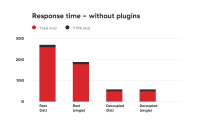
We conducted testing in Chrome, where we could see the total response time and the TTFB separately. We tested response times ten times in a row: first without plugins and then with the plugins added. Also, we tested the response for a list of posts and for a single post.

The results of the test are illustrated in the tables below:

Comparison graph depicting response times of using WordPress REST API vs using the decoupled approach without added plugins. The decoupled approach is 2 to 3 times faster

Comparison graph depicting response times of using WordPress REST API vs using the decoupled approach without added plugins. The decoupled approach is 2 to 3 times faster. (Large preview)

Comparison graph depicting response times of using WordPress REST API vs using the decoupled approach with added plugins. The decoupled approach is up to 8 times faster.

Comparison graph depicting response times of using WordPress REST API vs using the decoupled approach with added plugins. The decoupled approach is up to 8 times faster. (Large preview)

As you can see, the difference is drastic.

Security Concerns

There are some caveats that you’ll need to take a good look at. First of all, we are manually loading WordPress core files, which in the WordPress world is a big no-no. Why? Well, besides the fact that manually fetching core files can be tricky (especially if you’re using nonstandard installations such as Bedrock), it could pose some security concerns.

If you decide to use the method described in this article, be sure you know how to fortify your server security.

First, add HTML headers like in the test.php file:

header( ‘Access-Control-Allow-Origin: your-front-end-app.url’ );

header( ‘Content-Type: application/json’ );

The first header is a way to bypass CORS security measure so that only your front-end app can fetch the contents when going to the specified file.

Second, disable directory traversal of your app. You can do this by modifying nginx settings, or add Options -Indexes to your .htaccess file if you’re on an Apache server.

Adding a token check to the response is also a good measure that can prevent unwanted access. We are actually working on a way to modify our Decoupled JSON plugin so that we can include these security measures by default.

A check for an Authorization header sent by the frontend app could look like this:

if ( ! isset( $_SERVER[‘HTTP_AUTHORIZATION’] ) ) {
return;
}

$auth_header = $_SERVER[‘HTTP_AUTHORIZATION’];

Then you can check if the specific token (a secret that is only shared by the front- and back-end apps) is provided and correct.

Conclusion

REST API is great because it can be used to create fully-fledged apps — creating, retrieving, updating and deleting the data. The downside of using it is its speed.

Obviously, creating an app is different than creating a classic website. You probably won’t need all the plugins we installed. But if you just need the data for presentational purposes, caching data and serving it in a custom file seems like the perfect solution at the moment, when working with decoupled sites.

You may be thinking that creating a custom plugin to speed up the website response time is an overkill, but we live in a world in which every second counts. Everyone knows that if a website is slow, users will abandon it. There are many studies that demonstrate the connection between website performance and conversion rates. But if you still need convincing, Google penalizes slow websites.

The method explained in this article solves the speed issue that the WordPress REST API encounters and will give you an extra boost when working on a decoupled WordPress project. As we are on our never-ending quest to squeeze out that last millisecond out of every request and response, we plan to optimize the plugin even more. In the meantime, please share your ideas on speeding up decoupled WordPress!

Smashing Editorial
(md, ra, yk, il)

Collective #462

Original Source: http://feedproxy.google.com/~r/tympanus/~3/-Rw4acTHyyk/

C462_WOTW

Inspirational Website of the Week: Femme & Fierce – She is Fire and Ice

Beautiful colors and components with a fresh look and lovely details. Our pick this week.

Get inspired

C462_NW

Our Sponsor
Earn your master’s in Information Design and Strategy

Learn to drive effective digital communication and blend information architecture and experience design with branding and messaging.

Apply now

C462_grid

Random irregular grid

Vincent De Oliveira shows how to use a single paint worklet on multiple elements showcased on a creative grid.

Check it out

C462_Confessions

Confessions of a Flawed Designer

Pablo Stanley created these fun comics on some bad habits he’s trying to fix.

Check it out

C462_robin

Robin Delaporte – Creative developer

Looking for a position as a creative/front-end developer, Robin Delaporte made this beautiful portfolio.

Check it out

C462_selector

Splicing HTML’s DNA With CSS Attribute Selectors

John Rhea explains how attribute selectors work and shows some use cases.

Read it

C462_funccss

Simplify Styling with Functional CSS

Harry Nicholls explains what functional CSS is and shows how it can simplify styling.

Check it out

C462_apitime

The Intl.RelativeTimeFormat API

Mathias Bynens introduces the brand new Intl.RelativeTimeFormat API and shows how it can be used for relative time-formatted values.

Read it

C462_wireframes

User flow is the new wireframe

An illustrated guide on the different “resolutions” of user flows, and when to use them. By Alexander Handley.

Read it

C462_design

DesignBase

DesignBase is a database of highly curated free resources for all designers.

Check it out

C462_game

The Mine: No JS, CSS only adventure game

Jamie Coulter’s contribution to the Codepen Halloween challenge.

Check it out

C462_csslist

Incomplete List of Mistakes in the Design of CSS

A list of CSS design mistakes that should be corrected if anyone ever invents a time machine.

Check it out

C462_2018website

Websites in 2018

This is how many website visits indeed look like. Coded by Seva Zaikov.

Check it out

C462_invaders

Invaders

Gerard Ferrandez created this fantastic invaders pattern with canvas.

Check it out

C462_auth

Dweb: Identity for the Decentralized Web with IndieAuth

Aaron Parecki shows what IndieAuth is all about and how to get started using it.

Check it out

C462_shapes

Gradient Shapes

Shapes generated with CSS background gradients by Yuan Chuan (includes conic gradients, which are currently Chrome only).

Check it out

C462_freehtml

April Landing Page Template

April is a new free HTML landing page for startups available on Cruip.

Get it

C462_daverupert

Hard Costs of Third-Party Scripts

Dave Rupert investigates User Experience costs of third-party scripts.

Read it

C462_custom

Firefox 63 – Tricks and Treats!

Great news: support for modern Web Components APIs has shipped in Firefox!

Read it

C462_china

Design in China featuring A Black Cover Design

An interview with the founders of “A Black Cover” that offers some great insight into the Chinese design community.

Read it

C462_hexagon

Hexagon

A beautifully animated hexagon wave made by Misha Tsankashvili with CSS only.

Check it out

C462_sprites

Free Monster Enemy Game Sprites

A set of 10 evil little characters in various image formats including AI, EPS, SCML and PNG.

Check it out

Collective #462 was written by Pedro Botelho and published on Codrops.

99% Off: Get the Creator’s Multimedia & Design Super Bundle for Only $39

Original Source: http://feedproxy.google.com/~r/Designrfix/~3/swylPfK2HGA/creators-multimedia-and-design-super-bundle

Videos and images are incredible tools for capturing the attention of the public. Most people prefer infographics, images, and videos than reading long-form content. If you run a business or if you want to land a career in design or video production, then the Creator’s Multimedia & Design Super Bundle is for you. Creator’s Multimedia […]

The post 99% Off: Get the Creator’s Multimedia & Design Super Bundle for Only $39 appeared first on designrfix.com.

How to Start a Newsletter for Your Website

Original Source: http://feedproxy.google.com/~r/1stwebdesigner/~3/Ea3i2swMUdw/

Creating a newsletter for your website can be a great way to keep loyal visitors up-to-date on your adventures, while leaving them engaged and coming back for more. But where to begin? How can you create a newsletter on your own? It’s not so difficult – here’s what you need to do!

Choose an Email Marketing Service

Your first step in this venture is to choose an email marketing platform. Whether you’re looking to send out automated emails curated from content on your website, or to craft custom templates to send each week or month, most services will have what you need. It’s a matter of the features and pricing that’s right for you.

There are hundreds of fantastic email services out there; here are a few examples.

MailChimp: This popular platform is a safe bet for beginners. It’s packed with features and free up to 2,000 contacts and 12,000 emails per month. It’s perfect if you’re not sure about committing.
GetResponse: GetResponse is an affordable all-in-one platform that includes email marketing, automation and landing page design.
Constant Contact: Constant Contact aims to deliver marketing for small businesses that’s offered to as many people as possible. The drag-and-drop editor makes templates easy to create.

Newspaper and business cards

Select Content and Craft a Template

Picked a marketing platform? It should come with email templates that you can personalize to fit your brand and vision. While this step will vary depending on the service you picked, here are a few things to keep in mind while creating your newsletter template.

The subject line is the most important part of an email. It’s the difference between a deleted email and an engaged user. Don’t waste any time here; grab their attention, make an offer, or create urgency in your headline.
Build intrigue! Use teasers for blogs or products; promise something if they visit your site, like an exclusive look at the latest posts or products.
Don’t forget your call to action! Lead the readers to your website with a gripping CTA and a button that can’t be missed.
Limit the frequency of emails, but make sure to be consistent. Any more than weekly can annoy users; any less than monthly can cause lost engagement.
Use images. A text-only email is boring. Include a large picture to grab attention and draw it to the main content.

If you’re pulling from your blog feed, you’ll need to use RSS-to-email features.

Blueprints, pencil and ruler

Collect Subscribers

Once you have a solid template to work with and have your automation set up, you need to get some subscribers. Remember to obtain them legitimately through your website; buying email lists isn’t worth being blacklisted as a spam domain.

To start, make sure to advertise everywhere you can on your website! Promote it at the end of blog posts; add the form to your header or footer; include a “hello bar” that greets users and invites them to join. Pop-ups can be used when users reach the end of an article or leave the tab.

Include a lead magnet in your email campaign. What will they get if they sign up to your newsletter? A free e-book? A coupon? Give them a reason to commit to you.

If you’re not writing a blog, consider starting one. A high-quality blog can bring traffic to your website, which means more chances at gaining subscribers!

And make sure the sign-up process is as seamless as possible. The form should be accessible and visible on every page. Make the sign-up application the central focus. And, avoid having too many forms. In short, make it easy to find and even easier to fill out.

Email subscriber illustration

Creating Compelling Emails

Starting a newsletter can take a lot of work, but it’ll be worth it when you see the results. A newsletter will retain past visitors who might have otherwise forgotten your website, while looping in new fans in the process.

If you want to create a little more engagement with your visitors, start a weekly or monthly newsletter and watch as people return to see your latest endeavors. With so many easy-to-use email marketing platforms out there, anyone can create a newsletter.


You Wouldn’t Believe These Birds are Made From Paper [Photos]

Original Source: https://www.hongkiat.com/blog/paperbirds-diana-beltran-herrera/

Diana Beltrán Herrera loves to seek the relationship between animal and nature with her down-to-earth tools – her hands and paper. Her enthusiasm has thus given birth to a series of…

Visit hongkiat.com for full content.

When to Say No to a Web Design Client

Original Source: http://feedproxy.google.com/~r/1stwebdesigner/~3/lthL-dyGAfw/

Rejecting potential clients is an art that all freelancers and designers should know. Sometimes, you and the client just don’t work well together, and that’s okay! It just takes a bit of finesse – so even when you have to reject them in the middle of the project, you and your business can come out unscathed.

When They Push the Limits

Some people will get away with whatever they can. They may “negotiate” your contract, ask for extra revisions without paying, or just generally undermine the rules you set. The goal is often to avoid paying full price.

The best thing you can do is make a contract that covers all your bases, and put your foot down. You may or may not want to compromise with certain clients, but never let yourself get taken advantage of.

A "Stop" sign

When a Client is Rude or Demanding

There’s no reason to deal with someone who looks down on you. If in the initial exchange you find your client to be short, nagging, or abusive, it’s time to say no right then. These people will make your job way harder than it’s worth. They may avoid paying, nitpick, ask for constant revisions, or simply make your life difficult. If a client is showing warning signs, don’t take the job. It’s not worth it!

Woman and man having a conversation

When They Make Strange Requests

Sometimes people aren’t sure how to phrase what they want. Their requests can seem incomprehensible and vague. Or maybe what they’re asking for would take too much time.

The right questions can solve many of these problems. Ask ones that leave no room for vague answers, give a few examples to pick from, or elaborate on a confusing statement. Explain why something won’t work, or why you don’t understand their request.

But sometimes, it’s best to simply turn down these clients. When you’d only be guessing at what they want, the result isn’t going to satisfy either of you.

People reviewing documents

When Your Design Choices Clash

A designer who can’t please their clients can never succeed. However, that doesn’t mean the customer is always right. When a client has a different vision – one that may ruin the project in your eyes – the best you can do is gently explain why you made that decision, compromise, or let it go.

However, if it gets to the point that you’d be ashamed to put this project in your portfolio, it may be best to refer the client elsewhere. And if you know from the get-go that you don’t want your name associated with this project, refuse them right away.

Animals fighting

When You Can’t Do the Job

Every designer runs out of time. Jobs pile up, emergencies spring, and you just can’t take on another project. Or maybe the client is asking for something that’s out of your area of expertise.

Instead of trying to do a job you just can’t, be honest and briefly tell them why. It’s better than struggling and turning in something late or with little effort put into it. This will damage your reputation way more than rejecting a client due to lack of skills or time constraints.

A large stack of paper

When Something Feels Wrong

Trust your gut. Do they sound like a message in your spam folder? They could just be a bot. Is someone giving off weird vibes? They might turn into the rude, nitpicking client that every designer dreads. Afraid they’re not going to pay? Reject the project.

If you feel like a client will refuse to pay you, be difficult to work with, or ask for more than you’re capable of, don’t ignore the warning signs.

Can of SPAM

Learning to Deal with Clients

“Saying no” doesn’t mean being blunt or rude with a client. The best way to reject a client is to be firm but polite, brief but informative, and perhaps not to include the word “no” at all.

Trying to help the client can lessen the blow. Refer them to another designer when you can’t continue the project; explain who can help them when they’re asking for something outside your field (such as illustration, graphic design, or web development). This way, the client can transition seamlessly. No harm done to your reputation.


Collective #461

Original Source: http://feedproxy.google.com/~r/tympanus/~3/jiSvSQCHgD4/

C461_advjs

The Ultimate Guide to Execution Contexts, Hoisting, Scopes, and Closures in JavaScript

Tyler McGinnis shares another part of their “Advanced JavaScript” course in this video and article.

Read it

C461_Famous

Our Sponsor
The Missing Link In Your Design Process

Famous Studio enables designers to import designs from Sketch, Photoshop, AdobeXD and turn them into live, immersive web experiences.

Sign-Up for the Beta

C461_Galio

Galio

A new framework for rapidly building mobile apps that comes with many ready-to-use features and components.

Check it out

C461_pictureinpic

Watch video using Picture-in-Picture

Learn about Picture-in-Picture (PiP) that allows users to watch videos in a floating window.

Read it

C461_gov

Building a better GOV.UK, step by step

Read about how the “step by step journey” navigation experience is being implemented on GOV.UK.

Read it

C461_Graphql

Graphpack

With Graphpack you can create GraphQL servers with zero configuration.

Check it out

C461_supports

Using Feature Detection, Conditionals, and Groups with Selectors

A great article by Jirka Vebr on how to use feature detection in CSS including a trick for checking support for selectors.

Read it

C461_cheatsheet

Asynchronous JavaScript cheatsheet

A cheatsheet that contains a summary of the “Mastering Asynchronous JavaScript” course at Frontend Armory.

Check it out

C461_games

Building a Cross-browser, Cross-platform, Real-time Game Streaming Protocol

The first article in a series of blog posts in which Andrew Sampson outlines their experience with developing the first HTML5 game-streaming service for the web.

Check it out

C461_webinar

Free Vue.js Webinars

A site that aims to help developers learn about Vue.js. Learn more about it in this article.

Check it out

C461_3d

How Facebook 3D Photos Work

An interesting article that breaks down the 3D image effect Facebook uses.

Read it

C461_perf

The Amazing World Of Browser Performance – How To Be Performant

An introduction to web performance and how to get started improving it.

Read it

C461_pdf

Tea-School.js – Generate a PDF File From HTML And CSS in Node.js

Amir Tugendhaft writes about the challenges of creating a JavaScript based PDF generator.

Read it

C461_draft

Drafta

A tool to store and share web and interface design screens.

Check it out

C461_100css

100 Days CSS Challenge

A fun challenge created by Matthias Martin where he posts a new daily design to be coded.

Check it out

C461_icons

Evericons

A great pack of essential icons free for a subscription.

Check it out

C461_load

Ready, Steady, Crash!

Katie Koschland shares her load testing journey.

Read it

C461_link

1ty.me

One-time self-destructing links for sharing sensitive information.

Check it out

C461_console

10 Console tricks, to debug like a Pro

Amit Solanki shares some useful tips for console debugging.

Read it

C461_designres

Learn Design

Lapa Ninja’s extensive resource collection for learning design.

Check it out

C461_

Now you see it: dark patterns in web design

Ksenia Pedchenko showcases some nasty dark patterns in web design.

Read it

Collective #461 was written by Pedro Botelho and published on Codrops.