Managing and Promoting Your Online Courses

Original Source: https://www.hongkiat.com/blog/managing-promoting-your-online-courses/

E-learning market has shown a humungous growth in the past 5 years. From college students and stay-at-home moms to retirees and even regular company employees, millions of people are now depending on…

Visit hongkiat.com for full content.

Collective #379

Original Source: http://feedproxy.google.com/~r/tympanus/~3/sHfFGpssON0/

C379_WOTW

Inspirational Website of the Week: Crux

An old schoolish, yet refreshingly realistic design with a brilliant navigation. Our pick this week.

Get inspired

C379_hellosign

This content is sponsored via Syndicate Ads
HelloSign API: The dev friendly eSign

Embed HelloSign API into your app in minutes, with only a few lines of code.

Check it out

C379_blue

365 shapes of blue

Explore Julien Espagnon’s journey of learning to code with experiments he made each day in 2017.

Check it out

C379_method

Object Explorer

A resource to help figure out what JavaScript object method would be best to use at any given time. By Sarah Drasner.

Check it out

C379_grid

Auto-Sizing Columns in CSS Grid: ‘auto-fill’ vs ‘auto-fit’

Sara Soueidan explains how to auto-size columns in a CSS grid layout in this great article.

Read it

C379_framework

lit

A tiny CSS framework that aims to preserve everything Skeleton, Milligram, and other micro frameworks have to offer. By Arham Jain.

Check it out

C379_checklist

Front-End Performance Checklist 2018

A very useful front-end performance checklist for 2018 by Vitaly Friedman.

Check it out

C379_2018

Top JavaScript Libraries & Tech to Learn in 2018

Eric Elliott’s fantastic analysis and predictions for 2018.

Read it

C379_stimulus

Stimulus

A JavaScript framework that doesn’t take over your complete front-end but adds to it.

Check it out

C379_cssdemo

The Future Belongs to CSS

An interesting demo employing CSS Grid, Flexbox and position: sticky. Made by Josh Collinsworth.

Check it out

C379_joishi

Cyberspace

An interesting three.js experiment by Yoichi Kobayashi.

Check it out

C379_objectfit

Cropping & Scaling Images Using SVG Documents

Sara Soueidan shares an SVG snippet that replaces a CSS object-fit declaration.

Read it

C379_sapper

Sapper: Towards the ideal web app framework

Read about Sapper, a new web app framework by Svelte.

Read it

C379_webic

Building a webic community

Read Chen Hui Jing’s inspiring article on building a ‘webic’ community in Singapore.

Check it out

C379_headless

headless-devtools

Headless-devtools lets you perform Chrome DevTools actions from your code by leveraging Headless Chrome with Puppeteer.

Check it out

C379_preload

Can Preload Cut the Mustard?

Scott Jehl writes on a an interesting peculiarity of link[rel=preload].

Read it

C379_feedback

Fizzl

A tool for collecting design feedback quickly and easily. Free for the first couple of months.

Check it out

C379_gradients

The Secret of Great Gradient

Anna Grenn shows how to create the perfect gradient inspired by nature.

Read it

C379_2017

A recap of front-end development in 2017

A list of the most notable events in front-end engineering in 2017.

Read it

C379_insta

Instagram.css

Complete set of Instagram filters in pure CSS inspired by CSSgram.

Check it out

C379_2018trends

19 web design trends for 2018

John Moore Williams explores the hottest web design trends, techniques, and tools for 2018.

Read it

Collective #379 was written by Pedro Botelho and published on Codrops.

How to add texture to your pastels with primers

Original Source: http://feedproxy.google.com/~r/CreativeBloq/~3/OURdJ5XFMkU/add-texture-to-your-pastels-with-primers

Using pastel primers to create surfaces for your art means you can build a more textured surface to work on than paper, which holds more layers of pastel. Primers also allow you to vary that texture, helping you to add interest and even to add drama to your pastel artworks.

For me, the most exciting thing about them is the way that I can create an underpainting to work over, which gets my paintings off to a lively start, and takes away that 'fear of the blank canvas'.

By underpainting first, you combine drawing and painting skills even more than before, and inject a mixed media feel into your work. This can lead to unexpected developments and unplanned outcomes, keeping the experience fresh and exciting. So read on to breathe life into your pastel work.

01. Choose a pastel primer

Pots of primers, tubes of acrylic paint and a paintbrush

It’s easiest to buy your primers ready-made

Many artists prepare their own textured grounds, using various mixtures of gesso, pumice, or grit and acrylic primers, but it is easier to buy them already prepared. I like the Art Spectrum Colourfix range, which has 20 colours, plus a clear version. They can be brushed or rolled on, and thinned with water to adjust the texture.

02. Mix two colours for a tailored tone

Photo of artist applying a tan-coloured primer

Use a cheap decorator’s brush with a bit of water to apply your primer

Loosely mixing Raw Sienna and Sand Colourfix Primer with a cheap decorator's brush gives a lovely soft base colour for portraits. Using mount card as the base, use a little water on the same brush to brush the primer on. Speed really is essential in this process, as the primers dry extremely quickly. Remember that the more water you use, the less texture you'll have.

Pastel portrait of a man with headphones around his neck

Primer gives your an excellent base colour for portraits

When painting Nathaniel, I build up many layers, using Unison Soft Pastels, Conté crayons and pastel pencils. You can use a pencil eraser to rub out, and even add water to your pastel work. A pastel primed surface is a strong and forgiving surface.

03. Create texture with Golden Acrylic Ground

Pastel drawing of birch trees

A layer of Golden Acrylic Ground is great for adding texture

This quick sketch of birch trees was done over a layer of Golden Acrylic Ground for Pastels. This product has no colour, so you need to add your own, or underpaint the first layer with acrylic paints, for example. I like the way that on this piece, the rough brushstrokes show through.

04. Create bright surfaces

Applying a clear coat of primer to a bright blue surface with a brush

Coat layers of acrylic with Clear Colourfix Primer for a bright background

When I want a bright surface to work on, I paint two or three layers of acrylic paint – in this case, System 3 Acrylic in Ultramarine. When dry, I coat with Clear Colourfix Primer, which looks milky as you paint it on, but dries transparent. This clear primer can be painted over many other types of paint or surface, so is also great for collage.

Pastel jack russell dog portrait on a bright blue background

A blue background can make your foreground colours really pop

It can liven up your work to use background colours that are unexpected. I like the way that blues are part of the shadow colours for white animals, they also look good behind black, and make browns and oranges (a complementary colour for blue) jump off the page. Remember that you don't have to 'colour it all in' – create a feeling of space by leaving some areas unpainted. 

05. Tint primers with acrylics

A pastel seascape

The more colour you add to your primer, the less texture you’ll get

Pastel primers can be tinted with any water-based paint or ink. Keep in mind that the more paint you use, the less texture you will have to work with when applying pastel. You can let the primer dry and then wash colour over it to retain texture. In this base for a seascape, I loosely paint Yellow Ochre and Burnt Umber acrylics and primer together.

06. Treat primers as paint

Roughly painting a blue mound

Paint in a base with Colourfix Primers Sand and Deep Ultra

To create the feeling of a windswept day up on the high moor in this piece, I loosely paint a base using Colourfix Primers Deep Ultra and sand, treating them like paint and using my cheap decorator's brush.

Blue and sand-painted background

Don’t hang about!

The finished underpainting dries in about 20 minutes, so I have to work quickly and cannot dwell on detail or worry about strokes.

Yellow and green pastel marks added to the blue background form the shape of a moor

Make sure that some of your underpainting shows through

Once the underpaint is dry, I work into the piece in some areas with Unison soft pastels, limiting my palette, and making sure that I leave areas of the underpainting showing. It is easy to get carried away and cover it all up, but that would lose a lot of the life and energy.

People are added to the scene, drawn in pastel

Be careful not to overdo it

I add more definition to the rocks, by creating sharper edges and using strong lights and darks. By adding figures, I create a sense of scale to the piece. I want the painting to have a light, sketchy feel, so I am stopping at this point. They say that paintings are never finished, they just stop in interesting places.

07. Use shades of primer to add depth

A hillside scene with a tree clinging to rocks

Here, different shades of primer add depth to the finished painting

This painting, Deep Roots, is a much larger pastel, worked over pastel primers as in the previous example, but with more depth and definition. I paint a dark blue under the rocks to emphasise their strength and weight, and cream under the sky to create contrast. In the bottom right-hand corner, I leave the brushstrokes of primer showing.

This article was originally published in issue 12 of Paint & Draw, the magazine offering tips and inspiration for artists everywhere. Buy it here.

Related articles:

How to master colour theoryDrawing techniques: 7 fundamentals of pencil drawingHow to make your own canvas boards

Tried & Tested Methods of Reducing Shopping Cart Abandonment

Original Source: http://feedproxy.google.com/~r/1stwebdesigner/~3/oD1k80wvaM0/

When it comes to the sales process, it’s easy to assume that your potential customers take transaction forms for granted, especially since they are so commonplace in online shopping. Besides, your offerings are already tempting enough to convince them to shop with you, right?

Realize that your transaction forms are an opportunity for you to gain your customers’ trust. Through your transaction forms, you’re asking them for sensitive information such as online identity, credit card details, and shipping addresses. Your customers have plenty of reasons not to give this information away blindly.

Be sure to place the recognizable security logos (such as “Norton Secured” and “Verisign Secured” logos) in prominent positions. More importantly, make sure you have the infrastructure to back it up.

Be Clear About All Costs Up Front

One of the most frustrating things about shopping online is expecting to pay a specific amount, only to find out at checkout that you’re paying a whole lot more in hidden costs, fees, and surcharges. Even more egregious than these charges are the dreaded shipping charges.

Based on data from UPS, shipping costs can be such an obstacle to online shopping as to be the single biggest reason cited for shopping cart abandonment above all others.

Be as forthcoming about shipping as possible. As for the delivery estimates, be equally transparent about the lead times, so your customers can decide whether it’s worth their money to have their items arrive sooner, especially if the difference can be days instead of weeks.

Offer Free Shipping

In the spirit of making shipping a painless process as opposed to a deal-breaker for online shoppers, consider waiving the shipping costs altogether. Free shipping is such an incentive when shopping online that customers may even happily accept higher nominal prices when the shipping is free.

If you choose to offer free shipping, of course make sure you make it as obvious as possible. Use large, bold fonts and icons to point to this selling point, and win your customers over.

Retarget Shoppers with Reminder Emails and Ads

Online shoppers can abandon their carts for a number of reasons, none of which are as critical as the time that elapses when they do. It is important to reach out to them with a reminder to finish what they started.

Approximately 72 percent of online shoppers return to their abandoned shopping carts within 12 to 24 hours to complete their shopping.

Coupons can be a great incentive here, as well as pop-up ads. By utilizing cookies, retailers can have the reminders appear after the shopper leaves the page without completing the transaction, which helps avert abandonment entirely.

Keep The Cart Visible

With almost three out of four shoppers coming back to their carts within a day, the vast majority of the remaining shoppers abandon their carts with the intention of saving their items for future consideration.

This makes it really important to have the cart in clear view and easily accessible, to keep your customers aware of their unfinished shopping.

If you know how to create your own website for online shopping, you probably know about the various customized cart icons that you can install to remind your customers that you haven’t forgotten about them.

Make Navigation Between Cart And Store Effortless

This is one of the most difficult strategies to implement, mostly because trying to manage shoppers’ behaviors is like trying to hit a moving target.

As shopping in a brick-and-mortar store is nuanced, often non-linear and counterintuitive, from a merchant’s standpoint, it still helps to tailor the user experience to enable the customer to navigate effortlessly between shopping cart and store.

Offer logical, intuitive navigation options and adhere to the old adage “the Back button doesn’t exist.” The less frustrating the experience, the more likely your customers will complete the transaction.

Offer Multiple Payment Options

“Overcome obstacles.” This golden rule is usually reserved for salespeople who need to get past unwilling potential consumers to make a sale. But what about the willing ones?

Making sure that more payment options are available is another way that online sellers can overcome obstacles. Aside from the usual options such as credit cards and debit accounts, PayPal is still a popular option. Also, Apple Pay and Google Wallet are gaining traction among younger shoppers.

Having a wide variety of payment gateways means that more people can shop at your online store, and that’s a good thing.

Enable Guest Checkout

They say membership has its privileges, but by making membership a prerequisite, you alienate an entire market of casual shoppers who just want to buy what you have to sell. Of course, it would make things easier for both you and your customers if they would sign up, but if the goal is to minimize shopping cart abandonment, then enabling guest checkout is a no-brainer.

There are plenty of online tools that allow you to make guest checkout possible for your customers. By showing them that you are committed to their satisfaction as customers first, they will be more willing to become members in the future.

Make Checkout Lightning Fast

Online shoppers may have a wide range of tolerance for inconvenience, but it’s best for you as a merchant to assume that making them jump through hoops just to be a customer of yours is a bad idea.

The more you can streamline the checkout process, whether by reducing windows, steps, or pieces of personal information, the more likely their shopping experience will be a successful one.

Implement Exit-Intent Pop-Ups

Exit-intent pop-ups can detect when a user is about to leave a particular page. They serve to encourage the user to stay on the page, often offering incentives or vital information about their shopping session.

Offer a Bulletproof Money-Back Guarantee

eCommerce is founded on trust, and a faithless transaction can be damning to your online business. Once payment has been processed, the pressure is on you to deliver on your promise, and this pressure can be tremendous.

By demonstrating your willingness to stand behind your products and services, whether by offering money-back guarantees or implementing a generous return policy; make sure your customers are fully aware of your willingness to look out for them.


Dedicated Servers: Gateway to a Secured and Reliable Web Hosting Service

Original Source: http://feedproxy.google.com/~r/Designrfix/~3/YAHISkxPSb8/dedicated-servers-gateway-secured-reliable-web-hosting-service

Dedicated web hosting is also known as managed hosting service or simply dedicated servers. This is one of the best options for web hosting services that offer immense benefits. Before moving forward with dedicated servers, it is important to understand, what is a web hosting service? Web hosting is a kind of service that enables […]

The post Dedicated Servers: Gateway to a Secured and Reliable Web Hosting Service appeared first on designrfix.com.

How to Track Ecommerce Transactions with Google Analytics

Original Source: https://www.sitepoint.com/track-ecommerce-transactions-google-analytics-reports/

Google Analytics is a really useful tool for tracking visitors on your website, but few developers go beyond adding the standard tracking code, which consists of a JavaScript snippet.

Other than custom Events (see the link above if you’re curious what Events are), we can also track ecommerce transactions in Google Analytics using some extra code.

Why Track Ecommerce Transactions in Google Analytics?

Most ecommerce systems offer detailed transaction statistics, but you can’t necessarily relate them to sessions, devices, demographics or other important metrics. For example, was an increase in sales caused by UX improvements, a successful marketing campaign, or seasonal variations? Who knows.

Recording transactions in Google Analytics means that:

product and user reports are richer and more insightful
you can relate transactions directly to AdWords and other campaigns systems
you can assess the success of campaigns and concentrate on those that lead to a high return on investment
you can award access to these reports to those in your company without having to add them to the ecommerce system.

Let’s dive in.

The Overall Concept

Typically, your users will add items to a cart, check out, possibly register, pay an amount, and then be redirected to a confirmation screen. The transaction details will then show up in Google Analytics, once the user has officially checked out.

Ecommerce transaction data is usually stored in your back-end system or the back-end system of a payment gateway. For this information to show up in Google Analytics, we need to update our JavaScript code so Google Analytics can track this data too.

How to Enable Ecommerce Tracking

Proceed to the Admin area (cog icon) on the left-hand side, select your PROPERTY (your website), and then select Ecommerce Settings. Switch the “Status” to ON.

Note: the Related Products feature was deprecated in April 2017, so avoid this entirely.

Enhanced Ecommerce Settings allows you to record product impressions, promotions and actions such as coupon usage. I recommend that you implement standard ecommerce tracking first, then consult the Enhanced Ecommerce Documentation when you want to move on to more advanced ecommerce tracking later down the line.

Finally, open the View Settings menu and change the Currency displayed as value if necessary.

Enable Ecommerce Transactions

Next, use this snippet to enable ecommerce transactions:

ga(‘require’, ‘ecommerce’);

Note: this must be run after the page tracking snippet and before any ecommerce functionality is used.

Starting a New Transaction

Next, the transaction is initiated with this JavaScript code:

ga(‘ecommerce:addTransaction’, {
‘id’: ‘[transactionId]’,
‘affiliation’: ‘[storeName]’,
‘revenue’: ‘[totalCost]’,
‘shipping’: ‘[shippingCost]’,
‘tax’: ‘[taxCost]’,
‘currency’: ‘[currency]’
});

Let’s look at each of the lines in this object individually …

[transactionId] (required)

The unique transaction identifier, e.g. ‘ABC-123’.

[storeName] (optional)

The affiliation or store name, e.g. ‘My Online Shop’.

[totalCost] (optional)

The total cost including shipping and taxes. A string-encoded number without currency symbols must be used, e.g. ‘12.99’.

[shippingCost] (optional)

The (numeric) cost of shipping, e.g. ‘2.99’.

[taxCost] (optional)

The (numeric) tax, e.g. ‘1.64’.

[currency] (optional)

We already set up the default currency earlier, but you can alternatively specify a 3-character ISO 4217 country code such as EUR (Euros) or GBP (British Pound) if the shopper opts to pay using a different currency.

Adding Items to a Transaction

Items are added to an existing transaction with this snippet:

ga(‘ecommerce:addItem’, {
‘id’: ‘[transactionId]’,
‘name’: ‘[productName]’,
‘sku’: ‘[productCode]’,
‘category’: ‘[categoryName]’,
‘price’: ‘[price]’,
‘quantity’: ‘[quantity]’
});

Again, let’s look at each of the lines in this object individually …

[transactionId] (required)

The unique transaction identifier, e.g. ‘ABC-123’. This must match the code used in the transaction above, to clarify that this item relates to the basket the user already has.

[productName] (required)

The product name, e.g. ‘mens blue shirt’.

[productCode] (optional)

A unique product code or stock-keeping unit (SKU), e.g. ‘MBS-00001’.

[categoryName] (optional)

A category or variation, e.g. ‘mens shirts’.

[price] (optional)

The numeric price of this item, e.g. ‘9.99’.

[quantity] (optional)

The quantity purchased, e.g. ‘2’.

Clearing Items in a Transaction

In case the user empties their cart, the following JavaScript command clears all items from the transaction:

ga(‘ecommerce:clear’);

Submit the Transaction to Google Analytics

The final transaction with all items must then be submitted with the following JavaScript command:

ga(‘ecommerce:send’);

Naturally, this would happen on the confirmation screen.

Continue reading %How to Track Ecommerce Transactions with Google Analytics%

30 Common UX Terms Every Web Designer Should Know

Original Source: http://feedproxy.google.com/~r/1stwebdesigner/~3/CMvoyjI3oaQ/

With so many intuitive content management systems and pre-built design templates available, there are many people – designers and non-designers alike – who can create a high-quality design. There is a difference, however, between creating an aesthetically pleasing website and one that’s effective in its mission. This is why user experience (UX) design is so important.

UX design is a much more thorough and rigorous version of web design as most of us know it. It involves a lot of research, planning, and testing, all to ensure that the resulting site provides an optimally enhanced experience for the user.

Here are 30 common UX terms every designer should know, whether you’re brand new to design or you’re wanting to take your skills to the next level

1. A/B Testing

The process by which different versions of a website are tested simultaneously in order to detect differences in user behavior and preference between the two.

2. Affinity Diagramming

A form of data organization used to clearly outline groups of ideas and establish relationships among them. In UX, this is used for the purposes of planning site layout or content.

3. Analysis

This is the stage where team members research all the data collected up to a point. The data (or “analytics”) is then used to decide how best to approach a design for the user experience.

4. Beta Launch

The soft launch of a website that gives designers (and others) an opportunity to see and interact with it live, and test out kinks before the official launch.

5. Card Sorting

Card sorting refers to the physical or digital cards used to capture information about various parts of the website (e.g. content, breadcrumb link trails, navigation). It’s done in a highly organized manner to ease the subsequent planning of the site.

6. Color Theory

The idea that color has an effect on user behavior. Also known as color psychology.

7. Competitor Analysis

This is the study of competitors’ websites for the purposes of identifying strengths and weaknesses. This information is then used to help designers form a plan based on what already works for the known audience, but that won’t hinder the site from standing out from the competition.

8. Comparative Analysis

Similar to competitor analysis, this is when other websites are studied with the intent of spotting strengths and weaknesses. This assessment, however, focuses more on comparing granular website elements.

9. Content Audit

During the initial review and assessment stage, all current content is catalogued and assessed for continued viability.

10. Content Strategy

Any type of planning that defines how content is written and structured within a website. Affinity diagramming and card sorting are part of this process.

11. Contextual Enquiry

UX designers can engage with a user in real time as they move through a website. This helps them get a better sense for how users feel as they interact with certain elements of the site.

12. Diary Study

This is similar to a contextual enquiry (above), except that a diary study takes place over the long-term and without instantaneous feedback. Users instead record their experiences and share them all at a later date.

13. Experience Architecture

Experience architecture, or map, is a clearly defined path through which users on a website should navigate to reach the intended goal (the conversion).

14. Heuristic Review

As part of the review phase, a website is assessed for usability issues that will require addressing in the next iteration.

15. Interaction Design

A form of web design that focuses on creating a meaningful and valuable connection between the visitor and the website.

16. Iterative Design

Rather than have a clear start and stop, iterative design is more cyclical in nature so that the process of review, planning, prototyping, implementation, and QA repeat until the desired result is achieved.

17. Mood Board

A mood board helps UX designers define a specific style for a website through a collection of images, colors, text, and other branding elements. Unlike other data collection and design manipulation methods, this is more of a free-flowing collage rather than a step-by-step diagram.

18. Personas

This is a general marketing term, by nature, and one that seeks to establish a clear identity for the target audience. This is especially helpful in UX as it’s the user’s predicted behaviors and desires that affect how a website is to be designed in the first place.

19. Progressive Disclosure

This is a subset of interaction design, one which is meant to simplify the user experience as much as possible. So rather than present users with all the information at one time, they feed the minimum amount to them slowly over a series of steps of dynamic shifts.
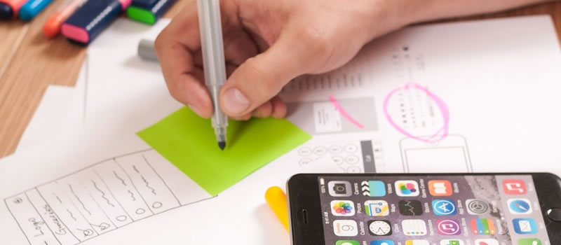
20. Prototype

A prototype is an outline or sketch of a proposed web design. Low-level prototypes are usually just the bare bones of what a website may look like. High-level prototypes include more details, but fall short of a full design mockup.

21. Qualitative Research

During the information gathering phase, UX designers utilize a number of techniques. Through interviews, contextual enquiries, diary studies, and more, the goal is to better understand how users interact with a website; thus, focusing on the quality of the interactions.

22. Quantitative Research

Quantitative research is the other side of the research coin. Instead of focusing on the quality of a user’s experience with a website, solid data is what matters most. A/B testing and competitor analysis are two examples of this.

23. Scenario

A scenario is a story that a designer envisions for their users. It usually begins with a look into the hypothetical life of the target audience. The scenario then plays out how the website would factor into providing them with a solution to a problem they face in their everyday life.
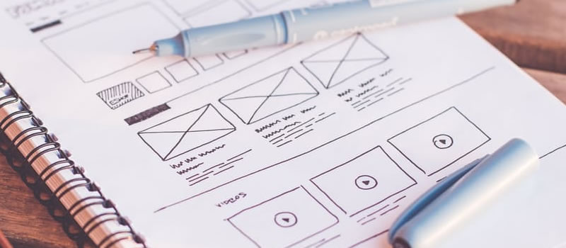
24. Storyboard

A storyboard is a sketch. In UX, it can be the visual sketch of a scenario or it can be the rough sketches of how a designer envisions a website will look.
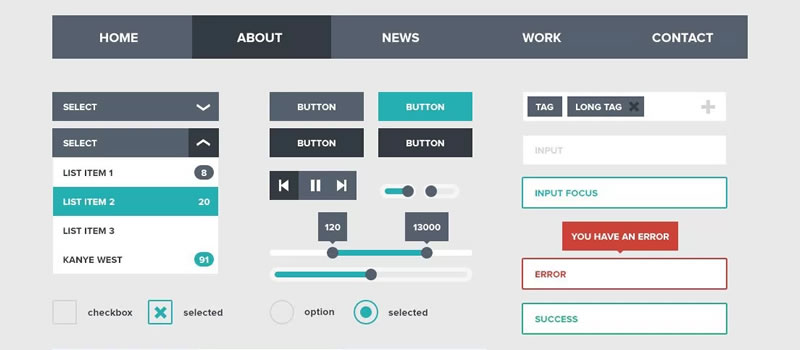
25. UI Elements

These are the parts of a website that enable users to control their experience. Buttons, navigation bars, slider arrows, and anything else that may be engaged with in order to move through the website is a user interface (UI) element.

26. Usability

This refers to the basic ease of interacting with and navigating through a website.

27. User-centered Design

This is the main goal of UX design: to create a website wholly centered around accommodating to the user’s experience.

28. User Journey

A user journey is the pathway that a UX designer establishes for site visitors, from the point of entry to conversion. This may also be referred to as UX flow.

29. User Research

User research is another term for all the analytical tasks that are completed in order to understand a brand’s audience better. Quantitative and qualitative research are the two segments of this.

30. User Test

The key difference between a user test and a contextual enquiry is that users are monitored live and in-person as they interact with a website.

31. UX Assets

UX assets are tools used to iteratively build a site’s design, including prototypes, wireframes, moodboards, mockups, etc.

32. Wireframe

Wireframes take place before prototyping and aim to establish the basic skeleton of a website’s layout.

Now that you have learned the most important UX terms, you should also learn about the most important marketing terms as well.


The 10 Best Newsletters Web Designers & Developers Should Subscribe To

Original Source: http://feedproxy.google.com/~r/1stwebdesigner/~3/pIrwhJl8sL8/

Newsletters offer a direct way to stay in touch with news and updates in the design world. They arrive right in your inbox and share only the best stuff.

1. Sidebar

Sidebar is really a design curation site where the creator Sacha Greif hand-picks 5 new links every day to promote. These are always design related posts covering tutorials, breaking news, or insights from industry thought leaders.

sidebar newsletter

The Sidebar newsletter comes daily and it gives you these 5 links right into your inbox. It’s a super convenient way to stay on top of Sidebar without constantly visiting the site.

2. 1stWebDesigner

Here at 1stWebDesigner we also have a sweet newsletter geared towards design professionals. This heavily curated resource shares only the best news and articles from around the web targeted specifically at designers.

1stwebdesigner newsletter

It offers a great way to satiate your design curiosity with top-quality content.

3. Really Good Emails

It doesn’t get more meta than the Really Good Emails Newsletter. A site devoted to newsletters with their own newsletter? Yep, and it’s pretty awesome too!

rly good newsletter

Every major site needs a newsletter. But the toughest part can be designing one and understanding how to orient content. With this newsletter you’ll get inspiration and marketing tips sent directly to your inbox once a week.

4. The Web Designer

You may be surprised to learn The Web Designer isn’t a blog, community, or gallery. It’s solely a newsletter dedicated to web designers and the design industry.

the webdesigner newsletter

It’s one of the fastest-growing newsletters online with over 23k subscribers and counting. These emails include a hodgepodge of design freebies, JS plugins, and awesome articles that deserve your attention.

5. The Smashing Newsletter

Smashing Magazine has built an empire of incredible content in the design & dev space. Their Smashing Newsletter has to be one of the most viewed in the design community with over 230k subscribers.

smashing magazine newsletter

This newsletter covers a little bit of everything. You’ll find coding tutorials, UX design articles, WordPress articles, and everything relevant to a modern designer. If you’ve never read any newsletters before then this is a great place to start.

6. Responsive Design Newsletter

Every designer knows & loves responsive design. It’s the way of the future for web design and with Responsive Design Weekly you can keep up with all the latest news, tutorials, and top-quality inspiration dedicated to responsive design.

responsive newsletter

We’ve reached a point where non-responsive design is almost a strange relic of olden times. By staying on top of the responsive design community you’ll be at the forefront of the newest techniques and CSS/JS libraries.

7. Hacking UI

I’d say that Hacking UI is geared towards coders over designers. It covers a lot about startups, building quality interfaces, and front-end coding with the right tools.

hacking ui

The site also runs a podcast and offers dozens of amazing tutorials so you have a huge library to pick from. But their newsletter curates everything together into a nice little bundle delivered to you on a weekly basis.

8. Web Designer News

User-curated news was popularized by Digg and carried on through many other websites. One design-oriented site is Web Designer News and it’s quickly becoming the source for breaking design news online.

webdesigner newsletter

Their newsletter gets delivered daily with all the latest news over the past few days & weeks. If you don’t want daily updates then this may not be for you.

But it’s the best resource to get design news hand-delivered without any effort.

9. CSS Weekly

Frontend technology has so much room for modern CSS3 to grow into uncharted territory over the next few years. And CSS Weekly is sure to keep you updated on all the latest happenings as they occur.

css weekly newsletter

The newsletter is only focused on CSS but can include tools/resources on Sass, Less, and other similar tools. Everything is hand-curated by Zoran Jambor and it’s the single best resource for staying on top of the latest CSS developments.

10. UX Design Weekly

Another weekly resource is UX Design Weekly which covers a broad scope of user experience and interaction design. Every issue of the newsletter can be seen on the website including all links from the prior week.

ux design weekly newsletter

This newsletter is perfect for finding UX tutorials, case studies, opinion pieces and tools. This info is imperative for every skilled UX designer & aspiring designer.

Wrapping Up

Finding the right newsletter is all about matching your interests with a resource that can add value to your career.

Take another look at this collection and sign up for any newsletters that grab your attention. They are all completely free, and you can always unsubscribe, so there’s nothing to lose!

You might also like to take a look at the 30 best web design blogs worth following.


Collective #378

Original Source: http://feedproxy.google.com/~r/tympanus/~3/cLCa4EcsSsM/

C378_Sponsor

Our Sponsor
Create Beautiful Websites Visually

The free & easy way to design WordPress websites. Create a stunning new website with Elementor Page Builder, zero coding needed.

Check it out

C378_Toapi

Toapi

A library for easily letting any website provide APIs. By Jiuli Gao.

Check it out

C378_gridopinion

How should we resolve percentage margins and padding on grid and flex items?

The CSS Working Group is asking the community’s opinion on a longstanding issue in the CSS Grid Layout and Flexbox specification. Rachel Andrew has put together some examples that showcase the issue.

Read it

C378_Tinder

A Tinder Progressive Web App Performance Case Study

Addy Osmani writes about Tinder Online’s journey of becoming a Progressive Web App.

Read it

C378_slider

A Sliding Nightmare: Understanding the Range Input

Ana Tudor dives into browser inconsistencies of the range input slider.

Read it

C378_talkingemoji

How I made a talking emoji using regular emojis and JavaScript

Maurizio Carboni shows how to make an emoji talk.

Read it

C378_Ether

Ether

Ether is a modular base for any design system.

Check it out

C378_pikolo

Free Font: Pikolo Block Alt

A stylish two-line display typeface designed by Ideabuk.

Get it

C378_dom

How To Make Changes to the DOM

As part of the series “Understanding the DOM” by DigitalOcean, Tania Rascia’s explains how to create, modify, and remove DOM elements in this article.

Read it

C378_productivity

Productivity Tips And Tricks: The Community Shares Its Piece Of Advice

Rachel Andrew summarizes the most interesting productivity tips of the web community.

Read it

C378_kathedral

Cathedrale

A great Christmas Experiment made by David Ronai.

Check it out

C378_gridscreencasts

Want to learn CSS Grid? Here’s my free full-length course. Merry Christmas!

Per Harald Borgen shares 13 interactive screencasts for learning CSS Grid.

Check it out

C378_colormanagement

Colour management, part 2

Read about how color space conversion works in this article by the folks of Bjango.

Read it

C378_documentation

Designing Better Design Documentation

Slava Shestopalov shows some ways for making documentation clearer, better structured, and more appealing.

Read it

C378_elasticpoints

Pointer Controlled Elastic Points

An elastic shape demo by Jack Rugile where you can click and drag to move the triangles.

Check it out

C378_behance

Behance: Year in Review 2017

It’s a special year for Behance: it marks Behance’s 10 year anniversary. Look back at a decade of creativity.

Check it out

C378_colorglyph

Colorglyph

A fun pixel glyph collection game where you create and trade tiny pixel art.

Check it out

C378_opensource

Start your open-source career

An article by Vincent Voyer on getting started with open source and finding your first project.

Read it

C378_peter

“We’ve centralized all of our data to a guy called Mark Zuckerberg” says Pirate Bay Founder

A very interesting interview with Pirate Bay founder Peter Sunde on the centralization of the internet.

Read it

C378_nectarjs

NectarJS: compiling JavaScript into Native Binaries for Every Platform

In case you missed it: Adrien Thierry shares the fascinating story of the exciting NectarJS project.

Read it

C378_cssglitch

From Our Blog
CSS Glitch Effect

An experimental glitch effect powered by CSS animations and the clip-path property. Inspired by the technique seen on the speakers page of the 404 conference.

Check it out

Collective #378 was written by Pedro Botelho and published on Codrops.

A Look Back at 2017: Round-up of Codrops Resources

Original Source: http://feedproxy.google.com/~r/tympanus/~3/2UTS6k1Tgqc/

codrops2017

2017 was yet another incredible year for web designers and developers! We’de like to invite you to a quick look back at all our resources we’ve released this year. The round-up contains all demos we’ve created in 2017, together with our talented contributors! We are very much looking forward to the next year and hope it brings much inspiration and evolution. We wish you a healthy 2018 and encourage you to make a difference. Let’s be bold and fearless, let’s turn this new year into a milestone of change!

From all our hearts, we thank our amazing readers, supporters, contributors and sponsors! Have a wonderful new year full of good vibes, kindness and love. Make it count!

With love,
Pedro, Manoela & little Lucas

A Look Back at 2017: Round-up of Codrops Resources was written by Mary Lou and published on Codrops.