Why design resolutions fail – and how to smash your goals this year

Original Source: http://feedproxy.google.com/~r/CreativeBloq/~3/MFhcC1KWgx0/why-design-resolutions-fail-and-how-to-smash-your-goals-this-year

It’s not clear why, but something about a change in the calendar makes us mega-confident that this year, we really will turn things around. Yet you only have to look at February’s empty gym changing rooms to know that keeping to resolutions is harder than it might seem. 

In this article, leading creatives share previous design-related resolutions, why they failed, and what we can learn from their experiences. 

01. Learning a new skill

“My New Year’s resolutions have often involved learning a new skill to keep pace with the ever-changing digital world,” says Dan Bradshaw, design director at TH_NK. “This year, I wanted to learn how to design for AR and VR, which then took on the form of having to pick up 3D as a skill.”

But this turned out to be his first stumbling block. “Whilst I read and immersed myself in the world of VR and AR – both literally and metaphorically – when it came to learning the 3D software I hit a wall,” he explains. “Learning the new software is expensive and finding time were factors – least not because they’re not needed at the moment in my day to day work. 

“So far, I have a much better understanding, and have explored the worlds of AR and VR from a design theory point of view. Now I just need to do it. So a key resolution for 2019 is: set a much more pointed goal, a time frame, and actually set aside time to do it.”

There’s much more to VR than meets the eye. Image credit: Jeshoots.com

It was a similar story for Tom Moran, UX lead at TH_NK. “My 2018 new year’s resolution was to draw more,” he explains. “My design put a lot of value in craft and as a UX lead it’s critical for me to be able to communicate an idea clearly and articulately. A good scamp or mock-up, even of boxes on a page, can go a long way.

“I used this as an opportunity to learn how to draw with a tablet too… and this could be the reason resolution didn’t stick,” he muses. “A bad workman quarrels with his tools, and in time I probably would have got there, but in the short run it was enough to fall by the wayside. Next year, my plan is to draw more, but maybe stick to paper.”

Lesson learned: If you hit a wall, take a step back and see what is achievable. Rather than just giving up, be like Bradshaw. Reframe your resolution (in his case: not becoming an expert practitioner, but still having a rounded knowledge of the subject). And then craft a more suitable resolution to carry things forward the following year.

02. Taking on creative challenges

"As a social media addict, I find myself constantly scrolling and finding design challenges in hashtags such as #inktober or #36daysoftype," says Alexandra Francis, junior designer at Flow Creative. "Every year I have tried to participate in more hashtags but found myself excited to start and never finishing."

So at the start of 2018, she resolved to do things differently this year. "I decided to tweak the 36 days of type challenge to suit me, and made a new year’s resolution to draw the alphabet," she explains. 

"But instead of completing the challenge in 36 days I posted a letter on my Instagram whenever I had time, aiming for once a week. Once a week fitted better into my schedule, didn’t give me added stress and meant I actually enjoyed drawing each letter as opposed to rushing my way through the alphabet.
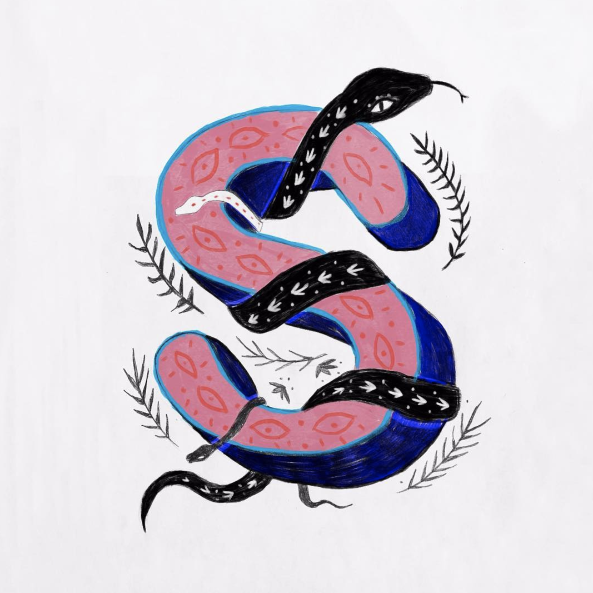
Alexandra Francis tweaked her resolution for 2018, and got a job as a result

And the result couldn't have been better. "On top of making the challenge suit me, I accidentally lined up my Instagram grid so that each letter appeared directly on top of each other. Liking how this looked and wanting my Instagram to act as a mini portfolio, it forced me to draw a letter so that this was maintained. In doing this I was headhunted by Flow Creative, who saw my feed and I landed my dream job!

"I am now on the letter Z and in giving myself a weekly brief, I have been able to really push my style and technique," she concludes. "I have gone from only traditional drawing to experimenting with Paint, Procreate and Illustrator."

Lesson learned: A daily design challenge sounds like a fun thing. But are you really that flexible with your time and schedule that you can realistic fulfil it? Consider whether changing it to weekly, fortnightly or monthly might be more achievable.

03. Better work/life balance

Designer, artist and illustrator Craig Minchington made one major resolution at the start of 2018: having a better work-life balance. But soon after coming back after his Christmas break, he slid back into old habits.

“I found myself diving head first back in to work,” he recalls. “Twelve to 14-hour days were standard. I would finish client work and then work in to the early hours doing personal projects, chasing new business, working on my portfolio.” 

He soon realised that he was ignoring all his past mistakes, and actually being less work effective. “So then I made a conscious effort to balance out my work and down time hours. 
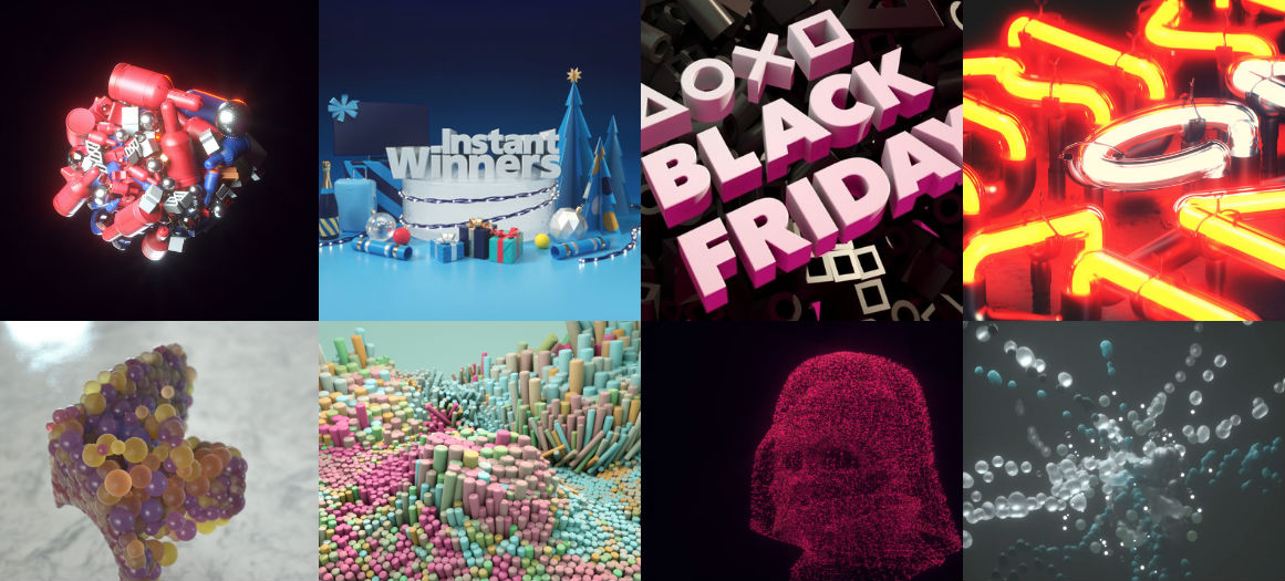
Craig Minchington design work

Craig Minchington, who specialises in 3D illustration, typography and high end image creation, has perservered with his 2019 resolution

"Non-working hours didn’t mean I wasn’t creative as I became obsessed with gardening." he continues, "but also began running seriously again for some mindful reflection time. I realised I needed these alternative to decompress, reflect, sleep better and evidently make me more effective in my 9am-6pm hours.” 

“I am not sure if those early months of chasing new business helped, or whether things just occurred naturally, but for the rest of the year work seemed to keep coming in, whilst balancing out my life and most importantly – avoiding burnout,” he adds.

Lesson learned: Just because you fall off the wagon doesn’t mean you can’t jump right on it again. Stick to your guns, and you’ll get there in the end.

04. Saying no 

“I think the resolution to ‘say no more often’ is probably on many lists every year in most industries,” says Darren Ammar, a designer at Purple Creative. “But the reality is that it's a luxury not every agency or freelancer can afford. And it is not always clear at the beginning of a project whether it is worth doing or not. I've seen dead ducks become KPI-beating swans, and a pearl of a project become a complete nightmare.”
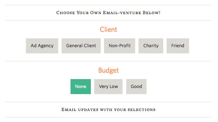
Jessica Hische's client email helper

Learning to say no is a useful skill. Trying out Jessica Hische’s client email helper can be a good start. 

So what he’s learned to do more of over the last 12 months is the importance of spending time considering why something is a great thing to do. 

“When you get that initial desire to turn a project down, make sure you fully kick it around and understand what is driving it, and whether it's justified,” he advises. “If it is, then the answer should always be no.”

Lesson learned: If your resolution requires willpower, then to stick to it you’ll need to build up a habit of taking decisions more slowly and carefully. Otherwise, you’ll end up panicking and breaking your resolution through a rush to judgement.

05. Doing more side projects

Sometimes you don’t quite achieve your resolution in full because other things get in the way that are, let’s face it, more important. That’s just what happened to freelance web designer Robert Fenech in 2018. “I made a resolution to do one mobile app design/layout per week to hone my skills on that side of things,” he explains. 
Ninja avatar

Web designer and “wannabe ninja” Rob Fenech notes that resolutions aren’t the be-all and end-all

"Random brands and ideas, but just 52 unique designs. I managed a total of 39. I ended up skipping weeks due to work commitments rather than it just fading out. It was always client work that got in the way, but that is never a bad thing.”

Lesson learned: Sometimes other things are simply more important than keeping to your resolution. As long as you’ve given it a good go, and you’re happy with the compromise you made, there's no point in beating yourself up. 

8 tips to help you keep your resolution

We can learn as much from creatives who have kept their resolutions, as those who haven’t. Here we here the stories of New Year’s resolutions that went well, and some lessons that can help us pull off the same level of success ourselves.

01. Revisit previous resolutions

There’s no rule to say that you need to make fresh resolution each New York. Revisiting the same resolutions can be just as, if not more important.

“Every year I resolve to step away from the computer, detach from all the blog inspiration that we are sent and get outside,” says Claudia Morris, design director at B&B Studio. 

“To get sketching, really look, immerse in the unfamiliar. Getting this headspace to explore, away from our online world continues to be a resolution that I need to keep revisiting! It’s one that always pays off and one that we encourage across the design team.”

02. Build on your resolutions from year to year

As well as just setting the ‘reset’ button on previous resolutions, it’s also good to develop and evolve your resolutions from year to year. Mark Davis, co-founder and creative director of property branding agency me&dave, offers an example. 

“At the start of 2018 we resolved to work towards changing the way all parties approach the pitching process. We wanted to work out how it could be done better and in a way that benefits all parties. As it stands, it’s not good for clients, it drains agencies’ resources, and it’s certainly not good for the creative process.” 

Such an endeavour, of course, can’t be fully realised in just 12 months. “So our 2019 resolution is to endeavour to make the pitching process more relevant for today’s industry and market. 

"We’re set out three manageable steps towards achieving our goal: insisting on chemistry meetings, refusing to pitch against more than two other agencies, and advising prospective clients that a pitch should be a direction to interpretation, not an exposition.”

03. Make it a regular thing

If your resolution is something you can do at any time, chances are, you’ll never do it. So it can be useful to turn it into a regular ritual. 

At the start of the year, Becca Mitchell, head of agency operations at Purple Creative, made a resolution to “Be inspired more and be more inspiring”. She explains: “You know what it’s like when you’re working to tight deadlines day in, day out? You get tired. Then you decide not to go to that gallery or exhibition that evening because you’re too exhausted.”

So she set up a monthly creative get-together she called Sidekick Series. “The objective was to put randomly selected people together every month – so they can spend time with each other and learn what each do – and get one pair to ‘host’ a creative evening for about two hours. 

“It’s their job to decide what we do: things like invite in someone inspirational to talk, go somewhere new, learn something. To date we’ve had a guided architectural tour of the Barbican, a candle-making workshop, a talk by a photographer and a pasta-making class. What I love about it is that it’s a group activity; it gets people together, excited and inspired.”  

04. Apply focus

At the end of the day, you need to focus hard on keeping your resolution; it won’t happen just by itself. Dave Bowers, head of strategy at Likely Story, offers an example from 2018. 

“This year, we wanted to get better at understanding our utilisation,” he explains. “So we started using Asana for our tasks, which lets us see what time we need to spend on each task so we don’t over-service and end up out-of-pocket. It took some discipline for a couple of months, but now it’s helping us keep our profit margins.”

05. Find the appropriate time

Too many people fail to keep their resolutions because of a ‘lack of time’, but if you need time, you have to proactively make time. 

Jamie Fleming, copywriter at Purple Creative, made a 2018 resolution to get in the habit of creativity by writing more. He reached it by finding a specific time to do so, and sticking to it. 
Jamie Fleming kept to his 2018 resolution by resisting the pull of Angry Birds

“I commute into work, which can take anywhere between 60 and 90 minutes over the course of a day,” he explains. “It’s dead time really – so I decided that I’d stop podcasting, Angry Birding and Spotifying and put pen to pad. It wasn’t always good, I didn’t always want to do it, but eventually the ideas start coming and the writing started flowing.”

The last creative we’ll hear from is Neil Richards, who (almost totally) fulfilled a New Year’s resolution he called 'Analogue 366'. 

“As I primarily work with computers, I tried to do something 'non-digital',” he explains. “So throughout the year I took a screen printing course, fixed and shot film cameras, did more hand drawn sketches, did some Lino printing, printed digital photographs – and more. If you check out the Instagram tag you can see the 362 photos I posted, so somewhere along the line I messed up! I possibly ended up in hospital; I can't remember!”

To our minds, 362 out of 366 counts as a success. And so here are Richard’s two tips for fulfilling your design-related New Year’s resolutions.

06. Take a step back

“Think of the bigger picture," says Richards. "It's so satisfying to look back at the end of the year and see how it was shaped by your resolution.”

08. Be flexible

“Don't beat yourself up if you have to skip a day, or change the parameters. The only person that it matters to is YOU, so do what's right for YOU.

"There will be hits and there will be misses, but you probably wouldn't get the hits without learning from the misses. I loved the fact that I learned new skills on my year, and some of the smaller projects made the bigger ones better."

Read more: 

9 must-have design tools for 20195 ways to get more freelance work in 20197 hot web trends for 2019

10 skills graphic designers need to get ahead in 2019

Original Source: http://feedproxy.google.com/~r/CreativeBloq/~3/qCcZTLuPU14/10-skills-graphic-designers-need-to-get-ahead-in-2019-new

A new year is a great time to reflect on the need to upskill yourself over the next 12 months. Why? Because whatever stage you're at in your career, you need to avoid getting swept aside by the tide of history.

“The role of a designer is continuously changing, now more than ever due to a revolution in the way we live and work," explains Bill Strohacker, principal director of Strohacker Design School. "So it’s extremely important for designers to keep up with these changes by continued professional development. Design is evolving, and we need to adapt across the digital experience and be relevant.”

Ben Christie, creative partner at Magpie agrees. "A truly successful graphic designer develops an innate ability to continually grow and adapt to their ever-changing environment," he says. "So you should always be looking and learning. Sucking up as much of the world as you can. Sustained designer nourishment."

But what skills are really going to help you grow your career? Here, we look at what's most in demand right now, and how you can meet those needs by upskilling yourself in 2019.

01. Digital typography 

If you're working as a graphic designer, you should already know the fundamentals of typography; if not, get started with our refresher, Typography rules and terms every designer must know.

But as graphic design slowly transitions from print to online, the need to understand the principles of digital (as opposed to print) typography have never been greater. And it's not just simply a case of swapping ems for pixels.

"Although the skills are transferable, there are a whole host of differences when designing digitally," says Alexandra Lofthouse, senior UX designer at Fifteen. "These include licensing, font sizes, resources, accessibility and more." And that's not even to mention new technologies like variable fonts and responsive type.

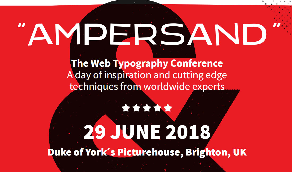
Ampersand homepage

Variable fonts are already in use on the website of type conference Ampersand

With so much to consider, and new techniques evolving all the time, it's important to stay informed by reading around the subject, believes Jack Statham, designer at Ragged Edge. 

"There are plenty of high quality tutorials and blogs that cover typography for web and apps," he says. "A more in-depth approach would be to subscribe to a video course. Skillshare and LinkedIn Learning (previously Lynda.com) are two providers of graphic design courses that are put together by professionals." 

02. Software skills

It's perfectly possible (and indeed, surprisingly common) for graduates to emerge from respected design courses without actual software skills. And in one sense that's fine: as long as you've covered the fundamental principles of graphic design, you have a firm bedrock on which to add those skills later. 

But at some point, you will need to do so. In fact, it's unlikely you'll get even a junior designer job without a good grasp of at least Photoshop, Illustrator and InDesign. 

Meanwhile, if you're in a later stage of your career, it always helps when applying for positions to add a few software strings to that bow, depending on which direction you wish to specialise in.

To get a taste of what people are looking for, check out the job listings on a site like Design Jobs Board; most ads will list particular tools as 'must haves' and others as 'preferred'. But also remember that by the time you're fully trained, that may have changed. 

After Effects graphic

Will 2019 be the year you get your head around After Effects?

The most important thing, then, is to focus on software skills that will help you grow in the areas that you're most passionate about. For instance, you might want to try out Blender in order to develop your 3D modelling skills; After Effects to build your abilities in motion graphics and animation, or WordPress as a way of dipping your toes into web design. 

“Constantly changing software, channels and end user terrain mean that nothing stays still for long,” stresses Mick Dean, creative director and lecturer at Edinburgh Napier University. “So it's important to know your strengths and play to them.”

"You can't know everything about everything. But when you recognise either a commercial or academic need, and you also have the passion to drive yourself into new areas, then on completion of that journey, you'll be a better designer."

03. Image editing

As the world gets more visually minded in the age of Instagram and Snapchat, editing and retouching images is becoming an increasingly important part of graphic design jobs at all levels. 

Primarily done using Adobe Photoshop and Adobe Lightroom, it's about everything from small-scale cleanup work (removing tiny glitches from a photo such as dirt, dust, flare and glare), to cropping pictures to fit different social platforms, to full-on image manipulation and enhancements. 

The best way to improve your skills in this area is, of course on the job. "Since starting working here at PWAR Creative, my photo editing skills have improved massively," says graphic designer Kara Clifford. "I personally think the pressure of working for clients and also working alongside other talented designers has taught me more about image editing than any course has in the past." 

Photo of coastal village

Cleaning up, editing and enhancing images is an increasingly important skill for designers

But if your role doesn't currently involve image editing, it's certainly worth taking some time to build on your current skills. Especially as it's something that you're unlikely to ever completely 'master'. 

"For me, it's been a slow drip of knowledge over a number of years," says Sarah Gray, a freelance designer based in Dublin. "I've learned as I've needed to from various sources: school, projects for university, YouTube, freelance projects, skills on my internship. But Photoshop is so functionally dense I feel like there's still so much to learn."

You can also boost your image editing skills by taking a course, following Photoshop tutorials or by pursuing a side project.

04. Photography

As well as editing images, the ability to capture original images is an extremely useful one for designers to have. As a freelancer it means you can reduce your reliance on stock imagery and add more value to the client. And if you're working in a studio and commissioning other photographers, your personal knowledge of the discipline can help you communicate with them better and get the exact shots you need.

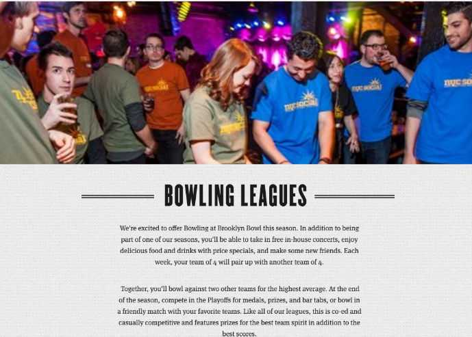
"Although it’s a cliche, a picture really does say a thousand words," says Jacob Cass. "And for this reason I use photography in the vast majority of my projects, especially in web design. A good example would be for Brooklyn Bowl, where we had to show off artists performing on stage, the extraordinary interiors of the establishment and of course, the finger-licking food. "

There are a near-infinite number of ways to hone and improve your photography skills. "I own a lot of books by photographers and I’ve read plenty of articles, but it was trial and error mainly," says Mark Dearman, a creative director based in Bristol. "Take some photos, analyse them and work out what I needed to do to improve. I’ve learnt a lot from my mistakes. There really is no substitute for taking lots of photos. I always liked the quote: 'Your first 10,000 photographs are your worst.'”

People at bowling alley

Building his skills with a camera meant Jacob Cass didn’t need to hire a photographer for his website build for Brooklyn Bowl

In practical terms, graphic designer and photographer Matthew Holland recommends: "Get a DSLR and explore all the manual settings. If you rely on automatic, like you get on a smartphone, you're only really capturing half a photo. The camera is making all the decisions for you. It would be the equivalent of laying out a wireframe and clicking a 'design' button which decides the colour pallet, typography, images etc. Only when you start to understand the power of aperture, shutter speed, ISO and white balance can you start to make informed artistic decisions."

He also urges that you "shoot in RAW rather than jpg, as you can then make the processing decisions yourself. If you shoot jpg, then your camera is making the decisions on how your image should look. 

"RAW allows you to experiment with exposure, contrast, saturation, Levels, Curves, White Balance and dozens of other settings in post. Some people argue that this makes you lazy as you can 'fix' a photo after capturing it, but people have been adjusting their images in the darkroom for years."

05. UX design

As the design industry becomes ever more focused on digital, user experience (UX) design is becoming more and more important. “Designing the part of products that people interact with is increasingly in-demand among employers,” says Strohacker. “Data has become central to many products, which has created a need for people with user interface design skills who can make those products easy for customers to use.”

So what is UX, exactly? “The role of the UX designer is to take every opportunity to enhance the other person’s enjoyment of an end product, not just visually but cognitively too, removing obstacles and easing the experience,” explains Alec East, founder of Narrative Industries.

Three iPhones show Dolphin bathrooms' website

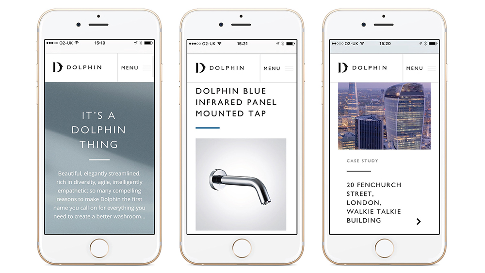
Interface design work by Taxi Studio for Dolphin Solutions

“UX design is not graphic design nor web design; it’s a different discipline that goes much deeper and is more aligned with human behaviour – but it is something that many designers are well equipped to perform if they have the discipline.”

And it’s not necessarily about pursuing a career change to become a UX designer, but boosting your ability to do the job you’re currently in. 

“I believe graphic designers should aim for a wide and deep ‘T-shape’ with knowledge and appreciation for other disciplines but with a specialism (and therefore a point of view) that they excel in,” says Lee Carroll, senior interaction designer at Seymourpowell. “So it’s about graphic designers learning to speak the language of UX designers, and to communicate their point of view better, not to replace them.”

Get started by learning some of the basic rules of UX design and check out some of these TED talks on UX design. 

06. Coding 

 As it is for UX, so it is for coding. Nobody is expecting someone focused on graphic design to build a website from start to finish – that would make them a web designer – but the more you can understand about the coding process, the better you can collaborate with developers and programmers on your digital designs.

“I hate the ‘you must code’ dogma,” says designer, developer and artist Mike Brondbjerg. “But learning to code at some level – even if that’s scripting in Illustrator or Sketch – can help designers to generate and iterate through ideas faster, and opens up a world of design complexity that is not possible manually.”

As Dean puts it: “All these skills – or knowledge of what they are and how to design with those aspects in mind – are useful. However, programming is such a vast area that the need to know how to program is less important than the need to understand how and what a programmer needs to create an outcome within a designed environment.”

Picture shows a purple model of a man, and the text 'Border: 1px solid purple'

Follow the advice of Jessica Hische and Russ Maschmeyer: don’t fear the internet but embrace it

Indeed, these skills are in such high demand now that your employer may well provide time at work for you to develop them. Nelson Bostock Group certainly sees things that way, says lead designer Laura Gibbons. “Here, our personal development plans identify areas of interest and important new skills to learn,” she explains.

“We believe in self-learning; encouraging our people to use resources like SkillShare.com alongside their day to day work. We protect this personal development time and offer ‘creative days’ to inspire or realign their thinking and passion. We also encourage partners and suppliers to share skills – this happened recently with an external developer sharing their insight into HTML and responsive coding.”

And even if you can’t get time at work, something as basic as HTML is pretty quick and easy to pick up. There are many good online courses, including the free ones provided by W3Schools. And if you want to go a little further, check out Don’t Fear the Internet, a learning resource from by Jessica Hische and Russ Maschmeyer that’s specifically aimed at print designers, photographers and other creatives.

07. AI/AR/VR

UX and coding have been around for quite some time now, but other, newer technologies are also becoming important to design agency work, including VR (virtual reality), AR (augmented reality), mixed reality and AI (artificial intelligence). Every graphic designer needs to keep a close eye on developments in such fields, stresses Vanessa Eckstein, D&AD Design Jury president 2018 and principal at Blok Design.

“We are designing identities and branding that need to be expansive and seamless and to cross many platforms and experiences,” she says. “This means we all need to get more savvy and knowledgeable about what technologies and innovations are taking place and how these could align with the needs of a particular brand. And then try to rethink the opportunities instead of repeating patterns.

“We can’t avoid being both in awe and overwhelmed about the big shifts taking place in AI, for example. This will affect many spaces we inhabit and the ways we interact with each other and society as a whole. 

"But the key is not only to learn about it but to understand that the movement is so rapid that whatever we think we understand today might not be so in five years; while remembering that creativity and storytelling will always be at the core of everything.”

Get started by checking out 20 tutorials to help you use VR in your design work, learning how to mock up AR graphics with After Effects and how to design for artificial intelligence.

08. Print design

Many experienced graphic designers have told us they feel behind the curve on digital skills. Conversely, however, there can be a skills gap with some younger designers when it comes to print design.

Despite the rise of digital, the importance of print media to the design industry is still strong, so understanding how to properly set up your screen designs for the physical world is still a vital part of a designer's knowledge base.

“I would encourage a junior to visit a print production house,” says Gibbons. “These guys know it all; they can share their knowledge and experience on the print process, artworking, paper stock, use of colour, finishing, and more. 

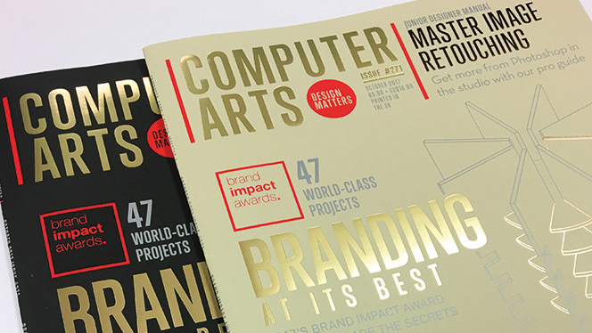
Two front covers of Computer Arts magazine with gold foil text and illustrations

Print specialists Celloglas applied soft touch varnish and foils to issue 271 of Computer Arts magazine

"If you are fortunate enough to have a say in the final execution, this breadth of knowledge could really benefit you when it comes to initial idea generation and finishing specs. Many designers nowadays are too narrowly focused, and this vital breadth of knowledge can really help you stand out from the crowd.”

09. Problem-solving 

We’ve already established that in 2018 it’s important for every designer to focus on specific software and technological skills. But Eckstein fears that some of the more important design skills may get lost along the way.

“I believe we are losing our ability to think expansively about problems in ways that accept uncertainty and paradox and raise new questions,” she says. “If we rely on data and measurability too much, we lose the deep understanding and insights that are at the core and essence of new thought.”

But if our problem solving skills are important, what can we do to hone and develop them?

Man pretending to playfully punch

As Steve Fisher puts it: “Design is about solutions, not visuals”

“Get uncomfortable, be humble and go out and experiment with something you have never done,” she recommends. “Create projects that will push your boundaries and that of the idea in your mind. See how far a concept can go, and then take it there! In my case I love collaborating with great thinkers, artists, architects etc, and I learn by doing.”

This article by Steve Fisher develops the theme that design is about solution, not visuals, while this article from the Interaction Design Foundation also provides some hints and tips to help you sharpen your problem solving skills.

10. Expansive thinking

Along with problem solving, Eckstein cites the "ability to think expansively" as a useful skill for designers to develop. Unlike other skills, which require formal study through books, courses or tutorials, this is more about constant and daily practice.

“It is not what you do but a way of seeing and relating to the world,” she explains. “It can begin by stimulating your senses and an awareness about what is happening within our profession, a space where D&AD had established itself as a leader for us all, as much as reading about very diverse subject matters and in many cases trying to analyse situations from different perspectives.“

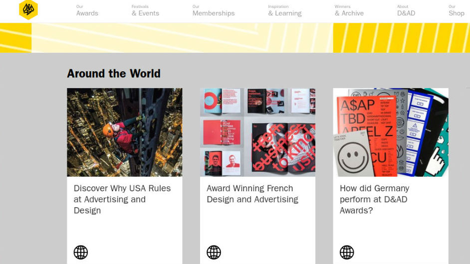
D&AD website's news section

D&AD has established itself as a leader in disseminating information and advice about new trends within the profession

“It involves everything from constantly feeding our curiosity through art, poetry, architecture or being part of conversations happening in our communities, through to being involved in projects of social justice, for example,” she continues.

“Open yourself up to experiencing diversity versus falling into your usual patterns of actions and thoughts. At the core of thinking expansively lies the elasticity of our own minds.”

Read more:

7 hot web trends for 20195 huge illustration trends for 2019The best antivirus software for 2019
10 Free Device Mockup Templates for Web Designers

Original Source: http://feedproxy.google.com/~r/1stwebdesigner/~3/1ate80qwnAY/

A great mockup for a website, app or other design helps to drive sales – just as eCommerce stores have models wearing available pieces of clothing. It’s easier for customers to visualize the look and feel of the product when it’s placed in a real-world image. That’s why mockups are so important when it comes to web design. You’ll see these mockups on developer’s websites and when you search for apps on the Google and Apple stores.

Although sometimes you’ll want to pay for mockups, you can typically find high-quality free options that look just as professional as the premium ones. That’s why we’ve put together a list of free mockup templates for web designers.

Some of these include tablets, phones and other devices on their own, while others show those devices in the midst of various scenes. For instance, it’s not uncommon to see website mockups with a computer in a coffee shop or on a phone in someone’s hand.

If you’re looking for free web design mockups, this is the place to be.

Your Designer Toolbox
Unlimited Downloads: 500,000+ Web Templates, Icon Sets, Themes & Design Assets


DOWNLOAD NOW

Free Vintage Macbook Photorealistic Mockups

Free Vintage Macbook Photorealistic Mockups

This is an excellent free mockup for creating a simple, elegant presentation for your website. You’ll receive multiple views of the Macbook on the same table, allowing you to get creative with your mockup.

Floating iPhone X Mockup

Floating iPhone X Mockup

The floating iPhone takes a different route than what you typically see from phone mockups. This would work great in a website header or on a landing page trying to sell an app or mobile website.

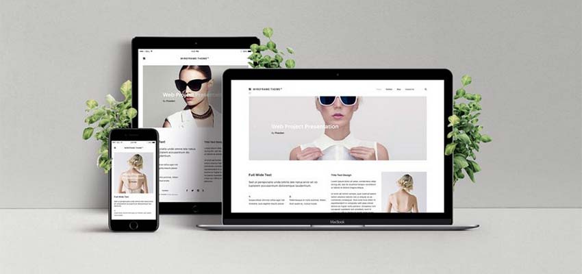
Responsive Web Design Showcase Mockup

Responsive Web Design Showcase Mockup

All web designers need to show how they can develop websites for multiple devices. One of the best ways to sell your site is to have a showcase of all devices supported. This way, customers get a taste of what the theme, template, or final web design looks like on phones, tablets and computers.

Apple Watch Mockups

Apple Watch Mockups

Web designers also create interfaces for wearable devices, so it’s nice to have an Apple Watch mockup in your arsenal. This one is a free PSD file with different views on multiple wrists. This way, people can visualize what the watch will look like when they actually wear it.

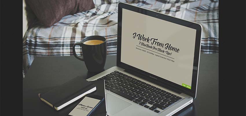
Morning Device Mockups

Morning Device Mockups

Today, many people work from home. That’s why it’s essential to have some mockups with computers and phones sitting on kitchen counters, coffee tables and beds.

iPad on White Table Mockup Bundle

iPad on White Table Mockup Bundle

This mockup features a white iPad with bright colors and even a little clipboard to include some other graphics to go with your brand.

Free Galaxy S7 Mockup

Free Galaxy S7 Mockup

Don’t forget Android devices! It’s all too common to limit most of your mockups to iPhones and Macs because of how sleek they look. However, lots of people have Androids and Windows computers, meaning you want to make those people feel included as well.

iPhone 6 & iPad Air 2 Photo MockUps

iPhone 6 & iPad Air 2 Photo MockUps

Some mockups bring the technology you have worked with into the real world. And that makes sense, since some folks plan on using their phones while camping or at coffee shops. Allow your users or clients the opportunity to envision themselves using your web design in their natural habitats.

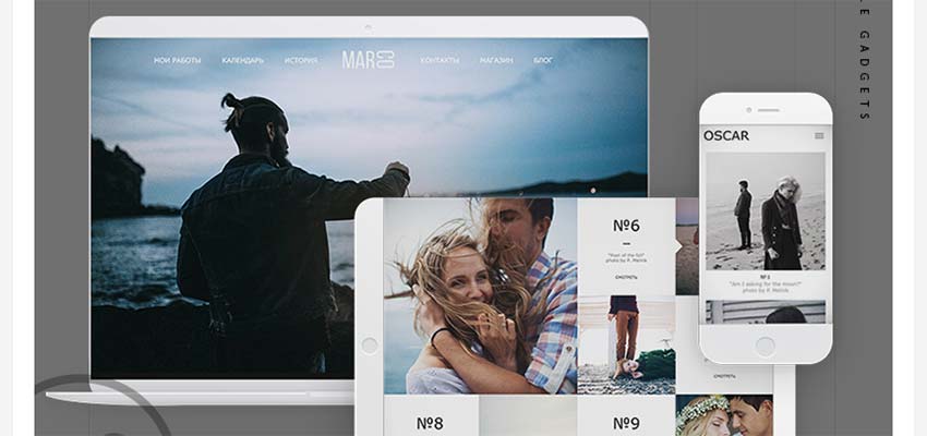
Simple Gadgets

Simple Gadgets

Here’s another mockup with multiple responsive designs. It’s simple and sleek, using white and grey colors to mimic something you might see on the Apple website.

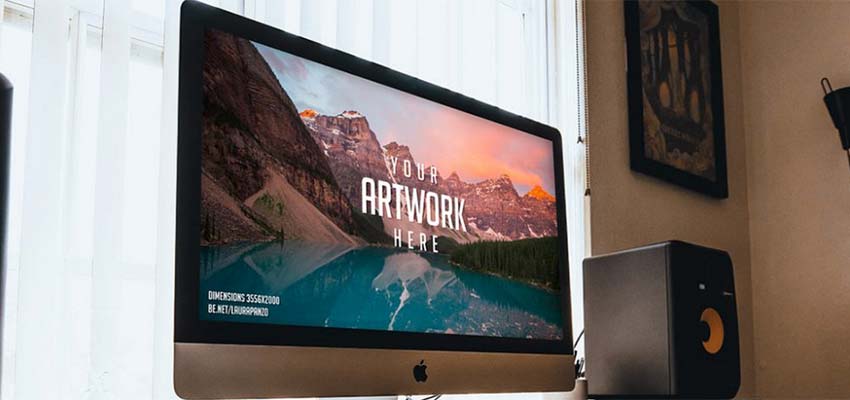
iMac on Wooden Desk

iMac on Wooden Desk

One of the most popular ways to show a visual of your website design is to go with the standard iMac on a desk. The tricky part about using a mockup on a desk is ensuring that it looks like real life. Sometimes you see desks that are way too pristine or they don’t have anything on them at all. I like this one since it’s a wooden desk and you can see several other devices like speakers, phones, and even some books and decorations. This is more realistic and similar to what someone would have at their own home office.


The best Boxing Day laptop deals in 2018

Original Source: http://feedproxy.google.com/~r/CreativeBloq/~3/hN3a3pzqM_E/the-best-boxing-day-laptop-deals-in-2018

The Boxing Day sales are here – hurrah! So if Santa didn't deliver that shiny new laptop you asked for, never fear, we have you covered with all the best Boxing Day laptop deals right here. 

We've seen a few good ones, with many retailers turning the Boxing Day sales into special events to try and finish off the year with a bang. So if you missed all the Black Friday action, there's still a chance to grab yourself a great bargain on a quality laptop.

The best laptop bags in 2018

And the best part is we've done all the hard work for you, posting all the best Boxing Day laptop deals on this page. So hit the bookmark button and check back throughout the day…

Where can you find the best Boxing Day laptop deals?

Well, right here, of course! We're sharing all the best Boxing Day laptops deals as and when they come in. But if you prefer to browse through the sales at your own leisure, here are some of the retailers we expect to get stuck in to the Boxing day deal action:

AmazonVeryCurrysAo.comJohn LewisArgosZavvi
The best Boxing Day laptop deals – US
The best Boxing Day laptop deals – UK

Read more:

The best laptop for graphic designThe best iPad accessories in 2018The 6 best laptops for photo editing in 2018

10 Free Handwriting Fonts for Design Projects

Original Source: http://feedproxy.google.com/~r/1stwebdesigner/~3/xXeY1G0urNM/

Sometimes, those plain serif and sans-serif fonts aren’t doing it for you. These fonts are great to use for the bulk of your website because they’re very simple and readable. But when you’re designing a logo or want to add a personal touch to select areas of a website, fonts that look like handwriting might be a better choice. Here are ten free handwritten fonts to get you started!

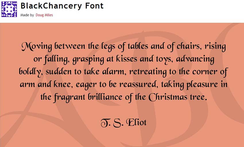
Black Chancery

Black Chancery

This calligraphic font would look great on any site that needs an extra bit of elegance. The vaguely medieval feel will work well with history and literature websites, or sites that simply want to look a bit more graceful and royal. It’s also a very legible font, so you can use it pretty much anywhere. Pick up Black Chancery Italic while you’re at it!

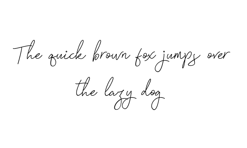
Signatura

Signatura

Need to emulate someone’s signature? Signatura is just the thing! It easily creates a beautiful and legible signature that looks like it was scanned right off the paper. Use it to sign the website creator’s name, or just as a sophisticated script font.

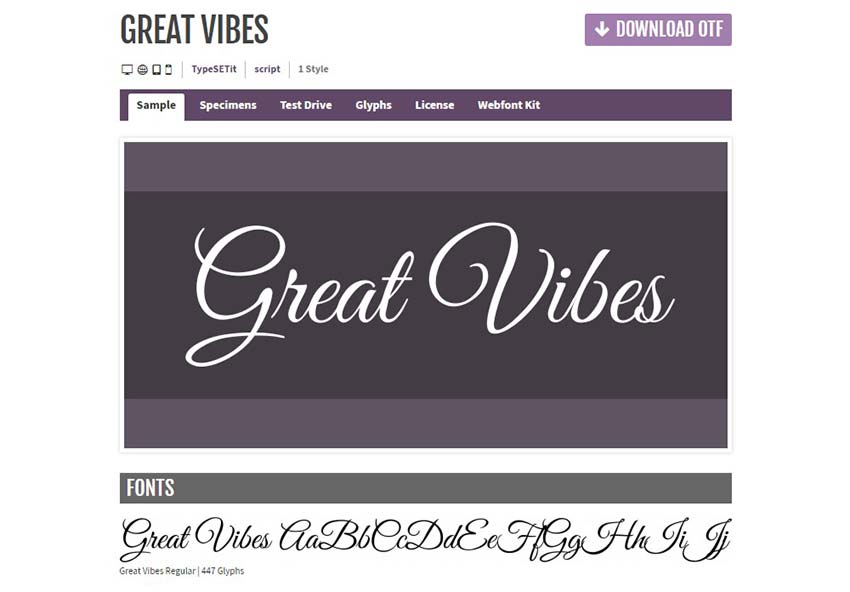
Great Vibes

Great Vibes

Great vibes is simply gorgeous. If you run a business that wants to radiate dignity and sophistication, try out this font. The calligraphy is unsuitable for blocks of text, but try it out with short sentences or a few words and you’ll love the result.

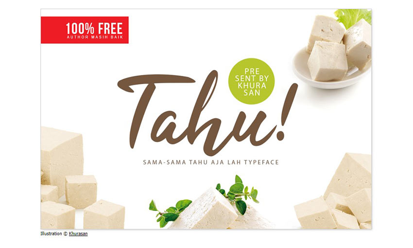
Tahu!

Tahu!

Tahu is a bold, eye-grabbing font, easily readable but not lacking at all in that individual handwritten style. Tahu italic’s look and thick lines would make for a great header, or as the central text in a banner or poster.

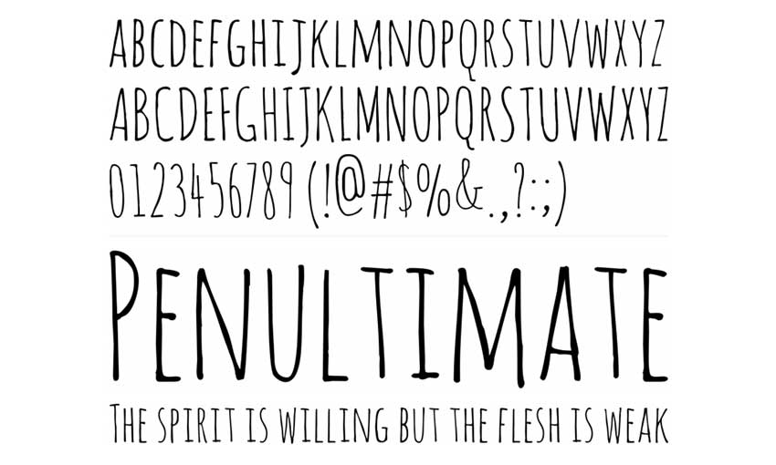
Amatic

Amatic


This thin, narrow font is very versatile. It comes in regular and bold style and is made with entirely uppercase lettering. If you need a neat, hand drawn font that makes a statement, Amatic might be right for you.

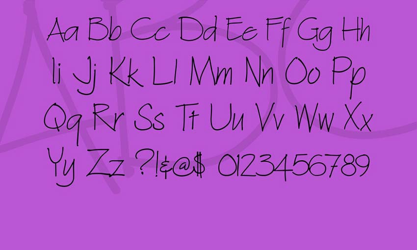
Architext

Architext

Architext was created to emulate the lettering you’d find on hand-drawn architectural sketches. Neat, pristine and thin, this font really looks like someone transcribed their own handwriting. The little flairs on the lettering make it beautiful. Try Architext if you’re after familiar and informal, but stylish.

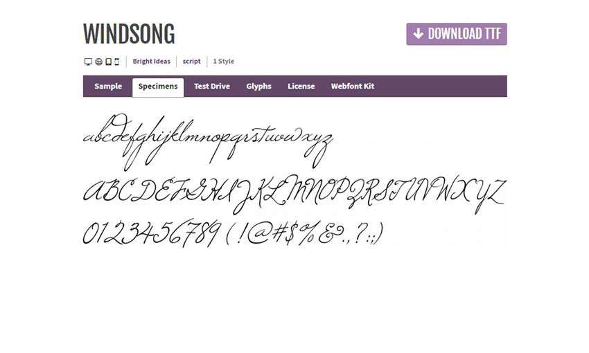
Windsong

Windsong

Perfectly elegant, Windsong is a great choice if you’re looking for something delicate and tasteful. This beautiful script lettering comes with support for nearly all symbols and letters, so it’ll work with non-English languages, too.

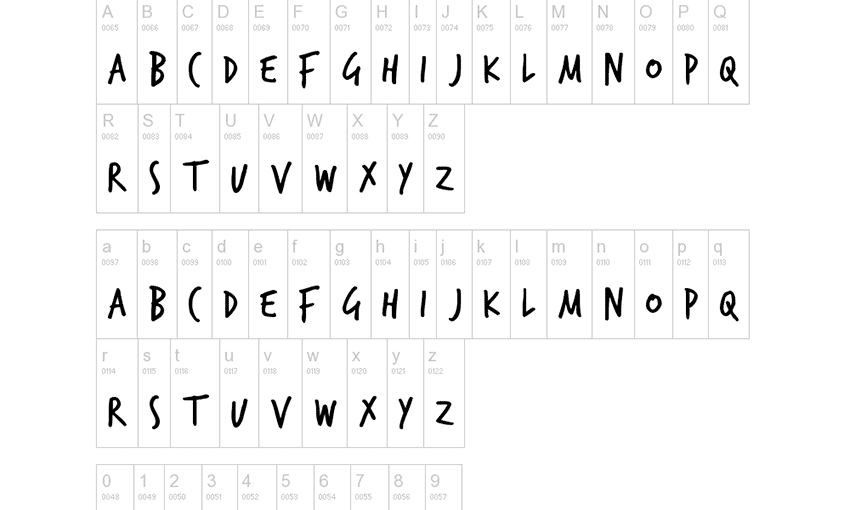
TrashHand

TrashHand

TrashHand’s bold strokes and slight serifs make it look really unique. The neat handwriting would look great on any website, professional or personal, if used in the right spots. Try it out; you’ll definitely love it!

Jo Wrote a Lovesong

Jo Wrote a Lovesong

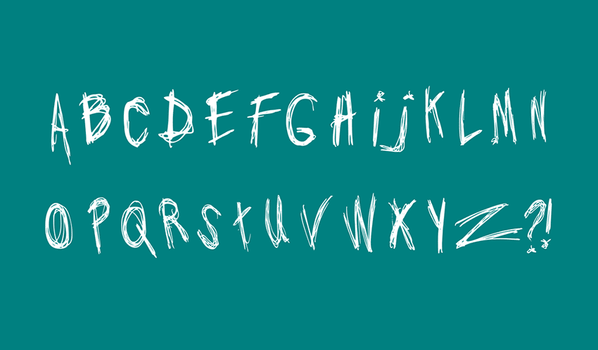
Need a horror font, or something exceptionally scribbly? Jo Wrote a Lovesong sacrifices legibility for a unique style. It definitely isn’t a font to over-use. But carefully placed and used correctly, it can make a big impact on a site’s tone.

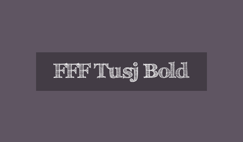
FFF Tusj

FFF Tusj

FFF Tusj is a sketchy font, perfect if you need something that looks like it was made with a pencil. The font takes an interesting spin on Georgia, and it’s surprisingly easy to read. The small imperfections and variance on the shading of each letter just adds to the effect. Try it if you want something rougher.

Personal Handwritten Fonts

Stylistic fonts generally shouldn’t be used for the bulk of a website’s text, as they can be difficult to read when used for more than a few words. But for logos, headers, and little snippets of text, these fonts can really spruce up a webpage! Whether you’re going for elegant, down-to-earth, or artistic, one of these script and stylistic fonts should be able to help you.


Quiz: Could You Become a Design Consultant in 2019?

Original Source: https://www.webdesignerdepot.com/2018/12/quiz-could-you-become-a-design-consultant-in-2019/

According to a recent QuickBooks survey, the #1 reason freelancers go into business for themselves is because it lends them the freedom to shape their own career path.

Whether you’ve done freelance web design work for a few months or a few years, there may come a time when you feel bored, unchallenged, or limited by it. When that happens, do you keep charging along because it’s what you originally set out to do? Or do you work on turning your career path into something that better aligns with your goals and job preferences?

One possible career pivot I want to present to you today is web consulting. Be sure to scroll down and take the quiz to see if this is a smart move for you!

Designer vs. Consultant: What’s the Difference?

A web designer or developer is someone who actually gets their hands dirty. They’re the ones who use coding and design skills to build a website from the ground up. Projects usually only last a couple months, unless maintenance services are offered afterwards.

A web consultant is an advisor for those in need of or who already have a website. They can provide a one-time assessment to clients or work as a dedicated advisor and guide.

Consultants specialize in the total landscape—from user persona research to optimization of a website and related marketing activities post-launch. As such, a web consultancy enables you to offer as little or as much as you’d like, unlike web design services which are a bit more rigid in nature.

In fact, selling consulting as an add-on to your web design plans could prove quite lucrative in and of itself. Not only would you become a total end-to-end provider of website services, but this would help you retain clients over longer periods of time.

Plus, as website builder tools grow more and more popular, you may find that many of the clients you would’ve easily sold design services to a year ago now confidently believe they can build a website on their own. And they have a point. Builders have greatly simplified the work that goes into creating professional-looking websites.

What these builders haven’t been able to do, though, is teach everyone how to choose the right color palette for accessibility or the right typeface for mobile users. Nor do page builders explain the importance of things like security and speed in the grand scheme of SEO. They may remove the need for someone to do hands-on work on a website (at least in your clients’ eyes), but they haven’t taught these DIY users the why of it all.

Take the Quiz: Are You a Designer or a Consultant?

I don’t mean to make this a completely black-or-white question. I believe that you can still build websites for a living while also providing occasional consulting to clients. Or vice versa. In fact, performing a mix of duties might be the perfect way to spice up your workday while bringing some much-needed stability to your income.

Use the following quiz to shed some light on whether or not website consulting is a viable path for you:

If you’re an implementer through-and-through, consulting isn’t a good choice for you.


If you’re not happy with the job anymore, it’s time to look at another career path, like consulting.


Consultants are inherently great at project management. If you don’t have the skills or interest, don’t go down that path.


Small business owners would appreciate the guidance, but won’t be able to afford your services. Enterprise-level companies will want the total package from you, so unless you have an agency, it may be best to hold off on approaching them.


If you’re not a people-person, consulting will be a very bad fit.


Consultants aren’t just people-persons. They’re also know-it-alls (but in the good sense).


Consultants are voracious learners. They have to be if they want to provide guidance that’s well-informed and valuable.


Unless you plan on providing one-off consulting services to clients, planning to consult, design, and develop by yourself just isn’t sustainable.

Is Web Consulting for You?

Not everyone is cut out for web consulting. And that’s fine. There are other ways to provide high-priced and recurring services to clients. Like selling website support or maintenance services.

But if you’re unhappy with what you’re doing now, don’t let your discontent affect the quality of your work. Find a way to fix it by pursuing a career path that makes the most sense for you.


Featured image via DepositPhotos.

Add Realistic Chalk and Sketch Lettering Effects with Sketch’it – only $5!

Source

p img {display:inline-block; margin-right:10px;}
.alignleft {float:left;}
p.showcase {clear:both;}
body#browserfriendly p, body#podcast p, div#emailbody p{margin:0;}

Interactive Animated Landscape

Original Source: http://feedproxy.google.com/~r/tympanus/~3/Lcj4RCDYNOY/

Today we are going to explore a playful animated landscape with a psychedelic look. The idea is to show how an experimentation on art and design with a generative process can lead to interesting interactive visuals which can be used in a variety of mediums like web, print, illustration, VJing, installations, games and many others. We made 3 variants of the landscape to show you how small changes in parameters can change a lot in visuals.

The demos are made with three.js and the animations and colors are controlled in a custom GLSL shader. For the letter animations we are using TweenMax.

landscape_featured

The cool thing about doing this with WebGL is that it’s widely supported and with GLSL shaders we can animate thousands, even millions of vertices at 60 FPS on the major desktop and mobile web browsers.

If you’re not familiar with three.js and GLSL shaders, you can start by creating a scene and reading this introduction to Shaders.

Let’s go through the main build up of the demo.

Breaking down the demo
1. Creating terrain with a plane

Let’s make a basic three.js scene, place a plane with a nice amount of vertices, rotate it 90 degrees is the x-axis, and lift the camera a little bit:

interactive_landscape1_plane

Create custom vertex and fragment shaders and bind them to a ShaderMaterial. The objective is to displace vertices up in the vertex shader with a perlin noise and multiply it with a height value:

// pseudo-code for noise implementation

vec3 coord = vec3(uv, 1.0)*10.0;
float noise = 1 + pnoise( vec3( coord.x, coord.y + time, coord.z ));

float height = h * noise;

// we apply height to z because the plane is rotated on x-axis
vec4 pos = vec4( position.x, position.y, height, 1.0 );

// output the final position
gl_Position = projectionMatrix * modelViewMatrix * pos;

interactive_landscape2_terrain

2. Create a road with some math

Now we’ll use a little bit of math. We’ll implement the formula below, where x is the vertex x-coordinate, h is the maximum height of terrain, c is the center of road and w is the width of road:

interactive_lanscape_formula

Playing with those variables, we can get different results, as we can see in the graphs:

interactive_lanscape_graph_h

interactive_lanscape_graph_c

interactive_lanscape_graph_w

Now, applied in vertex-shader code, multiplied by the previously calculated noise it looks as follows:

// pseudo-code for formula implementation
float height = h * pow( abs( cos( uv.x + c ) ), w ) * noise;

// we apply height to z because the plane is rotated on x-axis
vec4 pos = vec4( position.x, position.y, height, 1.0 );

// output the final position
gl_Position = projectionMatrix * modelViewMatrix * pos;

interactive_landscape1_road

To make a curved road, we use uv.y as angle and take the sin of it to oscillate the center along the y-axis (the plane is rotated on the x-axis, remember?).

interactive_landscape3_road_curve


3. Adding color layers

Let’s colorize the terrain with a nice trick. First, create a color pallete image like this one:

interactive_landscape_pallete1

And then we’ll use it as a lookup texture in the fragment shader, getting the color value from the height calculated in the vertex shader as texture uv.y coordinate:

// pseudo-code for getting the color
vec2 coord = vec2( 0.0, normalize( height ) );
vec4 color = texture2D( palleteTexture, coord );

gl_FragColor = color

interactive_landscape4_colors_layers

4. Having fun adding interactivity

Now we’ve done the heaviest part, it’s easy to use mouse, touch or whatever input you want, to control the formula’s variables and get interesting forms of interactivity:

// JS pseudo-code in the render loop for uniforms manipulation with mouse
terrain.material.uniforms.c.value = (mouseX / window.innerWidth – 0.5) * 0.1;
terrain.material.uniforms.w.value = (mouseY / window.innerHeight – 0.5) * 4;
5. Final touches

Let’s adjust the camera position, add a nice color pallete, fog, a sky background, and we are done!

interactive_landscape1_final

We hope you enjoy this walk-through and find the experiment inspirational!

References and Credits

three.js
WebGL noise by Stefan Gustavson
sky + sun shader by @blurspline
Desmos
Coolors
TweenMax

Interactive Animated Landscape was written by André Mattos and published on Codrops.

Visual Composer: The Brain-Twisting Story of the Name Change

Original Source: https://www.sitepoint.com/visual-composer-the-brain-twisting-story-of-the-name-change/

If you have been a Visual Composer user for some time, you have witnessed some changes happening that might have been a little bit confusing.

The post Visual Composer: The Brain-Twisting Story of the Name Change appeared first on SitePoint.

6 Reasons to Use Infographics in Web Design

Original Source: http://feedproxy.google.com/~r/Designrfix/~3/oN4qGobt1R4/6-reasons-to-use-infographics-in-web-design

Infographics are quickly finding their place in the world of web design for several very good reasons. If you are looking to build a website, whether it is personal or commercial, this is one element of web design you really should consider that’s important on a number of levels. Here are six of the reasons […]

The post 6 Reasons to Use Infographics in Web Design appeared first on designrfix.com.

Collective #478

Original Source: http://feedproxy.google.com/~r/tympanus/~3/tFkCIPjrVP8/

C478_WOTW

Inspirational Website of the Week: Rezo Zero

A sophisticated design with great typography and smooth effects. Our pick this week.

Get inspired

C478_cssmas

#merryCSSmas

Tommy Hodgins covers some of the most requested CSS styling features in a month-long series in this Twitter thread.

Check it out

C455_Divi

Our Sponsor
Real Time Design in WordPress

Divi is powered by the Divi Builder, an insanely fast and incredibly intuitive front end editor like nothing you have seen before. It will change the way you build websites forever.

Check it out

C478_select

Styling a Select Like It’s 2019

Scott Jehl shows how a reasonable set of styles can create a consistent select across new browsers, while also looking fine in older ones.

Read it

C478_easing

Reversing an Easing Curve

Michelle Barker walks through the math of reversing any easing function.

Check it out

C478_screenreader

I Used The Web For A Day Using A Screen Reader

Chris Ashton experiences first-hand difficulties that visually impaired users face and describes what we can do as web developers to help.

Read it

C478_servworker

Handling broken images with the service worker

Ire Aderinokun shows how to implement a service worker for handling broken images.

Read it

C478_components

Web components still need to be accessible

Eric Bailey reminds us that using modern development techniques are not a guarantee for accessibility.

Read it

C478_glimmer

Glimmer

A mesmerizing Christmas Experiment by Nicolas Riciotti.

Check it out

C478_pyramid

JavaScript Getter-Setter Pyramid

André Staltz provides a tour through the different layers of JavaScript abstractions.

Read it

C478_sketch

Magic Sketchpad

Every time you start drawing a doodle, a machine learning algorithm tries to finish it and match the category you’ve selected. Made by Monica Dinculescu.

Check it out

C478_flame

Flame in the wind

Blake Bowen coded this captivating flame demo.

Check it out

C478_spotify

Spotify Wrapped 2018 – Technical Case Study

A look under the hood at the technology and techniques used to power Spotify Wrapped 2018.

Read it

C478_ouch

Ouch!

Super stylish illustrations for your next project. PNGs are free for a link.

Check it out

C478_multiline

Animated Multiline Link Underlines with CSS

Danny Guo shares how to create an animated underline style for a breaking link.

Read it

C478_lock

I’m Awake! Stay Awake with the WakeLock API

Learn all about the Wake Lock API in this post by Pete LePage.

Read it

C478_textadventure

Writing A Multiplayer Text Adventure Engine In Node.js

A tutorial by Fernando Doglio on how to build a multiplayer text adventure engine.

Read it

C478_Taming

Taming Data with JavaScript

An article by Brian Greig where he shares some insight on how to properly deal with data processing in the browser.

Read it

C478_d3

Why you should use D3

Mike Bostock lays down two reasons why you might want to use a library like D3 (or Vega).

Read it

C478_game

XmasTree Game

A fun game where you decorate a Christmas tree.

Check it out

C478_flutter

How to do this in Flutter?

A cheat sheet for React Native developers for finding Flutter alternatives to familiar concepts.

Check it out

C478_emptycss

Checking if an input is empty with CSS

An article by Zell Liew where he explores how to check if an input is empty using CSS.

Read it

C478_spotifyeffect

Spotify Wrapped Animation using GSAP

A recreation of the effect seen on the Spotify “Your 2018 Wrapped” page. By Peter Barr.

Check it out

C478_2018

From Our Blog
Inspirational Websites from 2018

An inspirational collection of our favorite website designs from 2018.

Check it out

Collective #478 was written by Pedro Botelho and published on Codrops.