New & Upcoming Course Highlights: Data Visualization in Excel & Using Create React App

Original Source: http://blog.teamtreehouse.com/new-upcoming-course-highlights-data-visualization-excel-create-react-app

Every week, new courses and workshops are published to the growing Treehouse Library! Here’s a short list of what we’ve added recently, upcoming course highlights, and our weekly video update of What’s New at Treehouse.

NEW COURSE

Data Visualization in Excel– Michael Watson (60 minutes)

This overview of Data Visualization in Excel is designed for absolute beginners, but can also benefit people who have already been using Excel to create charts. You will learn about the fundamentals of data visualization, how create types of charts in Excel, and tips on how to get the most of the charts you make.

screen-shot-2017-07-27-at-1-29-25-pm

NEW WORKSHOP

Using Create React App– Guil Hernandez (22 minutes)

Create React App is a tool built by developers at Facebook to help you build React applications. It saves you from time-consuming setup and configuration. You simply run one command and create react app sets up the tools you need to start your React project. Learn to quickly set up React projects using Create React App.

screen-shot-2017-07-27-at-2-49-09-pm

UPCOMING

Data Visualization with Bokeh– (July 2017)

Learn how to use the Bokeh library to generate interactive charts, graphs, and other visualizations using Python. We’ll explore a world population data set and see how to generate different charts using this powerful library.

.NET Core CLI Quick Start– (July 2017)

In this quick start workshop, you’ll learn how to use the .NET Core CLI to create a simple .NET Core console application.

Start learning to code today with your free trial on Treehouse.

The post New & Upcoming Course Highlights: Data Visualization in Excel & Using Create React App appeared first on Treehouse Blog.

3 Reasons Why Customer Satisfaction and a Well Designed Website Are Related

Original Source: http://feedproxy.google.com/~r/Colorburned/~3/9Ye6cPeBBJs/

You may think of your website as something that’s a promotional tool and a representation of you or your business but might not have stopped to think about how it’s directly associated with customer service. Keep reading to learn about that important connection and why it matters when you’re building a well-designed website.

People Get Frustrated When They Can’t Find What They Need

Think back to the last time you were in a grocery store and had trouble finding a certain item you wanted to buy. That event caused you to waste time and may have even made you so fed up that you were close to deciding not to shop there again.

The same thing could happen if you build a website that’s poorly designed and badly organized. If people go to your website to fulfill a certain purpose and are not able to accomplish that task, they’re likely to leave quickly before ever giving your website a chance and may not return to it.

Word Spreads Quickly Online

People are usually quick to tell others about especially good or bad experiences they’ve had. For example, they might rave to friends about good movies, tasty restaurants, and skilled hairdressers. However, if they have experiences they’d rather forget, they’ll often warn others so they don’t make the same mistakes.

If your website has lots of errors or isn’t optimized for mobile devices, those are two things that could cause people to tell their friends it’s not worthwhile to spend any time at your website. If you upset the customers who do decide to visit your site, it’ll be a lot harder to get new traffic because a lot of potential visitors will have probably heard from others that their time is better spent elsewhere.

Bad Websites Make It Hard to Build Long-Term Relationships

If you’re lucky, you may be able to entice people to stay on your website long enough to do one thing, such as read a blog post, look at your online portfolio, or purchase something, despite having a poorly designed website. However, it’s too risky and foolish to assume those people will keep coming back even though your site isn’t serving them well.

However, once you depend on a professional website builder to craft a site that meets your ideas and is representative of your goals, it’ll be much easier to enjoy long-term relationships with site visitors. Before long, they might bookmark your page so they can come back to it quickly and may even sign up for your newsletter or another type of periodic correspondence.

When your website looks nice and is easy to navigate, people are much more likely to return to it because they actually enjoy spending time there. Another way you could make it easier to create long-term relationships with visitors is to ask for feedback and actually listen to it. That’ll make people feel they’re truly valued.

Hopefully, you now understand the strong links between a beautiful, highly functional website and favorable levels of customer satisfaction. Without your customers, it’d be hard to thrive, so make sure your website accounts for their needs.

The post 3 Reasons Why Customer Satisfaction and a Well Designed Website Are Related appeared first on Colorburned.

How to Create a Spring Header in Adobe Muse

Original Source: https://webdesignledger.com/how-to-create-a-spring-header-in-adobe-muse/

Creating a Spring Header in Adobe Muse - Adobe Muse CC - Muse For You
How to Create a Spring Header in Adobe Muse. No Coding Skills Required.

 Muse For You - Adobe Muse CC Adobe Muse CC Logo

The warm weather is finally here! Being a resident of Wisconsin you have no idea how grateful I am for that. Yes the days can be muggy and humid at times but I’ll take that over 12 inches of snow any day :P. With that being said I’ll segue into today’s article.

Lately, I’ve been creating different headers in Adobe Muse to showcase how to use Adobe Muse and to give ideas for building your own headers. The theme of this week’s header is Spring.

Creating a Spring Header in Adobe Muse - Adobe Muse CC - Muse For You

The tutorial is composed of 8 steps. They are:

1. Setting Largest Breakpoint

2. Adding Spring Text 1

3. Adding Spring Text 2

4. Masking Image in Photoshop

5. Adding Paragraph Text

6. Adding Contact Button

7. Adding Logo and Menu

8. Finishing Touches

We use various tools in Adobe Muse to create this header. For the fonts we use the text panel to set the font type, size, alignment, tracking, leading, and line height. These options are very useful when getting the text just how you want it.

For the image we use Adobe Photoshop to mask the image within an abstract looking image. This lends itself to a unique visual for the header.

We also use other tools, like stroke, the built-in menu widget, along with the Adobe Muse pinning options.

Adobe muse is very powerful tool and my goal is to make it easier to use by demonstrating fun, easy to create headers :).


For more video tutorials and widgets for Adobe Muse visit http://museforyoushop.com.

Happy Musing!

Read More at How to Create a Spring Header in Adobe Muse

The Worst Websites On The Internet. Ever.

Original Source: https://webdesignledger.com/worst-websites-ever/

We may not judge a book by the cover, but we always judge a business by its website. This is the reality and we have to deal with it.

worst websites ever

Back in time, in the early days of the Internet, creating a website was something that only IT guys were capable of making. With today’s advancement of technology and increasing interest for better and easier solutions when designing websites, almost anyone can design websites without much effort or any coding know-how.

However, this also brings some inconveniences since not everyone understands the concepts and principles of website-building. Therefore, sometimes the creativity goes too far away either due to lack of knowledge or experience or simply laziness.

In order to solve this problem, some companies have created website builder apps. Most of them have pretty nice templates, responsive designs, many options for customizing them, and can be used to create attractive websites with a few clicks of a button. But what most people tend to forget is that a website builder is merely a tool. If you don’t have the right vision and you don’t know the design principles, then you will most likely fail to make your site eye-catching, functional, and efficient.

Instead of having a website conveying the right message to your audience, you will get something that will either make people laugh or ask what was in the designer’s mind. Either way, your visitors will leave your web page without giving you any second chance.

Before listing the worst websites I have found on the Internet, let me be clear about some things:

– Firstly, I don’t mean to cause any trouble or pain to anyone, and I am certainly not making fun of web designers. Therefore, I beg the developers of the listed sites not to take offense at my remarks. I am quite sure some of these sites are designed by beginner designers. We all have to start somewhere. Besides, mistakes easily occur if you don’t have any experience.

– Secondly, I’m not talking about those websites that are just too old and haven’t been updated since their inception. Those sites may look unappealing to us now, but surely, they were created while considering the design principles of their time. But if it happens to display some old designs, it may also be because there is something in the design that’s plainly terrible and hideous.

I have listed these websites keeping in my mind several design principles:

Easy to understand navigation;
Proper use of color;
Right use of animation;
An easy-to-use layout;
An aesthetically-pleasing model;
Appropriate to the topic;
The design elements do not hinder content;
Great content that’s easy to find, navigate, consume, and share.

Simply put, the main idea is that I don’t want to shame anyone. Taking into consideration that we are all used to finding and appreciating the best website designs, I think we should also analyze awful designs and learn from such painstaking mistakes.

With that being said, let’s take a look at some websites that are hilariously terrible:

1. Penny Juice (link to www.pennyjuice.com/htmlversion/whoispj.htm)

Penny Juice is a fruit juice concentrate that’s made specifically for childcare centers, preschools, etc. When you get to the website, the first thing you need to do is to choose which version you want to use: either HTML or Flash. Choose wisely!

Once you have chosen the version you want to use, you get to the next page with a simple menu structure and flashy colors that irreversibly hurt your retina. You will also find a copyright notice since 2001-2002. That should explain the horror, but I wouldn’t bet on it.

All of this looks pretty innocent until you click to visit a particular page on the site. That’s when your monitor bursts out. The color scheme is completely overwhelming and drowns the little information left about the product. It is also extremely challenging to navigate through this website, with small links hidden at the bottom of the page.

2. Yale University School Of Art (link to http://art.yale.edu/)

You would expect a college art school to have a lovely website that reflected the kind of education you could get from there. Therefore, you would assume Yale’s site was more appealing to your visual senses. Instead of this, the website leaves you wondering if you are really in the right place.

It uses Ruby on Rails, and it is updated by the faculty and students quite often. But the tiled images in the background and the horrible font choices are just inexcusable. The navigation is pretty user-friendly, but the ghastly use of animated backgrounds is enough to put you off.

3. Patimex (link to http://www.patimex.com/)

This website looks and sounds bad from the very beginning – starting with allowing running Adobe Flash player if you want to enter. OK, maybe if you take each element separately, that wouldn’t be too terrible. But if you put them all together and add the music, then YES – it’s THAT bad. If you go to their actual site (www.wegieldrzewny.pl), it looks quite normal. But this only makes you wonder: “Why is the devil grilling himself in a floating BBQ? What’s with that music? Why? Seriously… Why?”

4. Ling’s Cars (link to www.lingscars.com)

Ling Valentine, the owner of Ling’s Cars, first appeared on the BBC program Dragon’s Den in 2006. The Metro named Lingscars.com as “the worst and weirdest website on the internet” and taking a look at it, I can understand why. It’s filled with flashing graphics, gaudy patterns, and bubble writing.

5. ARNGREN (link to www.arngren.net)

OK, this is probably the ugliest and most confusing website I have ever seen. The enormous quantity of tiny pictures and links does not help us understand the purpose of this web page. When designing your site, remember that less is more. And this is the best example.

6. Uglytub (link to http://uglytub.com)

Are you thinking of replacing your old bath tub? Then you should do it because this website doesn’t really convince you to do otherwise. A combination of flashing poor quality imagery, tiny fonts, and garish colors in conjunction with the limiting frames minimizing the site to a small window in the center of the screen sure makes this the worst offenders on the web.

7. Jamilin (link to www.jamilin.com)

Jami Lin “Love Love, LOVES helping you to evolve” but maybe she could use a little of her own advice to revamp her website. Collages of images, videos, links, adverts, and copy are all crammed into the center of the site. This surplus of images and text is a little overwhelming and blocks the clear navigation

8. Gatesnfences (link to www.gatesnfences.com)

At first glance, this Florida-based company has a website that’s stuck in the past. And taking into consideration that you will find a copyright notice of 2004-2008, I think I’m right. At the same time, they’ve decided that the best way to increase the user engagement is to bombard them with A LOT (and I mean A LOT) of information straight on the homepage. Some small, low-quality images are scattered throughout the page, but nothing to break up the huge amount of text. It hurts. Badly. Maybe they should learn that sometimes less is more.

9. James Bond Museum (link to www.007museum.com)

For decades, James Bond has been gracing the silver screen as a charismatic, charming and ultra-slick secret agent. Yet, the website for the James Bond museum is SOOO FAR AWAY from the classy image of the secret agent that it’s offensive. Its stark background and Times New Roman typeface make it obnoxious. Barely expressing the character of Bond himself, the homepage is an overwhelming, sour and incomprehensible mix of menus, hyperlinks, and random imagery.

10. Rudgwick Steam & Country Show (link to www.rudgwicksteamshow.co.uk)

Although this may not be the worst website, it’s still terrible. I think the developers tried to have a responsive design, but they failed miserably. If you visit the website using a phone, it doesn’t look that bad, but if you use a laptop or a desktop, the website looks like an image placed in the center of the screen. What’s more, they’ve chosen a design packed with primary colors and a collage of random images. The relevant information is there, but it is confusing due to the busy layout.

11. Irishwrecksonline.net (link to www.rudgwicksteamshow.co.uk)

In contrast to many websites listed here, this one lacks not just a catchy title, but also text. Larger pictures, a new layout, and functional links would help make this website more inviting and visually-appealing.

12. Constellation 7 (link to www.constellation7.org/Constellation-Seven/Josiah/Index.htm)

OK, I think this is one of the ugliest websites I have ever seen. I’m not kidding. They use a blend of conspicuously bright colors throughout the entire site, bold and colorful typography, and some animations that are making you run as far as you can. Fortunately, they don’t have any music.

13. Mojo Yogurt (link to http://mojoyogurt.com/#/home)

Again, this is a website built using Flash. The whole design wouldn’t be that terrible, had it not been for that horrible, annoying background music, and sound effect that you can’t pause. Just to let you know, dearest Mojo Yogurt, people who visit your website are trying to look for your product, not listen to that awful music.

14. Industrial Painter (link to http://industrialpainter.com)

This company has chosen to have irritating music in the background with no option for you to turn it off. Along with Flash-based, horrible design and low-quality images you get the idea of a terrible-terrible site. I really don’t know how they plan on attracting customers with such a website.1

15. Superior Web Solutions (link to http://industrialpainter.com)

This is the company’s website that built Industrial painter. Taking into consideration that it’s a web design company, I can say it’s even worse than Industrial Painter. That’s mainly because you expect a web design company to know about the latest trends and design. Instead, we find annoying music, along with a non-responsive, flash based, and horrible homepage design. I cannot overstate how horrific this website looks.

Read More at The Worst Websites On The Internet. Ever.

From Waiter to Programmer & Digital Content Manager: Jonathan Borteij’s Story

Original Source: http://blog.teamtreehouse.com/from-waiter-to-programmer-and-digital-content-manager-jonathan-borteijs-story

In his early 20s, Jonathan Borteij found himself without a college degree, working in a restaurant. It was a badly paid, stressful job that Jonathan didn’t enjoy, and he knew it was time to pursue an entirely new career path. That’s when Jonathan discovered Treehouse and began learning. This experience introduced him to the tech industry, which was a perfect fit for him.

Since then, Jonathan has worked as a programmer and now works as a digital content manager at one of the world’s largest ferry operators. Using his Treehouse knowledge, he has also earned 5 certifications from Google. With such a diverse resume of skills alongside his knowledge of digital strategies, Jonathan is starting out on an exciting career path, an opportunity that he credits Treehouse for helping him achieve.

We asked Jonathan to share his story.

jonathan

What first encouraged you to learn to code and pursue a career as a web developer?

I started programming when I was about 11 years old. I didn’t take it seriously, but it did establish my interest in the web and web development. I was curious about how the technology of the web worked and how I could use it to build things that I could use with my friends. However, at the time, there weren’t any platforms like Treehouse to learn how to code.

A few years ago, with the help of Treehouse, I began seriously learning to code and received my first job as a programmer. I was able to use all of the knowledge I had learned both in practice and in job interviews. Today I work at one of the world’s largest ferry operators companies as a digital content manager.

None of this would happen if it wasn’t for Treehouse, which is why I still used it a lot to grow my coding skills.

What were you doing when you first joined Treehouse and how did you integrate learning into your everyday life?

I worked at a restaurant. It was stressful and badly paid and I had to decide what I wanted to do with my life. I chose to learn computer programming so I could combine it with digital marketing. I don’t regret changing my career in my 20s. I earn a great salary each month and there aren’t many people my age in the same position without a college degree. But in the tech world, it’s possible.

There aren’t many people my age in the same position without a college degree. But in the tech world, it’s possible.

What has the value of a Treehouse education meant to you?

My Treehouse education has been extremely valuable to me, it has taught me all the basics, but it has also taught me how to create and build advanced skills. I also gained an extremely good understanding of SEO and have been able to help companies increase their revenues using digital strategies and SEO. One example is a wholesale company in Sweden that increased its turnover significantly in less than 2 years. So I guess my training at Treehouse has also meant a lot to the employers who have hired me!

What advice would you share with students who are just starting to learn to code?

The most important thing is to never to stop dreaming. Tech is the future, so invest in yourself and the knowledge, and keep on learning new technologies. Build a goal and make sure you reach it.

If you have a dream to start working as a web developer, be sure to follow your Treehouse lessons. Every time you get a notification email from Treehouse, make sure to complete the course. If you do not succeed with your quizzes and code challenges the first time, be sure to try again. You will find it difficult to understand syntax and code at the beginning, everybody does. But you will learn it, I promise.

The most important thing is to never to stop dreaming. Tech is the future, so invest in yourself and the knowledge, and keep on learning new technologies.

What are your plans for the future?

I will continue to work and keep learning new technologies. I have also received a lot of interest in my digital marketing skills. I plan to start a course at Wharton School at the University of Pennsylvania in digital marketing. They have one of the world’s best digital marketing programs. I would never have been able to take on an educational opportunity like this if I wasn’t well-paid as a developer. I’ll also continue learning with Treehouse, particularly as they’re great at sharing the latest tech industry news.

Start learning to code today with your free trial on Treehouse.

How I Became a Self-Taught Developer in 3 Months: Chris Dabatos’s Story

The post From Waiter to Programmer & Digital Content Manager: Jonathan Borteij’s Story appeared first on Treehouse Blog.

Should I Learn Kotlin or Java?

Original Source: http://blog.teamtreehouse.com/learn-kotlin-java

With Android officially adopting Kotlin as a supported language, there’s one question that every new Android developer should be asking themselves: should I learn Kotlin or Java?

Rather than burying the answer all the way at the bottom… in my mind, it’s definitely Kotlin.

Kotlin was introduced in 2011 by JetBrains (maker of IntelliJ IDEA, PyCharm, and many other top IDEs) who at the time were using almost entirely Java. They created Kotlin because, “First and foremost, it’s about our own productivity”.

kotlin island*Kotlin is named after Kotlin Island in St. Petersburg, Russia

So Kotlin was created explicitly to be better than Java, but JetBrains wasn’t about to rewrite their IDEs from scratch in a new language. Which is why they made Kotlin 100% interoperable with Java. Kotlin runs on the JVM and compiles down to Java bytecode; you can start tinkering with Kotlin in an existing Java or Android project and everything will work just fine.

That said, there aren’t yet many Android tutorials using Kotlin; most beginner stuff is in Java along with the Android docs (though we’re working on our first beginner-focused Kotlin for Android course, and it should be out before too long). So to figure out how the Android system works and what it looks like behind the scenes, you’ll have to spend some time with Java.

Now let’s get back to that productivity part. There are plenty of articles out there showcasing what Kotlin can do, and there’s even a really good Java/Kotlin comparison on the Kotlin website (which has excellent documentation). So rather than creating an exhaustive list of what makes Kotlin so awesome, I’m going to show you my favorite example of Kotlin superiority which I borrow from our Kotlin for Java Developers course.

Creating a Card Class

Let’s say we need a class to represent the state of a playing card. It would need 3 properties: the value of the card, the suit of the card, and whether or not the card is face up. Also, since we usually deal cards face down the ‘faceUp’ property will typically be false, so we shouldn’t need to specify it every time.

Here’s what that looks like in Java. We need three fields as well as associated getters/setters, along with two constructors.

Here’s what it looks like in Kotlin:

class Card(val value: Int, val suit: String, var faceUp: Boolean = false)

33 lines down to 1! Not bad, right? But it gets better. In Java (and Kotlin), if you try to print out an object, instead of seeing the properties of the object you see the object reference:

And if you try to compare these two cards, you’ll end up comparing object references, and it’ll be false:

println(card1 == card2); // false
println(card1.equals(card2)); // false

In Java, if you want to test for equality between objects you need to override the ‘equals’ method:

And if you want to see something useful when you print the object, you need to override the ‘toString’ method:

But in Kotlin, all you have to do is add the word ‘data’ in front of your class:

data class Card(val value: Int, val suit: String, var faceUp: Boolean = false)

Here it is in action:

We’ve now got 51 lines of Java, and still just 1 line of Kotlin!

smilies

In summary, learn Kotlin. But if you’re completely new to programming, start with Java first. Most Android code is still written in Java, and at the least, understanding Java will be a boon for understanding the docs. Once you’ve got the basics of Java, you’ll be able to pick up Kotlin that much faster and will have a greater appreciation for the benefits that Kotlin brings. On the other hand, if you’re an experienced developer check out our Kotlin for Java Developers course. It teaches you everything you need to know about Kotlin by building a headless solitaire app!

Ps. If you’re looking for a list of reasons Kotlin is better than Java, Magnus Vinther does a great job of breaking it down in this medium post. 

The post Should I Learn Kotlin or Java? appeared first on Treehouse Blog.

Interview with Julie Anixter, Executive Director of AIGA

Original Source: http://justcreative.com/2017/07/17/interview-with-julie-anixter-executive-director-of-aiga/

Below is an interview with Julie Anixter, Executive Director of AIGA, on the topic of career development, which is the topic of the this year’s annual AIGA Design Conference in Minneapolis, Minnesota on October 12-14, 2017.

Also see the free Podcast / YouTube interview with Julie and Ram Castillo here.

Enjoy!

1. Why is career development so important to AIGA?

Careers in design are morphing constantly alongside an evolving industry, which presents a challenge for all designers, new and established. The AIGA community draws from a wealth of experience to help provide foresight on those changes and the other challenges that come with building a career – whether you are trying to find a path forward or grow in your current position.

2. Have you taken any unusual jobs that led to remarkable experiences?

Honestly, making the decision to lead the AIGA was a different path for me. It has introduced me to so many remarkable people and experiences. It’s privilege to serve designers and the design community – which represents unending inspiration and possibility. We want to make sure to harness our members’ and chapters’ extraordinary energy and share it across the US. I’m especially keen on sharing new design experiences at our upcoming Design Conference in October, where we’re focusing on the connecting power of design.

3. Best advice you’ve ever been given regarding your career/or the worst

Don’t waste time in the wrong job, regardless of the temptations that might drive you to accept one or stay longer than necessary. Find a place that provides a good fit for your talents and the opportunity to bring as much of your experience as possible.

4. What advice can you offer those just starting off in design?

When you’re starting off, the best thing you can do is immerse yourself in work from a wide variety of projects, disciplines and designers. A good way to do that is joining organizations or groups such as AIGA which allows you to take advantage of the association’s resources and the membership’s collective knowledge.

Amazing Things

5. What is the most important lesson you’ve learned in your career to date?

Courage is stronger than fear.

When you let fear be your main driver, you miss out on life experience, but when you live courageously new opportunities are always on the horizon.

6. How has mentorship made a difference in your professional or personal life?

My mentors travel with me in my head, heart and instincts. (See here for how to get a mentor guaranteed) They make me smile and show up like guides when the going gets rough. Chief among them: my father, Tom Peters, Seth Godin, Admiral Joseph Dyer and Gyongy Laky.

7. How does AIGA help designers looking to move along their desired path?

AIGA helps designers along their career paths through connection and community, first and foremost. It takes resources and the support of a strong network to become a successful designer, and AIGA members have a network of mentors built in. Our members go past just connecting to help each other find answers or jobs, and provide inspiration and stimulation at every point of the journey.

8. What do you want AIGA to accomplish in the next year/five years?

For more than 30 years, AIGA has served as an epicenter for our diverse community of professionals to meet, exchange ideas, and grow the design industry. Our community is our most valuable asset. The strength within our community is fueled by making sure that designers have the competencies to make an impact on business, industry, and society. Over the course of the next couple of years, we are really focusing on career journeys and the myriad of possibilities evolving out of design’s ever-changing landscape.

Do you have any further questions to ask Julie? Let us know below.

Desktop Wallpaper Calendars for July 2012

Original Source: http://feedproxy.google.com/~r/visualswirl/~3/k285KixL9do/

July desktop calendars are hot off the press. 2012 is halfway gone but these fun and inspiring calendar wallpapers will surely help you get through the dog-days of summer. These fine wallpapers have been hand-picked from talented artists and designers from around the web. Feel free to share your favorites and check back next month for some great new desktop calendars. As always, if you’d like to include your own design in future roundups, let me know.

5 Desktop Wallpaper Calendars for July
Wallpaper by Paper Leaf

Sandy backgrounds and a retro color scheme comprise this beautiful wallpaper. The script font matches nicely with this “made for the beach” design.

July 2012 Desktop Calendar

Wallpaper by Webgranth

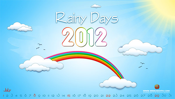
Rainy days may be a title better served for the spring (depending on your location) but regardless, this illustrated desktop calendar provides some optimism for what is typically a scorchingly hot time of year.

Wallpaper by Studio of Mae

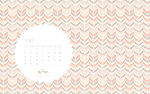
Studio of Mae  has another nice  patterned wallpaper ready for July. As always the fonts and minimal calendar go nicely with the lovely background. Enjoy!

Decorative July Desktop Wallpaper

Wallpaper by Kriegs

This darker, grunge based design has some nice inkblot/rorschach digital art working for it. Do you see anything in the ink blots?

July Desktop Wallpaper Calendar

Wallpaper by Cromoart

Abstract shapes bursting from an evening view of the shade tree on a farm. I absolutely love the color scheme. There’s also iPad and iPhone versions available.

Abstract July 2012 Desktop Calendar

That’s the roundup. Please let us know which calendar is your favorite by leaving a comment below.

The post Desktop Wallpaper Calendars for July 2012 appeared first on Visual Swirl Design Resources.

25 Examples of Super Wide Website Designs

Original Source: https://line25.com/articles/25-examples-of-super-wide-website-designs

As monitor resolutions become larger, websites tend to become wider. This showcase features 25 awesome website designs over 1000px in width.

Many of these super wide website designs are built as responsive layouts, which allows the designer to accommodate even the largest of screen sizes with the max-width property without chopping off elements on smaller resolutions.

Want more similar website designs for inspiration? Check out these Fullscreen WordPress Themes! 

Michela Chiucini

This is the portfolio of an Italian designer and art director. It makes use of the popular flat design trend and focuses on typography rather than images.

Michela Chiucini Wide Website Designs

Dave Gamache

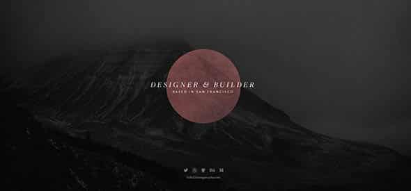
Dave is a designer & builder based in San Francisco and this is his portfolio website that features a fullscreen layout and cool effects.

Dave Gamache Wide Website Designs

Miro Hristov

This is an exceptional portfolio website with an interactive layout that will definitely get your attention.

Miro Hristov Creative Portfolio Design

Michael Schmid

Michael Schmid is a German Digital Designer & Developer and this is his monochromatic, minimalist portfolio design. It has some nice transitions, so make sure you check it out.

Michael Schmid Wide Website Designs -

Studio Airport

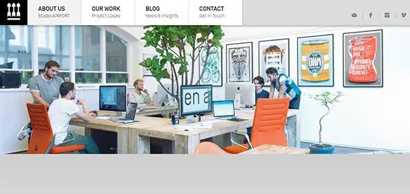
This is the website for a creative design agency. It includes useful info about the services they provide, team members, a blog, contact, etc.

Studio Airport Graphic Designer Portfolio Website

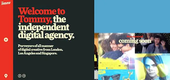
Tommy

This is the presentation website of an independent digital agency. It has a fullscreen layout and bold, large typography to catch your attention.

This Is Tommy Wide Website Designs

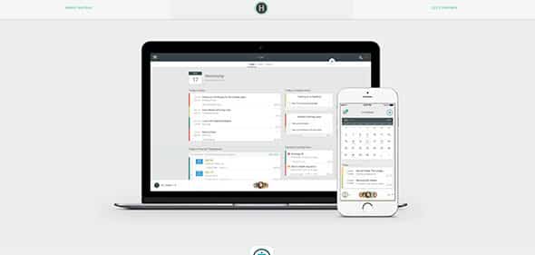
HatBox

This website fills up your whole screen with info. It has a minimalist design and a simple layout.

Proven user experience design consulting

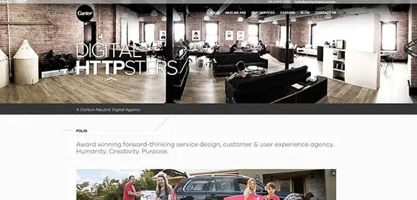
Carter Digital

This is the presentation website of a usability, service design & user experience agency that creates ideas and products that transform and grow businesses.

Carter Wide Website Designs

Lounge Lizard

This is a creative web design with a fixed menu design, beautiful fonts, full-screen layout, high-quality images, and more.

Lounge Lizard Portfolio Website

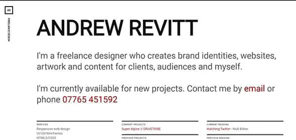
Andrew Revitt

Andrew Revitt is a freelance designer with 15 years experience working in web, graphic, branding, UI and UX design and this is his extremely straightforward, minimalist portfolio.

Andrew Revitt Wide Website Designs

Jeff Broderick

This creative wide website design includes a parallax effect, lovely fonts, a beautiful transparent header with a menu and more features.

Jeff Broderick Portfolio Website

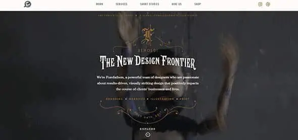
Forefathers Group

Forefathers Group is a global design conglomerate that builds responsive branding systems, web design, and web development for brands and businesses. This is their website. It has a wide layout and some vintage-inspired graphic elements and fonts.

Forefathers Wide Website Designs

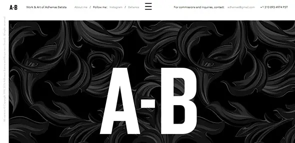
Adhemas Batista

This is a creative portfolio website with a full-screen layout which takes up the entire space of the browser.

Adhemas Batista Creative Portfolio Design

Information Architects

iA creates digital products and offers strategic design and consulting services through their UX studios. This is their simple but very effective website design.

Digital Product Studios Wide Website Designs

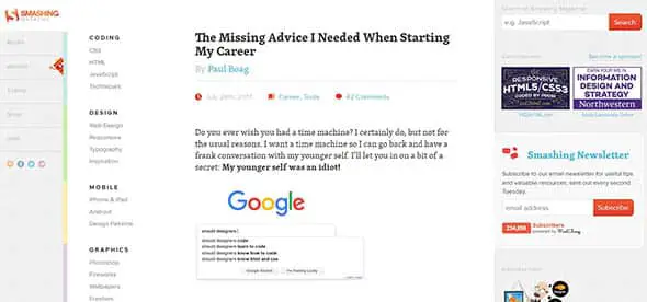
Smashing Magazine

Smashing Magazine is a website for web designers and developers. This is the layout they use for the posts section of the site.

Smashing Magazine Wide Website Designs

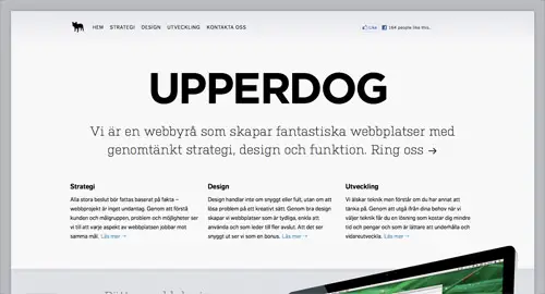
UPPERDOG

Upperdog is a solutions focused web design and digital marketing agency in Bournemouth, Dorset. They have a very wide website design with large graphic elements and images.

 Wide Website Designs

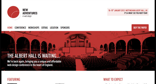
New Adventures in Web Design

This website covers the whole area of your browser with its extremely wide slider and content block.

 Wide Website

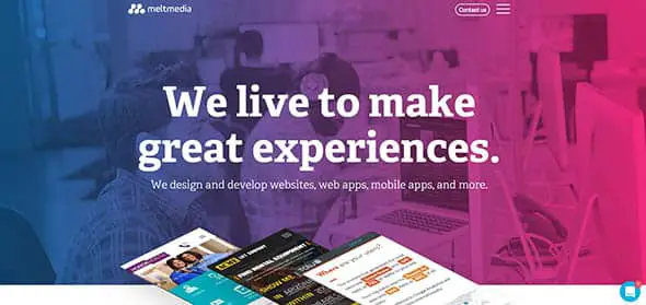
Meltmedia

Meltmedia designs and develops websites, web apps, and mobile apps with robust CMS platforms and web technologies. This is their colorful website with a wide layout and a blend of high-quality images.

meltmedia Wide Website Designs

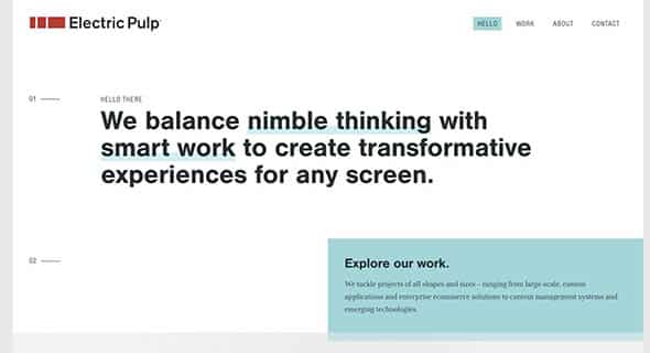
Electric Pulp

Electric Pulp is a digital agency focusing on Responsive Web Design, Web Development and Mobile eCommerce. They put an accent on large fonts, with bold features and solid color blocks.

Electric Pulp

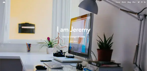
Jeremy Sallee

This is a great portfolio website with a simple, wide layout design. It uses a full-screen layout with a transparent header design.

Jeremy Sallee Website Design
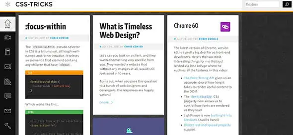
CSS-Tricks

You all know this website. It offers tips, tricks, and techniques on using Cascading Style Sheets. They have a grid layout design that covers the whole browser area.

CSS Tricks Wide Website

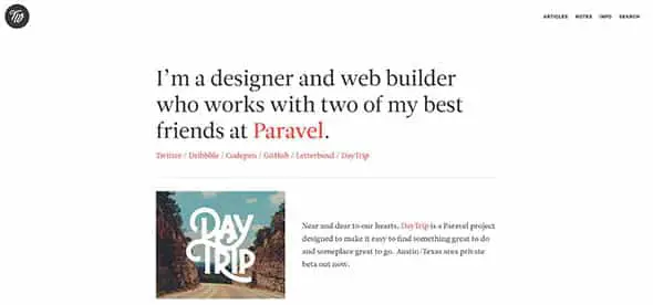
Trent Walton

This is the portfolio of a designer and web builder. It has a white, clean background and a wide layout for the content area.

Trent Walton Wide Website

Tuts+

This is the website to find videos and online courses to help you learn skills like code, photography, web design and more. Their website layout is wide and contains grid sections as well.

How-To Tutorials & Online Courses Wide Website

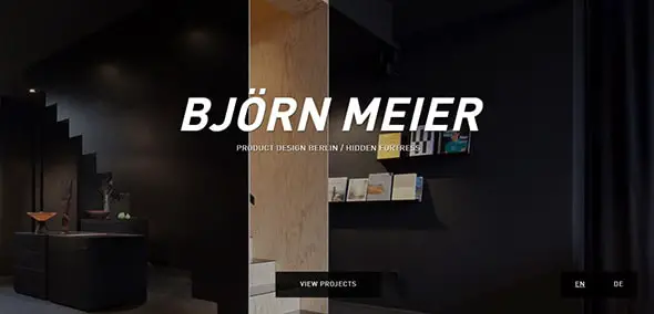
Björn Meier

Check out this creative website design which makes use of large, bold fonts to catch the visitors’ attention. It has a fullscreen layout.

Bjorn Meier Graphic Designer Portfolio Website

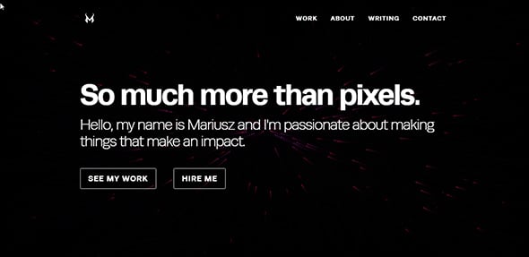
Mariusz Cieśla – Web & Mobile Interface & Experience Designer

This is a creative portfolio website with  an interactive design and a unique, wide, animated background.

Mariusz Cieśla Web & Mobile Interface & Experience Designer

The post 25 Examples of Super Wide Website Designs appeared first on Line25.

The Critical Request

Original Source: https://css-tricks.com/the-critical-request/

Serving a website seems pretty simple: Send some HTML, the browser figures out what resources to load next. Then we wait patiently for the page to be ready.

Little may you know, a lot is going on under the hood.

Have you ever wondered how browser figures out which assets should be requested and in what order?

Today we’re going to take a look at how we can use resource priorities to improve the speed of delivery.

Resource priority at work

Most browsers parse HTML using a streaming parser—assets are discovered within the markup before it has been fully delivered. As assets are found, they’re added to a network queue along with a predetermined priority.

In Chrome today, there are a number of asset prioritization levels: Very Low, Low, Medium, High and Very high. Peeking into Chrome DevTools source shows that these are aliased to slightly different labels: Lowest, Low, Medium, High and Highest.

To see how your site is prioritizing requests, you can enable a priority column in the Chrome DevTools network request table.

If you’re using Safari Technology preview, the (new!) Priority column can be shown in exactly the same way.

Show the Priority column by right clicking any of the request table headings.

You’ll also find the priority for a given request in the Performance tab.

Resource timings and priorities are shown on hover

How does Chrome prioritize resources?

Each resource type (CSS, JavaScript, fonts, etc.) has their own set of rules that dictate how they’ll be prioritized. What follows is a non-exhaustive list of network priority plans:

HTML— Highest priority.

Styles—Highest priority. Stylesheets that are referenced using an @import directive will also be prioritized Highest, but they’ll be queued after blocking scripts.

Images are the only assets that can vary priority based on viewport heuristics. All images start with a priority of Low but will be upgraded to Medium priority when to be rendered within the visible viewport. Images outside the viewport (also known as “below the fold”) will remain at Low priority.

During the process of researching this article, I discovered (with the help of Paul Irish) that Chrome DevTools are currently misreporting images that have been upgraded to Medium as Low priority. Paul wrote up a bug report, which you can track here.

If you’re interested in reading the Chrome source that handles the image priority upgrade, start with UpdateAllImageResourcePriorities and ComputeResourcePriority.

Ajax/XHR/fetch()—High priority.

Scripts follow a complex loading prioritization scheme. (Jake Archibald wrote about this in detail during 2013. If you want to know the science behind it, I suggest you grab a cuppa and dive in). The TL;DR version is:

Scripts loaded using <script src=”name.js”></script> will be prioritized as High if they appear in the markup before an image.
Scripts loaded using <script src=”name.js”></script> will be prioritized as Medium if they’re appear in the markup after an image.
Scripts that use async or defer attributes will be prioritized as Low.
Scripts using type=”module” will be prioritized as Low.

Fonts are a bit of a strange beast; they’re hugely important resources (who else loves the “‘I see it!”, “Now it’s gone”, “Whoa, a new font!” game?), so it makes sense that fonts are downloaded at the Highest priority.

Unfortunately, most @font-face rules are found within an external stylesheet (loaded using something like: <link rel=”stylesheet” href=”file.css”>). This means that web fonts are usually delayed until after the stylesheet has downloaded.

Even if your CSS file references a @font-face font, it will not be requested until it is used on a selector and that selector matches an element on the page. If you’ve built a single page app that doesn’t render any text until it renders, you’re delaying the fonts even further.

What makes a request critical?

Most websites effectively ask the browser to load everything for the page to be fully rendered, there is no concrete concept of “above the fold”.

Back in the day, browsers wouldn’t make more than 6 simultaneous requests per domain — people hacked around this by using assets-1.domain.tld, assets-2.domain.tld hosts to increase the number of asynchronous downloads but failed to recognize that there would be a DNS hit and TCP connection for each new domain and asset.

While this approach had some merits, many of us didn’t understand the full impacts and certainly didn’t have good quality browser developer tools to confirm these experiments.

Thankfully today, we have great tools at our disposal. Using CNN as an example, let’s identify assets that are absolutely required for the viewport to be visually ready (also known as useful to a someone trying to read it).

The user critical content is the masthead, and leading article.

There’s really only 5 things that are necessary to display this screen (and not all of them need to be loaded before the site is usable):

Most importantly, the HTML. If all else fails the user can still read the page.
CSS
The logo (A PNG background-image placed by CSS. This could probably be an inline SVG).
4(!) web font weights.
The leading article image.

These assets (note the lack of JavaScript) are essential to the visuals that make up the main viewport of the page. These assets are the ones that should be loaded first.

Diving into the performance panel in Chrome shows us that around 50 requests are made before the fonts and leading image are requested.

CNN.com becomes fully rendered somewhere around the 9s mark. This was recorded using a 4G connection, with reasonably spotty connectivity.

There’s a clear mismatch between the requests that are required for viewing and the requests that are being made.

Controlling resource priorities

Now that we’ve defined what critical requests are, we can start to prioritize them using a few simple, powerful tweaks.

Preload (<link rel=”preload” href=”font.woff” />) instructs the browser to add font.woff to the browser’s download queue at a “High” priority.

Note: as=”font” is the reason why font.woff would be downloaded as High priority — It’s a font, so it follows the priority plan discussed earlier in the “How does Chrome prioritise resources?” section.

Essentially, you’re telling the browser: You might not know it yet, but we’re going to need this.

This is perfect for those critical requests that we identified earlier. Web fonts can nearly always be categorized as absolutely critical, but there are some fundamental issues with how fonts are discovered and loaded:

We wait for the CSS to be loaded, parsed and applied before @font-face rules are discovered.
A font is not added to the browser’s network queue until it matches up its CSS rules to the DOM via the selectors.
This selector matching occurs during style recalculation. It doesn’t necessarily happen immediately after download. It can be delayed if the main thread is busy.

In most cases, fonts are delayed by a number of seconds, just because we’re not instructing the browser to download them in a timely fashion.

On a mobile device with a slow CPU, laggy connectivity, and without a properly-constructed fallback this can be an absolute deal breaker.

Preload in action: fonts

I ran two tests against calibreapp.com. On the first run, I’d changed nothing about the site at all. On the second, I added these two tags:

<link rel=”preload” as=”font” href=”” type=”font/woff2″ crossorigin />

<link rel=”preload” as=”font” href=”” type=”font/woff2″ crossorigin />

Below, you’ll see a visual comparison of the rendering of these two tests. The results are quite staggering:

The page rendered 3.5 seconds faster when the fonts were preloaded.

Bottom: Fonts are preloaded — The site finishes rendering in 5 seconds on a “emerging markets” 3G connection.

<link rel=”preload”> also accepts a media=”” attribute, which will selectively prioritize resources based on @media query rules:

<link rel=”preload” href=”article-lead-sm.jpg” as=”image” type=”image/jpeg” media=”only screen and (max-width: 48rem)”>

Here, we’re able to preload a particular image for small screen devices. Perfect for that “main hero image”.

As demonstrated above, a simple audit and a couple of tags later and we’ve vastly improved the delivery & render phase. Super.

Getting tough on web fonts

69% of sites use web fonts, and unfortunately, they’re providing a sub-par experience in most cases. They appear, then disappear, then appear again, change weights and jolt the page around during the render sequence.

Frankly, this sucks on almost every level.

As you’ve seen above, controlling the request order and priority of fonts has a massive effect on render speed. It’s clear that we should be looking to prioritize web font requests in most cases.

We can make further improvements using the CSS font-display property. allows us to control how fonts display during the process of web fonts being requested and loaded.

There are 4 options at your disposal, but I’d suggest using font-display: swap;, which will show the fallback font until the web font has loaded—at which point it’ll be replaced.

Given a font stack like this:

body {
font-family: Calibre, Helvetica, Arial;
}

The browser will display Helvetica (or Arial, if you don’t have Helvetica) until the Calibre font has loaded. Right now, Chrome and Opera are the only browsers that support font-display, but it’s a step forward, and there’s no reason to not use it starting today.

Keeping on top of page performance

As you’re well aware, websites are never “complete”. There are always improvements to be made and it can feel overwhelming, quickly.

Calibre is an automated tool for auditing performance, accessibility and web best practices, it’ll help you stay on top of things.

As you’ve seen above, there are a few metrics that are key to understanding user performance.

First paint, tells us when the browser goes from “nothing to something”.
First meaningful paint, tells us when the browser has “rendered something useful”.
Finally, First Interactive will tell you when the page has fully rendered, and the JavaScript main thread has settled (low CPU activity for a number of seconds).

Here, we set a budget on CNN’s “First meaningful paint” for <5 seconds.

You can set budgets against all these key user experience metrics. When those budgets are exceeded (or met) your team will be notified by Slack, email or wherever you like.

Calibre displays network request priority, so you can be sure of the requests being made. Tweak priorities and improve performance.

I hope that you’ve learned some valuable skills to audit requests and their priorities, as well as sparked a few ideas to experiment with to make meaningful performance improvements.

Your critical request checklist:

✅ Enable the Priority column in Chrome DevTools.
✅ Decide which requests must be made before users can see a fully rendered page.
✅ Reduce the number of required critical requests where possible.
✅ Use for assets that will probably be used on the next page of the site.
✅ Use [Link: <https://example.com/other/styles.css>; rel=preload; as=style](https://www.w3.org/TR/preload/) nopush HTTP headers to tell the browser which resources to preload before the HTML has been fully delivered.
🚫 HTTP/2 Server push is thorny. Probably avoid it. (See this informative document by Tom Bergan, Simon Pelchat and Michael Buettner, as well as Jake Archibald’s “HTTP/2 Push is tougher than I thought”)
✅ Use font-display: swap; with web fonts where possible.
⏱ Are web fonts being used? Can they be removed?
If no: Prioritise them and use WOFF2!
⏱ Is a late loading script delaying your single page app from displaying anything at all?
📹 Check this great free screencast by Front End Center that shows how load webfonts with the best possible fallback experience.
🔍 View chrome://net-internals/#events and load a page — this logs network related events.
No request is faster than no request. ✌️

The Critical Request is a post from CSS-Tricks