Collective #354

Original Source: http://feedproxy.google.com/~r/tympanus/~3/wUMnPEtZSZM/

C354_dapulse

Our Sponsor
Project management tools are obsolete

Dapulse is the next generation of visual tools, built for designers and developers. See what everyone on your team is working on in a single glance.

Check it out

C354_learningmachine

Teachable machine

A Google A.I. Experiment where you can teach a machine using your camera. View the GitHub repo here.

Check it out

C354_textanimations

Moving Letters

A fantastic collection of animated letters and typography effects by Tobias Ahlin.

Check it out

C354_modal

Micromodal.js

Micromodal.js is a lightweight, configurable and a11y-enabled modal JavaScript library.

Check it out

C354_webfont

Using Webfonts

An excerpt from Chapter 2 of Bram Stein’s new book, “Webfont Handbook”.

Read it

C354_cssonlugallery

Full-Width Panel Expansion, CSS only

A CSS only expanding panel gallery demo by Shaw.

Check it out

C354_bubbly

Bubbly-bg

A tiny script for creating bubbly backgrounds.

Check it out

C354_neuralstyle

Fast Neural Style Transfer with Deeplearn.JS

A demo of a browser based “Fast Neural Style Transfer” algorithm using the deeplearn.js library.

Check it out

C354_LogoCrunch

Logo Crunch

Logo Crunch is a multi-resolution logo maker that uses computer vision to make your high-res logo legible at lower resolutions.

Check it out

C354_respimg

Fundamentals of Responsive Images

Marc Drummond’s guide on responsive images.

Read it

C354_collision

How to Code: Collision Detection Part II

Second part of a video series on making realistic looking collisions in JavaScript.

Watch it

C354_react

The 100% correct way to structure a React app (or why there’s no such thing)

David Gilbertson shares his insights and shows how he structures his React apps.

Read it

C354_sound

Microscope

A Web Audio and WebGL experiment by Tim Pulver using cables and tone.js.

Check it out

C354_animals

Savage Animals Vector Bundle (AI, PSD)

Tortugastudio designed these versatile animal vectors.

Get it

C354_sticky

Sticky Sidebar

A JavaScript plugin for making sticky sidebars. Made by Ahmed Bouhuolia.

Check it out

C354_moocha

Moocha

A search engine for online courses from edX, Coursera, Udacity and more. Made by Matt Evenson.

Check it out

C354_CSS4Sel

Intriguing CSS Level 4 Selectors

Dennis Gaebel shows how powerful the new CSS selectors are.

Read it

C354_calcflow

Calcflow

An intuitive VR interface for mathematical visualizations.

Check it out

C354_Hyperpixel

Hyperpixel

A great collection of well designed landing pages for your inspiration.

Check it out

C354_TR101

TR-101

A synth drum machine by Ohad Ron.

Check it out

C354_python

Learning Python: From Zero to Hero

Learn Python from scratch in this essential guide by Leandro T.k.

Read it

C354_Comic

Comic book style layout with CSS Grid

A great demo that shows how to make a comic book like layout with CSS grid. By Ren Aysha.

Check it out

C354_Stripe

Stripe Elements

Stripe Elements are rich, pre-built UI components that help you create checkout flows across desktop and mobile.

Check it out

C354_stripes

From Our Blog
Sliced Dual Image Layout

Some layouts with sliced background images, slideshow functionality and glitch effect.

Check it out

Collective #354 was written by Pedro Botelho and published on Codrops.

8 Must Have WordPress Plugins for Site Optimization

Original Source: http://feedproxy.google.com/~r/Designrfix/~3/yNPsY0Rud2o/8-wordpress-plugins-site-optimization

WordPress is easily the platform which offers tons of customization options and packs the ease which allows anyone to create a website. Alongside it brings a variety of plugins that can get your website to the next level. Following are the must have WordPress plugins in 2017: 1.      OptinMonster Image Source:www.optinmonster.com OptinMonster is the frequently […]

The post 8 Must Have WordPress Plugins for Site Optimization appeared first on designrfix.com.

Minimalistic Design With Large Impact: Functional Minimalism For Web Design

Original Source: https://www.smashingmagazine.com/2017/10/functional-minimal-web-design/


As web design focuses more and more on good user experience, designers need to create the most usable and attractive websites possible. Carefully applied minimalist principles can help designers make attractive and effective websites with fewer elements, simplifying and improving users’ interactions.

Minimal Design With Large Impact: Functional Minimalism For Web Design

In this article, I will discuss some examples of minimalism in web design, things to consider when designing minimalist interfaces, and explain why sometimes “less is more”. If you’d like to get more creative with your own designs, you can download and test Adobe XD, and get started right away.

The post Minimalistic Design With Large Impact: Functional Minimalism For Web Design appeared first on Smashing Magazine.

Non-Disclosure Agreements For Developers: What To Know Before You Sign

Original Source: https://www.smashingmagazine.com/2017/10/developer-non-disclosure-agreements/


Most days, your goal as a developer is to design, develop and program awesome software. However, part of the job is also finding new clients, and you don’t want to be caught off guard by unexpected legal documents that come up while you’re establishing new clients.

Non-Disclosure Agreements For Developers: What To Know Before You Sign

The most common legal document you will be asked to sign when working on a website or app is a non-disclosure agreement (NDA). If you’re not sure whether to sign an NDA as a developer, this article will guide you to make an educated decision.

The post Non-Disclosure Agreements For Developers: What To Know Before You Sign appeared first on Smashing Magazine.

Beautiful Examples of Motion Design in Web Design

Original Source: http://feedproxy.google.com/~r/1stwebdesigner/~3/JFQlbSi2gho/

Motion design has seen a substantial rise to prominence within the web design industry over the last few years. Most landing pages and award-winning website designs incorporate some aspect of motion, whether that be through illustrations, video, animated GIFs, or even subtle custom emotes.

Some websites even use motion design with their products, for example Apple who use vertical scrolling as a trigger for applying motion to their product mockups.

There are some remarkable examples which show just what can be achieved when applying elements of motion design to a website. In this article we are going to round up a selection of the very best.

Pipefy

Pipefy Motion Design in Web Design

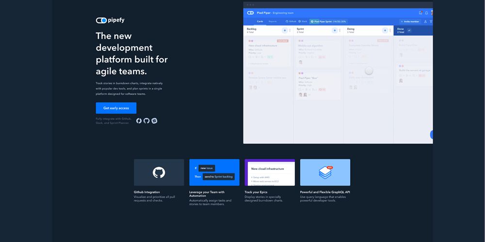
Pipefy uses motion design in the hero section of its website. It displays a user interface demo of their product with a hypothetical user interacting with and showcasing the platform.

Figma

Figma Motion Design in Web Design

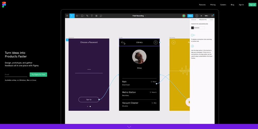
Figma’s main selling point is design collaboration. As such, it demos this using effective screen capture video footage in the hero section.

ZenDesk

ZenDesk Motion Design in Web Design

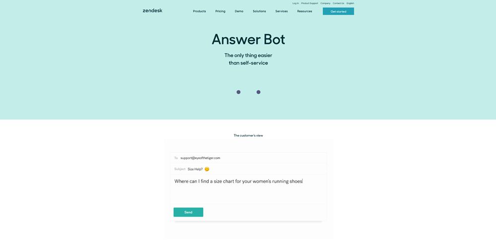
ZenDesk’s Answer Bot is demoed on their website using a minimal and simple example of motion design.

Museum of Science + Industry

Museum of Science + Industry Motion Design in Web Design

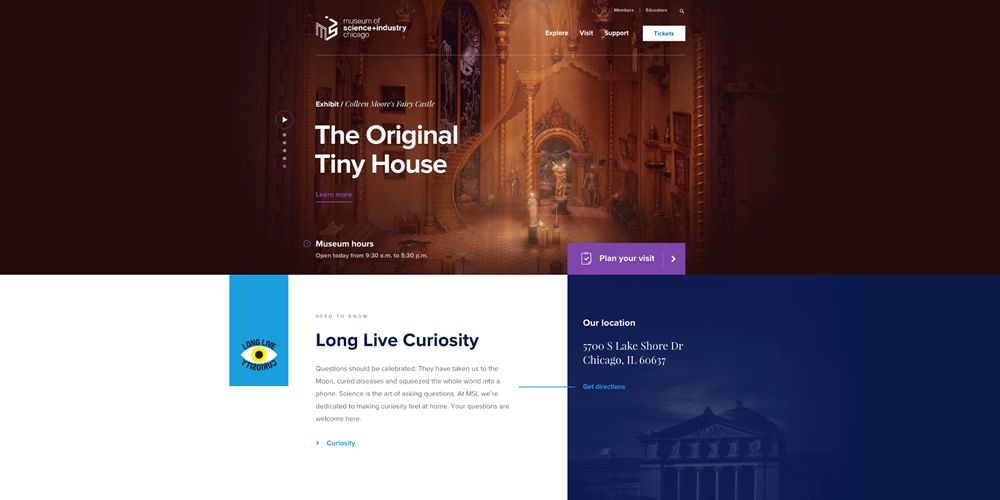
The Museum of Science + Industry uses motion graphics and video in the hero section of their website to illustrate each active exhibition. It adds a great deal of visual interest and effect.

Adidas

Adidas Motion Design in Web Design

Adidas Climazone’s landing page uses motion design via user scrolling as the trigger. As the the user makes their way down the page the graphics and images morph and change.

Stripe Sigma

Stripe Sigma Motion Design in Web Design

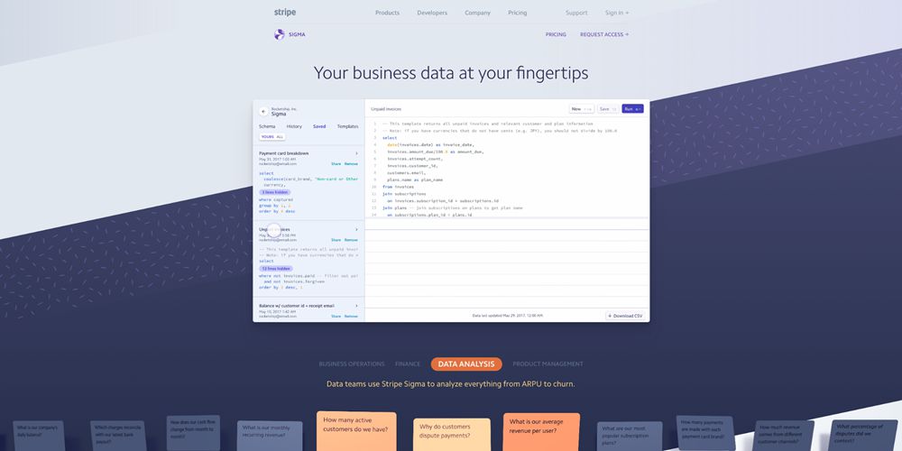
In possibly the most impressive example of all, Stripe uses motion design in multiple instances. The hero section uses a video to illustrate the product in action, while below a scrolling ticker of FAQ cards makes its way from right to left, changing color over time.

Snappd

Snappd Motion Design in Web Design

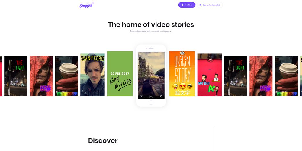
Snappd’s homepage scrolls through a selection of video stories. When one lines up with the iPhone mockup, it triggers the video to play.

ZKIPSTER

ZKIPSTER Motion Design in Web Design

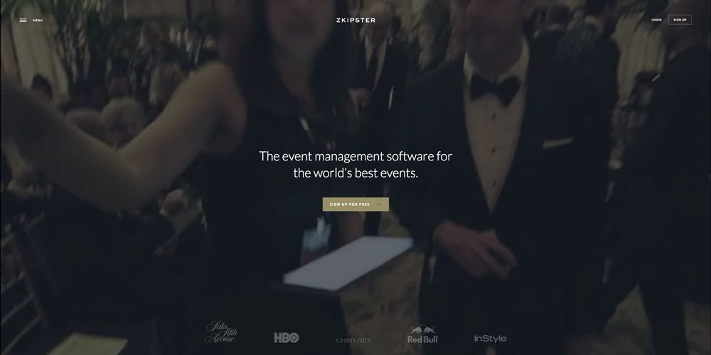
ZKIPSTER uses one of the more traditional implementations of motion design: a full size background video. It does so with great effect, applying a filter on top for greater contrast and subtlety.

Shopify

Shopify Motion Design in Web Design

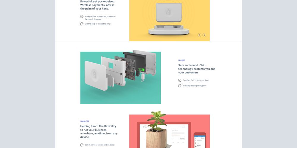
Shopify uses motion through its product imagery. In this instance, the user’s scroll location is used as a trigger to expand the product mockup and reveal its complexity within the simple design.

An Interesting Day

An Interesting Day Motion Design in Web Design

The ‘An interesting Day’ website applies motion by implementing a parallax effect which tracks the point of the user’s cursor to produce a depth effect. It’s subtle but highly effective and satisfying to experience.


Collective #353

Original Source: http://feedproxy.google.com/~r/tympanus/~3/qXHdr8WWclw/

C353_WOTW

Inspirational Website of the Week: Badass

An actually fun to scroll site with an interesting skew effect. Our pick this week.

Get inspired

C353_northwestern

This content is sponsored via Syndicate Ads
Earn your MS in Information Design and Strategy

Learn to master the space where data meets story in Northwestern’s online master’s in Information Design and Strategy.

Find out more

C353_Draggable

draggable

A lightweight and responsive drag and drop library by Shopify. Great interactive presentation, too.

Check it out

C353_FF

Start Your Engines – Firefox Quantum Lands in Beta, Developer Edition

Great news from Firefox: double acceleration with the Quantum engine is now available in the developer edition.

Read it

C353_GridGotachs

CSS Grid Gotchas And Stumbling Blocks

An article by Rachel Andrew where she answers a number of common questions regarding CSS Grid.

Check it out

C353_EssImageOpt

Essential Image Optimization

Addy Osmani’s eBook on automating image compression.

Read it

C353_ExpoAr

Introducing Expo AR: Three.js on ARKit

Nikhilesh Sigatapu shows how you can use the new Expo Augmented Reality API for iOS to create AR scenes using only JavaScript.

Read it

C353_ARTut

WebVR is for everyone – This is how to design and develop an experience.

Get started with WebVR using Google Blocks in this tutorial by Natalia Wojtkowska.

Read it

C353_DesignCasestudies

How They Design

Handpicked casestudies delivered biweekly to your inbox. Curated by Dawid Woźniak.

Check it out

C353_WInner

Js13kGames Winners

Find out who the winners of this year’s Js13kGames JavaScript coding competition are.

Check it out

C353_UX

Growing a UX tool

Julius Huijnk builds and shares small prototypes and writes about them. This is part three of his series.

Read it

C353_Fuzzy

Fuzzy Plus

Great demo of a hair like structure by DPDK.

Check it out

C353_GuidetoTypo

A Five Minutes Guide to Better Typography

A great visual guide for understanding what makes good typography. By Pierrick Calvez.

Read it

C353_Sort

What I Talk About When I Talk About Sorting: Untangling Array#sort

Claudia Hernández explains how JavaScript’s Array#sort works under the hood.

Check it out

C353_VRTutAFrame

Creating Your First WebVR App using React and A-Frame

Prayash Thapa’s tutorial on creating a WebVR application using A-Frame and React.

Check it out

C353_Jam

Jam Icons

A set of 422 versatile icons in SVG and as web font.

Get it

C353_FutureHTML

I’ve seen the future, it’s full of HTML

Some suggestions by Mikeal Rogers to distribute re-usable framework independent components with just npm.

Read it

C353_ExJS

The rise and fall of Ext JS

Jay Garcia walks you through the history of Ext JS and expresses his observations and personal thoughts along the way.

Read it

C353_billion

Serving One Billion JavaScript Library Downloads

Learn how the team at Algolia managed to deliver over a billion JavaScript libraries.

Read it

C353_Viro

Viro AR

Leveraging React Native and a proprietary rendering engine, Viro is a cross platform alternative to Apple’s SceneKit for AR/VR development.

Check it out

C353_Cryptocurrency

Blockchain curated

Blockchain Curated is a project by Zach Segal that collects the best blockchain-related content.

Check it out

C353_Clockify

Clockify

Free time tracking for agencies and freelancers.

Check it out

C353_ElectrodeNative

Electrode Native: The Platform For Integrating React Native Into Your Apps

Alex Grigoryan introduces Electrode Native, a streamlined mobile app development platform based on React Native.

Check it out

Collective #353 was written by Pedro Botelho and published on Codrops.

Essential Trends of Web Design 2K17

Original Source: http://feedproxy.google.com/~r/Designrfix/~3/V3281iZ5lYg/essential-trends-web-design-2k17

  We all are attracted to beautiful website designs and anything less; we discard them for not appealing. So as a designer you must stick to the rules that make a site worth visiting, at all times. The simpler the design, the better as it prevents clutter, offers seamless navigation and gives a sleek overall […]
The post Essential Trends of Web Design 2K17 appeared first on designrfix.com.

Pay What You Want for the White Hack Hacker 2017 Bundle

Original Source: http://feedproxy.google.com/~r/Designrfix/~3/4deOuee8AyA/pay-white-hack-hacker-2017-bundle

The news is often full of stories about hackers stealing data from the government and large corporations. Because of this, it’s easy to see why people tend to associate the word hacker with thieves and cybercriminals. But the truth is that, not all hackers are evil. Despite the overused negative connotation that hackers use their […]

The post Pay What You Want for the White Hack Hacker 2017 Bundle appeared first on designrfix.com.

Abstract 3D Creations by Patrick Foley

Original Source: http://feedproxy.google.com/~r/abduzeedo/~3/61l_Wnhqbn8/abstract-3d-creations-patrick-foley

Abstract 3D Creations by Patrick Foley

Abstract 3D Creations by Patrick Foley

PauloGabriel
Sep 28, 2017

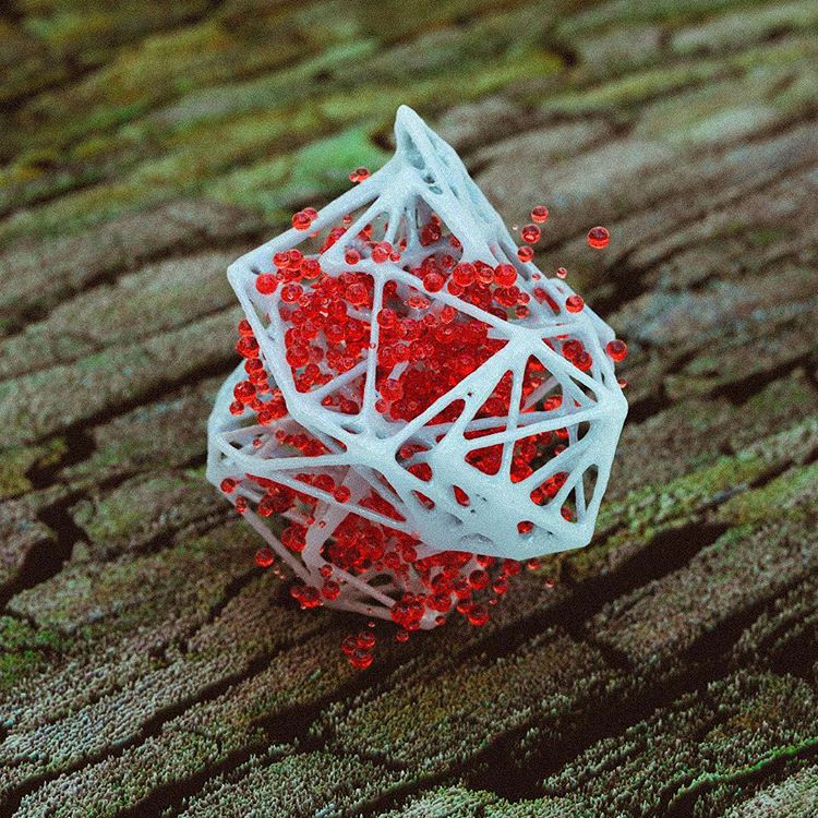
Nothing like a fresh 3D set to start the day. It’s awesome that artists get to come up with so many cool creations, like these by Patrick Foley. These are some very cool abstract scenes, in which materials, textures and lighting are the main characters.

As usual, these are only a handful of his works. For more of it, please visit his Instagram account! I hope you enjoy these as much as we did. Cheers! 😉

Uma publicação compartilhada por Patrick Foley (@patrick_4d) em Set 25, 2017 às 9:41 PDT

Uma publicação compartilhada por Patrick Foley (@patrick_4d) em Set 22, 2017 às 8:48 PDT

Uma publicação compartilhada por Patrick Foley (@patrick_4d) em Set 16, 2017 às 3:05 PDT

Uma publicação compartilhada por Patrick Foley (@patrick_4d) em Ago 27, 2017 às 3:17 PDT

Uma publicação compartilhada por Patrick Foley (@patrick_4d) em Ago 15, 2017 às 9:18 PDT

Uma publicação compartilhada por Patrick Foley (@patrick_4d) em Ago 11, 2017 às 12:33 PDT

Uma publicação compartilhada por Patrick Foley (@patrick_4d) em Ago 10, 2017 às 12:48 PDT

Uma publicação compartilhada por Patrick Foley (@patrick_4d) em Jul 18, 2017 às 7:58 PDT

computer graphics
3d
abstract


Not Taking Negative Feedback from a Client Too Personally

Original Source: http://feedproxy.google.com/~r/1stwebdesigner/~3/zrvTD3sVED8/

There’s something deeply personal about being creative. It feels like you’re putting a piece of yourself in whatever you create. For many designers, it’s really a labor of love.

The anticipation of sharing a shiny new design with a client is exciting. After all, if you’re passionate about the work you’ve done for them, they should feel the same way about what they see.

Unfortunately, things don’t always turn out that way. Clients may not see things quite the same way as you do. Sometimes their feedback can be constructive; sometimes it can even be a bit harsh. Either way, seeing something you poured your heart and soul into creating being picked apart can really sting.

Receiving negative feedback, unpleasant as it is, is something every designer faces. Let’s take a look at some ways that we can better deal with it.

It’s Not Personal

Receiving criticism can be very difficult – especially for inexperienced designers. When someone casually says that they don’t like something you’ve done, it can make you feel like a failure. You’ve put in untold hours of work and here is this person who, in your mind, may not even be qualified to critique design just tearing apart your ideas.

This is something we will all experience. In my own career, I can recall instances where I felt as if I were the poorest excuse for a web designer in the world. You start to think that others have zero confidence in your abilities to get the job done. You start to question whether they’re right.

Don’t fall for it. Sometimes our minds tend to project more meaning into situations than is really there. In the overwhelming majority of cases, it’s the design being criticized – not you personally. In fact, the person you’re dealing with may think highly of you and is in no way looking to hurt your feelings. They’re just being honest with their opinions – whether you agree with them or not.

As you deal with this sort of thing more often, it becomes easier to compartmentalize design critique into its own little space. Having to make changes may frustrate you, but it shouldn’t make you feel as though you’ve failed.

Remember, even the best athletes don’t win every single time. They make adjustments to their game and come back stronger. It’s much the same in design.

It’s Not Your Baby

It’s natural to take ownership of something you have created – even if you’ve created it for someone else’s use. And so we take it to heart when someone isn’t as thrilled with a design as we are. In a way, this is a good trait to have because it shows how much you care.

On the other hand, the work you’re doing for someone else ultimately belongs to them. So while you may be disappointed if a certain part of a design doesn’t meet with their approval – it’s their right to do so.

Sometimes a client may even have a suggestion or demand that you think will fully ruin the whole concept. Personally, this is always a tough one to swallow. But there are a few different ways you can deal with it.

First, state your case. Kindly and calmly explain your reasons for making specific design choices. You were hired because of your expertise and have every right to express your professional opinion. It may just be enough to get the client to see things your way, or compromise on a happy medium.

If that doesn’t work, the second tact is to simply do what the client has asked to the very best of your abilities. This isn’t as easy as it sounds. When you’re certain that a change will have a negative impact on a design, it may be difficult to gather up enough enthusiasm to go through with it.

That’s when you need to remember that you’re working for your client – not the other way around. Put forth your best effort and sincerely try to make it work. Showing that you’re willing to try conveys a maturity and professionalism that will be very much appreciated.

It’s Part of the Job

If you hire someone to remodel your kitchen, you’ll want to express your opinions about how it’s going to look. There may even be some things you want to change during the process. Feedback is a natural side effect of work. And that’s really how we should treat it.

Once you learn to accept criticism as part of the design process, you’ll be so much better at dealing with it. Seeing what different people do and don’t like can be a valuable resource in future projects. You’ll become a better listener and more focused on the client’s point of view. Put it all together and that can make you an even better designer.

The next time you receive negative feedback, think of it not as an insult but as an opportunity for growth.