14 magically meticulous design style guides
Original Source: http://feedproxy.google.com/~r/CreativeBloq/~3/SQkekewhOro/great-examples-design-style-guides-3132070
This is heading directly into geek territory. But we are self-confessed geeks, particularly when it comes to logo design and typography. And that leads us to the meticulously regulated world of brand style manuals…
A style manual, or style guide, is a set of standards for the design of documents, signage, and any other form of other brand identifier. The reason for their existence is to ensure complete uniformity in style and formatting wherever the brand is used.
We've gathered 14 of the best to inspire you when you create your own brand style guide…
01. easyGroup
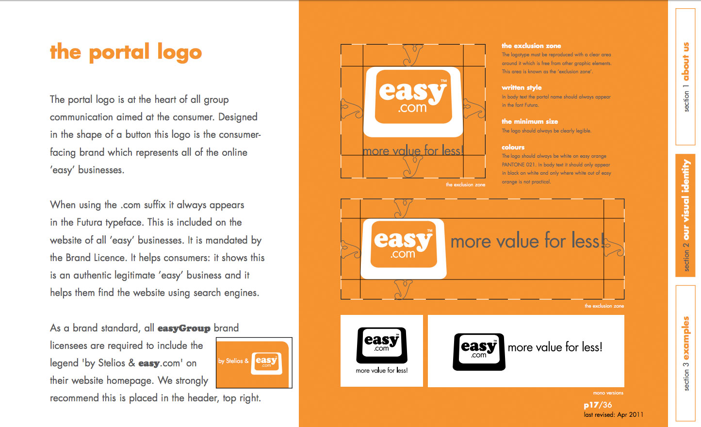
easyGroup’s brand guidelines try to keep things as straightforward as possible
It's hard not to love a brand identity that's based around the colour orange (Pantone 021 C to be precise) and Cooper Black, surely the most 1970s of typeface.
Stelios Haji-Ioannou's easyGroup keeps things simple with its branding, but its brand manual still manages to run to 36 pages, covering matters such as the company strapline, do's and don'ts of using the logo, and a guide to easyGroup lingo.
02. Urban Outfitters
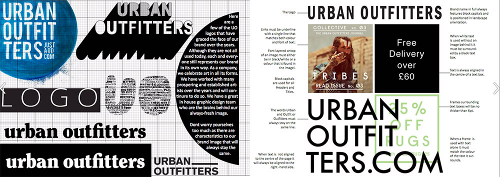
Urban Outfitters changes its logo often but has strict rules about its display
The average branch might look as though a bunch of squatters decided to hold a jumble sale in a derelict factory, but hipster bazaar Urban Outfitters takes its visual identity very seriously, as a quick flick through its brandbook will reveal.
The 42-page guide covers everything from Urban Outfitters' history and philosophy through to logo usage, typography, photography methodology and guidelines on the tone of voice to be used in communications.
03. I Love New York
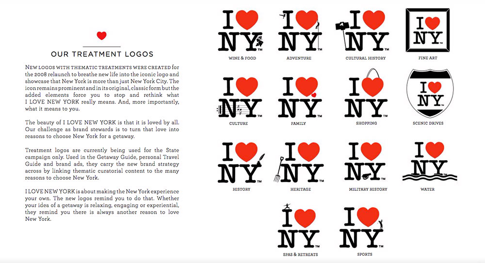
We’re sure Milton Glaser approves of these cute treatments
Milton Glaser's I Love New York logo is a wonderfully simple and iconic piece of design, so you might not expect there to be a 50-page set of brand guidelines attached to it. However there's more to I Love New York than Milton Glaser's logo; that's just the most memorable aspect of a campaign launched in 1977 and refreshed in 2008.
The scrupulously detailed brand guidelines cover all the bases for a campaign that represents the whole state of New York and not just New York City; there's a mission statement and brand pyramid, consistency and typography guidelines, plus a whole load of thematic logo treatments and logo usage guidelines to follow.
04. NASA

This beautiful reissue is available to buy now
The National Aeronautics and Space Administration's Graphics Standards Manual was created by Danne & Blackburn in 1974 when NASA changed from its original crest-based logo to the 'worm' logotype that we are now familar with.
The manual has recently been revived thanks to a Kickstarter campaign to fund its reissue. Jesse Reed and Hamish Smyth's glorious new 220-page version of the case-bound NASA document comes with 'static shielding' packaging and can be purchased over at standardsmanual.com.
05. British Rail
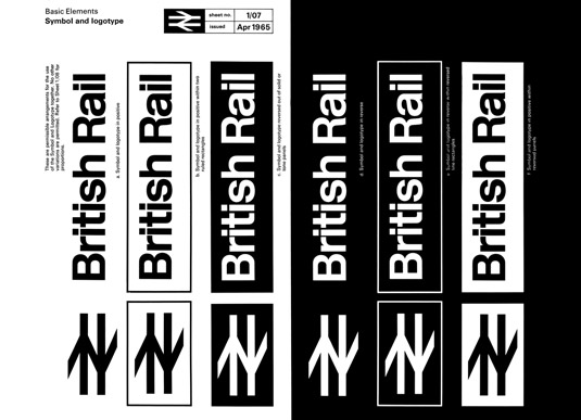
Bring it back!
Certain members of the Creative Bloq team have spent hours poring over the British Rail corporate identity manual (okay, it's me) and it is easy to see why. Epic levels of obsessive behaviour abound in the guide, which dates back to 1965, and some of the pictograms are a delight. Want to own your own copy? You're in luck; after a successful Kickstarter campaign, designer Wallace Henning has created a high-specification recreation of the original manual that you can order now; find out more here.
06. Channel 4
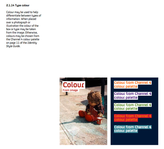
The Channel 4 style guide is simple, clean and uncluttered for ease of use
Channel 4’s comprehensive style guide leaves no room for confusion on how its brand is used. The guide is 46 pages long, each of which is clean and clear, stating a single guideline per page, often accompanied by a graphic for visual reference.
07. Skype
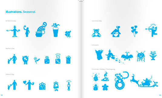
The Skype style guide lets illustration do all the talking
The Skype style guide is brilliant for many reasons – its pages of cool illustrations being one of them. The communication network hasn’t filled its guide with pages of industry jargon, it simply employs easy-to-understand explanations and graphics to get its point across.
08. Apple
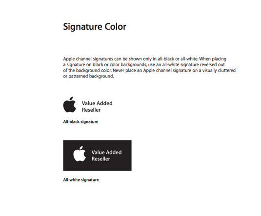
The Apple style guide is made up of 48 pages detailing exactly how the company’s branding is to be used
One of the biggest companies in the world, Apple has a comprehensive style guide detailing how its branding is to be used. Clean, clear and concise, this 48-page guide explains exactly how to use Apple assets – even where to apply stickers to your Smart car.
09. Adobe
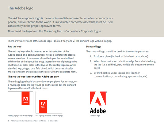
Adobe’s style guide goes into great detail about how you can use the branding, with some strict rules
Adobe is one of the design industry's strongest brands, and protecting that cast-iron integrity is this style document. So beware – do not use the red tag logo, it is for Adobe use only. (We do love it when you're forceful, Adobe!)
10. New York City Transit Authority
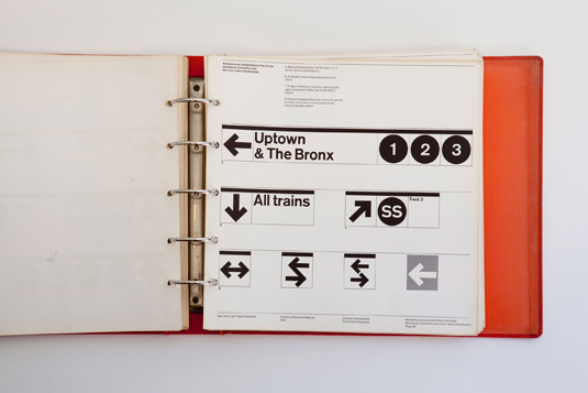
The images of the New York City underground standards manual are a frustrating joy
We love this collection of photos of the New York City Transit Authority Graphics Standards Manual, designed by Massimo Vignelli of Unimark International, which feature a font that looks very much like Helvetica and some great pictograms.
11. Barbican
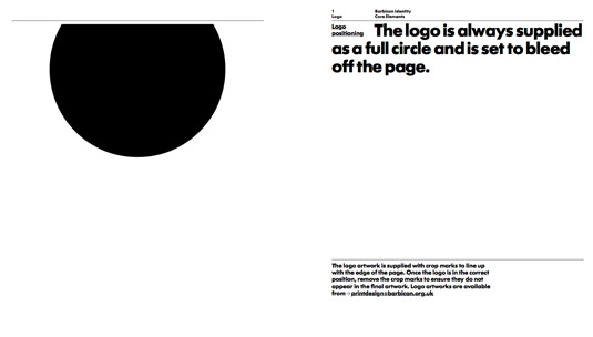
The Barbican has ultra-specific instructions for the use of its circle logo
The Barbican theatre’s identity “is not just a logo. It is a design scheme composed of a number of core elements that come together to create a distinctive look and feel that makes the Barbican brand instantly recognisable”. Which is why this guide is so important.
Having said that, the Barbican allows a degree of creative flexibility for designers tasked with using its identity, and takes you through exactly how to achieve that. Which is nice.
12. Firefox
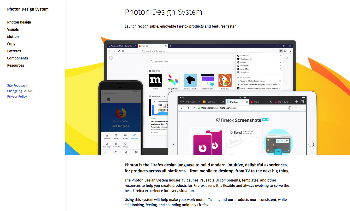
The Mozilla Foundation has introduced a new design language, Photon, for Firefox
Mozilla has ditched its old style guide for Firefox and introduced a whole new design language, Photon, to help designers create beautiful products for Firefox users. As well as useful guidelines and principles, the Photon Design System features reusable UI components, templates, and other resources for building consistent and recognisable products across all platforms.
13. Macmillan
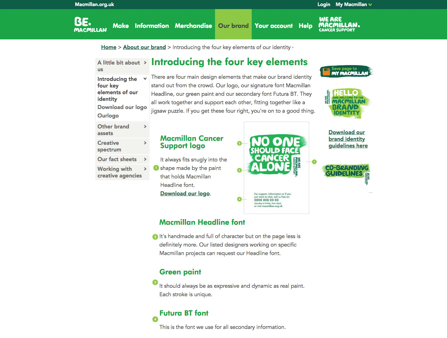
Macmillan’s guidelines focus on the charity’s brand values as well as style
Cancer charity Macmillan is another organisation that's dropped its brand document in favour of an online guide. So instead of having to comb through 67 pages, you're only ever a couple of clicks away from helpful identity design rules for everything from signage to infographics, as well as tips on how to use the brand's familiar green colours and which photos are best used as the image silhouettes you'll find in the charity's marketing material.
14. Boy Scouts of America
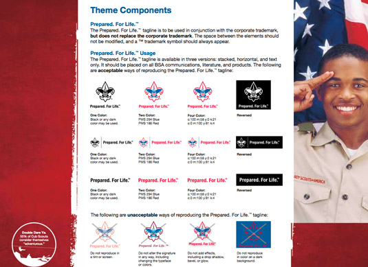
No surprise that the Boy Scouts of America style document has strict guidelines for badge design
Dib dib dib! The quickest way to achieve your logo design badge is to follow the Boy Scouts of America's mildly militaristic manual. Just don't think of writing the scouts' tagline "Prepared. For. Life." without those all-important full-stops…
Related articles:
10 commandments of logo designHow to create a design style guide: 25 pro tipsSpeed up your web workflow with style guides


Leave a Reply
Want to join the discussion?Feel free to contribute!