10 Creative Website Navigation Designs
Original Source: http://feedproxy.google.com/~r/1stwebdesigner/~3/7kht-mTDQ-M/
While most websites use similar navigation structures and placements, there are small proportions that break free of the traditional layouts. These websites often do so to present a unique design, while also to experiment with alternate and often improved solutions. Every website is different, and the one-size-fits-all approach can often be outdated – particularly for websites which are more visual or do not follow a traditional template-like structure.
In this article, we’ll take a look at ten of the most creative website navigation designs around in 2018.
Your Web Designer Toolbox
Unlimited Downloads: 500,000+ Web Templates, Icon Sets, Themes & Design Assets

DOWNLOAD NOW
No Questions Asked
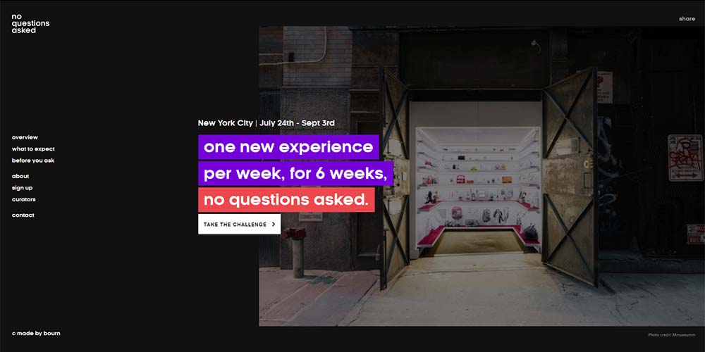
Opting to position their stacked navigation on the left, No Questions Asked’s website leaves the header section as clean as possible and introduces a slide-deck type layout.
Inflatable Regatta
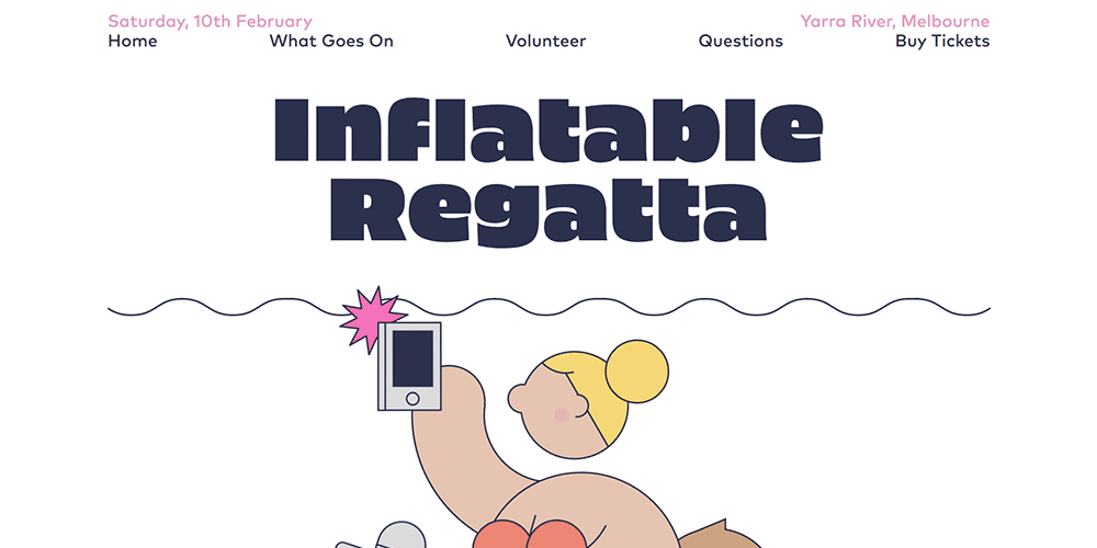
The Inflatable Regatta website uses a full-width navigation with large, bold text links. It’s a simple solution which is easy to use, but one that is rarely implemented across the web design industry.
The Scenery
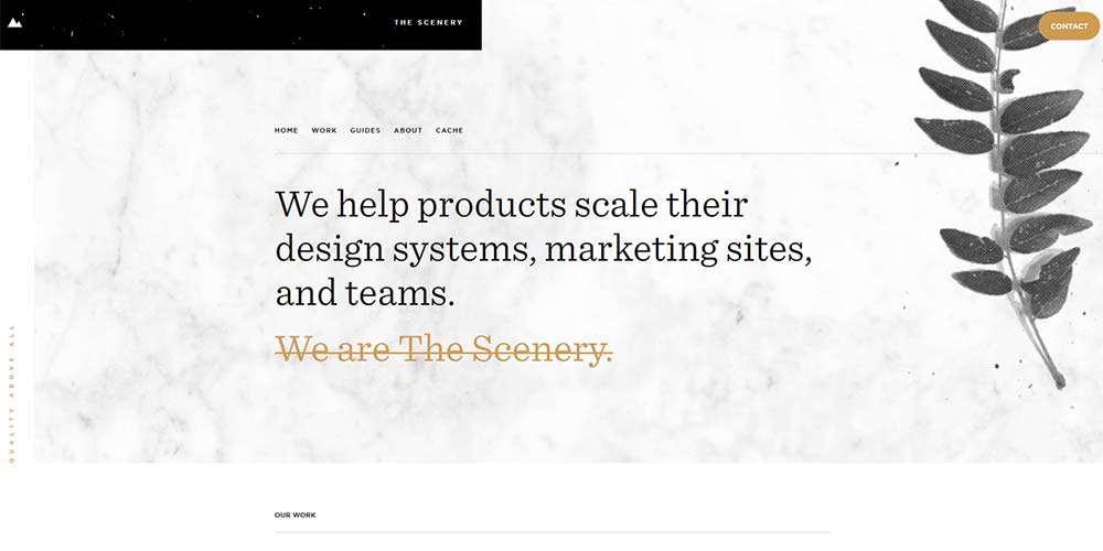
The Scenery uses the uppermost tier to position their logo and a primary CTA in the form of a contact button. The page navigation is positioned within the container and below this section. It makes for a neat and accessible navigation placement which is more closely tied to the content.
Stine Goya
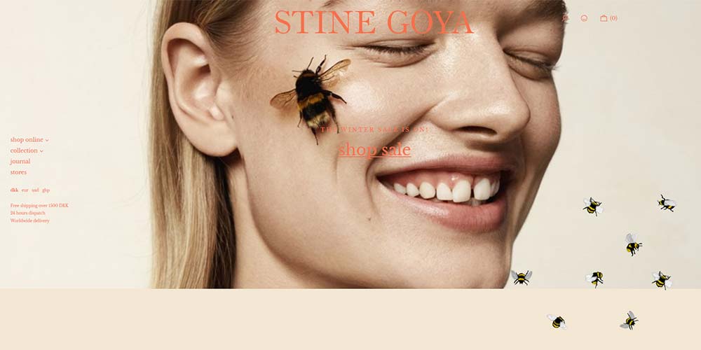
Stine Goya is another site to use the left-aligned vertical stack navigation. It opens up the header, allowing a large logotype, hero background, and inclusion of cart/checkout icons.
HelloSign
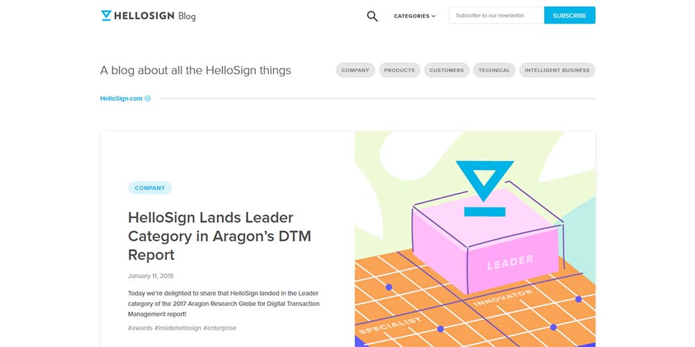
HelloSign’s blog uses a two-tier navigation design. The top tier includes search, categories and subscribe. The second tier allows for some quick-access topics. This makes it really easy for a user to filter results with little effort.
South Australia
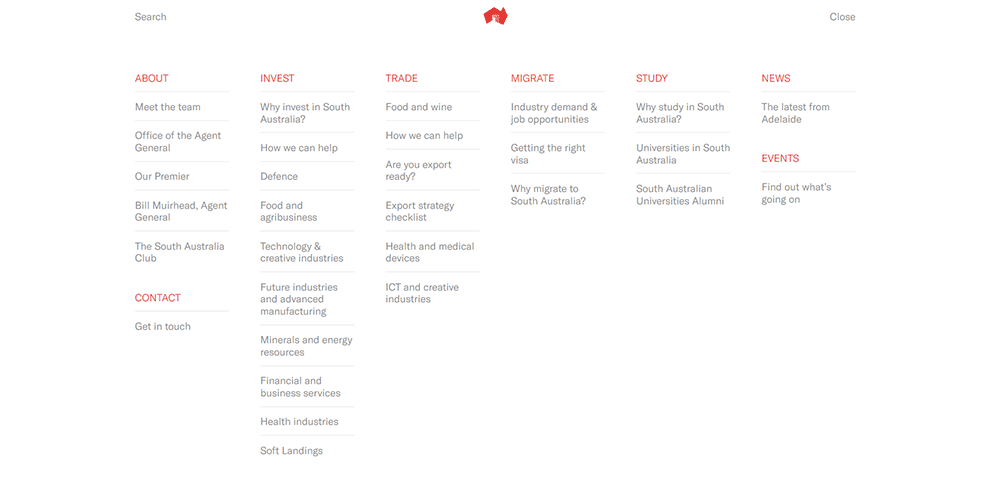
South Australia’s navigation is comprehensive in terms of content. There are over 30 individual items, which is why they have positioned them behind a menu link. The full-screen design is easy to use due to its spaciousness and separation of categories through color and a well-structured layout.
Bobby

Bobby’s portfolio website splits the hero section into two halves. The left side includes six items: three navigation items at the top, and three link items at the bottom. Each is spread as far apart as possible for optimum visual separation and aesthetic effect.
Wade Jeffree
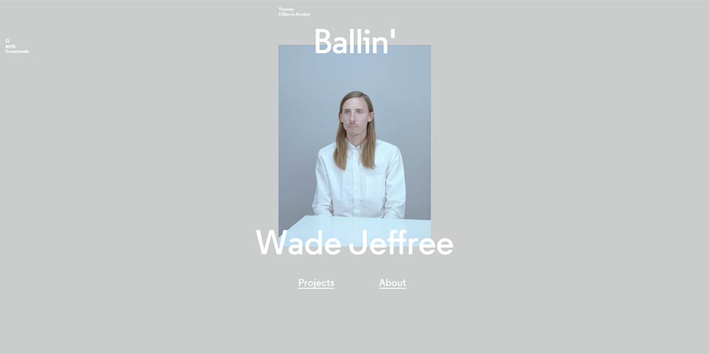
Wade Jeffree has done away with a traditional navigation layout, instead opting for two emphatic links positioned at the foot of the main screen. They are clear and still manage to draw attention through their bold weight and underline decoration.
Newlyn
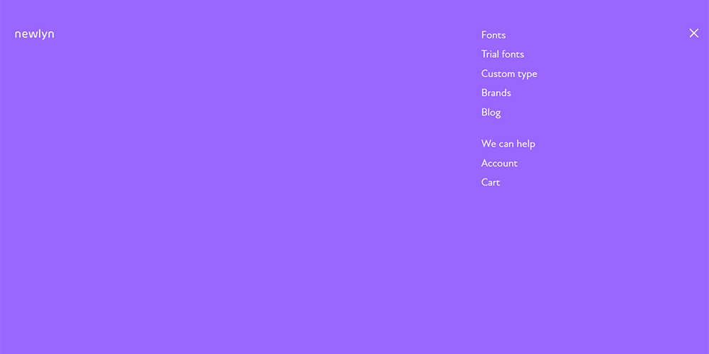
One of the most simple and effective navigations is by Newlyn. The hamburger icon expands to reveal a full-screen list of items. It’s incredibly spacious and in-keeping with the remainder of the website design.
Logistics Solutions
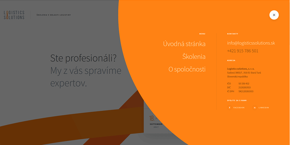
Logistics Solutions implements some neat animation and transitional effects to expand the circular hamburger icon. It results in this eye-catching orange bubble which encompasses primary navigation items as well as company information, social links and contact details.


Leave a Reply
Want to join the discussion?Feel free to contribute!