Unique Ways to Integrate Social Media into Web Design
Original Source: https://www.webdesignerdepot.com/2018/11/unique-ways-to-integrate-social-media-into-web-design/
 There’s something very special about social media marketing and how it compels consumers to engage with it.
The Hootsuite 2018 Social Media Barometer says there are now over 3.2 billion global consumers who are active on social media. With such a large part of the population actively involved in social media, it’s no surprise that 67% of business executives surveyed in the report said that social media marketing improves their bottom line.
As a web designer, you can take that knowledge and keep doing what everyone else does with it:
Add “connect” icons to the header;
Stick “share” icons to the scrolling blog sidebar;
Embed videos from YouTube.
Or you can find unique ways to infuse your web design with a dash of social media.
Unique Ways to Use Social Media in Web Design
Obviously, I’m not telling you to turn your site into a social network, or a rolling masonry grid of photos. Instead, I would encourage you to think outside the box and consider how you can apply the strengths of social media creatively to your design.
Here are some real-life examples to inspire you:
1. Add Hashtags and Handles to the Design
When you think of what makes social media so distinct from other kinds of marketing, you’ll likely think of hashtags (#) and handles (@). They’re simple symbols that we used long before social media was invented and, yet, they now have a special significance for most of us.
If it makes sense for your brand (i.e. it has a younger audience and also happens to be active on social media), hashtags and handles can add a really cool touch to your web design.
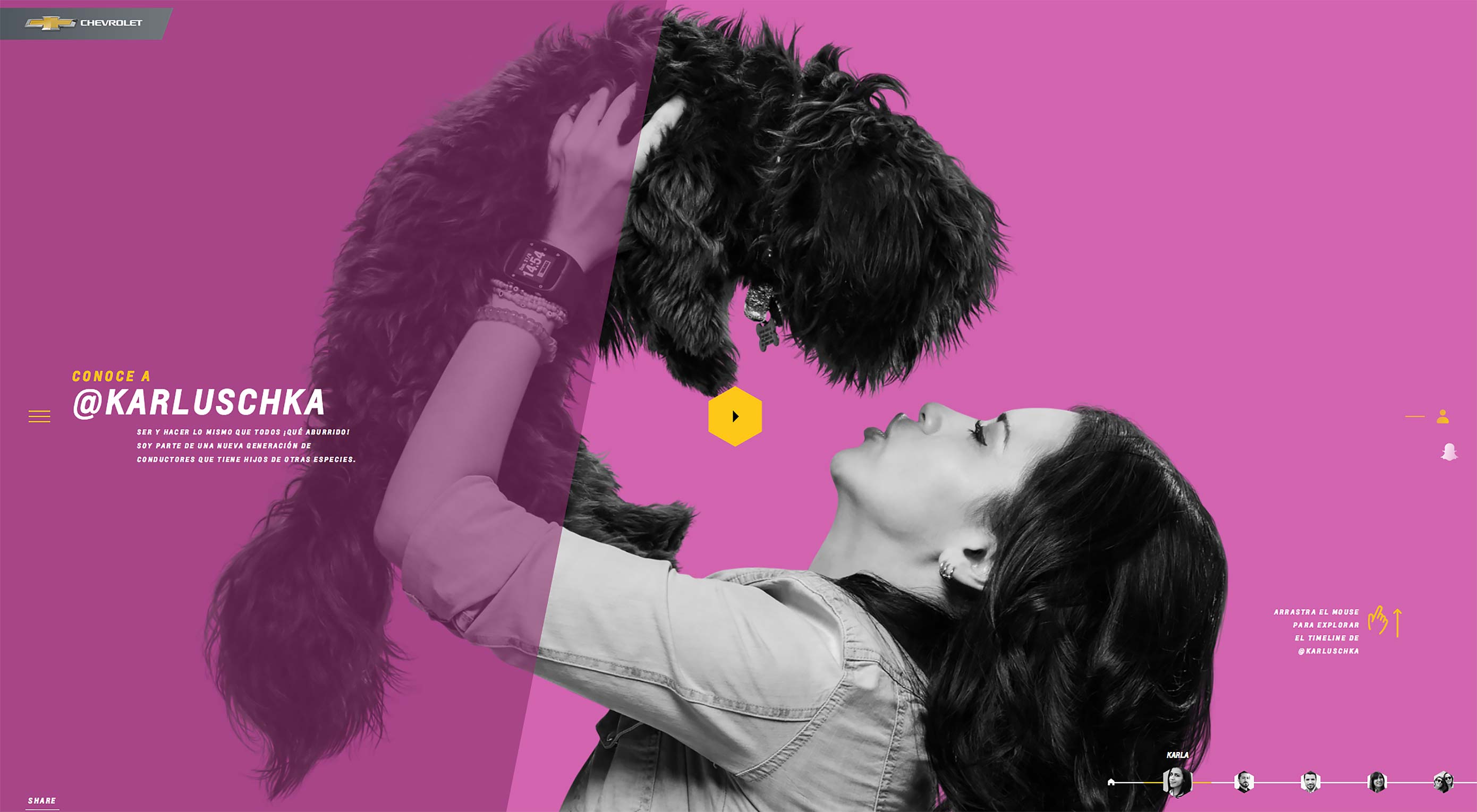
Here is an example from the Nuevos Conductores website from Chevrolet Mexico:
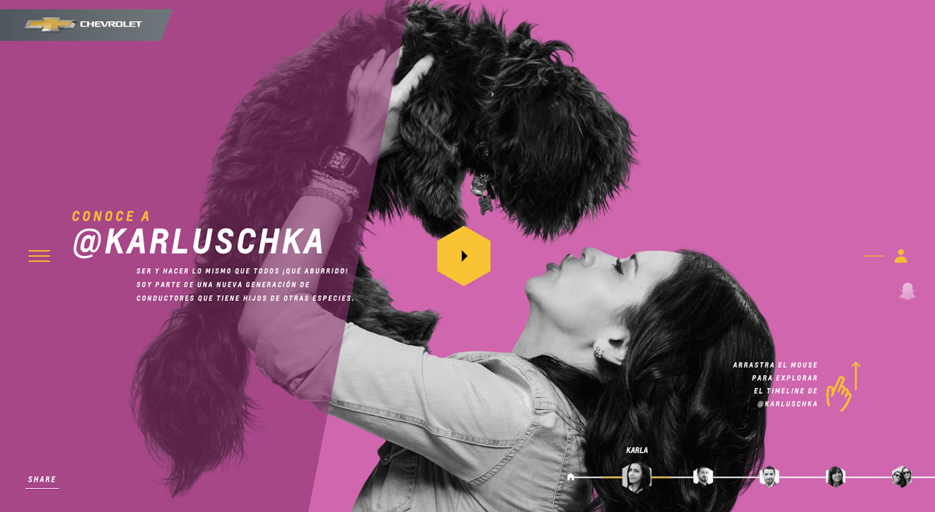
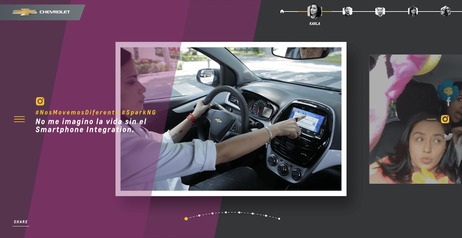
This website pays homage to the “new drivers” Chevy is catering to and uses real people to make its case. This whole website is an interesting case study in and of itself, that not only uses real Chevy drivers’ Twitter handles, but also includes messages, hashtags, and images from their social accounts to build out the design and message.
Hashtags can be used for strictly self-promotional purposes as well and don’t need to have such a predominant placement in the design either. Take the Caribana Festival, for example.
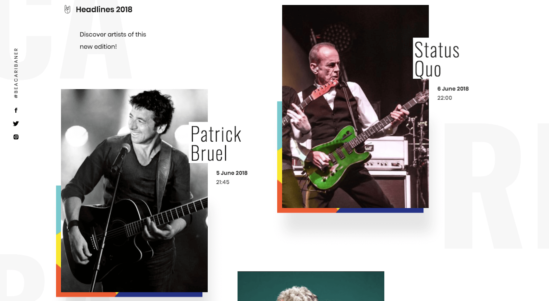
You’ll find a small hashtag has been added to the left side of the website. It’s really subtle, but it’s ever-presence is likely to get noticed by fans of the festival who’ve come to the site to learn more and get tickets.
Then, there’s Popular Pays’ 2017 Year in Review that actually uses hashtags as a design element.
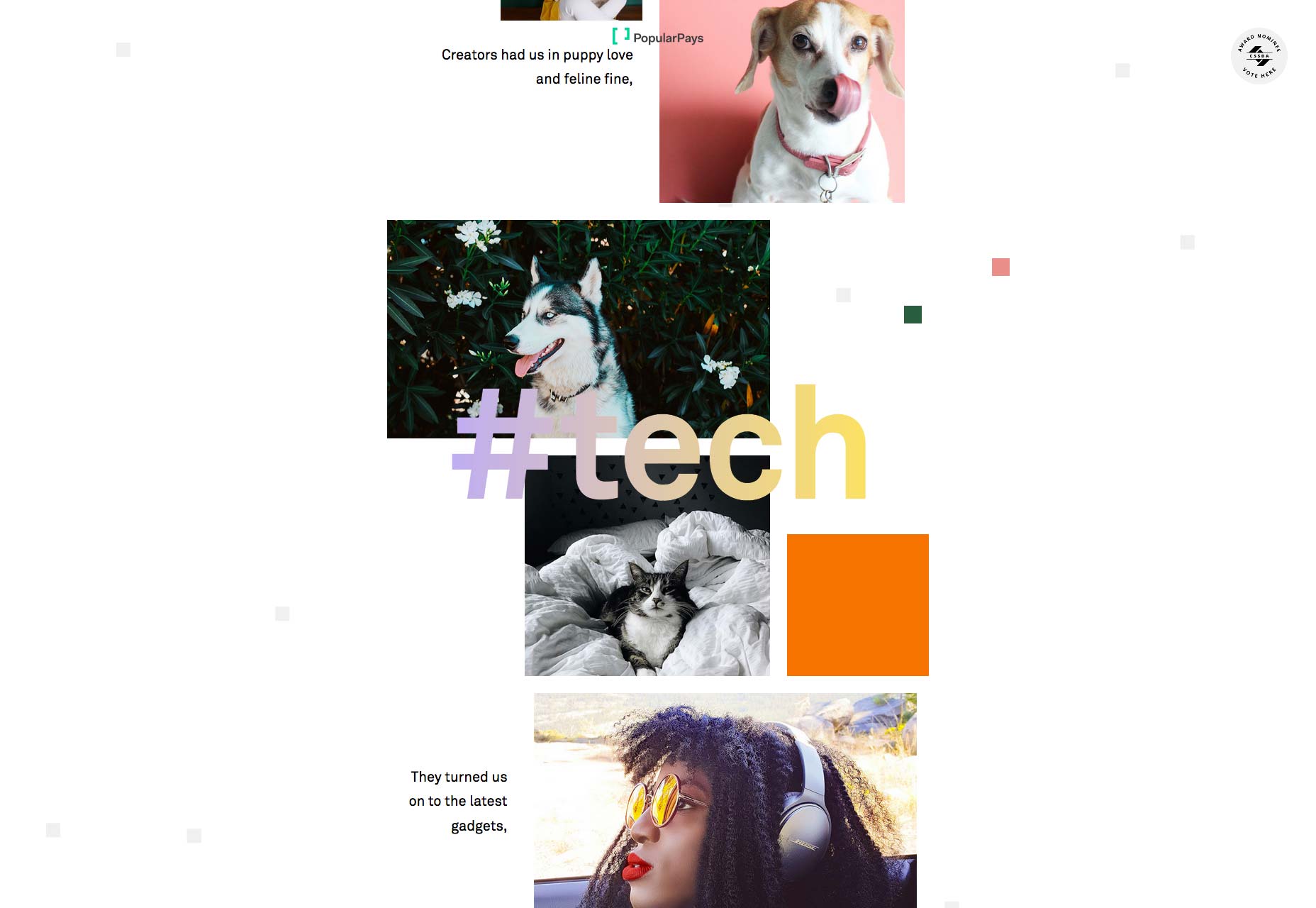
As users scroll to a new topic on the page, the hashtag changes. Think of it the way you’d use header tags in a blog post or on a page of a website. Only, this adds a bolder touch.
2. Use Notification Tickers
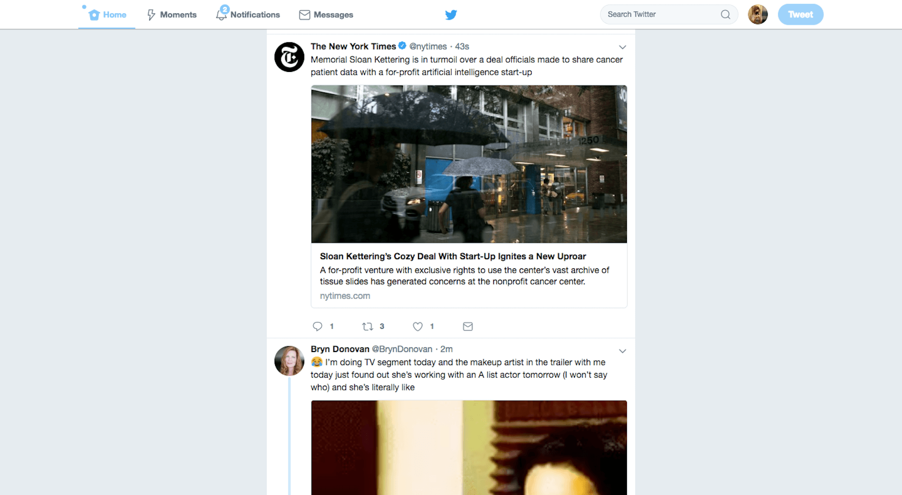
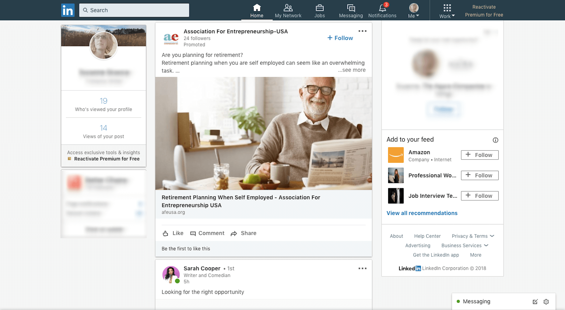
Because of how ubiquitous email and social media have become in consumers’ lives, there’s no denying the lure of the pending message notification. You know the ones I’m talking about.
Twitter does it:
LinkedIn does it:
Now, websites are doing it, too:
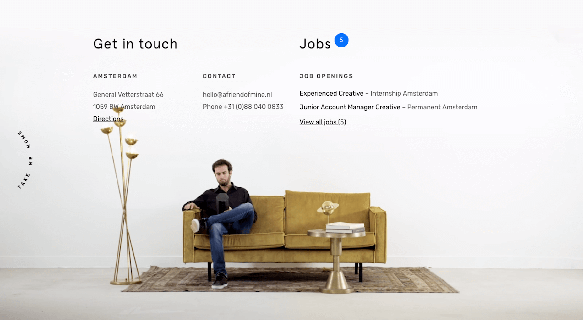
But this is an interesting use case from a friend of mine. The recognizable notification ticker isn’t telling visitors that there are messages waiting for them (though it has the same effect in drawing their eyes there). Instead, it’s saying, “Hey, we have five jobs waiting for you to apply to!”
I think there are other ways this could be used as well and it doesn’t have to be for users logged into a SaaS platform or membership site. As we move more and more away from things like pop-ups that can intrude on the user experience, I think we’ll see websites find unique approaches to share news and promo codes and things of that nature. This notification ticker would be an interesting way to do that.
3. Design a Timeline
With most social media feeds, we’re presented with a chronological timeline of our activity as well as those we’ve connected to. There’s something very appealing about this layout, in general, as it allows us to get a sense for someone’s story.
And what is a website if not the “story” about a brand and its mission to serve its consumers?
Dr. Pepper is a brand that’s been around a long time, but I bet a lot of its drinkers don’t know much about its history. Well, if they were to visit the Dr. Pepper website, they’d definitely learn more about where this soft drink came from and even catch a glimpse at old promotional content that some may recognize still today.
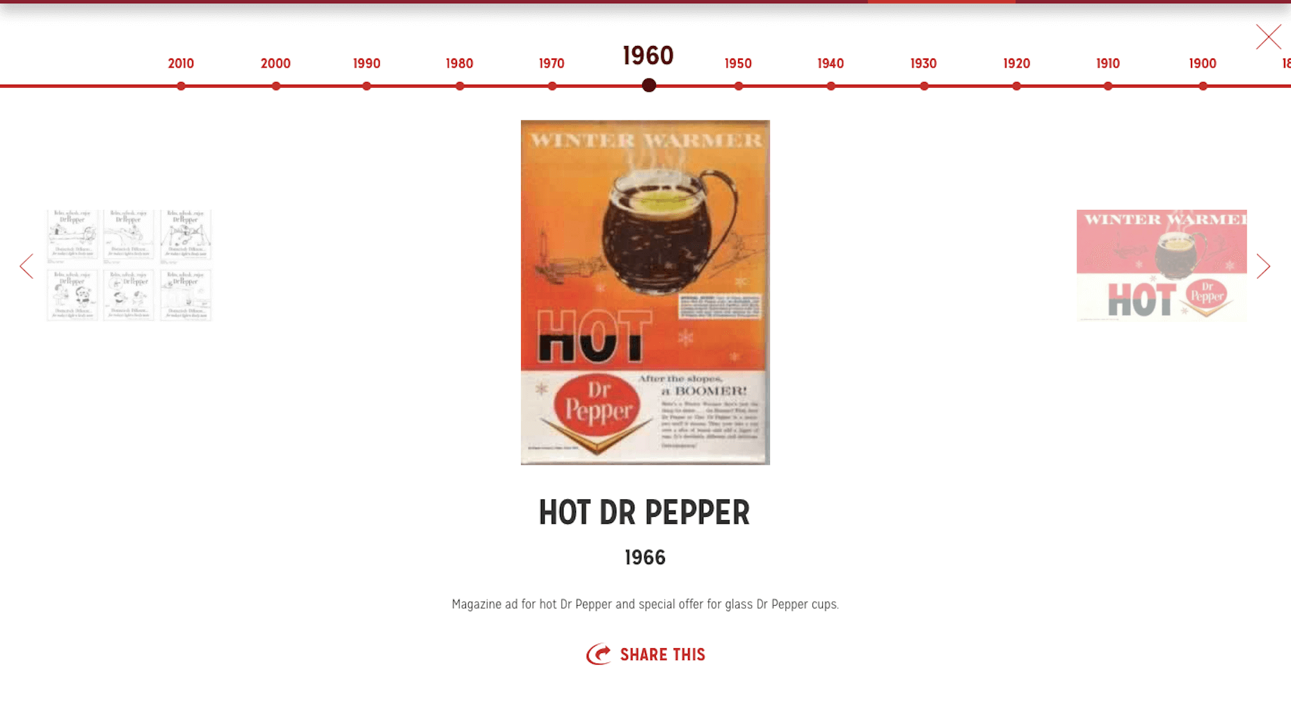
If you navigate to the History page on the site, you’ll encounter a timeline that briefly tells its story (nice and succinct just like most of our own social media “stories”):
Then, as you scroll down, you’ll encounter images that support the story, even playing on the nostalgia of having drank Dr. Pepper through the decades:
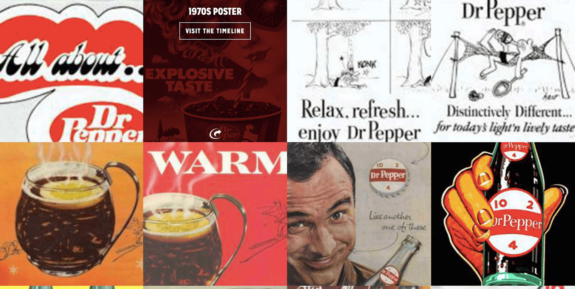
When you think about it, this is really no different than why we as consumers take photos and post them online. We want to share the highlight reel of our lives, and brands are able to do a similar thing with their websites.
4. Talk to Visitors with Quizzes and Chat UIs
Let’s face it: a lot of times, a website just feels like a digital flyer. “Here is our business. Learn about us and get in touch.” I believe that’s why so many people flock to social media nowadays; to learn more about and actually engage with businesses.
There are so many ways in which you can jazz up your web design to make the experience less lackluster, of course. A well-timed pop-up or an eye-catching animation can help. Gamified elements like timers are a nice touch, too.
Aside from placing a live chat on your website—that someone then has to man—there has got to be another way in which you can make your web design really talk to its visitors. Right?
One example I like is the John Frieda website. There is a Style Match page which allows visitors to talk to the site the way they would a hair stylist:
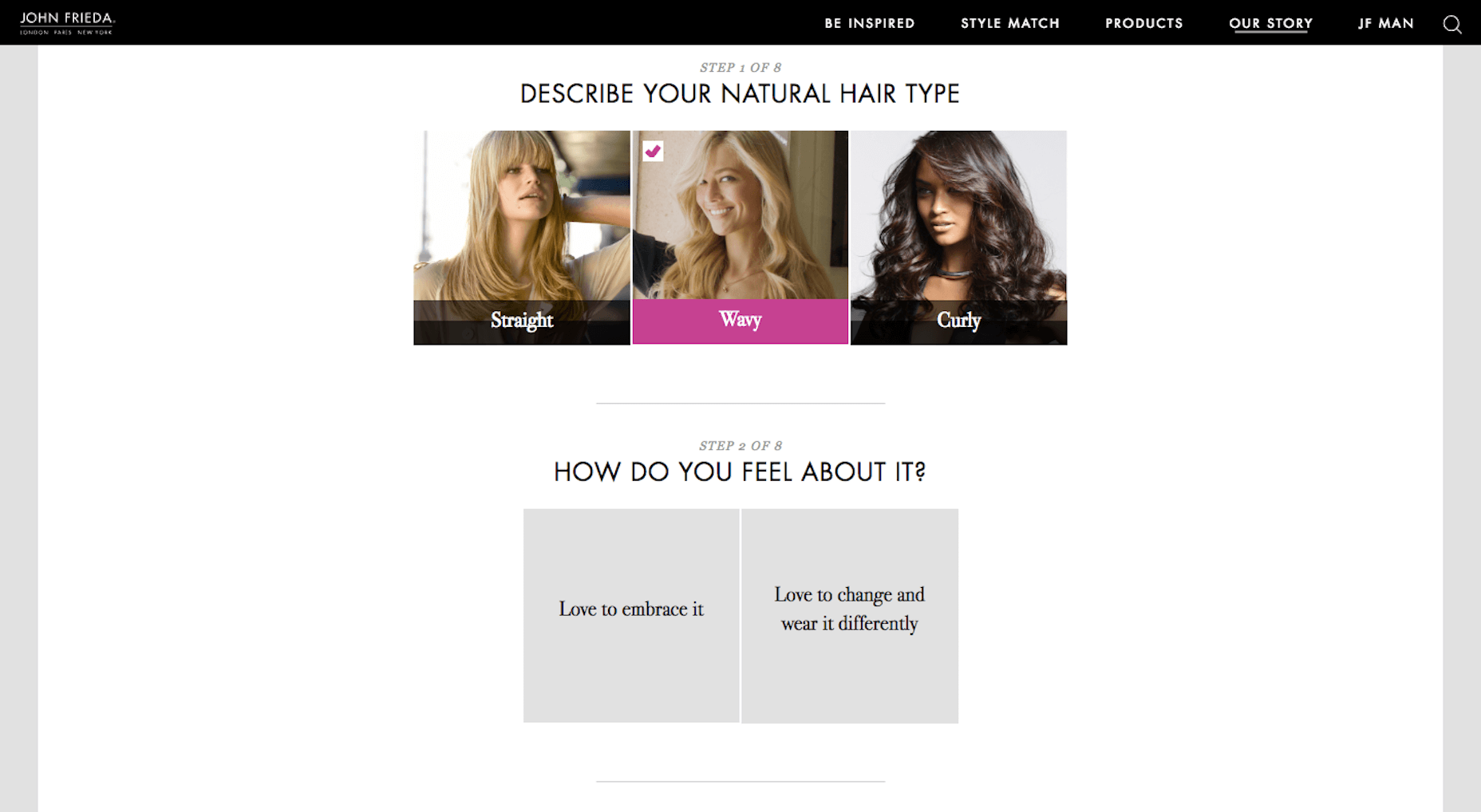
The quiz-style format allows visitors to input answers to questions they’d get when visiting a salon. In the end, they receive a personalized response and recommendations based on what they “talked” about.
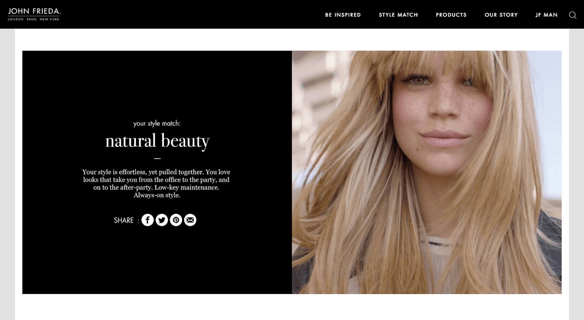
A chat UI is also possible, though AI isn’t as simple of an implementation as something like a built-in quiz. Consider what makes the most sense for your web design and apply the interactive element accordingly.
Wrap-Up
Social media plays a big part in the modern business’s marketing efforts. But when it comes to websites, why is it that we only catch minor glimpses of it in the form of social share icons or the embedded news feed?
I would argue that we should think more abstractly about the strengths of social media. Then, apply those same unique principles and elements to web design to make it even better.
Add Realistic Chalk and Sketch Lettering Effects with Sketch’it – only $5!
![]()
Source
p img {display:inline-block; margin-right:10px;}
.alignleft {float:left;}
p.showcase {clear:both;}
body#browserfriendly p, body#podcast p, div#emailbody p{margin:0;}

Leave a Reply
Want to join the discussion?Feel free to contribute!