Subtle K-Y rebrand is a stroke of genius
Original Source: http://feedproxy.google.com/~r/CreativeBloq/~3/EWK1pGrwxjk/k-y-rebrand
With International Women's Day approaching on Sunday, lubricant brand K-Y Jelly has revealed a rebrand focused on female sexual empowerment.
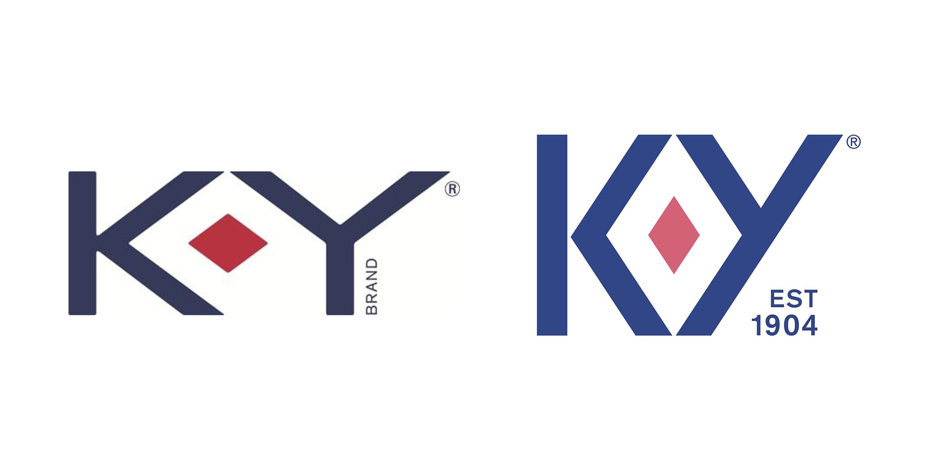
Design Bridge New York's new logo design emphasises the ruby in its centre, turning it into a much prouder celebration of the vulva than before, and a "strong symbol of female sexual power". The ruby was always part of the logo, but diagonalising the 'Y's descender to meet the 'K' creates a new outer diamond, making the effect far more obvious.

The old logo (left) compared to the new one (right)
"We've loaded it with meaning," says Claire Parker from Design Bridge, "and brought a sensuality and confidence to the brand that was lacking before."
If you ask us, the vulvarisation (sorry) of the logo is a stroke of genius. The old logo looks positively prudish, clinical even, compared with this playfully confident rebrand. And if anyone needs help spotting the visual reference, Design Bridge's accompanying video (below) for the rebrand ensures that the new ruby looks, well, nice and inviting.
K-Y Jelly was one of the first lubricants aimed specifically at women. Launched in 1904, it entered a marketplace aimed predominantly at men. This new identity is a brilliantly strong statement of the brand's mission to, as K-Y puts it, to "empower women to have the best sex, always".

Are you ready for this jelly?
As well as the new logo, the rebrand includes bespoke typography and iconography for the product's packaging, as well as a refined colour palette with consistent use of the brand's "deep, ruby red – a colour that universally represents love and passion". We love it.
Related articles
Durex hits the spot with sexy new rebrandThe problem with period product brandingDesigners react to bizarre Gucci rebrand

Leave a Reply
Want to join the discussion?Feel free to contribute!