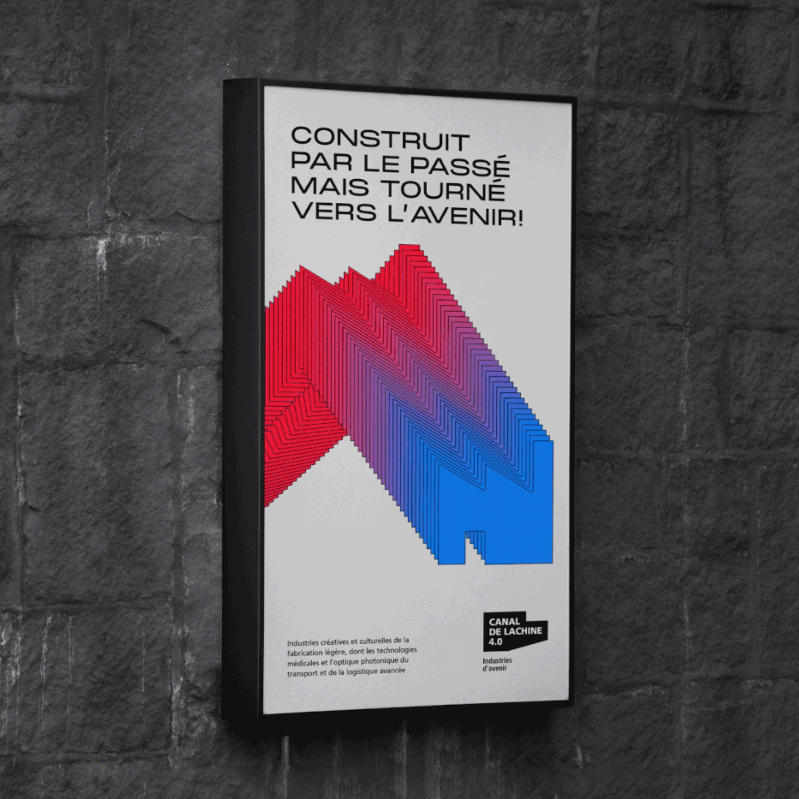
Montreal's Canal de Lachine 4.0: Where Heritage Meets Innovative Branding
Original Source: https://abduzeedo.com/montreals-canal-de-lachine-40-where-heritage-meets-innovative-branding
Montreal’s Canal de Lachine 4.0: Where Heritage Meets Innovative Branding

abduzeedo0828—24
Featuring’s branding for Montreal’s Canal de Lachine 4.0 economic development hub marries historical elements with a forward-thinking vision. Discover how design fosters growth in this unique urban space.
Montreal’s Canal de Lachine 4.0 is more than an economic development hub; it’s a bridge between the city’s storied past and its innovative future. This vision is captured beautifully in the branding and graphic identity crafted by Featuring, a design agency known for its thoughtful and impactful work.
The challenge was to create a visual language that aligns with Montreal’s economic hubs while reflecting the unique character of Canal de Lachine 4.0. Featuring’s solution is a harmonious blend of heritage and progress.
The design uses brick red and an industrial icon to evoke the area’s rich industrial history. This nod to the past is balanced by vibrant green, symbolizing sustainability and the area’s evolution towards a greener future. The typography is clean and modern, hinting at innovation and technology.
A recurring motif is the flowing blue line representing the Lachine Canal itself. This symbolizes both the area’s industrial heritage and its ongoing transformation, connecting past, present, and future.
Featuring’s design is more than just aesthetics; it’s a strategic tool for attracting businesses and talent. The strong visual identity communicates the area’s unique value proposition: a place where history and innovation converge, fostering growth in industries like creative arts, manufacturing, and technology.
This project is a testament to the power of branding and web design. It shows how design can capture the essence of a place, tell its story, and contribute to its economic development. Featuring’s work for Canal de Lachine 4.0 is a shining example of design that’s not only beautiful but also meaningful and effective.
Branding and web design artifacts
Credits
Client : Ville de Montréal, PME MTL
Agence : Featuring
Direction de création : Karl-Frédéric Anctil
Direction artistique / motion : Lou Tondellier
Web : TREIZE
Service-conseil : Laurianne Bonnici

Leave a Reply
Want to join the discussion?Feel free to contribute!