Love Wellness: Branding Design That's Fun and Functional
Original Source: https://abduzeedo.com/love-wellness-branding-design-thats-fun-and-functional
Love Wellness: Branding Design That’s Fun and Functional

abduzeedo0925—24
Love Wellness, the women’s health brand by Lo Bosworth, needed branding and packaging that were as playful as they were informative. Discover how custom typography and illustrations made this brand a hit.
Love Wellness isn’t your average women’s health brand. It’s bubbly, vibrant, and oh-so-relatable. But striking the balance between light-hearted and informative can be a tough act for any designer. So, how did Kristine Arth and Lobster Phone nail it?
Let’s break down what makes this branding and packaging design sing.
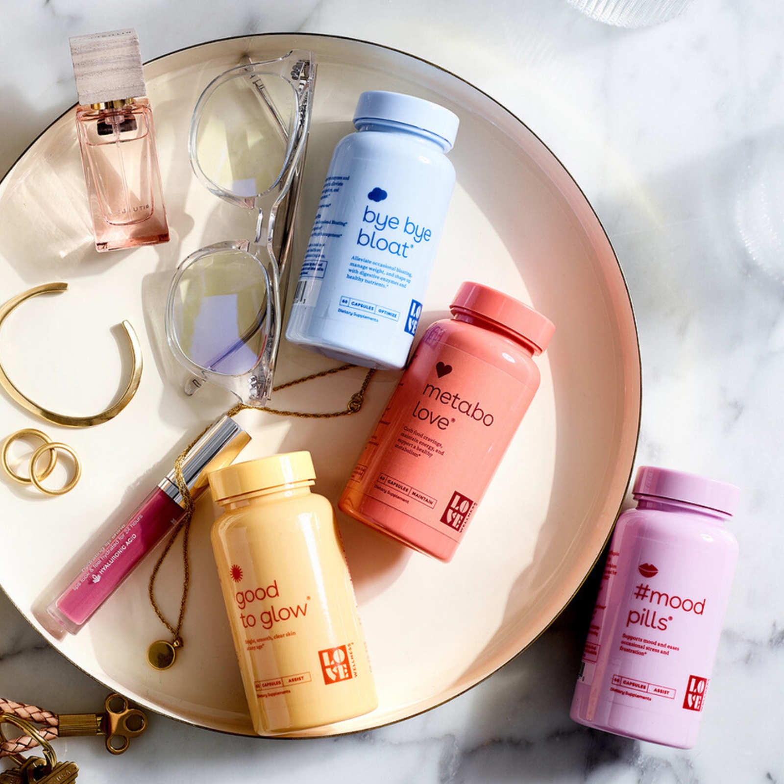
The logo, inspired by a 1930s art deco type specimen, gives a nod to vintage glamor. But the playful twist on the letterforms, especially the kissable ‘V,’ adds a fresh, contemporary vibe. It’s like your cool, stylish aunt giving you the best health advice – fun and trustworthy all at once.
Forget clinical diagrams. Love Wellness uses quirky illustrations that capture the essence of each product. It’s a visual language that’s both approachable and memorable. Plus, it perfectly complements the playful typography, creating a cohesive brand identity.
Ever noticed how certain colors just make you feel something? Love Wellness uses color psychology to its advantage. Each product features a unique color combo that evokes specific emotions and highlights the product’s purpose. Think calming blues for stress relief or energizing yellows for a boost.
From the quirky product names (who wouldn’t love “Good Girl Probiotics”?) to the cheeky illustrations, Love Wellness oozes personality. This brand isn’t afraid to have fun, and that’s exactly what makes it stand out in a sea of sterile health products.
Love Wellness proves that health and wellness branding doesn’t have to be boring. By blending vintage inspiration with modern design sensibilities, this brand has created a visual identity that’s as playful as it is powerful.
So, next time you’re tackling a branding project, remember: Don’t be afraid to inject some personality. A little bit of fun can go a long way in capturing hearts (and customers!).
Branding and packaging design artifacts
For more information make sure to check out Kristine Arth on Behance and lobsterphone.com

Leave a Reply
Want to join the discussion?Feel free to contribute!