Los Kalakos Tequila Blanco: Minimalist Packaging Design
Original Source: https://abduzeedo.com/los-kalakos-tequila-blanco-minimalist-packaging-design
Los Kalakos Tequila Blanco: Minimalist Packaging Design

abduzeedo0913—23
Los Kalakos’ Tequila Blanco 2023 isn’t just another beverage in the spirits aisle – it’s a masterclass in brandjng and packaging design presented on a bottle. Commissioned by the illustrious Ernesto Serna, known to many as Sr. Brander, this project had its visual DNA mapped out by the artful hands of Moisés Guillén.
What is immediately striking is the deceptive simplicity of the design. Guillén doesn’t just do minimalism. He *owns* it. His minimalistic approach allows the beauty of the white label to shine, painting a canvas of purity and refinement. But do not mistake this simplicity for lack of depth. With the faintest of strokes, Guillén ensures that every element sings, even in its subtlety.
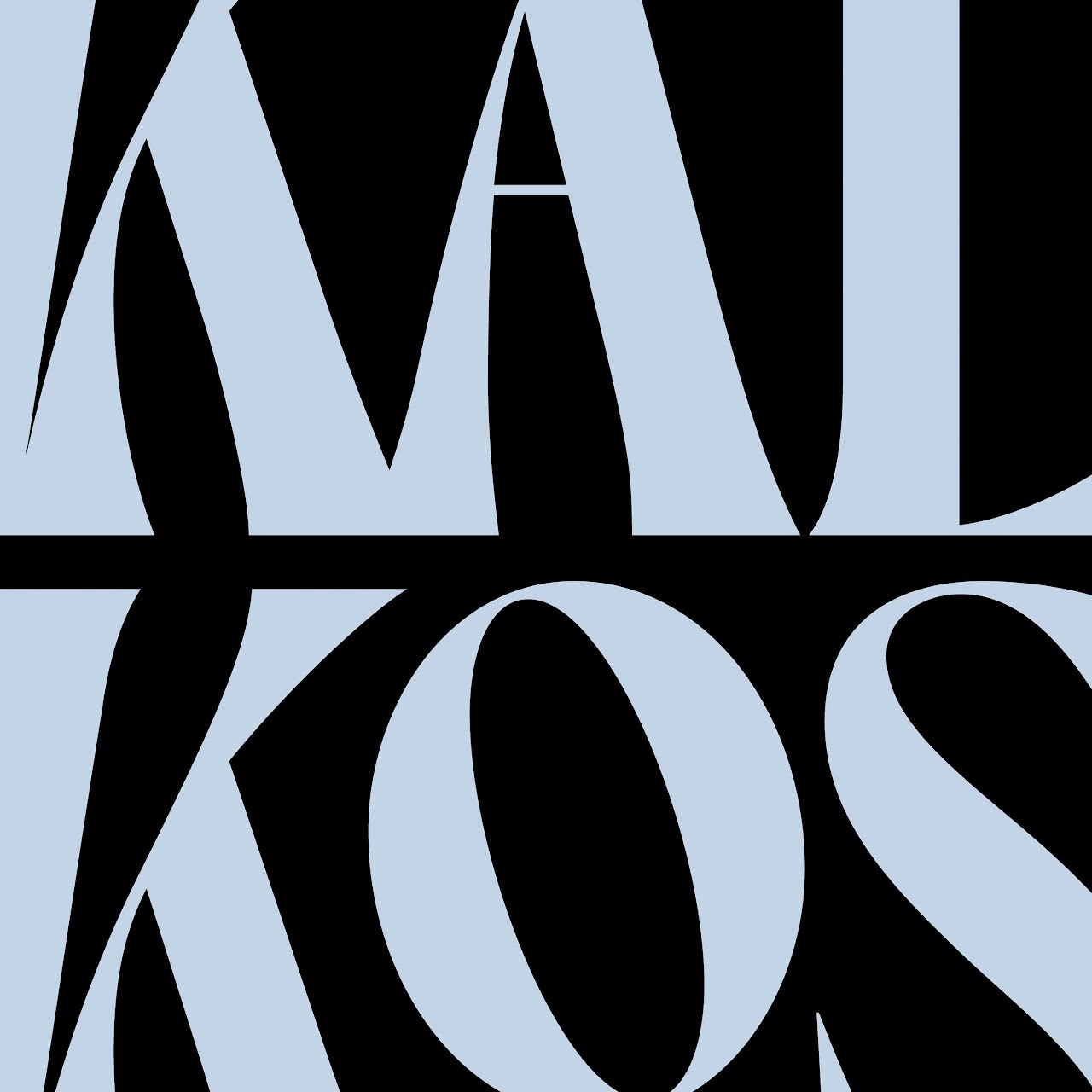
The custom logotype, for instance, is a feat in itself. While many might marvel at the clean lines, the cognoscenti will appreciate the cunning use of negative space that gives the letters an illusion of depth. It’s reminiscent of the agave leaves folding in on themselves – a delightful nod to the very heart of tequila. This is not just a logotype; it’s Guillén’s witty tip of the hat to the spirit’s origins.
Perhaps the true hallmark of great design is scalability. And this branding identity doesn’t falter, whether it’s embossed on glass, stamped on cork, or imprinted on paper. Guillén has crafted an identity for Los Kalakos that seamlessly adapts, echoing a consistent narrative irrespective of the medium.
In a world overflowing with loud designs clamoring for attention, Los Kalakos’ Tequila Blanco reminds us of the power of restraint. It isn’t just about being seen; it’s about being remembered. Guillén’s work isn’t just about branding; it’s about leaving an indelible impression.
For those who understand design, Los Kalakos isn’t just another tequila. It’s a visual narrative, bottled. Cheers to Guillén, for serving us design perfection with a hint of agave.
Branding, packaging design and visual identity
Credits
Project Concept, Art Direction, Graphic Identity, Illustration & Packaging: Moisés Guillén.
Commissioned by: Ernesto Serna (Sr. Brander).

Leave a Reply
Want to join the discussion?Feel free to contribute!