Is There Such A Thing As Too Much Social Proof?
Original Source: https://www.smashingmagazine.com/2019/09/too-much-social-proof/
Is There Such A Thing As Too Much Social Proof?
Is There Such A Thing As Too Much Social Proof?
Suzanne Scacca
2019-09-23T13:30:59+02:00
2019-09-23T18:06:20+00:00
It’s very easy to start a business these days. But succeeding in that business is another story. There are just too many people who want to escape the 9-to-5, do something with their big idea and make a better life for themselves in the process. I totally applaud that.
However, it’s not practical to think that the idea will sell itself. Consumers need to be given some reason to trust that their money (or time) will be well spent. And when a business or product is new, the best way to gain this trust is by getting clients, customers and others to vouch for you.
That said, is it possible to go overboard with testimonials, reviews, case studies, client logos and other forms of social proof? And is there a wrong way to build social proof into a mobile website or PWA?
Yes and yes!
When Too Much Social Proof Is A Bad Thing
I was working on the copy for a new website earlier this year. My client told me that the design team had prepared a wireframe for the home page and wanted me to use that as a framework for the copy. Normally, I would be stoked. When I work as a writer, I want to stay in writer mode and not have to worry about layout and design suggestions.
The only problem was that the home page they wanted was littered with social proof and trust marks. It would’ve looked like this (note: the purple boxes contain social proof):

A sample wireframe of a home page with too much social proof. (Source: Canva) (Large preview)
In reviewing the wireframe, I had a number of gripes. For starters, it was way too long, especially for mobile visitors.
There was no way people were going to scroll seven times to find the section that finally invites them to take action.
“
Secondly, there was too much social proof. I know that seems counterintuitive. After all, isn’t it better to have more customer validation? I think in some cases that’s correct. Like with product reviews.
In BrightLocal’s 2018 Local Consumer Review Survey, respondents said they want to see at least 40 product reviews, on average, before believing a star rating.

BrightLocal’s consumer review survey says that consumers want to see 40 review before believing a business’s start rating. (Source: BrightLocal) (Large preview)
Even then, consumers aren’t looking for a perfect score. As you can see here, only 9% of respondents need a business to have a perfect rating or review in order to buy something from them:
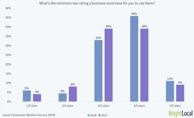
BrightLocal survey respondents prefer to see a minimum of 3- or 4-star ratings instead of 5. (Source: BrightLocal) (Large preview)
And I can tell you why that’s the case.
I used to write product reviews. One of the things I’d do when assessing the quality of a product (before making my own judgments) was to look at what online reviewers — professional reviewers and customers — had to say about it. And let me tell you… there are tons of fake reviews out there.
They’re not always easy to spot on their own. However, if you look at enough reviews at once, you’ll start to notice that they all use the same verbiage. That usually means the company paid them to leave the review or gave family, friends and employees pre-written reviews to drop.
I’m not the only one who’s noticed this trend either. BrightLocal’s respondents have as well:

33% of BrightLocal respondents have seen lots of fake reviews while 42% have seen at least one. (Source: BrightLocal) (Large preview)
Only 26% of respondents said they hadn’t come across a fake review while 42% had seen at least one in the last year and 33% had seen a lot.
When it comes to things like testimonials and case studies, I think consumers are growing just as weary about the truthfulness of the praise.
TrustRadius surveyed B2B buyers on the subject of online reviews vs. case studies. This is what it found:
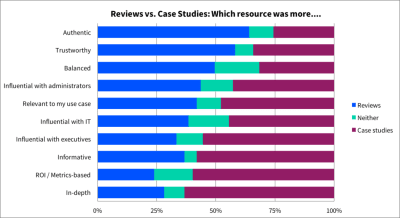
TrustRadius asked respondents to assess their feelings on customer reviews vs. case studies (Source: TrustRadius) (Large preview)
It makes sense why consumers don’t feel as though case studies are all that authentic, trustworthy or balanced. Case studies are written by the companies themselves, so of course they’re only going to share a flattering portrait of the business or product.
Having worked in the digital marketing space for a number of years, I can tell you that many customer testimonials aren’t always genuine either. That’s why businesses need need to stop worrying about how much social proof they have and start paying more attention to the truthfulness and quality of what they’re sharing with visitors.
The point I’m trying to make isn’t that we should ditch social proof. It’s an important part of the decision-making process for consumers. But just because it can affect their decision, it doesn’t mean that repeatedly bashing them over the head with it will work either. If your website and its messaging can’t seal the deal, a bunch of logos and quotes meant to convince them to buy won’t either.
What you need to focus on when building social proof into a mobile site or PWA is quality over quantity. Sure, you might want to highlight the sheer quantity of reviews that have been gathered on a product, but in terms of space on your website? With social proof, less is more.
Tips For Building Social Proof Into A Mobile Website Or PWA
You don’t have a lot of room to spare on mobile and you don’t want to make your visitors dig and dig to find the important details. So, while you do need social proof to help sell the business and its product, you need to do so wisely.
That means giving your content room to shine and strategically enhancing it with social proof when it makes the most sense to do so.
Consolidate Social Proof on the Home Page
I know how hard it can be to convince people to work with you or buy from you when your business is new. That’s especially the case when you’re entering a field that’s already dominated by well-known and well-reviewed companies.
However, rather than make your home page longer than it needs to be — for desktop or mobile visitors — why not consolidate the strongest social proof you have and put it in one section?
What’s neat about this option is that you can get creative with how you mix and match your social proof.
Customer Reviews + Trust Seals
Two Men and a Truck is the kind of company that needs customer testimonials. It’s the only way they’re going to effectively convince new customers to trust them to enter their home and carefully transport their belongings from one location to another.
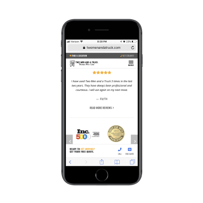
Local movers Two Men and a Truck stack a testimonial on top of trust seals on the home page. (Source: Two Men and a Truck) (Large preview)
Rather than bog down their home page with testimonials, Two Men and a Truck use one especially positive review and a number of professional trust seals to close the deal in one fell swoop.
Google Reviews + Facebook Reviews
Another way to consolidate social proof on the home page is by aggregating reviews from other platforms as the website of Drs. Rubinstein and Ducoff does:

The home page of Drs. Rubinstein and Ducoff shows off the latest reviews from Google and Facebook along with an average star rating across all platforms. (Source: Drs. Rubinstein and Ducoff) (Large preview)
This is a tiny section — it doesn’t even fill the entire screen — and yet it packs a lot of punch.
First, you have the total number of reviews and average star rating shown at the top. Remember that survey from BrightLocal? This is the kind of thing that would go a long way in convincing new patients to sign up. There’s a good amount of reviews to go on and the average rating seems realistic.
Also, because these reviews come from Google and Facebook, they’re connected to real people’s profiles. Plus, the date is included in the Google review.
Unlike testimonials which are just a quote and a person’s name (if we’re lucky), this is a quote, a star rating and the date it was published. This way, prospective patients don’t have to wonder how long ago it was that Drs. Rubinstein and Ducoff received these reviews.
Twitter + App Store Reviews + Awards
You’ll find another creative example of consolidated social proof on the Pocket website.

Pocket uses Twitter, the Google App Store, the Google Play Store Webby Awards as trust marks. (Source: Pocket) (Large preview)
Even though Pocket is free to use, that’s not necessarily enough to convince someone to try a new piece of software — especially if you want them to download it as a mobile app.
Rather than rely on faceless testimonials, though, Pocket has chosen to show off some convincing and verifiable social proof:
A quote from a Twitter user with a healthy follower base,
The actual rating of its app on both apps stores,
The number of times it’s won a Webby award.
It’s a unique patchwork of social proof which is sure to stand out from the traditional quote block many websites use to promote their products.
Make It Sticky
One of the great things about making the move to a PWA is you can use app-like elements like a sticky bar to show off important information to visitors. If it makes sense to do so, you could even put some social proof there.
Google Reviews Widget
There’s been a big surge in independent mattress companies in recent years. Tuft & Needle. Loom & Leaf. Saatva. They all seem to promise the same thing — a better quality memory foam mattress at a steal of a price — so it’s got to be hard for consumers to choose between them.
One way to make this differentiation is with Google Reviews.
On the desktop website for Lull, the home page reviews callout is tucked into the bottom-left corner.

Lull shares Google customer reviews in a widget on its desktop website. (Source: Lull) (Large preview)
It’s almost too small to notice the reviews with so much more to take in on the home page. That’s a good thing though. The social proof is always present without being overwhelming.
What’s interesting to note, though, is that the mobile counterpart doesn’t show any Google reviews on the home page. It’s not until someone gets to the Mattress page where they’re able to see what other customers have said.
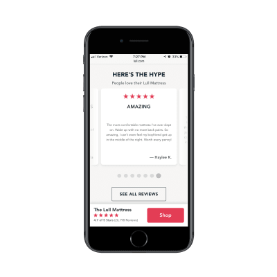
Lull shares Google customer reviews in a sticky bar on its PWA. (Source: Lull) (Large preview)
In this particular screenshot, you can see that the Mattress page on the PWA has a section promoting the product’s reviews. However, even when visitors scroll past that section, the sticky bar continues to remind them about the quantity and quality of reviews the mattress has received on Google.
CTA Banner
Another type of website this sticky social proof would be useful for would be one in hospitality. For example, this website for the Hyatt Regency San Antonio:
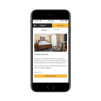
An example of one of the Suites pages on the Hyatt Regency San Antonio website. (Source: Hyatt Regency San Antonio) (Large preview)
Just like the Lull example above, the Hyatt Regency tucks its social proof into a sticky bar on its internal sales pages.
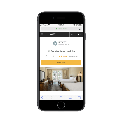
The Hyatt Regency places TripAdvisor reviews next to its conversion elements in a sticky bar. (Source: Hyatt Regency San Antonio) (Large preview)
Visitors see the number of TripAdvisor reviews and star ratings when they first enter the Suites page. When they scroll downwards, the sticky bar stays in place just long enough (about one full scroll) for visitors to realize, “Cool. It’ll be there if or when I’m ready to do more research.”
What’s nice about how this particular sticky bar is designed is that the reviews are part of the conversion bar. It’s kind of like saying, “Want to book your trip, but feeling nervous about it? Here’s one last thing to look at before you make up your mind!”
Create a Dedicated Page for Social Proof
If you’re not building a PWA or you have too much social proof to show off in a small space, create a dedicated page for it. This is a great option, too, if you plan to share something other than just testimonials or reviews.
Testimonials/Reviews
Winkworth is an estate agency in the UK. Testimonials are a useful way to convince other sellers and lessors to work with the agency. Yet, the home page doesn’t have any. Instead, the company has chosen to place them on a Testimonials page.

The Winkworth estate agency keeps its home page free of testimonials and instead places them on a dedicated page. (Source: Winkworth) (Large preview)
It’s not as though this page is just a throwaway of every positive thing people have said. The testimonials look like they’ve been hand-picked by Winkworth, especially the longer ones that contain more details about the experience and the people they worked with.
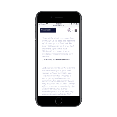
An example of some of the hand-picked testimonials Winkworth has gathered for its Testimonials page. (Source: Winkworth) (Large preview)
Each testimonial includes the person’s name as well as which Winkworth location they’re referring to. This way, visitors can learn more about the experience at specific locations instead of just hearing how great Winkworth is as a whole.
Case Studies
It’s not just testimonials that could use their own page. Case studies shouldn’t clutter up the home page either.
While Bang Marketing promotes its case studies with a promotional banner on the home page, that’s all you hear of it there. They save their customers’ stories for individual pages like this one:

Bang Marketing includes a video testimonial with every case study. (Source: Bang Marketing) (Large preview)
Each case study page is minimally designed, but captures all of the information needed to tell the story.
First, there’s a video from the client explaining what Bang Marketing was able to do for them. Then, there’s a brief description of what the team worked on. Finally, high-quality images provide visitors with a look at the resulting product.
This is a much more effective way to share case studies than placing a barrage of portfolio images all over the home page.
Press
There are two ways to handle the Press section of a website. The company could publish its own press releases or it can share information about where it’s been featured in the press.
While the former is useful for sharing company news and wins with visitors, it’s just too self-promotional and won’t help much with conversion. The latter option could really make a big impact though.
This, for instance, is what visitors will find on the About & Press page for The Dean Hotel:

The Dean Hotel includes magazine covers and article screenshots as social proof on its website. (Source: The Dean Hotel) (Large preview)
After a short intro of the hotel, the rest of the page is covered in magazine covers and article screenshots that go back as far as 2013. Visitors can click through to read each of the articles, too.

The Dean Hotel uses articles as social proof on its website. (Source: The Dean Hotel) (Large preview)
This is a unique way for a website of any type to share social proof with visitors.
If your client happens to have a bunch of positive press and never-ending hype surrounding its brand, try to leverage that on the site. Plus, by including screenshots from the articles themselves, you get another opportunity to show off the product (or, in this case, the hotel and its rooms).
Wrapping Up
Consumers have become very savvy when it comes to marketing and sales online. That’s not to say that they don’t fall for it — usually, when it’s done genuinely and with transparency. However, we’re at a point where a brand saying, “We’re the best! Trust us! Buy from us!”, doesn’t usually cut it. They need more validation than that.
At the end of the day, your mobile website or PWA needs social proof to convince visitors to convert.
That said, be careful with how you build social proof into the site, especially on the home page. You don’t have time or space to waste, so don’t create something unnecessarily bulky just so you can show off how many testimonials, reviews, case studies, client logos high-profile partnerships you have. This is about quality over quantity, so make it count.

(ra, yk, il)

Leave a Reply
Want to join the discussion?Feel free to contribute!