How to Win at Email Design
Original Source: http://justcreative.com/2017/12/04/how-to-win-at-email-design/
Below is an interview with Mike Smith, the art director for Aweber (the email marketing service I use for JUST Creative) and he has answered a few common questions on email design.
On a side note, if you’ve designed a great email newsletter, enter it into EmailMonks’ free newsletter competition and win your share of $10k in prizes.
1. How can using a consistent template build brand trust?
Templates are beneficial for many reasons, but specific to your customers, a consistent template design helps to establish expectations. A consistent template makes the cognitive load on subscribers lighter because they see a recognizable structure and aesthetic. This minor mental trigger builds a subconscious trust with readers which goes a long way to making your brand stronger.
2. What are the best colors and placements for CTAs in emails?
The best way to know how subscribers will respond is through testing, but here are some tips we’ve learned with our own testing. If you can place a link or button just under a header image or headline we’ve seen marked increases in the click through.
When it comes to color, matching your brand is important but so is contrast. The higher the contrast between a button and the background it sits on the more actionable it will appear.
3. How much do I really need to change on the template to make it unique?

The templates in your email provider have been designed to make your life easier. If you only change the colors and logo that is sufficient enough to make a well designed email. No need to go crazy with changing all the elements just to “make it your own”.
The templates are also created to be flexible so adding additional images and content should be easy to make work within the constraints the email designer created for that specific template.
4. Should my template match my website?

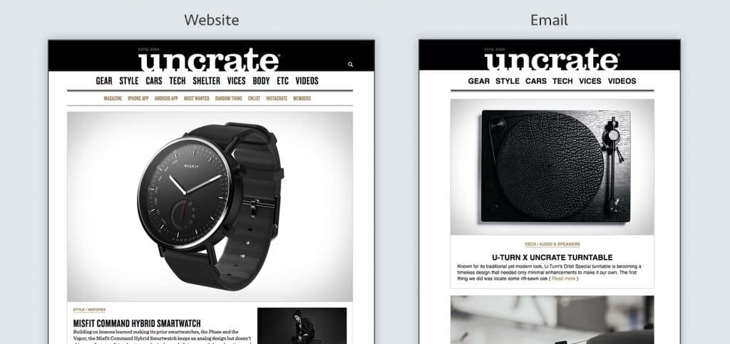
It’s a big challenge to match an email and web experience 1 to 1. The use cases for each are quite different so there isn’t a point in beating yourself up to make it perfectly match. The important elements of your site–fonts, colors, logos, image styles– are enough to make the two coexist.
Think about your email in the way that old school correspondence kits were designed. Your business card and letterhead don’t look identical, because they have different purposes. But they did obviously live as part of the same brand. That is the same logic that applies to a website and email template, similar but designed with the medium’s intent in mind.
5. Should design or content come first when thinking about creating an email newsletter?
A flexible email template design should allow for all types of content.
6. What are fun and unique ways to make your email stand out from other brands?
Let your personality shine! This doesn’t have to be through witty copy or flashy GIFs but it could be. Whatever you do make it true to you. Every person and brand are a unique mix of their history, their convictions, and their personality. Allow that to come through in your design decision making, don’t focus on “being different”.
7. What’s the number one mistake you see marketers make in email designs?

Trying to be fancy. Clip art images, crazy fonts or font colors, or whacky layouts aren’t necessary. Drive home the value every time you send an email and subscribers will want to hear from you. Don’t put a bunch of silly distractions in the way of getting to the value!
Win at Email Design: Video Series
Mike Smith has been working on a series of videos about email design. Below is the first video which teaches you how to design an awesome welcome email, focusing on the principles of brand aesthetics, setting expectations and showing humanity.
Enjoy!

Leave a Reply
Want to join the discussion?Feel free to contribute!