Four Common Font Types and When to Use Them
Original Source: http://feedproxy.google.com/~r/1stwebdesigner/~3/YZcqNpcyVao/
When you’re first learning the nuances of typography, all those different font types can be confusing. You might know the difference between serif and sans-serif, but do you know the right time to use them? And what about the dozens of subtypes?
There are four main types of fonts you can use in web design, each with their own distinctive look. Not sure where to begin? We’ll give you a little typography guidance so you can design a website that perfectly conveys the mood you’re going for.
UNLIMITED DOWNLOADS: 400,000+ Fonts & Design Assets

DOWNLOAD NOW
Serif

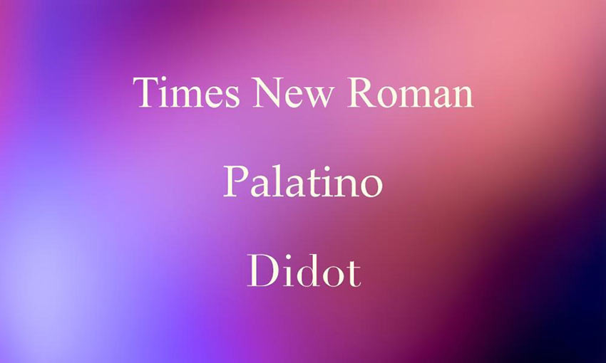
Serif fonts are the go-to for elegant and professional designs. These stylish typefaces are marked by the little dashes extending from the stroke of each letter. Serifs have long been used for extensive passages in print. They give websites an old-fashioned, sophisticated tone.
In general, serif fonts are suitable for almost any situation: headers, body text, small to large sizes, and short or long copy – they should only be avoided in very small sizes. Some also claim that serifs are less screen-legible.
Old Style: Going back to the 1400s, these serifs are marked by low line contrast and diagonal stress.
Transitional: Transitional styles bridge the gap between traditional and modern serifs. You begin to see more line contrast and stylistic additions.
Didone: These modern serifs have dramatic line contrast, and are very commonly used in print pieces.
Slab Serif: Wide, bold, and instantly eye-catching, slab serifs make great display fonts.
Sans-Serif

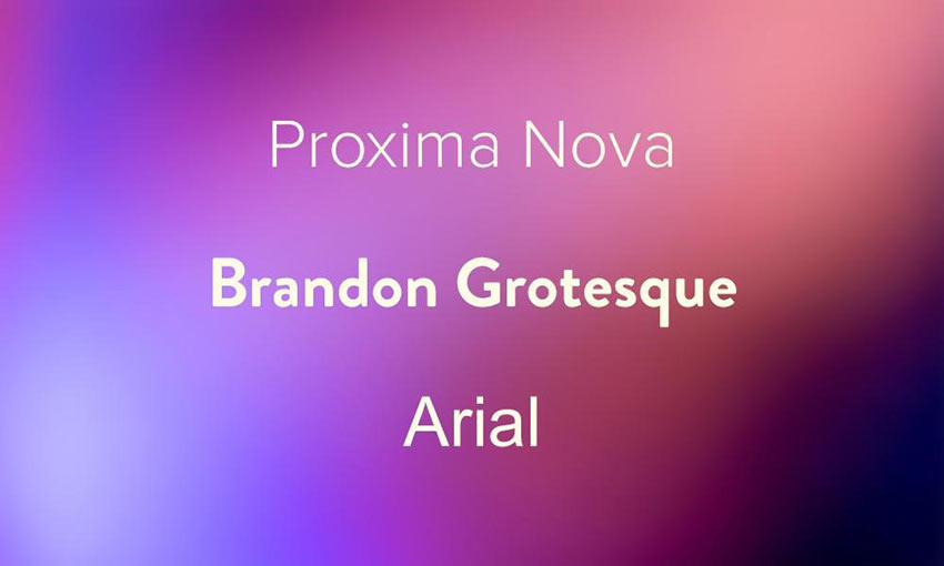
Throughout history sans-serifs were rejected in favor of their more elegant cousins, but the bold and legible typeface is now used to represent modernity, simplicity, and efficiency.
Sans-serif fonts lack the small strokes at the end of letters, and as a result are more legible on screens and at smaller sizes. These fonts are a jack of all trades, and look great at any size and in any length of text. Use them when you’re shooting for a modern or minimalist vibe.
Grotesque: The earliest sans-serifs, these fonts are simple and bold, often with a square shape to them.
Neo-Grotesque: Neo-Grotesques less resemble early serifs, with a more minimalistic style.
Geometric: Composed of simple shapes like circles and squares, these have an appealing simplicity but are a little less legible in body type.
Humanist: Inspired by calligraphy and old-style serifs, humanist fonts are unique with highly varied line widths.
Script

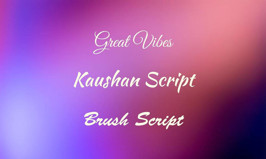
Script fonts are defined by their handwritten, cursive- or calligraphy-like style. They bring the elegance of serifs with a more authentic and beautiful design.
Unlike serifs, however, scripts aren’t made for legibility. They shouldn’t be used as body text or passages longer than a paragraph or two. They look great as headers, logos, or short quotes. If you need something a little more unique, try a script font.
Due to its unique nature, this typeface is hard to classify, but there are a few distinctive categories.
Formal: Inspired by handwriting from the 1600s-1800s, formal scripts often have large, dramatic loops and antiquated styling, and appear to be drawn with a quill or pen.
Casual: Casual scripts are just as beautiful but less formal, looking more like fancy modern handwriting. Often, they look as if drawn with brush strokes.
Decorative/Display

The last font type, and the hardest to pin down, is decorative/display typefaces. These fonts are the most unique and come in any kind of style you can think of, from graffiti to abstract to three-dimensional font types.
You may be able to get away with using a script font in a paragraph if you’re feeling adventurous, but decorative fonts belong only in single sentences and as header text. They’re designed for style, not legibility.
There’s also symbol fonts, which display letters as various ornaments like faces or objects. This can have some use as decoration.
Display and decorative fonts are optimized for use at very large sizes. Use them anywhere but your body text.
Create Better Font Palettes
Now that you know how to use every type of font, it’s time to put together a font palette for your design project. Most websites use two or three main typefaces, a header and body font.
Remember to use the rule of contrasts. You could use a script header font and match it with an elegant serif, or serif body text with an eye-catching sans-serif title. You could even try two of the same types of fonts, but pick a bolder display typeface and contrast it with a clean body font.
Your choices are unlimited, so experiment with various flavors of fonts and see what happens.

Leave a Reply
Want to join the discussion?Feel free to contribute!