Collective #416

Original Source: http://feedproxy.google.com/~r/tympanus/~3/FG5PVrVKyE8/

C416_WOTW

Inspirational Website of the Week: Hypergiant

An awesome retro design with a great flow and nice details. Our pick this week.

Get inspired

C416_mobilitymodernization

Our Sponsor
Want Enterprise Mobile Auth Simplified?

With 5 minutes and a few bits of config, you can build an app connected to OpenID, Active Directory, OAuth2 or SAML.

Learn more

C416_customprop

A Strategy Guide To CSS Custom Properties

A fantastic guide for getting the most out of CSS Custom Properties by Michael Riethmuller.

Read it

C416_cereal

Working Type

A case study that shows how a new typeface was introduced to Airbnb’s UI.

Read it

C416_yourown

Build your own X

A repo that collects all kinds of “build your own” tutorials. By Daniel Stefanovic.

Check it out

C416_lash

Free Font: Lash

Mehmet Reha Tugcu designed this display font with a distressed look.

Get it

C416_language

12 Languages Icon Set

A lovely set of language character vector icons designed by Max Panchyk.

Get it

C416_crypto

Crypto App iOS UI Kit

A crypto currency management app UI kit designed by Kishore.

Get it

C416_screely

Screely

Screely instantly turns your screenshot or design into a beautiful image.

Check it out

C416_smarthome

Visualizing Your Smart Home Data with the Web of Things

James Hobin shows how to do a great mashup app for visualizing smart home data.

Read it

C416_reactcomp

Building Reusable React Components

How to build reusable components in React along with some of the best practices to follow.

Read it

C416_thermo

Smart Home Temperature Slider

A thermometer concept for a smart home by Chris Gannon.

Check it out

C416_bash

Safe ways to do things in bash

Some valuable advice on how to do things safely in bash and avoid common pitfalls.

Read it

C416_resptables

Responsive tables, revisited

Lea Verou explores text-shadow and element() for responsive tables without duplicating content.

Read it

C416_pattern

Wallpaper Generator

A tileable pattern generator with different options made by Tim Severien.

Check it out

C416_backdrop

The backdrop-filter CSS property

Robin Rendle takes a look at the magical backdrop-filter property and shows what can be done with it.

Read it

C416_EasyToggle

Easy Toggle State

A tiny JavaScript library to easily toggle the state of any HTML element and its targets.

Check it out

C416_dumbreact

Dumb React

Dumb React is a collection of React components used to create a static (dumb) website screen. By Brad Frost.

Check it out

C416_backward

The Slow Death of Internet Explorer and the Future of Progressive Enhancement

An article by Oliver Williams where he argues that we shouldn’t break the backward compatibility of the web.

Check it out

C416_Rotcircles

Rotating Circles with Canvas2D

Yoichi Kobayashi created this nice canvas demo.

Check it out

C416_vuetemplate

Compile Vue.js templates on the Fly with v-runtime-template

Alex Jover Morales introduces v-runtime-template, a Vue component that makes it easy to compile and interpret a Vue.js template at runtime by using a v-html-like API.

Read it

C416_boilerplate

Naperg

A boilerplate for a fullstack GraphQL app with React and Prisma including authentication.

Get it

C416_abster

Free Font: Abster

A great looking minimal font designed by Rachel Manch.

Read it

Collective #416 was written by Pedro Botelho and published on Codrops.

5 Steps to Installing WordPress with LEMP on Alibaba Cloud

Original Source: https://www.sitepoint.com/5-steps-to-installing-wordpress-with-lemp-on-alibaba-cloud/

This article was created in partnership with Alibaba Cloud. Thank you for supporting the partners who make SitePoint possible.

WordPress is one of the most popular content management systems (CMS) in the market, owing to the fact that it is completely free to use and extremely versatile. Typically, you would deploy WordPress on a LAMP stack, regardless of the type of website, as WordPress is based on MySQL and PHP.

In this article however, we will discover how to deploy a WordPress website on a LEMP stack. We have chosen NGINX as our web server instead of the more popular Apache because it is much faster, more scalable and secure for a single site.

By completing the steps in this article, you should expect a fresh WordPress site running on an Alibaba Cloud Elastic Compute Service (ECS) instance, running a highly performant LEMP Stack.

This article assumes that you already have an account on Alibaba Cloud. If you don't have one yet, just sign up and enjoy the $300 new user free credit.

Step 1: Provision and Secure an Ubuntu 16.04 Server

In the first step, we will create an Alibaba Cloud ECS instance running Ubuntu 16.04. This step is pretty straightforward, it mostly involves purchasing an ECS instance from the Alibaba Cloud console, selecting your preferred configurations, and running some Linux commands.

However, to improve security, we will also be securing the server by creating a superuser and disabling root login. We will then configure the Ubuntu UFW (Uncomplicated FireWall) on the server.

Read the detailed steps here.

This provides a versatile foundation upon which we will complete our LEMP stack, which we will do in the next step.

Step 2: Completing the LEMP Stack

In this step, we will complete a modern LEMP stack for our WordPress website. Specifically, we will be setting up our LEMP stack with a highly-performant combination of NGINX, MariaDB, and PHP7. This setup is widely regarded as the optimum foundation for a modern WordPress site.

Read the detailed steps here.

At present, we can only visit our site by entering the server IP address in a web browser, so we will fix that in the next step by configuring a domain name to serve our site, and securing everything with an SSL certificate. After that, we will move on to installing WordPress on our LEMP stack.

Step 3: Configuring a Domain and Let's Encrypt SSL

In the third step, we will run through Domain Management for our site, adding DNS records, and installing a Let’s Encrypt SSL certificate. In the previous two steps, we provisioned and secured our Ubuntu 16.04 server installation, and then completed the LEMP stack with NGINX, MariaDB, and PHP7. However, we will need to configure a domain to make our server publicly accessible. Additionally, we will secure our WordPress site with an SSL certificate so it can only be accessed via HTTPS.

Read the detailed steps here.

Your ECS instance should now have a secured and highly performant LEMP stack installed, with a domain configured, and a secure SSL certificate protecting visitors' information.

Step 4: Installing WordPress on Your Alibaba Cloud ECS Instance

In the fourth step, we will be installing WordPress via both by using wget/curl and the WordPress Command Line (WP-CLI). This is where you have a decision to make, as this tutorial is going to show you two different ways to install WordPress.

Continue reading %5 Steps to Installing WordPress with LEMP on Alibaba Cloud%

10 Sleek Apple-Style Code Projects From CodePen

Original Source: http://feedproxy.google.com/~r/1stwebdesigner/~3/v91bae7rM8Y/

Apple is well-known for their incredible design prowess and easy-to-use products. Their technology is a designer’s best friend, so it’s no surprise that we often follow in their footsteps.

It’s also why you can find so many re-creations of Apple’s style on the web. Use the code snippets in this collection for both inspiration and to further your learning.

Menu Redesign

See the Pen Apple menu redesign by Daniel Gooß (@daniel_gooss) on CodePen.

The Apple.com menu is well known by even the youngest web designers. It’s been around for years and has always had such a unique style.

This snippet takes the Apple navigation menu and restyles it using CSS3.

The design is mostly the same, but it includes some different hover features and a custom search menu. But since this is a demo, the links don’t actually work. You’d have to do some editing on this one to make it fully functional.

Messages Waiting Animation

See the Pen Apple Messages “Waiting” Animation by Maxwell Antonucci (@max1128) on CodePen.

Anyone who’s used the Apple messaging app should be familiar with the speech bubble icon. It pops up whenever someone is typing and it’s got a pretty slick animation.

Developer Maxwell Antonucci rebuilt this animation in full with just pure HTML and CSS. You can see the final result in this pen.

Note that this does use Pug for HTML compiling and Sass instead of CSS. But you can always compile down if you can’t read those frameworks.

Either way, this is a brilliant snippet for learning how to design animated graphics using CSS.

Apple-Style Mobile Menu

See the Pen Apple style mobile menu by Andy Leverenz (@justalever) on CodePen.

Beyond the main desktop navigation is Apple’s mobile responsive menu.

This uses the typical hamburger icon and it’s found on most all devices. If you want to re-create this in HTML5, have a look at this free snippet written by Andy Leverenz.

If you click the hamburger icon you get a neat little animation effect, plus the menu actually slides down onto the page. How cool is that!

iOS iMessage in HTML5

See the Pen iOS9 iMessage Responsive HTML5 by Jojo Jonah old (@jojojonahold) on CodePen.

Earlier I mentioned the speech bubble animation from Apple’s messenger app. But with this snippet you can actually build the entire iMessage mobile app using HTML5 and some raw JavaScript.

All of the JS code runs on jQuery – so it’s super easy to edit. Not to mention that the final demo is so darn sleek and really does feel like the real iMessage app.

While I can’t imagine that this would be useful outside of a practice project, it’s still fun to play with.

MacOS + Browser

See the Pen MacOS + Browser by Liam (@Lierrmm) on CodePen.

Speaking of fun practice projects: get a load of this one replicating a full MacOS dashboard in your browser.

You can hover the dock icons to get that traditional Apple animation, or even click the Chrome app icon to open up a mock browser window.

And somehow this pen only uses 55 lines of JavaScript to get it all working.

This is definitely a sweet project that you’ll really appreciate in full view.

Apple Watch Radial Chart

See the Pen Apple Watch Radial Chart by Mark (@xna2) on CodePen.

Apple’s smartwatch broke new ground in the tech space. It also created a whole new interface for consumers to learn.

If you like the Apple Watch animations, then have a look at this snippet on CodePen. It features a custom animated watch face with the radial chart design.

These are fairly common features with many Watch apps, but you never see them in the browser. Well, until now.

Apple Style Toggle

See the Pen Apple Style Toggle by Adrien Bachmann (@AdrienBachmann) on CodePen.

Ah, the classic on/off switch. This first gained popularity thanks to iOS and it really stuck around thanks to Apple’s original design.

In this pen by Adrien Bachmann, you’ll find a basic switch design with HTML/CSS code. It runs completely free of any JavaScript, which is a huge accomplishment by itself.

Not to mention that this snippet is clean and truly does match the Apple-style of animation. You can change the size, color and animation style with ease.

It’s a brilliant way to bring some Apple design into your own web project.

Pure CSS Apple Keyboard

See the Pen Re: Apple Keyboard in pure CSS. by Joey Anuff (@januff) on CodePen.

While this snippet may not be as useful on a real website, it’s certainly a fun project to study.

Developer Joey Anuff created a full CSS-only keyboard modeled after the Apple keyboard.

It does use some JavaScript to support click events dynamically. So you could delete the JS and still have the exact same keyboard in your browser.

This was designed as part of a CSS coding challenge and I have to say that Joey hit this one out of the park.

Search Boxes

See the Pen Search Box inspired by apple by M. Mulia Maulana (@molenmaulana) on CodePen.

We’ve all seen the Apple search box on their main website and in the mobile App Store. It’s got a common theme with rounded corners and a single magnifying glass icon.

This snippet on CodePen recreated the Apple search bar in full.

You’ll notice that there’s actually a couple variations here: a light one and a dark one. These stand out on their own and you can use them to blend into practically any website.

History of Apple.com’s Navbar

See the Pen The History of Apple.com’s Nav Bar in CSS by DBM (@dbm) on CodePen.

This last one is quite a doozy and a fun trip down memory lane.

Take a look at this pen and scroll through some of the designs. You’ll find a huge compilation of every Apple navigation menu dating back to the late 90s.

So many designs, so many crazy gradients. All from one tech company that has left quite a mark on the design space.


9 A11y Tips for Global Accessibility Awareness Day

Original Source: https://www.webdesignerdepot.com/2018/05/9-a11y-tips-for-global-accessibility-awareness-day/

The 17th May 2018 is Global Accessibility Awareness day, which makes today the ideal time to consider how inclusive our experiences are for those users who may be disabled, differently-abled, or temporarily inconvenienced.

2017 was a big year for website accessibility lawsuits. Seyfarth and Shaw reported that, by year’s end, there were 814 ADA Title III federal lawsuits filed against websites in the United States alone. Perhaps the most well-known of these cases was Juan Carlos Gil v. Winn-Dixie Stores, Inc.

The blind plaintiff, Mr Gil, alleged that certain parts of the website essential to the shopping experience (like the store locator tool and coupon generator) could not be accessed by his JAWS screen reader. The reason why this case made such waves in the news is: one, because it was the first of its kind to go to federal court; and, two, because Winn-Dixie lost the case (as well as a lot of money and part of its reputation in the process).

While Mr. Gil wasn’t trying to purchase anything from the Winn-Dixie site, per se, this does still bring up an important question about what types of businesses are required by law to make their sites accessible.

So, let’s explore what it means to have an accessible website and which kinds of websites should take heed. Later, we’ll look at 9 recommendations posed by the Website Accessibility Initiative on how to ensure your site abides by the rules of accessibility.

What is Website Accessibility?

Website accessibility isn’t a difficult concept to understand. It simply means that a website is equipped to deliver an experience to all users, regardless of any disability or impairment they might have. And it’s not just about being able to see, read, or understand the content either; users need to be able to navigate through websites and complete transactions just like everyone else.

You may be surprised by the kinds of impairments that are affected by a lack of accessibility. Here are some of the broader categories:

Visual
Auditory
Cognitive
Physical (think of someone with a broken arm or hand)
Geographic (for instance, users living in areas with limited bandwidth)

Website accessibility aims to address any limitations that may prevent the general public from being able to use a website that was explicitly built for public consumption.

Who Should Abide by Website Accessibility Rules?

The Winn-Dixie lawsuit was a big deal. It demonstrated that you don’t have to explicitly sell any goods or services online in order to be required by law to provide a fully accessible experience to all users. What ultimately matters is whether or not a website falls under the category of providing “public accommodation” as defined by the Americans with Disabilities Act.

In the case of Winn-Dixie, the judge ruled against the grocery store chain because the lack of website accessibility consequently affected the in-store experience. But that’s not always the case.

In another case from the United States, Andrews v. Blick Art Materials, LLC, Blick attempted to argue that, because it only sold art supplies online, that it did not technically fall under the “place of public accommodation” rule defined by the ADA. The judge, however, threw out their argument with the understanding that any business that deals with the public—either in person or online—should be held accountable for providing an accessible website.

If you’re designing websites for businesses or individuals that intend on offering a service or selling a product to the public, then website accessibility needs to be a part of your workflow starting now.

That said, it’s important to note that this will likely be a more common request you receive from clients based in the United States. While there are other countries where web accessibility laws have been established, most of them pertain to government and other public sector websites. While we wait for these laws to be revamped to account for more stringent web accessibility laws, it might still be a good idea to adopt the following tips into your workflow.

Design and Development Tips for Website Accessibility

Below, you will find web design and development tips from W3C and the Website Accessibility Initiative (WAI) on how to build websites that better accommodate impaired users.

1. Use Proper Tagging

Using header tags in text is helpful for a number of reasons. For one, the visual hierarchy of enlarged and stylized text makes it easier to understand content. But it also serves an important purpose in accessibility as the title tag and subsequent header tags of a page inform impaired individuals when they arrive at key points.

2. Write Descriptive Code

Some users rely on markup to figure out what is on the screen. So you will need to use markup that provides some context for what they’re seeing on screen. This should include things like the language attribute.

3. Be Careful with Color

Pay attention to color choice as well, especially as it pertains to text. When there’s a lower contrast between the text and background–usually with lighter fonts against white backgrounds or daker fonts with dark backgrounds—it can be too difficult for users to read.

Rely on strong indicators like underlining, animation on hover, large call-to-action buttons, and high contrast text.

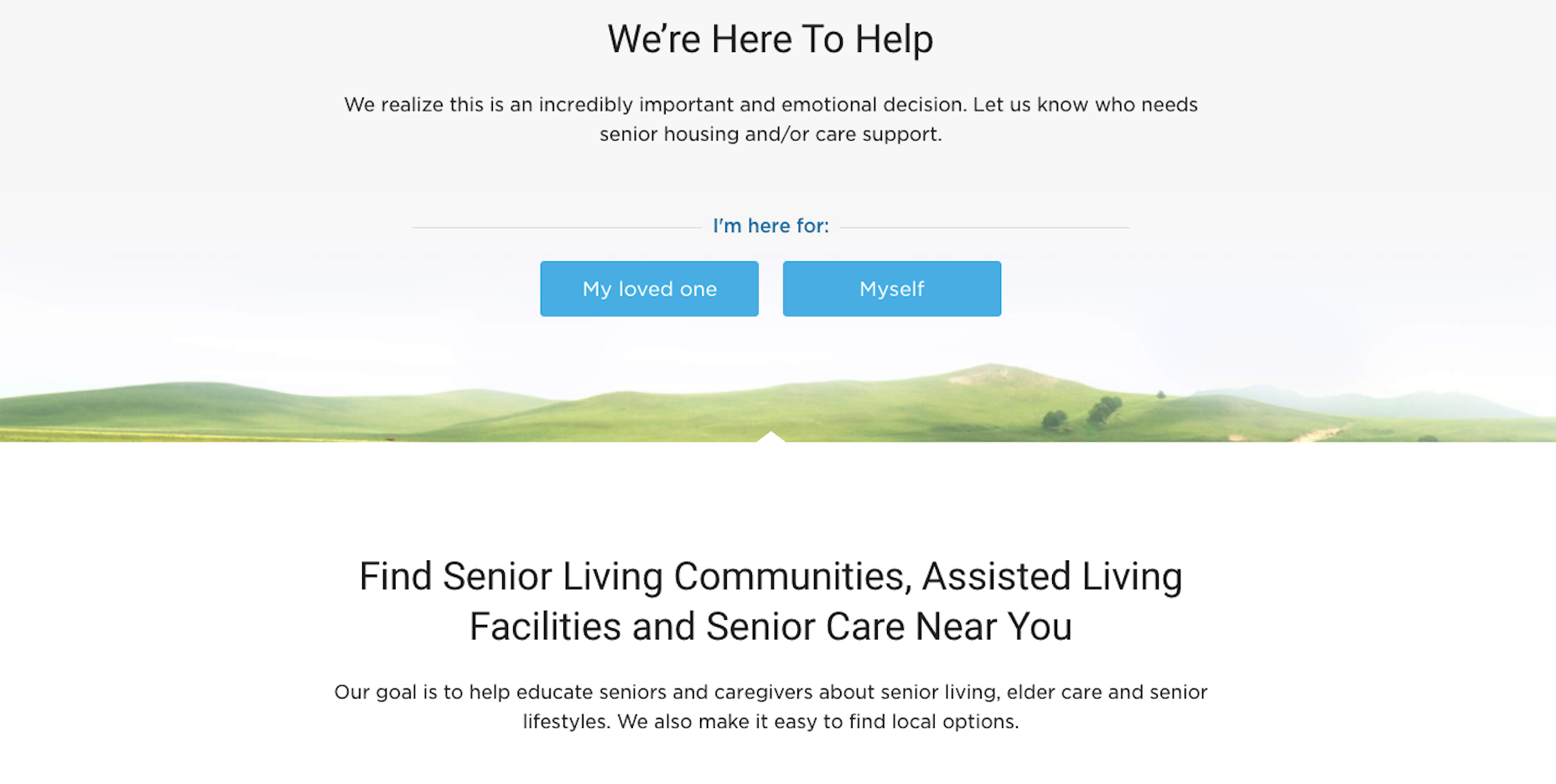
The Senior Living website does a great job with high-contrast text (and also large text).

4. Use Big Text

Use a font size that can be reasonably read from any and all devices or screen sizes. Beyond that, you may also want to integrate with a tool that enables users to increase the font size if it isn’t large enough for their needs.

5. Make It Keyboard Accessible

Some visitors will access your site using a keyboard.

If interactive elements (like the menu) are not tabbable or keyboard accessible, you’re going to have serious problems.

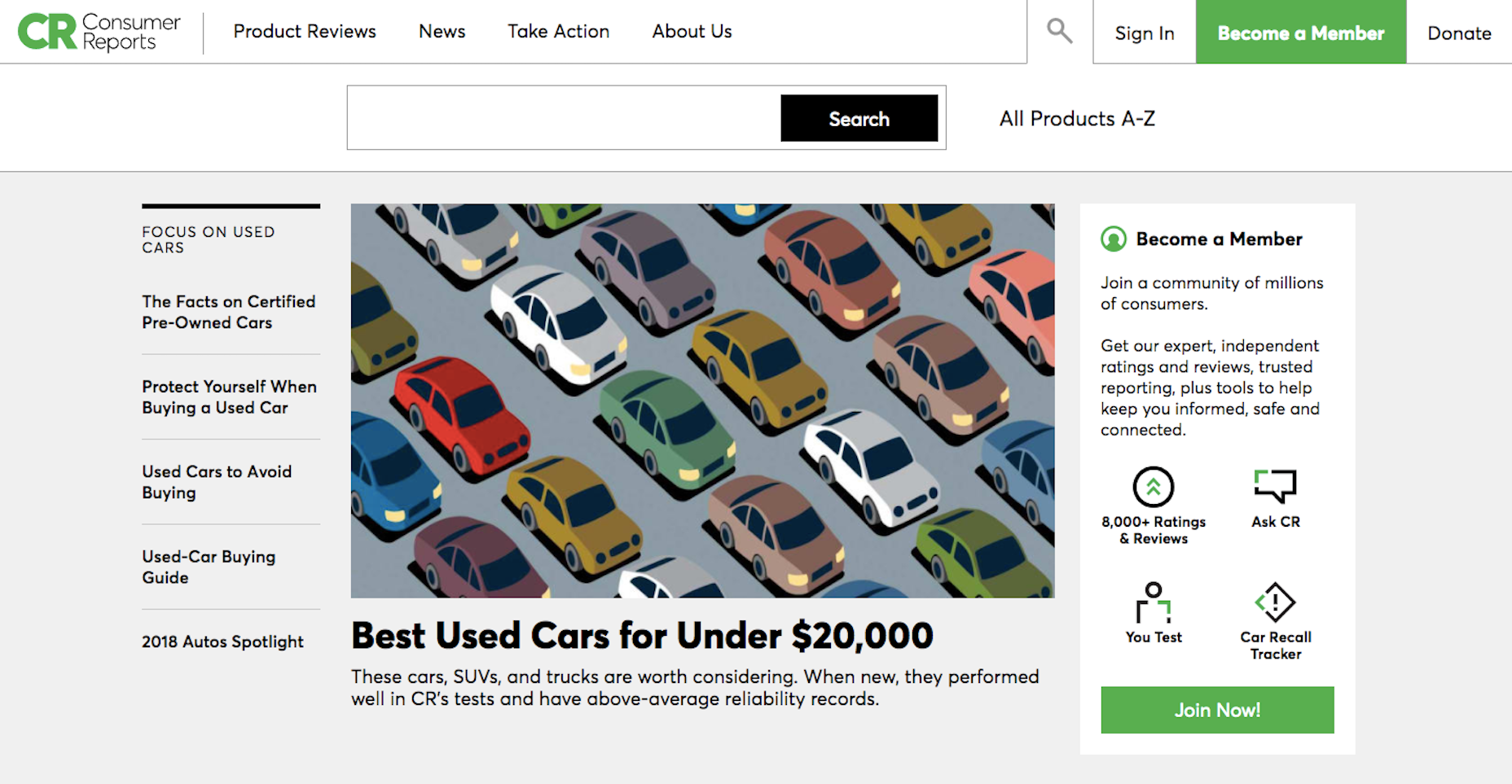
The Consumer Reports site is tab accessible.

6. Create Ultra Clear Forms

Contact forms are an important element in websites.

Without them, you would have to rely on in-person or telephonic conversions (which just isn’t going to fly with a modern audience). So, pay extra special attention to these. Here are some tips:

Provide instructions on how to fill out the form.
Include descriptive and clear labels for each field.
Make form fields tabbable in the order in which they appear.
Use big, bold error messages with exclamation points, shading, or warning symbols, to indicate problems to your users.
Do not use CAPTCHA.

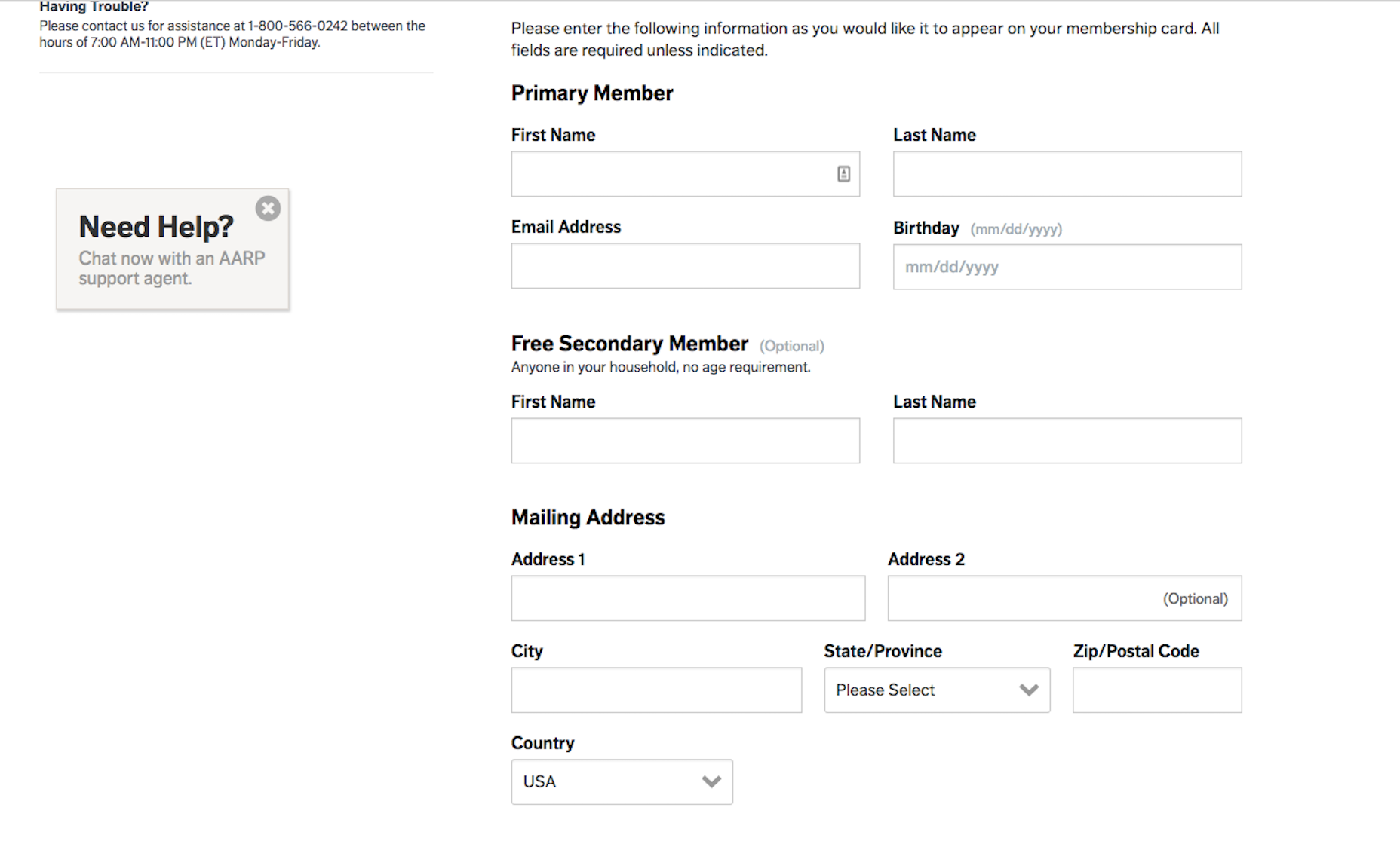
The AARP website has a well-labeled and easy to populate contact form.

7. Add Supportive Text

In order to ensure that everyone can consume your visual content, add supportive text.

For images, use alt-text that describes the photo as well as captions.
For videos, add a transcript below or active captions within it.
For podcasts and other audio, include a corresponding transcript.

Also, be sure to give users control over any of this media that auto-plays, including video, audio clips, and image sliders.

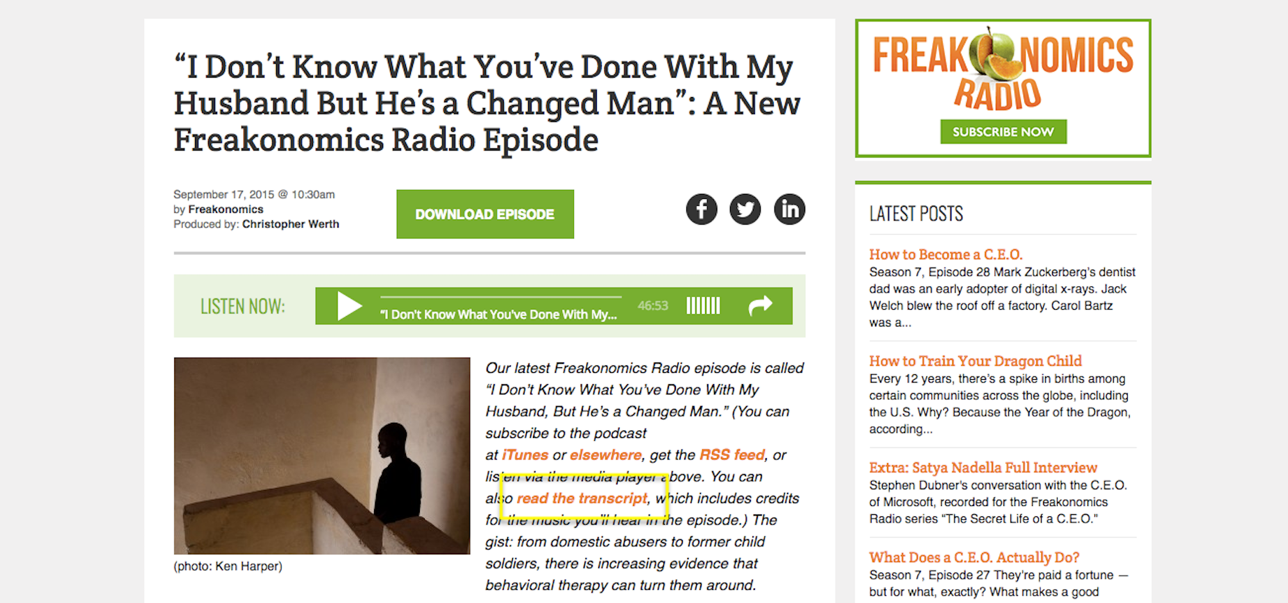
Freakonomics includes transcripts of each of its podcasts.

8. Use Abundant White Space

It may be difficult for some disabled individuals to focus on what’s most important if pages are cluttered. Use abundant white space to frame the most important parts of your site while also providing enough breathing room for them to comfortably view your content.

9. Include Orientation Cues

Another way in which you can guide users through a site is by including orientation cues. Of course, navigation is an important part of this.

You can also add breadcrumbs as well as strong UI elements that draw users down through the page. If all else fails, add a search bar to the top so they can instantly look for what they need.

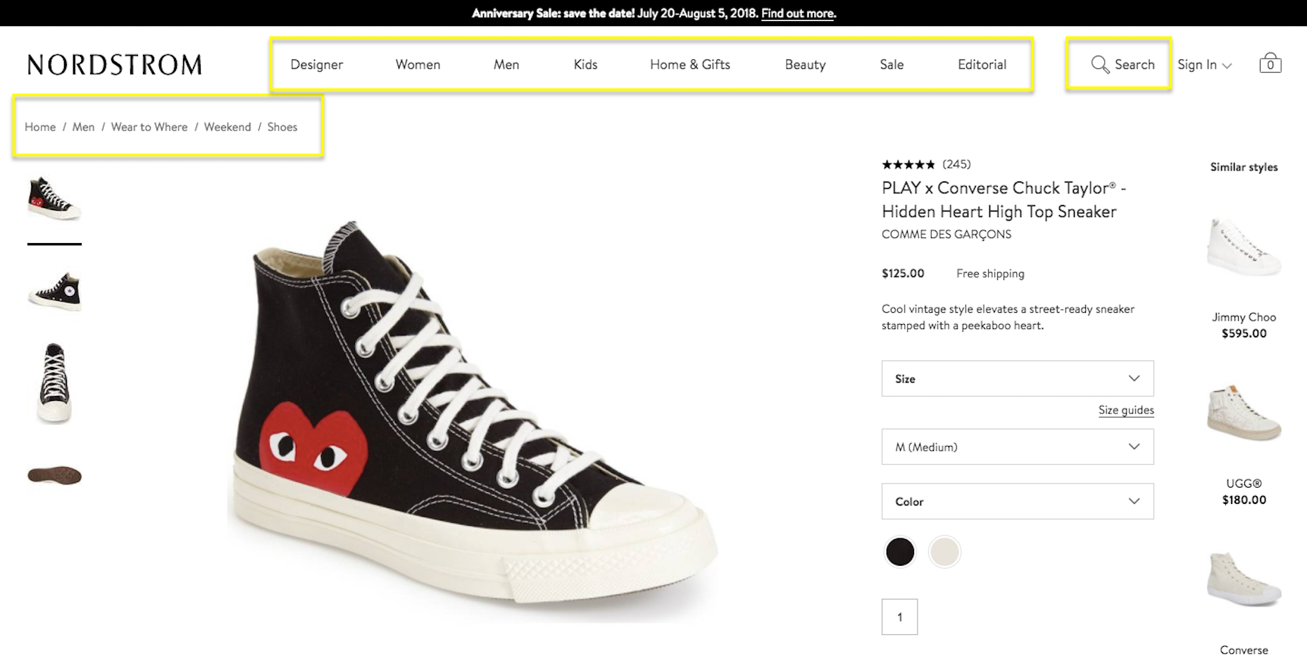
Nordstrom uses abundant navigational cues.

Wrapping Up

All in all, I would say that enabling a site for website accessibility is beneficial for all parties. Your site’s ability to deliver a consistently high-quality experience for all users will lead to higher times on page, lower bounce rates, and, ideally, greater conversion rates. This, in turn, will give your site a more favorable ranking in search… and who doesn’t want that?

Add Realistic Chalk and Sketch Lettering Effects with Sketch’it – only $5!

Source

p img {display:inline-block; margin-right:10px;}
.alignleft {float:left;}
p.showcase {clear:both;}
body#browserfriendly p, body#podcast p, div#emailbody p{margin:0;}

Take Control of WordPress with New Elementor Pro 2.0

Original Source: https://www.webdesignerdepot.com/2018/05/take-control-of-wordpress-with-new-elementor-pro-2-0/

Elementor 2.0 is an innovative approach to site building in WordPress that lets you customize any part of your site, with absolutely zero coding knowledge.

A plugin rather than a theme, this flexible approach means that you can use Elementor 2.0 to manage your site design, and unlike some WordPress site builders, you won’t be tied to a particular theme; Elementor 2.0 works with almost any WordPress theme from any vendor, as well as custom themes.

Build everything on your WordPress site exactly as you want it, without having to switch themes to find the right functionality, or pay a developer’s fees to personalize your template.

A Comprehensive Site Builder

There are dozens of different theme builders that will allow you to change the layout of your static content, but they nearly all tie you to fundamental elements of the theme, such as the header, or footer. Elementor 2.0 is designed to free you from that restriction by enabling the customization of those hard-to-change elements such as your header.

Using intuitive tools that enable you to build your site in a familiar WYSIWYG style, Elementor 2.0 is one of the simplest ways to make these changes, all the while confident that the code underpinning your design is robust and properly implemented.

All of this functionality was available before, but reserved for those coders who knew how to drill into the WordPress codebase. Elementor 2.0 puts the power to customize your site in your hands.

Intuitive Workflow

Elementor 2.0 has been crafted for speed. To make changes, simply install the plugin and you’ll find the Elementor option added to your dashboard menu, and you can now create new templates at will. Everything works instantly, giving you control of your site in a few clicks.

To speed up the editing process Elementor 2.0 features theme element widgets, such as an author box, a site logo, or a featured image; these and other elements can be combined to rapidly develop real-world WordPress solutions. To build templates, either start with one of the pre-designed options and customize it to suit your site, or build entirely from scratch.

All of Elementor 2.0’s code is fully responsive, meaning that you can create a design and be confident that it will look exactly as you intend on any device. You can even create premium features like a sticky header—an essential component of modern UX—so that your menu will follow users up and down the screen as they scroll.

To see your design live, all you have to do it click the ‘publish’ button and choose the conditions under which your new element should appear.

Conditional Elements

One of the features of Elementor 2.0 that we like the most is the conditional option: Once you’ve finished designing an element for your site, you can choose the conditions under which it will be displayed.

Let’s say for example that you want to design two headers: one for your main site, and one for your blog; Elementor 2.0 allows you to create them both and set them so that they will appear on the right pages; even when you’re creating repetitive UI elements you can apply them intelligently.

Create different footers for your site and blog, or a unique footer for your contact page, or even different designs for personal blog posts and professional blog posts. The biggest benefit to conditional elements is that you retain control of what elements appear when.

Design Dynamic Content

Many pages on your site, your home page for example, are static pages. Your blog posts however—the part of your site that WordPress really excels at creating—are dynamic. Dynamic pages pull content in from your database, so you can’t always be sure what that content will be.

The challenge this creates is that while static pages can easily be previewed in your WordPress dashboard, dynamic pages cannot, and each dynamic post could significantly affect your design. Elementor 2.0 solves this issue with an innovative preview option that really should be built into the WordPress core: With Elementor 2.0 you can choose which post content to preview a page with, giving you an unprecedented overview of your design right in the dashboard.

As well as elegantly handling static pages and dynamic posts, Elementor 2.0 allows you to create archives like category pages and search results, even a custom 404 error page; all the control you need to manage a modern WordPress site.

Conclusion

You shouldn’t have to choose between the freedom to switch themes and the ability to modify your site; with Elementor 2.0 you don’t have to.

Fresh to the market, Elementor 2.0 is a significant advancement in the control WordPress developers have, enabling them to edit almost any theme with ease, and with absolutely zero coding knowledge.

Not only is Elementor 2.0 a boost to creativity, but it’s a boon to timetables too. Delivering site-wide changes in a fraction of the time it would take to hand-code them could give you the competitive edge you need.

With a unique visual approach to theme building, Elementor 2.0 opens up new possibilities for WordPress professionals.


[– This is a sponsored post on behalf of Elementor –]

Add Realistic Chalk and Sketch Lettering Effects with Sketch’it – only $5!

Source

p img {display:inline-block; margin-right:10px;}
.alignleft {float:left;}
p.showcase {clear:both;}
body#browserfriendly p, body#podcast p, div#emailbody p{margin:0;}

Not All Logo Dimensions Are Created Equal

Original Source: http://feedproxy.google.com/~r/Designrfix/~3/bYvLhRaIbME/logo-dimensions

The importance of logos to modern-day businesses cannot be emphasized enough. More and more content is being viewed on smartphones, and often the very first thing a customer knows about our business is what they understand from your logo. That’s why it’s so important to make sure that your logo dimensions are appropriate and visually attractive […]

The post Not All Logo Dimensions Are Created Equal appeared first on designrfix.com.

The Top 10 Best Typography Logos

Original Source: http://feedproxy.google.com/~r/Designrfix/~3/ylbFrgFgus8/typography-logos

Of all the decisions you need to make when starting a business, designing your logo is the one you need to get right. Your logo is your first impression, and we all know the importance of those. Choosing the brightest or the busiest may seem like a good idea initially, but study after study has […]

The post The Top 10 Best Typography Logos appeared first on designrfix.com.

Join Glug's club for great creative deals

Original Source: http://feedproxy.google.com/~r/CreativeBloq/~3/mTTNMaVbP7Y/join-glugs-club-for-great-creative-deals

Everyone likes a good deal, and if you're after some great deals that can help you in your design career then there's a new free platform that can sort you right out.

6 sure-fire ways to build your creative network

Glug Club is a brand new initiative from Glug, one of the most popular creative events around. It started out as a handful of friends talking shop and showing off their work in an East London pub in 2007, and since then has grown into an international movement with events all round the world and talks from some of the biggest names in the business.

With over 40,000 global members, Glug has found itself in the perfect position to negotiate a stack of killer deals with 45 industry-leading suppliers. Glug Club has been specially curated so that there's something for everyone from young creatives to industry veterans, and members can unlock exclusive offers and perks that they might not be able to access as individuals.

"We've curated the list of products and services based on the experience of a select group of Glug Ambassadors," explains Glug's Malin Persson. "They know what's worked and what hasn't, so we can pass these insights down to the next generation of agency owners and young creatives."

Membership of Glug Club is free, and since its announcement last week, it's already attracted another 3,000 members keen to take advantage of its benefits. And with a who's who of top companies involved, including Adobe, Getty Images, Pantone, Slack, Fontsmith and Microsoft, it's easy to see why.

Glug has been organising informal talks and ‘notworking’ events since 2007

"We've been working on Glug Club for some time, trying to negotiate a range of great deals for our community,"  says Glug founder and CEO Ian Hambleton. "With over 40,000 global members, we're now able to push brands to give our community better rates and services."

Hambleton expects that as Glug Club grows, the range of services and offers it's able to share with its members will grow with it. "Glug Club embodies everything we've tried to build with Glug," he continues. "To help young creatives on their career journey and provide them with useful tips and tools to get ahead. In this case, it's not a speaker talk at an event, but rather an amazing list of tools they should use to get ahead."

Want to get involved and give your career a free helping hand? Head over to the Glug Club sign-up page today.

Read more:

How to network successfully: 19 pro tipsThe essential guide to tools for designersThe best laptop deals for May 2018

Grid Layout with Motion Hover Effect and Content Preview

Original Source: http://feedproxy.google.com/~r/tympanus/~3/_7neVZ70Fl8/

Today we’d like to share a little grid layout with you. We use CSS Grid and a playful hover effect on the grid items which are composed of different wildly placed elements. When an item is clicked, we slide in a content preview overlay and animate the grid items out and the preview items in. For the animations we use TweenMax by Greensock.

GridLayoutMotion_featured

The demo is kindly sponsored by monday.com: Get your team on the same playbook!. If you would like to sponsor one of our demos, find out more here.

Attention: We’ve made this layout with modern browsers in mind.

Here’s how the grid looks like:

GridLayoutMotion_grid

The content preview overlay looks like this:

GridLayoutMotion_preview

We hope you enjoy this little layout and find it useful!

References and Credits

TweenMax by Greensock
Images from Unsplash.com
imagesLoaded by Dave DeSandro
Cross icon designed by Freepik

Grid Layout with Motion Hover Effect and Content Preview was written by Mary Lou and published on Codrops.

Turn Conventional Web Forms Into Conversations with This Script

Original Source: https://www.hongkiat.com/blog/turn-web-forms-into-conversations/

If you’ve ever wanted to humanize your web forms then you’ll adore the Conversational Form script created by SPACE10. This script automatically converts all your input fields into Q&A…

Visit hongkiat.com for full content.