Original Source: https://www.smashingmagazine.com/2018/08/1000-smashing-members/
We Are Just Getting Started: 1,000 Smashing Members
We Are Just Getting Started: 1,000 Smashing Members
Vitaly Friedman
2018-08-03T13:50:31+02:00
2018-08-06T08:19:27+00:00
We’ve all been there: bringing a new product to the market is a tough nut to crack. It requires patience, commitment, and a bit of healthy stubbornness. That’s the exact attitude we started off with when we launched our shiny new Smashing Membership last October — a friendly and respectful community that keeps this website alive, along with books, webinars, discounts, networking, and a seasoned selection of fancy cats.
Thanks to the generous support of Smashing Members, we’re incredibly honored to have crossed the 1,000 members mark today. This is a very important day for us, and frankly, it’s quite flattering to see 1,000 people actively supporting our little site and sharing our goals. In fact, with Membership, sometimes it feels like walking around a small town in which everyone knows each other and their friends, and so we know many members by name, and we’ve also met some of them at Smashing Conferences. It’s a wonderful family that shares similar values and wants to get better at their work. But it’s also a family that wants to bring along a shift in the industry.
The People Behind The Scenes
When looking at obscure avatars and nicknames appearing in remote corners of the web, it’s easy to forget that there are actually real people behind them. That’s why it was important for us that the Membership experience is focused around real names and real faces of the community members — both on the new Smashing Magazine website and in our Membership Slack channel. It’s the people who shape the community and make it feel like home, and so Membership should become a humane product, with approachable and friendly authors, contributors and attendees.
We reached out to a few members to ask them why out of all the wonderful resources on the web, they chose to support the red, cat-friendly, and quirky Smashing Magazine, and what they found useful or remarkably painful during their Membership so far.

Allen Brady
Allen is based in Knoxville, TN. He is passionate about building great experiences on the web for companies and their audiences. Currently he is learning to make the web more accessible with great HTML, CSS and inclusive design.
“I wanted to support Smashing Magazine as soon as they launched their membership program because not only have they been an excellent resource over the years with all the fantastic articles, books and conferences, but also because they’re so great at amplifying the voices in this industry, which is really important. I know that with my membership I’m getting a diverse range of perspectives that’s really helped shape me into a better developer.
The best part about this membership is the community. There’s a fantastic Slack group where you can talk about your projects, ask for help or just chat about whatever. The webinars have also been great. My favorite part is that we get to chat with the hosts and each other during the live recording. Involving the community in everything they can seems to be a theme with Smashing Magazine. It sets them apart from other resources out there and I love it.”

Verena Vertonghen
Verena’s journey in the development world started 6 years ago. She studied Multimedia Technology with a specialisation in Web&UX in Antwerp.
“Now I’m a front-end developer who also picks up some design challenges from time to time. I love creating all sorts of things and going on walks with my dogs. Because Smashing Magazine has been an invaluable learning resource for me throughout my studies and my career. I decided on membership to support the continuation of all the great work that Smashing Magazine already offers. But also because you get even more goodies when you do.
Some of the things I really like about it are the eBooks, previews to articles, webinars and the Slack channel that gives me the opportunity to connect with people that have a similar profile. The user experience is overall really great, and SmashingMag cat mascot gives a very playful and personal vibe!”

Emily Serven
Emily is a recent college graduate and new member of the workforce. In her spare time, she like practicing photography, listening to foreign music, and occasionally playing Overwatch.
“I remember checking SmashingMag regularly as far back as middle school and have always loved the quality and steady quantity of content. I know I can trust the quality of writing on Smashing (especially considering there’s so much content and noise from other places to sift through nowadays)!
I’m also a cat person, for sure. I’ve found the available resources to be really useful (eBook library and book discounts), and I can’t wait for the printed magazine to come out. That’s the other thing about Smashing; even though the medium in which I express my work as a web dev is primarily digital, Smashing still recognizes the value of well-produced and attractive physical media. I love getting the physical books for that reason.
Oh, another thing. I used to freelance more back in middle school until I got my full-time position recently. When I found Smashing for the first time, I really loved how it really ‘got’ me and my job. There was coding, but also design (Photoshop, UX, etc.) and freelance articles specifically. It all felt very well balanced. I think that helped me develop my dev skills and the other auxiliary talents in a way that led to my holistic view of dev nowadays, too.

Arthur Leonov
Arthur is a product designer that also codes front-end. He is a firm believer that merging design and technology can solve even the most difficult problems.
“I’m a designer that codes front-end. What a combo, right? I also believe that merging design and technology can solve even the most difficult problems in this world. The Smashing community keeps me inspired and informed day in and day out.
I catch up on SmashingMag every morning because it is one of the few online magazines in this industry who puts a lot of emphasis on good quality, relevant, and practical content.”
It might sound like an overstatement, but these people have already made a difference. They’ve helped us initiate projects that we wouldn’t be able to support otherwise. Now, don’t get me wrong: with dwindling ad revenues facing us, of course our aim was to earn enough with the help of the Membership to keep the magazine independent and self-funded. But that’s just one side of the story. Our aim was also to support design education and new voices in the industry; reward great people doing great work; foster open, diverse, inclusive and accessible initiatives. Last but not least, we wanted to help community events and projects, and the people behind them.
Did we achieve any of these goals with the money we’ve earned? I’m glad you asked.
So How Much Money Did We Earn? Total: $33,128
Initially, we were hoping to provide a larger financial support for new design/tech education initiatives and open-source projects, but with limited resources we had to be more realistic and pragmatic. We reached 1,013 Smashing Members in 257 days, with 30 supporters, 562 members, and 421 smashers. That makes a current total of $6,689 gross per month for August 2019.
Since the launch of the Membership, Smashing Members contributed a total of $33,128 net over the course of 10 months (including current month):
Month
Net revenue
Total
$33,128
November 2017
$1,104
December 2017
$1,530
January 2018
$2,130
February 2018
$2,181
March 2018
$2,748
April 2018
$4,015
May 2018
$4,440
June 2018
$4,750
July 2018
$4,990
August 2018
$5,240
It goes without saying that these kind contributions massively helped us cover monthly costs, from maintenance to honorarium for authors, in particular:
Honorarium for authors contributing articles and chapters for Smashing Magazine, our eBooks and printed books,
Honorarium for reviewers, editors, proofreaders, illustrator Ricardo Gimenes and front-end developer Ilya Pukhalski,
Honorarium for all webinar speakers,
All design education initiatives and community support is enabled by Smashing Membership,
All money was reinvested in the Magazine and Membership projects.
From day one, we kept things fully transparent; we’ve been sharing monthly reports on how much money we’ve earned and how we spent it. So here’s what happened since the launch of Membership last year.
Smashing TV: 24 Live Sessions
Each month, we are proud to host 2 curated webinars for Smashing Members. We’ve teamed up with active members of the community to run 1:1 interactive sessions with Smashing Members. Overall, we ran 24 Smashing TV webinars on front-end, UX, ethics, performance, accessibility and design workflow. With Marcy Sutton, Val Head, Dan Rose, Ada Rose Cannon, Martin Splitt, Michael Riethmueller, Sara Soueidan, dina Amin, Rachel Andrew and Dan Mall, among others.
The goal of every session is to be highly practical and provide actionable insights and learnings — be it in front-end or in user experience. Everyone can also suggest topics for upcoming webinars in the Membership Slack channel, and we’ll invite speakers to cover the topic. Of course, live recordings of these sessions are available as well, and are later released publicly for free for everybody.
Smashing TV: “Smashing Big Bang Redesign” with Vitaly Friedman
Design/Tech Courses And Trainings
These days there is always something to do, learn, or wrap your head around these days, and because all of us tend to get lost in small details, video tutorials and courses can be quite helpful. There are of course huge video course platforms which are wonderful, but there are also many fantastic one-man-show-teachers out there in the community who produce courses and tutorials for everybody to learn from.
That’s why we’ve teamed up with some of these teachers to provide community discounts for training and video courses. For example, for a “Debugging” course run by Remy Sharp, or “DevTools Web Performance Course” by Umar Hansa, or “CSS Layouts Course” by Rachel Andrew or “React/ES6” courses by Wes Bos — with many more courses coming up over the next months.
Supporting Community Initiatives
It’s not easy to maintain and grow a community, and we are proud to help community initiatives around the world to connect like-minded designers and developers.
Here are the projects we’ve supported so far:
Prjctr Design School (Kiev, Ukraine),
MinskCSS/MinskJS (Minsk, Belarus),
UX Salon (Tel-Aviv, Israel),
WebdeLDN (London, UK),
Osijek Digital Design Academy (Osijek, Croatia),
New Digital School (Porto, Portugal),
Ladies that UX Berlin (Berlin, Germany),
UX Day (Amsterdam, Netherlands),
ExConf Bratislava (Bratislava, Slovakia),
Kyiv ReactJS Meetup (Kyiv, Ukraine),
Ladies That UX Amsterdam (Amsterdam, Netherlands),
PiterCSS (Moscow, Russia),
DesignX (Toronto, Canada),
Local communities in Kairo, Egypt.
If you are running a meet-up or a community in your city, we’d be happy to support you as well. Just drop us a line and tell us a bit about your community, and we’ll make it happen!
Smashing Book 6: New Frontiers In Web Design
It took us a while, but we are almost there. The brand new Smashing Book 6 is coming out early September, with contributions by Laura Elizabeth, Marcy Sutton, Rachel Andrew, Mike Riethmuller, Harry Roberts, Lyza Gardner, Yoav Weiss, Adrian Zumbrunnen, Greg Nudelman, Ada Rose Cannon, and yours truly.
It explores common pain points and solutions from real-world projects: be it accessibility in times of single-page apps, performance loading patterns, making design systems work in real-life, AR/VR, responsive art-direction, building an advanced service worker and designing for next-gen interfaces. A book packed with practical advice for designers and developers alike, designed and illustrated by Chiara Aliotta.

Smashing Book 6 is coming. Shipping of the book will start late September, but you can already start reading the first chapters if you order your copy today. (Large preview)
The book is being finished as we speak, but we’ve been slowly releasing chapters, so Members can actually start reading the book already before its official release. All new books and eBooks — as well as upcoming Smashing Print magazine (currently in the works) — is made available for Members free of charge. But that goes without saying, doesn’t it?
Smashing Diversity Program
There is a huge amount of discrimination out there, and not everybody is getting a fair chance even though they deserve one. That’s why we’ve launched a Smashing Diversity program, providing conference and workshop tickets for students, non-profits, and people who might not be able to afford a conference ticket or attend a workshop. We also make sure that our conference volunteers can attend the sessions they’d love to see.
Beyond that, please ping us if there is a way we can help you become a better speaker. To support and encourage new voices in the industry, I’ll be heading to Paris for Mozilla’s Tech Speaker program to provide mentorship, training, and opportunities to up-and-coming speakers from all over the world.
Support New Wave Of Digital Education
Tiego Pedras and Sara Ramos run the New Digital School, a new design education initiative in Porto, Portugal. In fact, they spoke about their project at SmashingConf Freiburg last year. Their goal is to provide students with better front-end and design education to be ready for real-life world.
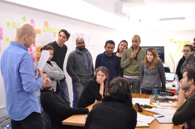
Each group of students had their own project to work on at The New Digital School. (Image source: Tiago Pedras) (Large preview)
Students presented their projects and shared their results with the group. (Image source: Tiago Pedras) (Large preview)
For two years in a row now, I was honored to be able to explore the current state of front-end, interface design, and responsive art-direction with students from all over the world. In February this year, I headed to Porto to spend a week with students from India, Malaysia, Portugal, France and USA for an entire week. Each group of students was working on their own project, ranging from interactive VR storytelling to (hello, Miguel and Sarthak!) to Olympics leaderboards (and hello to you, Prashant and Marissa!).
It might not sound like a big deal, but it was so rewarding to see the sparkle in the eyes of the students as they were working on their projects. Being able to provide an experience that hopefully many students will remember was a huge privilege and a remarkable moment in the entire experience. And it was all possible thanks to the contributions of our Smashing Members. I couldn’t be more proud of this effort.
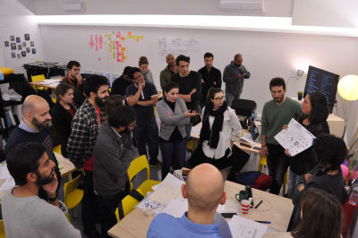
Berlin Design Campus
Late June is usually quite slow, with most projects slowly fading into sleep mode. Well, it was quite the opposite for us. For June, we teamed up with Prjctr Design School (Kyiv, Ukraine) to run Berlin Design Campus — a week-long trip to Berlin to explore digital design agencies and studios with students from Ukraine. It was our first initiative to improve design education by setting up a project of our own.
We visited the offices of Mozilla (thanks, Emanuela and Amin!), SinnerSchrader (thanks, Martin!), EdenSpiekermann (thanks, Daniel!), Hort (thanks, Eike!), Fjord (thanks, Simon and Jake!), Contentful (thanks, Ben!), Matteo Cevucci (previously EdenSpiekermann, Thoughtworks) with hands-on workshops in those companies throughout the week.

We couldn’t be more proud to team up with Prjctr Design School from Kiev, Ukraine who are trying change the education landscape in Kiev, Ukraine, and London. Visuals were designed by the Prjctr team as well. (Image source) (Large preview)
We visited both design agencies and larger consultancy firms, spoke with local freelancers, artists and entrepreneurs. We’ve set up informal evening meetings in which students could ask questions, and we organized visits to offices so students could see how other professionals work. It was a fascinating week with practical insights you would never get otherwise; a look behind the scenes in actual real-life projects with early prototypes that failed and hands-on exercises to work on.
During Berlin Design Campus, we visited a number of offices in Berlin. One of them was Mozilla’s office, with a hands-on workshop by Amin al Hazwani. (Image source) (Large preview)
You never get to visit or see how designers in those respected companies work, and what their processes look like. So happy and honored to be a part of this little initiative, and looking forward to more adventures in the future. Again, made possible through contributions of wonderful Smashing Members.
New SmashingConf Experience
With a few more resources available to us, we were able to focus on exploring new formats for Smashing Conferences. Being inspired by our Italian friends from the NoSlidesConf, we tested a brand new format in Toronto earlier this year: interactive live sessions in which speakers were not allowed to use slides (be it Powerpoint, Keynote or Reveal.js). Instead, we encouraged speakers to show how they work, how they design and build, what their setup looks like, and give audience insights into how they think as they make progress in their work.
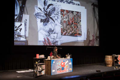
One of those unforgettable moments. When Gemma O’Brien brought her entire studio to SmashingConf Toronto, a conference where speakers weren’t allowed to use slides. We’ll be rolling out this format at all Smashing events in 2019. (Image credit: Marc Thiele) (Large preview)
Instead of speaking in front of a podium, we set up a coffee shop-alike setting with speakers sitting at the desk and literally walking the audience through their thought process. It was a quite special event. Some speakers felt challenged and excited about the new format, and attendees appreciated the fact that every session was unique and pushed the speakers outside their comfort zones. That’s why we’ll be rolling out this format for SmashingConf 2019, along with lightning talks, design nights, and a book exchange board. It goes without saying: all Smashing Members are getting a heavy discount on all Smashing Conferences.
Giving Back To The Community
Of course, Smashing Magazine has always been free, but with Rachel Andrew joining us on board last year, we now have a strong and keen Editor-in-Chief focusing on getting the best articles out there every single day. Since then, we’ve published 87 articles — all thoroughly reviewed and edited by the Smashing Editorial team. We refocus back on the heart of it all — yours truly Smashing Magazine.
We are committed to make the content we get out there accessible to as many people as possible. That goes for our eBooks as well. That’s why we also publicly released “Inclusive Design Patterns” eBook by Heydon Pickering (PDF, ePUB, Amazon Kindle), a wonderful book on inclusive design patterns — for free. Why? Because accessibility matters.
We Are Just Getting Started
1,000 is a first major milestone for us. Not many people know it, but the entire Smashing team is actually quite small, with just 13 of us floating from one project to another. Frankly, we might be a bit slow at times, but we are trying our best to bring along a positive change to our industry.
We need less craziness and narrow-mindedness around us, and we need more respect, care, and constructive help. That’s the goal we are aiming to provide with the Smashing Membership, with our next projects, and with your help. There might be something in it for you, too. We are in it for a long game. We are, after all, just getting started.
Huge thank you to Cosima Mielke for helping with preparations of this article, and Scott Whitehead for his kind support and work on the Smashing Membership. You are truly smashing!

(cm, sw, il)
With so much happening on the web, what should we really pay attention to? At SmashingConf New York 2018 ?? we’ll explore everything from PWAs, font loading best practices, web performance and eCommerce UX optimization, to refactoring CSS, design workflows and convincing your clients. With Sarah Drasner, Dan Mall, Sara Soueidan, Jason Grigsby, and many other speakers. Oct 23–24.
Check the speakers →


 There’s a certain peace to be found at night, when the world goes dark and silent. You might settle down on the couch for a moment, and just soak in the absence of noise and bustle. However, if you’re at work, and the world goes dark and silent, it’s a lot less comforting.