Original Source: https://smashingmagazine.com/2021/05/desktop-wallpaper-calendars-june-2021/
There’s an artist in everyone. Some bring their creative ideas to life with digital tools, others capture the perfect moment with a camera, or love to grab pen and paper to create little doodles or pieces of lettering. And even if you think you’re far away from being an artist, well, it might just be hidden somewhere deep inside of you. So why not explore it?
Since more than ten years, our monthly wallpapers series is the perfect opportunity to do just that: to challenge your creative skills and break out of your daily routine to do something just for fun, fully immersing yourself in the creative process.
For this post, folks from across the globe once again took on the challenge and designed beautiful and unique wallpapers to cater for some good vibes on your screens. All of them come in versions with and without a calendar for June 2021 and can be downloaded for free. At the end of this post, we also compiled some wallpaper goodies from our archives that are just too good to be forgotten. A big thank-you to everyone who shared their designs with us — this post wouldn’t exist without you. Happy June!
You can click on every image to see a larger preview,
We respect and carefully consider the ideas and motivation behind each and every artist’s work. This is why we give all artists the full freedom to explore their creativity and express emotions and experience through their works. This is also why the themes of the wallpapers weren’t anyhow influenced by us but rather designed from scratch by the artists themselves.
Submit a wallpaper!
Did you know that you could get featured in our next wallpapers post, too? We are always looking for creative talent! Join in! →
Mother Nature
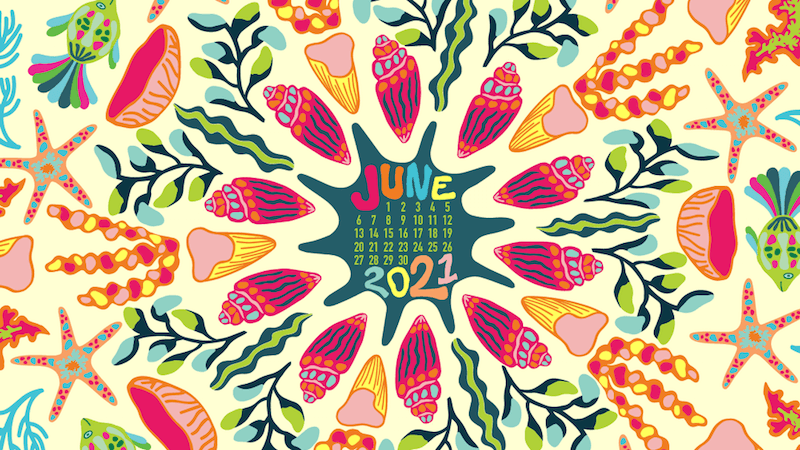
“Rain, fog, and winter jackets have been our companions for the last couple of weeks, but we are challenging the gloomy weather with this colorful, vibrant, picturesque calendar design. Spring is the most wonderful time of the year, intense, powerful, and vivid. We hope to summon sunny June with our desktop wallpaper – join us!” — Designed by PopArt Studio from Novi Sad, Serbia.
preview
with calendar: 320×480, 640×480, 800×480, 800×600, 1024×768, 1024×1024, 1152×864, 1280×720, 1280×800, 1280×960, 1280×1024, 1366×768, 1400×1050, 1440×900, 1600×1200, 1680×1050, 1680×1200, 1920×1080, 1920×1200, 1920×1440, 2560×1440
without calendar: 320×480, 640×480, 800×480, 800×600, 1024×768, 1024×1024, 1152×864, 1280×720, 1280×800, 1280×960, 1280×1024, 1366×768, 1400×1050, 1440×900, 1600×1200, 1680×1050, 1680×1200, 1920×1080, 1920×1200, 1920×1440, 2560×1440
Reef Days
“June brings the start of summer full of bright colors, happy memories, and traveling. What better way to portray the goodness of summer than through an ocean folk art themed wallpaper. This statement wallpaper gives me feelings of summer and I hope to share that same feeling with others.” — Designed by Taylor Davidson from Kentucky.
preview
with calendar: 480×800, 1024×1024, 1242×2208, 1280×1024
without calendar: 480×800, 1024×1024, 1242×2208, 1280×1024
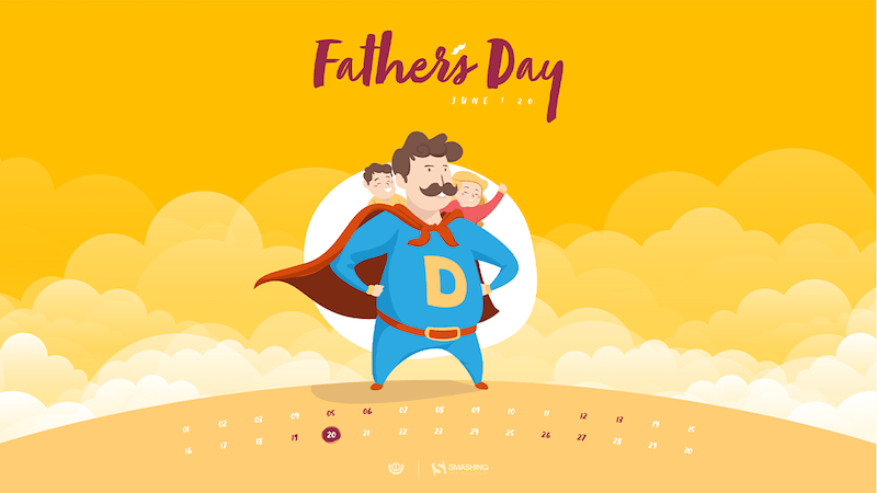
Happy Father’s Day
“Whatever you call them, Pa, Dad, Daddy, Pops, they all have one thing in common: they are our superheroes. So, to honor superhero fathers this Father’s Day, we created this super calendar for you to enjoy.” — Designed by Ever Increasing Circles from the United Kingdom.
preview
with calendar: 320×480, 640×480, 800×480, 800×600, 1024×768, 1024×1024, 1152×864, 1280×720, 1280×800, 1280×960, 1280×1024, 1366×768, 1400×1050, 1440×900, 1600×1200, 1680×1050, 1680×1200, 1920×1080, 1920×1200, 1920×1440, 2560×1440
without calendar: 320×480, 640×480, 800×480, 800×600, 1024×768, 1024×1024, 1152×864, 1280×720, 1280×800, 1280×960, 1280×1024, 1366×768, 1400×1050, 1440×900, 1600×1200, 1680×1050, 1680×1200, 1920×1080, 1920×1200, 1920×1440, 2560×1440
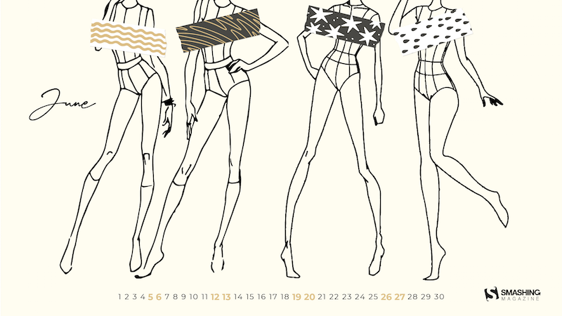
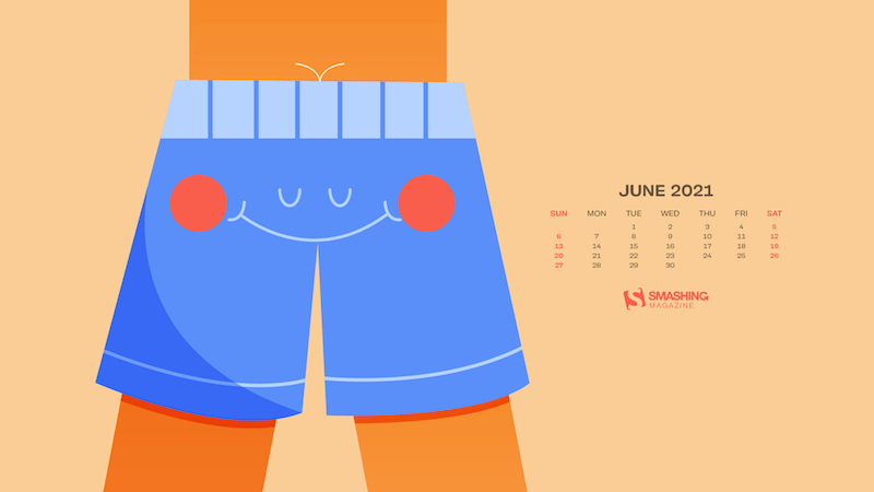
Bikini Season
“June reminds me of growing up on the lake. For me, this month is the official start of bikini season! I wanted to create this wallpaper to get everyone excited to put on their favorite suit and find their favorite body of water.” — Designed by Katie Ulrich from the United States.
preview
with calendar: 640×480, 1024×1024, 1680×1200, 1920×1200, 2560×1440
without calendar: 640×480, 1024×1024, 1680×1200, 1920×1200, 2560×1440
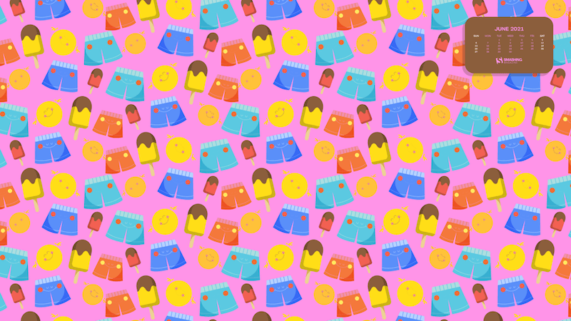
Summer Party
Designed by Ricardo Gimenes from Sweden.
preview
with calendar: 640×480, 800×480, 800×600, 1024×768, 1024×1024, 1152×864, 1280×720, 1280×800, 1280×960, 1280×1024, 1366×768, 1400×1050, 1440×900, 1600×1200, 1680×1050, 1680×1200, 1920×1080, 1920×1200, 1920×1440, 2560×1440, 3840×2160
without calendar: 640×480, 800×480, 800×600, 1024×768, 1024×1024, 1152×864, 1280×720, 1280×800, 1280×960, 1280×1024, 1366×768, 1400×1050, 1440×900, 1600×1200, 1680×1050, 1680×1200, 1920×1080, 1920×1200, 1920×1440, 2560×1440, 3840×2160
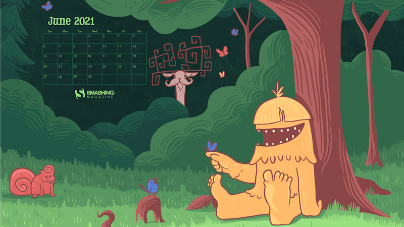
Happy Squatch
“I just wanted to capture the atmosphere of late spring/early summer in a fun, quirky way that may be reflective of an adventurous person during this time of year.” — Designed by Nick Arcarese from the United States.
preview
with calendar: 320×480, 640×480, 800×480, 800×600, 1024×768, 1024×1024, 1152×864, 1280×720, 1280×800, 1280×960, 1280×1024, 1366×768, 1400×1050, 1440×900, 1600×1200, 1680×1050, 1680×1200, 1920×1080, 1920×1200, 1920×1440, 2560×1440
without calendar: 320×480, 640×480, 800×480, 800×600, 1024×768, 1024×1024, 1152×864, 1280×720, 1280×800, 1280×960, 1280×1024, 1366×768, 1400×1050, 1440×900, 1600×1200, 1680×1050, 1680×1200, 1920×1080, 1920×1200, 1920×1440, 2560×1440
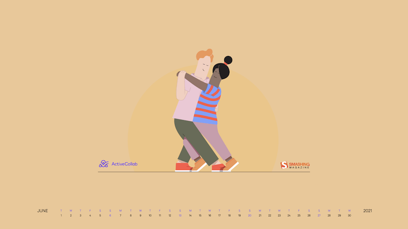
Dancing In The Summer Moonlight
“If you’re happy and you know it – show some dance moves – because summer is finally here!” — Designed by ActiveCollab from the United States.
preview
with calendar: 1080×1920, 1366×768, 1400×1050, 1440×900, 1600×1200, 1680×1050, 1920×1080, 1920×1200, 1920×1440, 2560×1440
without calendar: 1080×1920, 1366×768, 1400×1050, 1440×900, 1600×1200, 1680×1050, 1920×1080, 1920×1200, 1920×1440, 2560×1440
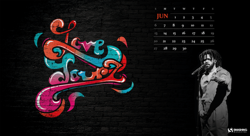
Love Yourz
“J Cole is one of the most inspiring hip hop artists and is known for his famous song ‘Love Yourz’. With all of the negativity and hate we have been having the past year, this is a message to remind people to love your life (love yourz) because there is no such thing as a life that is better than yours.” — Designed by James from Pennsylvania.
preview
with calendar: 640×480, 800×600, 1024×768, 1024×1024, 1152×864, 1280×800, 1280×1024, 1366×768, 1400×1050, 1440×900, 1680×1200, 1920×1080, 1920×1200, 1920×1440, 2560×1400
without calendar: 640×480, 800×600, 1024×768, 1024×1024, 1152×864, 1280×800, 1280×1024, 1366×768, 1400×1050, 1440×900, 1680×1200, 1920×1080, 1920×1200, 1920×1440, 2560×1400
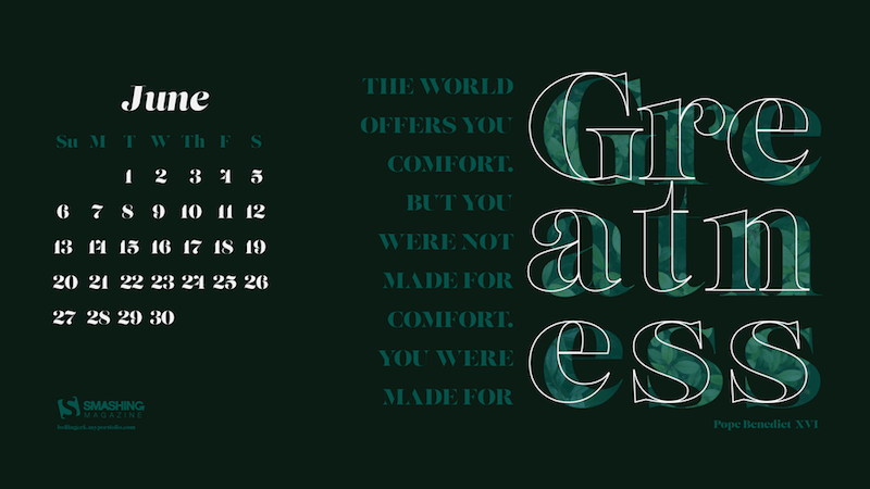
Made For Greatness
“Inspiring to more than mediocrity.” — Designed by Katherine Bollinger from the United States.
preview
with calendar: 320×480, 640×480, 800×480, 800×600, 1024×768, 1024×1024, 1152×864, 1280×720, 1280×800, 1280×960, 1280×1024, 1366×768, 1400×1050, 1440×900, 1600×1200, 1680×1050, 1680×1200, 1920×1080, 1920×1200, 1920×1440, 2560×1440
without calendar: 320×480, 640×480, 800×480, 800×600, 1024×768, 1024×1024, 1152×864, 1280×720, 1280×800, 1280×960, 1280×1024, 1366×768, 1400×1050, 1440×900, 1600×1200, 1680×1050, 1680×1200, 1920×1080, 1920×1200, 1920×1440, 2560×1440
Summertime
Designed by Ricardo Gimenes from Sweden.
preview
with calendar: 640×480, 800×480, 800×600, 1024×768, 1024×1024, 1152×864, 1280×720, 1280×800, 1280×960, 1280×1024, 1366×768, 1400×1050, 1440×900, 1600×1200, 1680×1050, 1680×1200, 1920×1080, 1920×1200, 1920×1440, 2560×1440, 3840×2160
without calendar: 640×480, 800×480, 800×600, 1024×768, 1024×1024, 1152×864, 1280×720, 1280×800, 1280×960, 1280×1024, 1366×768, 1400×1050, 1440×900, 1600×1200, 1680×1050, 1680×1200, 1920×1080, 1920×1200, 1920×1440, 2560×1440, 3840×2160
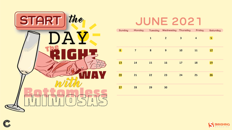
This Is How You Start The Day
“When I think of June, I think of what summer items make you happy. For the 21+ club, summer means grabbing a drink with your friends on a hot summer day. The preferred drink of the summer is bottomless mimosas! And what better time to start drinking than the beginning of the day (responsibly of course)!” — Designed by Carolyn Choates from the United States.
preview
with calendar: 640×480, 800×480, 800×600, 1024×1024, 1280×800, 1280×960, 1280×1024, 1600×1200, 1680×1050, 1920×1200, 1920×1440, 2560×1440
without calendar: 640×480, 800×480, 800×600, 1024×1024, 1280×800, 1280×960, 1280×1024, 1600×1200, 1680×1050, 1920×1200, 1920×1440, 2560×1440
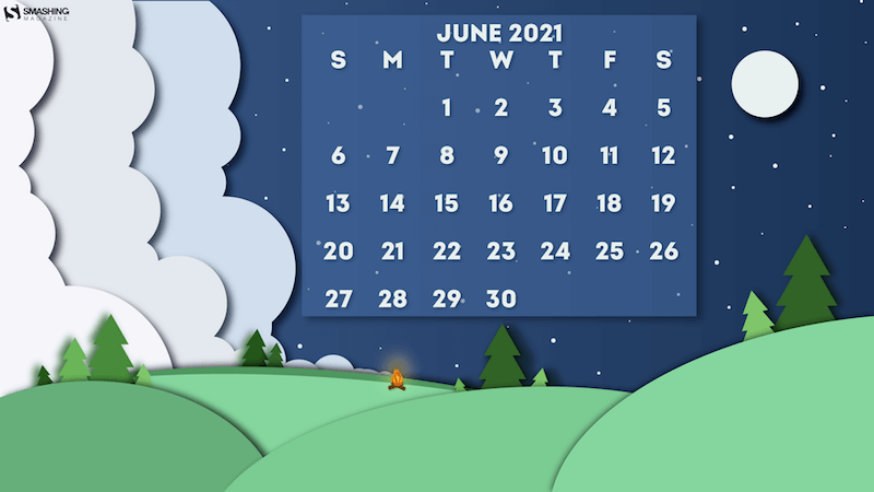
Under The Starlight
“After being cooped up inside for so long, everyone needs a little nature break! And what’s more calming than a crackling campfire on a cool midsummer night, looking up at the shining stars and full moon!” — Designed by Hannah Basham from the United States.
preview
with calendar: 800×600, 1280×720, 1400×1050, 1600×1200, 1920×1080, 2560×1440
without calendar: 800×600, 1280×720, 1400×1050, 1600×1200, 1920×1080, 2560×1440
Oldies But Goodies
Ready for more? Below you’ll find a little best-of from past June wallpapers editions. Enjoy! (Please note that these designs don’t come with a calendar.)
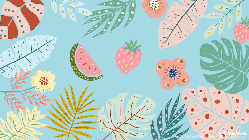
Summer Coziness
“I’ve waited for this summer more than I waited for any other summer since I was a kid. I dream of watermelon, strawberries, and lots of colors.” — Designed by Kate Jameson from the United States.
preview
without calendar: 320×480, 1024×1024, 1280×720, 1680×1200, 1920×1080, 2560×1440
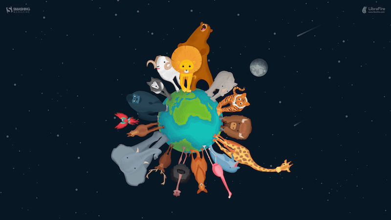
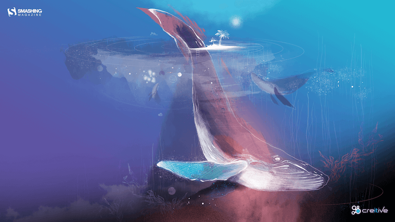
Wildlife Revival
“In these turbulent times for men, we are witnessing the extraordinary rebirth of nature, especially of the wildlife around the planet. Maybe this situation is a blessing in disguise? Either way, one thing is for sure, this planet is the home that we share with all other forms of life and it is our obligation and sacred duty to protect it.” — Designed by LibraFire from Serbia.
preview
without calendar: 320×480, 640×480, 800×480, 800×600, 1024×768, 1024×1024, 1152×864, 1280×720, 1280×800, 1280×960, 1280×1024, 1366×768, 1400×1050, 1440×900, 1600×1200, 1680×1050, 1680×1200, 1920×1080, 1920×1200, 1920×1440, 2560×1440
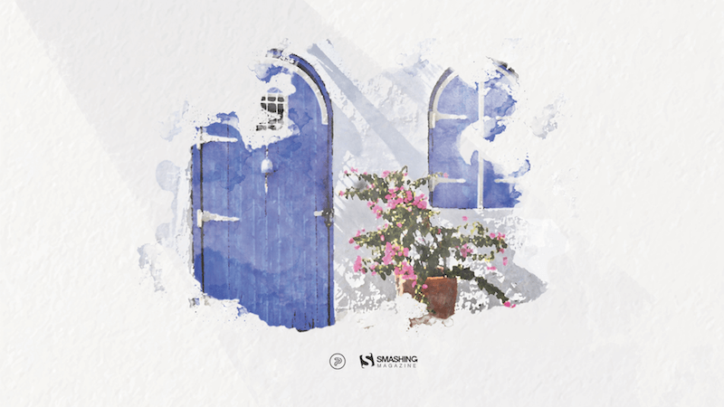
Summer Is Coming
“Imagine a sunny beach and an endless blue sea. Imagine yourself right there. Is it somewhere in Greece? The Mediterranean? North Africa? Now turn around and start wandering through those picturesque, narrow streets. See all those authentic white houses with blue doors and blue windows? Feel the fragrance of fresh flowers? Stop for a second. Take a deep breath. Seize the moment. Breathe in. Breathe out. Now slowly open your eyes. Not quite there yet? Don’t worry. You will be soon! Summer is coming…” — Designed by PopArt Studio from Serbia.
preview
without calendar: 320×480, 640×480, 800×480, 800×600, 1024×768, 1024×1024, 1152×864, 1280×720, 1280×800, 1280×960, 1280×1024, 1366×768, 1400×1050, 1440×900, 1600×1200, 1680×1050, 1680×1200, 1920×1080, 1920×1200, 1920×1440, 2560×1440
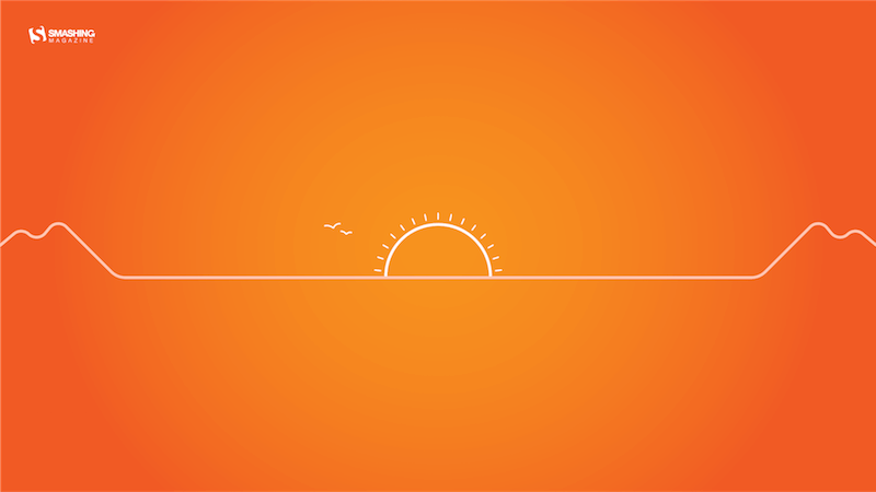
Solstice Sunset
“June 21 marks the longest day of the year for the Northern Hemisphere — and sunsets like these will be getting earlier and earlier after that!” — Designed by James Mitchell from the United Kingdom.
preview
without calendar: 1280×720, 1280×800, 1366×768, 1440×900, 1680×1050, 1920×1080, 1920×1200, 2560×1440, 2880×1800
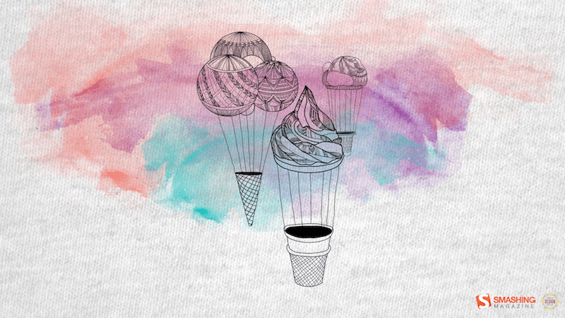
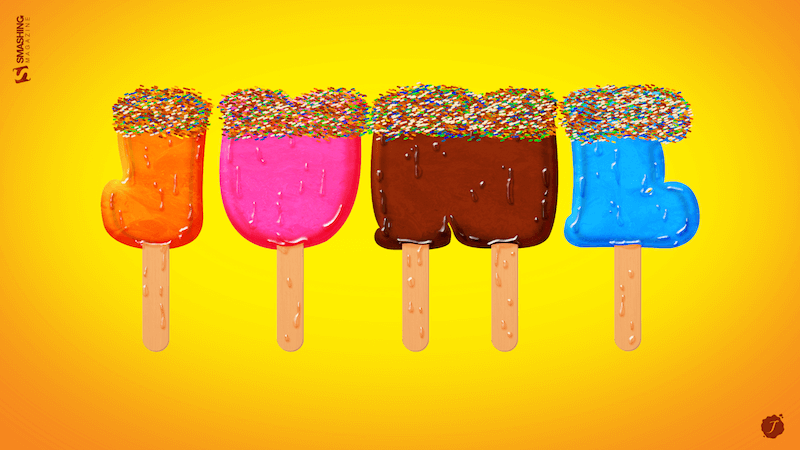
Ice Creams Away!
“Summer is taking off with some magical ice cream hot air balloons.” — Designed by Sasha Endoh from Canada.
preview
without calendar: 320×480, 1024×768, 1152×864, 1280×800, 1280×960, 1400×1050, 1440×900, 1600×1200, 1680×1050, 1920×1080, 1920×1200, 2560×1440
Deep Dive
“Summer rains, sunny days and a whole month to enjoy. Dive deep inside your passions and let them guide you.” — Designed by Ana Masnikosa from Belgrade, Serbia.
preview
without calendar: 320×480, 640×480, 800×480, 800×600, 1024×768, 1024×1024, 1152×864, 1280×720, 1280×800, 1280×960, 1280×1024, 1400×1050, 1440×900, 1600×1200, 1680×1050, 1680×1200, 1920×1080, 1920×1200, 1920×1440, 2560×1440
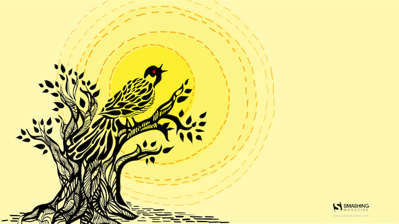
The Call Of Koel
“The peak of summer is upon us, and June brings scorching heat to most places in India. Summer season in my state also reminds me of the bird songs, especially the Koel bird. A black bird with a red eye, this bird’s elegant voice rings through the trees on hot summer afternoons. This June, I have created a wallpaper to give life to this experience — the birds singing in scorching heat give us some respite!” — Designed by Anuja from India.
preview
without calendar: 640×480, 1024×768, 1280×960, 1366×768, 1440×900, 1680×1200, 1920×1080, 1920×1200, 1920×1440, 2560×1440
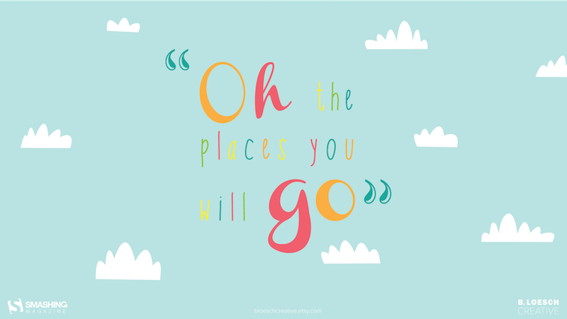
Oh, The Places You Will Go!
“In celebration of high school and college graduates ready to make their way in the world!” — Designed by Bri Loesch from the United States.
preview
without calendar: 320×480, 1024×768, 1280×1024, 1440×900, 1680×1050, 1680×1200, 1920×1440, 2560×1440
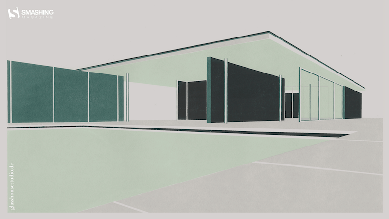
Bauhaus
“I created a screenprint of one of the most famous buildings from the Bauhaus architect Mies van der Rohe for you. So, enjoy the Barcelona Pavillon for your June wallpaper.” — Designed by Anne Korfmacher from Germany.
preview
without calendar: 640×480, 800×480, 800×600, 1024×768, 1024×1024, 1152×864, 1280×800, 1280×960, 1280×1024, 1366×768, 1400×1050, 1440×900, 1600×1200, 1680×1050, 1680×1200, 1920×1080, 1920×1200, 1920×1440, 2560×1440
Join The Wave
“The month of warmth and nice weather is finally here. We found inspiration in the World Oceans Day which occurs on June 8th and celebrates the wave of change worldwide. Join the wave and dive in!” — Designed by PopArt Studio from Serbia.
preview
without calendar: 320×480, 640×480, 800×480, 800×600, 1024×768, 1024×1024, 1152×864, 1280×720, 1280×800, 1280×960, 1280×1024, 1366×768, 1400×1050, 1440×900, 1600×1200, 1680×1050, 1680×1200, 1920×1080, 1920×1200, 1920×1440, 2560×1440
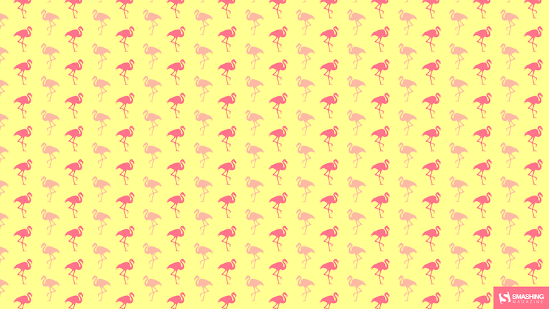
Flamingood Vibes Only
“I love flamingos! They give me a happy feeling that I want to share with the world.” — Designed by Melissa Bogemans from Belgium.
preview
without calendar: 320×480, 640×480, 800×480, 800×600, 1024×768, 1024×1024, 1152×864, 1280×720, 1280×800, 1280×960, 1280×1024, 1400×1050, 1440×900, 1600×1200, 1680×1050, 1680×1200, 1920×1200, 1920×1440, 2560×1440
Shine Your Light
“Shine your light, Before the fight, Just like the sun, Cause we don’t have to run.” — Designed by Anh Nguyet Tran from Vietnam.
preview
without calendar: 768×1280, 1024×1024, 1280×800, 1280×1024, 1366×768, 1440×900, 1600×1200, 1680×1050, 1680×1200, 1920×1080, 1920×1200, 1920×1440, 2560×1440
Summer Surf
“Summer vibes.” — Designed by Antun Hirsman from Croatia.
preview
without calendar: 640×480, 1152×864, 1280×1024, 1440×900, 1680×1050, 1920×1080, 1920×1440, 2650×1440
Ice Cream June
“For me, June always marks the beginning of summer! The best way to celebrate summer is of course ice cream, what else?” — Designed by Tatiana Anagnostaki from Greece.
previewwithout calendar: 1024×768, 1280×1024, 1440×900, 1680×1050, 1680×1200, 1920×1440, 2560×1440
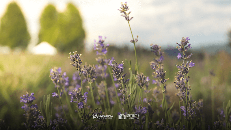
Lavender Is In The Air!
“June always reminds me of lavender — it just smells wonderful and fresh. For this wallpaper I wanted to create a simple, yet functional design that featured — you guessed it — lavender!” — Designed by Jon Phillips from Canada.
preview
without calendar: 320×480, 640×480, 800×480, 800×600, 1024×768, 1024×1024, 1152×864, 1280×720, 1280×800, 1280×960, 1280×1024, 1400×1050, 1440×900, 1600×1200, 1680×1050, 1680×1200, 1920×1080, 1920×1200, 1920×1440, 2560×1440
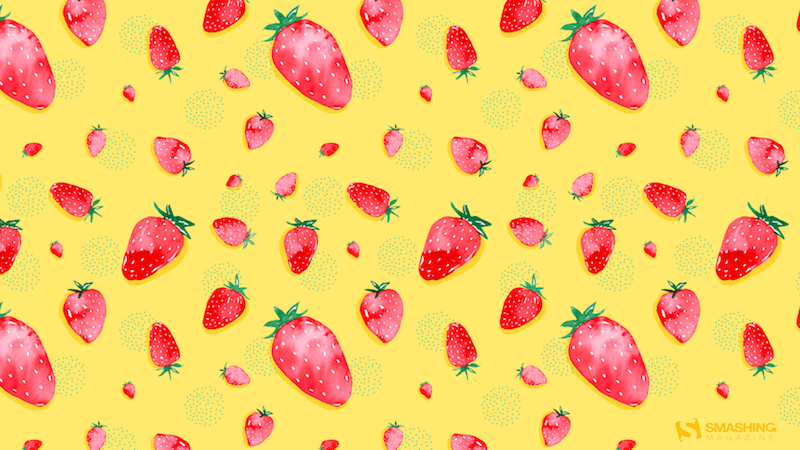
Strawberry Fields
Designed by Nathalie Ouederni from France.
preview
without calendar: 320×480, 1024×768, 1280×1024, 1440×900, 1680×1200, 1920×1200, 2560×1440
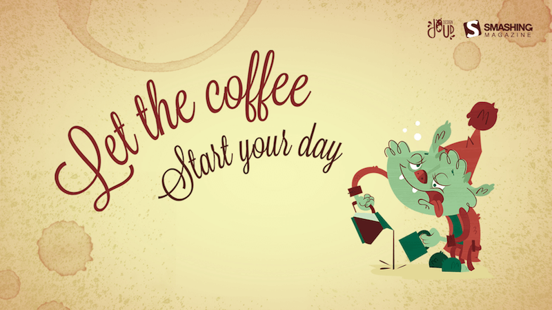
Start Your Day
Designed by Elise Vanoorbeek from Belgium.
preview
without calendar: 1024×768, 1280×720, 1280×800, 1280×960, 1280×1024, 1440×1050, 1440×900, 1600×1200, 1680×1050, 1680×1200, 1920×1080, 1920×1220, 1920×1440, 2560×1440
Pineapple Summer Pop
“I love creating fun and feminine illustrations and designs. I was inspired by juicy tropical pineapples to celebrate the start of summer.” — Designed by Brooke Glaser from Honolulu, Hawaii.
<img loading=”lazy” decoding=”async” src=”https://cloud.netlifyusercontent.com/assets/344dbf88-fdf9-42bb-adb4-46f01eedd629/16db22ee-c7f8-47a3-856c-992c82cd61f9/june-16-pineapple-summer-pop-preview-opt.png” alt=”Pineapple Summer Pop”
preview
without calendar: 640×480, 800×600, 1024×768, 1152×720, 1280×720, 1280×800, 1280×960, 1366×768, 1440×900, 1680×1050, 1920×1080, 1920×1200, 1920×1440, 2560×1440
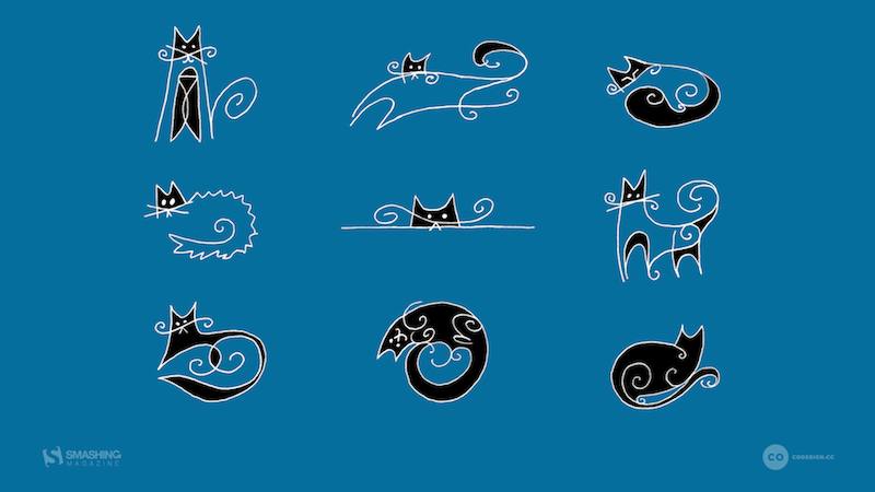
Nine Lives!
“I grew up with cats around (and drawing them all the time). They are so funny… one moment they are being funny, the next they are reserved. If you have place in your life for a pet, adopt one today!” — Designed by Karen Frolo from the United States.
preview
without calendar: 1024×768, 1024×1024, 1280×800, 1280×960, 1280×1024, 1366×768, 1440×900, 1600×1200, 1680×1050, 1680×1200, 1920×1080, 1920×1200, 1920×1440, 2560×1440


 Animation showcase (Large preview)