CARE OF LORD: Bauhaus-Inspired Branding for the Modern Commuter
Original Source: https://abduzeedo.com/care-lord-bauhaus-inspired-branding-modern-commuter
CARE OF LORD: Bauhaus-Inspired Branding for the Modern Commuter

abduzeedo0917—24
Discover how CARE OF LORD’s Bauhaus-inspired branding elevates minimalist fashion for the urban commuter. Explore the fusion of form and function in this visually striking design project by Lowkey Design.
In the bustling world of urban commuting, where functionality meets style, the CARE OF LORD brand emerges with a distinct visual identity. Designed by the acclaimed Lowkey Design, this branding project takes inspiration from the Bauhaus movement, offering a fresh perspective on minimalist fashion for the discerning businessman.
CARE OF LORD’s design philosophy centers on the Bauhaus principle of marrying form and function. This is evident in every aspect of their visual identity, from the logo to the branded materials. The Oracle font, with its clean lines and geometric precision, serves as the cornerstone of the brand’s typography. Its numerical design cleverly echoes the brand’s focus on performance parameters, reinforcing the idea that these garments are as practical as they are stylish.
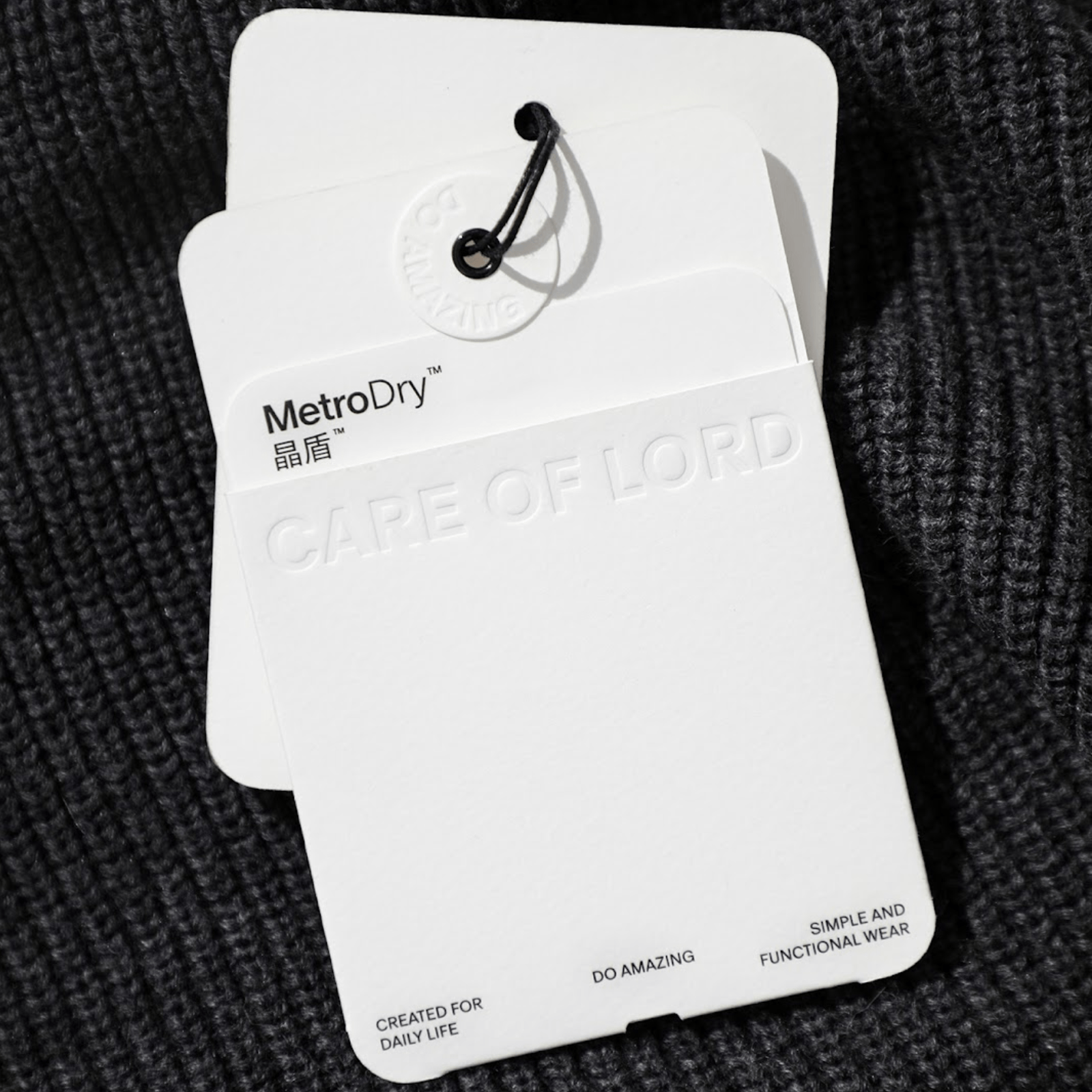
The brand’s commitment to quality extends to its choice of materials. Durable cardboard boxes, designed for reusability, reflect CARE OF LORD’s sustainable ethos. Even the hangtags serve a dual purpose, transforming into labels for storage boxes. This attention to detail speaks to a brand that values longevity and user experience.
A Grid System for Visual Harmony
Underpinning the entire visual identity is a rigorous grid system. Inspired by the vertical proportions of the CARE OF LORD name, this grid ensures consistency across all brand materials. From the website to the care labels, every element adheres to this system, creating a sense of visual order and harmony.
The Bauhaus Legacy Lives On
CARE OF LORD’s branding is a testament to the enduring influence of the Bauhaus movement. By embracing simplicity, functionality, and a timeless aesthetic, the brand has created a visual identity that resonates with the modern urban commuter. It’s a reminder that good design is not just about looking good; it’s about serving a purpose.
Branding and visual identity artifacts
Grid System
CARE OF LORD believes that order creates happiness. By establishing visual order through a rigorous grid system, we standardize the design of brand materials, such as the brand book, the website, and care labels, ensuring all layouts adhere to this system.
The fundamental proportions of the grid system are based on the vertical proportions of CARE OF LORD, We have created a motion to explain the derivation process of the grid system.
Credits
Design:lowkey design
Motion Design:lowkey design
Photography:lowkey design

Leave a Reply
Want to join the discussion?Feel free to contribute!