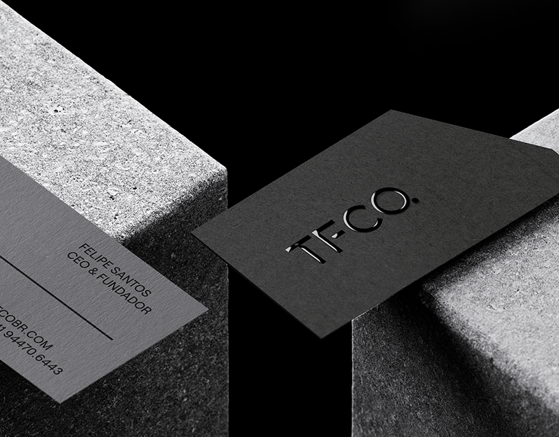
Branding for TFCO
Original Source: http://feedproxy.google.com/~r/abduzeedo/~3/xn_TkY9oEO8/branding-tfco
Branding for TFCO

abduzeedo07.29.21
Ted Oliver shared a branding and visual identity project for TFCO. (The Foaming Co.). TFCO developed a self-levelling foamed cellular concrete, an extremely useful solution in the modernization of the Civil Construction sector, ensuring efficiency in the final result of flatness, leveling and adherence, in addition to optimizing construction time and cost.
Design
The visual identity developed for TFCO has solid forms with a notch in the 30º angle, giving personality and originality to the brand.
The notch symbolizes the shadow projected by the constructions, the stretched letter F, symbolizes the process of applying the cellular concrete to the surface.
For more information make sure to check out Ted on
Behance
Instagram
Website

Leave a Reply
Want to join the discussion?Feel free to contribute!