Brand Identity for The Clifford Pier Singapore
Original Source: http://feedproxy.google.com/~r/abduzeedo/~3/Fn-Y3uO5Qzg/brand-identity-clifford-pier-singapore
Brand Identity for The Clifford Pier Singapore
AoiroStudio
Jun 14, 2018
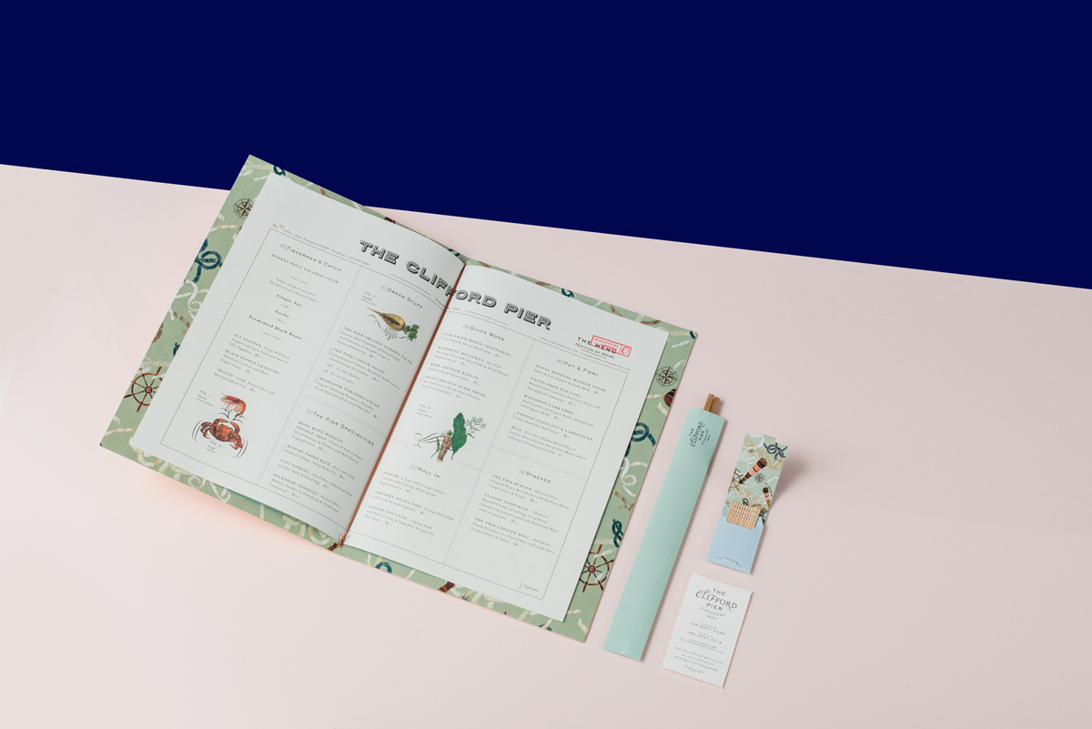
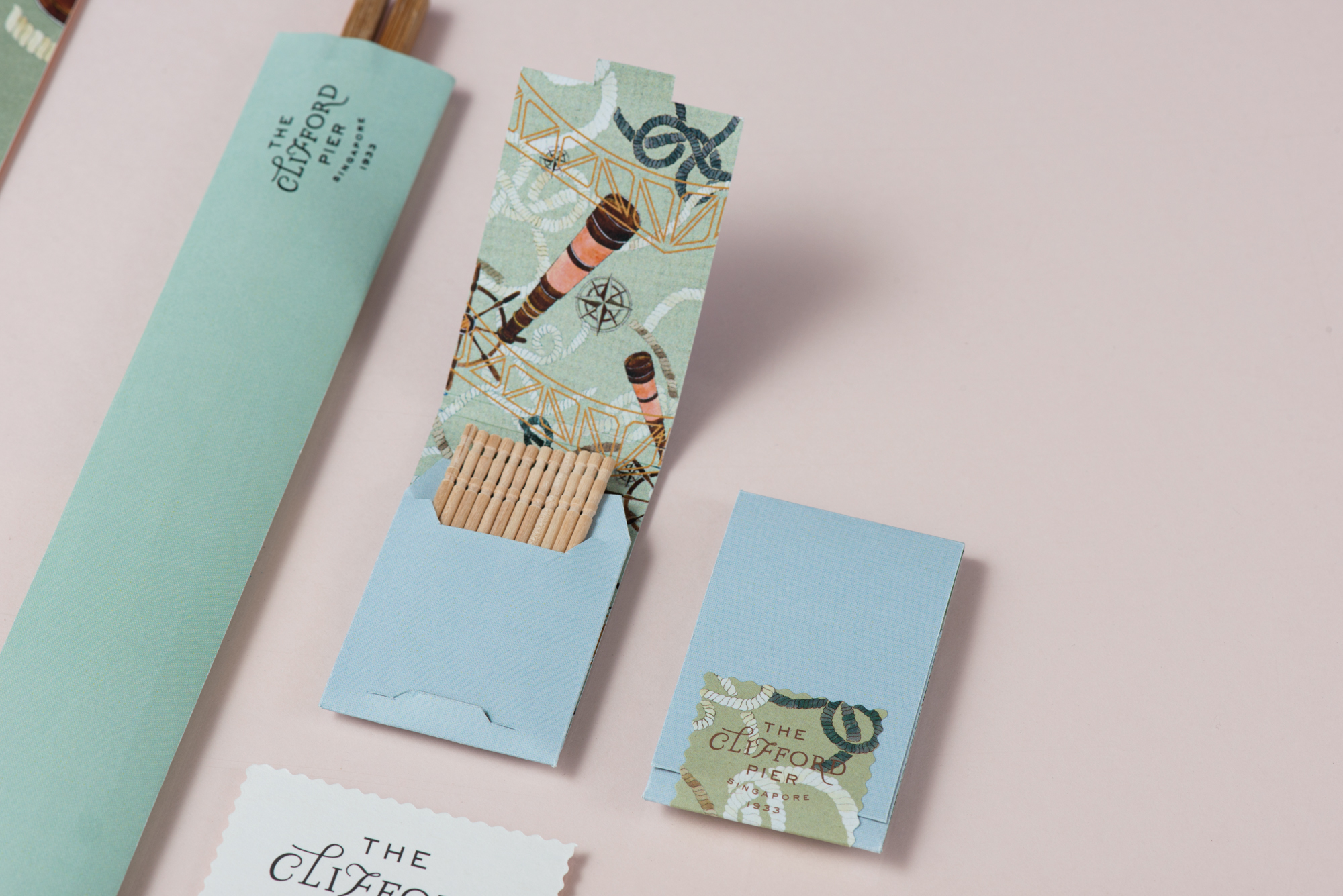
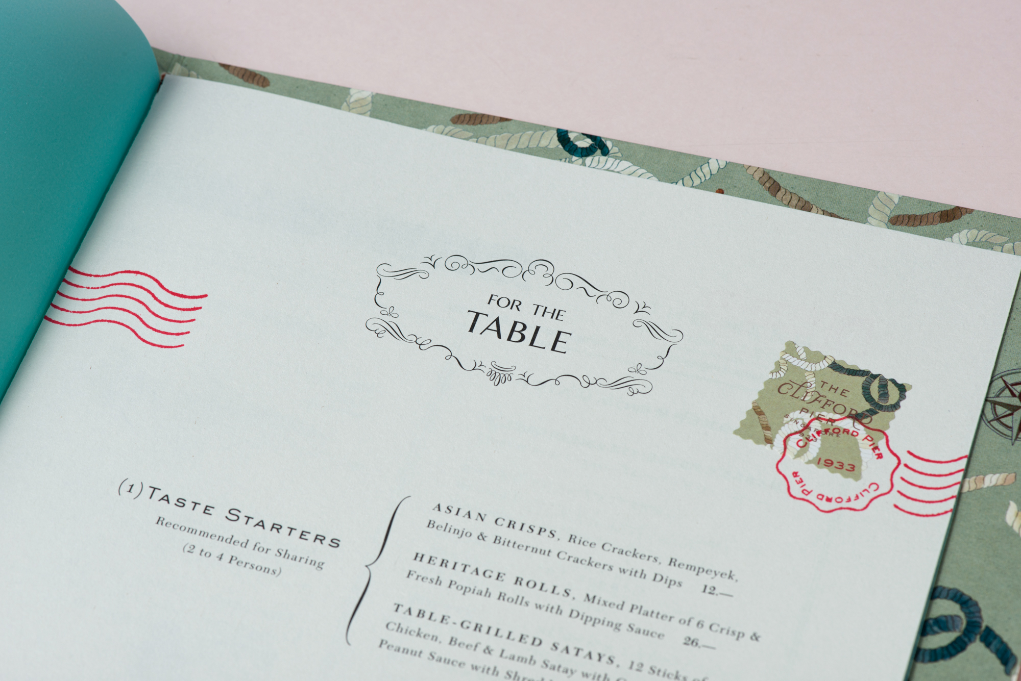
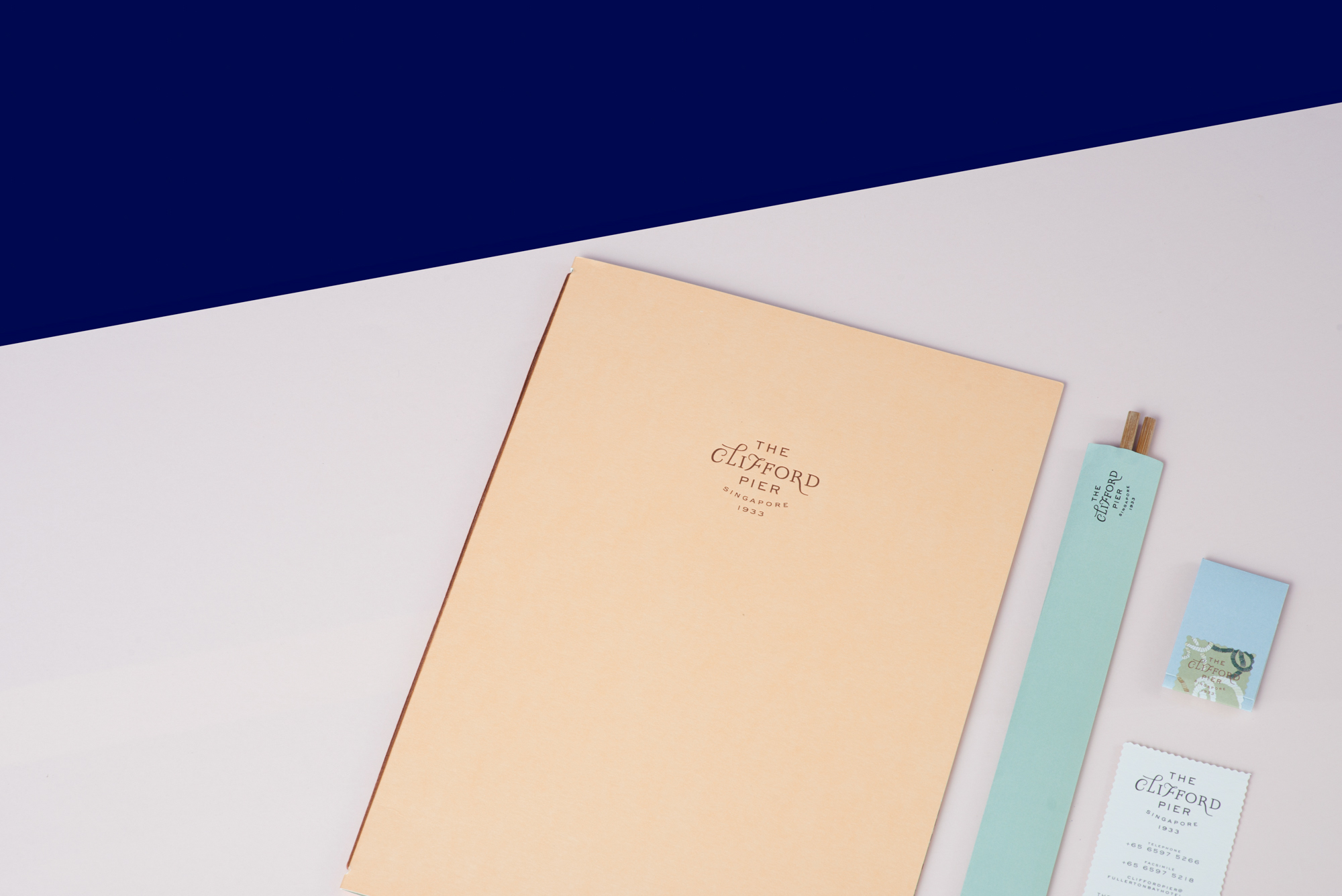
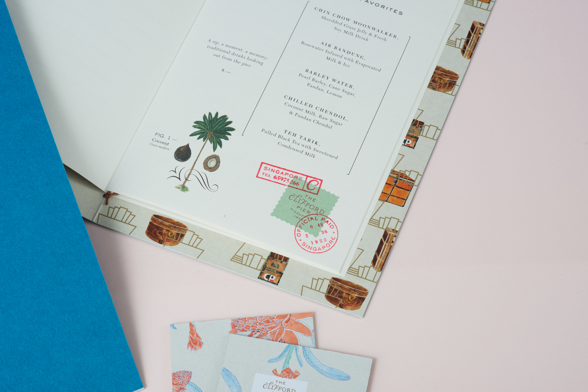
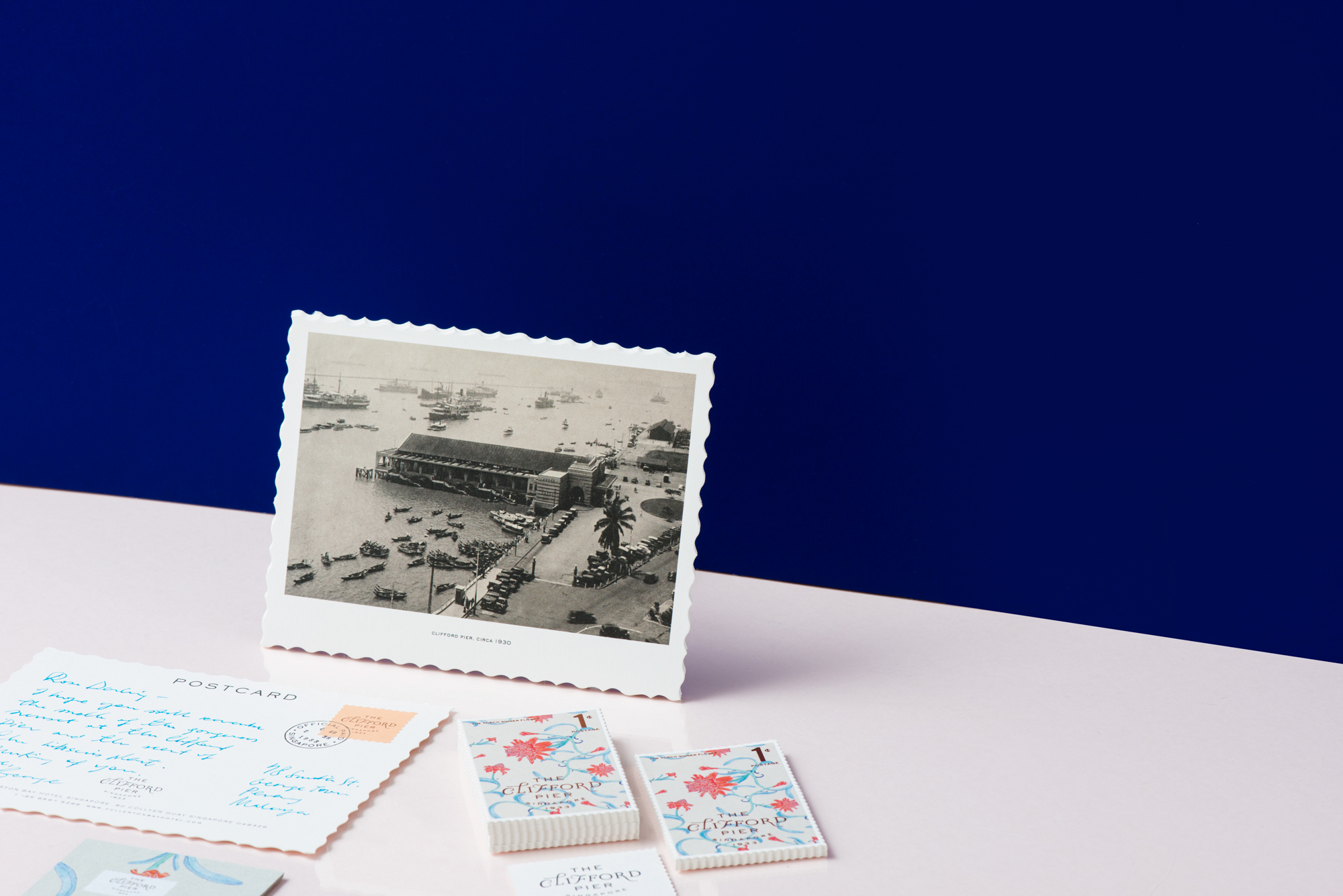
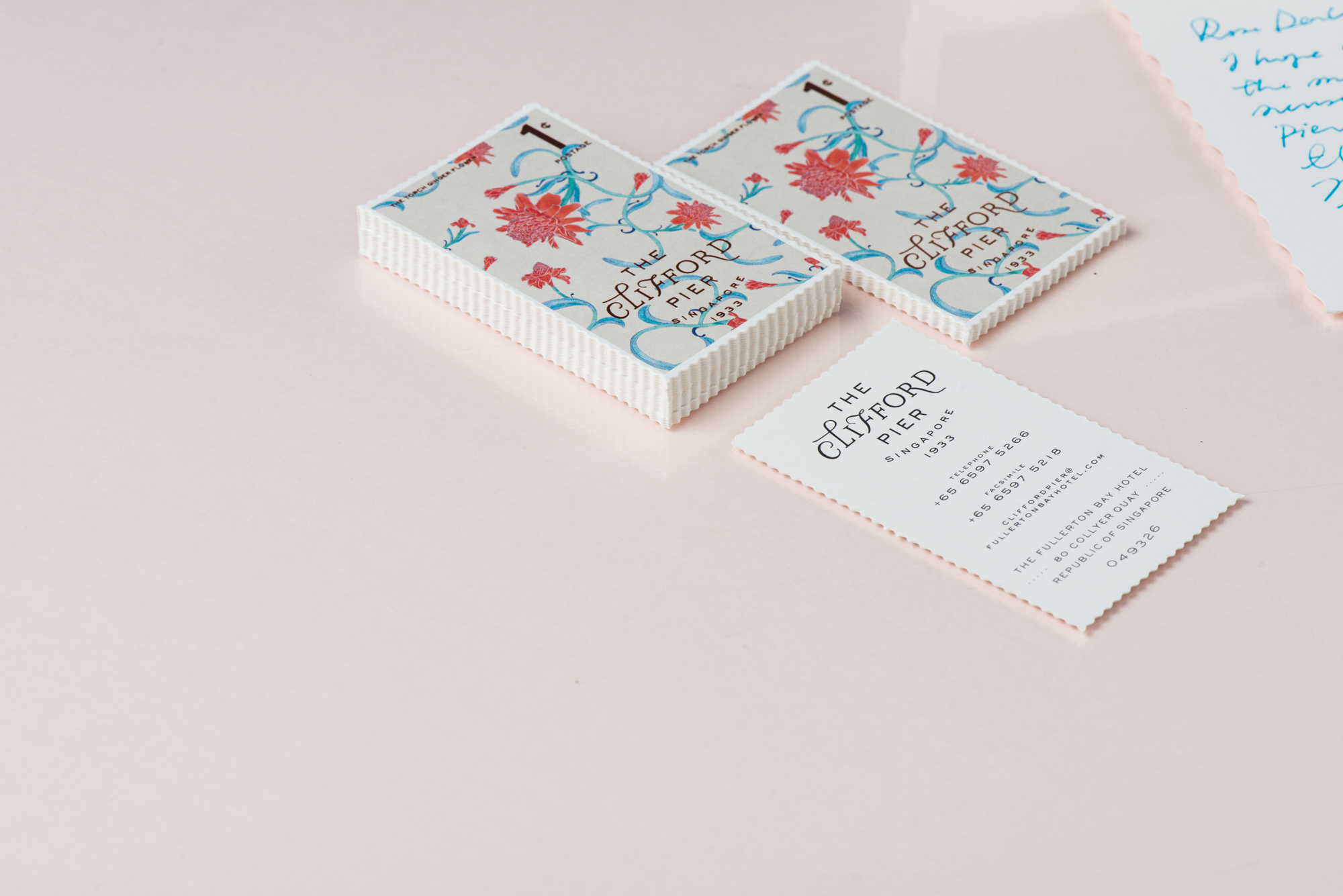
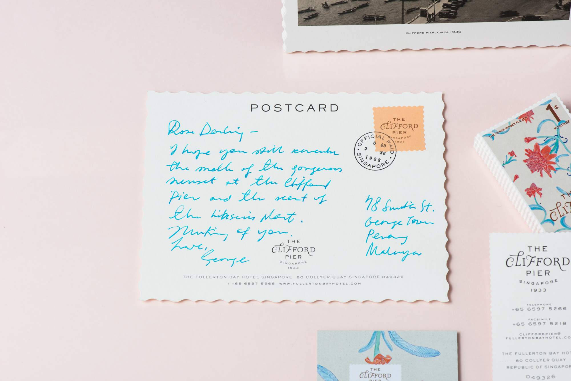
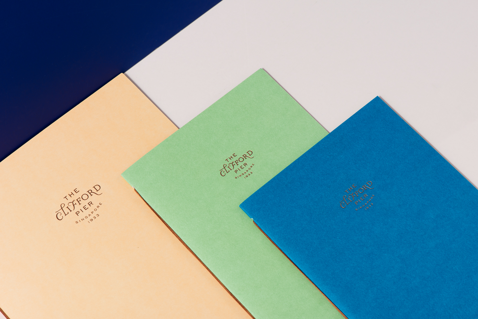
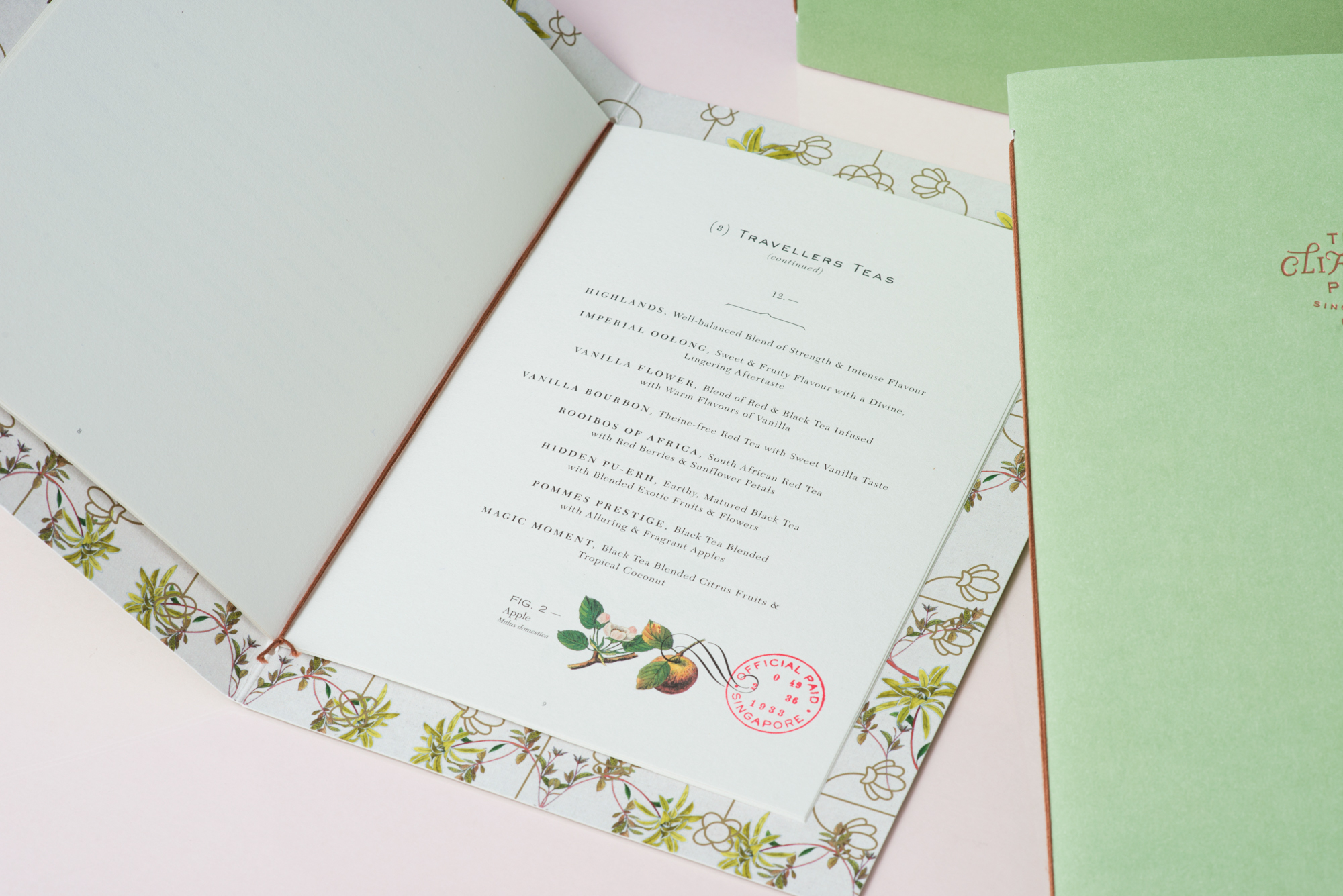
It’s booked! We will be heading down to Singapore for our yearly vacation, nothing cooler than exploring designers, artists, and photographers based in this beautiful country. Let’s take a look at the work of Foreign Policy and their Brand Identity for The Clifford Pier. I took this particular project because the design truly reflects the colours from Singapore after watching so many travel videos on the subject. As they quote: “Collaterals with color palette in sea-foam, coral and Caspian blue; classic postage stamps accented with tropical flora and fauna”.
Sharing an entity with its heritage, The Clifford Pier draws from its legacy as a bustling port in Singapore during the 1930s. Ginger flower motifs pay homage to William Farquhar who was fascinated with local botany during his time on the island. Collaterals with color palette in sea-foam, coral and caspian blue; classic postage stamps accented with tropical flora and fauna, along with architectural elements, are reminiscent of the glorious voyages that set sail from this historical landmark.
More Links
Learn more about Foreign Policy
Brand Identity & Graphic Design





brand identity
branding
graphic design


Leave a Reply
Want to join the discussion?Feel free to contribute!