Original Source: https://ecommerce-platforms.com/articles/best-ai-story-generators
With the ability to generate cohesive content through artificial intelligence (AI), you can now create articles, blog posts, and social media posts with ease. But if you want to use the same technology for more creative writing, you can turn towards the best AI story generators.
These AI-based story generators are able to create interesting and often captivating stories through simple instructions, which can help you through writer’s block, brainstorming sessions, or a lack of inspiration.
To assist you in using the ideal systems for your needs, here are 7 AI story generators that can fulfill your creative writing requirements.
What is AI Story Generator?
Toggle accordion
An AI story generator is a program that can create stories from scratch through text prompts. The system achieves this feat through AI models that have been trained on a vast amount of text examples by using deep learning. This leads most of these AI generators to use models such as Generative Pre-trained Transformer 3 (GPT-3) that produce natural sounding text like a human.
What are the Best AI Story Generators?
1. Jasper.ai

Jasper.ai has become known as one of the most popular AI-based content development platforms. But apart from writing blogs, emails, and social media posts, it can also be used to generate interesting stories through AI.
What makes Jasper.ai one of the best AI story generators is its use of a modified GPT-3 model. Through the use of deep learning training that takes examples from textbooks, internet entries, and Wikipedia, the Jasper.ai system can craft engaging stories on various topics.
You can simply enter a text prompt and modify the tone of your resulting story using the preset descriptors. From there, Jasper.ai whips up the story for you and tries to stay true to your prompt. You can even narrate stories in the form of celebrity impressions.
Using the GPT-3 model, Jasper.ai writes one word at a time while still being relevant to the previous word and its context. This can provide you with quite some interesting stories, while still being mostly unique in their execution.
Since Jasper.ai is easy to use and has an intuitive interface, it only adds to the platform’s usage as a story generator. Through the document-editor interface that looks like Google Docs, you can feel at home with the solution and easily enter your prompts without compromising your visual comfort.
Pricing
Japser.ai has three pricing plans in place.
Starter. This plan for short-form content starts from $40/month for 20,000 words.
Boss Mode. This tier lets you write long-form content and starts from $82/month for 50,000 words.
Business. This option lets you obtain a custom quote for your requirements.
Pros 👍
Cons 👎
Pros 👍
Intuitive interface.
Reliable solutions.
Competitive pricing.
Multi-language support.
Cons 👎
Originally built for business purposes.
Might need successive regenerations to develop a compelling story.
Integrated plagiarism checker by Copyscape is not free.
Who is This Best For?
Hobbyists
Fiction Writers
Bloggers
Go to the top

2. Rytr

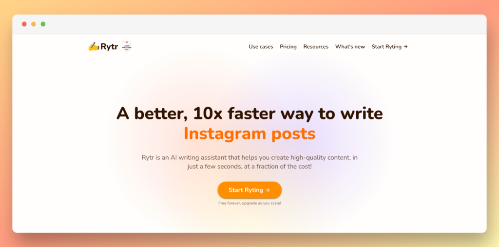
While looking for the best AI story generators, you may also stumble upon Rytr. Built on a GPT-3 model, Rytr is able to develop emails, headlines, and interview questions among other professional texts. But when given prompts to write short stories, the platform doesn’t disappoint.
Since Rytr uses GPT-3, it also holds the power of incredible training for its AI. With the AI drawing from popular literature, internet submissions, and encyclopedias, it can provide you with stories that are just as interesting as they are engaging.
While Rytr might commit a few mistakes here and there, you can fix them manually to have a near-flawless piece of writing at your hand. Given that this possibility holds true for all the AI-generated texts, this requirement does not paint Rytr in a bad light.
Rytr’s user interface (UI) is modern, sleek, and easy on the eyes. This also makes it a breeze to use, especially for short story prompts. You can use preset descriptors to modify the tone and style of your story, which provides you with fiction that goes right in line with your needs.
Pricing
Rytr’s pricing is segmented into three plans. You can get two extra free months if you pay through annual billing.
Free. This plan lets you generate up to 10,000 characters per month.
Saver. This offering enables you to generate 100,000 characters per month for $9/month. It also lets you create your own use case. It also lets you generate up to 20 AI images per month.
Unlimited. This option allows you to generate unlimited characters every month and gives you dedicated account support along with the features in Saver. It is available for $29/month and comes with 100 AI image generations.
Pros 👍
Cons 👎
Pros 👍
Easy to use interface.
Modern design.
High quality results.
Free plagiarism checker.
Cons 👎
Pricing plan is convoluted by charging for characters instead of words.
Can be more expensive than other similar platforms.
Who is This Best For?
Hobbyists
Fiction writers
Students
Go to the top

3. Copy.ai

Copy.ai is mainly a business-centric text generator that uses AI for creating various types of content. This includes content such as blog posts, social media posts, and emails. But with its ability of using a modified model of GPT-3, it has also established itself as one of the best AI story generators currently on the market.
With Copy.ai, you can use simple text prompts and modifiers to get the AI to generate an engaging story for you. The content that is generated through your prompts is typically in line with your instructions, with the results often ranging from wildly amusing to thoroughly entertaining.
But even with the varying degrees of quality, Copy.ai makes one thing clear: The AI will stay true to the prompt that you provide to it. This means that no matter the type of story that you are trying to write, Copy.ai will deliver on your vision more often than not.
Copy.ai uses a modern but simple interface that makes it easy for you to write your story prompts. After you have entered a prompt, you can get your results back almost instantly. From there, you may further refine the text or generate another story.
Pricing
Copy.ai has two pricing plans. You can get a 25 percent discount if you sign up for the annual plan.
Free. This plan gives you 2,000 words per month with more than 90 copywriting tools including a blog wizard.
Pro. $49/month. This plan lets you generate unlimited words per month, while also including 5 user seats and everything from the Free plan. It also has priority support.
Pros 👍
Cons 👎
Pros 👍
Robust generative AI.
Simple but effective design.
Competitive pricing.
Rephrasing tool to avoid plagiarism.
Cons 👎
The interface may take a while to make new users comfortable.
You may need to refine the generated text.
Who is This Best For?
Writers
Bloggers
Students
Go to the top

4. Compose AI

Compose AI is available as a Google Chrome extension that primarily autocompletes your text and lets you rephrase your communication in aspects such as business emails and text messaging. But through creative use, you can also turn it into one of the best AI story generators that are currently available.
While Compose AI is available through a web-based service, that solution is not linked to its Chrome extension’s website. This makes it easier for you to determine that the Chrome extension is the platform’s center of operations.
With Compose AI, you can continue writing your emails, texts, or documents in any web page or platform such as Gmail. When the Chrome extension detects that you are writing something, it provides you with autocomplete suggestions to conclude your text. If you have the extension enabled for third-party websites, the same functionality can be displayed for other websites as well.
This also leads you to use Compose AI for generating stories. However, this is where it gets tricky. Instead of giving the AI a simple prompt, you have to write the story’s outline yourself. After getting a feel for the type of story that you are drafting, Compose AI can fill in the blanks for you. You can also use the rephrase feature to redo any section of text that you do not like.
Pricing
Compose AI in its Chrome extension form is free to use. Its web-based service comes at a price of $35/month. A discount for annual billing is available.
Pros 👍
Cons 👎
Pros 👍
Free to use.
Quick and easy tool.
Variety of functions.
Works across various writing applications.
Cons 👎
Paid plan is not available with the Chrome extension.
Subscribing to the web-based service is convoluted.
Inability to generate text through prompts.
Who is This Best For?
Hobbyists
Writers
Students
Go to the top

5. ShortlyAI

Entering the list of the best AI story generators, ShortlyAI is yet another platform that uses GPT-3 for its functionalities. But instead of many other providers in this space, ShortlyAI does not hyperfocus on business communication. Instead, it expands its horizons to help writers with unleashing their creativity. This sets ShortlyAI apart from a slew of other platforms in the generative AI sector.
When you turn to ShortlyAI, you can use commands to expand, rewrite, or shorten your sentences. This is different from giving the AI model a prompt to write a short story. But when you use these commands with a targeted objective in mind, they can provide you with results with higher precision and accuracy that matches your needs.
ShortlyAI has an intuitive interface that is simple to operate and navigate through. In this web-based program, you can choose how to refine your existing text, expand over your thoughts, or make it more concise. The interface has helpful options that let you decide how lengthy you want the generated text to be. This gives you more control over the process through simple commands that you can adjust with a point-and-click mechanism.
Pricing
ShortlyAI has two pricing plans, which differ due to their billing cycle. As such, the annual plan gives you two months of service free upon signing up.
Monthly Plan. $79/month.
Annual Plan. $65/month.
Both of these plans carry the same set of features that let you use commands to refine or create texts. No matter which option you choose, you can enjoy an equal opportunity to write stories with the help of AI.
Pros 👍
Cons 👎
Pros 👍
Purpose-built tool for writers.
Multiple ways to use existing text.
Refined commands make it easy to get your targeted result.
Simple UI.
Cons 👎
Does not work with traditional prompts.
Learning curve can be a bit steep.
Pricing is a bit higher as compared to competitors with simpler solutions.
Who is This Best For?
Writers
Students
Go to the top

6. AI-Writer

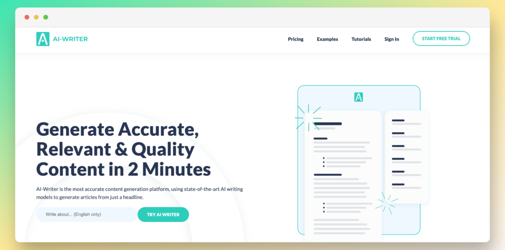
Staying true to its name, AI-Writer uses artificial intelligence to develop different kinds of texts. From articles to social media posts, you can get the platform to meet different requirements. But due to its training on GPT-3, you can also use it as one of the best AI story generators available at the moment.
By using the expansive training of the GPT-3 system, AI-Writer can help you write short stories through simple prompts. The instructions that you give to AI-Writer can be emulated into short stories with little to no time and allow you to get your required text without extensive delays.
AI-Writer is mainly based on a research writing approach, where you can get the platform to write a full-length post from a single headline. AI-Writer not only drafts your content through this simple instruction, but also gives you links to use as citations to back up any claims made in the piece.
But when it comes to story writing, you can use AI-Writer to generate fiction text with ease. With GPT-3, the prose that is created can often be interesting, while requiring some finetuning by your end from time to time.
You can also reword your text through AI-Writer or get it to rephrase the content that it generated for you. This gives you the ability to get almost unlimited revisions for anything that has been written by the platform itself.
Pricing
AI-Writer has three pricing plans. You can get 2 months free by opting for yearly payments.
Basic. $29/month. This plan lets you generate up to 40 articles
Standard. $59/month. This offer lets you create up to 150 articles.
Power. $375/month. This approach allows you to develop up to 1,000 articles.
Pros 👍
Cons 👎
Pros 👍
Easy to use interface.
Powerful writing tools.
Text rewording.
Direct publishing to the web (WordPress).
Cons 👎
Limited features as compared to competitors.
Some functionalities such as citations are redundant for fiction writers.
Who is This Best For?
Writers
Students
Go to the top

7. WordTune

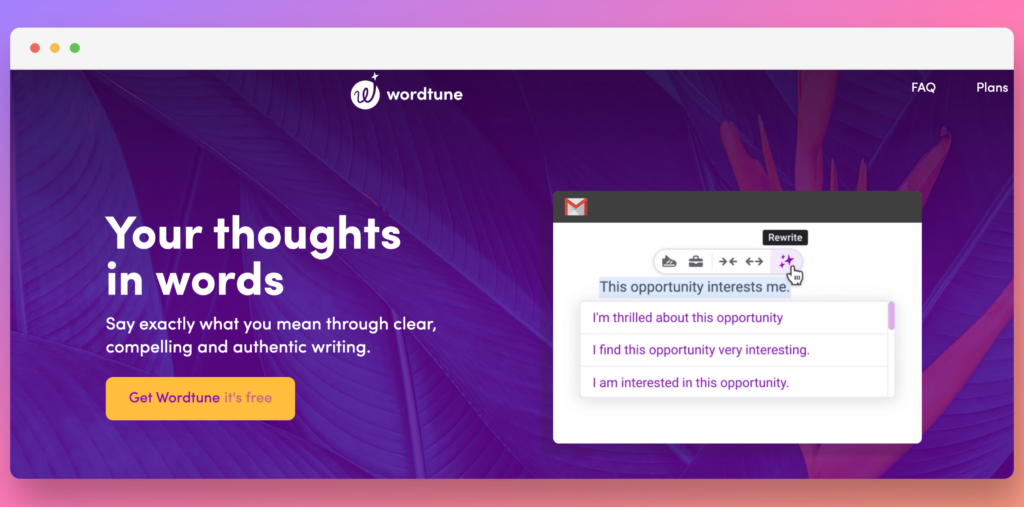
When searching for the best AI story generators, you may also happen upon WordTune through different lists. This AI-based content creation platform is available as a Google Chrome browser extension. This means that it can work seamlessly with your existing web-based applications instead of being used as a standalone platform.
When trying to generate stories with WordTune, you can use the platform to edit your text. This allows you to enhance your pre-written stories that are left unfinished, while also giving you the chance to expand on half-formed ideas.
WordTune also lets you rewrite your text, which is a huge part of its value proposition. This refinement allows you to create high quality text with the power of AI, which can elevate the overall impact of your stories and how you want to present them to your readers.
WordTune can also make your writing more concise in order to make it compelling. Whether you are writing a manuscript or an introduction to a larger body of work, this feature can come in handy.
With that being said, WordTune does lag behind when it comes to using the platform as a fully-fledged writing assistant that creates stories from scratch. If you are looking for one such platform, you may have better luck elsewhere.
Pricing
WordTune has three pricing plans. You can get a 60 percent discount by switching to annual payments.
Free. This plan lets you do 10 total rewrites to change your tone and the length of your text.
Premium. $24.99/month. This tier gives you unlimited rewrites while also giving you access to paragraph rewrites and premium support.
Business. Available upon request. This option is available upon request. It adds team billing to the mix for multiple editors.
Pros 👍
Cons 👎
Pros 👍
Easy to use.
Editing features to change the tone and length of prewritten text.
Competitive pricing plans for the available features.
Cons 👎
Cannot generate text on its own.
Individual sentence or paragraph rewriting can be frustrating.
Who is This Best For?
Editors
Writers
Students
Go to the top

Conclusion
Finding the best AI story generators can be a difficult task. But it gets easier when you know what you want from such a platform, what type of needs you want it to fulfill, and how much budget you are setting aside for it.
For instance, if you are only looking for an assistant that lets you brainstorm ideas, you may not need to shell out a significant amount of money on an AI-platform. On the other hand, if you want your short prompts to be expanded into detailed ideas, you may want to subscribe to an AI story generator solution without any delay.
In some instances, AI story generators may not write stories at all. Instead, they may simply perform basic editing tasks such as shortening and expanding your text. These niche use cases are quite targeted and do not serve the needs of every type of writer. But if you are trying to expand or shorten pre-written ideas, this might be of use to you.
To ensure that you are making an informed decision, keep the following aspects in mind.
Provider Technology
This is one of the most important factors to consider when choosing your AI story generator. With renowned technologies such as GPT-3, many AI providers easily outline what AI model they are using. By finding out the source of each platform’s functionality, you can determine if the platform is worth your time.
Platform Functionality
You need to make sure that the platform you pay for or subscribe to actually performs the functions that you need. By taking a deeper look at what each solution brings to the table and whether it is something that you need in the first place, you can steer clear of bad deals that are of no use to you.
Value Proposition
While every platform claims to be a part of the best AI story generators currently available in the market, the truth is a bit different. By comparing the prices for each platform with similar solutions, you can decide if the cost is justified for the functionalities that they offer. This lets you ensure that you are not going out of your way to spend more money on something that you can get at a lower price.
By considering these aspects, you can find a solution that is more in line with your needs and enjoy using AI to unleash your creativity.
The post 7 Best AI Story Generators for 2023 appeared first on Ecommerce Platforms.


