Original Source: https://www.webdesignerdepot.com/2017/12/breaking-the-grid-without-breaking-design/

Symmetry is safe. It’s comfortable, non-threatening, and aesthetically pleasing. It can also be very dull. Using ‘asymmetrical balance’ can make things more interesting while still sticking to a grid to keep things ordered. In design, as in so many other things, the higher the risks the greater the potential rewards.
Symmetry has long been considered a good thing precisely because it is aesthetically pleasing and unchallenging to the eye. The word symmetry is derived from greek components which translate to ‘with measure’; symmetry is about proportion and balance, qualitative similarity as opposed to identical sameness. Asymmetry would therefore be a lack of balance or proportion, an unevenness.
In a visual context, however, most of us, even if we can’t remember taking basic geometry lessons (never mind what was in them) think of symmetry with a more restricted definition.
If something is symmetrical [has symmetry], it has two halves which are exactly the same, except that one half is the mirror image of the other.
-Collins dictionary
One very famous example of near perfect symmetry is the Rorschach Test cards. Their bilateral symmetry was a deliberate and important aspect of their appearance: Hermann Rorschach stated that many patients rejected asymmetric images. While the reasons for this might be an interesting area of study in itself, it’s a whole other article. All we need to know is: Symmetry comfortable; Asymmetry not so comfortable.
All we need to know is: Symmetry comfortable; Asymmetry not so comfortable
Asymmetrical balance, in a visual design context, is where two or more elements on either side of a plane are different but have the same visual weight. A simple example would be an image on one side with a block of text on the other, sized and styled to balance each other.
The two tools we use to create symmetry–and asymmetrical balance–in a design are the grid and our eye. The grid, as we know it is very much a mid 20th century invention, but in the same way that gravity already existed long before an apple fell on Isaac Newton’s head, so we can see evidence of grid based layout in some of the oldest surviving manuscripts we have: The Dead Sea Scrolls are written in even columns with regular margins and leading; the care taken over the positioning of illustration and text in early medieval manuscripts, such as the 8th century Book of Kells, indicates the use of a grid.
The grid is the bedrock of modern graphic design, and has been so for centuries in some form or other, long before the term graphic designed was coined. The grid ensures balance in a design by breaking up the ‘page’ into equal or proportional sections.
While the grid is objective, dividing space up based on exact mathematical proportions, the human eye is subjective. There are some guidelines or rules which apply for the vast majority, such as line length of x characters depending on device size, readable color contrast, all caps is a bit aggressive, and so on. But how a particular design is seen and received can vary greatly.
These variations range from the big (like the different meanings of colors across the world) down to the the individual variations of personal taste.
This is where a designer needs to have confidence; The courage to acknowledge that not everyone is going to love every design you do, and doing it anyway because it works. Knowledge and experience help, understanding why something doesn’t work means you understand how to fix it.
the grid is a tool that helps us, but we do not have to be bound by it
Sometimes, even though you know that an element is positioned correctly, or some leading is proportionally accurate according to your grid, somehow it just looks wrong. So you fix it by eye. You make adjustments until it looks right, until it feels right.
Our immediate response to design is emotional, the intellectual and analytical responses follow after. So we need to remember that the grid is a tool that helps us, but we do not have to be bound by it.
So, how can we break the grid, while still maintaining a coherent design?
Using Masonry
Probably the most frequently used technique is a masonry layout, like that made popular by Pinterest. The page is divided into regular columns along the horizontal plane, but the content blocks within those columns are of differing heights. Sometimes columns can be of double-or even triple-width, or an individual element may take up two or more column widths, but it will always be divisible by the single column width.
This technique can be applied the other way round—as in, content blocks of differing widths arranged into regular height rows—but it’s more commonly done as even columns. A masonry layout can, of course, be completely regular. If the vertical plane is divided into equal height rows and the height of each content block is a multiple of that row height then you have a masonry layout that sticks to the grid.
It is usual for the vertical spacing between elements is always the same, and matches the horizontal spacing between columns. If your content blocks contain text, making sure that the block height is consistent with your baseline grid can help with visual coherence.
Alliance Graphique Internationale
Alliance Graphique Internationale is a classic example of a masonry layout. The images are of equal widths, but differing heights while the vertical margins between images match the column gutters. All the images fill a single column width making it nicely responsive. An added touch is that the images load in randomly as you scroll down.

L’ÉLOI
L’ÉLOI’s layout has some double width content and uses a larger gutter size, both of which increase the impression of randomness. The greater space between elements emphasises the difference in their heights and vertical position.

Grafik
Grafik’s layout takes things a bit further again. Like the two previous examples, the page is divided into equal columns, the number of columns being dependent on the width of the viewport. But there is no defined horizontal or vertical spacing between elements, and the images are not all sized to fill a full column width. The column widths are the same, but the horizontal space between items in each column is dependent on the size of the elements and the size of the browser window. The result feels interesting and random, while at the same time having a reassuring order that we are subconsciously aware of.
In addition, hovering over an image brings up it’s article title and an excerpt, which in a lot of cases overlaps adjacent images.

Repeating Irregular Pattern
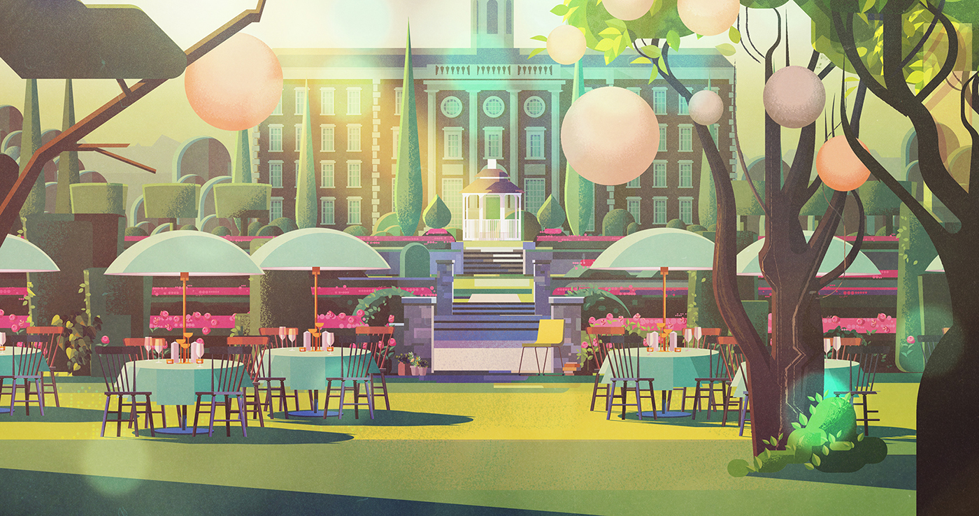
Another technique is to create a repeating pattern of irregularly placed elements. The human eye is drawn to patterns, and our brains have a natural tendency to recognize patterns all around us. We instinctively seek out patterns because their predictability makes us comfortable.
Tom Dixon
Tom Dixon’s layout groups together several different sized elements, with varying horizontal and vertical space between them. The exact arrangement varies depending on screen size as the images scale at different rates. This ‘sub’ layout is then repeated with more content. It gives us the visual interest created by the irregular spacing and misalignment, but combines it with the reassuring symmetry of a repeating pattern.

Look Mom, (Almost) No Grid!
You can of course retrospectively apply a grid to almost any design. And even those designs that don’t appear to be grid based, almost always make use of an underlying grid, especially for their typography. However, as the whitespace around elements grows the grid becomes visually less and less dominant.
Ditching a grid based layout entirely is risky, but it can work in the right hands. Keeping things minimal and clean is an easier option to avoid grid geometry. This type of layout also works best with all images or at least predominantly images.
Sojournal
Sojournal pairs an image with a title and subheading. There is a slight pattern in that the images alternate between left and right placement. But the images are different sizes and proportions, and the exact placement varies from image to image. There are no defined columns and the vertical space between elements varies.
The size of the images mean that no more than two are visible in the window at a time. It is a very clean, spacious feeling layout and the irregular positioning of the images focuses attention on each one in turn.

Blacksheep
Because the images in Blacksheep’s layout are all of a similar—quite small—size, and are on the same subject theme they can be grouped together more closely, in some places even overlapping. The overlaps are balanced out by the larger spaces in other places.

Hollie Fernando Photography
For Hollie Fernando’s portfolio, smaller images are placed closer together, while larger ones have more space around them. As with the two previous examples, the images here are carefully chosen and grouped. Content curation is always important for any site, but it is a vital part of a successful gridless layout.

Source
p img {display:inline-block; margin-right:10px;}
.alignleft {float:left;}
p.showcase {clear:both;}
body#browserfriendly p, body#podcast p, div#emailbody p{margin:0;}


 Every week users submit a lot of interesting stuff on our sister site Webdesigner News, highlighting great content from around the web that can be of interest to web designers.


