Brizy Review: Visual Page Building Reinforced
Original Source: https://inspiredm.com/brizy-review-visual-page-building-reinforced/
Meta: This Brizy Page Builder review covers everything you need to know about the WordPress plugin, with focus on how it would potentially impact your business.
Well, of course, we love WordPress for its usability, and most importantly, its wide array of third-party plugins optimized for pretty much everything to do with websites.
Come to think of it, we could spend a fortnight comparing different plugin categories, debating about the most essential one. However, if you’re honest, you’d acknowledge that nothing comes close to web design plugins especially when it comes to ecommerce sites.
Consider this. The first impression visitors have of your website is 94% related to its overall design. That’s according to a study conducted by Northumbria and Sheffield Universities. The University of Surrey, on the other hand, released a separate report revealing that users’ assessment of your business’ credibility is 75% based on the website design.
And that explains why a well-designed web interface is capable of boosting your standard conversion rate by 200 to 400%.Design comes first before other supplementary site elements pick up from there to optimize the conversion process.
That’s why I’ve always been crazy about web building plugins. Leveraging good ones is one way to lay a solid foundation for a seamless experience with other plugins and site elements.
That said, I’ll admit that I’ve used quite a couple of extremely effective plugins in this space. But, as expected, I’ve also seen my fair share of poor ones.
Above everything, I’ve always found it exciting to try out the newest entrants. Mostly because some of them come out with all guns blazing. They are seemingly never shy to challenge even established competitors with trendy, exciting features at comparatively cheap rates.
And that’s how I was quick to notice Brizy Page Builder. A new kid on the block, but certainly one of the most notable entrants.
So, what exactly does it come with? And is it any different from its predecessors?
Well, let’s find out. This Brizy Page Builder review covers everything you need to know about the WordPress plugin, with focus on how it would potentially impact your business.
Brizy Page Builder Overview
Barely two months ago, in May, was Brizy launched as a page builder for WordPress-based sites. It was essentially developed to eliminate all the coding mumbo-jumbo, and consequently help users design and set up web pages without hiring developers.

Now, let me take a wild guess here. I assume you’ve heard that same description numerous times by now. So many that it has almost grown into a cliché.
Of course, it’s understandable that you might be thinking “another page builder?” What does Brizy gain from a space that’s already seeing a steady influx of tools on a regular basis?
Well, according to the team behind Brizy, it turns out that it’s not just a standard page builder. They acknowledge that indeed there are tons of page builders out there, but claim that Brizy will change your entire perception of visual page editors.
Top on the list of things its creators boast is a new revolutionary approach, which simplifies the whole editing process by availing only the tools that matter. Through Brizy, they also attempted to do away with what they call restrictive design elements. Instead, the tool now supports extensive customization to empower site owners to do exactly what they want.
Now that only scratches the surface. There are loads of other features its developers say you’ll not see in other page builders.
Sounds impressive, right? Well, to be fair, this could possibly be marketing fluff to set the ball rolling. But then again, get this. Over the past couple of weeks, Brizy has grown to well over 100,000 downloads with a corresponding active user base of more than 20,000.
To top it off, the company is right on the verge of launching a whole new version of the tool- Brizy Pro.
Now that’s not a bad run. Quite remarkable as a matter of fact.
But are its features worth the hype?
Let’s take a closer look…
Brizy Page Builder Reviews: Features
Premium Themes
A bland outlook is one way to approach your page design, especially if you believe that graphics could be distracting.
But, let’s look at facts here. Going by research conducted by Adobe, 38% of your traffic will bounce off immediately your store’s website loads without appealing imagery or layout.
To help you entice your users, Brizy has outsourced theme designing to the real experts- Themefuse. This renowned group of professionals has designed a wide range of attractive and elegant premium themes, which are principally available on Brizy Pro.

And to avoid distracting users, the templates come with simple, clutter-free layouts. They are sleek, with minimalistic arrangements to help site visitors navigate around without any problems.
Clean Interface
While it might be exciting to see a wide range of editing tools when you’re working on a web page, let’s face it. Even for extremely complex pages with dynamic elements, you’ll only be able to use a limited number of tools at a time. Consequently making the rest redundant and bothersome.
Brizy addresses this problem by eliminating the crowd of editing tools we’ve seen with the bulk of other page builders.
However, make no mistake about it. The tools are not abolished completely. Instead, Brizy avails only what you need for the specific task at hand, and hides the redundant options.
The result? Well, apart from a well-streamlined editing process, you get to enjoy a smart, clean interface.
Extensive Design Elements
Availing only the necessary editing options is quite commendable. But, admittedly, the subsequent clean editing interface could get you worried that Brizy might have very limited design elements.
Well, could that be the case with this WordPress plugin?
To comprehensively assess Brizy’s capabilities, I went beyond the standard options. I tried creating a web page with multiple elements, all dynamically linked within a single interface.
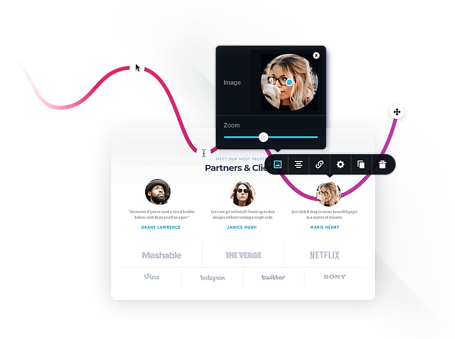
Thankfully, Brizy systematically provided a wide range of elements to design just the right page. In addition to maps, Brizy supports videos, icons, images, buttons, text, and many more.

Among its provisions is over 4,000 different icons, available in both Glyph and Outline versions. It also offers more than 150 pre-made page design blocks, which can be conveniently added to your web page to set its structure.
Recently, its creators further introduced entrance animations to the whole editing package. You can now take advantage of more than 40 animation types to create an intuitive scrolling experience.
That said, here’s the kicker. While Brizy has covered all the fundamental design elements, it’s fairly limited when it comes to advanced elements. But the silver lining is the fact that the team behind it continues to improve the editing environment with additional web page design elements.
Global Customization
Embedding all those elements with their default parameters would ideally shorten the page building procedure. But, it would also result in a boring, unappealing web page. Different pages would possibly share more or less the same outlook.
Since every site is unique in its own way, Brizy found it critical to expand its editing options to facilitate extensive customization. That way, you can comfortably adopt your entire website to the specific business branding strategy.
But, how does this work exactly?
Brizy essentially allows you to adjust multiple aspects and parameters of the individual page elements. When you need to set positions within the page, for instance, you could capitalize on the intuitive drag and drop feature. It helps you conveniently move the elements to their desired position by simply choosing, clicking, dragging and dropping them anywhere within the page.
If the columns seem to be disproportionate, you could resize them by moving a mid-handle. You might especially find the corresponding percentage values displayed up top quite handy in ensuring accuracy.
And guess what? Customizing the columns doesn’t affect the content. Everything simply readjusts to adapt to the new dimensions.
And speaking of content, Brizy also comes with a smart text editor, which is optimized for changing text alignments, fonts, and colors. You can also extend the color scheme to the rest of the page layout with a single click to edit template properties.

And you know what? You’re free to be creative and experiment with multiple design options. You can always click to undo or redo any edit.
Mobile Optimization
A typical internet user today is pretty versatile. A report by Adobe revealed that 83% of customers worldwide, on average, surf on multiple screens using 2.23 devices at the same time.
Yes, you’re dead right. This includes smartphones and mobile tablets.
As a matter of fact, users love their mobile devices so much, that 74% of them say that they may never attempt to revisit a site if they found it to be poorly optimized for mobile surfing. I guess our addiction to surfing on-the-go might have everything to do with this widespread preference.
Now, one thing’s for sure. Such entitlement by internet users is not going anywhere. Quite simply adapt your site or go home.
Fortunately, Brizy provides a Mobile View mode with just the right tools to optimize your web page for mobile devices. Shifting to this window allows you to design all the elements for smaller screens.

Brizy Page Builder Reviews: Pricing
You’ll love this.
At the moment, all these features are available for free. You’re not going to pay even a dime to leverage them.
Developers are working now on an extended version (Brizy Pro) that will offer much more features aimed at web professionals and marketers.
What you are buying now is a pre sale for the Pro version, but the catch is that this is a one time payment only, lifetime deal. Once the Pro is out, the lifetime will be gone and you’ll pay yearly.
Brizy Pro
Brizy Pro is basically standard Brizy on steroids. According to the developing team, some of the additional features it will introduce include:
A/B Testing- You’ll be able to review and compare two distinct versions of the same web page with varying parameters.
Advance Forms-While the free version supports standard forms, Brizy Pro supports advanced forms with additional design options.
Role Manager-This allows you to set access and editing privileges for different parties you’ll be collaborating with.
Pop-up Builder- To boost your conversion rate, the pop-up builder facilitates the design and setup of call-to-action windows, pop-up banners, and more.
Third-Party Integration- Brizy Pro will support the following third-party services; Drip, SendGrid, AutoPilot, Mailer (Lite), HubSpot, Zapier, Unsplash, Salesforce, AWeber, MailChimp, Campaign Monitor, TypeKit, plus more.

Who Should Consider Using Brizy Page Builder?
To recap, here are the crucial takeaways:
Top on the list of things Brizy’s creators boast is a new revolutionary approach, which simplifies the whole editing process by availing only the tools that matter.
Over the past couple of weeks, Brizy has grown to well over 100,000 downloads with a corresponding active user base of more than 20,000.
Developers are working on a parallel version, Brizy Pro, which will offer much more features at a price. If you’re interested, you could pay $247 for a lifetime package of Brizy Pro once it launches.
Going by the current provisions, Brizy is quite decent for personal projects and basic websites. It can also suffice for small businesses and startups, but only for non-sales web pages.
Heavier users with high business ambitions have no choice, but to hang on until Brizy Pro is ultimately launched. And from the few features that have been leaked, I have to say that we expect it to make a substantial impact in the WordPress page building space.
For now, paying for the lifetime package seems like a pretty safe bet. Especially considering the fact that Brizy’s developers have already proven what they are capable of over the long haul.
Otherwise, let’s wait and see how it pans out. And maybe, I might hit you with a comprehensive Brizy Pro review in the near future.
The post Brizy Review: Visual Page Building Reinforced appeared first on Inspired Magazine.


 Every week users submit a lot of interesting stuff on our sister site Webdesigner News, highlighting great content from around the web that can be of interest to web designers.


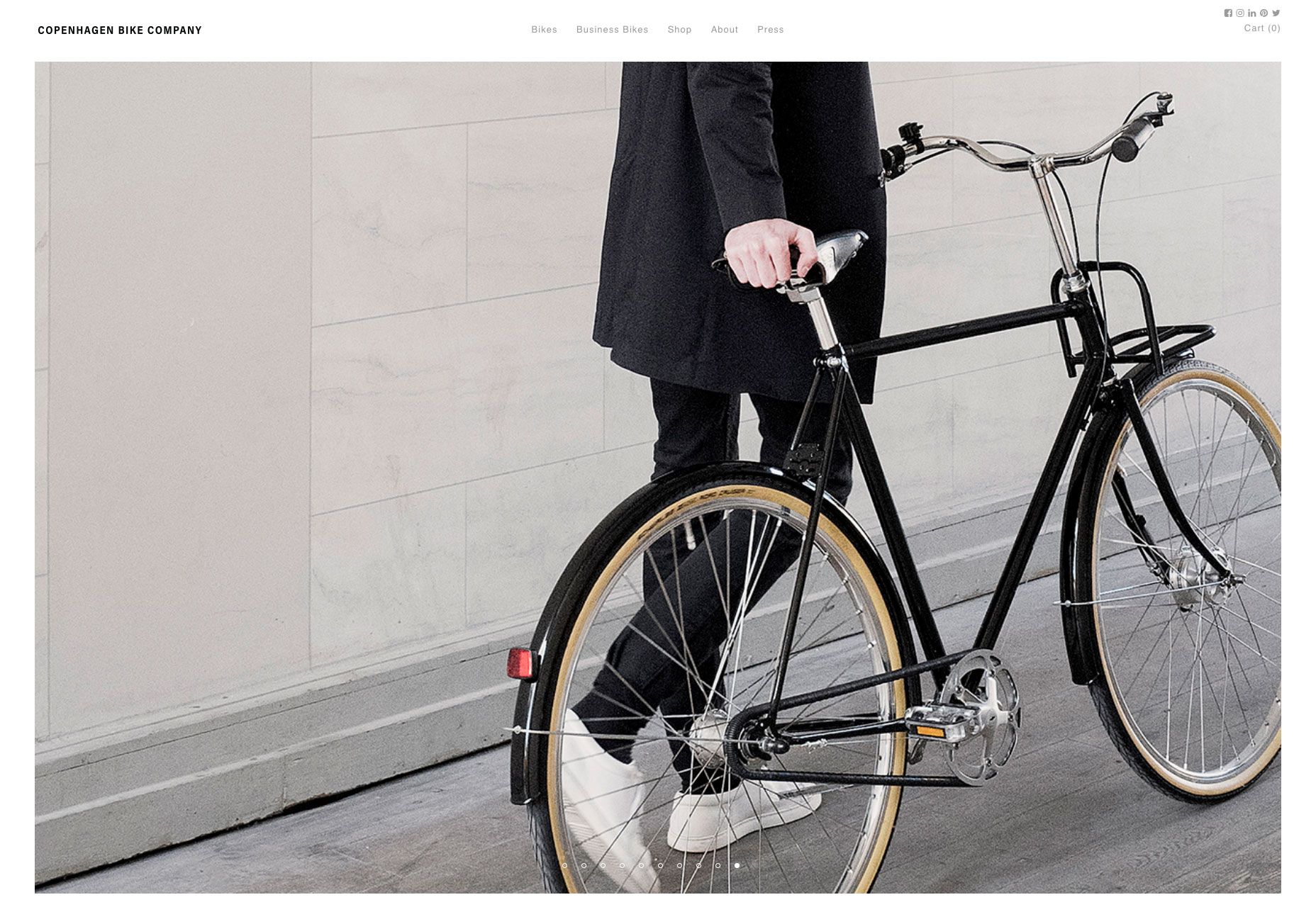
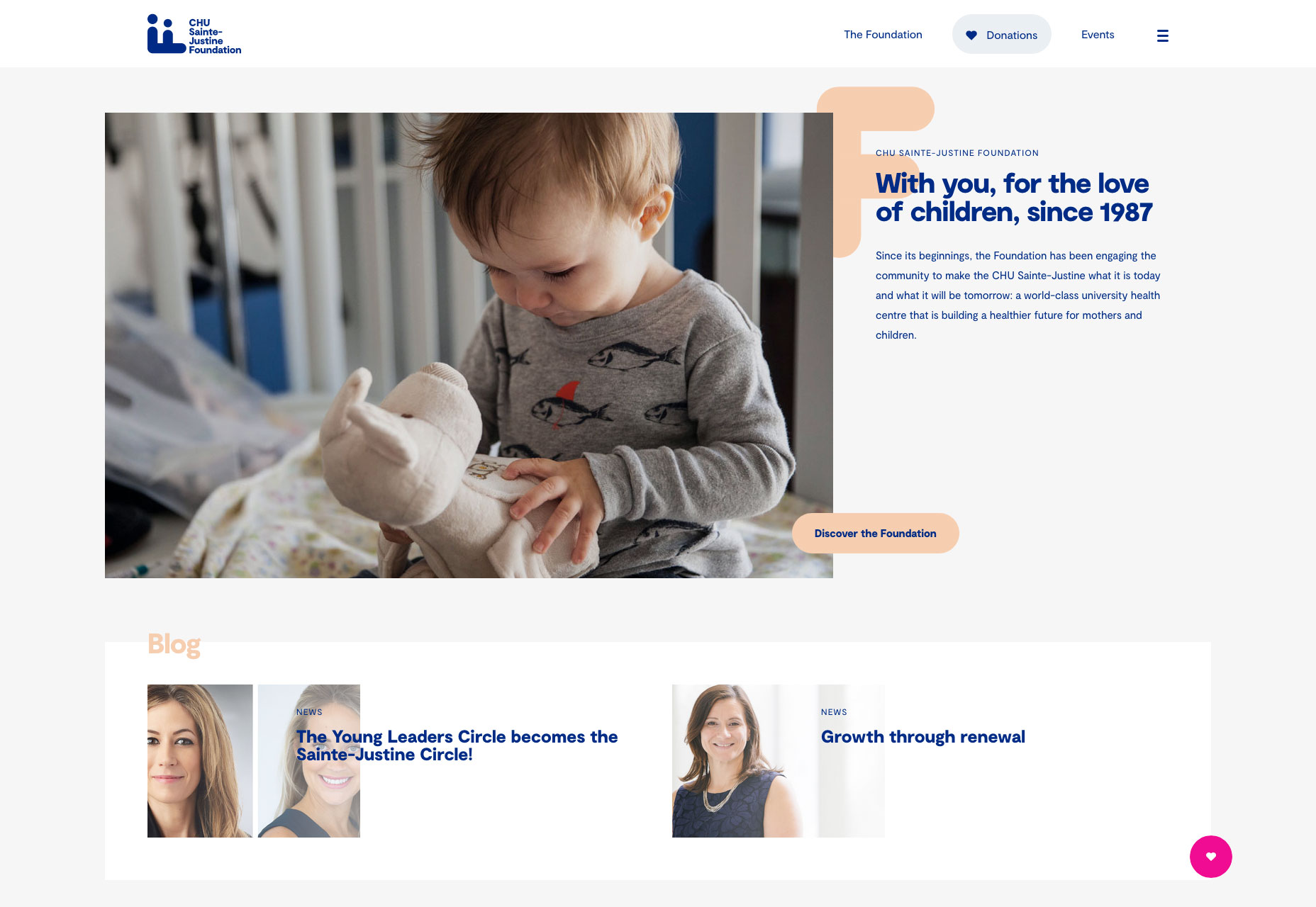
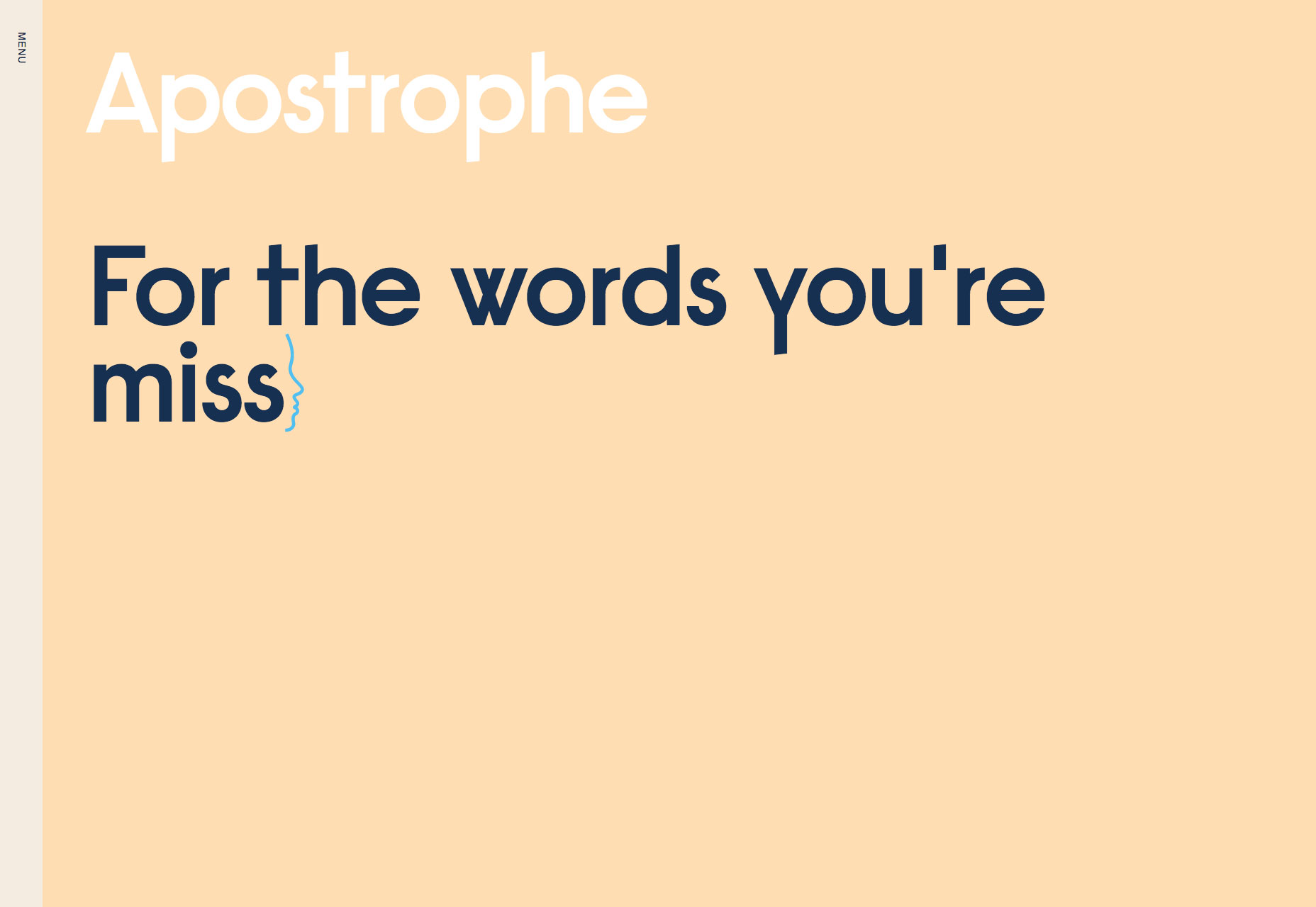
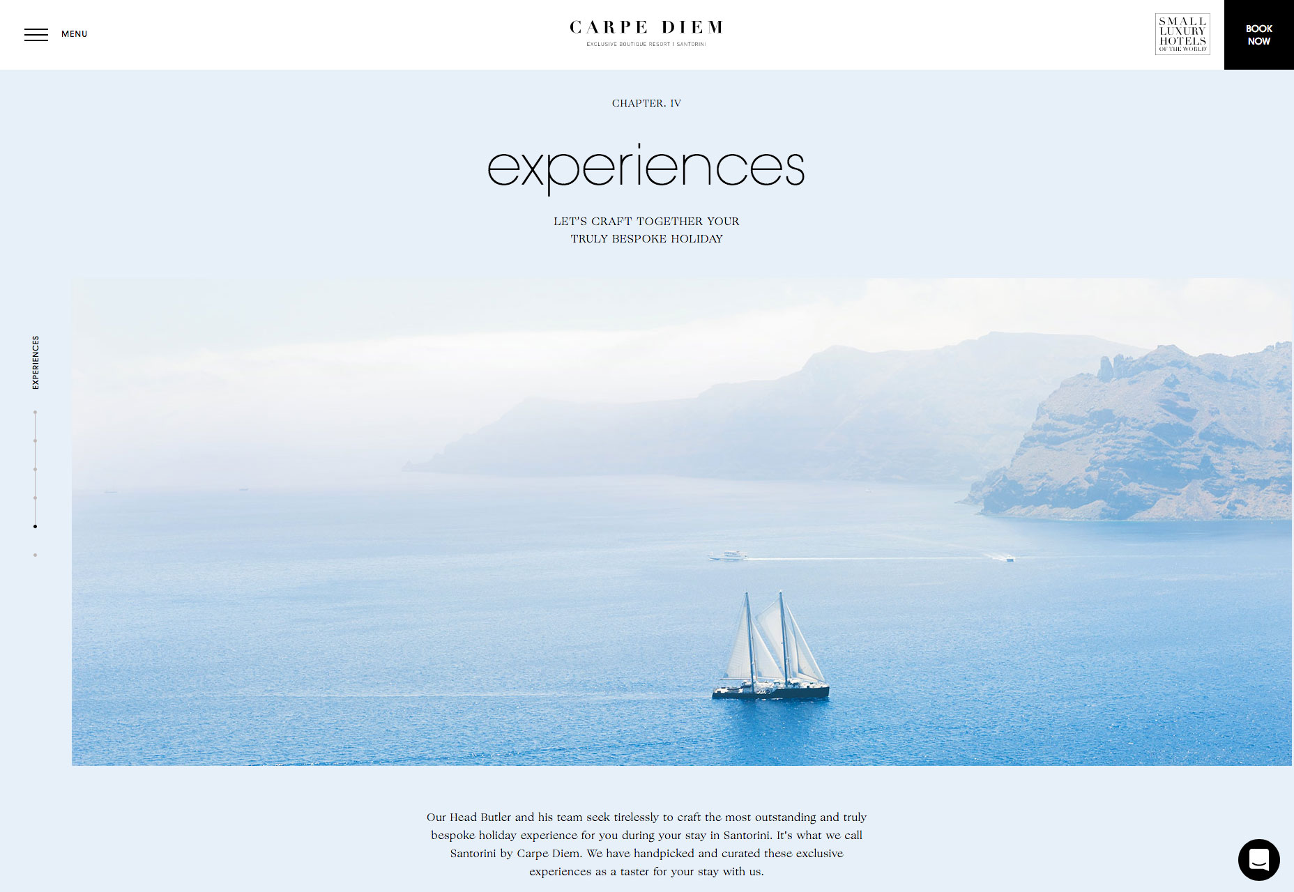
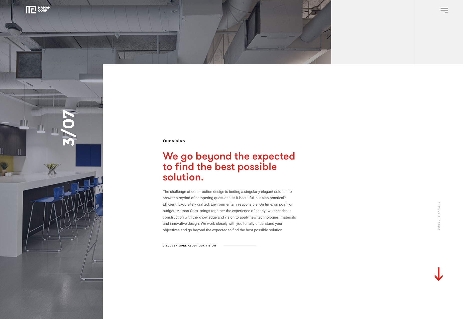
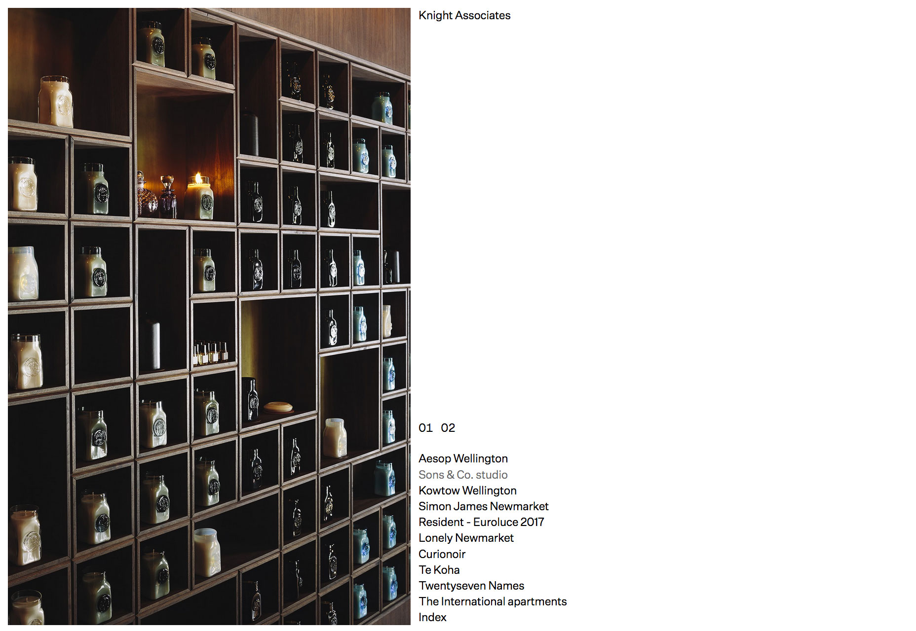
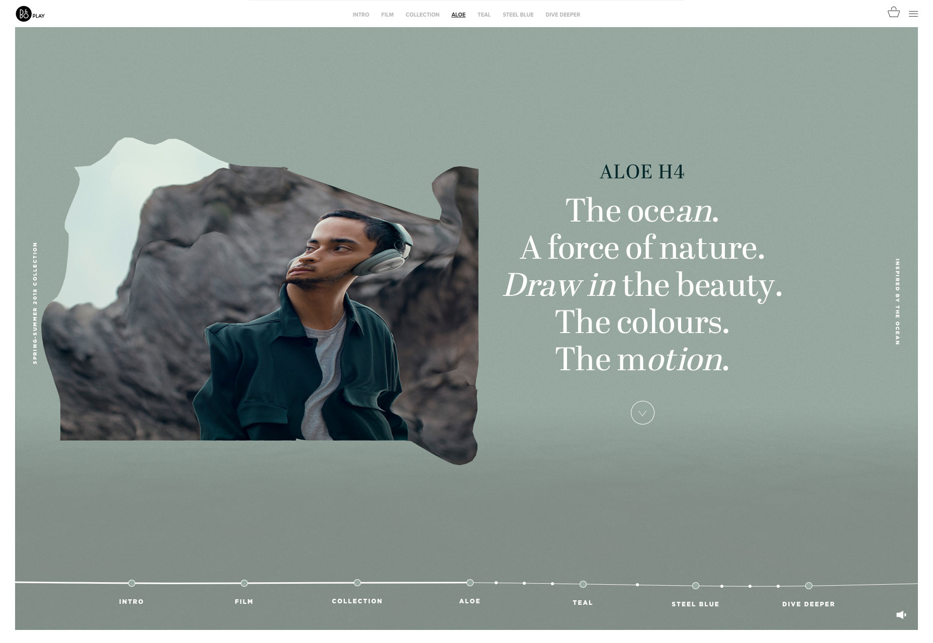
 Welcome to our roundup of the best websites launched (or significantly updated) this month. July is a strange time to launch a site with the Summer slowdown in full effect, but these intrepid entrepreneurs have done so. We’ve got examples of great ecommerce, a couple of agency sites that we couldn’t resist, and lots of incredible art direction.