Design Your Website to Sell While You Work

Original Source: https://www.webdesignerdepot.com/2019/05/design-your-website-to-sell-while-you-work/

Design work is very time consuming. But it’s not just the labor you put into building websites that takes time and concentration.

Because the projects you work on typically have a short shelf life, you’re constantly having to find new gigs, woo potential clients, and sign them onto your service — which is like another job in and of itself. So, when do you find time to look for more work when you’re so busy actually doing it?

You could set aside time on the weekends to work on drumming up new projects, but that’s the last thing you want to do. Imagine spending that time booking new business and then being too burned out to get started with any of them? That’s no good.

You could, of course, do it during the workweek. It would just require you to dedicate otherwise billable hours to non-billable work and cut into your business’s profitability.

Without hiring someone to handle sales for you, what’s the solution?

It’s your website.

Here are some things you can do to design a website that relieves you of at least some of the burden of finding and selling to new clients.

1. Design for Your Niche

One of the best things you can do as a web designer (or any creative freelancer, really) is to carve out a highly specific niche. For instance, you could design websites for:

Real estate agents
Female-owned businesses
Restaurants in your city

The more targeted your audience, the easier it will be to sell to them (and to build their websites).

I’m going to take this one step further as I don’t just think it’s enough to choose a niche to design for.

I think your own website should be reflective of your niche. More specifically, it should be designed to look like a website your client would want as their own. What better way to sell a prospect on a website than to show them that you know exactly how to build the solution they need?

The Modern Firm is an excellent example of this:

Visit the website and you’ll notice:

The company name sounds like it should be working for law firms.
The design is super buttoned-up — traditionally-structured, muted color palette, and minimalism at its best.
Copy is professional, honest, and straight to the point.

In other words, this website looks and sounds like one that its target clientele would want for themselves.

2. Answer Their Questions

Think about how much time you spend dealing with objections as you talk to prospective clients. That’s either because their expectations haven’t been set properly before meeting with you or they’re a bad fit.

If you use your website to answer those questions, though, you can significantly decrease the amount of time you spend on sales calls with prospects.

One way to do this is to explain in the simplest terms what your clients get. Here’s how I handle this for prospective copywriting clients:

I was frustrated that I had to explain over and over again to prospects what it meant to create optimized content. The question continued to come up on calls, so I decided to just provide the answer on my website.

I now no longer get questions about my services. Prospects hop on the phone with me and ask how much they have to pay to get started. It’s been a huge time-saver.

As a web designer, it might not be as simple as to say, “You’ll get a 10-page website, built using X theme, optimized for speed with caching, etc.” When it comes to websites, you’re just delivering too technical of a product.

So, for you, I’d suggest taking the same basic principle of “answer their questions”, but tackle them with an FAQs like Eternity does:

They’ve done such a great job of providing simple and straightforward answers to the kinds of questions I’m sure all of you get. Not only will this decrease the amount of time people have to spend with them on sales calls, but it’ll help weed out bad-fit clients.

3. Create a More Impressive Portfolio

There’s absolutely no question that your website needs to include an awesome portfolio of websites. Just make sure that any samples you include in your portfolio:

Are 100% something you’re proud to show off;
Are relevant to your target audience;
Are consistently designed.

Here’s what I mean:

Bluetext is in the business of creating digital campaigns (including web design) for clients. Although they build solutions for a couple dozen industries, they keep their portfolio well-organized, grouping sample work based on category.

For example, this is what their “Cybersecurity” portfolio looks like:

Notice how well put together this portfolio is — everything is clearly labeled, designed in a similar style, and is impressive to look at. It also helps clients in quickly see the potential for their specific business without the distraction of other types of websites getting in the way.

4. Establish Trust

As a web designer, you have to build trust with clients if you want them to pay top-dollar for your services. While you can certainly do that throughout the web design process, why wait? Use your website as a vehicle for establishing trust now.

One way to do this is with your portfolio.

Another way to do this is by including testimonials or, at the very least, logos from clients who are happy to connect their brand to yours. Interactive Strategies uses a dedicated banner on its home page to show off brands who’ve trusted them:

If you don’t have a client base with recognizable names, or you’re still working to amass an impressive list of clients, don’t worry. You can use other trust marks to establish trust now as Direction.com does:

Prospective clients can see all of their awards and certifications in one place — and it’s definitely something to marvel at.

5. Simplify Next Steps

If you’ve been doing this for long enough, I bet you can anticipate what prospective clients’ next steps are after they’ve visited your website.

For my business, I know that they’ll see my site and then reach out for pricing. However, I know that I can’t actually answer that question during a first phone call. I have to review their needs, business, industry, and a whole host of other details before I can provide a quote.

So, I give them two options:

Fill out a contact form if you have further questions;
Schedule a 15-minute call with me through Calendly.

There’s just one caveat to the phone call though. I don’t get on the phone with anyone until they fill out my questionnaire (which their “Thank You” email sends to them). It asks them everything I need to know to provide them with a quote.

That way, when I do get on the phone, I’m fully prepared to talk about my process, explain final questions, and give them a number.

I would suggest building out a similar set of contact options (e.g. contact form and scheduler, chatbot and scheduler, chatbot and email, etc.), so you can spend less time going back-and-forth on the phone or over email and instead get them a quote and contract right away.

Design Your Website to Sell While You Work

Would you like to stop spending so much time on job boards, social media, and in search trying to find new clients? You already know how to build websites to help your clients sell their businesses, so why aren’t you doing the same for your own?

Add Realistic Chalk and Sketch Lettering Effects with Sketch’it – only $5!

Source

p img {display:inline-block; margin-right:10px;}
.alignleft {float:left;}
p.showcase {clear:both;}
body#browserfriendly p, body#podcast p, div#emailbody p{margin:0;}

Collective #512

Original Source: http://feedproxy.google.com/~r/tympanus/~3/VV820Ts2Qf4/

C512_designsystem

Let’s Make A Design System! Live Coding at Smashing Conf

Watch Brad Frost live-code a design system on stage at Smashing Conf San Francisco.

Check it out

C512_parcel

Moving from Gulp to Parcel

Ben Frain explains how to use Parcel instead of Gulp for application bundling.

Read it

Divi

Our Sponsor
Divi: The Powerful Visual Page Builder

Divi is a revolutionary WordPress theme and visual page builder for WordPress. With Divi, you can build your website visually. Add, arrange and design content and watch everything happen instantly right before your eyes.

Try it

C512_mutation

Getting To Know The MutationObserver API

Louis Lazaris shows how to use the MutationObserver API to make observing for DOM changes relatively easy.

Read it

C512_spatial

CSS Spatial Navigation Level 1

The first public working draft of the specification that defines a general model for navigating the focus using the arrow keys, as well as related CSS, JavaScript features and Events.

Read it

C512_3d

3D Projection

Jordan Santell writes about the fundamentals of 3D projection and frustums with lots of visuals and math cheats.

Read it

C512_tania

Using React Router for a Single Page Application

A tutorial by Tania Rascia on how to use the react-router-dom library.

Read it

C512_bubblesort

Musical Bubble Sort (CPC Bubble Sort)

In this great demo by Stephen Sparling you can actually listen to Bubble sort!

Check it out

C512_lines

Line Drawing

A hypnotizing pattern demo that changes according to the mouse position. By Liam Egan.

Check it out

C512_drag

DRAG AND JUUUMP!! AND DROP

Have some fun with a click and drag interaction.

Check it out

C512_animatescrollcss

Create an animated scroll cue

Learn how to add a subtle cue to the bottom of the page that lets people know that they can scroll to see more content.

Read it

C512_svgsways

The Billion Ways to Display an SVG

An exploration of the various ways there are across HTML, CSS, and JavaScript for getting a SVG to display in the browsers.

Read it

C512_cssmixin

Angled Background CSS-only “Mixin”

A demo by Miriam Suzanne that shows how to create Sass-like “functions” and “mixins” in plain CSS.

Check it out

C512_uber

Base Web React Components

Base Web is the React implementation of Base, Uber’s design system comprised of modern, responsive, living components.

Check it out

C512_semantic

Enriching Search Results Through Structured Data

Learn about the importance of structured data in this article by Daniel Waisberg on the Google Webmaster Central Blog.

Read it

Screen-Shot-2019-04-30-at-01.16.12

Building a pure CSS animated SVG spinner

Glenn McComb’s tutorial on to create a SVG spinner powered by CSS animations.

Read it

C512_picsum

Lorem Picsum

Easy to use, stylish placeholders where you just need to add your desired image size after the URL, and you get a random image.

Check it out

C512_font

Free Font: Pippa Handwriting

A playful handwriting font made by Queenie Appleyard.

Get it

C512_waterfall

Rushing rapid in a forest by Three.js

A beautiful Three.js demo by Yiting Liu.

Check it out

C512_mirrorball

Mirrorball

A very creative way of showcasing projects.

Check it out

C512_svgiconanimate

A Designer’s Guide to Animating Icons with CSS

Shannon Thomann shows how to approach CSS animations for animating SVG icons.

Read it

C512_citylife

City Life Icons Collection

50 SVG and PNG icons with a city theme by Freepik. Free for a subscription.

Get it

Collective #512 was written by Pedro Botelho and published on Codrops.

Free One-Page Portfolio Website Builders

Original Source: http://feedproxy.google.com/~r/1stwebdesigner/~3/oKBT6B9eBao/

In the growing world of designers, developers and other online service providers, having a great portfolio is essential to getting hired. You won’t get work if you don’t put yourself out there, and what better way than with a portfolio? These one-page website builders are free, easy to use, and simple to set up, so you can get your portfolio online fast.

Carrd

Carrd

Carrd is a one-page site maker that uses a super straightforward interface to help you set up your portfolio. If you’re looking to create something elegant and minimalistic, you’ll love this. Many builders can be overwhelming before you get used to them, but Carrd is easy to use right from the get-go. Just pick a theme and click one button to add elements.

There’s a really cheap Pro version, which offers various forms, custom domain compatibility, and custom code + third party widgets. At $9 a year, this is about as affordable as it gets. However, all the core features are free, so feel free to test it out and even publish your website.

Mobirise

Mobirise

An offline web builder solution for Mac and Windows, Mobirise allows you to easily create mobile-friendly websites. It was specifically designed to be as easy to use as possible for non-programmers and visual thinkers. If you’re new to this, try it out.

Once you’ve finished putting together your website in this block-based builder, publish it for free wherever you want. No domain? Mobirise can publish to Github Pages at no cost to you.

About.me

About.me

Simple and professional, creating an about.me website is a great way to introduce yourself. Just type in some info about yourself, pick from one of three clean themes, and you have a mini portfolio! From there you can customize the website further, changing text and adding links. There’s also a nifty email signature feature, which adds your about.me as an email signature.

The Pro version has various other features, testimonials, image and video embeds, messages, appointment scheduling and newsletter building. With the free version, you can still build a professional biography.

WordPress

WordPress

If you’d rather do it yourself than use a simple website builder, but don’t have the technical know-how to create a website from scratch, WordPress is probably the solution. Choosing a one-page WordPress template still gives you something to work off of, but you’ll be more in control of your website’s appearance. And there’s hundreds of thousands of themes – no website builder can boast that.

Customizing and making it your own may require HTML and CSS knowledge, and you’ll also need to handle hosting, domain and WordPress installation. WordPress itself is free and open source, but these aspects will probably cost money.

Diving blindly into WordPress is not for the faint of heart, but if you’re up for a challenge, this might be the solution for you.

Wix

Wix

Wix is considered by many to be similar to WordPress, but much easier to use. Its interface is intuitive enough, and setting up and publishing a website is super easy. There’s a ton of functionality in this builder if you’re willing to learn it.

The free version of Wix allows you to create and publish your site under a Wix domain. Premium plans let you get a custom domain, remove Wix ads from the site, or add apps, but it isn’t necessary to make your portfolio public.

Persona

Persona

Persona does absolutely no beating around the bush. Just click to get started, pick a theme, and start editing. The WYSIWYG editor is super powerful. It takes some adjusting to, but once you have the hang of it, you can create basically whatever you want.

However, note that you can only create a private Persona without upgrading. If you want to publish your portfolio, it will cost a relatively cheap $24/year or $4/month. Trying before you buy will at least let you know if this is the right tool for you.

Building a Simple One-Page Portfolio

Never underestimate the power of a one-page portfolio. A site that’s too complex can drive away potential clients, especially if you can’t hold their interest long enough to direct them to the contact page. But a well-crafted one-page website is concise and gets the point across quickly, while still showing off your skills to visitors.


Free Programming Courses from Harvard, MIT, Microsoft and More

Original Source: http://feedproxy.google.com/~r/1stwebdesigner/~3/O4jAGc1SW2A/

Did you know that you can learn computer science and programming online from institutions like Harvard, MIT, Berkeley and Microsoft on edX.org? The nonprofit site offers 2,000 online courses from 140 institutions worldwide. Courses are free to try.

edX Online Courses

Popular Courses

Here are some of the most popular courses and programs offered on edX:

CS50 from Harvard

The most popular course on edX gives you an introduction to computer science and programming. Learn how to think algorithmically and solve programming problems efficiently. Gain familiarity in a number of programming languages including C, Python, SQL, JavaScript, CSS and HTML.

Front End Web Developer from W3C

W3C (World Wide Web Consortium) is the organization that develops web standards. It was founded by the inventor of the web, Tim Berners-Lee. In this 5 course program, learn how to code with modern HTML5 tags, draw and animate fun web graphics, and play audio and video elements. Learn CSS best practices for web page design and the fundamentals of JavaScript to help you develop interactive web apps.

Introduction to Computing in Python from Georgia Tech

In this 4 course program, learn the fundamentals of computer science in one of the field’s most popular programming languages, Python 3, including writing code, executing it, interpreting the results, and revising the code based on the outcomes. Rated as one of the most in-demand and beginner-friendly programming languages, a background in Python will give you a solid foundation to build your career. Short videos (2-3 minutes each) are rapidly interwoven with live programming problems and multiple-choice questions to give you constant feedback on your progress and understanding.

C Programming with Linux from Dartmouth

Did you know that smartphones, your car’s navigation system, robots, drones, trains, and almost all electronic devices have some C-code running under the hood? Along with the C programming language comes Linux, an essential operating system that powers almost all supercomputers and most of the servers worldwide, as well as all Android devices and most “Internet of Things” devices.

In this 7-course program, develop and debug code in the C programming language. Discover the foundations of computer programming and Linux, manipulate the command line, manage processes, files and memory, and compile C code with Linux.

Data Science from Harvard

Data science is one of the hottest fields in programming. Learn key data science essentials in this 9-course program, including R and machine learning, through real-world case studies to jumpstart your career as a data scientist. Also learn statistical concepts such as probability, inference, and modeling and how to apply them in practice. Gain experience with data visualization with ggplot2 and data wrangling with dplyr. Become familiar with essential tools for practicing data scientists such as Unix/Linux, git and GitHub, and RStudio. This is one of the most popular programs on edX.

Blockchain for Business from the Linux Foundation

Everyone has heard of blockchain, but most don’t understand how it can apply to their business. Learn exactly what a blockchain is, its impact and potential for change around the world, and analyze use cases in technology, business, and enterprise products and institutions in this fundamental course from the experts at the Linux Foundation.

Microsoft Courses

Some of the popular Microsoft courses include:

Introduction to Typescript

Want to write organized code for your website that you can easily manage and maintain? TypeScript is the answer to building scalable web applications. TypeScript lets you write JavaScript the way you want to. TypeScript is a typed superset of JavaScript that compiles to plain JavaScript. It works on any browser. Any host. Any OS.

Introduction to Bootstrap

Bootstrap is an open source project originally created by Twitter to enable creation of responsive, mobile first web pages. Bootstrap has a standard set of classes that allow developers to quickly create applications that scale to devices of all sizes, and incorporate common components such as dialog boxes and validation. Bootstrap has become a de facto standard for web design.

Introduction to jQuery

jQuery is the most popular library for JavaScript. In this course, you will learn how to use jQuery to add additional power and interactivity to your web pages. You’ll see how to take advantage of jQuery in your web pages, how to work with the HTML document, and even make server-side calls.

Introduction to Angular

In this course, you will learn about the basics of how Angular works, and why Angular has emerged as a popular framework for JavaScript/TypeScript application development. You will also learn how to properly set up your development environment for creating an Angular app, including installing VS Code, Node.JS, TypeScript, and the Angular CLI.

Introduction to ReactJS

ReactJS is the latest JavaScript framework to capture the hearts and attention of the frontend developer community. Developers love ReactJS because it’s highly performant and renders changes almost instantly. The best part about ReactJS is that it is a relatively small framework and does not take too much time to learn!

Start Learning Today

If you are looking for something else, edX offers beginner to advanced programming courses in C++, C#, Java, Power BI, Artificial Intelligence, Machine Learning, Deep Learning, Cybersecurity, IoT, Cloud Computing, AWS, Azure, DevOps, and more. View more courses here.


5 Signs That Web Design Is Reaching Its Own Industrial Age

Original Source: https://www.webdesignerdepot.com/2019/04/5-signs-that-web-design-is-reaching-its-own-industrial-age/

The Internet as a concept, and as a community, is much like a teenager: it’s struggling to establish its identity, everyone is trying to tell it what to do, and it tends to lash out at both people who deserve it as well as those who don’t. It does so at random, and you’re not its real dad, anyway.

The practice of designing websites, however, has gone right past the teenage years and blown past the whole human-life-span metaphor entirely. Web design is, in my opinion, reaching an industrial age, of sorts. You know, the era of smokestacks and Charles Dickens’ really depressing novels.

Let’s see how:

Increased DIY Capability

The sewing machine was invented in 1755, about five years before the “official beginning” of the industrial age. This machine, and others like it, heralded the beginning of that age and the massive machines that would come after, but they also drastically expanded the production capabilities of individuals working at home, or in their place of business.

It started with software like FrontPage and Dreamweaver, and now we’ve got Squarespace, Wix, Weebly, Duda, Webflow, and a host of other options. They’re all designed to enhance the output of the individual, the hobbyist, the business owner, and the freelancing professional. Work that once might have taken a very long time for one person, or a reasonable amount of time for ten people, is all being done by one person, in a lot less time.

And if you’re a purist, you can always sew the buttons onto your web page by hand.

Increased Automation At The Professional-Level

Think of the massive looms in old factories. Now it’s not particularly easy to automate creative visual work, as such. Most of the automation in web design is done at the coding stage, in both front and back end. But even with such simple tools as Symbols in Sketch or Affinity Designer can drastically reduce the work required to produce a large number of designs.

Or at least something like a large number of buttons. It’s not a perfect analogy to the factories of old, but the tools we have are making it consistently easier to produce designs of consistent quality, even if they also have pretty uh… “consistent” layouts and aesthetic styles. This sort of drastically increased output is the very definition of industry.

Expansion Of The Digital Middle Class

Increased DIY capability and automation in the industrial age led to a dramatic expansion in what people could afford. The increased amount of work in general meant that more people could afford that stuff, and thus, the middle class was born.

The same thing is happening in web design. For the hobbyist or professional building sites on the cheap, shared hosting can cost as little as a few dollars a month, and code editors are free. For less code-focused hobbyists and business owners alike, code-free website builders are attractive and largely affordable options, too. Plenty of platforms offer a straight-up free plan.

Getting a web presence of some kind has literally never been easier, and it’s going to keep getting easier.

Outsourcing And Subcontracting

Then, of course, there’s outsourcing and sub-contracting. These come in two major forms: software as a service, and labor. SaaS in particular has become exceedingly popular as a way to build a product that constantly pays for itself, leaving you to focus on maintenance, and improvements. The train engineers of old wish they could have worked on their trains while they were still running.

While few websites are, I think, built by orphans trapped in smoke-filled factories, we should not ignore the fact that there is a lot of cheap labor out there. And you know what? A lot of them are actually really good, and are only cheap because of the economic disparity between nations. This actually leads me to my next point…

Poor Enforcement Of Industry Standards

One of the downsides of industrial ages as they happen all over the world is this: the constant push for progress sometimes leaves much to be desired in the way we treat our fellow humans. Of course, this isn’t happening to web designers in a bubble. The “gig economy” is often used as an excuse not to provide benefits for employees. Cheap labor is often taken advantage of in the worst ways. Overworking people to near-death is accomplished not with whips, but with Instagram and Twitter feeds praising the eighty-hour work week.

And the actual standards meant to ensure the quality of the product are often ignored. The W3C does a lot of good work, but they don’t actually have the power to enforce HTML validation. Well… that’s probably for the best, all things considered, but as we’ve seen, governments are also poorly equipped to provide QA for the Internet as a whole.

However, I should note that I greatly appreciate some of the government-led work done in the field of accessibility, particularly in countries that require WCAG compliance.

Fear Of Obsolescence

The proliferation of industry created a lot of jobs, and killed a lot of others. Design, however, is still a creative discipline, and thus there will always be room for good designers. Even so, automation and code-free design tools have people worried, and I can understand why. That said, lots of people will actually hire you to use Wix for them, so… shrug.

People outsourcing relatively easy tasks might save us, yet.

It’s Not All Doom And Gloom…

We call hand-crafted websites… well… that. Sometimes “bespoke”. Perhaps a better word would be “artisanal”, and we should just get used to being hipsters. I’m only mostly kidding.

In every industrial age we’ve witnessed, things got bad, and then they got better. We haven’t gotten rid of all the smoke stacks yet, but the world is in most ways a much better place than it was, and the Internet is developing faster than the rest of the world. It may be an industrial age now, but imagine what it will be like when they invent computers.

Wait…


Featured image via Unsplash.

Add Realistic Chalk and Sketch Lettering Effects with Sketch’it – only $5!

Source

p img {display:inline-block; margin-right:10px;}
.alignleft {float:left;}
p.showcase {clear:both;}
body#browserfriendly p, body#podcast p, div#emailbody p{margin:0;}

Guide to Linting JavaScript with JSHint

Original Source: https://www.hongkiat.com/blog/code-optimisation-linting-jshint/

Editor’s note: This article is part of our Code Optimization series, where we take a look at how to optimize coding for better efficiency in a bid to be better coders. Linting in computer…

Visit hongkiat.com for full content.

3 Essential Design Trends, May 2019

Original Source: https://www.webdesignerdepot.com/2019/04/3-essential-design-trends-may-2019/

Sometimes designs are of an acquired taste. That’s our theme for this month.

Each of the projects and trends featured here are things that you’ll probably either love…or hate. But wait to judge these projects until you navigate through them; most of them seem to grow on you the more you dive into the content. Here’s what’s trending in design this month:

Chaos by Design

Have you ever looked at a design and wondered “what were they thinking?”

But then … “that is actually pretty nice.”

It seems like there are plenty of designs out there right now that feature a structure of chaos. These projects are identifiable by an aesthetic that seems to be all over the place, but the more you dig into it, the more it seems to come together.

Common themes include:

Lack of an obvious grid
Lots of motion or animation across multiple elements
Website elements with the same visual weight
“Too many” fonts or colors
Oversized elements that make you think about content
“Trendy” word breaks without hyphenation
Peeking elements from the edges of the canvas

If these things sound like they could make a mess out of the design, you are totally right. But what’s happening with these projects – and the super talented design teams behind them – is that they break all the rules and work.

You will want to keep scrolling through these designs to see what comes next. Each of the examples below incorporates some of these themes and they are stunning.

Oversized Lettering

Big, bold typography has been a trend in website design for some time (we’ve explored that here on multiple occasions.) But there’s been a common theme until now: Most oversized type has been of the sans serif variety.

Now the trend is shifting to an even bolder display above the scroll: Oversized lettering and script fonts.

Each of the examples below uses this trend in a different way:

Kota uses a subtle gradient-color animation in a minimal style design. The letters KOTA are the brand of the website and have a memorable design. While the main logo of the site uses a simple square mark with a sans serif, the funky lettering style is carried through the design in the form of call to action links/buttons.

Feral also features its name in the center of the screen with a handwriting style font, but the bright yellow letters are on top of a dark image and behind a simple tagline for the company. The rest of the design is brighter and more minimal, but hints of the funky font carry through in surprising details.

Alt is a little less big than the other featured trending designs, but it is just as bold. What’s nice about the handwriting-style font here is that it is sleek and has a retro feel. As a center-screen element, it draws the eye in among multiple smaller photos and helps create a sense of cohesion among elements. The font and bright blue color combination do a great job of setting the mood for this website design. (Pay attention to the animation as well. The words don’t move while the image pop around it, some behind and some in front.)

The common theme among all three projects is that this style of typography works best with a single word or short phrase. This style of type can be a challenge in terms of readability, so sticking to a simple use is the best option.

Poster-Style Hero Images

Creating a poster-style hero image or homepage screen might be the least controversial trend in the roundup this month, but it can be equally challenging when it comes to design. With multiple layered elements and bold elements, getting the visuals to collapse (or expand) to different responsive viewports can take some work.

There are so many different ways to create a design that follows this trend. The commonality is that the first screen is an immersive visual experience. It’s not a about how much to read or three places to click; it’s about setting the scene for interactions to come.

What often makes this design style work is a combination of amazing imagery – each of the examples below start with stunning images – impactful text and enough of a curiosity tease to get users to explore the design more. (It’s also interesting that all three examples are from design studios; that’s where many envelope-pushing trends show up first.)

Deep Blue does this with an amazing visual. You might not know exactly what the website is about at first glance, but it’s so pretty that you’ll probably scroll to learn more. If you do, the design has done its job.

Chaptr Studio uses a striking image in a different way. It grabs your attention with a tiny, animated cursor that expands on clickable elements. Users hardly have to try to understand that there’s much more to this design.

Alber Graphics tugs at your curiosity with a stunning image and visual theme that is reminiscent of “Through the Looking Glass.” The visual presentation is so strong that users want to know what’s next; can you feel yourself wanting to engage with the CTA just to see how they respond?

Conclusion

How many of this month’s trends could you see as part of future design projects?

Working with super trendy elements, especially ones that break common design rules or contrast with principles of design theory, can be a challenge. But if you get it right, there’s a huge upside. That’s what you get with each of the projects above; these risky design concepts are well worth the time and are a lot of fun to explore.

Add Realistic Chalk and Sketch Lettering Effects with Sketch’it – only $5!

Source

p img {display:inline-block; margin-right:10px;}
.alignleft {float:left;}
p.showcase {clear:both;}
body#browserfriendly p, body#podcast p, div#emailbody p{margin:0;}

A Designer’s Guide To Better Decisions

Original Source: https://www.smashingmagazine.com/2019/04/designers-guide-better-decisions/

A Designer’s Guide To Better Decisions

A Designer’s Guide To Better Decisions

Eric Olive

2019-04-29T12:30:16+02:00
2019-04-29T12:35:13+00:00

Nearly everyone has experienced frustration while using a website, mobile app, or web application. In these moments, we might wonder “What were they thinking?” followed by “They sure were not thinking about making this easy for me.” One reason we encounter such frustrating moments is that the process of making sound and user-friendly decisions is difficult.

In this article, we’ll identify four decision-related traps that impede good design and offer techniques for avoiding these traps. These decision traps are based on research conducted by psychologists, neuroscientists, molecular biologists, and behavioral economists including several cited in this article.

Too many design decisions occur in isolation, are based on gut feel, or are not carefully examined. The web offers many examples of poor design decisions. For instance, let’s take a look at the example below.

A field in a form asking users to enter the place of birth. And Hover text that says: 'Please enter the place of birth of your parent.'

On the left: Are they asking for city, state, or country? On the right: This tooltip does not answer the user’s question. (Large preview)

At first glance, it seems quite straightforward: type the place of birth in the text field. A moment’s reflection, however, raises a question. Should we type the country, state, or city? It’s not clear. Clicking the question mark icon displays the help text shown below, to the right. The problem? The text does not answer the question; it simply restates the original request about entering the place of birth.

The design shown above violates a basic tenet of user experience (UX) immortalized by the title of Steven Krug’s famous book Don’t Make Me Think. Sure, it’s an amusing title, but he’s serious. The entire field of user experience is based on the idea of reducing the user’s cognitive load:

“Just like computers, human brains have a limited amount of processing power. When the amount of information coming in exceeds our ability to handle it, our performance suffers.”

— Kathryn Whitenton

In other words, when a design requires users to guess or think too hard about something as simple as one text entry, users will often make mistakes (costing your organization time and money) or abandon the task altogether.

Lightening the user’s cognitive load means increasing our own cognitive load as designers. We do have to think, hard and carefully. Essential to this effort is learning how to make good design decisions.

There are four common decision traps that we often fall into. I’ll explain how you can avoid them.

Availability Heuristic
Focalism Bias
Optimism Bias
Overconfidence Bias

1. Availability Heuristic

A heuristic is a mental shortcut that helps us make decisions quickly. These mental shortcuts are essential in certain situations. For example, if a car veers into your lane, you must act quickly; you don’t have time to review several options.

Unfortunately, heuristics become a flaw when making decisions in situations where many factors and participants must be considered. One such flaw is the availability heuristic, which involves an incomplete examination of current and past information.

A particularly distressing example of the availability heuristic in the design space is the software on the Boeing 737 Max. As of this writing, it appears that this software contributed to the tragedy of the downed airplanes. People around the world have asked how to prevent such tragedies in the future.

Part of the answer lies in avoiding quick fixes. Airbus, Boeing’s chief competitor, had refitted their A320 planes with larger engines. Boeing felt pressured to do the same leading to a variety of changes:

“The bigger engines altered the aerodynamics of the plane, making it more likely to pitch up in some circumstances.”

To compensate, Boeing added new software to the 737 Max:

This software “would automatically push the nose down if it sensed the plane pointing up at a dangerous angle. The goal was to avoid a stall. Because the system was supposed to work in the background, Boeing believed it didn’t need to brief pilots on it, and regulators agreed. Pilots weren’t required to train in simulators.”

The obvious and horrifying conclusion is that Boeing engineers and designers were placed under immense pressure to re-design the 737 Max at record speed resulting in a series of misjudgments. Less obvious, but equally troubling, is the likely role of the availability heuristic in these tragedies.

In short, the information used to make critical design decisions was not sufficient and resulted in tragedy.

Small red circle within a much larger blue circle

The availability heuristic limits our perspective (Large preview)

Solution

One solution is for designers to identify their area of competence. Within this sphere their intuitions are likely to serve them well, explains author Rolf Dobelli in The Art of Thinking Clearly. For example, UX designers should feel comfortable making decisions about layout and interaction design issues like flow, navigation, and how much information to present at one time.

When designers face a decision outside their circle of competence, it’s worth taking time to apply hard, slow, rational thinking. For example, when designing cockpit software for jets, designers would be well advised to work closely with engineers and pilots to ensure that everything in the proposed user interface (UI) is precise, accurate, and provides the information pilots need when they need it.

We are all subject to the availability heuristic. Designers must strive to mitigate this heuristic by consulting a variety of subject matter experts (SMEs), not simply the programmers and engineers on their immediate teams. The downside risk is simply too high.
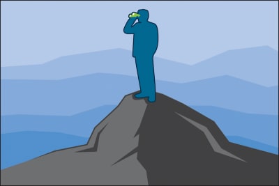
2. Focalism Bias

The availability heuristic hinders our ability to assess current and past information. The focalism bias concerns our ability to look forward. It refers to the inclination to concentrate on a single point when considering the future. As Harvard psychologist Daniel Gilbert explains in his book Stumbling on Happiness:

“It is difficult to escape the focus of our own attention — difficult to consider what it is we may not be considering.”

Camera lens showing a nature scene in focus

The focalism bias restricts our view of the future. (Large preview)

For example, while my colleagues and I were conducting UX research for a U.S. government agency, we discovered that caseworkers could not access information essential to processing applications for medical assistance.

As shown in the diagram below, these caseworkers literally had to stop in the middle of the application process in order to request critical information from another division. Typically, caseworkers had to wait 24 to 48 hours to receive this information.

Diagram listing many steps before re-design and fewer steps after re-design

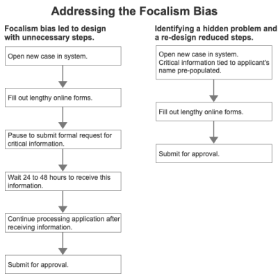
The focalism bias led to a delay, the opposite of the desired results. Our re-design resolved the issue. (Large preview)

Caseworkers found this delay stressful because it made it more difficult to meet a federal law requiring all applications to be processed within 10 days of receipt.

How did this happen? One reason, surprisingly, was the emphasis on deadlines. Through our observation and interviews, we learned that the system had been rushed into production to meet a project deadline (all too common) and to give caseworkers a way to process applications more efficiently.

The intentions were good, the goals made sense. Unfortunately, the focus on rushing a system into production to supposedly expedite the process had the opposite effect. Designers created a system that delayed the application process.

Solution: Become An Active Problem Seeker

This idea may sound counterintuitive. Why would we look for problems? Don’t we already have enough to deal with? In truth, however, organizations that seek problems, such as Toyota, often demonstrate impressive performance. They’re called high-reliability organizations (HROs). Other examples include the U.S. Navy’s aircraft carriers and air traffic control centers in the U.S., both of which have incredibly low error and failure rates.

As decision expert Michael Roberto of Bryant University explains, leaders of HROs do not wall themselves off from the possibility of failure. On the contrary, they preoccupy themselves with failure. For example, they:

Do not simplify explanations.
Remain sensitive and attentive to their front-line operations as we did while observing caseworkers.
Defer to those who have the local, specialized knowledge as opposed to those who simply have authority in the hierarchy. Again, we relied on the expertise of caseworkers on the ground.

Commit to resilience, to the notion that you cannot prevent all small problems. Rather, the goal is to focus on fixing these small problems before they mushroom into large problems.

Man standing on a mountain looking out with binoculars

Actively seeking problems leads to better decisions. (Large preview)

Problems are not the enemy; hidden problems are because these hidden problems become serious threats down the road as we saw in the government agency examples outlined above. In both cases, earlier and additional contextual inquiry (observing users in their natural home or work environments) would likely have identified current problems and possible UI solutions to these problems.

For example, while conducting contextual inquiry for a large Mexican bank, I observed customers trying (and failing) to transfer money to family members who held accounts at different banks. Customers expressed frustration at this limitation because they wanted an easy way to send money to family members, especially those who lived far away.

While living in Mexico, I learned that loaning and giving money to family members is more common in Mexico than in the U.S., Canada, or parts of Western Europe.

Given the deeply rooted Mexican tradition of supporting family members in financial need, I was initially surprised by this banking limitation. Upon reflection, however, I realized that this limitation was simply a hidden problem. When coding the banking web site, the developers were likely focused on security, paramount in all matters financial. They had not considered including a cross-bank transfer feature.

I identified this missing feature by conducting UX Research with banking customers in Mexico. This real-world example shows how critical it is to become an active problem seeker.

3. Optimism Bias

Focusing on a single point or problem impedes our ability to plan and design for the future. An equally troubling challenge is the optimism bias. We tend to imagine the best-case scenario.

“For example, we underrate our chances of getting divorced, being in a car accident, or suffering from cancer. We also expect to live longer than objective measures would warrant, overestimate our success in the job market, and believe that our children will be especially talented.”

— Tali Sharot

In design culture, this bias sounds like this:

“Sure, this part of the UI is a bit clunky, but customers will get used to it, and then it won’t be an issue.”

In other words:

“We need to ship the product; we don’t want to deal with the cumbersome interaction.”

As anyone who has conducted a survey or usability test knows, this optimism is misplaced. Users and customers are easily frustrated and often show little patience when products and UIs are hard to use.

I witnessed this bias when designing a web application for financial advisers — 70% of whom were male. The client insisted on using a red font to emphasize certain numbers. Even after I explained that approximately 9% of males are color blind, she refused to change the font color. She reasoned that financial advisers would see the numbers in context. In other words, no problem. When I conducted multiple rounds of usability testing, however, two male advisers struggled to distinguish the numbers in red. They could read those numbers, but the figures did not stand out.

The reason for this type of wishful thinking is our tendency to see the future as a variant of the present. We tend to assume that things will go on more or less as they have. In the case of the financial application, because advisers had not complained before so my client assumed that they would not complain in the future. What she failed to grasp was the significance of changing the font to red.

As author David DiSalvo explains:

“We tend to simulate the future by re-constructing the past, and the re-construction is rarely accurate.”

Solution: The Pre-Mortem Technique

That’s why it’s essential to resist this innate tendency by leveraging techniques like psychologist Gary Klein’s pre-mortem. The idea is to describe a scenario in which the project failed to meet a specific goal such as a revenue target, an increase in the percentage of new purchases, requests for more information, etc.

Here’s how it works. Before committing to a major initiative, the key stakeholder (often an executive) gathers everyone who is slated to participate. She outlines the key objective and explains “what went wrong.” The statement will sound something like this:

“Imagine that we have rolled out a new e-commerce mobile app at a cost of $3 million with a projected revenue of $10 million for the first year. At the end of one year, revenue is $1 million, a huge failure. Please take 20 minutes to write a history of this failure.”

This pre-mortem exercise:

Legitimizes doubt by providing a safe space for asking questions and expressing concerns about the decision.
Encourages even supporters of the decision to search for threats not previously considered.

An e-commerce mobile app is simply an example. The pre-mortem technique can be applied to nearly any project in any industry because it’s about expanding our perspective in order to identify what could realistically go wrong.

4. Overconfidence Bias

We unconsciously exaggerate our ability to accurately assess the present and predict the future. A study of patients who died in a hospital ICU compared the doctor’s diagnosis to the actual autopsy results. The doctors who were completely confident in their diagnosis were wrong 40% of the time.

When designers fall prey to the optimism bias, they exaggerate their ability to understand how users think. The most common results are information overload and confusing terminology and controls (buttons, checkboxes, sliders, and so on).

For example, while evaluating a client’s tablet-based investment application targeted at lay people, my team and I immediately noticed that:

The screen where users would create a risk profile included extraneous information.
The phrase “time zone” would likely confuse users. The client intended the term to refer to the customer’s investment time horizon. Yet, “time zone” usually means the time in a country or region, such as the U.K. or South Africa.
Plus and minus controls exhibited low affordance meaning that it was hard to tell whether they could be tapped or were simply part of the display.

These observations were supported during a subsequent usability test when participants expressed confusion over these specific points. In short, the designers for this project had overestimated their ability to create an interface that users would understand.

Solution

One solution is to conduct user research as we did with the tablet-based financial application outlined above. If such research is not possible, a second solution is to actively seek case studies beyond your immediate context. For example:

If you are designing an investment application, it might make sense to **refer to banking applications** to identify potential design challenges and what is already working well for customers.
If you are designing a tablet application to help nurse practitioners make a preliminary diagnosis, **look to other projects that are related** but outside your immediate context. Has your company developed a medical device UI for surgeons or ER doctors? What worked well for users? What did not?

Referring to other projects may sound like a no-brainer. Ask yourself, however, how often a systematic review of previous, related (but not identical) projects occurs within your organization. Remember, we are all subject to overconfidence.

Conclusion

In this piece, we’ve identified four common decision traps and corresponding solutions:

The availability heuristic causes us to ignore potentially important current or past information when making decisions. The solution is to expand our perspective by reaching beyond our circle of competence. For designers, this often means consulting highly technical experts.
Closely related is the focalism bias, our tendency to concentrate on a single point when designing thus overlooking other, equally important factors. The solution is to actively seek problems in order to identify and address hidden problems now before they become even larger difficulties.
The optimism bias refers to our tendency to imagine the best-case scenario. The solution is the pre-mortem technique. In this exercise, we imagine that a design project has gone terribly wrong and discuss why and how this happened. As with active problem seeking, the idea is to identify issues before they occur or get worse.
In the design space, the overconfidence bias refers to exaggerating our ability to understand how users think and design accordingly. The solution is to conduct user research and seek case studies similar to the current design initiative.

The cognitive biases discussed here are not intended to criticize designers (I am one). Rather, they are scientific observations about human nature. While we can’t change our biology, we can remain mindful of this biology and apply the four solutions outlined in this article. In so doing, we will increase the chances of creating better, safer, and more engaging designs.

Resources

“Minimize Cognitive Load To Maximize Usability,” Kathryn Whitenton, Nielsen Norman Group
“The Optimism Bias,” Tali Sharot, ScienceDirect
“Don’t Make Me Think,” Steve Krug
“Stumbling On Happiness,” Daniel Gilbert
“The Art of Thinking Clearly,” Rolf Dobelli
“Thinking Fast And Slow,” Daniel Kahneman
“What Makes Your Brain Happy and Why You Should Do the Opposite,” David DiSalvo
“Why Great Leaders Don’t Take Yes For An Answer,” Michael Roberto

Smashing Editorial
(ah, yk, il)

Monochrome Album Design for WARP – Steve Aoki and cie

Original Source: http://feedproxy.google.com/~r/abduzeedo/~3/v8nTQVknm4E/monochrome-album-design-warp-steve-aoki-and-cie

Monochrome Album Design for WARP – Steve Aoki and cie
Monochrome Album Design for WARP - Steve Aoki and cie

AoiroStudioApr 29, 2019

Let’s kick it off with a monochrome album design for WARP for The Bloody Beetroots featuring Steve Aoki. Designed by Carosello Lab, a creative agency based in Milan, Italy. They have a working collaboration DIM MAK, Steve Aoki’s label from California. They designed a special package to celebrate the 10th year anniversary of WARP. The song by The Bloody Beetroots feat. Steve Aoki became a global hit in 2009 by mixing electronic sound with rock and punk elements. This kind of graphic design has been quite inspirational and influential from times and still keep being accomplished.

Links
Full Project on Behance
Studio Site
Monochrome Album Design for WARP - Steve Aoki and cieMonochrome Album Design for WARP - Steve Aoki and cieMonochrome Album Design for WARP - Steve Aoki and cieMonochrome Album Design for WARP - Steve Aoki and cieMonochrome Album Design for WARP - Steve Aoki and cieMonochrome Album Design for WARP - Steve Aoki and cieMonochrome Album Design for WARP - Steve Aoki and cieMonochrome Album Design for WARP - Steve Aoki and cieMonochrome Album Design for WARP - Steve Aoki and cie


SitePoint Premium New Releases: Docker, Redux, & Interviews

Original Source: https://www.sitepoint.com/sitepoint-premium-new-releases-docker-redux-interviews/

We’re working hard to keep you on the cutting edge of your field with SitePoint Premium. We’ve got plenty of new books to check out in the library — let us introduce you to them.

Learning Docker – Second Edition

Docker lets you create, deploy, and manage scalable app containers across multiple platforms. Learn how to package apps and build, ship, and scale containers. Delve into microservice architecture. Explore real-world examples of securing and managing Docker containers.

Read Learning Docker – Second Edition.

Programming Interviews Exposed

With up-to-date advice on how to succeed in programming job interviews, this book discusses what interviewers need to hear, approaching phone screens with non-technical recruiters, examining common interview problems and tests, demonstrating your skills verbally, in contests, on GitHub, and more.

Read Programming Interviews Exposed.

Learning Redux

With Redux, build consistent web apps that run in different environments (client, server and native), and are easy to test, by centralizing the state of your app. Take your web apps to the next level by combining the power of Redux with other frameworks such as React and Angular.

Read Learning Redux.

And More to Come…

We’re releasing new content on SitePoint Premium almost every day, so we’ll be back next week with the latest updates. If you’re not a member yet, check out our library for $14.99/month.

The post SitePoint Premium New Releases: Docker, Redux, & Interviews appeared first on SitePoint.