3 Essential Design Trends, May 2019

Original Source: https://www.webdesignerdepot.com/2019/04/3-essential-design-trends-may-2019/

Sometimes designs are of an acquired taste. That’s our theme for this month.

Each of the projects and trends featured here are things that you’ll probably either love…or hate. But wait to judge these projects until you navigate through them; most of them seem to grow on you the more you dive into the content. Here’s what’s trending in design this month:

Chaos by Design

Have you ever looked at a design and wondered “what were they thinking?”

But then … “that is actually pretty nice.”

It seems like there are plenty of designs out there right now that feature a structure of chaos. These projects are identifiable by an aesthetic that seems to be all over the place, but the more you dig into it, the more it seems to come together.

Common themes include:

Lack of an obvious grid
Lots of motion or animation across multiple elements
Website elements with the same visual weight
“Too many” fonts or colors
Oversized elements that make you think about content
“Trendy” word breaks without hyphenation
Peeking elements from the edges of the canvas

If these things sound like they could make a mess out of the design, you are totally right. But what’s happening with these projects – and the super talented design teams behind them – is that they break all the rules and work.

You will want to keep scrolling through these designs to see what comes next. Each of the examples below incorporates some of these themes and they are stunning.

Oversized Lettering

Big, bold typography has been a trend in website design for some time (we’ve explored that here on multiple occasions.) But there’s been a common theme until now: Most oversized type has been of the sans serif variety.

Now the trend is shifting to an even bolder display above the scroll: Oversized lettering and script fonts.

Each of the examples below uses this trend in a different way:

Kota uses a subtle gradient-color animation in a minimal style design. The letters KOTA are the brand of the website and have a memorable design. While the main logo of the site uses a simple square mark with a sans serif, the funky lettering style is carried through the design in the form of call to action links/buttons.

Feral also features its name in the center of the screen with a handwriting style font, but the bright yellow letters are on top of a dark image and behind a simple tagline for the company. The rest of the design is brighter and more minimal, but hints of the funky font carry through in surprising details.

Alt is a little less big than the other featured trending designs, but it is just as bold. What’s nice about the handwriting-style font here is that it is sleek and has a retro feel. As a center-screen element, it draws the eye in among multiple smaller photos and helps create a sense of cohesion among elements. The font and bright blue color combination do a great job of setting the mood for this website design. (Pay attention to the animation as well. The words don’t move while the image pop around it, some behind and some in front.)

The common theme among all three projects is that this style of typography works best with a single word or short phrase. This style of type can be a challenge in terms of readability, so sticking to a simple use is the best option.

Poster-Style Hero Images

Creating a poster-style hero image or homepage screen might be the least controversial trend in the roundup this month, but it can be equally challenging when it comes to design. With multiple layered elements and bold elements, getting the visuals to collapse (or expand) to different responsive viewports can take some work.

There are so many different ways to create a design that follows this trend. The commonality is that the first screen is an immersive visual experience. It’s not a about how much to read or three places to click; it’s about setting the scene for interactions to come.

What often makes this design style work is a combination of amazing imagery – each of the examples below start with stunning images – impactful text and enough of a curiosity tease to get users to explore the design more. (It’s also interesting that all three examples are from design studios; that’s where many envelope-pushing trends show up first.)

Deep Blue does this with an amazing visual. You might not know exactly what the website is about at first glance, but it’s so pretty that you’ll probably scroll to learn more. If you do, the design has done its job.

Chaptr Studio uses a striking image in a different way. It grabs your attention with a tiny, animated cursor that expands on clickable elements. Users hardly have to try to understand that there’s much more to this design.

Alber Graphics tugs at your curiosity with a stunning image and visual theme that is reminiscent of “Through the Looking Glass.” The visual presentation is so strong that users want to know what’s next; can you feel yourself wanting to engage with the CTA just to see how they respond?

Conclusion

How many of this month’s trends could you see as part of future design projects?

Working with super trendy elements, especially ones that break common design rules or contrast with principles of design theory, can be a challenge. But if you get it right, there’s a huge upside. That’s what you get with each of the projects above; these risky design concepts are well worth the time and are a lot of fun to explore.

Add Realistic Chalk and Sketch Lettering Effects with Sketch’it – only $5!

Source

p img {display:inline-block; margin-right:10px;}
.alignleft {float:left;}
p.showcase {clear:both;}
body#browserfriendly p, body#podcast p, div#emailbody p{margin:0;}

A Designer’s Guide To Better Decisions

Original Source: https://www.smashingmagazine.com/2019/04/designers-guide-better-decisions/

A Designer’s Guide To Better Decisions

A Designer’s Guide To Better Decisions

Eric Olive

2019-04-29T12:30:16+02:00
2019-04-29T12:35:13+00:00

Nearly everyone has experienced frustration while using a website, mobile app, or web application. In these moments, we might wonder “What were they thinking?” followed by “They sure were not thinking about making this easy for me.” One reason we encounter such frustrating moments is that the process of making sound and user-friendly decisions is difficult.

In this article, we’ll identify four decision-related traps that impede good design and offer techniques for avoiding these traps. These decision traps are based on research conducted by psychologists, neuroscientists, molecular biologists, and behavioral economists including several cited in this article.

Too many design decisions occur in isolation, are based on gut feel, or are not carefully examined. The web offers many examples of poor design decisions. For instance, let’s take a look at the example below.

A field in a form asking users to enter the place of birth. And Hover text that says: 'Please enter the place of birth of your parent.'

On the left: Are they asking for city, state, or country? On the right: This tooltip does not answer the user’s question. (Large preview)

At first glance, it seems quite straightforward: type the place of birth in the text field. A moment’s reflection, however, raises a question. Should we type the country, state, or city? It’s not clear. Clicking the question mark icon displays the help text shown below, to the right. The problem? The text does not answer the question; it simply restates the original request about entering the place of birth.

The design shown above violates a basic tenet of user experience (UX) immortalized by the title of Steven Krug’s famous book Don’t Make Me Think. Sure, it’s an amusing title, but he’s serious. The entire field of user experience is based on the idea of reducing the user’s cognitive load:

“Just like computers, human brains have a limited amount of processing power. When the amount of information coming in exceeds our ability to handle it, our performance suffers.”

— Kathryn Whitenton

In other words, when a design requires users to guess or think too hard about something as simple as one text entry, users will often make mistakes (costing your organization time and money) or abandon the task altogether.

Lightening the user’s cognitive load means increasing our own cognitive load as designers. We do have to think, hard and carefully. Essential to this effort is learning how to make good design decisions.

There are four common decision traps that we often fall into. I’ll explain how you can avoid them.

Availability Heuristic
Focalism Bias
Optimism Bias
Overconfidence Bias

1. Availability Heuristic

A heuristic is a mental shortcut that helps us make decisions quickly. These mental shortcuts are essential in certain situations. For example, if a car veers into your lane, you must act quickly; you don’t have time to review several options.

Unfortunately, heuristics become a flaw when making decisions in situations where many factors and participants must be considered. One such flaw is the availability heuristic, which involves an incomplete examination of current and past information.

A particularly distressing example of the availability heuristic in the design space is the software on the Boeing 737 Max. As of this writing, it appears that this software contributed to the tragedy of the downed airplanes. People around the world have asked how to prevent such tragedies in the future.

Part of the answer lies in avoiding quick fixes. Airbus, Boeing’s chief competitor, had refitted their A320 planes with larger engines. Boeing felt pressured to do the same leading to a variety of changes:

“The bigger engines altered the aerodynamics of the plane, making it more likely to pitch up in some circumstances.”

To compensate, Boeing added new software to the 737 Max:

This software “would automatically push the nose down if it sensed the plane pointing up at a dangerous angle. The goal was to avoid a stall. Because the system was supposed to work in the background, Boeing believed it didn’t need to brief pilots on it, and regulators agreed. Pilots weren’t required to train in simulators.”

The obvious and horrifying conclusion is that Boeing engineers and designers were placed under immense pressure to re-design the 737 Max at record speed resulting in a series of misjudgments. Less obvious, but equally troubling, is the likely role of the availability heuristic in these tragedies.

In short, the information used to make critical design decisions was not sufficient and resulted in tragedy.

Small red circle within a much larger blue circle

The availability heuristic limits our perspective (Large preview)

Solution

One solution is for designers to identify their area of competence. Within this sphere their intuitions are likely to serve them well, explains author Rolf Dobelli in The Art of Thinking Clearly. For example, UX designers should feel comfortable making decisions about layout and interaction design issues like flow, navigation, and how much information to present at one time.

When designers face a decision outside their circle of competence, it’s worth taking time to apply hard, slow, rational thinking. For example, when designing cockpit software for jets, designers would be well advised to work closely with engineers and pilots to ensure that everything in the proposed user interface (UI) is precise, accurate, and provides the information pilots need when they need it.

We are all subject to the availability heuristic. Designers must strive to mitigate this heuristic by consulting a variety of subject matter experts (SMEs), not simply the programmers and engineers on their immediate teams. The downside risk is simply too high.

2. Focalism Bias

The availability heuristic hinders our ability to assess current and past information. The focalism bias concerns our ability to look forward. It refers to the inclination to concentrate on a single point when considering the future. As Harvard psychologist Daniel Gilbert explains in his book Stumbling on Happiness:

“It is difficult to escape the focus of our own attention — difficult to consider what it is we may not be considering.”

Camera lens showing a nature scene in focus

The focalism bias restricts our view of the future. (Large preview)

For example, while my colleagues and I were conducting UX research for a U.S. government agency, we discovered that caseworkers could not access information essential to processing applications for medical assistance.

As shown in the diagram below, these caseworkers literally had to stop in the middle of the application process in order to request critical information from another division. Typically, caseworkers had to wait 24 to 48 hours to receive this information.

Diagram listing many steps before re-design and fewer steps after re-design

The focalism bias led to a delay, the opposite of the desired results. Our re-design resolved the issue. (Large preview)

Caseworkers found this delay stressful because it made it more difficult to meet a federal law requiring all applications to be processed within 10 days of receipt.

How did this happen? One reason, surprisingly, was the emphasis on deadlines. Through our observation and interviews, we learned that the system had been rushed into production to meet a project deadline (all too common) and to give caseworkers a way to process applications more efficiently.

The intentions were good, the goals made sense. Unfortunately, the focus on rushing a system into production to supposedly expedite the process had the opposite effect. Designers created a system that delayed the application process.

Solution: Become An Active Problem Seeker

This idea may sound counterintuitive. Why would we look for problems? Don’t we already have enough to deal with? In truth, however, organizations that seek problems, such as Toyota, often demonstrate impressive performance. They’re called high-reliability organizations (HROs). Other examples include the U.S. Navy’s aircraft carriers and air traffic control centers in the U.S., both of which have incredibly low error and failure rates.

As decision expert Michael Roberto of Bryant University explains, leaders of HROs do not wall themselves off from the possibility of failure. On the contrary, they preoccupy themselves with failure. For example, they:

Do not simplify explanations.
Remain sensitive and attentive to their front-line operations as we did while observing caseworkers.
Defer to those who have the local, specialized knowledge as opposed to those who simply have authority in the hierarchy. Again, we relied on the expertise of caseworkers on the ground.

Commit to resilience, to the notion that you cannot prevent all small problems. Rather, the goal is to focus on fixing these small problems before they mushroom into large problems.

Man standing on a mountain looking out with binoculars

Actively seeking problems leads to better decisions. (Large preview)

Problems are not the enemy; hidden problems are because these hidden problems become serious threats down the road as we saw in the government agency examples outlined above. In both cases, earlier and additional contextual inquiry (observing users in their natural home or work environments) would likely have identified current problems and possible UI solutions to these problems.

For example, while conducting contextual inquiry for a large Mexican bank, I observed customers trying (and failing) to transfer money to family members who held accounts at different banks. Customers expressed frustration at this limitation because they wanted an easy way to send money to family members, especially those who lived far away.

While living in Mexico, I learned that loaning and giving money to family members is more common in Mexico than in the U.S., Canada, or parts of Western Europe.

Given the deeply rooted Mexican tradition of supporting family members in financial need, I was initially surprised by this banking limitation. Upon reflection, however, I realized that this limitation was simply a hidden problem. When coding the banking web site, the developers were likely focused on security, paramount in all matters financial. They had not considered including a cross-bank transfer feature.

I identified this missing feature by conducting UX Research with banking customers in Mexico. This real-world example shows how critical it is to become an active problem seeker.

3. Optimism Bias

Focusing on a single point or problem impedes our ability to plan and design for the future. An equally troubling challenge is the optimism bias. We tend to imagine the best-case scenario.

“For example, we underrate our chances of getting divorced, being in a car accident, or suffering from cancer. We also expect to live longer than objective measures would warrant, overestimate our success in the job market, and believe that our children will be especially talented.”

— Tali Sharot

In design culture, this bias sounds like this:

“Sure, this part of the UI is a bit clunky, but customers will get used to it, and then it won’t be an issue.”

In other words:

“We need to ship the product; we don’t want to deal with the cumbersome interaction.”

As anyone who has conducted a survey or usability test knows, this optimism is misplaced. Users and customers are easily frustrated and often show little patience when products and UIs are hard to use.

I witnessed this bias when designing a web application for financial advisers — 70% of whom were male. The client insisted on using a red font to emphasize certain numbers. Even after I explained that approximately 9% of males are color blind, she refused to change the font color. She reasoned that financial advisers would see the numbers in context. In other words, no problem. When I conducted multiple rounds of usability testing, however, two male advisers struggled to distinguish the numbers in red. They could read those numbers, but the figures did not stand out.

The reason for this type of wishful thinking is our tendency to see the future as a variant of the present. We tend to assume that things will go on more or less as they have. In the case of the financial application, because advisers had not complained before so my client assumed that they would not complain in the future. What she failed to grasp was the significance of changing the font to red.

As author David DiSalvo explains:

“We tend to simulate the future by re-constructing the past, and the re-construction is rarely accurate.”

Solution: The Pre-Mortem Technique

That’s why it’s essential to resist this innate tendency by leveraging techniques like psychologist Gary Klein’s pre-mortem. The idea is to describe a scenario in which the project failed to meet a specific goal such as a revenue target, an increase in the percentage of new purchases, requests for more information, etc.

Here’s how it works. Before committing to a major initiative, the key stakeholder (often an executive) gathers everyone who is slated to participate. She outlines the key objective and explains “what went wrong.” The statement will sound something like this:

“Imagine that we have rolled out a new e-commerce mobile app at a cost of $3 million with a projected revenue of $10 million for the first year. At the end of one year, revenue is $1 million, a huge failure. Please take 20 minutes to write a history of this failure.”

This pre-mortem exercise:

Legitimizes doubt by providing a safe space for asking questions and expressing concerns about the decision.
Encourages even supporters of the decision to search for threats not previously considered.

An e-commerce mobile app is simply an example. The pre-mortem technique can be applied to nearly any project in any industry because it’s about expanding our perspective in order to identify what could realistically go wrong.

4. Overconfidence Bias

We unconsciously exaggerate our ability to accurately assess the present and predict the future. A study of patients who died in a hospital ICU compared the doctor’s diagnosis to the actual autopsy results. The doctors who were completely confident in their diagnosis were wrong 40% of the time.

When designers fall prey to the optimism bias, they exaggerate their ability to understand how users think. The most common results are information overload and confusing terminology and controls (buttons, checkboxes, sliders, and so on).

For example, while evaluating a client’s tablet-based investment application targeted at lay people, my team and I immediately noticed that:

The screen where users would create a risk profile included extraneous information.
The phrase “time zone” would likely confuse users. The client intended the term to refer to the customer’s investment time horizon. Yet, “time zone” usually means the time in a country or region, such as the U.K. or South Africa.
Plus and minus controls exhibited low affordance meaning that it was hard to tell whether they could be tapped or were simply part of the display.

These observations were supported during a subsequent usability test when participants expressed confusion over these specific points. In short, the designers for this project had overestimated their ability to create an interface that users would understand.

Solution

One solution is to conduct user research as we did with the tablet-based financial application outlined above. If such research is not possible, a second solution is to actively seek case studies beyond your immediate context. For example:

If you are designing an investment application, it might make sense to **refer to banking applications** to identify potential design challenges and what is already working well for customers.
If you are designing a tablet application to help nurse practitioners make a preliminary diagnosis, **look to other projects that are related** but outside your immediate context. Has your company developed a medical device UI for surgeons or ER doctors? What worked well for users? What did not?

Referring to other projects may sound like a no-brainer. Ask yourself, however, how often a systematic review of previous, related (but not identical) projects occurs within your organization. Remember, we are all subject to overconfidence.

Conclusion

In this piece, we’ve identified four common decision traps and corresponding solutions:

The availability heuristic causes us to ignore potentially important current or past information when making decisions. The solution is to expand our perspective by reaching beyond our circle of competence. For designers, this often means consulting highly technical experts.
Closely related is the focalism bias, our tendency to concentrate on a single point when designing thus overlooking other, equally important factors. The solution is to actively seek problems in order to identify and address hidden problems now before they become even larger difficulties.
The optimism bias refers to our tendency to imagine the best-case scenario. The solution is the pre-mortem technique. In this exercise, we imagine that a design project has gone terribly wrong and discuss why and how this happened. As with active problem seeking, the idea is to identify issues before they occur or get worse.
In the design space, the overconfidence bias refers to exaggerating our ability to understand how users think and design accordingly. The solution is to conduct user research and seek case studies similar to the current design initiative.

The cognitive biases discussed here are not intended to criticize designers (I am one). Rather, they are scientific observations about human nature. While we can’t change our biology, we can remain mindful of this biology and apply the four solutions outlined in this article. In so doing, we will increase the chances of creating better, safer, and more engaging designs.

Resources

“Minimize Cognitive Load To Maximize Usability,” Kathryn Whitenton, Nielsen Norman Group
“The Optimism Bias,” Tali Sharot, ScienceDirect
“Don’t Make Me Think,” Steve Krug
“Stumbling On Happiness,” Daniel Gilbert
“The Art of Thinking Clearly,” Rolf Dobelli
“Thinking Fast And Slow,” Daniel Kahneman
“What Makes Your Brain Happy and Why You Should Do the Opposite,” David DiSalvo
“Why Great Leaders Don’t Take Yes For An Answer,” Michael Roberto

Smashing Editorial
(ah, yk, il)

Monochrome Album Design for WARP – Steve Aoki and cie

Original Source: http://feedproxy.google.com/~r/abduzeedo/~3/v8nTQVknm4E/monochrome-album-design-warp-steve-aoki-and-cie

Monochrome Album Design for WARP – Steve Aoki and cie
Monochrome Album Design for WARP - Steve Aoki and cie

AoiroStudioApr 29, 2019

Let’s kick it off with a monochrome album design for WARP for The Bloody Beetroots featuring Steve Aoki. Designed by Carosello Lab, a creative agency based in Milan, Italy. They have a working collaboration DIM MAK, Steve Aoki’s label from California. They designed a special package to celebrate the 10th year anniversary of WARP. The song by The Bloody Beetroots feat. Steve Aoki became a global hit in 2009 by mixing electronic sound with rock and punk elements. This kind of graphic design has been quite inspirational and influential from times and still keep being accomplished.

Links
Full Project on Behance
Studio Site
Monochrome Album Design for WARP - Steve Aoki and cieMonochrome Album Design for WARP - Steve Aoki and cieMonochrome Album Design for WARP - Steve Aoki and cieMonochrome Album Design for WARP - Steve Aoki and cieMonochrome Album Design for WARP - Steve Aoki and cieMonochrome Album Design for WARP - Steve Aoki and cieMonochrome Album Design for WARP - Steve Aoki and cieMonochrome Album Design for WARP - Steve Aoki and cieMonochrome Album Design for WARP - Steve Aoki and cie


SitePoint Premium New Releases: Docker, Redux, & Interviews

Original Source: https://www.sitepoint.com/sitepoint-premium-new-releases-docker-redux-interviews/

We’re working hard to keep you on the cutting edge of your field with SitePoint Premium. We’ve got plenty of new books to check out in the library — let us introduce you to them.

Learning Docker – Second Edition

Docker lets you create, deploy, and manage scalable app containers across multiple platforms. Learn how to package apps and build, ship, and scale containers. Delve into microservice architecture. Explore real-world examples of securing and managing Docker containers.

Read Learning Docker – Second Edition.

Programming Interviews Exposed

With up-to-date advice on how to succeed in programming job interviews, this book discusses what interviewers need to hear, approaching phone screens with non-technical recruiters, examining common interview problems and tests, demonstrating your skills verbally, in contests, on GitHub, and more.

Read Programming Interviews Exposed.

Learning Redux

With Redux, build consistent web apps that run in different environments (client, server and native), and are easy to test, by centralizing the state of your app. Take your web apps to the next level by combining the power of Redux with other frameworks such as React and Angular.

Read Learning Redux.

And More to Come…

We’re releasing new content on SitePoint Premium almost every day, so we’ll be back next week with the latest updates. If you’re not a member yet, check out our library for $14.99/month.

The post SitePoint Premium New Releases: Docker, Redux, & Interviews appeared first on SitePoint.

Privacy UX: Privacy-Aware Design Framework

Original Source: https://www.smashingmagazine.com/2019/04/privacy-ux-aware-design-framework/

Privacy UX: Privacy-Aware Design Framework

Privacy UX: Privacy-Aware Design Framework

Vitaly Friedman

2019-04-25T13:30:16+02:00
2019-04-26T17:34:54+00:00

Part 1: Privacy Concerns And Privacy In Web Forms
Part 2: Better Cookie Consent Experiences
Part 3: Better Notifications UX And Permission Requests
Part 4: Privacy-Aware Design Framework

We’ve already explored approaches for better cookie consent prompts, permission requests, and notifications UX, but how do they fit into an overall design strategy as we make design decisions in our design tools?

In her article “What does GDPR mean for UX?”, Claire Barrett, a UX and UI designer at Mubaloo in Bristol, UK, has shared a very practical, actionable set of UX guidelines that the design agency has been following in respect to GDPR. While these guidelines specifically target GDPR, they are applicable to a much wider scope of user-friendly and privacy-aware interactions, and could therefore be applicable to any kind of project:

Users must actively opt in to having their data collected and used.
Users must give consent to every type of data-processing activity.
Users should have the right to easily withdraw their consent at any time.
Users should be able to check every organization and all third parties that will handle the data.
Consent isn’t the same as agreeing to the terms and conditions, so they shouldn’t be bundled together; they are separate, and should have separate forms.
While asking for consent at the right times is good, it’s even better to clearly explain why consent will benefit their experience.

One of the interesting things that Claire recommends in her article is to focus on “just-in-time” data collection (mentioned in part 3 of this series); that is, explain why data is required, and how it will and will not be used — but only when the app or website actually needs it. Obviously, this could be done by including an “info” icon next to the more personal bits of information collected, and showing the tooltip with the benefits and rationale behind data collection on request.

'Just-in-time' explanations

‘Just-in-time’ explanations with the info tooltip in forms. (Image source: Claire Barrett) (Large preview)

Many mobile applications require access to location, photos, and even the camera during installation, which isn’t something most customers would be happy to consent to. A more effective way of getting permission is to explain the need for data at the point of collection by using “just-in-time” prompts, so users can give consent only when they understand the purpose of it, very much like we’ve seen with permissions earlier in this series.

'Just-in-time' prompts

‘Just-in-time’ prompts, asking for access to location only when it’s actually required. (Image source: Claire Barrett) (Large preview)

The explanations should also inform customers how to withdraw consent where applicable, and provide a link to the privacy policy. These have been a matter of ongoing complaints for years, as lengthy privacy policies written in perfectly obscure legalese are almost impossible to comprehend without a dedicated review session. (In fact, a 2008 study showed it would take the average person roughly 244 hours per year to read all of the privacy policies for the sites they use, which translates to about 40 minutes per day.)

Rather than presenting the privacy policy as a wall of convoluted text, it could be chunked and grouped into clearly labelled sections and expandable text, optimized for scanning, locating, and understanding.

Separated policy actions

Separated policy actions, presented as accordions. Optimized for easy scanning and comprehension. (Image source: Claire Barrett) (Large preview)

Once consent is granted, customers should have full control over their data; that is, the ability to browse, change, and delete any of the data our applications hold. That means data settings in our mobile applications need to provide granular options to revoke consent, and opt out from marketing preferences, as well as the option to download and delete any data without wandering around the convoluted maze of help sections and ambiguous setting panels.

'data settings' menu

Customers should have full control over their data, so our ‘data settings’ menu should provide granular options to revoke consent, opt out from preferences, and download/or delete all data. (Image source: Claire Barrett) (Large preview)

The main issue with privacy-aware design decisions is that it’s difficult to assess the impact of data collection and all the interface challenges it poses on design and development. Being humble and subtle isn’t just a matter of respect, but also about reducing technical debt and avoiding legal battles down the road. For that, the following general guidelines could help as well.

Save As Little Data As Possible

If you choose to store credit card data, you have to be upfront about the security measures you take to store them confidentially. The less data you require and store, the less of an impact a potential breach would have.

Treat Personal Data Well

Not all data is created equal. When users provide personal information, distinguish between different strata of data, as private information is probably more sensitive than public information. Treat personal data well, and never publish it by default. For example, as a user completes their profile, provide an option to review all the input before publishing it. Be humble, and always ask for permission first; proactively protect users and don’t store sensitive data. That might help prevent uncomfortable situations down the line.

This goes not only for the procedure of storing and publishing user data on your servers, but also when it comes to password recovery or using customer data for any kind of affiliate partnerships. In fact, handing over a customer’s email to somebody else without explicit consent is a breach of trust and privacy, and often results in emails marked as spam because customers are suddenly confronted with an unfamiliar brand they don’t trust. In fact, the latter is almost like a defence mechanism against rapacious websites that continuously harvest emails in exchange for a free goodie, access to videos, and freemium offerings.

Explain Early What Kind Of User Data Third Parties Will Receive

When providing an option for social sign-in, be specific about what will happen to the user’s data and what permissions third parties will have. Usually a subtle note appears when social sign-in is prompted, but it’s a good idea to be explicit straightaway about how data will be treated, and specifically what will not happen to a user’s data.

It’s common to see user interactions coming to a halt once customers are forced into connecting their brand new accounts with already existing ones, or when they are encouraged to use their social profiles to make progress with the app. That’s never a straightforward step to take, and requires some explanation and assurance that revoking access is easy.

Prepare Customer Data For Export

It’s not trivial to get a complete picture of the collected data, especially if third parties are involved. Make sure that whenever personal data is collected, it’s structured in a way that’s optimized for export and deletion later on. Bonus points if it’s also digestible for the end user, so they can find the bits and pieces they need once they are interested in something very specific. That also means tracking what types of data are collected and where data flows, as we can use this structure later to provide granular control over data settings and privacy preferences in our UI.

You might have heard of a few friendly companies that make importing personal data remarkably seamless, yet exporting user data is painfully difficult, or close to impossible. Unsurprisingly, this practice isn’t perceived well by customers; and especially at times when they are thinking about deleting their account, such a pervasive lock-in will lead to customer support complaints, call centre calls, and angry outbursts in social channels. That’s not a delightful feature that will keep them loyal long-term.

While some companies can take public blaming because of their sheer size, for many small and mid-sized companies, reputation is the most precious asset they have, and so it’s wise not to gamble with it. You could even think of partnering with similar services and make user data seamlessly portable and transferrable to each of them, while expecting the same feature to be supported by partners as well.

Making It Difficult To Close Or Delete An Account Fails In The Long Term

Corporate behemoths have excelled in making it remarkably difficult for customers to close or delete their accounts. And this technique works when when moving away is painfully difficult — that’s the case for Amazon and Facebook.

However, if you are working on a relatively small website which strives for its loyal customers, you might not be able to pull it off successfully, at least not long-term. The overall impact is even more harmful if you make it difficult to cancel a recurring payment, as is often the case with subscriptions. (In fact, that’s why subscriptions are also difficult to sell — it’s not just the commitment to monthly payments, but rather the difficulty of cancelling the subscription at a later time without extra charge due to early cancellation.)

In fact, just as designers are getting better at hiding notorious profile settings for deleting an account, so too are customers at finding ways to navigate through the maze, often supported by the infinite wisdom of easily discoverable tutorials in blogs. If it’s not the case, customers resort to the tools they know work best: turning their back on the service that shows no respect towards their intentions — usually by marking emails as spam, blocking notifications, and using the service less. It doesn’t happen overnight; but slowly and gradually, and as interviews showed, these customers are guaranteed to not recommend the service to their friends or colleagues.

Surprisingly, it’s the other way around when it’s remarkably easy to close the account. Just like with notifications, there might be good reasons why the user has chosen to move on, and very often it has nothing to do with the quality of service at all. Trying to convince the customer to stay, with a detailed overview of all the wonderful benefits that you provide, might be hitting the wrong targets: in corporate settings especially, the decision will have been made already, so the person closing the account literally can’t do much about changing the direction.

examples of cancellation of account and terminated subscription in smashing magazine

With Smashing Membership, we try to explain what happens to the data in a clear way, and give an option to leaving Members to export their data without any hidden tricks. (Large preview)

For Smashing Membership, we’ve tried to keep the voice respectful and humble, while also showing a bit of our personality during offboarding. We explain what happens to the data and when it will be irrevocably deleted (seven days), provide an option to restore the plan, allow customers to export their orders and guarantee no sharing of data with third parties. It was surprising to see that a good number of people who canceled their Membership subscription, ended up recommending it to their friends and colleagues, because they felt there was some value in it for them even though they didn’t use it for themselves.

Postpone Importing Contacts Until The User Feels Comfortable With The Service

Of course, many of our applications aren’t particularly useful without integrating the user’s social circle, so it seems plausible to ask customers to invite their friends to not feel lonely or abandoned early on. However, before doing so, think of ways of encouraging customers to use the service for a while and postpone importing contacts until the point when users are more inclined to do so. By default, many customers would block an early request as they haven’t yet developed trust for the app.

Save User Data For A Limited Amount Of Time After Account Closure

Mistakes happen, and it holds true for accidental mis-taps as much as deleting all personal data after a remarkably bad day. So while we need to provide an option to download and delete data, also provide an option to restore an account within a short amount of time. That means that data will be saved after the account is deleted, but will be irrevocably removed after that grace period has passed. Usually, 7–14 days is more than enough.

However, you could also provide an option for users to request the immediate deletion of data via email request, or even with a click on a button. Should users be informed about the ultimate deletion of their files? Maybe. The final decision will probably depend on how sensitive the data is: the more sensitive it is, the more likely users will want to know the data is gone for good. The exception is anonymized data: most of the time, customers won’t care about it at all.

Provide User-Friendly Summaries Of Privacy Policy Changes

Nothing is set in stone, and so your privacy policy and default privacy settings might need to adjust because of new personalization features or a change of the tracking script. Whenever this happens, rather than highlighting the importance of privacy in lengthy passages of text, provide clear, user-friendly summaries of changes. You could structure the summary by highlighting how things used to be and how they are different now. Don’t forget to translate legalese into something more human-readable, explaining what the change actually means for the user.

Frankly, most users didn’t seem to care much about privacy policy changes. After the never-ending stream of policy update notifications in 2018, the default reaction is usually immediate consent. Once they’ve noticed anything related to privacy policy in the subject line or the email body, they immediately accept changes before even scrolling to the bottom of the email. However, the more personal the data stored is, the more time was spent reviewing the changes, which often were remarkably confusing and unclear.

medium.com privacy policy

Microcopy has always been at the very heart of Medium.com. A well-designed and well-structured privacy policy with clear summaries of privacy policy changes. (Image source: Email Design BeeFree) (Large preview)

mailchimp privacy policy

MailChimp, with a concise summary of changes of its privacy policy. (Large preview)

Note: The folks at Really Good Emails have collected some great examples of email design related to GDPR if you’re looking for more inspiration on how to share privacy policy changes with your users and subscribers.

Set Up A Communication Strategy In Case Of A Breach

Nobody wants havoc after user data is compromised. In such situations, it’s critical to have a clear and strong communication strategy. Have an explanation prepared in case some user data is compromised. Mandy Brown published a fantastic article, “Fire Drills: Communications Strategy in a Crisis”, on A List Apart, explaining how to set one up, and a few things to consider when doing it.

Privacy By Design

It might sound like visiting websites is a quite ordinary activity, and users should feel comfortable and familiar with features such as social sign-in, importing contacts, and cookie prompts. As we’ve seen in this series, there are many non-trivial privacy considerations, and more often than not, customers have concerns, doubts, and worries about sharing their personal data.

Of course, the scope of this series could stretch out much further, and we haven’t even looked into password recovery, in-app privacy settings design, floating chat windows and pop-ups, performance and accessibility considerations, or designing privacy experiences for the most vulnerable users — children, older people, and those with disadvantages. The critical point when making design decisions around privacy is always the same, though: we need to find a balance between strict business requirements and respectful design that helps users control their data and keep track of it, instead of harvesting all the information we can and locking customers into our service.

A good roadmap for finding that balance is adopting a privacy-first best-practice framework, known as Privacy by Design (PbD). Emerging in Canada back in the 1990s, it’s about anticipating, managing, and preventing privacy issues before a single line of code is written. With the EU’s data protection policy in place, privacy by design and data protection have become a default across all uses and applications. And that means many of its principles can be applied to ensure both GDPR-compliance and better privacy UX of your website or application.

In essence, the framework expects privacy to be a default setting, and a proactive (not reactive) measure that would be embedded into a design in its initial stage and throughout the life cycle of the product. It encourages offering users granular privacy options, respectful privacy defaults, detailed privacy information notices, user-friendly options, and clear notification of changes. As such, it works well with the guidelines we’ve outlined in this series.

I highly recommend reading one of Heather Burns’ articles, “How To Protect Your Users With The Privacy By Design Framework,” in which she provides a detailed guide to implementing the Privacy by Design framework in digital services.

Where to start, then? Big changes start with small steps. Include privacy in the initial research and ideation during the design stage, and decide on defaults, privacy settings, and sensitive touchpoints, from filling in a web form to onboarding and offboarding. Minimize the amount of collected data if possible, and track what data third parties might be collecting. If you can anonymize personal data, that’s a bonus, too.

Every time a user submits their personal information, keep track of how the questions are framed and how data is collected. Display notifications and permission requests just in time, when you are almost certain that the customer would accept. And in the end, inform users in digestible summaries about privacy policy changes, and make it easy to export and delete data, or close an account.

And most importantly: next time you are thinking of adding just a checkbox, or providing binary options, think about the beautifully fuzzy and non-binary world we live in. There are often more than two available options, so always provide a way out, no matter how obvious a choice might appear. Your customers will appreciate it.

Smashing Editorial
(yk, il)

Getting To Know The MutationObserver API

Original Source: https://www.smashingmagazine.com/2019/04/mutationobserver-api-guide/

Getting To Know The MutationObserver API

Getting To Know The MutationObserver API

Louis Lazaris

2019-04-26T13:30:16+02:00
2019-04-26T11:43:00+00:00

In complex web apps, DOM changes can be frequent. As a result, there are instances where your app might need to respond to a specific change to the DOM.

For some time, the accepted way to look for changes to the DOM was by means of a feature called Mutation Events, which is now deprecated. The W3C-approved replacement for Mutation Events is the MutationObserver API, which is what I’ll be discussing in detail in this article.

A number of older articles and references discuss why the old feature was replaced, so I won’t go into detail on that here (besides the fact that I wouldn’t be able to do it justice). The MutationObserver API has near complete browser support, so we can use it safely in most — if not all — projects, should the need arise.

Basic Syntax For A MutationObserver

A MutationObserver can be used in a number of different ways, which I’ll cover in detail in the rest of this article, but the basic syntax for a MutationObserver looks like this:

let observer = new MutationObserver(callback);

function callback (mutations) {
// do something here
}

observer.observe(targetNode, observerOptions);

The first line creates a new MutationObserver using the MutationObserver() constructor. The argument passed into the constructor is a callback function that will be called on each DOM change that qualifies.

The way to determine what qualifies for a particular observer is by means of the final line in the above code. On that line, I’m using the observe() method of the MutationObserver to begin observing. You can compare this to something like addEventListener(). As soon as you attach a listener, the page will ‘listen’ for the specified event. Similarly, when you start observing, the page will begin ‘observing’ for the specified MutationObserver.

The observe() method takes two arguments: The target, which should be the node or node tree on which to observe for changes; and an options object, which is a MutationObserverInit object that allows you to define the configuration for the observer.

The final key basic feature of a MutationObserver is the disconnect() method. This allows you to stop observing for the specified changes, and it looks like this:

observer.disconnect();

Options To Configure A MutationObserver

As mentioned, the observe() method of a MutationObserver requires a second argument that specifies the options to describe the MutationObserver. Here’s how the options object would look with all possible property/value pairs included:

let options = {
childList: true,
attributes: true,
characterData: false,
subtree: false,
attributeFilter: [‘one’, ‘two’],
attributeOldValue: false,
characterDataOldValue: false
};

When setting up the MutationObserver options, it’s not necessary to include all these lines. I’m including these simply for reference purposes, so you can see what options are available and what types of values they can take. As you can see, all except one are Boolean.

In order for a MutationObserver to work, at least one of childList, attributes, or characterData needs to be set to true, otherwise an error will be thrown. The other four properties work in conjunction with one of those three (more on this later).

So far I’ve merely glossed over the syntax to give you an overview. The best way to consider how each of these features works is by providing code examples and live demos that incorporate the different options. So that’s what I’ll do for the rest of this article.

Observing Changes To Child Elements Using childList

The first and simplest MutationObserver you can initiate is one that looks for child nodes of a specified node (usually an element) to be added or removed. For my example, I’m going to create an unordered list in my HTML, and I want to know whenever a child node is added or removed from this list element.

The HTML for the list looks like this:

<ul id=”myList” class=”list”>
<li>Apples</li>
<li>Oranges</li>
<li>Bananas</li>
<li class=”child”>Peaches</li>
</ul>

The JavaScript for my MutationObserver includes the following:

let mList = document.getElementById(‘myList’),
options = {
childList: true
},
observer = new MutationObserver(mCallback);

function mCallback(mutations) {
for (let mutation of mutations) {
if (mutation.type === ‘childList’) {
console.log(‘Mutation Detected: A child node has been added or removed.’);
}
}
}

observer.observe(mList, options);

This is only part of the code. For brevity, I’m showing the most important sections that deal with the MutationObserver API itself.

Notice how I’m looping through the mutations argument, which is a MutationRecord object that has a number of different properties. In this case, I’m reading the type property and logging a message indicating that the browser has detected a mutation that qualifies. Also, notice how I’m passing the mList element (a reference to my HTML list) as the targeted element (i.e. the element on which I want to observe for changes).

See full interactive demo  →

Use the buttons to start and stop the MutationObserver. The log messages help clarify what’s happening. Comments in the code also provide some explanation.

Note a few important points here:

The callback function (which I’ve named mCallback, to illustrate that you can name it whatever you want) will fire each time a successful mutation is detected and after the observe() method is executed.
In my example, the only ‘type’ of mutation that qualifies is childList, so it makes sense to look for this one when looping through the MutationRecord. Looking for any other type in this instance would do nothing (the other types will be used in subsequent demos).
Using childList, I can add or remove a text node from the targeted element and this too would qualify. So it doesn’t have to be an element that’s added or removed.
In this example, only immediate child nodes will qualify. Later in the article, I’ll show you how this can apply to all child nodes, grandchildren, and so on.

Observing For Changes To An Element’s Attributes

Another common type of mutation that you might want to track is when an attribute on a specified element changes. In the next interactive demo, I’m going to observe for changes to attributes on a paragraph element.

let mPar = document.getElementById(‘myParagraph’),
options = {
attributes: true
},
observer = new MutationObserver(mCallback);

function mCallback (mutations) {
for (let mutation of mutations) {
if (mutation.type === ‘attributes’) {
// Do something here…
}
}
}

observer.observe(mPar, options);

Try out the demo  →

Again, I’ve abbreviated the code for clarity, but the important parts are:

The options object is using the attributes property, set to true to tell the MutationObserver that I want to look for changes to the targeted element’s attributes.
The mutation type I’m testing for in my loop is attributes, the only one that qualifies in this case.
I’m also using the attributeName property of the mutation object, which allows me to find out which attribute was changed.
When I trigger the observer, I’m passing in the paragraph element by reference, along with the options.

In this example, a button is used to toggle a class name on the targeted HTML element. The callback function in the mutation observer is triggered every time the class is added or removed.

Observing For Character Data Changes

Another change you might want to look for in your app is mutations to character data; that is, changes to a specific text node. This is done by setting the characterData property to true in the options object. Here’s the code:

let options = {
characterData: true
},
observer = new MutationObserver(mCallback);

function mCallback(mutations) {
for (let mutation of mutations) {
if (mutation.type === ‘characterData’) {
// Do something here…
}
}
}

Notice again the type being looked for in the callback function is characterData.

See live demo  →

In this example, I’m looking for changes to a specific text node, which I target via element.childNodes[0]. This is a little hacky but it will do for this example. The text is user-editable via the contenteditable attribute on a paragraph element.

Challenges When Observing For Character Data Changes

If you’ve fiddled around with contenteditable, then you might be aware that there are keyboard shortcuts that allow for rich text editing. For example, CTRL-B makes text bold, CTRL-I makes text italic, and so forth. This will break up the text node into multiple text nodes, so you’ll notice the MutationObserver will stop responding unless you edit the text that’s still considered part of the original node.

I should also point out that if you delete all the text, the MutationObserver will no longer trigger the callback. I’m assuming this happens because once the text node disappears, the target element is no longer in existence. To combat this, my demo stops observing when the text is removed, although things do get a little sticky when you use rich text shortcuts.

But don’t worry, later in this article, I’ll discuss a better way to use the characterData option without having to deal with as many of these quirks.

Observing For Changes To Specified Attributes

Earlier I showed you how to observe for changes to attributes on a specified element. In that case, although the demo triggers a class name change, I could have changed any attribute on the specified element. But what if I want to observe changes to one or more specific attributes while ignoring the others?

I can do that using the optional attributeFilter property in the option object. Here’s an example:

let options = {
attributes: true,
attributeFilter: [‘hidden’, ‘contenteditable’, ‘data-par’]
},
observer = new MutationObserver(mCallback);

function mCallback (mutations) {
for (let mutation of mutations) {
if (mutation.type === ‘attributes’) {
// Do something here…
}
}
}

As shown above, the attributeFilter property accepts an array of specific attributes that I want to monitor. In this example, the MutationObserver will trigger the callback each time one or more of the hidden, contenteditable, or data-par attributes is modified.

See live demo  →

Again I’m targeting a specific paragraph element. Notice the select drop down that chooses which attribute will be changed. The draggable attribute is the only one that won’t qualify since I didn’t specify that one in my options.

Notice in the code that I’m again using the attributeName property of the MutationRecord object to log which attribute was changed. And of course, as with the other demos, the MutationObserver won’t start monitoring for changes until the “start” button is clicked.

One other thing I should point out here is that I don’t need to set the attributes value to true in this case; it’s implied due to attributesFilter being set to true. That’s why my options object could look as follows, and it would work the same:

let options = {
attributeFilter: [‘hidden’, ‘contenteditable’, ‘data-par’]
}

On the other hand, if I explicitly set attributes to false along with an attributeFilter array, it wouldn’t work because the false value would take precedence and the filter option would be ignored.

Observing For Changes To Nodes And Their Sub-Tree

So far when setting up each MutationObserver, I’ve only been dealing with the targeted element itself and, in the case of childList, the element’s immediate children. But there certainly could be a case where I might want to observe for changes to one of the following:

An element and all its child elements;
One or more attributes on an element and on its child elements;
All text nodes inside an element.

All of the above can be achieved using the subtree property of the options object.

childList With subtree

First, let’s look for changes to an element’s child nodes, even if they’re not immediate children. I can alter my options object to look like this:

options = {
childList: true,
subtree: true
}

Everything else in the code is more or less the same as the previous childList example, along with some extra markup and buttons.

See live demo  →

Here there are two lists, one nested inside the other. When the MutationObserver is started, the callback will trigger for changes to either list. But if I were to change the subtree property back to false (the default when it’s not present), the callback would not execute when the nested list is modified.

Attributes With subtree

Here’s another example, this time using subtree with attributes and attributeFilter. This allows me to observe for changes to attributes not only on the target element but also on the attributes of any child elements of the target element:

options = {
attributes: true,
attributeFilter: [‘hidden’, ‘contenteditable’, ‘data-par’],
subtree: true
}

See live demo  →

This is similar to the previous attributes demo, but this time I’ve set up two different select elements. The first one modifies attributes on the targeted paragraph element while the other one modifies attributes on a child element inside the paragraph.

Again, if you were to set the subtree option back to false (or remove it), the second toggle button would not trigger the MutationObserver callback. And, of course, I could omit attributeFilter altogether, and the MutationObserver would look for changes to any attributes in the subtree rather than the specified ones.

characterData With subtree

Remember in the earlier characterData demo, there were some problems with the targeted node disappearing and then the MutationObserver no longer working. While there are ways to get around that, it’s easier to target an element directly rather than a text node, then use the subtree property to specify that I want all the character data inside that element, no matter how deeply nested it is, to trigger the MutationObserver callback.

My options in this case would look like this:

options = {
characterData: true,
subtree: true
}

See live demo  →

After you start the observer, try using CTRL-B and CTRL-I to format the editable text. You’ll notice this works much more effectively than the previous characterData example. In this case, the broken up child nodes don’t affect the observer because we’re observing all nodes inside the targeted node, instead of a single text node.

Recording Old Values

Often when observing for changes to the DOM, you’ll want to take note of the old values and possibly store them or use them elsewhere. This can be done using a few different properties in the options object.

attributeOldValue

First, let’s try logging out the old attribute value after it’s changed. Here’s how my options will look along with my callback:

options = {
attributes: true,
attributeOldValue: true
}

function mCallback (mutations) {
for (let mutation of mutations) {
if (mutation.type === ‘attributes’) {
// Do something here…
}
}
}

See live demo  →

Notice the use of the attributeName and oldValue properties of the MutationRecord object. Try the demo by entering different values in the text field. Notice how the log updates to reflect the previous value that was stored.

characterDataOldValue

Similarly, here’s how my options would look if I want to log old character data:

options = {
characterData: true,
subtree: true,
characterDataOldValue: true
}

See live demo  →

Notice the log messages indicate the previous value. Things do get a little wonky when you add HTML via rich text commands to the mix. I’m not sure what the correct behavior is supposed to be in that case but it is more straightforward if the only thing inside the element is a single text node.

Intercepting Mutations Using takeRecords()

Another method of the MutationObserver object that I haven’t mentioned yet is takeRecords(). This method allows you to more or less intercept the mutations that are detected before they are processed by the callback function.

I can use this feature using a line like this:

let myRecords = observer.takeRecords();

This stores a list of the DOM changes in the specified variable. In my demo, I’m executing this command as soon as the button that modifies the DOM is clicked. Notice that the start and add/remove buttons don’t log anything. This is because, as mentioned, I’m intercepting the DOM changes before they are processed by the callback.

Notice, however, what I’m doing in the event listener that stops the observer:

btnStop.addEventListener(‘click’, function () {
observer.disconnect();
if (myRecords) {
console.log(`${myRecords[0].target} was changed using the ${myRecords[0].type} option.`);
}
}, false);

As you can see, after stopping the observer using observer.disconnect(), I’m accessing the mutation record that was intercepted and I’m logging the target element as well as the type of mutation that was recorded. If I had been observing for multiple types of changes then the stored record would have more than one item in it, each with its own type.

When a mutation record is intercepted in this way by calling takeRecords(), the queue of mutations that would normally be sent to the callback function is emptied. So if for some reason you need to intercept these records before they’re processed, takeRecords() would come in handy.

Observing For Multiple Changes Using A Single Observer

Note that if I’m looking for mutations on two different nodes on the page, I can do so using the same observer. This means after I call the constructor, I can execute the observe() method for as many elements as I want.

Thus, after this line:

observer = new MutationObserver(mCallback);

I can then have multiple observe() calls with different elements as the first argument:

observer.observe(mList, options);
observer.observe(mList2, options);

See live demo  →

Start the observer, then try the add/remove buttons for both lists. The only catch here is that if you hit one of the “stop” buttons, the observer will stop observing for both lists, not just the one it’s targeting.

Moving A Node Tree That’s Being Observed

One last thing I’ll point out is that a MutationObserver will continue to observe for changes to a specified node even after that node has been removed from its parent element.

For example, try out the following demo:

See live demo  →

This is another example that uses childList to monitor for changes to the child elements of a target element. Notice the button that disconnects the sub-list, which is the one being observed. Click the “Start…” button, then click the “Move…” button to move the nested list. Even after the list is removed from its parent, the MutationObserver continues to observe for the specified changes. Not a major surprise that this happens, but it’s something to keep in mind.

Conclusion

That covers just about all the primary features of the MutationObserver API. I hope this deep dive has been useful for you to get familiar with this standard. As mentioned, browser support is strong and you can read more about this API on MDN’s pages.

I’ve put all the demos for this article into
a CodePen collection, should you want to have an easy place to mess around with the demos.

Smashing Editorial
(dm, il)

10 best static site generators

Original Source: http://feedproxy.google.com/~r/CreativeBloq/~3/03-_BPL_sY4/10-best-static-site-generators

Most sites you visit on the web are probably generated dynamically. That is, rather than having all their content encoded into the HTML stored on the server, they retrieve content from a database and construct pages to serve to you on the fly. 

Many also provide user interactivity through logins, forms and so on. Think of Facebook for an example of both of these things. To build this type of functionality yourself, you might look to a CMS such as WordPress.

21 best WordPress themes

For some use cases, however, this is overkill. Simple pages, such as a personal profile, information about a business or even a blog, really don’t need this sort of overhead or complexity. You could of course just build static HTML yourself in a text editor. And indeed many years ago this was how all sites were built, but this rapidly becomes cumbersome to maintain when you want to scale up or make changes. Static site generators offer a solution to this, by enabling you to build static HTML pages using templates.

Essentially, static site generators are command-line tools that shift the creation of the final HTML page forward from the point the user requests it to the point you write the content. When you make an update, you build the new page, which can then be served as-is to every user who requests it.

This offers several advantages. Performance will be greatly improved compared to a dynamic site, since serving static HTML and CSS has a very low footprint. Your server-side setup will be much simpler, which also means fewer security worries. Conversely, however, you’ll lose the opportunity to deliver real-time content or receive user input.

Static site generators have exploded in popularity in recent years, so navigating the wide range of choice can be difficult. Here, we’ve taken a look at some of the best options you should be considering.

01. Jekyll

Jekyll new release page

A first alpha for Jekyll 4.0 has just been released

First released in 2008 by Tom Preston-Werner, the co-founder of GitHub, Jekyll arguably popularised the concept of static sites and remains probably the most widely used static site generator. With Jekyll, you’ll typically work with content in Markdown, a lightweight markup language designed for text formatting.

The Liquid templating engine is used to place this Markdown content into a HTML template, and to combine templates representing various parts of a page (say, header, footer and content) in a modular and re-usable manner.

Support for Sass is built in for those with a preference for CSS preprocessing, and it’ll play fine with libraries like Bootstrap. Also included with Jekyll is an HTTP server which can be used to easily deploy and test your static pages locally.

Jekyll showcase page

Jekyll remains one of the most widely used static site generators

One of Jekyll’s key selling points is its wide range of ‘importers’, which enable an existing site to be migrated to Jekyll with relative ease. If you have a WordPress site, for example, you can switch to using Jekyll using one of the importers. It’s also trivial to convert existing static HTML sites to Jekyll, which can be great if you’ve been coding static HTML yourself or see a template you like the look of.

Notably, Jekyll is used to power GitHub pages, a static site hosting service which is provided with GitHub. If you have a GitHub repository, you’re able to create a GitHub pages site for free using Jekyll. This can be a convenient way to give a polished landing page to your GitHub project.

The big downside of Jekyll – and this applies to most generators – is that it can seem complex at first and is a new technology to master. You might not be up and running as quickly as with a CMS. However, it’s very well documented and the learning curve is quickly overcome.

02. Hexo

Hexo homepage

Be sure to write your content in Markdown for Hexo

Hexo is powered by Node.js and aimed at blogging. While the JavaScript implementation shouldn’t in theory make too much difference to how you work with it, since you’ll be using with markup and templating languages, it can make installation and configuration more familiar for JavaScript developers. If you’re already using npm and git then it’s extremely simple to get up and running.

Like many other general purpose generators, you’ll probably want to write your content in Markdown. The default templating engine is Swig, which is once again well suited for JavaScript developers. However, Hexo is extensible to allow other templating engines to be used if you want.

The Hexo website includes a range of pre-built themes for you to try out, and one especially popular feature of the tool is its support for single-command deployment.

03. Gatsby

Gatsby homepage

Gatsby can be picked up quickly by developers

Like Hexo, Gatsby is powered by Node.js and so will be more familiar territory for experienced JavaScript developers. However, several things set it apart from other similar tools.

Gatsby uses React, which means that everything is built with components, and allows it to benefit from React’s approach to DOM rendering. This means it can be picked up quickly by developers who have worked with React, but for those unfamiliar with it, learning React will be necessary.

It also utilises GraphQL at build time to retrieve data and content from data sources, which provides a modern, consistent interface to ensure that each page receives the exact data needed when it is built.

Finally, Gatsby will build pages as progressive single page apps, meaning that the entire site is downloaded and subsequent navigation is immediate.

04. Hugo

Hugo homepage

Whip up your site in milliseconds with Hugo

Widely regarded as the ‘other’ leading static site generator, it’s only natural to compare Hugo with Jekyll. Hugo is the newer of the two, and one of its key focus areas is speed, which for some has been a complaint with Jekyll. Nobody likes waiting for a site to build, and Hugo can put together a simple site from your markup and templates in milliseconds, or even blaze through thousands of pages in seconds. 

With Hugo it’s also typical to write content with Markdown, and the templating engine is based on Go templates since Hugo itself is implemented in the Go programming language. Like Jekyll, it ships with a lightweight HTTP server to quickly serve your pages locally. The two tools’ build workflows are overall fairly similar.

27 steps to the perfect website layout

For many, the key benefit of Hugo is its quicker, simpler path to getting started, with very little need for configuration and no dependencies other than the core binary. Its documentation and tutorials are very good, and it has an ethos of maintaining simplicity which makes for a very approachable learning curve.

One disadvantage Hugo has relative to Jekyll is that it lacks the extensive plugin ecosystem available for the latter. Given its wide range of built-in functionality, however, this is unlikely to be a problem for most users. It also may be marginally lighter on support on sites such as StackOverflow since it hasn’t been around as long; however, it continues to grow in popularity and many believe it may become the leading static site generator in the near future.

05. NUXT

NUXT homepage

Nuxt brings a component-based approach to development

Vue.js has gained immense popularity as a front end framework in recent years, due to its combination of a gentle learning curve, high performance and powerful feature set.

Nuxt.js is actually a framework for creating server-rendered Vue applications – that is, dynamic pages which are rendered by the server before being passed in their completed form to the client to display. However, it can also be use to build static sites, with a command line parameter that will build static HTML pages for all routes through a Vue project.

Since Nuxt is a Vue framework, familiarity with Vue will be necessary to use it, but developers who have worked with Vue before will feel right at home. And, like Vue, it also brings a component-based approach to development of your sites.

06. MkDocs

MkDocs homepage

MkDocs specialises in project documentation sites

MkDocs is more specialised than the tools we’ve looked at up until now. It sets out with one very simple objective in mind: to provide a fast and easy-to-use way to generate HTML sites for project documentation. And it absolutely succeeds at doing this. It’s built in Python, so you’ll need Python and pip (Python package manager) installed to get it.

After that, getting started is easy. Documentation is written in Markdown, and the tool is configured using a single YAML file. The command-line build process is as simple as it could be.

The MkDocs GitHub page includes a number of themes which are specially designed for documentation, or you can build HTML for your own theme. MkDocs is one of the easiest static site generators to get started with, and if documentation is your use case, there really isn’t much cause to look at other tools.

07. Pelican

Pelican page

Pelican allows you to import your site from a variety of blogging platforms

Pelican supports content written in multiple languages, including the ubiquitous Markdown. It uses the Jinja templating engine, which is both easy to use and extremely powerful, meaning that while Pelican is primarily optimised for building blogs, it is also well suited to building a wide range of different types of other sites. It’s also fast, and can comfortably handle sites with thousands of pages without making you wait for them to build.

Like many of the leading static site generators, Pelican allows you to import your site from a variety of blogging platforms. This makes it trivial to convert an existing site built with WordPress or many other popular content management systems. If you’re familiar with Python, and especially if you’ve used Jinja templates before, Pelican is a very safe choice.

Conversely, however, it may be a little harder to get to grips with for developers who are more familiar with JavaScript or Ruby.

08. Metalsmith

Metalsmith homepage

Metalsmith is more customisable than other tools on this list

Metalsmith takes a different approach to many other static site generation tools, in that it doesn’t try to do very much at all. Essentially, static site generators take a set of source files, manipulate them, and then generate a set of output files which is the static site itself.

Metalsmith provides a framework for doing this, but leaves all of the actual manipulations to plugins. These manipulations are things which typically come out of the box with other static site generators, such as utilising templates, substituting variables, or interpreting languages like Markdown.

When run through Metalsmith, all source files are converted to JavaScript objects, which means that manipulations by plugins are essentially modifications to properties of these JavaScript objects. There is, for example, a markdown() plugin which transpires Markdown to HTML.

The result of this approach is that Metalsmith is immensely customisable, but requires a little more consideration during setup than some of the more monolithic tools. Don’t like Jekyll’s use of the Liquid templating engine? Here you can pick your own. On the Metalsmith page, you’ll find a lengthy list of plugins to provide a wide range of functionalities, ranging from compiling Sass to CSS through to computing a word count.

If you have a preference for unopinionated frameworks, Metalsmith is about as unopinionated as you can get.

09. Middleman

Middleman homepage

Middleman is flexible enough to build a variety of sites


Middleman was released around the same time as Jekyll, and will be most familiar to developers who have worked with Ruby on Rails. Its default template engine is ERB (Embedded RuBy) and it also includes built-in support for Haml, Sass, SCSS and Coff eeScript, and can be extended further to support more.

Some leading static site generators are heavily geared towards blogs, but Middleman sets its ambitions wider and aims to provide the flexibility to develop any type of site. It’s highly unopinionated and extensible. This means, if all you are doing is a blog, the setup is a little more complex since you’ll have to configure it.

10. Spike

Spike homepage

Spike is designed to create very simple frameworks

Spike is built by the same team as Roots, which saw great popularity while it was actively maintained. It provides a familiar ecosystem for JavaScript developers, utilising webpack, Postcss, Reshape and Babel. Much like Metalsmith, Spike is designed to provide a very simple framework and allow plugins to handle your transformations.

Generate NYC

Web design event Generate New York returns on 24-25 April 2019, offering a packed schedule of industry-leading speakers, a full day of workshops and valuable networking opportunities – don’t miss it. Get your Generate ticket now.

This article was originally published in creative web design magazine Web Designer. Subscribe to Web Designer here.

Related articles:

The 7 web design lessons you need to knowThe future of web designHow to survive as a web designer beyond 2020

Amazing Abstract Wallpapers by Dante Metaphor

Original Source: http://feedproxy.google.com/~r/abduzeedo/~3/eelHnG0Qstc/amazing-abstract-wallpapers-dante-metaphor

Amazing Abstract Wallpapers by Dante Metaphor

abduzeedoApr 24, 2019

Dante Metaphor shared an awesome set of beautiful wallpapers. They have all the elements of  great wallpaper: abstract art, 3D, light effects. That’s the reason to deserve the feature here on ABDZ. The cool thing about this project is not just the outcome, but the reason behind it. He took the time to learn Houdini and Redshift 3D.

A bunch of 4k wallpapers i did while experimenting with houdini, enjoy

Wallpapers


Design A Lead Gen Landing Page For Mobile That Converts

Original Source: https://www.smashingmagazine.com/2019/04/design-landing-page-mobile-conversion/

Design A Lead Gen Landing Page For Mobile That Converts

Design A Lead Gen Landing Page For Mobile That Converts

Suzanne Scacca

2019-04-22T12:00:16+02:00
2019-04-24T13:41:22+00:00

There is a huge difference between a website (which can generate leads) and a lead capture page (which is only supposed to generate leads).

Websites tell visitors:

This is all of the stuff we can do for you. Have a look around and let us know when you’re ready to spend some money!

Lead capture pages, instead, tell visitors:

We have this one super valuable thing we want to give you for free. Share your name, email address and maybe a couple of other details and we’ll hand it straight over!

There’s also a significant difference in how the two are designed.

Unbounce has a nice side-by-side comparison that shows this difference in design between the two:

Web page vs. lead capture page design

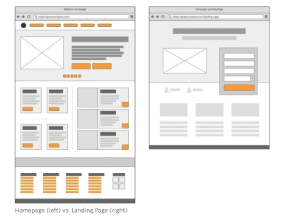
Unbounce contrasts the design of a web page with a lead capture page. (Source: Unbounce) (Large preview)

The only problem with this is that it depicts the design from a traditional desktop perspective. Just as you would consider the differences in conversion between a desktop and mobile website, you have to do the same for their landing pages.

In the following post, I’m going to give you some points to think about as you design lead capture pages for mobile audiences. I’ve also analyzed a number of landing pages on mobile so you can see how the design criteria may change based on what you’re promoting and who you’re trying to promote it to.

The Difference Between A Website And Lead Capture Page

This is the SnackFever website:

SnackFever home page

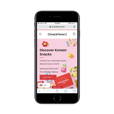
The home page of the SnackFever website. (Source: SnackFever) (Large preview)

It takes a few scrolls to get through all of the content:

SnackFever product highlights

The SnackFever website highlights their products. (Source: SnackFever) (Large preview)

And some more scrolling…

SnackFever descriptions

More information from the SnackFever website. (Source: SnackFever) (Large preview)

This is a content-packed home page, even for mobile. A page like this must mean that they’re prepared to have visitors wade through all of the options and opportunities available on the website. As you know, this can be a gamble on mobile what with conversion rates historically lower on those devices.

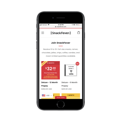
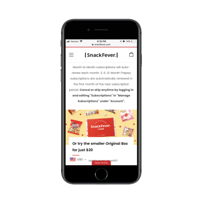
Then, compare this to SnackFever’s free gift lead capture page:

SnackFever lead capture form

The lead capture form on the SnackFever website. (Source: SnackFever) (Large preview)

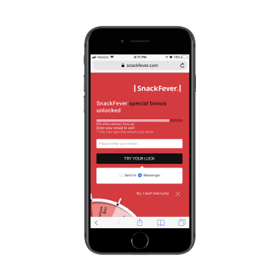
Only one swipe of the screen is needed to see the full page:

SnackFever lead capture page

The lead capture page on the SnackFever website. (Source: SnackFever) (Large preview)

Technically, this is a lead capture pop-up. However, on mobile, SnackFever has turned this into a full page design (which is a much better choice).

This is a pretty awesome example of why you should be designing different experiences for different devices.

You can see that this is much more succinct and easy to stay engaged with as it has a singular purpose. The goal here is to capture that lead ASAP. This is not designed to give them room to walk around the site and ponder other decisions.

This is exactly why you should be building lead capture pages away from the website. It doesn’t matter what kind of lead generation you’re using to lure visitors there:

eBooks, white papers and other custom reports
Courses or webinars
Checklists
Calculator or quiz results
Discounts or coupons
Demos or consultations
Free trials

By moving potential leads over to a distraction-free landing page full of highly targeted messaging and visuals, you can improve your chances of converting them into leads. It might not be a purchase, but you’ve helped them take that first step.

Design Tips For Lead Capture Pages On Mobile

Before you do anything else, I’d urge you to take a look at your website’s Google Analytics data. Specifically, go to Audience > Mobile > Overview and look for this:

Google Analytics mobile sessions

Google Analytics Mobile Session Duration data. (Source: Google Analytics) (Large preview)

This is the average amount of time your mobile visitors spend on your website.

This data point will be helpful in determining, realistically, how long you have to capture and hold the attention of your mobile visitors.

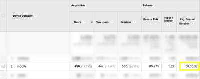
An even better way of doing this is to go to Behavior > Site Content > All Pages. Then, set the Secondary Dimension to Mobile (including Tablet) and click on the new dimension filter so that the “Yes” values go to the top:

Google Analytics mobile visitors per page

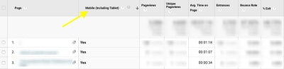
Google Analytics mobile visitor page- and time-related data. (Source: Google Analytics) (Large preview)

This lets you see how individual pages perform in terms of time on page with mobile visitors.

Look closely at any pages that have a strong and singular CTA, like a dedicated service or product page. You can use those times as an average benchmark for how long mobile visitors will stay engaged with a page that’s similarly structured (like your lead capture page).

Now that you have an idea of what your mobile visitors’ threshold is, you’ll be better prepared to design a lead capture page for mobile. The only thing is, though, it’s not that cut-and-dried.

I wish it were as easy to say:

Write a headline under 10 words.
Write a memorable description under 100 words.
Add a form.
Design an eye-catching button.
You’re done.

Instead, you’ll have to think dynamically about how your lead capture page will best convert visitors to it.

Here are the various things to consider as you design each part of your mobile landing page:

#1: Navigation

The navigation menu is a critical part of any website. It allows visitors to move around the site with ease while also gaining a better understanding of all that’s available within the walls of it.

But lead capture pages don’t exist within a website’s navigation. Visitors, instead, encounter promotional links or buttons on web pages, in emails, on social media and via paid ads in search. Upon clicking, they’re taken to a landing page that’s reminiscent of the website, but has a unique style of its own.

Now, the question is:

Should your lead capture page include the main website’s navigation atop it?

If the goal of a lead capture page is to capture leads, then it should have just one clickable call-to-action, right? Wouldn’t logic dictate that a navigation menu with links to other pages would serve as too much of a distraction? And what about the brand logo? After all, any other links will send the signal:

“Hey, it’s okay if you want to abandon this page.”

Instead of saying:

“We weren’t kidding. Look at how amazing this offer is. Scroll down and claim yours now.”

I’d say that the navigation should only be included when the website is already successfully converting visitors into paying customers/subscribers/members/readers. If the lead gen is merely there as a bonus element, then it’s not a big deal if visitors want to backtrack to the site.

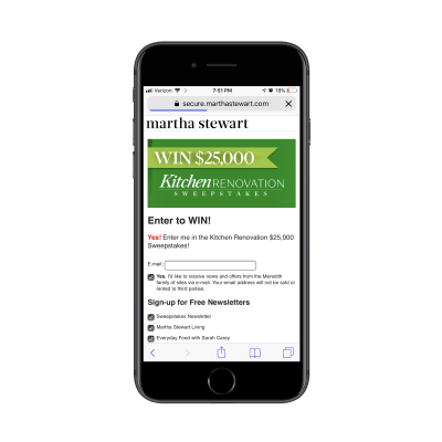
The logo should be fine to keep as it’s more of a branding element than a competing link in this context though. Take, for instance, this sweepstakes giveaway on the Martha Stewart website:

Martha Stewart sweepstakes

Martha Stewart promotional ad for sweepstakes giveaway. (Source: Martha Stewart) (Large preview)

This clickable promotional element takes visitors to the lead capture page where the navigation element has disappeared and only the logo remains:

Martha Stewart lead capture page

Martha Stewart’s lead capture page for its sweepstakes giveaway. (Source: Martha Stewart) (Large preview)

In general, if you need this lead gen offer to truly be a vehicle to grow your email list, the navigation should not be there. Nor should other competing links that draw them away from conversion.

#2: Copy

All of the usual rules for typography in mobile web design apply here — that includes size, spacing, color and font face. All of the rules you’d adhere to in terms of formatting a page for mobile apply as well. For example:

Very succinct headlines;
Short and punchy paragraphs;
Bulleted or numbered lists to describe points quickly;
Header tags to break up large swaths of text;
Bolding, italics, hyperlinks and other stylized text to call attention to key areas.

What about the amount of copy on the page though? Typically, the answer for mobile is:

Write only as much copy as you need to.

That is indeed the case with mobile lead capture pages… but there’s a catch.

Some lead gens are easier to “sell”, which means you shouldn’t need much more than the following to get people to convert:

A short and descriptive headline;
A paragraph explaining why the lead gen is so valuable;
Three to five bullets breaking out the benefits;
A short form asking for the basics: name, email and maybe a phone number.
A brightly colored and personally worded call-to-action button.

There are other cases where the lead gen offer requires more convincing. Or when the brand behind it decides to use the page’s copy as a way to qualify leads. You’ll see this a lot if the lead gen is something that requires an investment of time on the part of the brand. For instance:

Product demos
Consultations or audits
Webinars (sometimes)

In these cases, it makes more sense to write a lengthy lead capture page. Even then, I go back and forth on this because I’m just not sure that’s the smartest move for mobile visitors. So, what I’m going to suggest is this:

If you’re building a lead capture page for a well-established brand that’s known for overly-long pages and whose leads are valued at over $1,000 each, a super lengthy lead capture page is fine.

If you’re building a lead capture page for a newish brand that simply wants to grow their email list fast, don’t make visitors wait to convert.

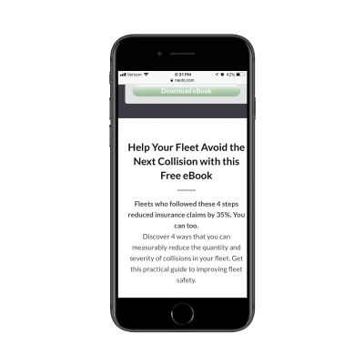
Get a look at this landing page from Nauto for a free eBook:

Nauto eBook

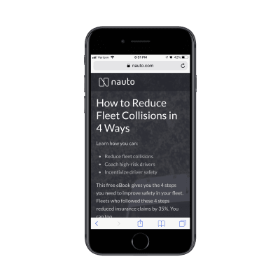
Nauto’s eBook lead capture page. (Source: Nauto) (Large preview)

It does a great job summarizing the lead gen offer above the fold. Scroll down one screenful and you’ll find this eye-catching form:

Nauto lead capture form

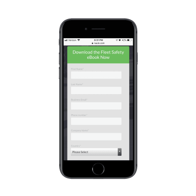
Nauto’s eBook lead capture form. (Source: Nauto) (Large preview)

It could’ve been as simple as that. However, Nauto continues on with more copy after the CTA:

Nauto post-form copy

Nauto includes additional copy after its lead capture form. (Source: Nauto) (Large preview)

What’s interesting here is that this part of the page essentially rewrites the intro at the top of the page. My guess is that they did this to strengthen the SEO of the page with a longer word count and a reiteration of the main keywords.

Either that or they found that visitors weren’t immediately filling out the form and needed a little more encouragement. That would explain why a couple more scrolls down take you through a closer look at the content of the eBook as well as another link to download it (which just returns you to the form):

Nauto post-form CTA

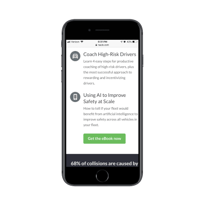
Nauto includes another CTA for the lead capture form. (Source: Nauto) (Large preview)

Clearly, you can still write a whole bunch of copy after the lead gen form, so long as there’s a good reason for it.

#3: Lead Capture Form

Nick Babich has a great piece on how to design forms for mobile. Although the guide pertains more to e-commerce checkout forms, the same basic principles apply here, too.

There are a number of other factors you should consider when designing forms to capture leads on a dedicated landing page.

Where should you place the form?

I’ve mostly answered that question in the above point about copy. But, if we want to be more specific, the lead capture form should always appear within no more than three swipes on mobile.

Realistically, the initial glance at a lead capture page should be an engaging visual element and headline. The next swipe down (if needed) should be an explainer paragraph and short list of benefits. Then, you should take them right to the form.

This is an example from GoToMeeting’s eBook lead capture page:

GoToMeeting engaging header design

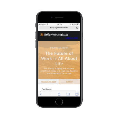
GoToMeeting lead capture image and headline. (Source: GoToMeeting) (Large preview)

They’ve truncated all of those key intro elements into the top header design.

Can you write the labels differently?

No, labels should never be tampered with, especially on mobile. Keep them clear and to the point. Name. Email. Business. # of employees. Etc.

What you can and should do differently, though, is to create more engaging form titles and CTAs. Or you can encapsulate the form within brightly-colored borders.

The whole point of this page is to convert visitors on a single element. While you can’t play with the field labels, you can increase their engagement with the outlier text and design.

How many fields should you include?

The answer to this is always “only the ones that are necessary”. However, you don’t want to go too far towards the simple side if the purpose of the lead gen is to qualify leads.

If all you’re doing is growing an email list, sure, Name and Email will suffice. If your goal is to provide something of value to the people who really need it and, later, follow up and start them on the sales journey, the lead capture form needs to be longer.

Here’s another look at the GoToMeeting landing page:

GoToMeeting lead capture form

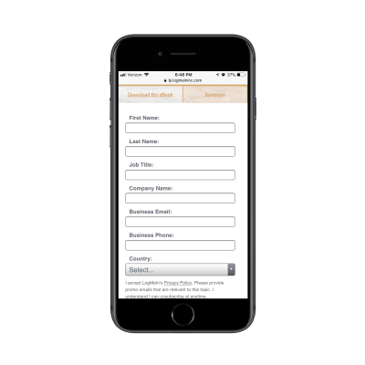
GoToMeeting’s lengthy lead capture form. (Source: GoToMeeting) (Large preview)

You can tell right away they’re not trying to give this eBook out to any and everyone. This is for a specific kind of business and they’re likely going to filter the leads they receive from it based on job title and country, too.

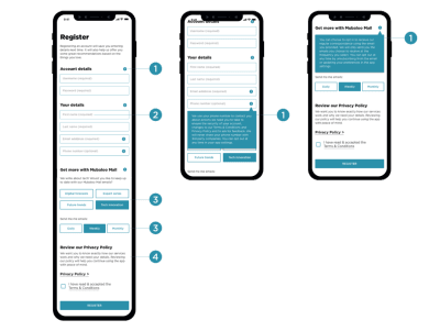
Don’t feel as though this is only something you can use for B2B websites either. Get a look at this custom wedding checklist lead capture form from Zola:

Zola lead capture form - your name

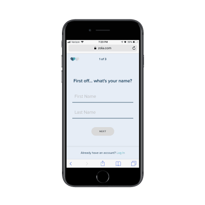
The first page of Zola’s lead capture form. (Source: Zola) (Large preview)

The first page of the form asks for your name. The second page of the form asks for your spouse-to-be’s name:

Zola lead capture form - spouse’s name

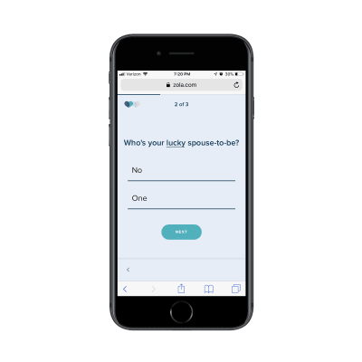
The second page of Zola’s lead capture form. (Source: Zola) (Large preview)

The final question then asks for your scheduled or tentative wedding day:

Zola lead capture form - wedding day

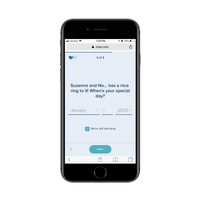
The third page of Zola’s lead capture form. (Source: Zola) (Large preview)

On the final page, Zola let’s you know that you can receive your custom wedding checklist if you’re willing to create an account:

Zola lead capture form - account required

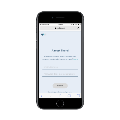
Zola requires an email address and password before sending the custom checklist. (Source: Zola) (Large preview)

It’s a simple enough series of questions, but also not the kind you would find on most lead capture forms. So, don’t be afraid to break outside the norm if it improves the value of the lead gen offer for the visitor and helps your client collect better data on their leads.

#4: Trust Marks

Trust marks are often used around mobile e-commerce checkout forms. That makes a lot of sense since the goal is to make mobile visitors comfortable enough to buy something from their smartphones.

But are trust marks necessary for lead capture pages?

I think this boils down to what kind of lead gen you’re giving away and what kind of communication you intend to have with the lead after they’ve filled out the form.

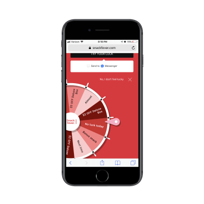
Take the SnackFever example above. It’s a fun little game they’ve put on their site that exchanges a discount for an email address. There’s no reason for SnackFever to put a Norton Security or SSL trust mark next to the form. It’s very low stakes.

But when the lead gen’s value is dependent on the knowledge and skills of the company behind it, it’s very important to include trust marks on the page.

In this case, you want to demonstrate that there are satisfied customers (not leads) who are willing to vouch for the capabilities and prowess of the company. If you can leverage well-known brand logos and flattering testimonials from individuals, your landing page will more effectively capture the right kinds of leads (i.e. the ones willing to enter the sales funnel after they get their lead gen).

It’s no surprise that someone like Neil Patel would leverage these kinds of trust marks — he has a lot of high-profile and satisfied customers. It would be silly not to include them on his lead capture page.

This is the top of his “Yes, I Want More Traffic” lead capture page:

Neil Patel lead capture page

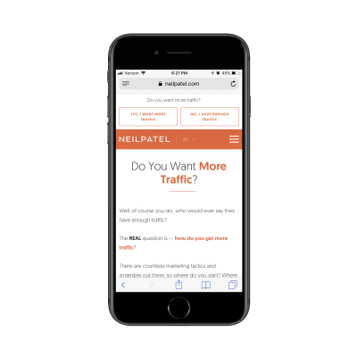
Neil Patel’s lead capture page sets the stage. (Source: Neil Patel) (Large preview)

It goes on and on like this for about a dozen scrolls. (As I mentioned before, if you’re known for writing overly long content on your site, you can get away with this.)

Neil Patel lead capture data

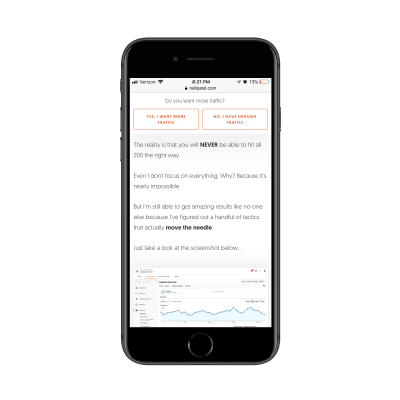
Neil Patel provides valuable data to demonstrate the value of his offer. (Source: Neil Patel) (Large preview)

Eventually, he gets to a point where he lets others tell the visitor why they should pursue this offer. The first block of trust marks come in the form of short quotes and logos from well-known companies:

Neil Patel customer quotes

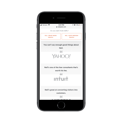
Neil Patel shows off his high-profile clients and quotes they’ve provided about him. (Source: Neil Patel) (Large preview)

The next section puts the spotlight on “smaller” clients that are willing to divulge what kinds of impressive results Neil has gotten for them:

Neil Patel customer data and testimonials

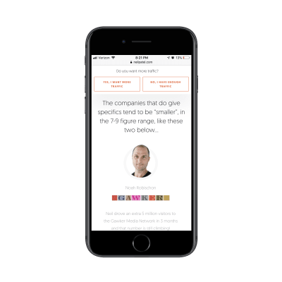
Neil Patel includes data-driven testimonials from other clients. (Source: Neil Patel) (Large preview)

While I wouldn’t suggest the length or style of this page for your clients, I do think there’s a great lesson to be taken away here in terms of leveraging the words and reputations of a satisfied client base to build trust.

#5: Footer

While I have a hard time justifying the use of a navigation on a lead capture page, I actually do think a footer is a good idea. That said, I don’t think it should be the same as your website’s footer. Again, we want to avoid any design element stuffed full of links that can distract from the goal of the page.

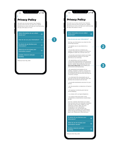
Instead, you should use the footer to further establish trust with leads. Terms of Use, Privacy Policy, and other data management policy pages belong here.

I’m including this final example from Drift because, well, it’s the most unique lead capture “page” I’ve encountered thus far — and because the footer is as simple as they come.

This page promotes Drift’s upcoming and previous webinars:

Drift webinar link

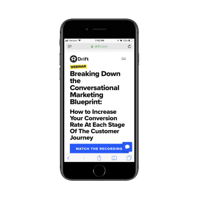
A link to an older webinar by Drift. (Source: Drift) (Large preview)

If you attempt to “Watch the Recording” of an old webinar, it’s fair to assume that Drift is going to want to capture your email address. However, Drift is in the business of developing conversational marketing tools for business. While they could’ve created a conversational landing page (sort of like what Zola did with its form above), it went a different route:

Drift mobile chatbot

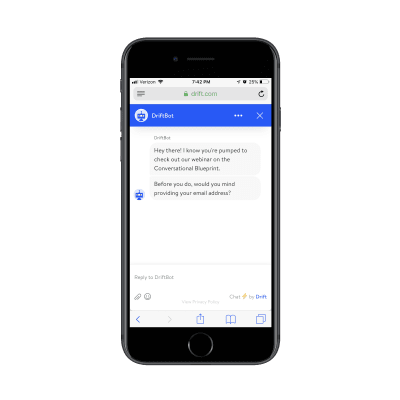
Drift’s chatbot asks visitors for their email address to get to the webinar. (Source: Drift) (Large preview)

Visitors interested in the webinar lead gen are taken to a DriftBot page. It’s very simple in design (as any chat interface should be) and includes the simplest of footers. While Drift’s link is there, the only other competition for attention is the “Privacy Policy” and it’s clear that Drift wants that to be an afterthought based on the font color choice.

One more thing I want to note about this example is that if you were to go through these same steps on the desktop website, DriftBot doesn’t ask you for an email address. It simply gives you a link:

Drift desktop chatbot

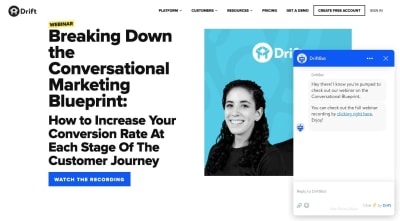
Drift’s desktop chatbot doesn’t ask for an email address. (Source: Drift) (Large preview)

This is further proof that you should be designing different experiences based on the expected outcomes on each device. In this case, they probably have data that shows that desktop visitors watch the webinar right away while mobile visitors wait until they’re on a larger-screened device.

Wrapping Up

While adhering to basic mobile design principles is the best thing to do when designing something new for your clients, be mindful of the purpose of the new element or page too.

As you can see in many of the examples above, there’s a stark difference between the kinds of lead gen offers your clients may want to share with visitors.

The simpler exchanges (e.g. give me your email/get this checklist) don’t require much deviation from the designs of other mobile web pages. More high stakes exchanges (e.g. give me your information/get a custom quote, consult or demo) may require some non-mobile-friendly design techniques.

I would suggest you do your research, see how long you can realistically hold your visitors’ attention on mobile and design it. Then, start A/B testing your design to experiment with form construction, page length, and so on. You may be surprised at what your mobile visitors will go for if the lead gen offer is juicy enough.

Smashing Editorial
(ra, yk, il)

Building A Node.js Express API To Convert Markdown To HTML

Original Source: https://www.smashingmagazine.com/2019/04/nodejs-express-api-markdown-html/

Building A Node.js Express API To Convert Markdown To HTML

Building A Node.js Express API To Convert Markdown To HTML

Sameer Borate

2019-04-23T12:30:16+02:00
2019-04-23T18:34:13+00:00

Markdown is a lightweight text markup language that allows the marked text to be converted to various formats. The original goal of creating Markdown was of enabling people “to write using an easy-to-read and easy-to-write plain text format” and to optionally convert it to structurally valid XHTML (or HTML). Currently, with WordPress supporting Markdown, the format has become even more widely used.

The purpose of writing the article is to show you how to use Node.js and the Express framework to create an API endpoint. The context in which we will be learning this is by building an application that converts Markdown syntax to HTML. We will also be adding an authentication mechanism to the API so as to prevent misuse of our application.

A Markdown Node.js Application

Our teeny-tiny application, which we will call ‘Markdown Convertor’, will enable us to post Markdown-styled text and retrieve an HTML version. The application will be created using the Node.js Express framework, and support authentication for conversion requests.

We will build the application in small stages — initially creating a scaffold using Express and then adding various features like authentication as we go along. So let us start with the initial stage of building the application by creating a scaffold.

Stage 1: Installing Express

Assuming you’ve already installed Node.js on your system, create a directory to hold your application (let’s call it “markdown-api”), and switch to that directory:

$ mkdir markdown-api
$ cd markdown-api

Use the npm init command to create a package.json file for your application. This command prompts you for a number of things like the name and version of your application.

For now, simply hit Enter to accept the defaults for most of them. I’ve used the default entry point file as index.js, but you could try app.js or some other depending on your preferences.

Now install Express in the markdown-api directory and save it in the dependencies list:

$ npm install express –save

Create an index.js file in the current directory (markdown-api) and add the following code to test if the Express framework is properly installed:

Const express = require(‘express’);
var app = express();

app.get(‘/’, function(req, res){
res.send(‘Hello World!’);
});

app.listen(3000);

Now browse to the URL http://localhost:3000 to check whether the test file is working properly. If everything is in order, we will see a Hello World!’ greeting in the browser and we can proceed to build a base API to convert Markdown to HTML.

Stage 2: Building A Base API

The primary purpose of our API will be to convert text in a Markdown syntax to HTML. The API will have two endpoints:

/login
/convert

The login endpoint will allow the application to authenticate valid requests while the convert endpoint will convert (obviously) Markdown to HTML.

Below is the base API code to call the two endpoints. The login call just returns an “Authenticated” string, while the convert call returns whatever Markdown content you submitted to the application. The home method just returns a ‘Hello World!’ string.

const express = require(“express”);
const bodyParser = require(‘body-parser’);

var app = express();
app.use(bodyParser.urlencoded({ extended: true }));
app.use(bodyParser.json());

app.get(‘/’, function(req, res){
res.send(‘Hello World!’);
});

app.post(‘/login’, function(req, res) {
res.send(“Authenticated”);
},
);

app.post(“/convert”, function(req, res, next) {
console.log(req.body);
if(typeof req.body.content == ‘undefined’ || req.body.content == null) {
res.json([“error”, “No data found”]);
} else {
res.json([“markdown”, req.body.content]);
}
});

app.listen(3000, function() {
console.log(“Server running on port 3000”);
});

We use the body-parser middleware to make it easy to parse incoming requests to the applications. The middleware will make all the incoming requests available to you under the req.body property. You can do without the additional middleware but adding it makes it far easier to parse various incoming request parameters.

You can install body-parser by simply using npm:

$ npm install body-parser

Now that we have our dummy stub functions in place, we will use Postman to test the same. Let’s first begin with a brief overview of Postman.

Postman Overview

Postman is an API development tool that makes it easy to build, modify and test API endpoints from within a browser or by downloading a desktop application (browser version is now deprecated). It has the ability to make various types of HTTP requests, i.e. GET, POST, PUT, PATCH. It is available for Windows, macOS, and Linux.

Here’s a taste of Postman’s interface:

Postman interface

(Large preview)

To query an API endpoint, you’ll need to do the following steps:

Enter the URL that you want to query in the URL bar in the top section;
Select the HTTP method on the left of the URL bar to send the request;
Click on the ‘Send’ button.

Postman will then send the request to the application, retrieve any responses and display it in the lower window. This is the basic mechanism on how to use the Postman tool. In our application, we will also have to add other parameters to the request, which will be described in the following sections.

Using Postman

Now that we have seen an overview of Postman, let’s move forward on using it for our application.

Start your markdown-api application from the command-line:

$ node index.js

To test the base API code, we make API calls to the application from Postman. Note that we use the POST method to pass the text to convert to the application.

The application at present accepts the Markdown content to convert via the content POST parameter. This we pass as a URL encoded format. The application, currently, returns the string verbatim in a JSON format — with the first field always returning the string markdown and the second field returning the converted text. Later, when we add the Markdown processing code, it will return the converted text.

Stage 3: Adding Markdown Convertor

With the application scaffold now built, we can look into the Showdown JavaScript library which we will use to convert Markdown to HTML. Showdown is a bidirectional Markdown to HTML converter written in Javascript which allows you to convert Markdown to HTML and back.

Testing with Postman

(Large preview)

Install the package using npm:

$ npm install showdown

After adding the required showdown code to the scaffold, we get the following result:

const express = require(“express”);
const bodyParser = require(‘body-parser’);
const showdown = require(‘showdown’);

var app = express();
app.use(bodyParser.urlencoded({ extended: true }));
app.use(bodyParser.json());

converter = new showdown.Converter();

app.get(‘/’, function(req, res){
res.send(‘Hello World!’);
});

app.post(‘/login’, function(req, res) {
res.send(“Authenticated”);
},
);

app.post(“/convert”, function(req, res, next) {
if(typeof req.body.content == ‘undefined’ || req.body.content == null) {
res.json([“error”, “No data found”]);
} else {
text = req.body.content;
html = converter.makeHtml(text);
res.json([“markdown”, html]);
}
});

app.listen(3000, function() {
console.log(“Server running on port 3000”);
});

The main converter code is in the /convert endpoint as extracted and shown below. This will convert whatever Markdown text you post to an HTML version and return it as a JSON document.


} else {
text = req.body.content;
html = converter.makeHtml(text);
res.json([“markdown”, html]);
}

The method that does the conversion is converter.makeHtml(text). We can set various options for the Markdown conversion using the setOption method with the following format:

converter.setOption(‘optionKey’, ‘value’);

So, for example, we can set an option to automatically insert and link a specified URL without any markup.

converter.setOption(‘simplifiedAutoLink’, ‘true’);

As in the Postman example, if we pass a simple string (such as Google home http://www.google.com/) to the application, it will return the following string if simplifiedAutoLink is enabled:

<p>Google home <a href=”http://www.google.com/”>http://www.google.com/</a></p>

Without the option, we will have to add markup information to achieve the same results:

Google home <http://www.google.com/>

There are many options to modify how the Markdown is processed. A complete list can be found on the Passport.js website.

So now we have a working Markdown-to-HTML converter with a single endpoint. Let us move further and add authentication to have application.

Stage 4: Adding API Authentication Using Passport

Exposing your application API to the outside world without proper authentication will encourage users to query your API endpoint with no restrictions. This will invite unscrupulous elements to misuse your API and also will burden your server with unmoderated requests. To mitigate this, we have to add a proper authentication mechanism.

We will be using the Passport package to add authentication to our application. Just like the body-parser middleware we encountered earlier, Passport is an authentication middleware for Node.js. The reason we will be using Passport is that it has a variety of authentication mechanisms to work with (username and password, Facebook, Twitter, and so on) which gives the user the flexibility on choosing a particular mechanism. A Passport middleware can be easily dropped into any Express application without changing much code.

Install the package using npm.

$ npm install passport

We will also be using the local strategy, which will be explained later, for authentication. So install it, too.

$ npm install passport-local

You will also need to add the JWT(JSON Web Token) encode and decode module for Node.js which is used by Passport:

$ npm install jwt-simple

Strategies In Passport

Passport uses the concept of strategies to authenticate requests. Strategies are various methods that let you authenticate requests and can range from the simple case as verifying username and password credentials, authentication using OAuth (Facebook or Twitter), or using OpenID. Before authenticating requests, the strategy used by an application must be configured.

In our application, we will use a simple username and password authentication scheme, as it is simple to understand and code. Currently, Passport supports more than 300 strategies which can be found here.

Although the design of Passport may seem complicated, the implementation in code is very simple. Here is an example that shows how our /convert endpoint is decorated for authentication. As you will see, adding authentication to a method is simple enough.

app.post(“/convert”,
passport.authenticate(‘local’,{ session: false, failWithError: true }),
function(req, res, next) {
// If this function gets called, authentication was successful.
// Also check if no content is sent
if(typeof req.body.content == ‘undefined’ || req.body.content == null) {
res.json([“error”, “No data found”]);
} else {
text = req.body.content;
html = converter.makeHtml(text);
res.json([“markdown”, html]);
}},
// Return a ‘Unauthorized’ message back if authentication failed.
function(err, req, res, next) {
return res.status(401).send({ success: false, message: err })
});

Now, along with the Markdown string to be converted, we also have to send a username and password. This will be checked with our application username and password and verified. As we are using a local strategy for authentication, the credentials are stored in the code itself.

Although this may sound like a security nightmare, for demo applications this is good enough. This also makes it easier to understand the authentication process in our example. Incidentally, a common security method used is to store credentials in environment variables. Still, many people may not agree with this method, but I find this relatively secure.

The complete example with authentication is shown below.

const express = require(“express”);
const showdown = require(‘showdown’);
const bodyParser = require(‘body-parser’);
const passport = require(‘passport’);
const jwt = require(‘jwt-simple’);
const LocalStrategy = require(‘passport-local’).Strategy;

var app = express();
app.use(bodyParser.urlencoded({ extended: true }));
app.use(bodyParser.json());

converter = new showdown.Converter();

const ADMIN = ‘admin’;
const ADMIN_PASSWORD = ‘smagazine’;
const SECRET = ‘secret#4456’;

passport.use(new LocalStrategy(function(username, password, done) {
if (username === ADMIN && password === ADMIN_PASSWORD) {
done(null, jwt.encode({ username }, SECRET));
return;
}
done(null, false);
}));

app.get(‘/’, function(req, res){
res.send(‘Hello World!’);
});

app.post(‘/login’, passport.authenticate(‘local’,{ session: false }),
function(req, res) {
// If this function gets called, authentication was successful.
// Send a ‘Authenticated’ string back.
res.send(“Authenticated”);
});

app.post(“/convert”,
passport.authenticate(‘local’,{ session: false, failWithError: true }),
function(req, res, next) {
// If this function gets called, authentication was successful.
// Also check if no content is sent
if(typeof req.body.content == ‘undefined’ || req.body.content == null) {
res.json([“error”, “No data found”]);
} else {
text = req.body.content;
html = converter.makeHtml(text);
res.json([“markdown”, html]);
}},
// Return a ‘Unauthorized’ message back if authentication failed.
function(err, req, res, next) {
return res.status(401).send({ success: false, message: err })
});

app.listen(3000, function() {
console.log(“Server running on port 3000”);
});

A Postman session that shows conversion with authentication added is shown below.

Final application testing with Postman

Final application testing with Postman (Large preview)

Here we can see that we have got a proper HTML converted string from a Markdown syntax. Although we have only requested to convert a single line of Markdown, the API can convert a larger amount of text.

This concludes our brief foray into building an API endpoint using Node.js and Express. API building is a complex topic and there are finer nuances that you should be aware of while building one, which sadly we have no time for here but will perhaps cover in future articles.

Accessing Our API From Another Application

Now that we have built an API, we can create a small Node.js script that will show you how the API can be accessed. For our example, we will need to install the request npm package that provides a simple way to make HTTP requests. (You will Most probably already have this installed.)

$ npm install request –save

The example code to send a request to our API and get the response is given below. As you can see, the request package simplifies the matter considerably. The markdown to be converted is in the textToConvert variable.

Before running the following script, make sure that the API application we created earlier is already running. Run the following script in another command window.

Note: We are using the (back-tick) sign to span multiple JavaScript lines for the textToConvert variable. This is not a single-quote.

var Request = require(“request”);

// Start of markdown
var textToConvert = `Heading
=======
## Sub-heading

Paragraphs are separated
by a blank line.

Two spaces at the end of a line
produces a line break.

Text attributes _italic_,
**bold**, ‘monospace’.
A [link](http://example.com).
Horizontal rule:`;

// End of markdown

Request.post({
“headers”: { “content-type”: “application/json” },
“url”: “http://localhost:3000/convert”,
“body”: JSON.stringify({
“content”: textToConvert,
“username”: “admin”,
“password”: “smagazine”
})
}, function(error, response, body){
// If we got any connection error, bail out.
if(error) {
return console.log(error);
}
// Else display the converted text
console.dir(JSON.parse(body));
});

When we make a POST request to our API, we provide the Markdown text to be converted along with the credentials. If we provide the wrong credentials, we will be greeted with an error message.

{
success: false,
message: {
name: ‘AuthenticationError’,
message: ‘Unauthorized’,
status: 401
}
}

For a correctly authorized request, the above sample Markdown will be converted to the following:

[ ‘markdown’,
`<h1 id=”heading”>Heading</h1>
<h2 id=”subheading”>Sub-heading</h2>
<p>Paragraphs are separated by a blank line.</p>
<p>Two spaces at the end of a line<br />
produces a line break.</p>
<p>Text attributes <em>italic</em>,
<strong>bold</strong>, ‘monospace’.
A <a href=”http://example.com”>link</a>.
Horizontal rule:</p>` ]

Although we have hardcoded the Markdown here, the text can come from various other sources — file, web forms, and so on. The request process remains the same.

Note that as we are sending the request as an application/json content type; we need to encode the body using json, hence the JSON.stringify function call. As you can see, it takes a very small example to test or API application.

Conclusion

In this article, we embarked on a tutorial with the goal of learning on how to use Node,js and the Express framework to build an API endpoint. Rather than building some dummy application with no purpose, we decided to create an API that converts Markdown syntax to HTML, which anchors or learning in a useful context. Along the way, we added authentication to our API endpoint, and we also saw ways to test our application endpoint using Postman.

Smashing Editorial
(rb, ra, il)