Smashing TV Interviews: The Mozilla View Source Line-Up

Original Source: https://www.smashingmagazine.com/2019/08/mozilla-view-source/

Smashing TV Interviews: The Mozilla View Source Line-Up

Smashing TV Interviews: The Mozilla View Source Line-Up

Rachel Andrew

2019-08-14T10:30:59+02:00
2019-08-14T14:43:22+00:00

Smashing TV has been working with our friends over at Mozilla to bring you content from their upcoming View Source conference in Amsterdam. We’re really excited about the event that they are putting together.

Here on Smashing Magazine, we often feature articles that explain a little bit about how web technologies are created. I’m a CSS Working Group member, and I enjoy sharing the things that we’ve been discussing in our meetings, such as my post on “Designing An Aspect Ratio Unit For CSS”. Earlier this year, we published an article by Amy Dickens, “Web Standards: The What, The Why, And The How” in which Amy explained what we mean by web standards and how standards groups work. We’ve also shared with you how browser vendors such as Mozilla are making web platform features easier for us to use in our work, such as this post by Chen Hui Jing, “Debugging CSS Grid Layouts With Firefox Grid Inspector”.

If you enjoy articles like these, then you will love View Source, and the chance to spend two days with people who are involved with specifying the web, and implementing it in our browsers. It’s a very special View Source because friends from Google, Microsoft, Samsung, and the W3C are joining Mozilla to bring the best of the web to developers and designers this year. I’ll be there too, wearing my CSS Working Group hat, as part of a discussion corner on how CSS gets into browsers.

Our own Vitaly Friedman has been interviewing some of the speakers from the upcoming event, and you can watch the first of those interviews now.

Enjoy this conversation with Kenji Baheux, a Product Manager at Google, working on Chrome/Web Platform, about the web in different parts of the world, differences between usage of the web, and what we need to be aware of when expanding to an unfamiliar market in India or Southeast Asia.

Mozilla’s View Source Amsterdam event is happening on Monday and Tuesday, Sept 30th and October 1st at Theater Amsterdam. Get your tickets here. You can save 25% with the code Smashing_VS, or use a direct link to check out. I look forward to meeting you there!

An Interview With Kenji Baheux

Vitaly: Hello and welcome to one of those interviews on view source speakers, live sessions with a few behind-the-scenes about the speakers and the sessions and the talks and the interesting topics. And I’m very happy and honored to have Kenji Baheux with us today, from Google, currently living in Tokyo, Japan. How’re you doing today, Kenji?

Kenji Baheux: I’m doing pretty good, thank you.

Vitaly: Fantastic. I have questions. You know, I always do, I have too many questions I believe, but I’m really curious because you know, I know that you’ve spent quite a bit of time and you know, the session you’re going to present today, you’re going to present that in view source which is all about multicultural web thing, right? It’s like the web beyond the scope of what we’re used to, and very often when we think about designing a building for the web, we’re thinking about designing and building for our web. You know, for wonderful screens and wonderful devices and wonderful connections and powerful devices, and all of that. But when we think about designing for Indonesia, when you think about designing for Southeast Asia or India or kind of all places where we’re are not familiar with, we have stereotypes, right? We tend to believe slow devices, unreliable connections, bad screens, you know, horrible, horrible conditions. Almost the opposite of what we’re used to, is it the true web outside of the comfortable bubble that we live in? Tell us.

Kenji Baheux: So, unfortunately, there is some truth to that, and the interesting thing is that the market in India and Indonesia they have like a common aspect, but there are differences — especially around connectivity, for instance. It used to be the case that connectivity in India was very expensive, and so people like wanted to save like data and so they, you know, they didn’t want to use the web too much. For instance, today, it has become a lot more affordable and so people are not concerned too much about data consumption. It is still true that maybe in the newer kind of like user segment, it might still be quite expensive, but it’s getting better quite fast. So I think like in term of like data usage, it’s not so much a concern anymore, but at the same time like 4G is available over there, but if you look at the speed and the like readability of the collection, it’s more kind of like a 3G connection than a 4G connection.

Kenji Baheux: And so you need to be careful about like your assumption about, “Oh, 4G is affordable and therefore the connectivity is going to be the same than what I experience in my own country.” Like there are some stats but like, for instance, I think India is actually at the bottom in terms of speed for 4G and it’s about a 10x slower than what it should be compared to like the top one, for instance. So there is some nuance there and also because there are a lot of users in India depending on the time of the day, the speed will like fluctuate and also sometimes like depending on the bandwidth the [inaudible] will keep up.

Kenji Baheux: And so you might lose connection. You might be on the go. There are a lot of dot points, like not enough antennas and things like that. So you need to be careful about speed and also like this idea that not always on connectivity is not always what user experience is over there. And if you contrast that with Indonesia, Indonesia is doing a bit better in terms of speed, like 4G over there is more kind of like 4G, and there are some reasons to that. The country is much smaller, urbanization is much higher, and so it does help, right? The user, they can reach out in Indonesia tend to have better infrastructure. So that’s one aspect. You mentioned also the devices, so on that, like it’s still very true that the devices tend to be on the lower end of the spectrum. And so like iPhone for instance, are a very tiny market share mostly because those devices are too expensive. And so most of the people can’t afford like high-premium devices.

Kenji Baheux: It used to be the case also that the memory that devices have was very low and this has become better, but it doesn’t mean that the device is cracked, right. I think the OEMs understood what the user cares about. Like does it have a great camera, does it have enough RAM, what about the storage? But then they want to keep the price low and so they are going to find ways to make the device cheap, right? And so it means like slow CPU, slow storage, and things like that. So you need to be careful about the connectivity, but also how much JavaScript you send because it’s going to make your page go slow, right?

Vitaly: It’s, you know, you spend quite a bit of time thinking about performance and also now because you’re working at the Chrome team and you kind of want to work on the instant loading team — if I’m correct, right? It means for me, personally, it means that you have very different challenges at times as well because probably now living in Japan or living in Indonesia kind of have to really look into the types of devices people are using, the habits that they have, the cultural ways of how the web is different. You know, if you look into Africa, for example, I’m sure as you probably know, of course, many people that Africa will be using kind of totally bypassing credit cards altogether, sending money by SMS and having a different kind of web applications, right? So that makes me think as well, when it comes to performance, obviously we want to make things fast and all that, would you say that progressive web apps as a model has become or is becoming more and more established just because it’s kind of an easier way in to get to better performance in India, in Southeast Asian, and so on?

Kenji Baheux: Yeah, we’ve seen a trend of success with PWA in those markets, for the reasons that I’ve outlined, right? If you build a PWA right, it’s going to minimize the amount of data that you fetch, right? You can use the storage and API to make sure that you don’t over-fetch. You can also deliver a very fast-like experience by showing at least a bit of like a piece of UX and then fetching the new content, right? You can minimize the amount of content you need to fetch in order to show the letters like data. So it’s, I think it’s a great fit. It does help a lot of like partners over there.

Vitaly: Many companies that they kind of work with and some of my colleagues are working with, they have a very difficult time moving kind of exploring new markets, moving their architecture, their application, the the way they built up their app or the website really on these markets kind of trying to gather that market share. And it’s very often not very clear why is that? Is it just because the architecture that we’re used to with this mountain of JavaScript that we are pushing with, you know, the Western World that say it’s just totally unacceptable for Southeast Asia? And again, I don’t know, China’s a difficult story anyway, and India. So in many ways, many of these companies see as one of the paths to get to those markets is just built something entirely different. So when you see, if you see, let’s say somebody who had maybe watching this session later trying to get through those markets, would you recommend to adapt the existing architecture, try to kind of make it work for those markets, or would you say it’s better to start from scratch and use something like an assistant ecosystem that’s already there?

Kenji Baheux: Yeah, I think it’s usually better to start from scratch because you might be tempted to try to keep around different features because maybe you’ve seen them doing well in your market and so you, you think those will be like super important to have. And so it’s going to be hard to make some trade off. And so it might be better to start from scratch and like really find, okay, what are the keys— what is the goal of this product? What are we trying to achieve? And keep it to the essential and start from there and see if you really like your product too, it’s bare minimum, like how fast can it float on the connectivity that you can find in markets like that? Like, try to get a low-end device, it’s not too hard to get something that could feel relevant for the market that you are trying to target and just play with it.

Kenji Baheux: I think trying to create a product on your desktop computer or even looking at it like on an iPhone or like a high-end Android device is not going to give you a good idea of like what your experience is going to be. And so you need to really like put yourself in the the shoes of your customers and really like confirm for yourself that what you have is going to work. So yeah, start from something very simple like the bare minimum that your product is about, and see how far you can take it from there.

Vitaly:It’s interesting to also be talking about people, but also… most of the time when we have these conversations about performance, we think about devices. You know, when you start thinking about internationalization and localization and all those things that are actually just going to those markets, I start wondering about the habits of people. Maybe they use the web very differently. So this is exactly what you’re saying, right? We need to do some research to understand how people are used to certain things. What would work? Maybe a feature you spent two years on here in Germany somewhere is just not going to work at all in India, right? So because, I mean, I just have to ask you because I’m so curious, it’s maybe not on the technical side, but I’m just curious. So if you compare the web, how people use the web, but say in the Western World, and again, let’s say in Japan where you spent the last 20 years, I believe, how is it different? I mean, I’m sure that there are certain things that are just, just totally confusing for somebody who experiences, let’s say, the way people are using the web in Japan coming from very different culture, did you have any kind of cultural shocks or anything of that kind or do you see things differently?

Kenji Baheux: That’s an interesting one. I think one of the most surprising thing for me when I arrived in Japan, like 20 years ago, was the fact that the website were like very visual, to the point of like being very noisy. Like from a European viewpoint, it’s kind of like, oh, this is way too much in your face. Like, there was so much going on on that page, how can you even understand how to use it? But actually this is what like most users are actually here, like when it comes to user experience, they want to know more upfront about the product, and so you end up with this like long page detailing all the things about why this project is like the most amazing thing in the world. And then at the bottom of it, there is like finally a way to purchase that product, so that’s one typical user experience that I’ve seen a couple of times already.

Kenji Baheux: So yeah, so that’s very visual: Trying to put as much information upfront about what the product is about. So that’s for Japan. And then for countries like Indonesia and India, especially in India, there are a lot of difficulties around language. As you probably know, India has a lot of official languages and so you really need to understand which users you are trying to reach. Because if you don’t have the content in their language, it’s going to be very hard for them to understand how to use the website, and so on. For most, it’s the first time that they are getting online and there are still a lot like new users getting online every day, and so they don’t have any like notion of like what a tab is like background tab, all of these things that we take for granted, like a lot of users actually that’s the first time that they are online, and so it’s very hard for them to just know about the things we take for granted. And so be very careful about making sure that your product is like self-explaining, and that there is nothing that people need to know in advance, for instance.

Vitaly: I’m also wondering, very often when we’re building products or when we’re designing products, we tend to think that we are building this technology that’s almost neutral, but in the end, whenever we’re building something, we always reflect our identity somehow in the little snippets of JavaScript and CSS we’re writing, and so I think that, in many ways, as designers and developers, we also have certain stereotypes when it comes to designing for those markets or kind of adapting for those markets. So what do you see, I mean, I mentioned one of them in the very beginning, like everything is slow, everything is horrible, totally unreliable and all of that — what do you see maybe as other common misconceptions or myths surrounding global web from people who are designing and building in a Western World Web?

Kenji Baheux: Yeah, that’s an interesting one. I think one particular aspect is the local players tend to be much more successful for various reasons, but one of them is that, especially in Indonesia, they know that the population is very young in general, and so they opt for a more casual tone which is something that I guess most websites in the US and EU don’t tend to do a lot. And so if you’re in e-commerce, you might be tempted to be very serious because you want to present yourself as the company that people can trust, but it might actually be the [inaudible] to your brand image if you go to a market like Indonesia where people want to have a more fun experience maybe.

Vitaly: Right, and also if you look forward into how things are evolving or how they’ve changed, I mean, you’ve seen tremendous change on the web over the last 20 years, I’m sure, but I’m wondering also when we look forward, let’s say five years from now, and look into connectivity, it seems like there is this gap that we used to have. It’s kind of bridging, we have pretty much stable connectivity that’s coming, at least worldwide, it’s still a long way to go, but it’s, you know, it’s coming. How do you see the web — the World Wide Web as we intended it to be from the very first place — evolving? Will we breach all these gaps between the Western world and non-Western world, at least in terms of the web? Or are there going to be significant cultural differences still?

Kenji Baheux: Obviously, eventually, things will get in a similar place in terms of conductivity and, like, maybe even like devices. But I think it’s going to take a while because as I said, there is still a lot of like new users getting online for the first time, and for them it’s like the price of data and devices are getting in the affordable realm, and you see, especially in markets like India for instance, there is still a lot of like feature phone and it’s not the like the old-side feature phone. It’s kind of like a more fully-fledged feature phone. I believe that KaiOS is getting a lot of attraction — people should be aware of that brand. Go check it online, google for KaiOS devices, and you will see that it’s actually bringing the modern web into a feature phone from factor.

Kenji Baheux: And so the idea is that the lowest end of the smartphone is still too expensive for a lot of users, and so by bringing something that people can use and get connected to on a feature phone from factor, like carriers can lower the price points where a lot more users can get online. So I think this is still going to be the case for a long time, and so having to be mindful about low-end devices and slow connectivity because as more people get online, the infrastructure should keep up but it’s going to be very hard. All of these programs are still going to be a thing for a long time, I think.

Vitaly: When I was in Indonesia, by the way, I was surprised about one thing because it’s the first time when I experienced it, and it was the fact that I would go online and we’d get a SIM card and then there would be a Facebook Internet and everything else. Essentially, whenever I go through the gates of Facebook and I try to, you know, going to click on the links and all that, it’s free. But then as long as I want to type in anything else in my URL bar, I have to pay. So this is where I actually got to be hit almost by the role that net neutrality has and how it’s actually not respected really in those countries where you have to pay more for access in certain parts of the web. In terms of net neutrality, how do you see things there? Because I’ve only been to Indonesia where it happened to me. Is that a common thing that we have a Facebook Internet in many places around the world?

Kenji Baheux: So I believe this is part of something that was called Facebook Basics. I don’t know if it’s still the same name, but I’ve seen different countries where you can get online for free but you only have access to a few websites. And I’m just guessing that it’s a deal between those websites and the carrier. The stats that we have indicate that it only gets, like, a lot of people would just move away from that very soon, like quickly because as they get to hear from their friends and family about all the different things that they are able to do, they quickly realize that what they have is like very limited. And so as the purchasing power like grows, they do like pay a few additional like quota, not maybe for the full month, and eventually at some point they will be able to do so, but there is an appetite for getting beyond this like few websites sites that are available for free.

Vitaly: Yeah. And then maybe the final one, Kenji, and I will let you go, and free… So, if you look forward, let’s say in a few years from now, and maybe if you look back into that interview when I asked that question, what would you like to see changed in the next two years? Is there anything on the web that you desperately want to fix or something that kind of bothers you for quite a bit of time where you are spending all your time and efforts and you know, you’re in the nighttime when you can’t sleep, and just to solve that thing… If you had to, if you could solve just one thing for good on the web, what would it be?

Kenji Baheux: That’s a tough one. I feel that the web in general is still, like, we say that web is like very low friction and it is in a sense because everything is just like one link away. And so, and also there’s like no new install phase, it’s very safe and secure, right? But at the same time, on mobile, a lot of time it’s very frustrating because you have to wait and the pages load very slowly, the UX is not always great… So I hope that the work we do will eventually get us in a place where the web feels like instant, seamless, and delightful. And I’m wondering if there is something that is missing, which is some of the, like the native apps are on, you know, like do provide a better user experience cause I feel they have the incentive to do so to like things like ratings and reviews, right? There is a way to know where you are falling off the path, like what is wrong about my app? How can I fix it? And also you have the incentive to do it because there is like rankings and people can see what other people think about your app, and so I’m wondering if there is something on the web that is missing there where we could get more signals from users and help the web get better based on that, and so I would like to, to get some feedback on that and what people think about this idea.

Vitaly: Oh, that sounds exciting. So I guess that maybe that’s something you’ll bring up in your session on October 1st at View Source in Amsterdam, and I can’t wait to hear more insights about the web in different parts of the world because the web is much bigger than just us sitting here in fancy offices in front of wonderful displays. Alright, Kenji, thank you so much for being with us today, and thanks to everyone for watching as well. I’m looking forward to the next one and I’m looking forward to seeing you in Amsterdam.

Vitaly: Thank you, Kenji. Bye!

Kenji Baheux: Thank you, bye!

Watch the Smashing YouTube and Smashing Vimeo channels for more interviews with the View Source speakers.

Smashing Editorial
(vf, mc, il)

Creating Authentic Human Connections Within A Remote Team

Original Source: https://www.smashingmagazine.com/2019/08/creating-authentic-human-connections-remote-team/

Creating Authentic Human Connections Within A Remote Team

Creating Authentic Human Connections Within A Remote Team

Randy Tolentino

2019-08-12T13:00:59+02:00
2019-08-12T21:07:53+00:00

On any given day, walk into your local coffee shop and you’ll likely see someone situated at a table, staring into a computer screen. Without knowing any details, one thing’s for sure, it’s obvious they’re ‘at work’. Many of us have been there at some point in our careers—all we need is a power outlet, internet access, and we’re good to go.

As a software developer for a global company, I have the benefit of collaborating with people from all over the world. Here, from the IBM Design Studio in Austin, Texas, approximately 4,500 miles and at least a fifteen-hour flight separate myself from the nearest developers on our product team. If we consider the furthest members, try 18 hours away by plane, literally on the other side of the planet.

In this current role, I’m a part of a multi-site team where most of the technical people are based out of two primary locations: Cork, Ireland and Kassel, Germany. On this product team, I happen to be the only satellite developer based in Austin, although I do have the benefit of sitting alongside our design team.

Scenarios like these are common nowadays. In 2018, Owl Labs found that 56% of the participating companies in their study adopted or allowed for some form of remote arrangement for its employees. While this organizational approach has revolutionized the way we perform our job functions, it’s also paved the way for new patterns to emerge in the way we interact with each other across the distance.

A map of the world showing main locations where our teams are based out of

Our product dev team is spread across the globe. (Large preview)

Connecting With People

I’ve always found that the most fascinating aspect of a distributed team is its people. The ‘diversity of people’, in itself, deserves emphasis. In my view, this mix of skills, knowledge, and perspectives make up the heart of the experience. Being able to integrate with people from various backgrounds is eye-opening. Hearing different accents, discovering new ways to look at problems, and learning about world cultures all within the normal flow of the day is simply refreshing.

At the same time, one of the biggest hurdles for those on remote teams is forming a relationship with your colleagues, that genuine human connection. In a 2018 study by And Co and Remote Year, 30% of the respondents reported lack of community as the number one factor impacting their happiness at work, understandably so. Having virtual colleagues makes it easy to fall into the trap of thinking ‘we all have individual assignments, we only need to interact when our work crosses paths, and all we’re here to do is deliver’.

It’s just not enough.

Throughout my career, almost every project I’ve worked on involved others that were remote in some capacity. In this context, I’ve learned plenty about what it takes to build meaningful partnerships with people across varying distances and multiple time zones. My hope is that the following list of suggestions and ideas can help others out there who are navigating through the challenge of building actual human connections with their teammates.

People, Not Resources
Building A Continuous Improvement Culture
Reading Emotions Across The Distance
A Little Extra Effort Can Bridge The Gap
Staying Thankful At The Core

1. People, Not Resources

Problem: Sometimes, remote team members can be mistakenly reduced or perceived as ‘contributors only’. In some cases, people are actually referred to as ‘resources’, literally.

About a year ago, I was on a kick-off call for a project where the client was headquartered in another city. At one point during the virtual meeting, I politely asked one of the client-stakeholders about credentials and ownership of a third-party app that they used. It was a fair question, I was simply gathering requirements. But his response towards me was belittling and unprofessional, making it seem as if I were questioning his knowledge or authority. From then on, it’s been a personal goal of mine to always acknowledge remote colleagues as people, not just resources.

At the very minimum, great collaborations are comprised of individuals who respect and care about one another on a holistic level. Sure, we collectively share the same objectives, but we’re also more than just workers. The very idea of ‘having a genuine connection with people you work with’, is a proven motivator for many when it comes to job satisfaction. It makes sense because as human beings, we have an innate need to connect with one another—this is especially true on remote teams.

These are some ways to remind us that people are the foundation of your team:

Proactively introduce yourself to as many teammates as possible.
Learn about each other, share cultures, stories, and professional backgrounds.
Be mindful of your audible and legible tone (on calls and chats), keep it friendly and respectful.

2. Building A Continuous Improvement Culture

Problem: As remote team members, we can find ourselves stranded on an island if we don’t ask for help sooner than later.

Oftentimes, we make the mistake of believing that in order to bring value to the team, we must know everything (all the time). This ‘rugged individualist’ mentality is a one-way ticket to imposter syndrome. The next thing you know, a significant amount of time passes, your progress remains stagnant, and by the time someone extends a hand you’re already underwater. Remember, no one knows everything, and more importantly, teams thrive off of collaboration. We learn together.

The best functioning teams that I’ve been on all had a healthy continuous learning culture. On these teams, failure is okay, especially when our mistakes are transformed into learning opportunities. When working on a remote team, instead of running or hiding from our mistakes, I personally recommend that we fail in “public”. This lets the team know that you hired a human, one who’ll run into stumbling blocks and will inevitably produce errors. By doing so, this gives others the opportunity to either offer assistance, or learn.

A GitHub pull request including a comment seeking for help and clarity

Asking for help and admitting mistakes allow you to improve your craft. (Large preview)

You can contribute to the team’s improvement culture in the following ways:

Leverage public channels to show when you’re stuck, this allows the group to help or point you in the right direction.
Share what you’ve learned in public channels, retrospectives, or through documentation.
Spend time listening and scanning for ways to help others.
When you do help your team, remind them that everyone asks for help and how you are all on this journey together.

3. Reading Emotions Across The Distance

Problem: Understanding someone’s emotional state is already difficult when you’re in the same office. When it comes to communicating online, getting a good read on someone’s tone, feelings, or intent, becomes even more challenging.

In person, it’s relatively easier to exercise soft-skills because you’re in the same physical space as your colleagues. From laughter to frustration, there’s an advantage we gain from being co-located when it comes to interpreting how someone is feeling. We can gauge these emotions based off of vocal inflections, facial expressions, and gestures.

However, when we’re far from teammates, we have to be more creative when trying to convey or pick-up on these sentiments. When I breakdown how I communicate with my team throughout the day, about 90% of it occurs in chats; the remaining 10% is split between in conference calls, email, and any other tool that allows for commenting. In each of these modes, we have to clearly convey not only what we say, but what we mean and how we feel.

A conversation in Slack showing how emoji helps convey feelings

Using the appropriate emoji can allow others to have a better grasp of how you might feel. (Large preview)

We can improve our team’s collective ability to read and convey emotions in the following ways:

Video calls provide a visual and audible opportunity to pick up on our expressions; turn on the camera and smile at each other.
Instead of just focusing on business objectives, develop the habit of paying particular attention to tone and feelings when communicating with your team.
Use the appropriate emoji to supplement your thoughts or reactions; these fun and effective special characters can help to surface your feelings.

4. A Little Extra Effort Can Bridge The Gap

Problem: The physical mileage between team members and multiple time-zones can cause a strain in our effort to connect with our colleagues.

With Germany being 7 hours ahead and Ireland being 6, I am constantly reminded how the time difference is an issue. On most occasions, when I have questions or run into some sort of blocker anytime after lunch, all of our dev team is offline.

If I worked the typical 9-to-5 schedule, I’d only have about 3 to 4 hours of an overlap with my remote team. It took me a few weeks to fully realize how much the time difference was a factor, but once I did, I decided to flex my schedule.

When I learned that our Ireland team had daily standups at 10:30 AM, (4:30 AM our time), I asked to be invited to those meetings. Most people might think: that’s way too early! But, for a couple of weeks, I joined their call and found it to be incredibly helpful from an alignment and tracking perspective. More importantly, the team understood that I was here to be as helpful as possible and was willing to sacrifice my own conveniences for the sake of the team.

While we can’t do much about the distance, there are a few strategies to potentially improving the overlap:

Find creative ways to extend yourself for the interest of the team; these gestures show good faith and the willingness to make things better for the group.
Be equally accommodating towards others and reciprocate the flexibility your colleagues show towards one another.
Take the most advantage of the overlapping time, ask critical questions, and ensure no one is blocked from making progress.

5. Staying Thankful At The Core

Problem: In our work, we spend almost every minute of every day focusing our attention on solving some sort of problem.

Deeply embedded into my personal culture is an appreciation mindset; practicing gratitude allows me to maintain a fairly good mood throughout the day. I regularly think about how blessed I am to work in the tech industry, helping to solve some of the world’s most challenging problems. I can never take this for granted. Being able to listen to my favorite hip hop playlists, writing code all day, and having access to learning from a wealth of individuals, this is a dream come true. This thankful mentality stays with me no matter what and it’s something I aim to emit when interacting with my team.

It’s not always easy though. In the tech industry, we spend nearly every minute of the day, using our skills and creativity to find our way out of a problem. Sometimes we’re focused on business problems, maybe we’re solving a user pain point, or maybe we’re managing an internal team issue. This repetition, over time, this can take a toll on us, and we could forget why we even chose to do this.

Keeping a positive attitude can help lift team morale and has been known to make you a better collaborator. Even though you may be far from your teammates, your attitude comes through in your work and communications. Here are some pointers to keep in mind when showing appreciation towards your team:

Use company tools to acknowledge a teammate.
Ask teammates how they’d like to be recognized, and thank them accordingly.
Relay positive feedback to a colleague’s lead or manager.

A thank you note using the digital recognition tool at IBM

At IBM, we use the Recognition platform to acknowledge our peers. (Large preview)

Remember To Be Human

You see them on various social media platforms, posts or photos of a team retreat where employees step away from their projects for a few days to focus on team-building. Some organizations intentionally design these events into their annual schedules; it’s an excellent way to bridge the gaps and facilitate bonding. Many teams return home from these retreats and experience improved alignment and productivity.

For other organizations, having the ability to meet face-to-face with your remote counterparts isn’t an option. In these cases, we have to make the best of our circumstances by depending on our soft-skills and creativity to help form the alliances we need. I’m confident that by caring for one another as people first, we collectively become better at what we do.

Behind every @username, profile picture, and direct message is a person, one who probably cries and rejoices for the same reasons you might. As technology continues to influence new social behaviors that shape the way we work, it’s important to remember that phenomenal teams are composed of individuals who understand each other and care for one another.

People make products, it’s not the other way around. No matter how far the distance between you and your teammates, I encourage you to make a conscious effort to connect with one another, invest in long-lasting friendships, and last but not least, remember to be human.

?

Smashing Editorial
(ra, il)

Google Maps to get idiot-proof AR update

Original Source: http://feedproxy.google.com/~r/CreativeBloq/~3/jW0T2ubdweA/google-maps-to-get-idiot-proof-ar-update

When you're visiting a new place, chances are you're going to rely on Google Maps to help find your destination. The popular tool from the search engine giant is one of the best iPhone apps for travellers and tourists thanks to its directional compass, but Google recently announced that it's set to get even easier to use thanks to a new augmented reality beta update called Live View.

With Live View, iOS and Android users will soon see Google Maps enhanced by their phone's camera overlay. This means that people will be able to hold up their phone and see navigational tips overlaid on top of their surroundings via the screen.

So, say you're looking for a nearby train station, all you'll have to do is fire up Live View and see big directional arrows on your phone screen pointing you in the right direction.

Live View isn't a new feature, but it is the first time that iOS and Android users will be able to enjoy it. Previously Live View has only run on Google's Pixel phones, which you can find great deals on here. Pixel users have been able to use the feature since March, but it's set to roll out to everyone else this week.

Get an idea of what Live View will look like in the GIF below.

"With a beta feature called Live View, you can use augmented reality (AR) to better see which way to walk. Arrows and directions are placed in the real world to guide your way," Google explains in a blog post.

"We’ve tested Live View with the Local Guides and Pixel community over the past few months, and are now expanding the beta to Android and iOS devices that support ARCore and ARKit."

Other updates to Google Maps include the Reservations tab and the timeline feature. All of which mean that soon we could be arranging every aspect of our trips through the app.

Related articles:

Mobile app design: A beginner's guide25 stunning iOS app icon designs18 of the best Android apps to download for creatives

20 Google Maps Tips and Tricks You Should Know

Original Source: https://www.hongkiat.com/blog/google-maps-tips-tricks/

Google Maps does more than just routing current location to destination. Here’s 21 more things it can do.

The post 20 Google Maps Tips and Tricks You Should Know appeared first on Hongkiat.

Visit hongkiat.com for full content.

What’s New for Designers, August 2019

Original Source: https://www.webdesignerdepot.com/2019/08/whats-new-for-designers-august-2019/

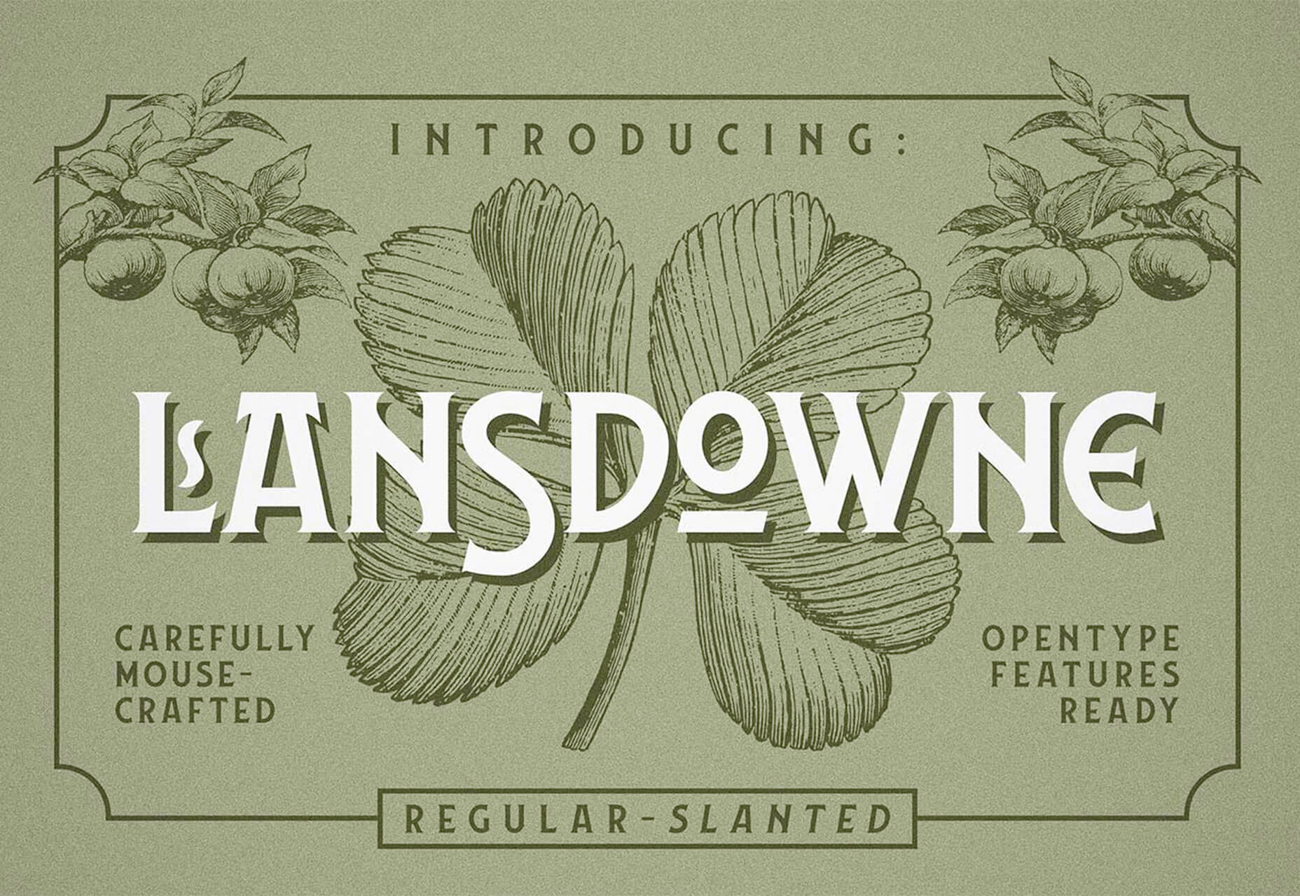
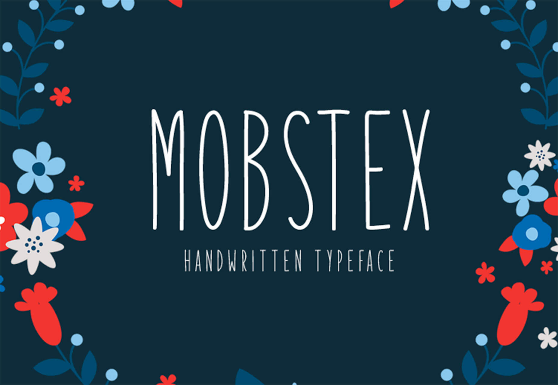
Some of the new tools in this month’s roundup are designed for productivity and getting ahead, from a tool that converts text to speech to a font that’s made for the winter holidays. That’s the whole point of new tools – to make our design lives that much easier. Here’s what’s new for designers this month.

Paaatterns

Paaatterns is a collection of vector patterns for backgrounds, fills, and anywhere you want an interesting design element. The patterns here are strong with bright colors and geo shapes. The collection is free to download and comes in multiple formats, including Sketch, Figma, XD, Illustrator as well as SVG and PNG.

Verby

Verby is a free text to speech tool that lets you create and download natural voices as MP3 files. The free version is even available for commercial use. This can be a valuable tool for websites or apps, online learning tools, video broadcasting, audiobook production, or communication accessibility. (There’s also a premium version with even more voice options.)

Dashblock

Dashblock uses a machine-learning model that can turn any website into an API. Go to a page, right-click on the data you want and save a custom API that you can query.

Rooki.design

Rooki.design is a magazine for design students and junior designers. It’s packed with features and resources to help rookies get acclimated into the design industry. Rooki.design is developed and managed by a student designer, Edoardo Rainoldi.

Gradient Magic

Gradient Magic is a huge gallery of CSS gradients in so many colors and styles that you might get lost browsing through all the combinations. Pick a style – standard, angular, stripes, checkered, burst – and color palette to get started. Then you can view and copy CSS for any selection you like.

Dynamic Charts

Dynamic Charts is a GitHub project that allows you to create animated charts and visualize data using React. Charts can use custom callbacks, labels, and allow you to run by command. There’s default styling that makes it easy to use, but you can go crazy with the design to make it your own.

Components AI

Components AI describes itself as an “experimental platform for exploring generative design systems.” It’s a neat concept that allows you to cycle through ideas and tweak designs until they are just right and then save and export for use.

Avant UI

Avant UI is a Bootstrap-based user interface kit that’s packed with sleek elements and animations. Everything is customizable, although the core design might be all you need. The UI kit includes almost every type of component you can imagine, including colors and gradients, buttons, inputs, dropdowns, alerts, tables, thumbnails, carosels, and more.

Tutorial: Phone Number Field Design Best Practices

It might be one of the most common fields in online forms, but do you ever stop to think about how phone number inputs work? Nick Babich has an excellent tutorial on how to best design these inputs for usability and efficiency. The tips include not splitting fields, using a country selector, and auto-formatting.

Money Vector Icons

Show me the money (icons)! This vector pack includes 50 icons that show currency, banks, and credit in three designed styles.

Stories Illustrations

Stories is an illustration kit with 11 vectors and characters that can tell a business story. The premium kit comes in AI and SVG format for easy use and manipulation.

Isometric

Isometric is a collection of free icon-style scenes that you can use in digital projects. Each illustration is an a true isometric style and SVG format featuring dozens of different designs.

jExcel v3

jExcel v3 is a tool to help you build spreadsheets online with columns, rows, and multiple data formats. From the developer: “jExcel is a lightweight vanilla javascript plugin to create amazing web-based interactive tables and spreadsheets compatible with Excel or any other spreadsheet software. You can create an online spreadsheet table from a JS array, JSON, CSV or XSLX files. You can copy from excel and paste straight to your jExcel spreadsheet and vice versa.”

Space Browser

Space Browser lets you organize all those unruly website tabs into smart folders that make it easy to go back to often used websites and track browsing history. You can also share and sync for collaboration with the tool.

Drama

Drama is a Mac app that’s still in beta and designed to help you draw user interfaces, create prototype, and make animations all in one location.

Font Awesome Duotone

Font Awesome now has a duotone option for Pro users. The style includes two-color options for over 1,600 icons.

Cocomat Pro

Cocomat Pro is a delightful grotesque style typeface with nice ligatures and interesting lines. The premium typeface includes a full family of styles and works for a variety of uses for almost all type elements.

Grinched 2.0

It’s never too early to start holiday planning. Save this font for those projects. Grinched 2.0 is a fun character-style typeface with a full character and number set.

Lansdowne Decorative Font

Lansdowne Decorative Font is just what you’d expect from the name. It includes all caps upper- and lowercase letters with tons of glyphs for personality in your typesetting. It has a vintage style that’s a fun option for light text and display use.

Mobstex

Mobstex is an uppercase handwriting style typeface with a light feel. The thin lines are somewhat elegant and provide visual interest.

Oliver

Oliver is a sans serif typeface featuring an uppercase character set in three weights. It could make a nice display option in light, regular, or bold.

Source

p img {display:inline-block; margin-right:10px;}
.alignleft {float:left;}
p.showcase {clear:both;}
body#browserfriendly p, body#podcast p, div#emailbody p{margin:0;}

What Can You Do With A Graphic Design Degree? 8 Career Paths To Consider

Original Source: http://feedproxy.google.com/~r/Designrfix/~3/MI0hbH3dBhU/graphic-design-degree

Technology surrounds us. We carry some of the most advanced and compact electronic devices with us in our pockets! We watch movies and television shows while we commute or wait in line. Indeed, we live in an age where media and technology exist in nearly perfect synchronicity, with people at its harmonious center.But the phones, […]

The post What Can You Do With A Graphic Design Degree? 8 Career Paths To Consider appeared first on designrfix.com.

Handling Unused CSS In SASS To Improve Performance

Original Source: https://www.smashingmagazine.com/2019/08/handling-unused-css-sass-performance/

Handling Unused CSS In SASS To Improve Performance

Handling Unused CSS In SASS To Improve Performance

Luke Harrison

2019-08-09T12:30:59+02:00
2019-08-09T17:37:05+00:00

In modern front-end development, developers should aim to write CSS which is scalable and maintainable. Otherwise, they risk losing control over specifics such as the cascade and selector specificity as the codebase grows and more developers contribute.

One way this can be achieved is through the use of methodologies such as Object-Oriented CSS (OOCSS), which rather than organizing CSS around page context, encourages separating structure (grid systems, spacing, widths, etc.) from decoration (fonts, brand, colors, etc.).

So CSS class names such as:

.blog-right-column
.latest_topics_list
.job-vacancy-ad

Are replaced with more reusable alternatives, which apply the same CSS styles, but aren’t tied to any particular context:

.col-md-4
.list-group
.card

This approach is commonly implemented with the help of a SASS framework such as Bootstrap, Foundation, or increasingly more often, a bespoke framework which can be shaped to better fit the project.

So now we’re using CSS classes cherry-picked from a framework of patterns, UI components and utility classes. The below example illustrates a common grid system built using Bootstrap, which stacks vertically, then once the md breakpoint is reached, switches to a 3 column layout.

<div class=”container”>
<div class=”row”>
<div class=”col-12 col-md-4″>Column 1</div>
<div class=”col-12 col-md-4″>Column 2</div>
<div class=”col-12 col-md-4″>Column 3</div>
</div>
</div>

Programmatically generated classes such as .col-12 and .col-md-4 are used here to create this pattern. But what about .col-1 through .col-11, .col-lg-4, .col-md-6 or .col-sm-12? These are all examples of classes which will be included in the compiled CSS stylesheet, downloaded and parsed by the browser, despite not being in use.

In this article, we’ll start by exploring the impact unused CSS can have on page load speeds. We’ll then touch upon some existing solution for removing it from stylesheets, following up with my own SASS oriented solution.

Measuring The Impact Of Unused CSS Classes

Whilst I adore Sheffield United, the mighty blades, their website’s CSS is bundled into a single 568kb minified file, which comes to 105kb even when gzipped. That seems like a lot.

This is Sheffield United’s website, my local Football team (that’s Soccer for you lot over in the colonies ??). (Large preview)

Shall we see how much of this CSS is actually used by on their homepage? A quick Google search reveals plenty of online tools up to the job, but I prefer to use the coverage tool in Chrome, which can be run straight from Chrome’s DevTools. Let’s give it a whirl.

The quickest way to access the coverage tool in Developer Tools is to use the keyboard shortcut Control+Shift+P or Command+Shift+P (Mac) to open the command menu. In it, type coverage, and select the ‘Show Coverage’ option. (Large preview)

The results show that only 30kb of CSS from the 568kb stylesheet is used by the homepage, with the remaining 538kb relating to the styles required for the rest of the website. This means a whopping 94.8% of the CSS is unused.

You can see timings like these for any asset in Chrome in Developer Tools via Network -> Click on your asset -> Timing tab. (Large preview)

CSS is part of a webpage’s critical rendering path, which involves all the different steps a browser must complete before it can begin page render. This makes CSS a render-blocking asset.

So with this in mind, when loading Sheffield United’s website using a good 3G connection, it takes a whole 1.15s before the CSS is downloaded and page rendering can begin. This is a problem.

Google has recognized this as well. When running a Lighthouse audit, online or via your browser, any potential load time and filesize savings which could be made by removing unused CSS are highlighted.

In Chrome (and Chromium Edge), you can right Google Lighthouse audits by clicking on the Audit tab in developer tools. (Large preview)

Existing Solutions

The goal is to determine which CSS classes aren’t required and remove them from the stylesheet. Existing solutions are available which attempt to automate this process. They can typically be used via a Node.js build script, or via task runners such as Gulp. These include:

UNCSS
PurifyCSS
PurgeCSS

These generally work in a similar way:

On bulld, the website is accessed via a headless browser (Eg: puppeteer) or DOM emulation (Eg: jsdom).
Based on the page’s HTML elements, any unused CSS is identified.
This is removed from the stylesheet, leaving only what is needed.

Whilst these automated tools are perfectly valid and I’ve used many of them across a number of commercial projects successfully, I’ve encountered a few drawbacks along the way which are worth sharing:

If class names contain special characters such as ‘@’ or ‘/’, these may not be recognized without writing some custom code. I use BEM-IT by Harry Roberts, which involves structuring class names with responsive suffixes like: u-width-6/12@lg, so I’ve hit this issue before.
If the website uses automated deployment, it can slow down the build process, especially if you have lots of pages and lots of CSS.
Knowledge about these tools needs to be shared across the team, otherwise there may be confusion and frustration when CSS is mysteriously absent in production stylesheets.
If your website has many 3rd party scripts running, sometimes when opened in a headless browser, these don’t play nicely and can cause errors with the filtering process. So typically you have to write custom code to exclude any 3rd party scripts when a headless browser is detected, which depending on your setup, may be tricky.
Generally, these kind of tools are complicated and introduce a lot of extra dependencies to the build process. As is the case with all 3rd party dependencies, this means relying on somebody else’s code.

With these points in mind, I posed myself a question:

Using just SASS, is it possible to better handle the SASS we compile so any unused CSS can be excluded, without resorting to just crudely deleting the source classes in the SASS outright?

Spoiler alert: The answer is yes. Here’s what I’ve come up with.

SASS Oriented Solution

The solution needs to provide a quick and easy way to cherry-pick what SASS ought to be compiled, whilst being simple enough that it doesn’t add any more complexity to the development process or prevent developers from taking advantage of things like programmatically generated CSS classes.

To get started, there’s a repo with build scripts and a few sample styles which you can clone from here.

Tip: If you get stuck, you can always cross-reference with the completed version on master branch.

cd into the repo, run npm install and then npm run build to compile any SASS into CSS as required. This should create a 55kb css file in the dist directory.

If you then open /dist/index.html in your web browser, you should see a fairly standard component, which on click expands to reveal some content. You can also view this here, where real network conditions will be applied, so you can run your own tests.

We’ll use this expander UI component as our test subject when developing the SASS-oriented solution for handling unused CSS. (Large preview)

Filtering At The Partials Level

In a typical SCSS setup, you’re likely going to have a single manifest file (eg: main.scss in the repo), or one per page (eg: index.scss, products.scss, contact.scss) where framework partials are imported. Following OOCSS principles, those imports may look something like this:

Example 1

/*
Undecorated design patterns
*/

@import ‘objects/box’;
@import ‘objects/container’;
@import ‘objects/layout’;

/*
UI components
*/

@import ‘components/button’;
@import ‘components/expander’;
@import ‘components/typography’;

/*
Highly specific helper classes
*/

@import ‘utilities/alignments’;
@import ‘utilities/widths’;

If any of these partials aren’t in use, then the natural way of filtering this unused CSS would be to just disable the import, which would prevent it from being compiled.

For example, if only using the expander component, the manifest would typically look like the below:

Example 2

/*
Undecorated design patterns
*/
// @import ‘objects/box’;
// @import ‘objects/container’;
// @import ‘objects/layout’;

/*
UI components
*/
// @import ‘components/button’;
@import ‘components/expander’;
// @import ‘components/typography’;

/*
Highly specific helper classes
*/
// @import ‘utilities/alignments’;
// @import ‘utilities/widths’;

However, as per OOCSS, we’re separating decoration from structure to allow for maximum reusability, so it’s possible the expander could require CSS from other objects, component or utility classes to render correctly. Unless the developer is aware of these relationships by inspecting the HTML, they may not know to import these partials, so not all of the required classes would be compiled.

In the repo, if you look at the expander’s HTML in dist/index.html, this appears to be the case. It uses styles from the box and layout objects, the typography component, and width and alignment utilities.

dist/index.html

<div class=”c-expander”>
<div class=”o-box o-box–spacing-small c-expander__trigger c-expander__header” tabindex=”0″>
<div class=”o-layout o-layout–fit u-flex-middle”>
<div class=”o-layout__item u-width-grow”>
<h2 class=”c-type-echo”>Toggle Expander</h2>
</div>
<div class=”o-layout__item u-width-shrink”>
<div class=”c-expander__header-icon”></div>
</div>
</div>
</div>
<div class=”c-expander__content”>
<div class=”o-box o-box–spacing-small”>
Lorum ipsum
<p class=”u-align-center”>
<button class=”c-expander__trigger c-button”>Close</button>
</p>
</div>
</div>
</div>

Let’s tackle this problem waiting to happen by making these relationships official within the SASS itself, so once a component is imported, any dependencies will also be imported automatically. This way, the developer no longer has the extra overhead of having to audit the HTML to learn what else they need to import.

Programmatic Imports Map

For this dependency system to work, rather than simply commenting in @import statements in the manifest file, SASS logic will need to dictate if partials will be compiled or not.

In src/scss/settings, create a new partial called _imports.scss, @import it in settings/_core.scss, and then create the following SCSS map:

src/scss/settings/_core.scss

@import ‘breakpoints’;
@import ‘spacing’;
@import ‘imports’;

src/scss/settings/_imports.scss

$imports: (
object: (
‘box’,
‘container’,
‘layout’
),
component: (
‘button’,
‘expander’,
‘typography’
),
utility: (
‘alignments’,
‘widths’
)
);

This map will have the same role as the import manifest back in example 1.

Example 4

$imports: (
object: (
//’box’,
//’container’,
//’layout’
),
component: (
//’button’,
‘expander’,
//’typography’
),
utility: (
//’alignments’,
//’widths’
)
);

It should behave like a standard set of @imports would, in that if certain partials are commented out (like the above), then that code shouldn’t be compiled on build.

But as we’re wanting to import dependencies automatically, we should also be able to ignore this map under the right circumstances.

Render Mixin

Let’s start to add some SASS logic. Create _render.scss in src/scss/tools, and then add its @import to tools/_core.scss.

In the file, create an empty mixin called render().

src/scss/tools/_render.scss

@mixin render() {

}

In the mixin, we need to write SASS which does the following:

render()
“Hey there $imports, fine weather isn’t it? Say, do you have the container object in your map?”
$imports
false
render()
“That’s a shame, looks like its won’t be compiled then. How about the button component?”
$imports
true
render()
“Nice! That’s the button being compiled then. Say hi to the wife for me.”

In SASS, this translates to the following:

src/scss/tools/_render.scss

@mixin render($name, $layer) {
@if(index(map-get($imports, $layer), $name)) {
@content;
}
}

Basically, check if the partial is included in the $imports variable, and if so, render it using SASS’s @content directive, which allows us to pass a content block into the mixin.

We would use it like so:

Example 5

@include render(‘button’, ‘component’) {
.c-button {
// styles et al
}

// any other class declarations
}

Before using this mixin, there’s a small improvement which we can make to it. The layer name (object, component, utility, etc.) is something we can safely predict, so we have an opportunity to streamline things a little.

Before the render mixin declaration, create a variable called $layer, and remove the identically named variable from the mixins parameters. Like so:

src/scss/tools/_render.scss

$layer: null !default;
@mixin render($name) {
@if(index(map-get($imports, $layer), $name)) {
@content;
}
}

Now, in the _core.scss partials where objects, components and utility @imports are located, redeclare these variables to the following values; representing the type of CSS classes being imported.

src/scss/objects/_core.scss

$layer: ‘object’;

@import ‘box’;
@import ‘container’;
@import ‘layout’;

src/scss/components/_core.scss

$layer: ‘component’;

@import ‘button’;
@import ‘expander’;
@import ‘typography’;

src/scss/utilities/_core.scss

$layer: ‘utility’;

@import ‘alignments’;
@import ‘widths’;

This way, when we use the render() mixin, all we have to do is declare the partial name.

Wrap the render() mixin around each object, component and utility class declaration, as per the below. This will give you one render mixin usage per partial.

For example:

src/scss/objects/_layout.scss

@include render(‘button’) {
.c-button {
// styles et al
}

// any other class declarations
}

src/scss/components/_button.scss

@include render(‘button’) {
.c-button {
// styles et al
}

// any other class declarations
}

Note: For utilities/_widths.scss, wrapping the render() function around the entire partial will error on compile, as in SASS you can’t nest mixin declarations within mixin calls. Instead, just wrap the render() mixin around the create-widths() calls, like below:

@include render(‘widths’) {

// GENERATE STANDARD WIDTHS
//———————————————————————

// Example: .u-width-1/3
@include create-widths($utility-widths-sets);

// GENERATE RESPONSIVE WIDTHS
//———————————————————————

// Create responsive variants using settings.breakpoints
// Changes width when breakpoint is hit
// Example: .u-width-1/3@md

@each $bp-name, $bp-value in $mq-breakpoints {
@include mq(#{$bp-name}) {
@include create-widths($utility-widths-sets, @, #{$bp-name});
}
}

// End render
}

With this in place, on build, only the partials referenced in $imports will be compiled.

Mix and match what components are commented out in $imports and run npm run build in the terminal to give it a try.

Dependencies Map

Now we’re programmatically importing partials, we can start to implement the dependency logic.

In src/scss/settings, create a new partial called _dependencies.scss, @import it in settings/_core.scss, but make sure it’s after _imports.scss. Then in it, create the following SCSS map:

src/scss/settings/_dependencies.scss

$dependencies: (
expander: (
object: (
‘box’,
‘layout’
),
component: (
‘button’,
‘typography’
),
utility: (
‘alignments’,
‘widths’
)
)
);

Here, we declare dependencies for the expander component as it requires styles from other partials to render correctly, as seen in dist/index.html.

Using this list, we can write logic which would mean these dependencies would always be compiled along with their dependent components, no matter the state of the $imports variable.

Below $dependencies, create a mixin called dependency-setup(). In here, we’ll do the following actions:

1. Loop through the dependencies map.

@mixin dependency-setup() {
@each $componentKey, $componentValue in $dependencies {

}
}

2. If the component can be found in $imports, loop through its list of dependencies.

@mixin dependency-setup() {
$components: map-get($imports, component);
@each $componentKey, $componentValue in $dependencies {
@if(index($components, $componentKey)) {
@each $layerKey, $layerValue in $componentValue {

}
}
}
}

3. If the dependency isn’t in $imports, add it.

@mixin dependency-setup() {
$components: map-get($imports, component);
@each $componentKey, $componentValue in $dependencies {
@if(index($components, $componentKey)) {
@each $layerKey, $layerValue in $componentValue {
@each $partKey, $partValue in $layerValue {
@if not index(map-get($imports, $layerKey), $partKey) {
$imports: map-merge($imports, (
$layerKey: append(map-get($imports, $layerKey), ‘#{$partKey}’)
)) !global;
}
}
}
}
}
}

Including the !global flag tells SASS to look for the $imports variable in the global scope, rather than the mixin’s local scope.

4. Then it’s just a matter of calling the mixin.

@mixin dependency-setup() {

}
@include dependency-setup();

So what we have now is an enhanced partial import system, where if a component is imported, a developer doesn’t then have to manually import each of its various dependency partials as well.

Configure the $imports variable so only the expander component is imported and then run npm run build. You should see in the compiled CSS the expander classes along with all of its dependencies.

However, this doesn’t really bring anything new to the table in terms of filtering out unused CSS, as the same amount of SASS is still being imported, programmatic or not. Let’s improve on this.

Improved Dependency Importing

A component may require only a single class from a dependency, so to then go on and import all of that dependency’s classes just leads to the same unnecessary bloat we’re trying to avoid.

We can refine the system to allow for more granular filtering on a class by class basis, to make sure components are compiled with only the dependency classes they require.

With most design patterns, decorated or not, there exists a minimum amount of classes which need to be present in the stylesheet for the pattern to display correctly.

For class names using an established naming convention such as BEM, typically the “Block” and “Element” named classes are required as a minimum, with “Modifiers” typically being optional.

Note: Utility classes wouldn’t typically follow the BEM route, as they’re isolated in nature due to their narrow focus.

For example, take a look at this media object, which is probably the most well-known example of object-oriented CSS:

<div class=”o-media o-media–spacing-small”>
<div class=”o-media__image”>
<img src=”url” alt=”Image”>
</div>
<div class=”o-media__text”>
Oh!
</div>
</div>

If a component has this set as a dependency, it makes sense to always compile .o-media, .o-media__image and .o-media__text, as that’s the minimum amount of CSS required to make the pattern work. However with .o-media–spacing-small being an optional modifier, it ought to only be compiled if we explicitly say so, as its usage may not be consistent across all media object instances.

We’ll modify the structure of the $dependencies map to allow us to import these optional classes, whilst including a way to import only the block and element in case no modifiers are required.

To get started, check the expander HTML in dist/index.html and make a note of any dependency classes in use. Record these in the $dependencies map, as per below:

src/scss/settings/_dependencies.scss

$dependencies: (
expander: (
object: (
box: (
‘o-box–spacing-small’
),
layout: (
‘o-layout–fit’
)
),
component: (
button: true,
typography: (
‘c-type-echo’,
)
),
utility: (
alignments: (
‘u-flex-middle’,
‘u-align-center’
),
widths: (
‘u-width-grow’,
‘u-width-shrink’
)
)
)
);

Where a value is set to true, we’ll translate this into “Only compile block and element level classes, no modifiers!”.

The next step involves creating a whitelist variable to store these classes, and any other (non-dependency) classes we wish to manually import. In /src/scss/settings/imports.scss, after $imports, create a new SASS list called $global-filter.

src/scss/settings/_imports.scss

$global-filter: ();

The basic premise behind $global-filter is that any classes stored here will be compiled on build as long as the partial they belong to is imported via $imports.

These class names could be added programmatically if they’re a component dependency, or could be added manually when the variable is declared, like in the example below:

Global filter example

$global-filter: (
‘o-box–spacing-regular@md’,
‘u-align-center’,
‘u-width-6/12@lg’
);

Next, we need to add a bit more logic to the @dependency-setup mixin, so any classes referenced in $dependencies are automatically added to our $global-filter whitelist.

Below this block:

src/scss/settings/_dependencies.scss

@if not index(map-get($imports, $layerKey), $partKey) {

}

…add the following snippet.

src/scss/settings/_dependencies.scss

@each $class in $partValue {
$global-filter: append($global-filter, ‘#{$class}’, ‘comma’) !global;
}

This loops through any dependency classes and adds them to the $global-filter whitelist.

At this point, if you add a @debug statement below the dependency-setup() mixin to print out the contents of $global-filter in the terminal:

@debug $global-filter;

…you should see something like this on build:

DEBUG: “o-box–spacing-small”, “o-layout–fit”, “c-box–rounded”, “true”, “true”, “u-flex-middle”, “u-align-center”, “u-width-grow”, “u-width-shrink”

Now we’ve got a class whitelist, we need to enforce this across all of the different object, component and utility partials.

Create a new partial called _filter.scss in src/scss/tools and add an @import to tools layer’s _core.scss file.

In this new partial, we’ll create a mixin called filter(). We’ll use this to apply logic which means classes will only be compiled if included in the $global-filter variable.

Starting off simple, create a mixin which accepts a single parameter — the $class which the filter controls. Next, if the $class is included in the $global-filter whitelist, allow it to be compiled.

src/scss/tools/_filter.scss

@mixin filter($class) {
@if(index($global-filter, $class)) {
@content;
}
}

In a partial, we would wrap the mixin around an optional class, like so:

@include filter(‘o-myobject–modifier’) {
.o-myobject–modifier {
color: yellow;
}
}

This means the .o-myobject–modifier class would only be compiled if its included in $global-filter, which can either be set directly, or indirectly through what’s set in $dependencies.

Go through the repo and apply the filter() mixin to all optional modifier classes across object and component layers. When handling the typography component or the utilities layer, as each class is independent from the next, it’d make sense to make them all optional, so we can then just enable classes as we need them.

Here’s a few examples:

src/scss/objects/_layout.scss

@include filter(‘o-layout__item–fit-height’) {
.o-layout__item–fit-height {
align-self: stretch;
}
}

src/scss/utilities/_alignments.scss

// Changes alignment when breakpoint is hit
// Example: .u-align-left@md
@each $bp-name, $bp-value in $mq-breakpoints {
@include mq(#{$bp-name}) {
@include filter(‘u-align-left@#{$bp-name}’) {
.u-align-left@#{$bp-name} {
text-align: left !important;
}
}

@include filter(‘u-align-center@#{$bp-name}’) {
.u-align-center@#{$bp-name} {
text-align: center !important;
}
}

@include filter(‘u-align-right@#{$bp-name}’) {
.u-align-right@#{$bp-name} {
text-align: right !important;
}
}
}
}

Note: When adding the responsive suffix classnames to the filter() mixin, you don’t have to escape the ‘@’ symbol with a ”.

During this process, whilst applying the filter() mixin to partials, you may (or may not) have noticed a few things.

Grouped Classes

Some classes in the codebase are grouped together and share the same styles, for example:

src/scss/objects/_box.scss

.o-box–spacing-disable-left,
.o-box–spacing-horizontal {
padding-left: 0;
}

As the filter only accepts a single class, it doesn’t account for the possibility that one style declaration block may be for more than one class.

To account for this, we’ll expand the filter() mixin so in addition to a single class, it’s able to accept a SASS arglist containing many classes. Like so:

src/scss/objects/_box.scss

@include filter(‘o-box–spacing-disable-left’, ‘o-box–spacing-horizontal’) {
.o-box–spacing-disable-left,
.o-box–spacing-horizontal {
padding-left: 0;
}
}

So we need to tell the filter() mixin that if either of these classes are in the $global-filter, you are allowed to compile the classes.

This will involve additional logic to type check the mixin’s $class argument, responding with a loop if an arglist is passed to check if each item is in the $global-filter variable.

src/scss/tools/_filter.scss

@mixin filter($class…) {
@if(type-of($class) == ‘arglist’) {
@each $item in $class {
@if(index($global-filter, $item)) {
@content;
}
}
}
@else if(index($global-filter, $class)) {
@content;
}
}

Then it’s just a matter of going back to the following partials to correctly apply the filter() mixin:

objects/_box.scss
objects/_layout.scss
utilities/_alignments.scss

At this point, go back to $imports and enable just the expander component. In the compiled stylesheet, besides the styles from the generic and elements layers, you should only see the following:

The block and element classes belonging to the expander component, but not its modifier.
The block and element classes belonging to the expander’s dependencies.
Any modifier classes belonging to the expander’s dependencies which are explicitly declared in the $dependencies variable.

Theoretically, if you decided you wanted to include more classes in the compiled stylesheet, such as the expander components modifier, it’s just a matter of adding it to the $global-filter variable at the point of declaration, or appending it at some other point in the codebase (As long as it’s before the point where the modifier itself is declared).

Enabling Everything

So we now have a pretty complete system, which lets you import objects, components and utilities down to the individual classes within these partials.

During development, for whatever reason, you may just want to enable everything in one go. To allow for this, we’ll create a new variable called $enable-all-classes, and then add in some additional logic so if this is set to true, everything is compiled no matter the state of the $imports and $global-filter variables.

First, declare the variable in our main manifest file:

src/scss/main.scss

$enable-all-classes: false;

@import ‘settings/core’;
@import ‘tools/core’;
@import ‘generic/core’;
@import ‘elements/core’;
@import ‘objects/core’;
@import ‘components/core’;
@import ‘utilities/core’;

Then we just need to make a few minor edits to our filter() and render() mixins to add some override logic for when the $enable-all-classes variable is set to true.

First up, the filter() mixin. Before any existing checks, we’ll add an @if statement to see if $enable-all-classes is set to true, and if so, render the @content, no questions asked.

src/scss/tools/_filter.scss

@mixin filter($class…) {
@if($enable-all-classes) {
@content;
}
@else if(type-of($class) == ‘arglist’) {
@each $item in $class {
@if(index($global-filter, $item)) {
@content;
}
}
}
@else if(index($global-filter, $class)) {
@content;
}
}

Next in the render() mixin, we just need to do a check to see if the $enable-all-classes variable is truthy, and if so, skip any further checks.

src/scss/tools/_render.scss

$layer: null !default;
@mixin render($name) {
@if($enable-all-classes or index(map-get($imports, $layer), $name)) {
@content;
}
}

So now, if you were to set the $enable-all-classes variable to true and rebuild, every optional class would be compiled, saving you quite a bit of time in the process.

Comparisons

To see what type of gains this technique is giving us, let’s run some comparisons and see what the filesize differences are.

To make sure the comparison is a fair one, we ought to add the box and container objects in $imports, and then add the box’s o-box–spacing-regular modifier to the $global-filter, like so:

src/scss/settings/_imports.scss

$imports: (
object: (
‘box’,
‘container’
// ‘layout’
),
component: (
// ‘button’,
‘expander’
// ‘typography’
),
utility: (
// ‘alignments’,
// ‘widths’
)
);

$global-filter: (
‘o-box–spacing-regular’
);

This makes sure styles for the expander’s parent elements are being compiled like they would be if there were no filtering taking place.

Original vs Filtered Stylesheets

Let’s compare the original stylesheet with all classes compiled, against the filtered stylesheet where only CSS required by the expander component has been compiled.

Standard

Stylesheet
Size (kb)
Size (gzip)

Original
54.6kb
6.98kb

Filtered
15.34kb (72% smaller)
4.91kb (29% smaller)

Original: https://webdevluke.github.io/handlingunusedcss/dist/index2.html
Filtered: https://webdevluke.github.io/handlingunusedcss/dist/index.html

You may think that the gzip percentage savings mean this isn’t worth the effort, as there’s not much difference between the original and filtered stylesheets.

It’s worth highlighting that gzip compression works better with larger and more repetitive files. Because the filtered stylesheet is the only proof-of-concept, and only contains CSS for the expander component, there isn’t as much to compress as there would be in a real-life project.

If we were to scale up each stylesheet by a factor of 10 to sizes more typical of a website’s CSS bundle size, the difference in gzip file sizes are much more impressive.

10x Size

Stylesheet
Size (kb)
Size (gzip)

Original (10x)
892.07kb
75.70kb

Filtered (10x)
209.45kb (77% smaller)
19.47kb (74% smaller)

Filtered Stylesheet vs UNCSS

Here’s a comparison between the filtered stylesheet and a stylesheet which has been run through the UNCSS tool.

Filtered vs UNCSS

Stylesheet
Size (kb)
Size (gzip)

Filtered
15.34kb
4.91kb

UNCSS
12.89kb (16% smaller)
4.25kb (13% smaller)

The UNCSS tool wins here marginally, as it’s filtering out CSS in the generic and elements directories.

It’s possible that on a real website, with a larger variety of HTML elements in use, the difference between the 2 methods would be negligible.

Wrapping Up

So we’ve seen how — using just SASS — you are able to gain more control over what CSS classes are being compiled on build. This reduces the amount of unused CSS in the final stylesheet and speeds up the critical rendering path.

At the start of the article, I listed some drawbacks of existing solutions such as UNCSS. It’s only fair to critique this SASS-oriented solution in the same way, so all the facts are on the table before you decide which approach is better for you:

Pros

No additional dependencies required, so you don’t have to rely on somebody else’s code.
Less build time required than Node.js based alternatives, as you don’t have to run headless browsers to audit your code. This is especially useful with continuous integration as you may be less likely to see a queue of builds.
Results in similar file size when compared to automated tools.
Out of the box, you have complete control over what code is being filtered, regardless of how those CSS classes are used in your code. With Node.js based alternatives, you often have to maintain a separate whitelist so CSS classes belonging to dynamically injected HTML aren’t filtered out.

Cons

The SASS-oriented solution is definitely more hands-on, in the sense that you have to keep on top of the $imports and $global-filter variables. Beyond the initial setup, the Node.js alternatives we’ve looked at are largely automated.
If you add CSS classes to $global-filter and then later remove them from your HTML, you need to remember to update the variable, otherwise you’ll be compiling CSS you don’t need. With large projects being worked on by multiple devs at any one time, this may not be easy to manage unless you properly plan for it.
I wouldn’t recommend bolting this system onto any existing CSS codebase, as you’d have to spend quite a bit of time piecing together dependencies and applying the render() mixin to a LOT of classes. It’s a system much easier to implement with new builds, where you don’t have existing code to contend with.

Hopefully you’ve found this as interesting to read as I’ve found it interesting to put together. If you have any suggestions, ideas to improve this approach, or want to point out some fatal flaw that I’ve missed entirely, be sure to post in the comments below.

Smashing Editorial
(dm, yk, il)

Top 20 Wedding Photographers and Their Masterpieces

Original Source: https://www.hongkiat.com/blog/top-wedding-photographer/

Like new born’s pictures or father-daughter photos, wedding photography captures one of the most emotional and memorable moments in one’s life. And that’s what makes them timeless…

Visit hongkiat.com for full content.

Free Website Templates for Online Stores

Original Source: http://feedproxy.google.com/~r/1stwebdesigner/~3/PRRA83WoGqk/

Online CMSes like WordPress, Shopify, and Joomla have popularized the use of templates and themes. With them, you can choose a look for your website and configure it without any knowledge of coding.

But did you know that you can also find HTML and Bootstrap templates that can be used on any website? What’s more, many of these templates are free. If you’re looking to start an online store and need a base to work off of, try one of these free eCommerce templates.

UNLIMITED DOWNLOADS: Email, admin, landing page & website templates

DOWNLOAD NOW

Fashion Hub

Example of Fashion Hub

Looking to make an elegant fashion boutique? Fashion Hub has everything you’ll need in this Bootstrap template. The homepage comes with a slider, service list, Instagram hub, and plenty of links pointing to your store. There’s also plenty of product pages, a blog, and even checkout/order screens.

eShopper

Example of eShopper


Made for all types of eCommerce websites, eShopper is a simple and clean design that comes with 11 pages. These include product listings, checkout pages, and a blog. This one’s a great all-purpose template with plenty of functionality and pages.

Sell Anything

Example of Sell Anything

With all the pages you’ll need to start building an online store, Sell Anything allows you to do just that. There’s a clean homepage with various product sliders, plenty of other pages you’ll need, and a topology page that shows you the various elements this template uses and explains how to use them to build your own pages.

Shop

Example of Shop

If you love elegant animations, you should try this HTML5 template. There’s plenty of scrolling animations, beautiful hover effects, and more in this stylish design. You get a few pages from this one, including a product, about, and services page. This one is perfect for a small shop that sells a few products.

Boighor

Example of Boighor

Light design and beautiful animations define this eCommerce design made just for online bookstores. But with such a nice design, you might want to repurpose this for any type of shop. The free version comes with twelve pages, while the pro version gives you a few extra pages and some variations on the available ones.

Toys Shop

Example of Toys Shop

With a bright and colorful design, this template is perfect for anyone selling toys or products for children. You get a product view and store page among many others, and the footer includes a Google Map and subscription form.

Darklook

Example of Darklook

Looking for something a little darker than all these bright, light designs? Darklook is great for technology and fashion shops. You’ll find cart, checkout, product detail, and blog post pages. The wide, large design puts a big emphasis on photography, so make sure you have high-res photos of your products to show off.

Shopper

Example of Shopper

This small template is great for medium to large shops of any kind. The simple three-color look is universally appealing, and it comes with a homepage, product list, product detail, contact, register, and cart page. This is enough to let you get your shop set up quickly.

Prezzie

Example of Prezzie

Last but not least is Prezzie, an extremely stylish and well-made template. With a built-in video slider header, gorgeous parallax effects, and a design that looks like it was custom made for you, you’ll quickly fall in love with this template.

Get Your Shop Running Quicker

HTML templates are so helpful because they save time, and they’re fairly easy to edit – even when you have limited knowledge of code. Often, it’s just a matter of replacing images and placeholder text, and you have a functioning website.

Of course, you’ll still need to add a payment gateway to your website, include product pages, and otherwise make your online store functional. But with one of these templates, you can skip the lengthy step of having to design and code a unique website, and start selling sooner.


Amazing Animated CSS Hover Effects

Original Source: http://feedproxy.google.com/~r/1stwebdesigner/~3/VQ7NnEiz5RY/

Have you ever visited a website and been stunned by a beautiful hover effect? Or have subtle UI animations left you feeling impressed with a site’s design? It may seem like a small detail, but hover animations can have a larger impact than you’d expect.

Good UI design means making interactive elements clear and visible, and hover effects can help you do just that. They look beautiful, and provide instant feedback when you hover over something that makes your UI easy to navigate.

These effects work particularly well in menu areas, but you can also use them on images, buttons, or other areas of your site too. These animations can leave a strong impression on people.

Today we’ve collected 17 awesome CSS hover effects, ranging from elegant menu and image hovers to more striking, unique animations. These are free for use under an MIT license, so try them on your site or use them as inspiration to create your own!

UNLIMITED DOWNLOADS: Email, admin, landing page & website templates

DOWNLOAD NOW

Rumble on Hover

See the Pen
Rumble on Hover by Kyle Foster (@hkfoster)
on CodePen.

Hover.css

See the Pen
Hover.css by vavik (@vavik96)
on CodePen.

Button on Hover Slide Effect

See the Pen
CSS Button On Hover Slide Effect by RazorX (@RazorXio)
on CodePen.

Shaking Shapes

See the Pen
Shaking Shapes by Laura Montgomery (@LauraMontgomery)
on CodePen.

Strikethrough Hover

See the Pen
Strikethrough hover by tsimenis (@tsimenis)
on CodePen.

Hover CSS3

See the Pen
Hover CSS3 by Berlin Eric (@eberlin)
on CodePen.

Image with Slide Up Title

See the Pen
#1107 – Image with slide up title on hover by LittleSnippets.net (@littlesnippets)
on CodePen.

Image and Title with Icons

See the Pen
#1193 – Image & title with icons on hover by LittleSnippets.net (@littlesnippets)
on CodePen.

Gradient Button Hover

See the Pen
Gradient Button Hover by Muhammed Erdem (@JavaScriptJunkie)
on CodePen.

Grow Hover Effect

See the Pen
CSS Grow Hover Effect by Adam Morgan (@AdamCCFC)
on CodePen.

Background Color Change on Hover

See the Pen
CSS Background Color Change on Hover by Ian Farb (@ianfarb)
on CodePen.

Fade Siblings on Hover

See the Pen
CSS-only Fade Siblings on Hover by Shaw (@shshaw)
on CodePen.

Pure CSS Blur Hover Effect

See the Pen
Pure CSS Blur Hover Effect by Matthew Craig (@mcraig218)
on CodePen.

Button Hover Effects

See the Pen
Button Hover Effects by Kyle Brumm (@kjbrum)
on CodePen.

Thumbnail Hover Effect

See the Pen
Pure CSS Thumbnail Hover Effect by Aysha Anggraini (@rrenula)
on CodePen.

Glitch Hover Effect

See the Pen
Glitch hover effect CSS by Kevin Konrad Henriquez (@kkhenriquez)
on CodePen.

Image Hover Effect

See the Pen
Pure CSS – Image Hover Effect by Bruno Beneducci (@brunobeneducci)
on CodePen.

Animate Your Website

When you’re designing a website, don’t neglect UI design. It’s one of the most important parts of a website’s look. And while other details like the layout of UI items, fonts, and colors will take up most of your focus, a well-placed hover animation can make a big difference.

Animations can also help define your brand and the tone of your website, along with help to complement its style. A distinctive glitchy hover effect could brand you as a technology company, or gradient animations would work well on upbeat, colorful websites.

Code on CodePen is free to use with their license, so try out one of these CSS hover effects for yourself. Or use these beautiful animations as inspiration as you make your own unique effects.