Original Source: http://feedproxy.google.com/~r/1stwebdesigner/~3/x9hx79pJEZs/
Since usually the best galleries are created in jQuery, we’ve mainly focused on jQuery type sliders, but there are a few simple CSS galleries as well. This collection has been organized into five main categories so you can easy switch to your preferred section. Before we start, we wanted to tell you that it’s up to you to go for a free or premium solution for your jQuery gallery or slider.
Web Designer Toolbox: Unlimited Downloads Starting at $16.50/Month

Website Kits
16,000+ Web Designs

UX & UI Kits
14,000+ UX & UI Kits
Graphic Assets
33,000+ Graphics
DOWNLOAD NOW


We did find quite a few free quality image solutions, that you will enjoy. Of course, with premium resources – there were some galleries that simply blew us away.
Table of Contents
jQuery Image Slideshows
jQuery Image Galleries
jQuery Image Sliders
jQuery Portfolio, News and Tour Sliders
CSS Based Galleries
Just go through the collection and find the best image solution for your needs. If it’s a personal project, surely you will not want to spend any money. But on other hand, if it’s a freelance job, maybe it’s worth spending a little money to really leave an impact on your client and save lots of time at the same time!
I guess what I am suggesting is to always look at how much time it takes for you to modify, install, or setup a free solution. If you aren’t as skilled or it’s time consuming – definitely look into pre-made code and inexpensive but high-quality tools like these.
jQuery Image Slideshows
Below you will find all the best jQuery slideshows. Usually slideshows are used on top of the website to present the most important parts in the most fashionable way.
1. AviaSlider
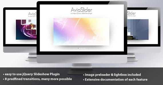
AviaSlider is a very flexible and easy to use image slideshow plug-in built with jQuery. It has a set of really unique transitions that I have not seen anywhere else, as well as some basic transitions.
It comes with an image pre-loader so the slider starts working only when images are loaded and ready to be presented. No clumsy animations with half loaded images.
To see how it works live, here is a demo preview.
2. Jssorr (Free)
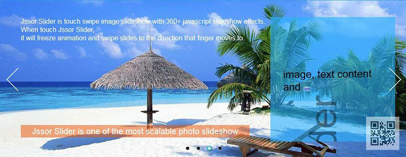
Jssor Slider is a touch swipe image slideshow with 360+ JavaScript slideshow effects. When you touch Jssor Slider, it will freeze the animation and swipe slides to the direction that your finger moves to.
There are more than 360 different effects, you can check all of them here. My own favourite slideshow effects are the simple fade and carousel slider.
3. S3Slider (Free)
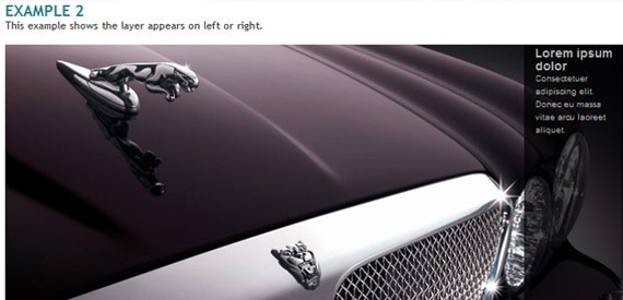
S3Slider a jQuery Slideshow with three different features and displaying sides. You can easily adjust the size of the slider and delay the change speed. Oh, and it comes with a really good documentation, too.
4. Camera Slideshow (Free)
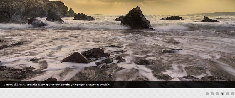
Camera slideshow is a jQuery plugin, that can also be used as a WordPress plugin.
It comes with 33 build-in themes, but you can be creative too, because slideshow has a CSS file included, where you can customize the parts you want.
You can easily implement HTML objects, videos, and captions. One downside is that this slideshow is based on a project called Diapo, that is no longer supported. But still, it has been tested on all major browsers.
Check the live demo here.
5. Sequence JS (Free)
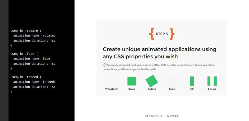
Sequence JS is a JavaScript slideshow based on a CSS framework. It’s meant to be used for creating sliders, banners, presentations and other step-based applications.
If free pre-built themes aren’t enough for you, check out their own theme shop. You can also simply order your custom-made theme. But as I look at it, you really do get all you need in the free version, plus there are quite a bit free themes available.
6. jQuery Banner Rotator / Slideshow
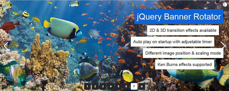
This is a jQuery banner rotator plugin featuring multiple transitions. The thumbnails and buttons allow for easy navigation for your banners/ads. The banner rotator is also re-sizeable and configurable through the plugin parameters.
7. Slide JS (Free)

Slide JS is a jQuery plugin that is responsive, has touch support, easy setup, and CSS3 transitions. It’s great to be displayed as a starting page of your website, and it is free. It also has full documentation, check the live preview on their home page.
8. Slideshow 2 (Free)
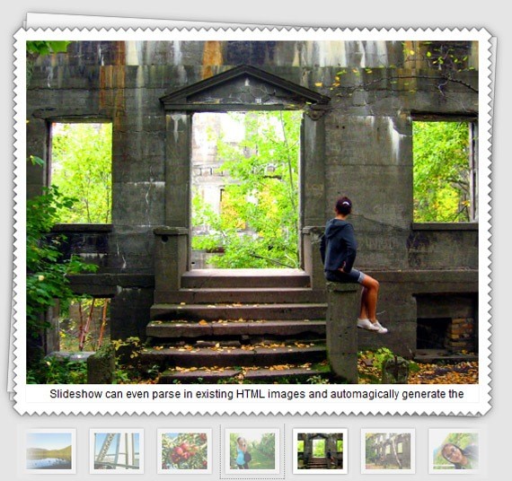
Slideshow 2 is a JavaScript class for Mootools 1.2 to stream and animate the presentation of images on your website. Please visit their website for a full feature list.
9. JavaScript TinySlideshow (Free)
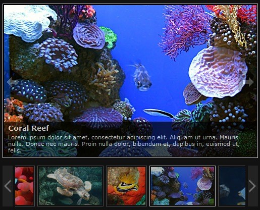
This dynamic JavaScript slideshow is a lightweight (5kb) and free image gallery / slideshow script.
You can easily set it to auto-display the images, set the scroll speed, thumbnail opacity or to disable thumbnail slider. I wanted to include it in this collection because it is so lightweight. Click here to download this slideshow and see a live preview.
jQuery Image Galleries
In this section you will find Image Galleries. They are best suitable for portfolios, but can also be used in blogs. So let’s dig in.
10. Galleria
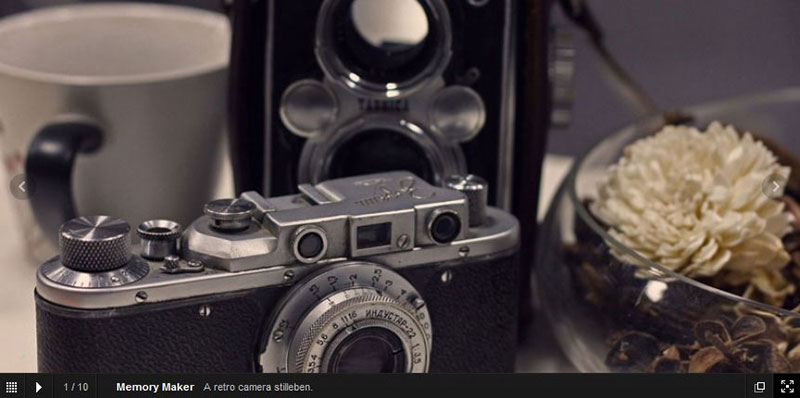
Galleria is a JavaScript Image Gallery. It’s built so that it simplifies your process of creating a beautiful image gallery. You don’t have to be a programming expert to use it. Just a few lines of code, add some pictures, and you’re done.
Galleria has a lot of great tools, which you can use to create your own image gallery. Galleria, you can see in the screenshot, is the free version, which you can customize as you want.
However, if you want to get any of Galleria other designs, you will need to pay for them, find more on their store. These themes are in price range between $9 and $29.
11. Sideways
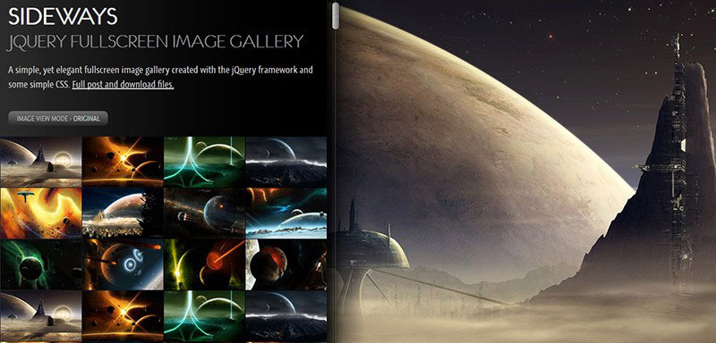
Sideways Image Gallery is a jQuery plugin with added CSS3 styling. The Gallery is responsive and features full-screen images with different modes and custom scrollbars. It is a modern and eye catching image gallery.
This one is the most suitable for photography portfolio showcasing, because it can really give the right credit to their work.
As if it wasn’t good enough, it’s also free to use. Check out the live preview here.
12. Visual Lightbox
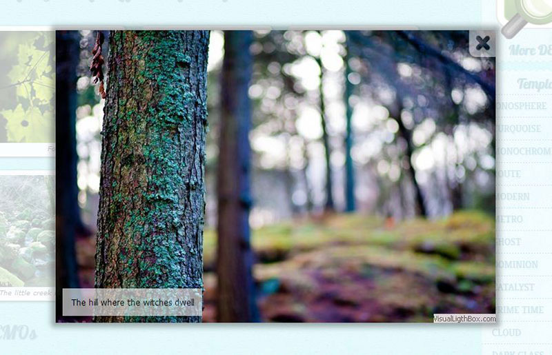
VisualLightBox is a free wizard jQuery program that helps you easily generate web photo galleries. It is based on famous LightBox2 script. In a few clicks you can create breathtaking galleries without writing a single line of code.
On their website they offer a lot of templates, that can be used for variety of purposes. It is the most suitable for travel agencies, adventure blogs, and work portfolio websites.
13. TripTracker

The TripTracker slideshow is a lightweight JavaScript image viewer with an animated slideshow feature. It does exactly what it says that it does. There are no extra options, it is a simple photo viewer. Very suitable for articles.
Click here to try it out.
14. NoobSlide
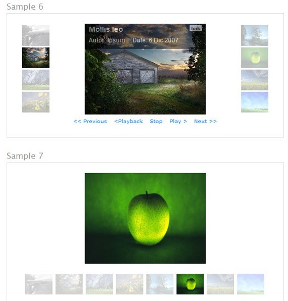
NoobSlide has 8 different examples of how to view your images using MooTools. Unfortunately, there isn’t any documentation, but it is a very easy to use gallery and worth checking out.It can be used as a showcase on a travel blog or even a portfolio.
15. PrettyPhoto
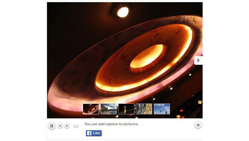
Pretty Photo is a jQuery Lightbox clone. Pretty similar to original Lightbox with few added features and full documentation. It is easy to setup and very flexible.
This plugin supports videos, Ajax, and iframes. It can be used for single photos or galleries. Galleries can also have mixed content. It is very suitable for different types of blogs.
For a demo and download, visit them here.
16. Unite Gallery
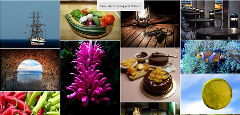
Unite Gallery is a modern gallery that uses jQuery. It is modular designed, with customization in mind. You can also create your own theme with ease.
This gallery is fully responsive. It offers 9 different skins and is fully documented. You can download it for WordPress, Drupal, PrestaShop, OpenCart and Joomla.
This gallery is suitable for photography showcases or Restaurant menus. It is free to use, as it is released under the MIT license. All in all, it’s a great addition to the image-packed websites.
You can see it in action here.
17. Auto Generating Gallery
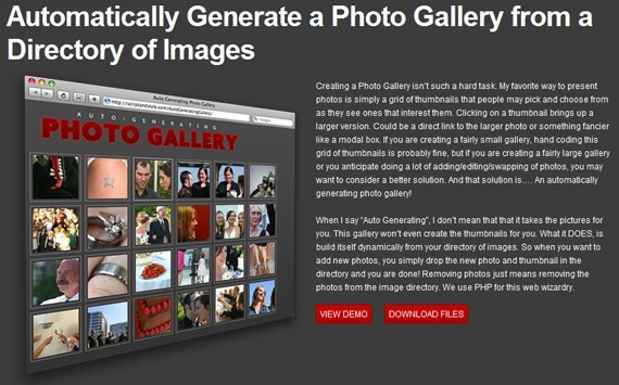
Auto Generating Gallery doesn’t actually take the pictures for you, but it’s pretty smart just the same. This gallery won’t even create the thumbnails for you. What it DOES, is build itself dynamically from your directory of images. So when you want to add new photos, you simply drop the new photo and thumbnail in the directory and you are done! Removing photos just means removing the photos from the image directory. This gallery use PHP for it’s web wizardry. You can find a complete tutorial and demo here.
18. HighSlide JS
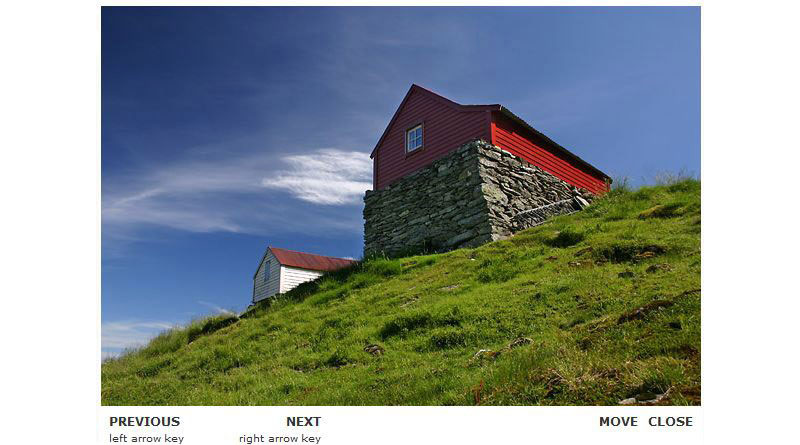
Highslide JS is an open source JavaScript software, offering a Web 2.0 approach to pop-up windows. It streamlines the use of thumbnail images and HTML pop-ups on web pages. You can use it asa thumbnail viewer or scrolling HTML content holder.
A live preview of its functionality can be found here.
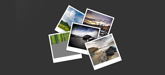
19. Flat-styled Polaroid gallery

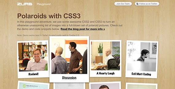
Polaroid gallery is available as a jQuery plugin. It takes the vintage look of Polaroid pictures to the next level.
Strengths of Polaroid Gallery include that it is designed with responsive and flat design in mind. Polaroid Gallery also offers shuffle transition and content holders if you need it. The images can flip and show the back as well.
This gallery is a good choice for travelers or bloggers who want to show off their last adventure.
Make sure to see it in action here.
jQuery Image Sliders
This section is dedicated to all the best and most beautiful sliders, both premium and free. They do a similar job as the Slideshows, but can emphasize content holders.
20. Touch Enabled RoyalSlider
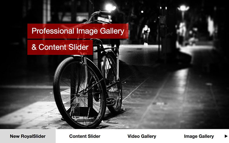
Royal Slider is a jQuery image gallery and more. This slider can be used as an image slider, slideshow, HTML content slider, gallery, banner rotator, video gallery carousel, or just as a presentation. Options are limitless. This full-featured slider is also available as a WordPress plugin.
It has built-in animated captions, supports touch for mobile devices, and is fully responsive. This is a must have jQuery image slider. Check out the live preview here.
21. LayerSlider
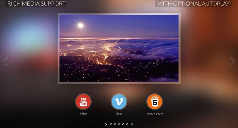
LayerSlider is a premium WordPress plugin for creating beautiful image galleries, content sliders, and amazing slideshows with unbelievable effects.
LayerSlider comes with 13 built-in skins. It has more than 200 2D and 3D slide transitions and 3 types of navigation. LayerSlider also offers support for mobile devices and multiple layouts.
You can add any content, from images, text, custom HTML, YouTube video, and Vimeo video to HTML5 self-hosted multimedia content.
By allowing you to build semantic markup with custom attributes that search engines can index easily, it is also SEO friendly.
See it for yourself here.
22. UnoSlider
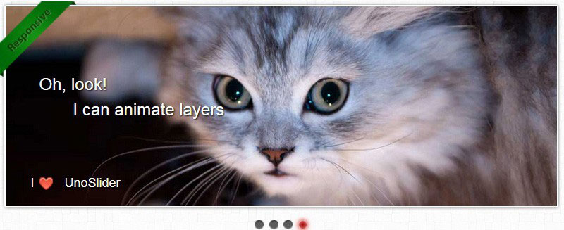
UnoSlider is a image slider that comes as a WordPress and jQuery plugin. It has unlimited transition animations.
This image slider is fully responsive and is also compatible with older browsers. Layers are very well animated with lots of customization options. Setup and use are simple.
UnoSlider features more than 30 animation options, per-slide options and is easy to theme. This slider is also equipped with public API, image pre-loader, and has the ability to hold multiple sliders on one page. HTML content can be shown as well. Choose from 12 pre built themes and more than 40 transitions options.
You can see a demo of this amazing image slider here.
23. Master Slider

Master Slider is a high value and quality-designed image and content slider. It is available as a jQuery and WordPress plugin. And it also has a free version.
This slider has everything that you need to build eye catching image and content sliders. It’s fully responsive and can work on any screen or any device. You can choose from 6 different interactive transitions and 25 pre-built templates.
This slider offers touch swipe navigation, animated layers, thumbnails, and tabs. Master Slider is also equipped with smart preloading of images.
24. Wow Slider
Wow slider is actually a slider for non-coders. It offers a drag and drop menu, that you use to create an image slider for your website.
In the core Wow slider is a jQuery image slider, but it can also operate without jQuery. It can be as light as you want it to be.
The drag and drop creator can generate using an HTML page, or WordPress or Joomla plugin. You can choose from 25 different transitions and it’s free to use.
Main features are:
Fully responsive
Highly customisable
Touch swipe navigation
All browser support
SEO friendly
These are just a few main characteristics. For a full list and live demo check their website.
25. Slider Revolution

Slider Revolution is a responsive and full-width slider with must-see-effects and SEO friendliness built-in. See the heaps of custom transitions and animations for each object on the page! Customize this slider with their convenient drag & drop back-end to suit your needs.
This plugin features tons of unique transition effects, an image pre-loader, video embedding, auto-play that stops on user interaction and lots of easy to set up options to create your own effects. Slider Revolution can be purchased as a WordPress, Drupal, PrestaShop, Magento OpenCart and jQuery plugin.
Worried about coding skills? Slider Revolution has Video Support which is easy to follow. No advance coding skills required, easy as cooking bacon. Ah…what am I saying? Just check for yourself.
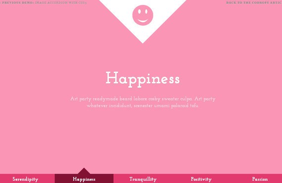
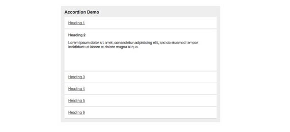
26. Accordion Slider

Accordion Slider is a fully responsive jQuery based slider. It’s available also as a WordPress plugin. There is almost nothing you can’t do with it.
Accordion Slider comes with animated layers and smooth animations. You don’t have to compromise with the design, as the slider has touch support for the best possible user experience.
Pagination on this slider is unique, because you can set the number of panels visible per page. The layout is fully customizable.
Because it has a lazy loading feature, the images can be loaded only when they are viewed. You can also set high-resolution images to be loaded only on high PPI screens, as it has support for Retina screens.
Some additional features are available for the WordPress plugin.
27. Fotorama image slider

Fotorama image slider is simple but at the same time very powerful. You can use it for jQuery or for WordPress and Ruby on Rails . To help you setp Fotorama, they also have a video tutorial.
It is a simple way to show your pictures or images, but powerful enough to blow you away. It’s free to use. Check it out here.
28. All in One Slider
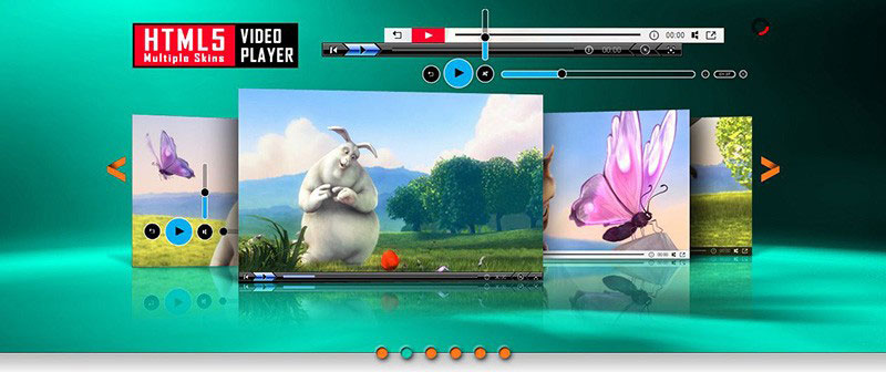
All in One slider is a jQuery slider and comes with five different ways to help you create a beautiful Banner rotator, Thumbnails Banner, Banner with Playlist, Content Slider, and Carousel.
It’s an advanced slider, that allows you to create powerful slides with animated text and HTML tags. This is a powerful tool that provides you with everything you need in development of a website to show your products or images.
All in One slider is fully responsive and touch screen supporting image slider. All in One slider offers 16 different transitions and animated text. Supports all major browsers and is a award winning product.
See it for your self. Here is a live preview.
29. Blueberry Image Slider

Blueberry image slider is a jQuery plugin, that was developed specifically for responsive web design. Blueberry image slider is an open-source project, based on a 1140px grid system from cssgrid.net. It’s simple and at the same time an excellent free option.
I’m sure you will like it as much as I do. Check the live preview and download option here.
30. RhinoSlider

RhinoSlider is a jQuery slider that comes with the possibility of customising your version before downloading. This can significantly decrease time spent on setting it up. You can of course download the whole package, but I think the best way is to use the generator.
It is very flexible and offers a lot of options on callbacks and callbefores. You can set it on auto-play or make it stop on hover. Captions are also available and are customisable.
Check for yourselves on their website. It is a great free tool.
31. Slippry

Slippry image slider is a jQuery plugin that uses CSS3 transitions and HTML5 elements. It can be as simple or as complex as you want it to be.
Because the CSS and Sass files are included, you can let your imagination free and style it as you want it. Slippry does its job best at the top of the home page. With captions it can serve as good presentation of a company.
Dont believe us, check it out here for full documentation and a live demo.
32. Un Slider

Unslider is a very simple slider that is based on jQuery. It’s very small but powerful. You can change everything, so it works and feels like you want.
Unslider is really the simplest slider I have come across. You really don’t have to be an expert to use this one. Just add a few lines of code, put in images and you have a slick slider for your website or blog.
Their whole site is a one big demo for this slider.
33. Unleash 3
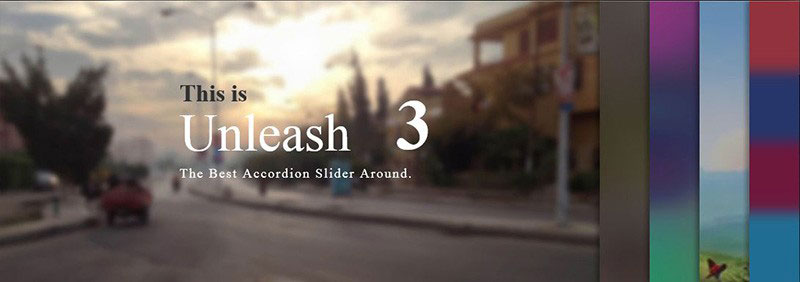
Unleash 3 is another jQuery accordion slider on our list. It’s one of the best there is. You have a lot of options and settings to choose from. You can add captions and controls with different styles or add any other content with multiple CSS3 animations.
Main properties are:
Fully responsive
Full screen mode
Ability to choose a slide when page is loaded
Step by step documentation
Touch support
Video support
34. MightySlider

Mighty Slider is everything you need to create an amazing one-directional slider. Mighty Slider can be used as a banner rotator, video gallery, presentation and basic slider. All of this is possible because of a very powerful API. Mighty Slider gives you total control over layout and design.
35. Fullscreen Slit slider

Fullscreen Slit Slider is a jQuery plugin and uses CCS3 animations. Slider can stretch across the whole viewport or be used as slider inside of other context.
Fullscreen Slit Slider is fully responsive and has some unique split screen transitions. With captions it is a great way of representing your cause to the visitors.
Check it out in action. I am sure you will be amazed of what this free slider can do.
jQuery Portfolio, News & Tour Sliders
This section is dedicated to sliders that are particularly designed to showcase portfolios, news, and tours.
36. jQuery Carousel Evolution

jQuery Carousel Evolution is an easy and low cost way to create an eye catching product or team presentation. Yes it’s a premium slider, but it delivers a great value for it’s money.
jQuery Carousel Evolution is a powerful slider that uses HTML markup. It offers 9 different styles for sliders. This slider also supports YouTube and Vimeo video implementation. All major browsers are also supported.
You can check the demo here.
37. Cube Portfolio – Responsive jQuery Grid Plugin
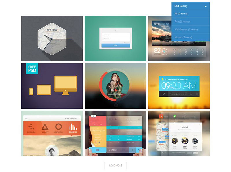
Cube Portfolio is a very cool jQuery plugin with tons of animations. It offers custom captions and plays well with your current HTML and CSS code.
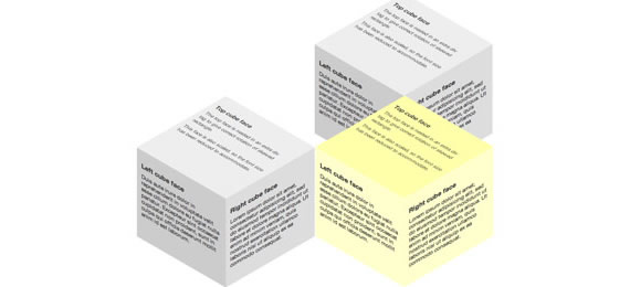
Cube Portfolio provides 30+ options, that gives you complete layout and design control. Slider has fully responsive design and is fully customizable. It uses CSS3 animations and you can choose from 19 starter pack templates. Cube Portfolio is also equipped with a filtering system.
It is best used for vertical sliders, portfolio projects, team members presentation, photography showcasing, or other mosaic grids. Usage is limitless. Cube Portfolio is also available as a WordPress plugin.
Check live preview here.
38. Slideme

This jQuery plugin is great for the top of the website, to present your work or say more about you.
Slideme has got full documentation and a tutorial how to set up your slider, for every type of device individually. Design is fully responsive with CSS3 animations. It is easy to setup and provides a public API.
Slideme is free to use and definitely worth a look. Check out the demo here.
39. PgwSlider

Pgw slider is a jQuery slider, that is designed for showcasing your images. This slider is fully responsive. It is lightweight and all-browser compatible. Pgw slider is also SEO friendly.
This slider is very suitable for news or blogging websites as it can show your most recent post or articles.
For full features and a demo slider click here.
40. All Around Content Slider

All Around slider is a multi purpose jQuery slider. You can use it as a carousel or slider. It also supports video. All Around slider offers 6 pre built themes or layouts and ton of options.
Slider is equipped with a drag and move circles option and infinite loop. Besides that, it’s fully responsive with mobile support. Every single image can be magnified and can contain a description, too.
All Around slider is best used as a product showcase or team presentation.
Check live preview here.
41. Lens Slider
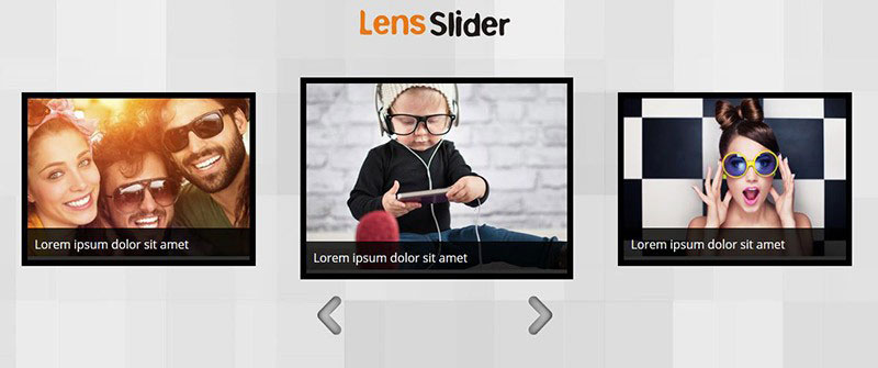
Lens Slider is an open-source project and so, fully customisable. Slider uses very simple HTML markup of an unordered list. Images are shown as you can see in the screenshot. No other option is available. Lens Slider is also available as a WordPress plugin and free to use.
The most suitable usage would be for products, services, or ateam presentation.
Check it out here.
42. Gridder
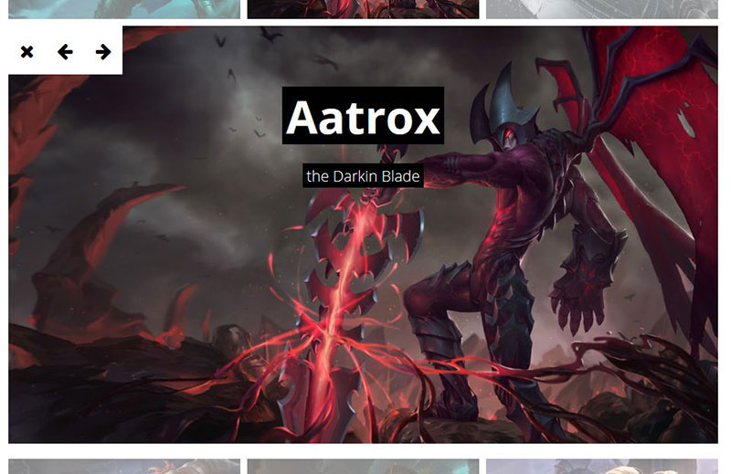
Gridder is an awesome slider for showcasing your work. Gridder kind of mimics Google image search. To view the larger picture you click on a thumbnail and it expands. This is a great way to show a large number of images at the same time.
Gridder is available as a jQuery or Ajax thumbnail previewer. It is an awesome free solution for your next portfolio project.
For jQuery live preview check here. If you want Ajax click here.
43. Barack Slideshow 0.3
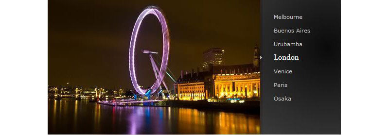
Barack Slideshow is an elegant, lightweight slideshow written in JavaScript. This slideshow can operate with vertical, horizontal, and irregular lists. The images are preloaded with MooTool Assets. To keep your code clean, you should check the CSS code. This means changing some parts if needed.
Barack Slideshow can be used as a portfolio showcase, product list, or even for listing your clients.
Here you can find a demo and test different options.
44. jQZoom Evolution
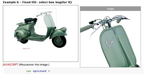 JQ Zoom Evolution
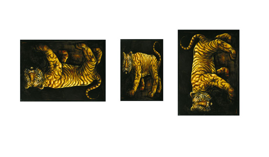
JQZoom is a JavaScript image magnifier, built on top of the popular jQuery JavaScript framework. jQZoom is a great and really easy to use script to magnify parts of your image.
This image magnifier is the most suitable for online stores and restaurants menus.
Find the documentation and demo here.
45. Multimedia Portfolio 2

Multimedia Portfolio 2 is a jQuery plugin that can automatically detect the extension of each media file and apply the appropriate player. It supports images and videos. Multimedia Portfolio uses simple HTML markup and it’s easy to use.
This slider is best suitable for showcasing products, services, and even news.
Check out their demo.
46. jQuery Virtual Tour

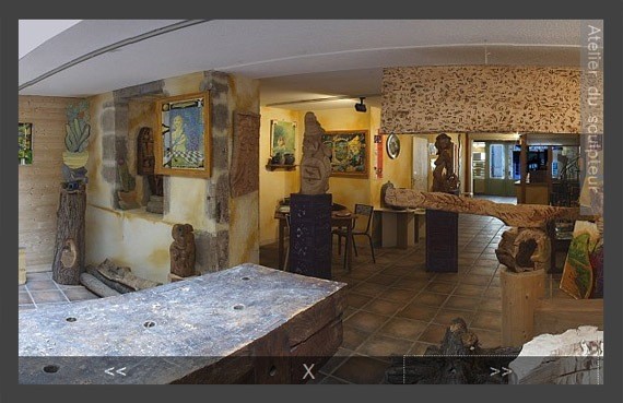
jQuery Virtual tour is an extension of the simple panorama viewer. This jQuery virtual tour allows you to transform some panoramic views into a virtual tour! It’s a great plugin that is worth looking at.
You can find a demo and download options here.
47.jQuery Vertical News Slider

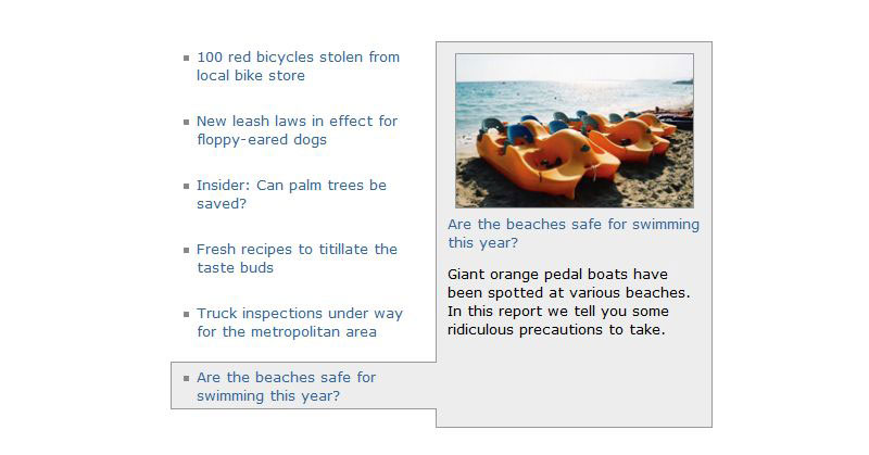
jQuery Vertical News slider is very useful for websites that want to show some news or marketing campaigns on their sites. It’s responsive and uses CSS3 animations. Vertical News slider also allows you to fully customise the style of the slider.
Check out the live preview here.
48. Multi Item Slider

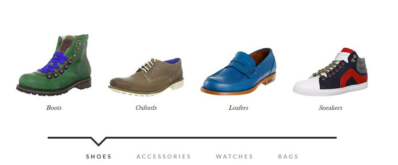
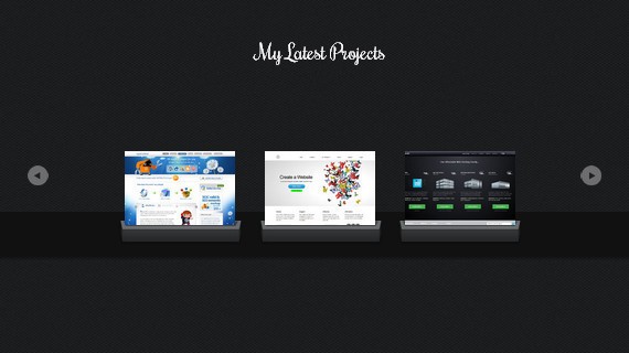
This gallery is also a tutorial on how to create it on your own. Multi item jQuery gallery was inspired by Apple slider, that shows multiple products at once. It’s fully responsive with a flat design with a variety of effects.
Multi item jQuery gallery is very suitable for online stores for showcasing their products. It comes with simple navigation, as seen in the screenshot. The navigation is intuitive for changing between a variety of categories.
For a live preview click here.
CSS Based Galleries
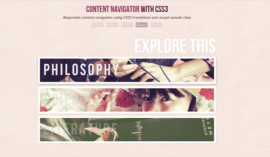
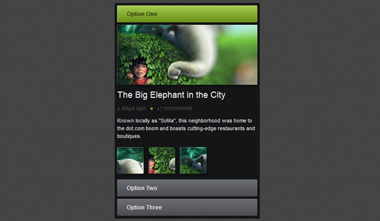
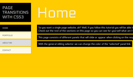
We have come to our last section, where you will find the best pure CSS Based Galleries. They may not be as popular but are sure worth a try. See it for yourselves.
49. HoverBox Image Gallery

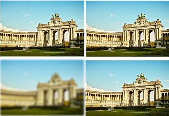
HoverBox Image Gallery is basically a super light-weight (8kb) roll-over photo gallery that uses nothing but CSS. For faster loading it only uses one image for thumbnail and roll-over preview. All major browsers are supported. HoverBox Image Gallery is free to use for your own projects.
It is best used as a photography showcasing for photographers, any type of portfolio and restaurant menus.
Live preview here.
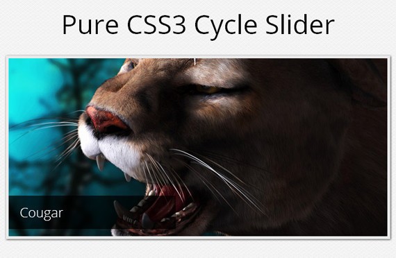
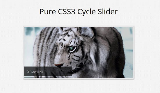
50. CSS Image slider with 3-D transitions

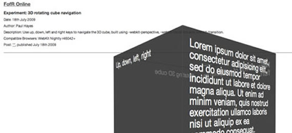
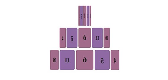
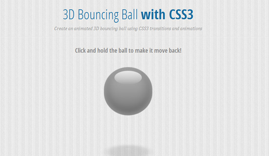
CSS image slider is an experimental project that also includes a full tutorial. For animation purposes it uses CSS and CSS3 techniques with the addition of 3-D effects on transitions. Intended usage is strictly as an image slider.
CSS image slider can be used for product and service showcasing. In my opinion it could do well also as an image slider in a full width article.
Check out the live preview.
51. CSS3 Animated Image Gallery

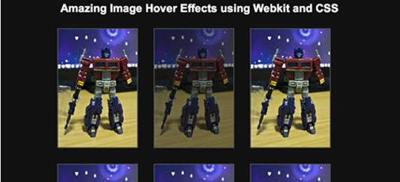
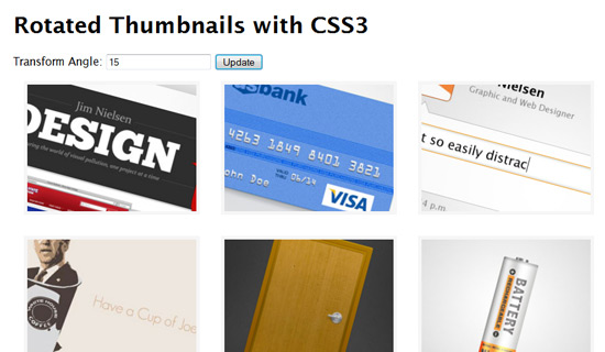
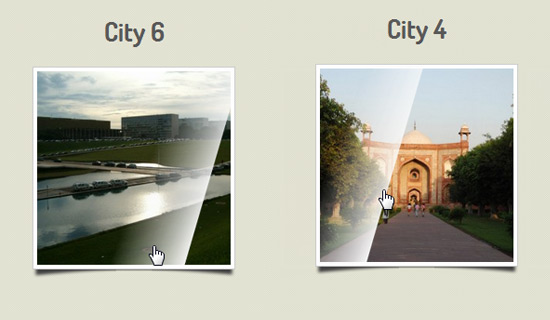
CSS3 animated image gallery uses CSS3 and HTML5 to render effects. The images zoom in when you hover over them. This enables a more detailed look. If you are interested, you can take a look at the tutorial and create it yourself. Otherwise you can just download the source code.
CSS3 animated image gallery it’s suitable for photography showcases.
52. Filtronio CSS3 Portfolio

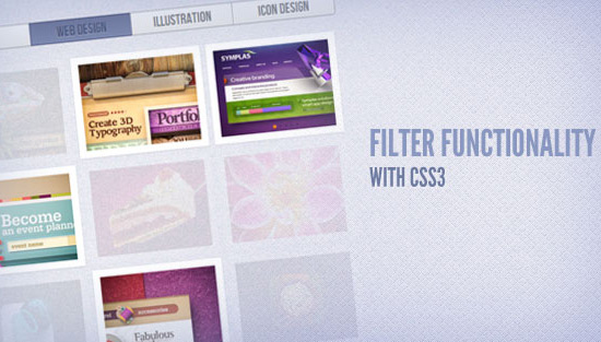
Filtronio CSS3 portfolio is a great pure CSS and HTML5 gallery for showcasing your portfolio or even your products.
It’s simple but at the same time a very powerful and professional portfolio gallery. You can choose from 3 different themes. Filtronio CSS3 portfolio also offers animated layers and a category filter. Gallery is clean coded and easy to customize.
Check out the live demo here.
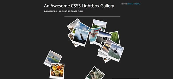
53. Pure CSS3 Image Gallery

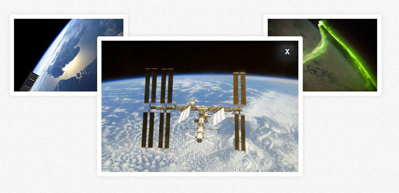
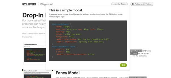
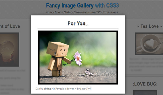
This is a simple CSS3 image gallery that creates the effect of a pop up window when you click on the image. It’s suitable for showcasing portfolios on the websites. If you are interested, you can also follow the tutorial to make it by yourself.
Check out the live preview.
54. CSS Lightbox Image Gallery

This image gallery is another pure CSS gallery. It zooms out on images when they’re clicked. You can download the source code, or if you feel like it, go trough the tutorial..
CSS Lightbox image Gallery should be used on a non-scrollable website. However this can be overridden with a single line of JavaScript, that is included at the end of the tutorial. The most suitable usage would be a portfolio showcase.
55. Slidea

And here is a gem of this collection, Slidea. Slidea is a multi purpose content slider. This slider plugin was build on the jQuery, VelocityJS and Animus animation framework. With Slidea there are no animation limitations–you can so much awesomeness with it!
I can try to describe how cool it is, but just check the demo and you’ll understand why I like it so much!
Conclusion
I have to say I really enjoyed researching these plugins. We found amazing sliders that will, hopefully, help you to work on your next project more efficiently. There’s something for every situation here.
There are so many amazing sliders and slideshows that it’s hard to decide what to pinpoint. But in my opinion you should definitely check out Gridder slider, because it’s really amazing what it can do, especially for free, so it’s a win-win situation.
And you definitely should not forget Slidea. Yes it’s a premium slider, but it carries so much value it’s well worth the investment!
If you enjoyed our article, share it with your friends, and tell us if we missed your favorite slider.
Which is your favorite gallery plugin? We would love to hear your experiences!
Editor’s note: this article was last updated August 26, 2020.
























































 JQ Zoom Evolution
