Original Source: https://ecommerce-platforms.com/articles/best-appointment-scheduling-apps
Long gone are the days of pen and paper scheduling for businesses—but also emails, phone calls, and Excel spreadsheets. Efficient businesses utilize some of the best appointment scheduling apps for booking clients through an online interface, managing appointments, and even getting paid.
Whether you run a local yoga studio or handle client meetings as a realtor or lawyer, you’re bound to save money, time, and your overall sanity by working with one of the best appointment booking apps.
There are plenty of appointment scheduling software options on the market, but we’ve tested them all to compile a list of the top contenders. We’ll first explain what types of features and functionality you get from these apps. Then, we’ll share the absolute best appointment scheduling apps based on our research of pricing, features, and the pros and cons.
Keep reading to make your appointment scheduling significantly easier and more profitable!
What is an Appointment Scheduling App?
An appointment scheduling app is an online portal for businesses to list potential appointment times, accept bookings for those appointments, and manage elements like pricing, cancellations, and client information.
Appointment scheduling apps usually come in SaaS (software as a service) form, where you can either sign up for free or pay a monthly fee to utilize all of its features. The apps are hosted and published online, resulting in two interfaces: the frontend portal where customers and clients make appointment bookings, and the backend interface where the admins manage the schedule.
What to Look for in an Appointment Scheduling App
The format and features of each appointment scheduling app varies, but you want to look for these primary features:
A frontend calendar: For customers and clients to come to your calendar and see available appointment times; after which, they can make bookings, edit their bookings, and even make payments.A backend admin management portal: For business owners to edit their schedule, view appointments, and communicate with clients.A connection to your website: That may be with a direct integration/embedded calendar, or a simple link that you can use in your website’s menu.Support for multiple business locations and team members: This is particularly important for multi-location businesses and those with independent workers (like therapists, doctors, or personal gym trainers).Full appointment control: Admins and clients should both be able to cancel and change appointments.Payment processing and upsells: The option to offer free appointments should always be available, but it’s nice to see payment processing for premium bookings, along with the ability to add upsells (like yoga mat rentals for a yoga studio).Automated notifications: Admins and customers should receive confirmation emails, along with SMS/Text messages if requested. You’ll also want an appointment app with reminder messages and notifications about cancellations or other changes.Alternative appointment/payment types: From memberships to subscriptions, and gift certificates to packages, the best appointment scheduling apps provide this type of flexibility for your business.
Now that you understand what features to look for in a booking app, keep reading to see the best appointment scheduling apps available on the market.
What are the Best Appointment Scheduling Apps?
We’ve compiled a list of appointment scheduling apps based on which ones offer the best overall value: with pricing, features, and their pros and cons all factored into the equation.
1. Squarespace Scheduling – Best Overall Appointment Scheduling App
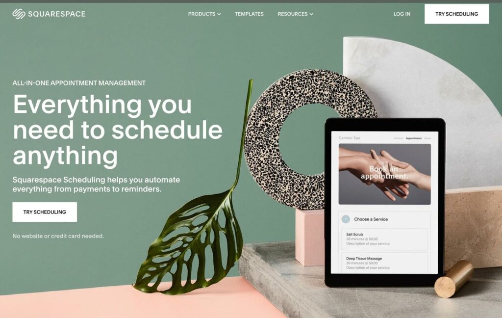
Squarespace, the popular website builder and ecommerce platform, offers a separate product called Squarespace Scheduling. You can run the calendar booking app on its own (hosted on a separate subdomain name) or add it directly to any website (Squarespace or otherwise).
The idea behind Squarespace Scheduling is to automate every aspect of your booking calendar, from bookings to reminders, and payments to availability. You can promote your availability with a frontend calendar, stay organized with calendar software integrations, and customize appointment confirmations and intake forms.
Not only that, but Squarespace Scheduling has built-in payment processing with discounts, packages, and subscriptions, allowing you to sell any type of appointment bundle you want.
Pricing
Squarespace Scheduling offers annual and monthly pricing plans, where you’d save a little money if committing to a full year. You can also sign up for a free trial to test out the booking software.
Here are the monthly pricing plans:
Emerging: $15 per month to get one calendar per team member or location, along with calendar syncing, custom payments, invoicing, automatic reminder emails, and card vaulting Growing: $25 per month for 2-6 calendars per team member/location, everything in the previous plan, plus SMS/Text reminders, subscriptions, memberships, gift certificates, and packages. Powerhouse: $50 per month for 7-36 calendars for each team member/location, everything in the previous plans, plus multiple time zones for locations, access to the custom API, CSS controls, and HIPAA (BAA) compliance.
Pros
The interface is beautifulEasy to integrate into your website (particularly with the Squarespace Scheduling module)Reasonable pricingOne of the few appointment scheduling apps with HIPAA (BAA) compliance measuresAccept payments through Stripe, Square, or PayPalCalendar syncing with iCloud, Google, Outlook, and Office 365Simple reminder emails and SMS notifications
Cons
No free planThose with previously held Acuity Scheduling accounts are left to use the older Appointment Scheduling block in SquarespaceYou need to upgrade to one of the higher plans to get things like multiple time zones, memberships, and packages
Who is it Best For?
Squarespace Scheduling works particularly well for businesses using Squarespace for their website, but it’s not a bad choice for other platforms, since the calendar is still embeddable. Those familiar with Acuity Scheduling will also enjoy the interface, since it’s almost exactly the same.
Go to the top

2. HubSpot Scheduling Software – Best Free Solution
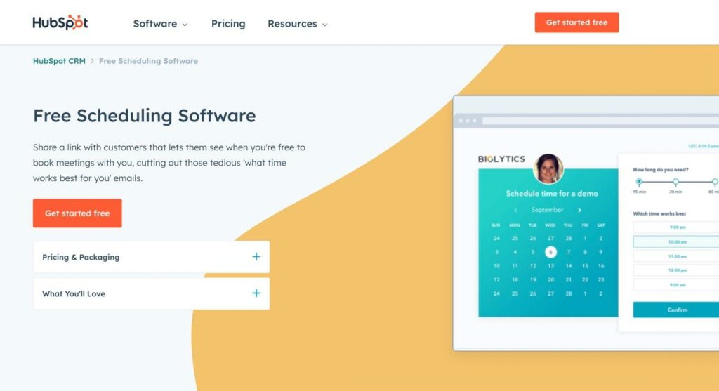
HubSpot offers a free scheduling software with decent tools for smaller businesses to accept appointments. After which, you can upgrade to a paid plan for more advanced features like payment processing, multi-language content, and automated marketing packaged into the premium plans.
We will say, however, that HubSpot is, perhaps, the most complete free scheduling app available, seeing as how the vast majority of the features you would need are included in the free plan. We’re talking an online calendar, calendar syncing, grouped meetings, and more.
Pricing
The main HubSpot Scheduling Software is free to use.
For more automation and scaling features, you’d upgrade to one of the premium HubSpot plans. Those plans give you a lot more than online appointment scheduling, so your desire to upgrade may depend on what is provided.
Here’s a look:
Starter: $50 per month to remove branding from the meeting scheduler, documents, live chats, and 1-to-1 emails. You also get things like payments for the scheduler, repeating tasks, Stripe integration, conversation routing, and email/chat support. Professional: $500 per month for everything in the previous plans, plus more advanced tools for sequences, required fields, teams, video messaging, eSignatures, and phone support. Enterprise: $1,200 per month for everything in the previous plans, plus hierarchical teams, advanced permissions, playbooks, conversation intelligence, and more.
We covered the monthly pricing, but you can save a little money by paying for a year upfront.
Pros
Free plan with most scheduling features you’d need for a small businessIntegrate with and sync calendars from Gmail, Suite, or Office 365Direct meeting scheduling toolGroup meetingsSync with CRM contactsIntegrations with video conferencing toolsAutomated follow-upsSleek frontend booking/calendar interface
Cons
Expensive premium plansPremium plans have many sales features that many small businesses won’t needA premium plan is required for payment processing and 1-to-1 emailYou must pay to remove HubSpot branding
Who is it Best For?
HubSpot is primarily meant for businesses with sales teams (even small ones). We can’t imagine a yoga studio or gym would find it as useful, but scheduling for lawyers, software sales, and product demos are great in HubSpot, especially since the upgrades lead to even more advanced sales and lead generation tools.
Go to the top

3. Calendly – Popular Solution
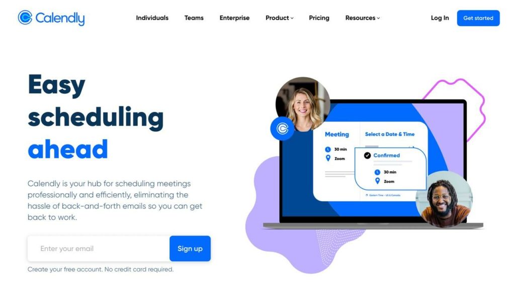
Calendly removes the need to send emails back and forth for scheduling purposes, all due to its multi-format meeting type scheduler.
With Calendly, you can schedule meetings for:
Collective meetingsRound robinsGroup meetingsOne-on-one meetings
The sales-oriented scheduling hub offers automated reminders, follow-ups, and a quick online scheduling calendar that links directly to video conferencing and calendar apps.
Pricing
Calendly has a free trial and discounts for annual billing.
Here are the monthly pricing plans:
Basic: Free for 1 calendar connection per person, syncing with calendar software, unlimited one-on-one events, polls, a booking link, automated notifications, and you can integrate with some cloud-based software and add the calendar to your website.Essentials: $10 per seat per month for everything in the free plan, plus group events, email reminders, follow-ups, reporting, and more.Professional: $15 per seat per month for everything in the previous plans, plus customizable notifications, text notifications, redirections, and more.Teams: $20 per seat per month for all previous features, plus round robin events, the locking and syncing of managed events for your team, and more.Enterprise: You must contact Calendly for a custom quote.
Pros
There’s a free plan with a customizable booking link and automated event notificationsThe premium plan pricing is reasonableAccess to automated reminders and SMS messagingVersatile meeting types like conference calls, round robins, and 1-on-1 meetingsIntegrations with software like GoToMeeting, Zoom, and SalesforceOptions to collect payments through Stripe and PayPal
Cons
There are simple branding elements, but not much advanced customizationChat and phone support is limited/non-existent
Who is it Best For?
Calendly is a simpler, more intuitive, and more affordable version of HubSpot, in that it’s primarily made for scheduling sales calls. We like it for sales, marketing, customer success, revenue operations, recruiting, and IT.
Go to the top

4. Square Appointments
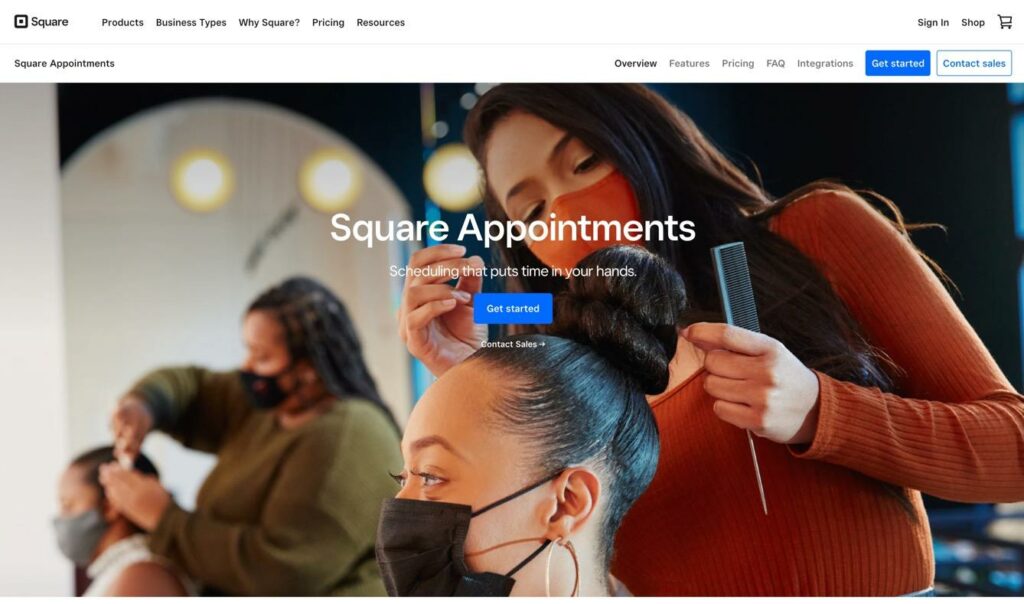
Square Appointments, from Square—the payment processing company—gives businesses a scheduling point of sale for handling bookings, collecting payments, and simplifying the overall scheduling process. It integrates with the entire Square ecosystem for immediate scheduling in person or online, so someone like a barber could allow a client to schedule their next appointment as they walk out the door, or the client could opt for scheduling through the barber’s website.
Pricing
Square Appointments has a free plan, custom pricing, discounts for qualifying businesses, and the option to cancel or change your plan at any time.
The plans are as follows:
Free: $0 per month for a single location, the scheduling app, custom availability, automated text and email reminders, blocking for personal events, multiple time zones, recurring appointments, payment processing, and access to other Square features like team management, website building, client management, and the booking system API. Plus: $29 per month per location for everything in the previous plan, decreased credit card processing rates, multiple locations, processing time, multiple staff appointments, daily appointment limits, no-show protection, double booking prevention, rescheduling, automated confirmations, Google Calendar syncing, and more. Premium: $68 per month per location for even more decreased credit card processing rates, everything from the previous plans, resource management, write access to the Bookings API, and Team Plus features like custom permissions and multiple wage rates.
Pros
Offers a simple and beautiful booking interfaceAppointment remindersProcess payments, even with the free planBuild a free ecommerce site with your bookings softwareIntegrates with Square POS for in-person and online bookingsUnlimited staff accountsIncludes card and contact information managementHas staff and customer management modules
Cons
It’s very ecommerce-oriented, which may not be necessary for some businessesNo built-in tool for importing appointments dataDoesn’t integrate with that many personal calendar toolsCustomization is limited
Who is it Best For?
Square Appointments has the unique ability to combine directly with the Square point of sale ecosystem, so it makes the most sense for retail and professional services where in-person bookings may occur; we’re talking businesses like hair salons, barbershops, auto repair, cleaning services, tutoring, and personal training. However, professional services (like lawyers and realtors) can benefit from Square Appointments as well, seeing as how it offers bookings online.
Go to the top

5. Setmore
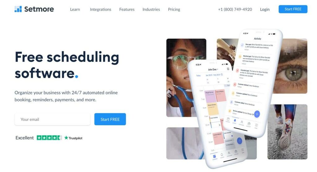
The Setmore app helps businesses stay a step ahead with a simple yet powerful online booking page. It’s one of the best appointment scheduling apps for getting paid in advance, minimizing no-shows, and reaching a more global customer base with 1-click Teleport and Zoom meetings.
The Setmore app lets you generate your booking page within seconds. Thereafter, you can customize the page a bit, show reviews for your business, and link the page to your website, Facebook, and Instagram.
Pricing
Setmore is one of the more affordable appointment scheduling apps, and you can save even more by opting for annual billing.
The monthly pricing plans include:
Free: $0 per user per month for unlimited appointments, email reminders, payments with Square, Teleport video meetings, social media integrations, and a custom booking page with unique URL.Premium: $12 per user per month for everything in the previous plan, plus SMS reminders, payments (with Square, Stripe, and PayPal), a two-way calendar sync, recurring bookings, support for 2 staff members, and 1-click video meetings through Teleport and Zoom.Pro: $9 per user per month to receive everything from the previous plans but for 3+ users (we’re assuming this is a promotional price—since it’s cheaper than Premium—but nothing else is listed).
Pros
Free plan with simple payments, email reminders, and unlimited appointmentsAffordable premium plans, especially when opting for an annual packageEmail and SMS remindersCustomizable notificationsRecurring appointmentsQuick integrations with Zoom and TeleportAccept bookings on social media or your website
Cons
The online payments are limited only to Square in free planCalendar customization options are limitedCalendar syncing only available for Google and Office365
Who is it Best For?
Setmore seems like a winner for the budget-conscience businesses out there, particularly since both Premium and Pro plans cost only $5 when paying annually. Other than that, it works well for those who need video conferencing or integrating with website builders/ecommerce stores.
Go to the top

6. Zoho Bookings
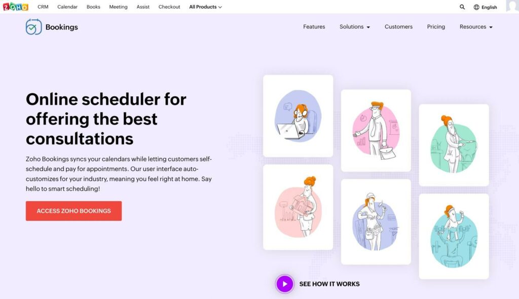
Zoho touts a myriad of tools in its suite of products, including a calendar, CRM, business email, and appointment booking module. Zoho Bookings is a free solution made for appointment scheduling, where clients book appointments and pay for services.
All bookings get managed on the Zoho dashboard, which has an Android and iOS app for on-the-go tinkering. You receive templates and customization options for the online calendar, while notifications and reminders send to both the admin and customer. Other than that, you can update your CRM right from Zoho Bookings, and handle tasks like two-way calendar syncing and team meetings.
Pricing
As with most Zoho products, there’s an introductory free plan with decent features. Having said that, most Zoho free plans aren’t quite enough for growing small businesses.
Here’s what to expect when it comes to pricing for Zoho Bookings:
Forever Free: $0 per month for 1 staff member, notification emails, online meetings, and two-way calendar syncing with Outlook, Office365, Zoho, and Google.Basic: $8 per user per month for everything in the previous plan, plus notification emails, round robin allocation, mobile apps, more integrations, brand color palette for the booking page, auto time zone conversions, a Zapier integration, and reporting.Premium: $12 per user per month for everything in the previous plans, plus an appointment sign-up portal for customers, Zoho Assist integration (remote support sessions), text notifications, upsells like rooms and equipment, recurring group events, removal of the Zoho branding, and a booking page on your own domain.
The yearly plans from Zoho Bookings save you a little money.
Pros
There’s a free planTeam management toolsSyncs with your CRMManagement from a mobile app or the online portalNo-show and last-minute cancellation preventionTime-off and special hoursBuffer times for meeting preparationSyncs with the entire Zoho ecosystem, and external tools like Microsoft Teams, Google, Slack, and SalesforceUses Stripe, PayPal, or Authorize.net for payment processingNotifications for confirmations and cancellationsUse with online meeting tools like Zoom, Google Meet, and GoToMeetingEmbed on any website
Cons
Syncs with some calendars, but not enough of the most popular onesCustomization is limitedZoho tries to sell you a lot once you’re in their ecosystemYou must pay for the most expensive plan to remove Zoho branding
Who is it Best For?
We like Zoho Bookings for businesses already entrenched in the Zoho ecosystem, particularly if you enjoy using their CRM, Zoho Meeting, and Zoho Flow. If you’re not a consistent user of the Zoho suite, it’s still a nice solution for the budget-conscience, particularly if online meetings are a big part of your business.
Go to the top

7. SimplyBook.me

SimplyBook.me pairs simplicity with flexibility, with its stylish, modern interface and intuitive ease of use. It’s perfect for service industry bookings, as you can accept online bookings, send notifications, receive payments, and add custom features like coupons and gift cards. There’s even a cordless checkout tool, along with beautiful templates to build a site just for your booking module.
The main reason we consider SimplyBook.me one of the best appointment scheduling apps is because you can publish its booking module on any website, social site, or even the Google Maps Bookings page.
Pricing
SimplyBook.me offers monthly pricing, and annual billing for discounts.
Here are the main plans:
Free: $0 per month for 50 bookings, 1 custom feature, 5 users, an admin app, booking website, booking widget, and directory listing.Basic: $9.90 per month for everything in the previous plan, plus 100 bookings, 3 custom features, 15 users, a client app, sale POS, coupons, and gift cards.Standard: $29.90 per month for 500 bookings, 8 custom features, 25 users, everything in the previous plans, and HIPAA compliance.Premium: $59.90 per month for 2000 bookings, unlimited custom features, 50 users, a branded client app, everything in the previous plans, and removal of the SimplyBook.me link.
Pros
Get a free booking website from SimplyBook.meThere’s a free appointment scheduling planPublish anywhere, from social media to your websiteMultiple users, even with the free planOne of the few scheduling apps with HIPAA compliance optionsThere’s an admin and client appCoupon and discount supportPayments through PayPal, Stripe, or SquareMemberships, classes, and tickets
Cons
Limits on the number of bookings for all pricing levelsYou must pay for the most expensive plan to remove SimplyBook.me branding May not be as customizable as some people want
Who is it Best For?
SimplyBook.me has the right stuff for service industry professionals with the need for absolute simplicity. It’s affordable and easy to install on social media and your website; or, you could just use the website they give you.
Go to the top

Which of the Best Appointment Scheduling Apps is Right for You?
Some of the best appointment scheduling apps are catered to sales teams, while others lean toward ecommerce or service businesses. If you’re still debating between two or three of these apps, use our final recommendations to help:
Squarespace Scheduling: Great all-around booking tool, especially for small businesses and Squarespace usersHubSpot Scheduling Software: A robust sales team platform for booking client calls and video conferencesCalendly: A simpler alternative to HubSpot; for sales teamsSquare Appointments: Ecommerce-oriented; perfect for an in-person/online booking hybrid Setmore: Budget-friendly, great video conferencing, nice for collecting paymentsZoho Bookings: Budget-friendly, and excellent for Zoho-familiar usersSimplyBook.me: Ideal for service-based industries; nice for adding a simple booking page to all online platforms (even social media
Have you used any of the best appointment booking app on this list? If so, please let us know what you think of them. If not, share any questions you may have in the comments!
The post Best Appointment Scheduling Apps for 2022 appeared first on Ecommerce Platforms.
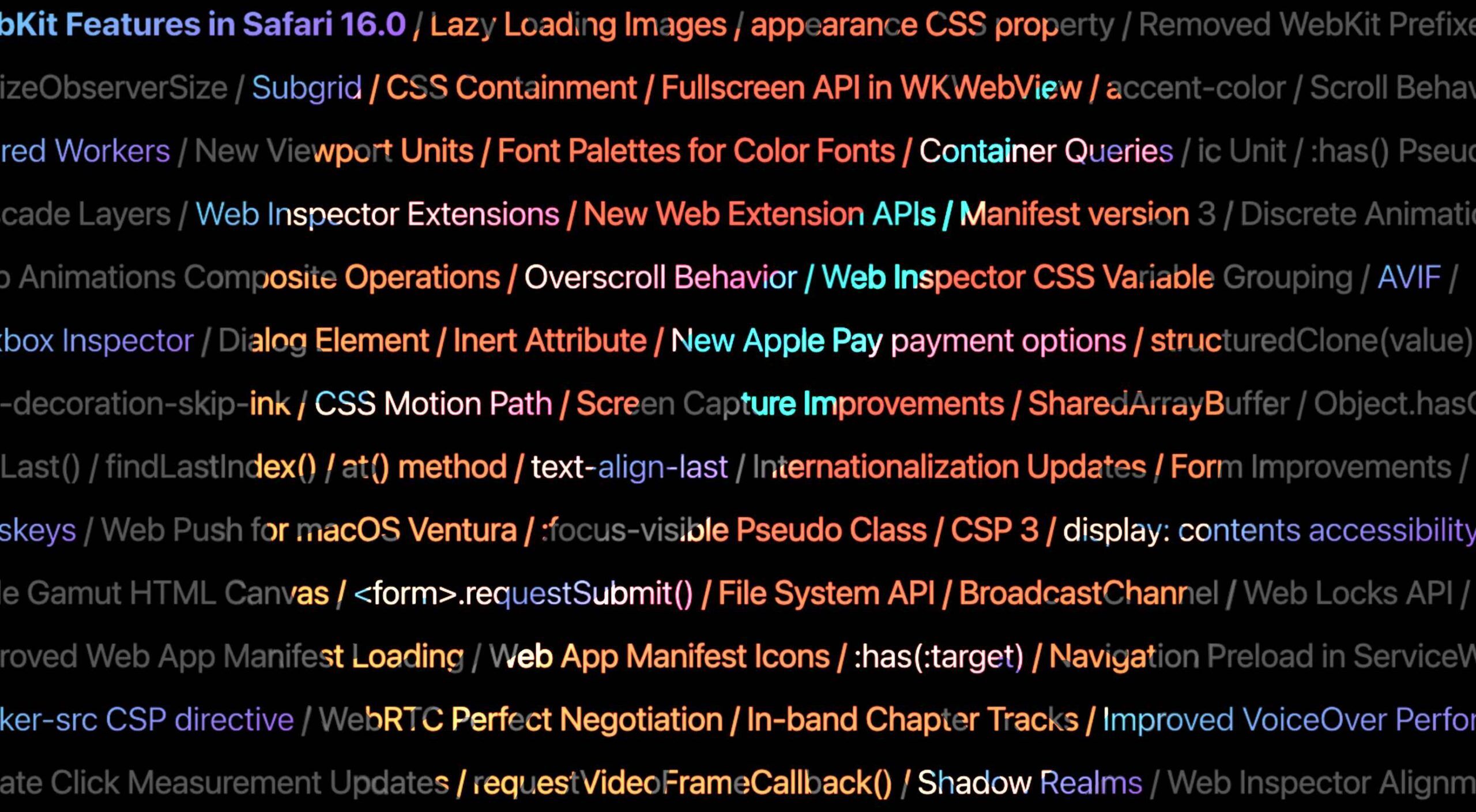 Apple has released an OS update. Packaged in with it is the latest version of Safari, 16.

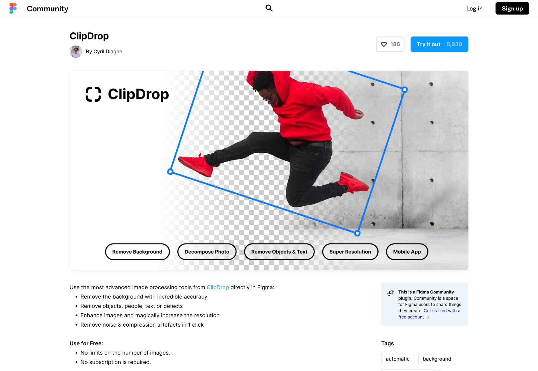
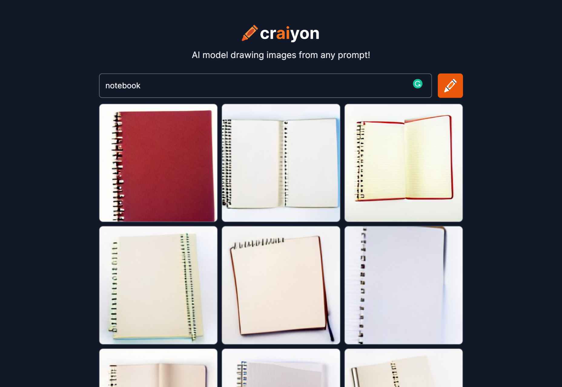
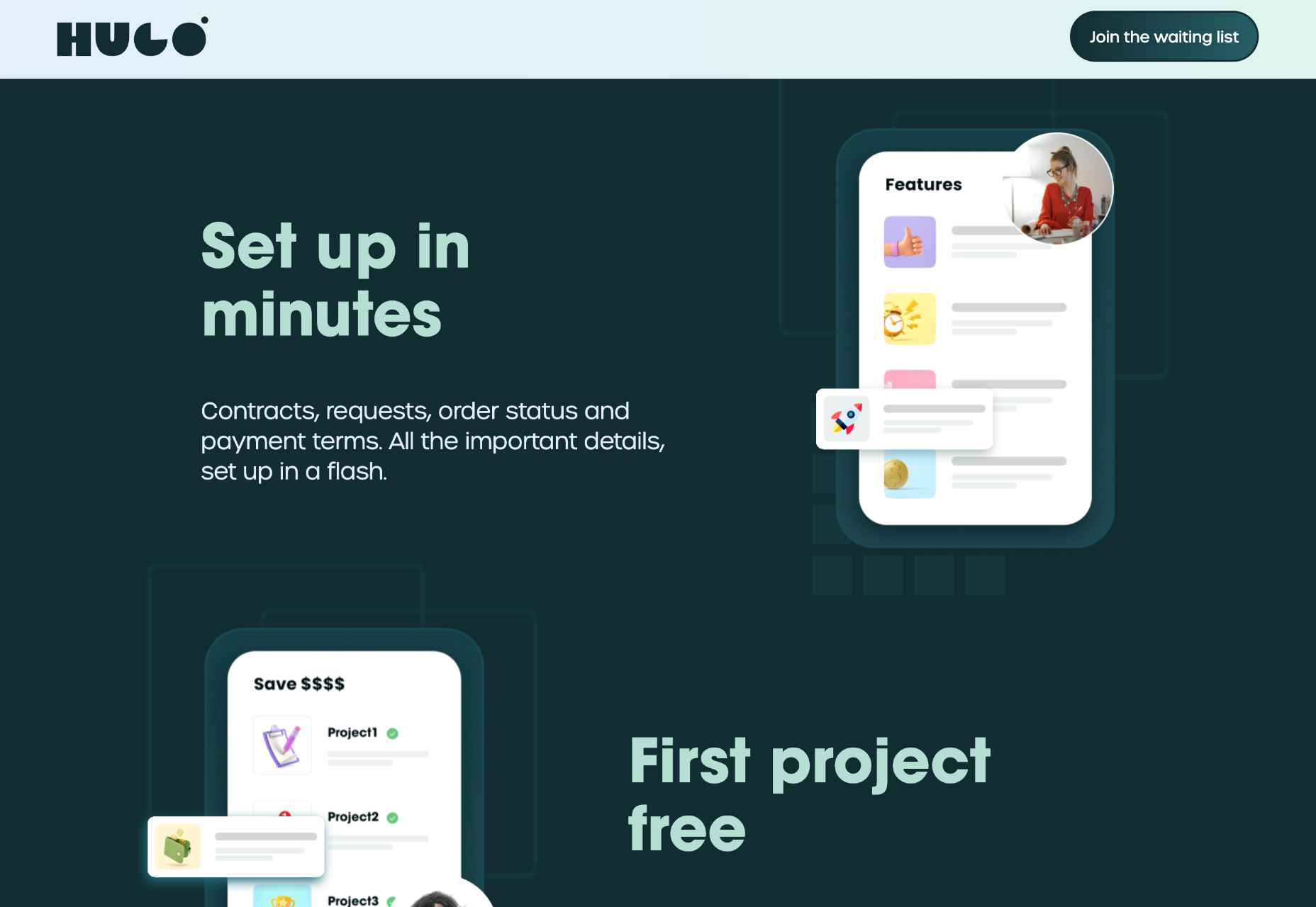
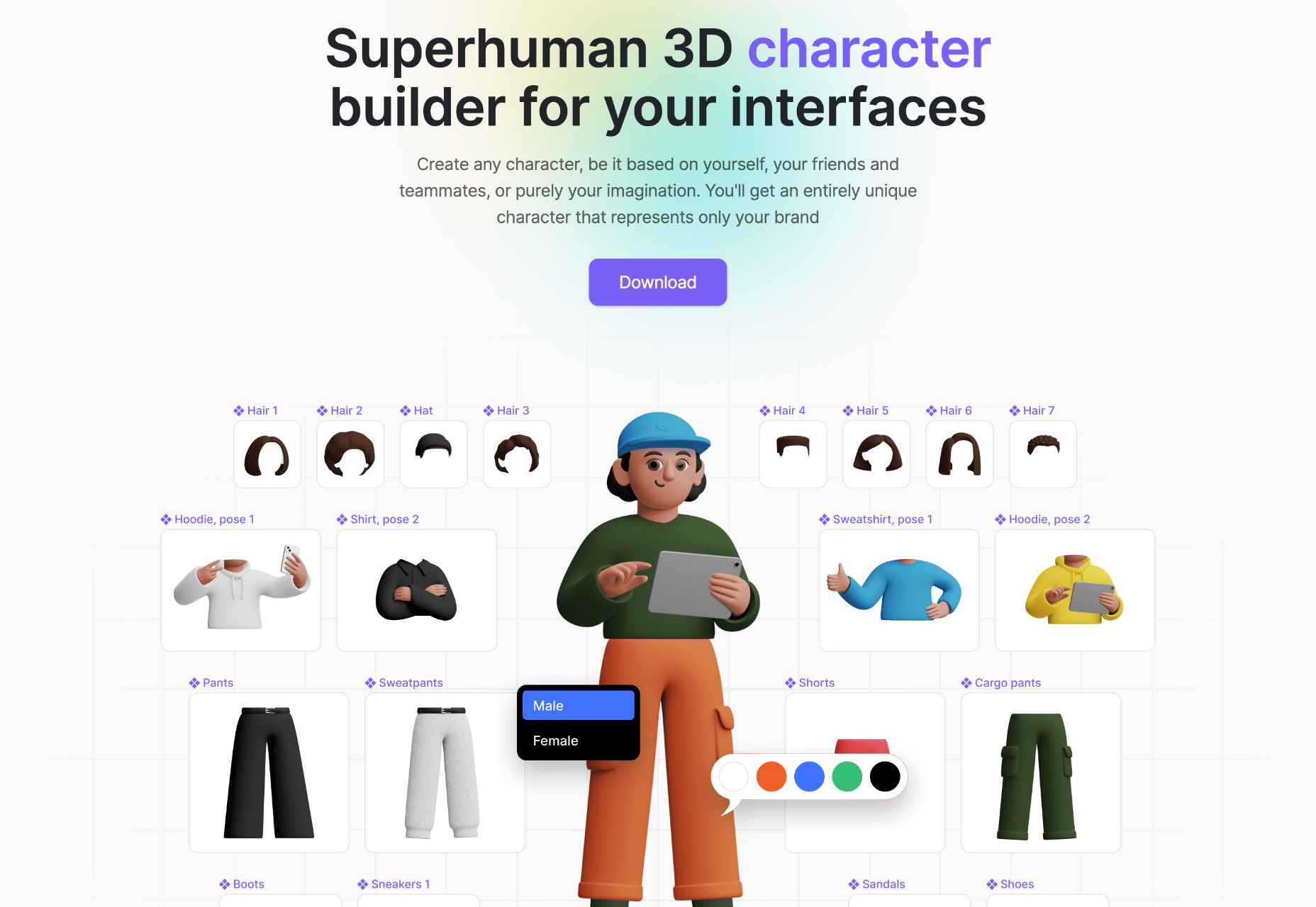
 The Summer’s over, and we’re back at our desks to discover that the web’s best app builders, font designers, asset creators, and developers have been hard at work to deliver this bumper collection of exciting new tools for designers and developers.
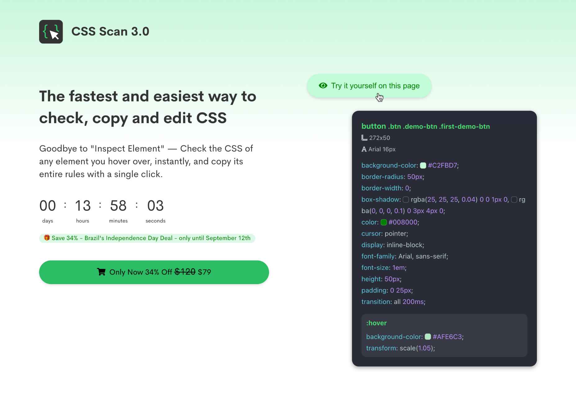









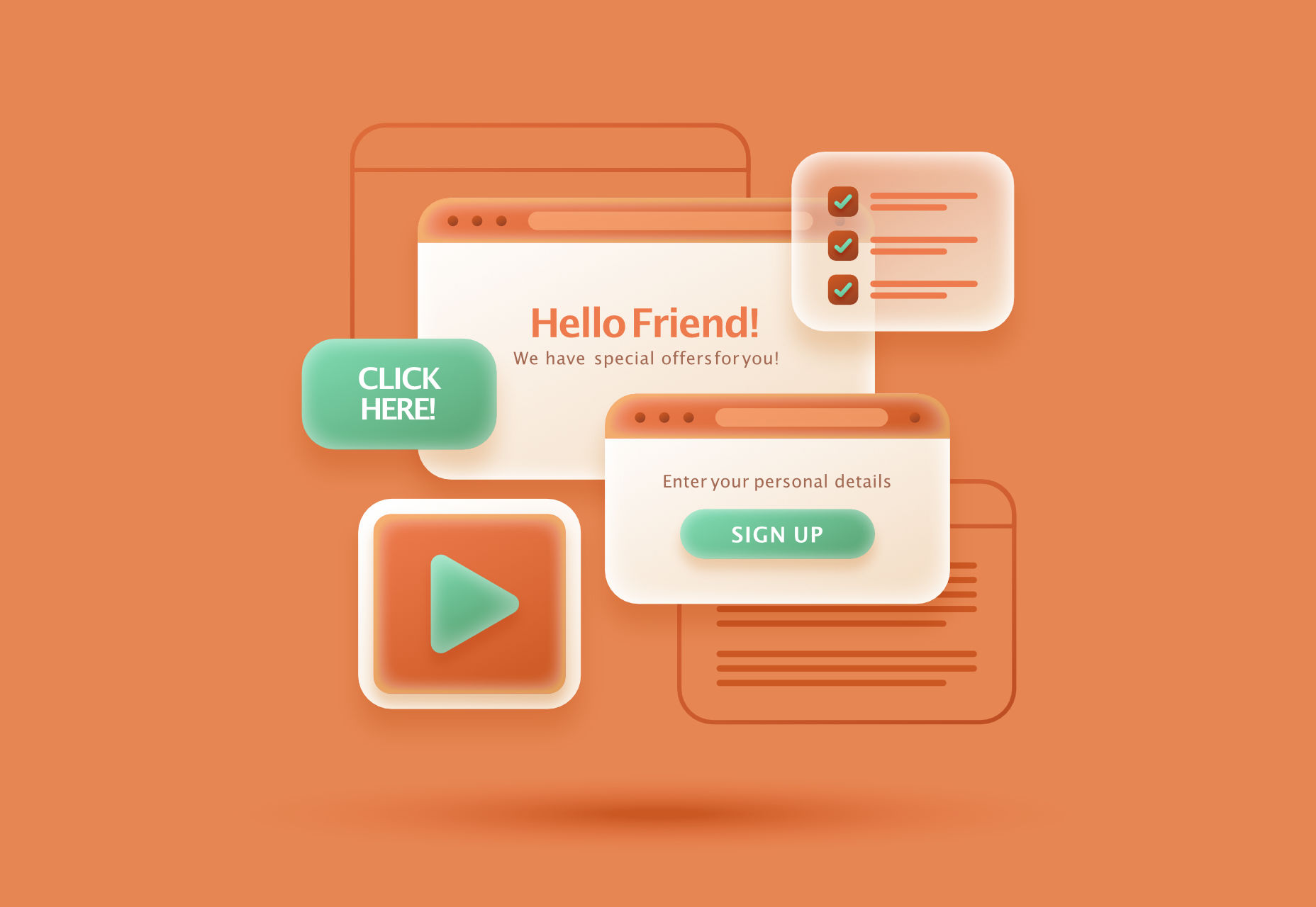 Modals, a nifty little feature that allows you to display different messages at the top of your website, have been touted as extremely useful. Some even claim that they are helpful enough to completely replace the banner ads we all hate so much. But are modals in web design a UX disaster?


![<p>[]</p>](https://assets.hongkiat.com/uploads/engagebay-crm/website-forms.jpg)


