BeTheme: The WordPress Theme that Follows the Latest Design Trends
Original Source: https://www.sitepoint.com/betheme-the-wordpress-theme-that-follows-the-latest-design-trends/
This article was created in partnership with BAWMedia. Thank you for supporting the partners who make SitePoint possible.
2018 may be one of the greatest years yet for web design and web designers. There are web designers who are looking to stay relevant by keeping up with the latest trends. They certainly have their work cut out for them. After all, it takes some time to get acquainted and comfortable with new trends. It also takes more time to find ways to incorporate them into website designs.
To make things worse, the latest trends have succeeded in raising the competitive bar. They have made the designer's work just that much more difficult.
Fortunately, there is a WordPress theme that has kept up with the latest in design. Here are examples of the 8 most stunning trends. BeTheme has incorporated them into their more than 330 pre-built websites.
8 Creative Design Trends BeTheme has Already Put to Use
Design Trend #1: Illustration & Graphic Art
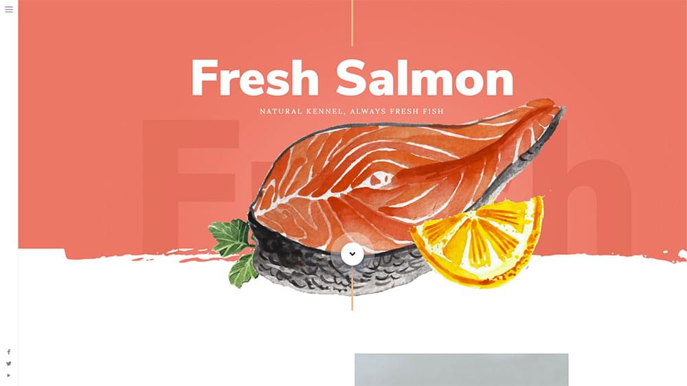
Custom art is currently all the rage in web design – and it doesn't appear to be going away any time soon. Eye-catching vintage watercolor illustrations have caught on. They bring that sense of nostalgia that makes people feel relaxed and comfortable.
BeSalmon
BeTea2
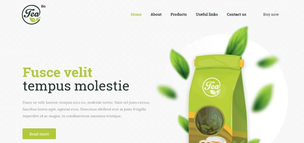
Notice the use of bold fonts (complete with serifs in the second example). It attracts attention without detracting from the illustrations.
Design Trend #2: Light, Shadow & Smoke
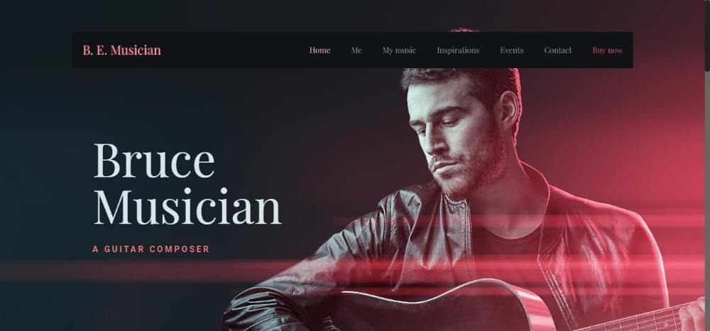
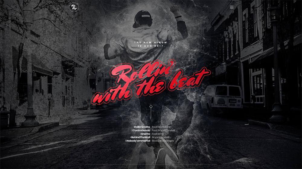
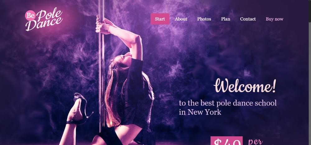
Playing with lights and shadows has always been a popular web design technique. When you add smoke to the mix the design trend takes on a whole new look with a different vibe, especially when it comes to music and dance.
The right mix of light, shadow, and smoke lead to a soft, romantic look:
BeMusician
Or a something a bit more dramatic:
BeHipHop
Or a perfect combination of sultry and classy…
BePole
Design Trend #3: Gradients aka Color Transitions
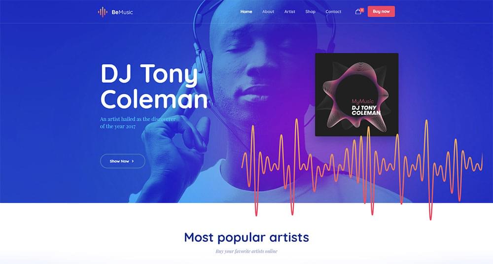
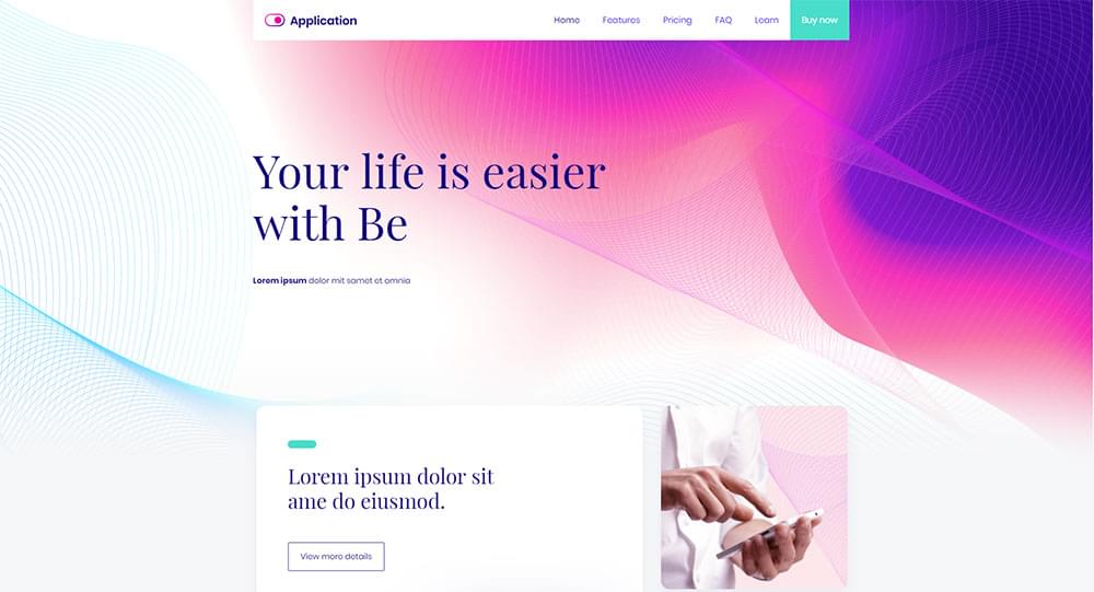
Gradients are hot. Even hotter than last year's use of bold colors. Gradients, or color transitions, work especially well with pastel colors. When they are allowed to clash with other design trends, the results can be surprising.
BeMusic2
BeApp3
Design Trend #4: 3D “Moving” Stills
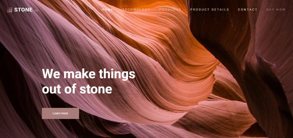
Creating a 3D "moving" still can be tough, but when done right it can be a genuine eye-catcher. Maybe it's because the illusion of the movement often attracts us more than movement itself. Here's a pair of examples where you can see the results for yourself – a 3D image that appears to flow.
BeStone
BeDigital
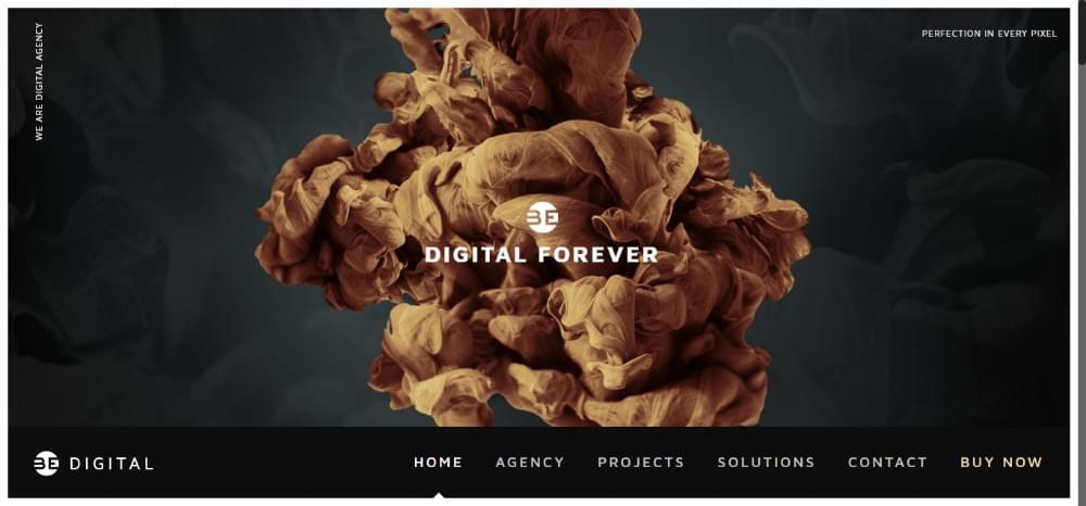
There's so much you can do with images like this. Give them any texture, play with light and shadow, make use of gradients or negative space. 3D moving stills combine nicely with many of the other trends to produce unique results.
Design Trend #5: 2018 Still Life
Still life has been popular for a long time. It's a trend that could likely go on forever, but that doesn't mean it can't be improved upon. The most popular form of modern still life is – you guessed it – 3D.
BeDietitian
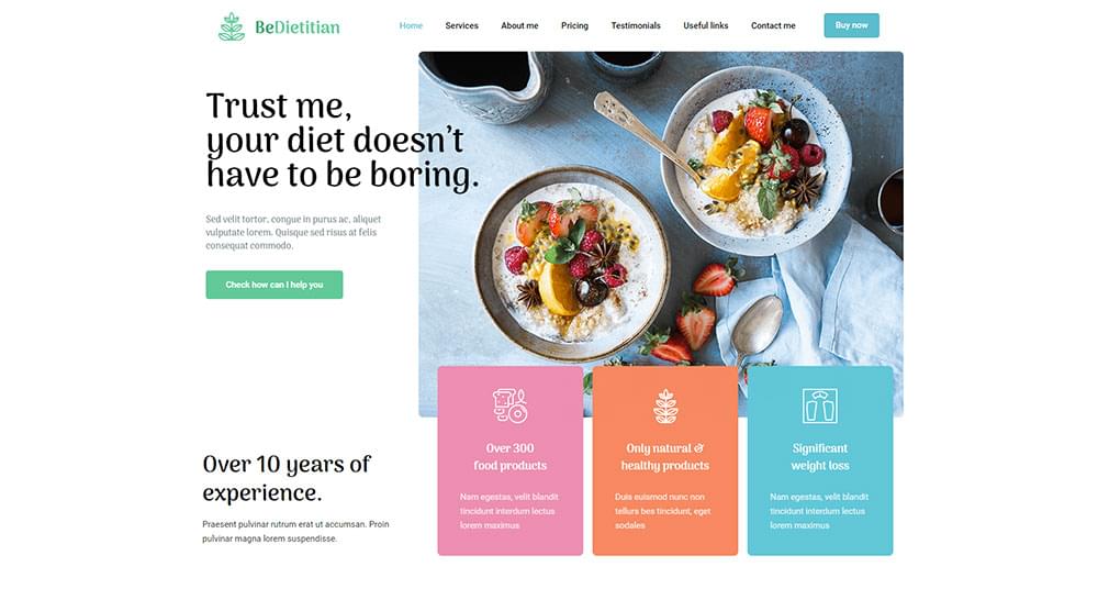
You can also use photography (or a 3D-photo combo). Here's a pair of examples that make extraordinary use of white space:
Continue reading %BeTheme: The WordPress Theme that Follows the Latest Design Trends%

Leave a Reply
Want to join the discussion?Feel free to contribute!