Original Source: http://feedproxy.google.com/~r/tympanus/~3/-PSOCyJKGIg/
Flash’s grandson, WebGL has become more and more popular over the last few years with libraries like Three.js, PIXI.js or the recent OGL.js. Those are very useful for easily creating a blank board where the only boundaries are your imagination. We see more and more, often subtle integration of WebGL in an interface for hover, scroll or reveal effects. Examples are the gallery of articles on Hello Monday or the effects seen on cobosrl.co.
In this tutorial, we’ll use Three.js to create a special gooey texture that we’ll use to reveal another image when hovering one. Head over to the demo to see the effect in action. For the demo itself, I’ve created a more practical example that shows a vertical scrollable layout with images, where each one has a variation of the effect. You can click on an image and it will expand to a larger version while some other content shows up (just a mock-up). We’ll go over the most interesting parts of the effect, so that you get an understanding of how it works and how to create your own.
I’ll assume that you are comfortable with JavaScript and have some knowledge of Three.js and shader logic. If you’re not, have a look at the Three.js documentation or The Book of Shaders, Three.js Fundamentals or Discover Three.js.
Attention: This tutorial covers many parts; if you prefer, you can skip the HTML/CSS/JavaScript part and go directly go to the shaders section.
Now that we are clear, let’s do this!
Create the scene in the DOM
Before we start making some magic, we are first going to mark up the images in the HTML. It will be easier to handle resizing our scene after we’ve set up the initial position and dimension in HTML/CSS rather than positioning everything in JavaScript. Moreover, the styling part should be only made with CSS, not JavaScript. For example, if our image has a ratio of 16:9 on desktop but a 4:3 ratio on mobile, we just want to handle this using CSS. JavaScript will only get the new values and do its stuff.
// index.html
<section class="container">
<article class="tile">
<figure class="tile__figure">
<img data-src="path/to/my/image.jpg" data-hover="path/to/my/hover-image.jpg" class="tile__image" alt="My image" width="400" height="300" />
</figure>
</article>
</section>
<canvas id="stage"></canvas>
// style.css
.container {
display: flex;
align-items: center;
justify-content: center;
width: 100%;
height: 100vh;
z-index: 10;
}
.tile {
width: 35vw;
flex: 0 0 auto;
}
.tile__image {
width: 100%;
height: 100%;
object-fit: cover;
object-position: center;
}
canvas {
position: fixed;
left: 0;
top: 0;
width: 100%;
height: 100vh;
z-index: 9;
}
As you can see above, we have create a single image that is centered in the middle of our screen. Did you notice the data-src and data-hover attributes on the image? These will be our reference images and we’ll load both of these later in our script with lazy loading.
Don’t forget the canvas. We’ll stack it below our main section to draw the images in the exact same place as we have placed them before.

Create the scene in JavaScript
Let’s get started with the less-easy-but-ok part! First, we’ll create the scene, the lights, and the renderer.
// Scene.js
import * as THREE from ‘three’
export default class Scene {
constructor() {
this.container = document.getElementById(‘stage’)
this.scene = new THREE.Scene()
this.renderer = new THREE.WebGLRenderer({
canvas: this.container,
alpha: true,
})
this.renderer.setSize(window.innerWidth, window.innerHeight)
this.renderer.setPixelRatio(window.devicePixelRatio)
this.initLights()
}
initLights() {
const ambientlight = new THREE.AmbientLight(0xffffff, 2)
this.scene.add(ambientlight)
}
}
This is a very basic scene. But we need one more essential thing in our scene: the camera. We have a choice between two types of cameras: orthographic or perspective. If we keep our image flat, we can use the first one. But for our rotation effect, we want some perspective as we move the mouse around.
In Three.js (and other libraries for WebGL) with a perspective camera, 10 unit values on our screen are not 10px. So the trick here is to use some math to transform 1 unit to 1 pixel and change the perspective to increase or decrease the distortion effect.
// Scene.js
const perspective = 800
constructor() {
// …
this.initCamera()
}
initCamera() {
const fov = (180 * (2 * Math.atan(window.innerHeight / 2 / perspective))) / Math.PI
this.camera = new THREE.PerspectiveCamera(fov, window.innerWidth / window.innerHeight, 1, 1000)
this.camera.position.set(0, 0, perspective)
}
We’ll set the perspective to 800 to have a not-so-strong distortion as we rotate the plane. The more we increase the perspective, the less we’ll perceive the distortion, and vice versa.
The last thing we need to do is to render our scene in each frame.
// Scene.js
constructor() {
// …
this.update()
}
update() {
requestAnimationFrame(this.update.bind(this))
this.renderer.render(this.scene, this.camera)
}
If your screen is not black, you are on the right way!
Build the plane with the correct sizes
As we mentioned above, we have to retrieve some additional information from the image in the DOM like its dimension and position on the page.
// Scene.js
import Figure from ‘./Figure’
constructor() {
// …
this.figure = new Figure(this.scene)
}
// Figure.js
export default class Figure {
constructor(scene) {
this.$image = document.querySelector(‘.tile__image’)
this.scene = scene
this.loader = new THREE.TextureLoader()
this.image = this.loader.load(this.$image.dataset.src)
this.hoverImage = this.loader.load(this.$image.dataset.hover)
this.sizes = new THREE.Vector2(0, 0)
this.offset = new THREE.Vector2(0, 0)
this.getSizes()
this.createMesh()
}
}
First, we create another class where we pass the scene as a property. We set two new vectors, dimension and offset, in which we’ll store the dimension and position of our DOM image.
Furthermore, we’ll use a TextureLoader to “load” our images and convert them into a texture. We need to do that as we want to use these pictures in our shaders.
We need to create a method in our class to handle the loading of our images and wait for a callback. We could achieve that with an async function but for this tutorial, let’s keep it simple. Just keep in mind that you’ll probably need to refactor this a bit for your own purposes.
// Figure.js
// …
getSizes() {
const { width, height, top, left } = this.$image.getBoundingClientRect()
this.sizes.set(width, height)
this.offset.set(left – window.innerWidth / 2 + width / 2, -top + window.innerHeight / 2 – height / 2)
}
// …
We get our image information in the getBoundingClientRect object. After that, we’ll pass these to our two variables. The offset is here to calculate the distance between the center of the screen and the object on the page.
// Figure.js
// …
createMesh() {
this.geometry = new THREE.PlaneBufferGeometry(1, 1, 1, 1)
this.material = new THREE.MeshBasicMaterial({
map: this.image
})
this.mesh = new THREE.Mesh(this.geometry, this.material)
this.mesh.position.set(this.offset.x, this.offset.y, 0)
this.mesh.scale.set(this.sizes.x, this.sizes.y, 1)
this.scene.add(this.mesh)
}
// …
After that, we’ll set our values on the plane we’re building. As you can notice, we have created a plane of 1 on 1px with 1 row and 1 column. As we don’t want to distort the plane, we don’t need a lot of faces or vertices. So let’s keep it simple.
But why scale it while we can set the size directly? Glad you asked.
Because of the resizing part. If we want to change the size of our mesh afterwards, there is no other proper way than this one. While it’s easier to change the scale of the mesh, it’s not for the dimension.
For the moment, we set a MeshBasicMaterial, just to see if everything is fine.
Get mouse coordinates
Now that we have built our scene with our mesh, we want to get our mouse coordinates and, to keep things easy, we’ll normalize them. Why normalize? Because of the coordinate system in shaders.

As you can see in the figure above, we have normalized the values for both of our shaders. So to keep things simple, we’ll prepare our mouse coordinate to match the vertex shader coordinate.
If you’re lost at this point, I recommend you to read the Book of Shaders and the respective part of Three.js Fundamentals. Both have good advice and a lot of examples to help understand what’s going on.
// Figure.js
// …
this.mouse = new THREE.Vector2(0, 0)
window.addEventListener(‘mousemove’, (ev) => { this.onMouseMove(ev) })
// …
onMouseMove(event) {
TweenMax.to(this.mouse, 0.5, {
x: (event.clientX / window.innerWidth) * 2 – 1,
y: -(event.clientY / window.innerHeight) * 2 + 1,
})
TweenMax.to(this.mesh.rotation, 0.5, {
x: -this.mouse.y * 0.3,
y: this.mouse.x * (Math.PI / 6)
})
}
For the tween parts, I’m going to use TweenMax from GreenSock. This is the best library ever. EVER. And it’s perfect for our purpose. We don’t need to handle the transition between two states, TweenMax will do it for us. Each time we move our mouse, TweenMax will update the position and the rotation smoothly.
One last thing before we continue: we’ll update our material from MeshBasicMaterial to ShaderMaterial and pass some values (uniforms) and shaders.
// Figure.js
// …
this.uniforms = {
u_image: { type: ‘t’, value: this.image },
u_imagehover: { type: ‘t’, value: this.hover },
u_mouse: { value: this.mouse },
u_time: { value: 0 },
u_res: { value: new THREE.Vector2(window.innerWidth, window.innerHeight) }
}
this.material = new THREE.ShaderMaterial({
uniforms: this.uniforms,
vertexShader: vertexShader,
fragmentShader: fragmentShader
})
update() {
this.uniforms.u_time.value += 0.01
}
We passed our two textures, the mouse position, the size of our screen and a variable called u_time which we will increment each frame.
But keep in mind that it’s not the best way to do that. For example, we only need to increment when we are hovering the figure, not every frame. I’m not going into details, but performance-wise, it’s better to just update our shader only when we need it.
The logic behind the trick & how to use noise
Still here? Nice! Time for some magic tricks.
I will not explain what noise is and where it comes from. If you’re interested, be sure to read this page from The Book of Shaders. It’s well explained.
Long story short, Noise is a function that gives us a value between -1 and 1 based on values we pass through. It will output a random pattern but more organic.
Thanks to noise, we can generate a lot of different shapes, like maps, random patterns, etc.


Let’s start with a 2D noise result. Just by passing the coordinate of our texture, we’ll have something like a cloud texture.

But there are several kinds of noise functions. Let’s use a 3D noise by giving one more parameter like … the time? The noise pattern will evolve and change over time. By changing the frequency and the amplitude, we can give some movement and increase the contrast.
It will be our first base.

Second, we’ll create a circle. It’s quite easy to build a simple shape like a circle in the fragment shader. We just take the function from The Book of Shaders: Shapes to create a blurred circle, increase the contrast and voilà!

Last, we add these two together, play with some variables, cut a “slice” of this and tadaaa:

We finally mix our textures together based on this result and here we are, easy peasy lemon squeezy!
Let’s dive into the code.
Shaders
We won’t really need the vertex shader here so this is our code:
// vertexShader.glsl
varying vec2 v_uv;
void main() {
v_uv = uv;
gl_Position = projectionMatrix * modelViewMatrix * vec4(position, 1.0);
}
ShaderMaterial from Three.js provides some useful default variables when you’re a beginner:
position (vec3): the coordinates of each vertex of our mesh
uv (vec2): the coordinates of our texture
normals (vec3): normal of each vertex our mesh have.
Here we’re just passing the UV coordinates from the vertex shader to fragment shader.
Create the circle
Let’s use the function from The Book of Shaders to build our circle and add a variable to handle the blurriness of our edges.
Moreover, we’ll add the mouse position to the origin of our circle. This way, the circle will be moving as long as we move our mouse over our image.
// fragmentShader.glsl
uniform vec2 u_mouse;
uniform vec2 u_res;
float circle(in vec2 _st, in float _radius, in float blurriness){
vec2 dist = _st;
return 1.-smoothstep(_radius-(_radius*blurriness), _radius+(_radius*blurriness), dot(dist,dist)*4.0);
}
void main() {
vec2 st = gl_FragCoord.xy / u_res.xy – vec2(1.);
// tip: use the following formula to keep the good ratio of your coordinates
st.y *= u_res.y / u_res.x;
vec2 mouse = u_mouse;
// tip2: do the same for your mouse
mouse.y *= u_res.y / u_res.x;
mouse *= -1.;
vec2 circlePos = st + mouse;
float c = circle(circlePos, .03, 2.);
gl_FragColor = vec4(vec3(c), 1.);
}
Make some noooooise
As we saw above, the noise function has several parameters and gives us a smooth cloudy pattern. How could we have that? Glad you asked.
For this part, I’m using glslify and glsl-noise, and two npm packages to include other functions. It keeps our shader a little bit more readable and avoids having a lot of displayed functions that we will not use after all.
// fragmentShader.glsl
#pragma glslify: snoise2 = require(‘glsl-noise/simplex/2d’)
//…
varying vec2 v_uv;
uniform float u_time;
void main() {
// …
float n = snoise2(vec2(v_uv.x, v_uv.y));
gl_FragColor = vec4(vec3(n), 1.);
}

By changing the amplitude and the frequency of our noise (exactly like the sin/cos functions), we can change the render.
// fragmentShader.glsl
float offx = v_uv.x + sin(v_uv.y + u_time * .1);
float offy = v_uv.y – u_time * 0.1 – cos(u_time * .001) * .01;
float n = snoise2(vec2(offx, offy) * 5.) * 1.;

But it isn’t evolving through time! It is distorted but that’s it. We want more. So we will use noise3d instead and pass a 3rd parameter: the time.
float n = snoise3(vec3(offx, offy, u_time * .1) * 4.) * .5;
As you can see, I changed the amplitude and the frequency to have the render I desire.
Alright, let’s add them together!
Merging both textures
By just adding these together, we’ll already see an interesting shape changing through time.

To explain what’s happening, let’s imagine our noise is like a sea floating between -1 and 1. But our screen can’t display negative color or pixels more than 1 (pure white) so we are just seeing the values between 0 and 1.

And our circle is like a flan.

By adding these two shapes together it will give this very approximative result:

Our very white pixels are only pixels outside the visible spectrum.
If we scale down our noise and subtract a small number, it will be completely moving down your waves until it disappears above the surface of the ocean of visible colors.

float n = snoise(vec3(offx, offy, u_time * .1) * 4.) – 1.;
Our circle is still there but not enough visible to be displayed. If we multiply its value, it will be more contrasted.
float c = circle(circlePos, 0.3, 0.3) * 2.5;

We are almost there! But as you can see, there are still some details missing. And our edges aren’t sharp at all.
To avoid that, we’ll use the built-in smoothstep function.
float finalMask = smoothstep(0.4, 0.5, n + c);
gl_FragColor = vec4(vec3(finalMask), 1.);
Thanks to this function, we’ll cut a slice of our pattern between 0.4 et 0.5, for example. The shorter the space is between these values, the sharper the edges are.
Finally, we can mix our two textures to use them as a mask.
uniform sampler2D u_image;
uniform sampler2D u_imagehover;
// …
vec4 image = texture2D(u_image, uv);
vec4 hover = texture2D(u_imagehover, uv);
vec4 finalImage = mix(image, hover, finalMask);
gl_FragColor = finalImage;
We can change a few variables to have a more gooey effect:
// …
float c = circle(circlePos, 0.3, 2.) * 2.5;
float n = snoise3(vec3(offx, offy, u_time * .1) * 8.) – 1.;
float finalMask = smoothstep(0.4, 0.5, n + pow(c, 2.));
// …
And voilà!
Check out the full source here or take a look at the live demo.
Mic drop
Congratulations to those who came this far. I haven’t planned to explain this much. This isn’t perfect and I might have missed some details but I hope you’ve enjoyed this tutorial anyway. Don’t hesitate to play with variables, try other noise functions and try to implement other effects using the mouse direction or play with the scroll!
If you have any questions, let me know in the comments section! I also encourage you to download the demo, it’s a little bit more complex and shows the effects in action with hover and click effects ¯_(?)_/¯
References and Credits
Images from Unsplash
Three.js
GSAP from GreenSock
Smooth Scrollbar
glslify
glsl-noise
Making Gooey Image Hover Effects with Three.js was written by Arno Di Nunzio and published on Codrops.

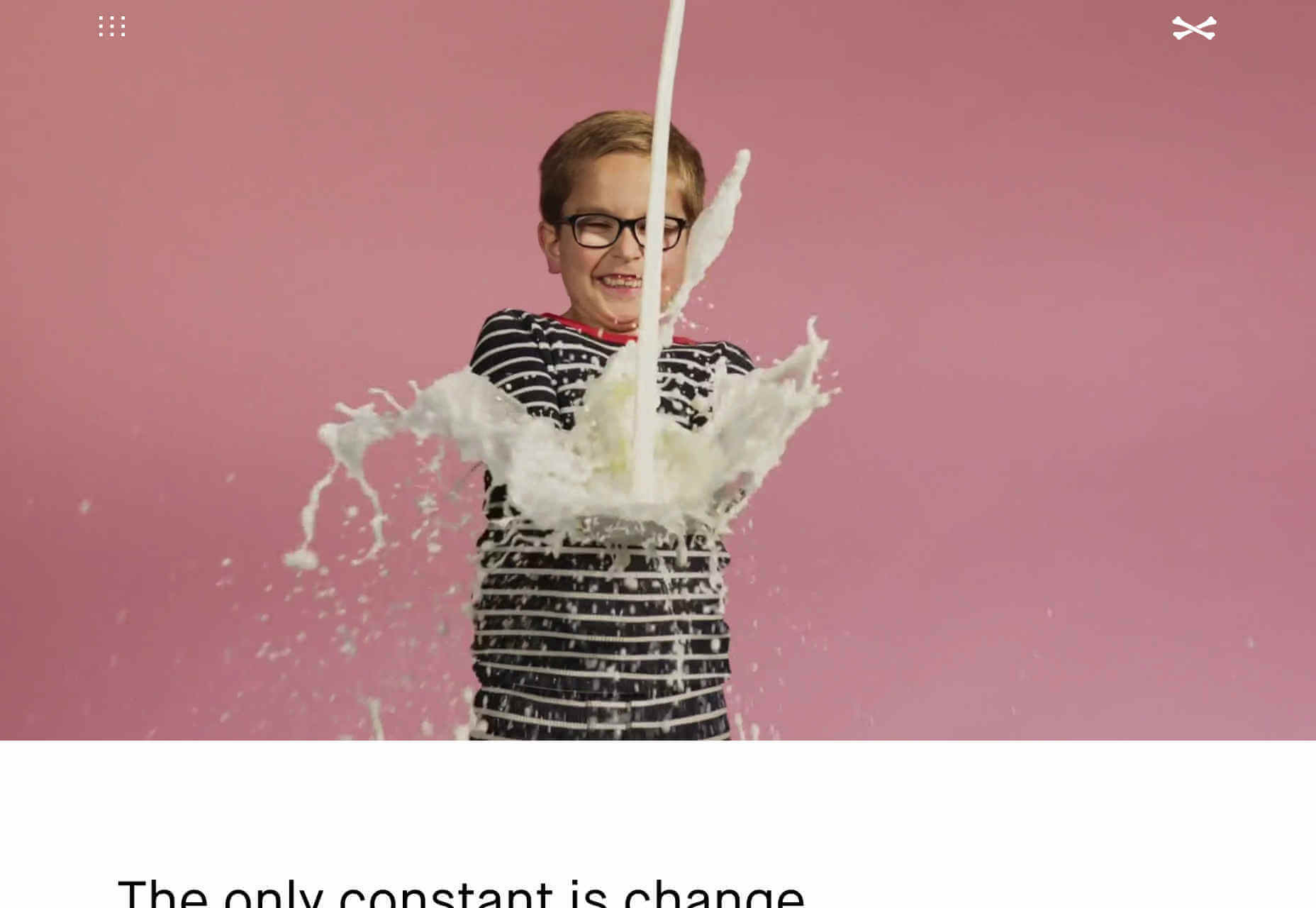
 Once in a while, every professional comes across a challenge so great, so ridiculous, that they just can’t help themselves. They just have to go for it. It’s like the story of David and Goliath… if David was just bored and Goliath wasn’t threatening his entire nation. As for me, I’m about to argue for putting sounds on a website, and discuss how to do it right.


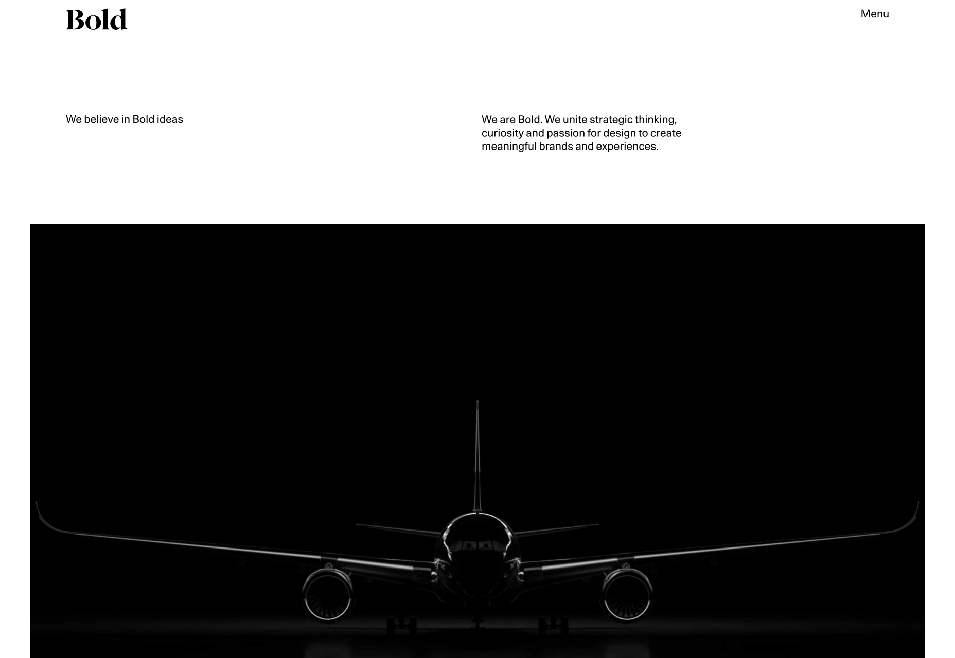
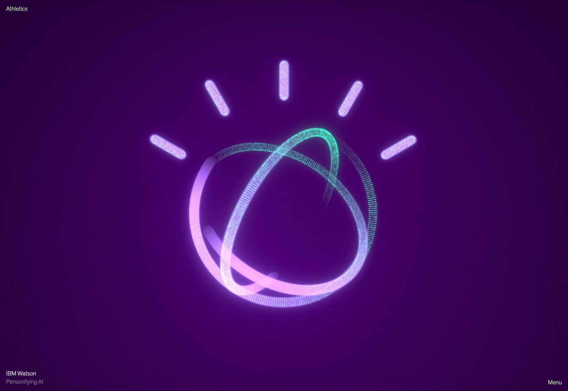
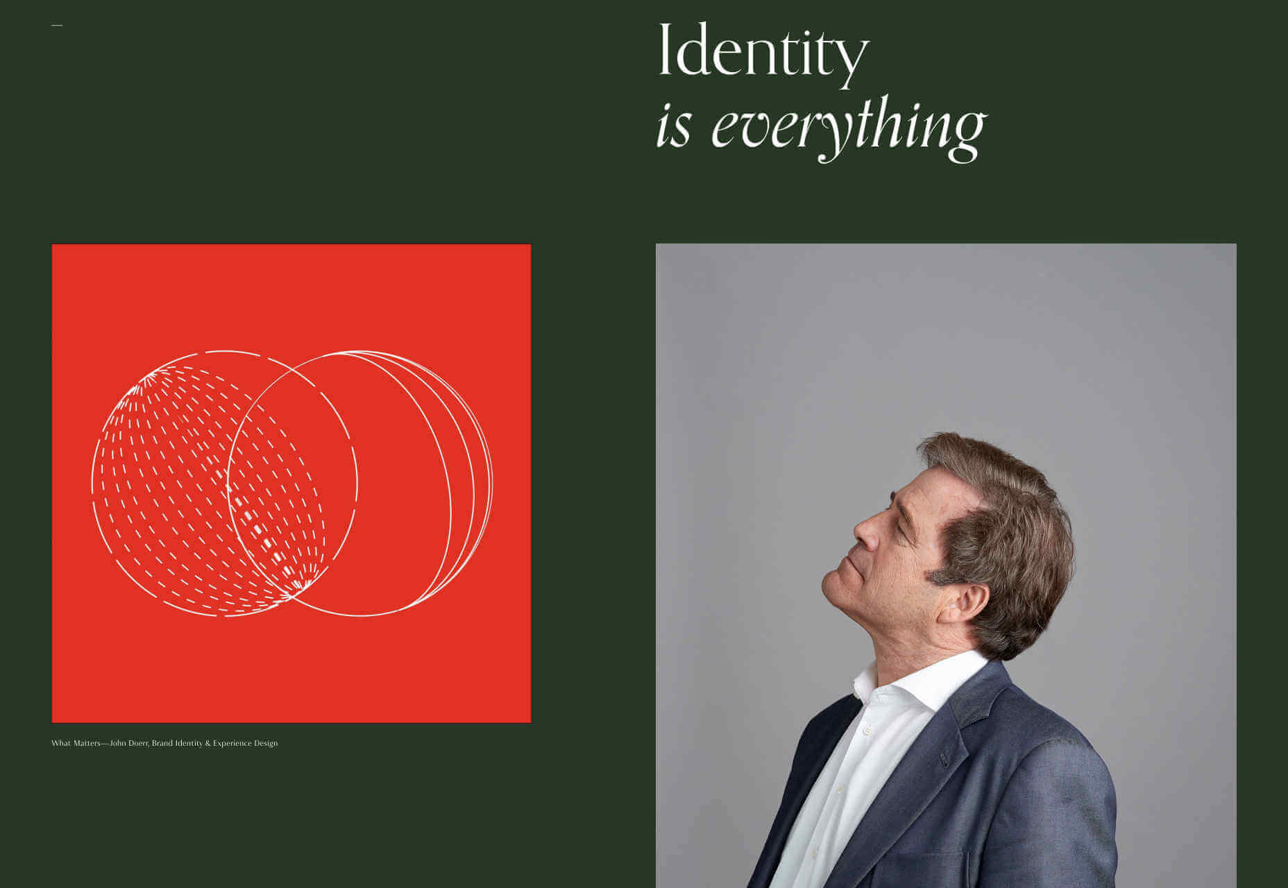
 All the signs are that web design is entering a phase of exuberance, with clashing colors, rapidly changing graphics, and dense layouts replacing the minimalism that’s dominated digital design for the last decade. Portfolios are beginning to adopt this maximalist approach, but never fear, for those who aren’t quote ready for full-on retina burn on a Monday in late October, we’ve included a few beautifully minimal sites for you to enjoy.
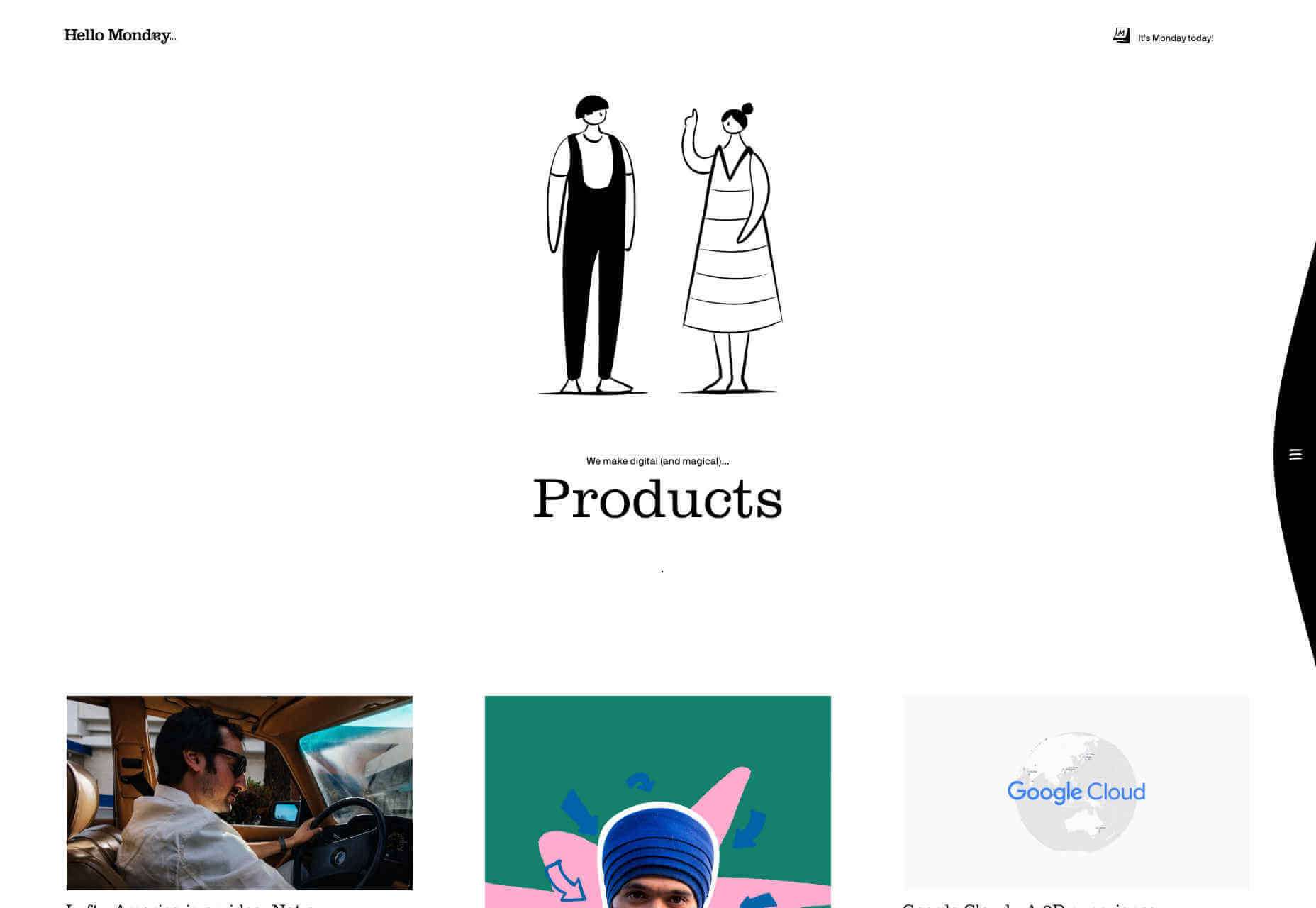


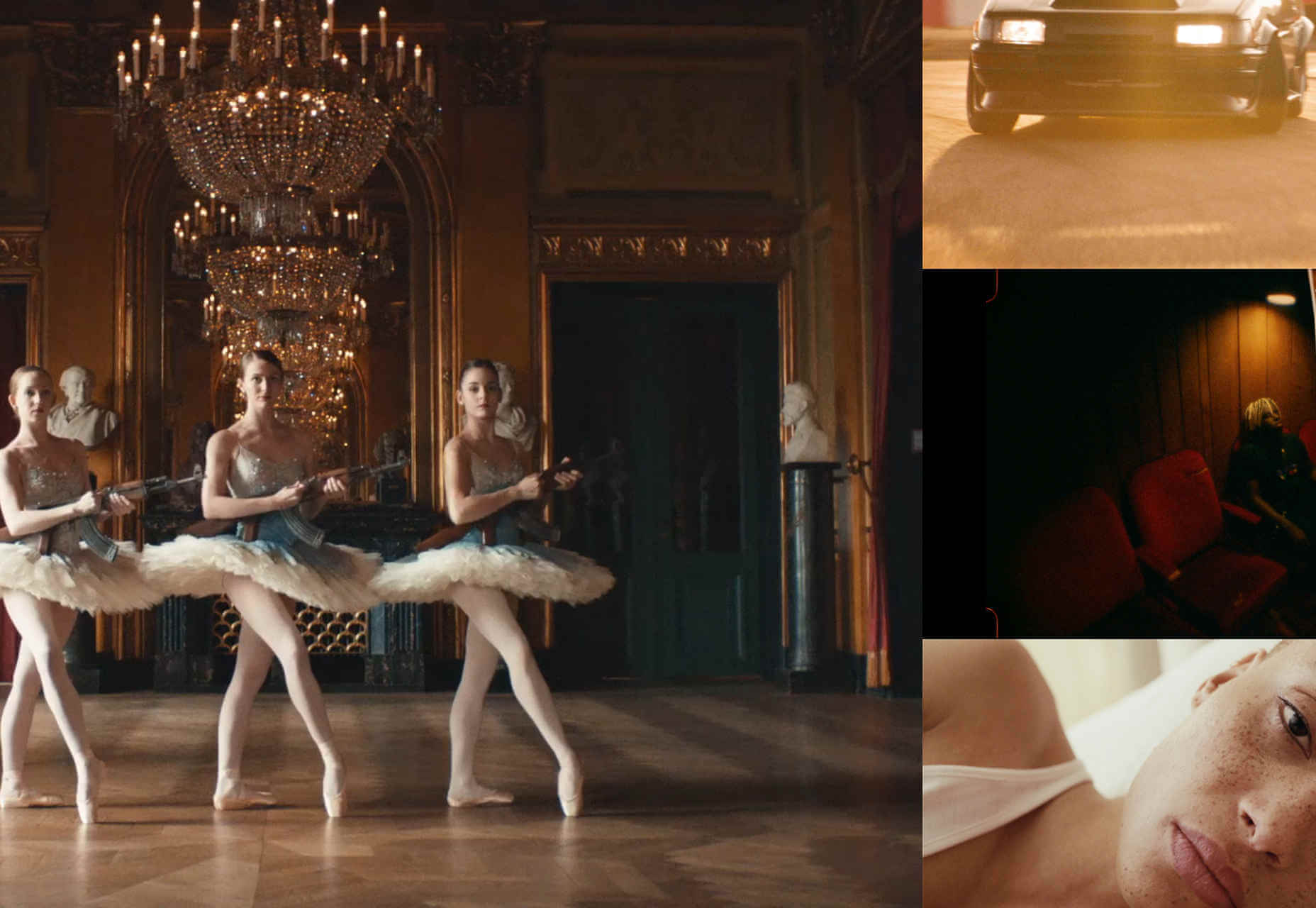

 By Ars Thanea