Original Source: https://www.smashingmagazine.com/2020/04/skeleton-screens-react/
Implementing Skeleton Screens In React
Implementing Skeleton Screens In React
Blessing Krofegha
2020-04-20T10:00:00+00:00
2020-04-20T16:34:50+00:00
Spinners and loaders have traditionally been the way to tell users that content is going to take a while to load. While this approach is great, it’s quickly becoming obsolete in modern development. Skeleton screens are becoming the perfect replacement for traditional loaders because they focus on progress rather than wait times, hence reducing loading-time frustration.
In this article, we won’t be going through the basics of CSS React or JavaScript syntax, so you don’t have to be an expert in either of these languages to follow along.
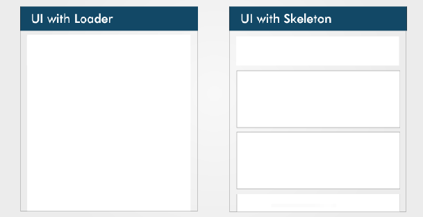 The difference between a loader and a skeleton screen UI (Large preview)
UI and UX experts teach us that, while users wait for content to load on a page, we should keep them engaged.
The idea behind using spinners to engage users before content loads is great; however, the result can be less than ideal because most users will get bored staring at a dummy animated spinner like it’s a clock. Luke Wroblewski elaborates on this.
Skeleton screens offer a better user experience by reducing loading-time frustration. By focusing on progress instead of wait times, it create the illusion for users that information will be incrementally displayed on the screen. Bill Chung in his research confirms this.
What Is a Skeleton Screen?
A skeleton screen is a version of the UI that doesn’t contain actual content; instead, it mimics the page’s layout by showing its elements in a shape similar to the actual content as it is loading and becoming available (i.e. when network latency allows).
A skeleton screen is essentially a wireframe of the page, with placeholder boxes for text and images.
What’s Unique About a Skeleton Screen?
A skeleton UI resembles the page’s actual UI, so users will understand how quickly the web or mobile app will load even before the content has shown up. Here are a couple of reasons why you might want to consider using skeleton screens in your next project:
mimicking a page’s layout is easier with a skeleton screen,
contents loads progressively (not all at once).
Skeleton screens are also referred to as:
ghost elements,
content placeholders,
content loaders.
Blockchain.com, YouTube, Facebook, Medium, and other big tech companies display skeleton screens while their content loads to boost the UX.
Blockchain.com
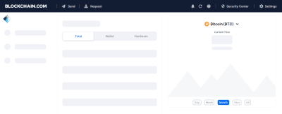
Blockchain.com’s partially loaded state (notice how a skeleton is used in the graph analytics) (Large preview)
Medium
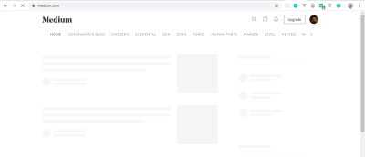
Medium’s skeleton UI (Large preview)
LinkedIn
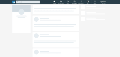
LinkedIn’s home feed loading state in 2018 (Large preview)
Types of Skeleton Screens
There are different kinds of skeleton screens. The major ones are text placeholders and image (or color) placeholders.
Most developers prefer to use text placeholders as the skeleton UI on their pages because they’re easy to build, and the developer doesn’t require any details about the substance of the actual content; instead the skeleton mimics the UI.
Color placeholders are harder to build because they require details about the content.
Some popular packages make implementing skeleton screens in web apps easier. Let’s take a closer look at both of them:
React Placeholder
React Loading Skeleton
We’ll look at the pros and cons of each package, before considering which to use for our application.
React Placeholder
Pros
Placeholder components are used to create a custom skeleton UI.
Pulse animation (i.e. motion effect on an element) is supported.
It comes with a component-based API.
Cons
Skeleton components are maintained separately, so updating styles of a component possibly requires updating the skeleton component as well.
The learning curve is not linear because there are multiple components for different needs.
The following is an example of a skeleton component using the react-placeholder package:
import { TextBlock, RectShape } from ‘react-placeholder/lib/placeholders’;
import ReactPlaceholder from ‘react-placeholder’;
const GhostPlaceholder = () => (
<div className=’my-placeholder’>
<RectShape color=’gray’ style={{width: 25, height: 70}} />
<TextBlock rows={6} color=’blue’/>
</div>
);
<ReactPlaceholder ready={ready} customPlaceholder={<GhostPlaceholder />}>
<MyComponent />
</ReactPlaceholder>
Importing TextBlock and RectShape from react-placeholder/lib/placeholder and ReactPlaceholder from react-placeholder, we’ve created a functional component named GhostPlaceholder. GhostPlaceholder has a div, and inside the div we’ve used the RectShape component, which describes the dimensions of a rectangle, passes the value of any color, and defines the rectangle’s styles.
Next, we used the TextBlock component to set the values for the rows and color. The TextBlock component defines the number of rows and color of text.
We pass MyComponent as a child of the ReactPlaceholder component, which receives ready and the GhostPlaceholder component as values for its ready and customPlaceholder props.
The MyComponent will load when the skeleton screen UI is shown.
To learn more, check the documentation.
React Loading Skeleton
Pros
It is API-based, and it has one component with props for all customization.
It can be used as a separate skeleton component and also inside any component directly, so it’s flexible.
It supports theming and Pulse animation.
Cons
It’s easy to implement for a simple skeleton UI, but complicated for more complex skeletons.
Having a separate skeleton component will make it harder to maintain when the UI and styles change.
The following is an example of React Loading Skeleton:
import Skeleton, { SkeletonTheme } from “react-loading-skeleton”;
const SkeletonComponent = () => (
<SkeletonTheme color=”#202020″ highlightColor=”#444″>
<section>
<Skeleton height={50} width={50} />
</section>
</SkeletonTheme>
);
We’ve imported Skeleton and SkeletonTheme from the react-loading-skeleton library, then created a functional component that renders the SkeletonTheme component, with color and hightlightColor as properties.
The SkeletonTheme component is used for theming (for example, adding color effects to the skeleton UI).
Finally, inside the section, we define the Skeleton component, with height and width properties and their appropriate values passed in.
Building a YouTube-Like Skeleton Screen UI
Let’s create a YouTube-like skeleton screen, using React Loading Skeleton, to show how a skeleton UI works.
Set Up React
The easiest way to set up React is to use Create React App, which is “an officially supported way to create single-page React applications. It offers a modern build setup with no configuration.”
We’ll use it to bootstrap the application that we’ll be building. From your terminal, run the command below:
npx create-react-app skeleton-screens && cd skeleton-screens
Once the installation has completed, start the React server by running npm start:
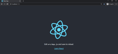
React welcome page (Large preview)
Create the YouTube UI Without a Skeleton Screen
First, let’s input YouTube dummy data. Real endpoints would normally be used instead of dummy data, but in this tutorial we will use dummy data.
Create a file in your src/ folder, and name it data.js, add the following code to it.
const dummyData= [
{
section: “Recommended”,
channel: “CNN”,
items: [
{
id: “fDObf2AeAP4”,
image: “https://img.youtube.com/vi/fDObf2AeAP4/maxresdefault.jpg”,
title: “75 million Americans ordered to stay home”,
views: “1.9M views”,
published: “3 days agos”
},
{
id: “3AzIgAa0Cm8”,
image: “https://img.youtube.com/vi/3AzIgAa0Cm8/maxresdefault.jpg”,
title: “Gupta: The truth about using chloroquine to fight coronavirus pandemic”,
views: “128K views”,
published: “4 hours ago”
},
{
id: “92B37aXykYw”,
image: “https://img.youtube.com/vi/92B37aXykYw/maxresdefault.jpg”,
title: “Willie Jones STUNS Simon Cowell In Pitch Perfect Performance of ‘Your Man’!”,
views: “2.47 million views”,
published: “1 month ago”
},
{
id: “J6rVaFzOEP8”,
image: “https://img.youtube.com/vi/J6rVaFzOEP8/maxresdefault.jpg”,
title: “Guide To Becoming A Self-Taught Software Developer”,
views: “104K views”,
published: “17 days ago”
},
{
id: “Wbk8ZrfU3EM”,
image: “https://img.youtube.com/vi/Wbk8ZrfU3EM/maxresdefault.jpg”,
title: “Tom Hanks and Rita Wilson test positive for coronavirus”,
views: “600k views”,
published: “1 week ago”
},
{
id: “ikHpFgKJax8”,
image: “https://img.youtube.com/vi/ikHpFgKJax8/maxresdefault.jpg”,
title: “Faces Of Africa- The Jerry Rawlings story”,
views: “2.3 million views”,
published: “2014”
}
]
},
{
section: “Breaking News”,
channel: “CGTN America”,
items: [
{
id: “tRLDPy1A8pI”,
image: “https://img.youtube.com/vi/tRLDPy1A8pI/maxresdefault.jpg”,
title: “Is Trump blaming China for COVID-19? You decide.”,
views: “876k views”,
published: “9 days ago”
},
{
id: “2ulH1R9hlG8”,
image: “https://img.youtube.com/vi/2ulH1R9hlG8/maxresdefault.jpg”,
title: “Journalist still goes to office during pandemic, see her daily routine”,
views: “873 views”,
published: “3 hours ago”
},
{
id: “_TkfQ9MaIgU”,
image: “https://img.youtube.com/vi/_TkfQ9MaIgU/maxresdefault.jpg”,
title: “How are small businesses going to survive the economic downturn of the COVID-19 era?”,
views: “283 views”,
published: “4 day ago”
}
]
}
];
export default dummyData;
To replicate YouTube’s format, we’ve created dummy data that has an array of objects, with properties such as ID, image, title, number of views, and publication date.
Next, let’s create our YouTube UI. We will have three components:
Card
Holds the details of the video’s thumbnail, title, number of views, publication date, and channel.
CardList
Returns all cards in a row.
App
Mounts our dummyData object, loads the skeleton UI for two seconds, and returns the CardList component.
Inside your src folder, create a folder and name it components. Inside the components folder, create a Card.js file, add the following code to it:
import React from “react”;
const Card = ({ item, channel }) => {
return (
<li className=”card”>
<a
href={`https://www.youtube.com/watch?v=${item.id}`}
target=”_blank”
rel=”noopener noreferrer”
className=”card-link”
>
<img src={item.image} alt={item.title} className=”card-image” />
<img src={item.image} alt={item.title} className=”channel-image” />
<h4 className=”card-title”>{item.title}</h4>
<p className=”card-channel”>
<i>{channel}</i>
</p>
<div className=”card-metrics”>
{item.views} • {item.published}
</div>
</a>
</li>
);
};
export default Card;
We created a Card component. Inside it, we imported React from react, and we deconstructed the item and channel props so that they can be used across the Card component. Each Card item component that displays one video will show the thumbnail, number of views, publication date, and title.
CardList Component
Inside the components folder, create a CardList.js file and add the following code to it:
import React from “react”;
import Card from “./Card”;
const CardList = ({ list }) => {
return (
<ul className=”list”>
{list.items.map((item, index) => {
return <Card key={index} item={item} channel={list.channel} />;
})}
</ul>
);
};
export default CardList;
In this component, we’ve imported the Card component that we created. The card accepts the item and channel props, which we get by mapping through the list.items. We then export this component as CardList, because we’ll be making use of it in our App component.
Note: The items array that is mapped in this component is the array of objects in our dummyData.
App Component
Inside the app.js file in the src/ directory, delete the code that is there and add the following to it.
import React, { useState, useEffect } from “react”;
import “./App.css”;
import dummyData from “./data”;
import CardList from “./components/CardList”;
const App = () => {
const [videos, setVideos] = useState([]);
const [loading, setLoading] = useState(false);
useEffect(() => {
setLoading(true);
const timer = setTimeout(() => {
setVideos(dummyData);
setLoading(false);
}, 5000);
return () => clearTimeout(timer);
}, []);
return (
<div className=”App”>
{
videos.map((list, index) => {
return (
<section key={index}>
<h2 className=”section-title”>{list.section}</h2>
<CardList list={list} />
<hr />
</section>
);
})}
</div>
);
};
export default App;
In this component, we’ve imported the useState and useEffect hooks alongside React and the other files that we’ve created and that will be needed in the App component.
Because our data is dummy data, we need to mock it up like the API data by loading the content after a two-second timeout, using the JavaScript setTimeout method.
Next, in the App component, we create a video state, and set the state to an empty array using useState.
To load our dummy data, we’ll use the useEffect hook. In our hook, we create a variable timer that holds the setTimeout() function. Inside the function, we set our video state to our dummyData object, and we ensure that the data loads after two seconds, and, lastly, we cancel the timer while unmounting.
Finally, we map through our video state and return the section element that contains the list-section and the CardList component with its list props.
Adding CSS
Until now, we’ve used a lot of classes without actual CSS. Inside the src folder, delete everything in App.css and replace it with the following code;
.App {
max-width: 960px;
margin: 0 auto;
font-size: 16px;
}
.list {
display: flex;
justify-content: space-between;
flex-wrap: wrap;
list-style: none;
padding: 0;
}
.section-title {
margin-top: 30px;
}
.card {
width: calc(33% – 10px);
margin: 20px 0;
}
.card-link {
color: inherit;
text-decoration: none;
}
.card-image {
width: 100%;
}
.channel-image {
border-radius: 100%;
padding: 0, 10px, 0, 0;
width: 40px;
height: 40px;
}
.card-title {
margin-top: 10px;
margin-bottom: 0;
}
.card-channel {
margin-top: 5px;
margin-bottom: 5px;
font-size: 14px;
}
/* Tablets */
@media (max-width: 1000px) {
.App {
max-width: 600px;
}
.card {
width: calc(50% – 22px);
}
}
/* Mobiles */
@media (max-width: 640px) {
.App {
max-width: 100%;
padding: 0 15px;
}
.card {
width: 100%;
}
}
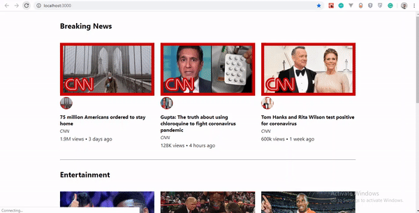
Let’s see what our YouTube UI looks like without the skeleton screen. You can see that when the page loads, a white screen appears for two seconds, and then the data loads promptly.
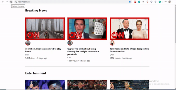 YouTube-Like UI without skeleton screen (Large preview)
Using React Loading Skeleton
Unlike other libraries in which you would meticulously craft a skeleton screen to match the font sizes, line heights and margins of your content, the Skeleton component is designed to be used directly in your components, in place of the content that is loading.
Let’s go over a few reasons why we’ve chosen React Loading Skeleton over others.
Theming
React Loading Skeleton supports theming. Thus, you can easily change the colors of all skeleton components by using SkeletonTheme and pass values to the color props.
Below is an example showing how it works:
import Skeleton, { SkeletonTheme } from “react-loading-skeleton”;
<SkeletonTheme color=”grey” highlightColor=”#444″>
<p>
<Skeleton height={250} width={300} count={1} />
</p>
</SkeletonTheme>
<SkeletonTheme color=”#990″ highlightColor=”#550″>
<p>
<Skeleton height={250} width={300} count={1} />
</p>
</SkeletonTheme>
 Theming effect in action (Large preview)
Duration
In addition to the height, width, and color props, we can also specify a duration prop.
<Skeleton duration={2} />
The duration defaults to 1.2. This determines how long it takes to do one cycle of the skeleton animation.
To learn more, check out the documentation.
Implementing Skeleton Screen UI
Now, we’ll install react-loading-skeleton. Run the following command in your terminal to install the package:
npm install react-loading-skeleton
Skeleton Component
Let’s create a skeleton component for our video data. Inside our components folder, create a SkeletonCard.js file, and add the following code:
import React from “react”;
import Skeleton from “react-loading-skeleton”;
const SkeletonCard = () => {
return (
<section>
<h2 className=”section-title”>
<Skeleton height={30} width={300} />
</h2>
<ul className=”list”>
{Array(9)
.fill()
.map((item, index) => (
<li className=”card” key={index}>
<Skeleton height={180} />
<h4 className=”card-title”>
<Skeleton circle={true} height={50} width={50} />
<Skeleton height={36} width={`80%`} />
</h4>
<p className=”card-channel”>
<Skeleton width={`60%`} />
</p>
<div className=”card-metrics”>
<Skeleton width={`90%`} />
</div>
</li>
))}
</ul>
</section>
);
};
export default SkeletonCard;
We’ve created an unordered list. Inside it, we’ve used the Array.fill() method. Because we have nine items of dummy data, we’ve used the Array.fill() method to loop through the length of our items object and filled it with no index value, hence making our array empty. See the Array.fill documentation to learn how it works.
Next, we mapped through our empty array to return a list containing the skeleton properties, and we specified the value of each of the skeleton properties.
Here, height connotes the length of a skeleton rectangle, and width refers to the breadth, while circle creates the rounded part of the skeleton UI.
React Loading Skeleton comes with default Pulse animation, which makes it handy. You could create Pulse animation to suit your project, but if you ask me, I would stick with the default.
Finally, the complete source code is available.
We now have a fully functional skeleton screen UI. Our example shows the skeleton for five seconds before showing the content.
Let’s see our result thus far:
 Our YouTube-like skeleton UI (Large preview)
Conclusion
Skeleton screens tremendously improve the user experience by avoiding the frustration of facing an entirely blank screen and giving the user an impression of what content will look like before it loads.
If you aren’t comfortable with any of the packages we’ve looked at, you can create your own skeleton UI by making rectangles and circles that mimic the page’s layout.
Please do share your feedback and experience with in the comments section below. I’d love to see what you come up with!
The supporting repo for this article is available on Github.
References
“Everything You Need to Know About Skeleton Screens”, Bill Chung, UX Collective
“Skeleton Loading Pages With React”, Anthony Panagi, Octopus Wealth
“Skeleton Screens With React And React Native”, Chris Dolphin, Alligator.io
“Implementing Skeleton Loading In React ”, Adrian Bece, DEV

(ks, il, al)