Original Source: https://ecommerce-platforms.com/articles/how-to-become-a-shopify-expert
You may have heard of the Shopify Experts marketplace and considered it as a way to make money selling your services. If that’s the case, it’s essential to understand the fundamentals of the marketplace and what it takes to become a Shopify Expert. Whether you’re a Shopify developer, designer, industry authority, or someone with unique Ecommerce experience, it’s possible that you may fit into the Shopify Partners and Experts ecosystem. In this article, we outline everything you need to know about how to become a Shopify Expert.
We’ll cover:
What a Shopify Expert IsThe Benefits of Becoming a Shopify ExpertCategories of Shopify ExpertsThe Differences Between Shopify Experts and Shopify PartnersPrerequisites to Becoming a Shopify ExpertThe Shopify Experts Application Process
Keep reading to start your journey as a Shopify Expert!
What’s a Shopify Expert?

As an ecommerce platform, Shopify sells its products and services to online store owners. These are users who often require contract work for things like web design, web development, writing, marketing, and business development. So, Shopify created a marketplace for agencies, freelancers, digital marketers, and developers to list their services and connect with Shopify store owners.
They call the marketplace Shopify Experts.
The Shopify Experts marketplace works alongside the Shopify Partner program, which is the actual community and site management system. Shopify Partners also provides unlimited access to development stores for passing over to clients, and it often comes into play when selling your services on Shopify Experts.
Overall, a Shopify Expert is:
A freelancer, agency, or contract worker that sells its services to Shopify customers. Experienced with Shopify, or willing to learn. Some Expert categories—like writers or marketers—don’t require advanced programming knowledge of the Shopify platform, but you must still know your way around the interface. A participant of the Shopify Partners program and with a proven track record of clients. A freelancer or agency with a solid portfolio of past work. Available for work in one of the Shopify Experts categories.
Categories of Shopify Experts
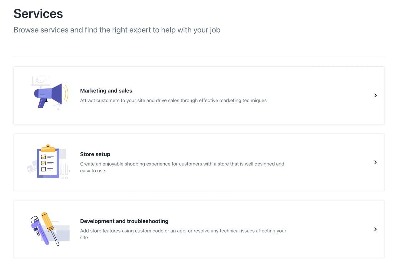
The Shopify Experts marketplace provides a long list of categories for its Experts, allowing you to choose some of those categories for users to find you based on the work they require.
That means you can become an Expert in any of the following categories and sub-categories:
Marketing and sales: Email marketingSEOSearch engine advertisingSearch engine marketingContent marketingSales channel setupConversion rate optimizationAnalytics and trackingMarketing and sales guidance Online shop setup: Store build or redesignStore migrationProduct and collection setupShopify theme customizationCustom visual elementsEcommerce website settings configurationPOS setup and migrationCheckout customizationStore setup and design guidanceAmazon or Etsy integration Development and troubleshooting: Custom app development and API integrationsApp installation from the Shopify App StoreCustom template developmentCustom domain setupCustom commerce experienceSite functionality and speed TroubleshootingVisual content and branding:Product descriptionsWebsite and marketing content Content writing: Product descriptionsWebsite and marketing contentExpert guidance: Online business strategy guidanceProduct sourcing guidanceStore setup and design guidanceMarketing materials and sales guidanceHelp merchants with site performance and speedSales tax guidance
It’s also worth mentioning that you’re not just stuck with picking one category. Shopify Experts frequently select multiple categories based on which services they sell.
The Benefits of Becoming a Shopify Expert
There are various advantages to becoming a Shopify Expert, most notably the exposure and networking potential it brings to your business. We like the Shopify Partner program for those interesting in building a business. But the true potential comes when you get listed on the Shopify Experts marketplace, allowing you immediate connections to millions of Shopify merchants who often need help with their site builds and content.
Here are the main benefits to becoming a Shopify Expert:
Improve your brand image: As a vetted marketplace, there’s no better stamp of approval than landing your business on the Shopify Experts marketplace. Merchants understand that it’s an exclusive list of contractors, so they expect the best possible workers when they see your brand on the list. Gain access to Shopify’s incredible user base: With over 2 million daily active users and more than 5 million active Shopify websites, becoming a Shopify Expert means your brand gets shown to each one of those merchants that require assistance with their store. It’s one of the largest of consolidated customer marketplaces you can find, and much of the time, those potential clients end up reaching out to you. Talk about free marketing. Benefit from a streamlined communications system: Although not required, many of the communications get held within the Shopify interface. It’s easy to use and understandable for all Shopify merchants and Experts. You can also move your conversations out of Shopify if you’d like. That makes your relationships flexible, but with a hint of security and reliability, seeing as how much of it is moderated by Shopify. Have some recourse if a client doesn’t pay: All agreements that occur through the Shopify Experts marketplace get held in escrow so that you know there are funds available for when you complete the job. You also have a Shopify customer support team to contact just in case something goes wrong. Handling freelance or agency clients in real life aren’t exactly that easy. You can connect and work with other Shopify Experts: Many Shopify Experts partner with each other to tackle an entire job. In fact, sometimes it’s a necessity. This means you meet other workers and have the opportunity to promote each other’s work. As this network builds, you’re able to refer clients to other Experts, and those Experts will refer business to you.
As you can see, it pays to get accepted into the Shopify Experts marketplace. Not only does the marketplace provide free marketing, but it opens up your business to various merchants and contractors who can spread the word about your work. It’s an excellent opportunity for creating a successful business, so keep reading to learn more about how it works and how to apply.
What’s the Difference Between Shopify Experts and Shopify Partners?
Shopify Partners is not the same thing as Shopify Experts, but they work together.

Shopify Partners is:
A business platform for creating and managing Shopify apps and stores for clients. Available to anyone who wants to try making or managing websites for clients. A system with options for creating or managing unlimited Shopify sites, sending client invoices, making apps, and becoming an affiliate. Linked to the Shopify community of other Partners, where you can learn, network, and collaborate with others.

Shopify Experts is:
A marketplace that provides listings of the most reputable Shopify Partner accounts for all Shopify merchants to hire. Only available to invited Partners, or those who can prove they have enough experience to get listed on the marketplace. A system that lets you customize a listing page with pricing, portfolio items, and services. Linked to the large community of Shopify merchants that are looking to hire experts.
How to Become a Shopify Expert
Joining the Shopify Experts marketplace requires experience with the platform, a history of clients, and an invitation from Shopify to join the marketplace. You also have the option to contact Shopify to gain access. Follow the steps below to understand how it works.
Prerequisites to Become a Shopify Expert
A Shopify Partners account: This is free for everyone to join. More than 5 client stores on Shopify: This shows you’ve successfully sold your services to clients, and you have experience working with Shopify. You can build stores or apps for eligibility in the Shopify Experts program. Experience in a given area: Categories include development, design, writing, marketing, product development, and more. A solid portfolio: A portfolio isn’t required, but it helps to show your skills to Shopify and potential clients. Include links, pictures, details on the projects, and maybe some references.
Read the entirety of the Shopify Experts marketplace requirements to ensure you’re eligible to join, and for maintaining your Expert status into the future.
Step 1: Join the Shopify Partners Program
To obtain a Shopify Experts profile and start selling your services, you must first join the Shopify Partners program.
Fill out the Shopify Partners form with this information:
Business namePrimary business email addressWebsiteAddressPrimary way you plan to make money with the programWhich ecommerce platforms you have worked with in the past
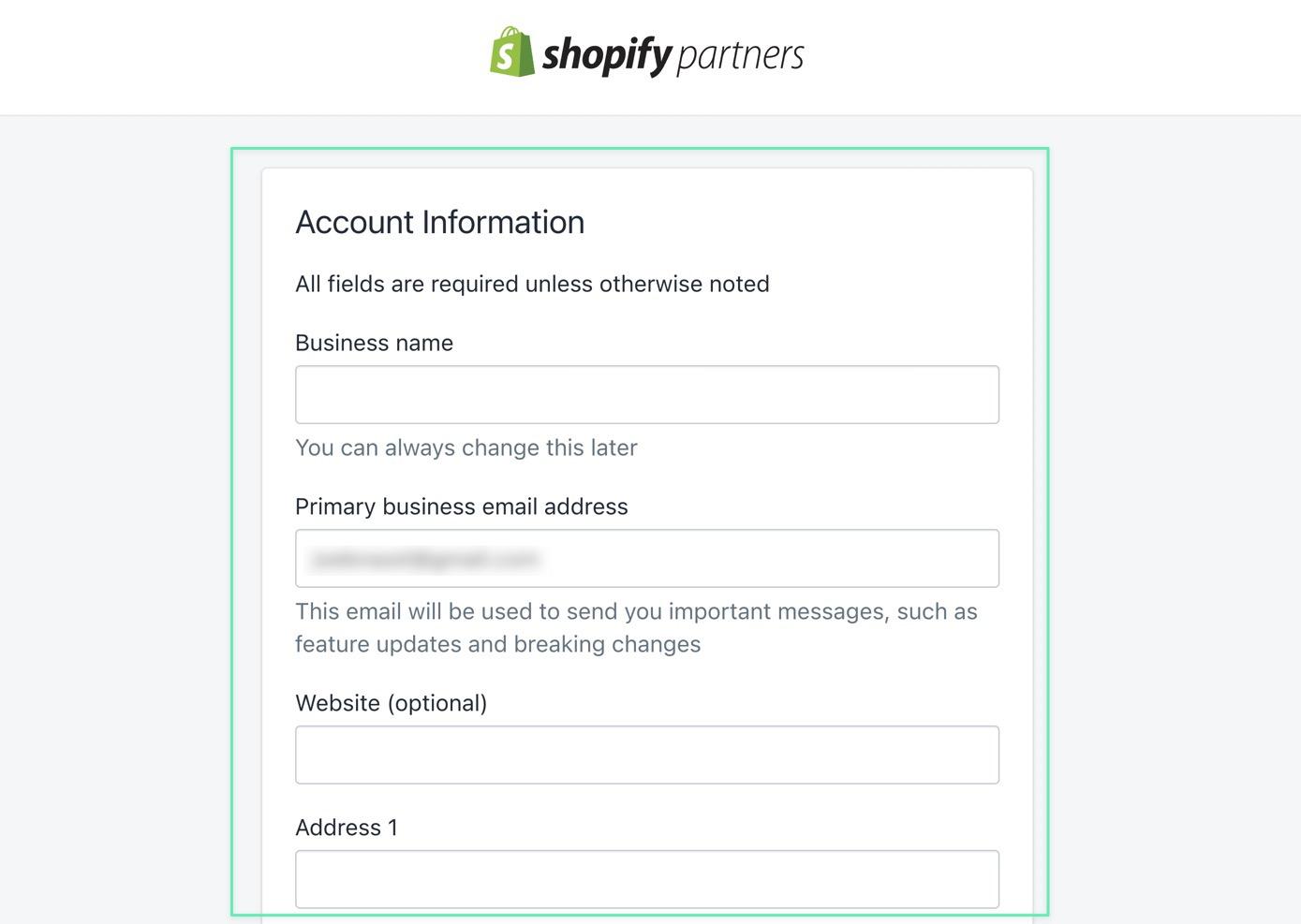
Anyone can join the Shopify Partners program, even if you’re just testing it out. The program gives you a dashboard for building and managing client sites.
Step 2: Manage at Least 5 Client Stores
To get considered for Shopify Experts, you must currently manage at least 5 Shopify stores in Shopify Partners. This means you’ve brought on the clients yourself, completed the development process, and passed ownership onto the client.
Note: Even non-development workers must join the Partners program and manage at least 5 stores. That doesn’t mean you have to develop those stores, but you should have access to these stores for contracting purposes. For instance, you may have 5 clients for which you provide writing or photography services.
Of course, that all starts with adding client stores. The goal is to move clients from the Development category to the Managed category, since Shopify Experts requires active, managed stores for consideration.
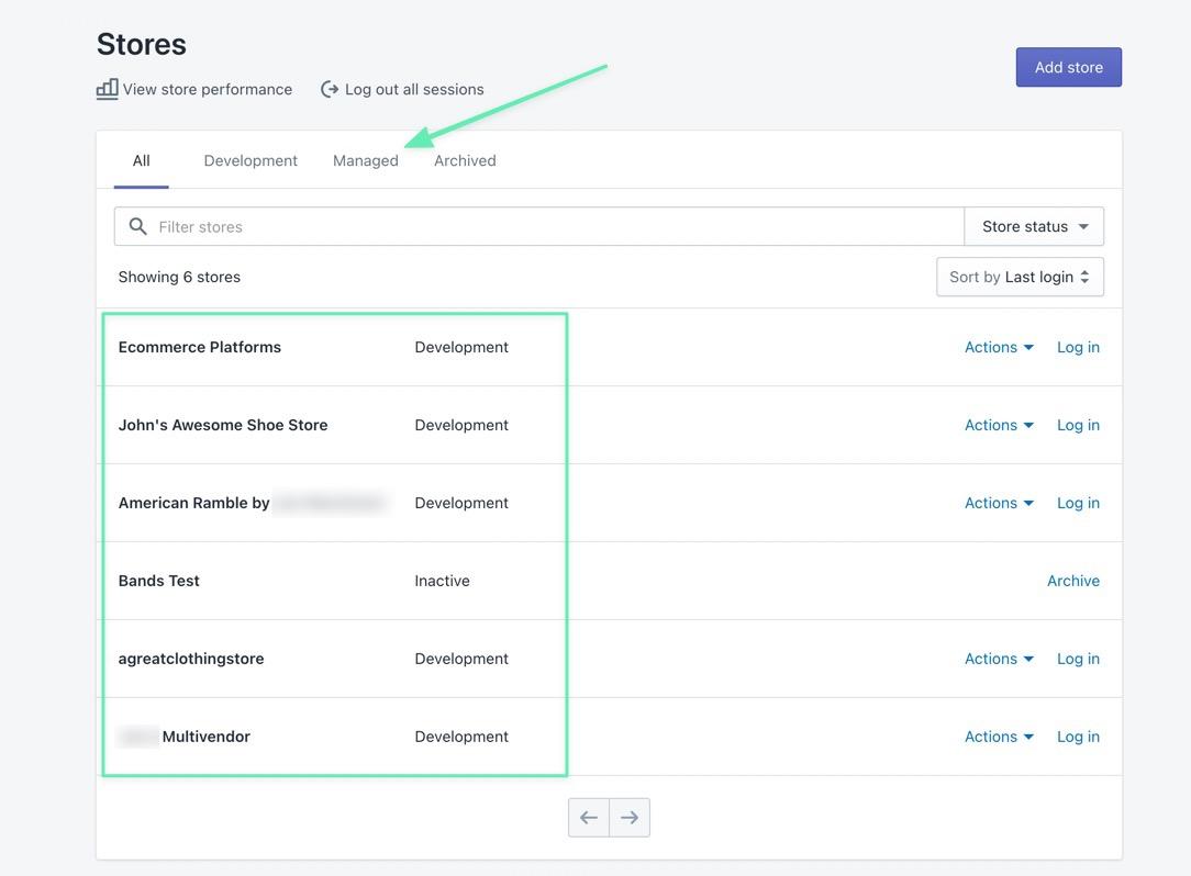
To add a new client to your list, click on the Add Store button.
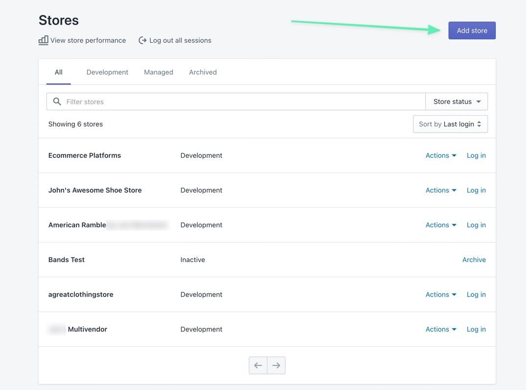
Here, you can choose between:
A development store: This is for building a Shopify store or app from scratch. You can then transfer ownership to a client. Managed store: This gives you access to an existing Shopify store, particularly when selling non-development services, like writing, photography, or website management.
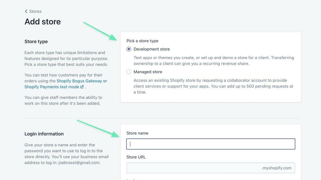
Make sure you select what you intend to do with the development store, like building a new store for a client, testing an app, or just playing around.

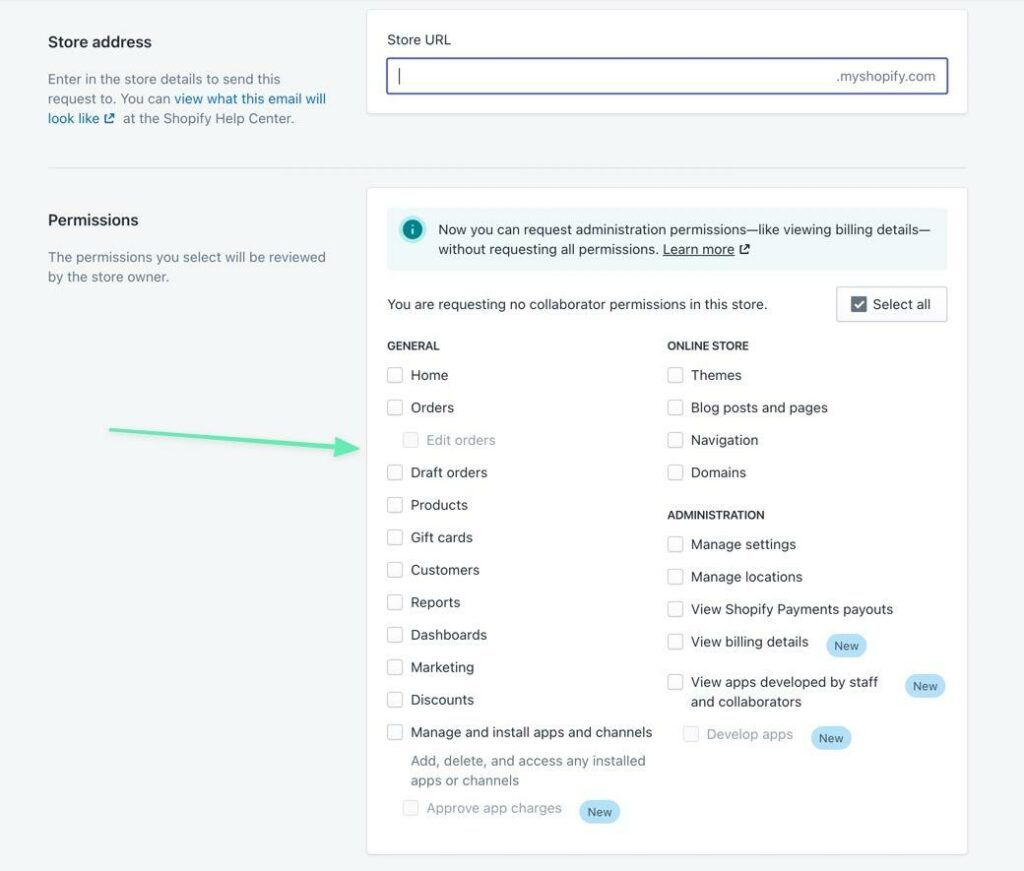
As an alternative, you can request administrative permissions to certain aspects of an existing site if you sell non-development services like writing or photography.
Once you’ve created a store, or gained permission to an existing site, it shows up on your list of managed sites, with a link to log into the backend and transfer ownership.
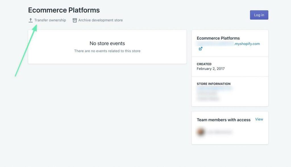
And to get considered for the Shopify Experts marketplace, you must do this 5 times!
Step 3: Create a Portfolio of Your Past Work
The Shopify Experts marketplace gives you a page to list your experience, portfolio items, rates, and location. Yet, you don’t have access to a page like this if you haven’t yet been accepted to the Experts marketplace. Therefore, we recommend building your own website (on places like WordPress, Wix, or Weebly) to display your portfolio.
This way, you’re able to present that experience with Shopify, giving yourself a stronger chance at acceptance.
Include a gallery of past projects, contact information, and descriptions on what went into the projects.
 Apolo Multimedia is a Shopify Expert, but they already had a website portfolio prior to joining the marketplace
Step 4: Request Access to the Shopify Experts Marketplace
Shopify states that reputable Shopify Partners often receive invites to join the Shopify Experts marketplace. So, Shopify already monitors its community and reaches out to those that may improve its collection of experts.
But instead of waiting around for an email from Shopify, workers and contractors can contact Shopify and request a listing on the Shopify Experts marketplace.
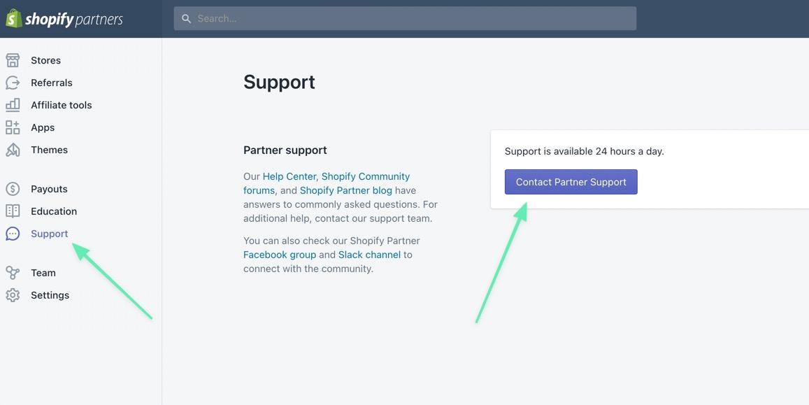
The only way to go about that is by sending a message to the Shopify Partners support team.
So, click on Support > Contact Partner Support.

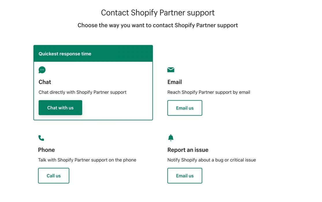
Choose online chat, email, or phone to explain why your freelance or agency business deserves to be listed on the marketplace. Include information to back up your request such as a website portfolio, years of experience, track record, and communication timeline.

Step 5: Build Your Shopify Experts Marketplace Page
After acceptance to the marketplace, several new tabs show up on your Shopify Partners dashboard. There’s much to managing your marketplace account, but the first step is filling in the profile with services, contact information, rates, and more.
You can go to Services > Profile to handle all of this.
Note: The Services tab isn’t available unless you’re granted access to the Shopify Experts marketplace.
Shopify has a comprehensive Getting Started Guide for setting up your Experts Marketplace profile.
Summary
Are you still interested in learning how to become a Shopify Expert? We encourage you to bookmark this guide as you walk through the preparation and application process. One of the unique parts of the Shopify Experts Marketplace is that Shopify vets every entrepreneur before listing on the website; that way, its users don’t have to worry about working with questionable contractors. But for you, that means it’s essential to have the know how, portfolio, and communications needed to meet Shopify’s expectations.
We encourage you to develop your expertise as you go, and consider applying for the Shopify Experts program once you’re ready. After that, the marketplace opens up a wide range of opportunities for your business, from connections with other Shopify Experts to your company name getting listed on an extremely popular freelance/agency marketplace.
With all of that said, let us know in the comments if you have any further questions about how to become a Shopify Expert. And share your thoughts on the program if you have experience in the past!
The post How to Become a Shopify Expert (From Start to Finish) appeared first on Ecommerce Platforms.
 Every day design fans submit incredible industry stories to our sister-site, Webdesigner News. Our colleagues sift through it, selecting the very best stories from the design, UX, tech, and development worlds and posting them live on the site.




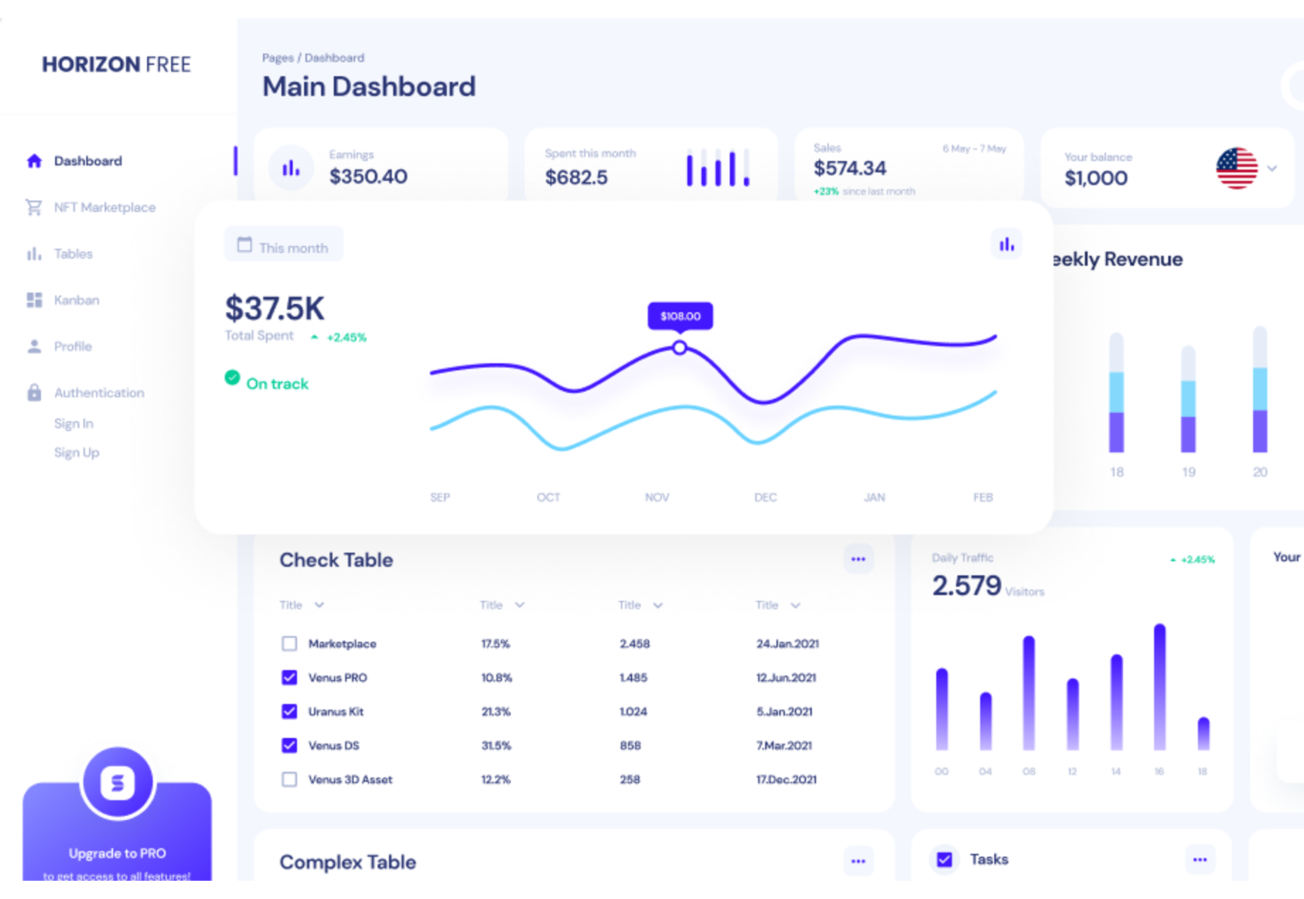


 A career as a web designer can be extremely lucrative. The average web designer in the US makes around $50-55,000 per year, equating to an hourly rate of around $25. Of course, not every designer will automatically get a full-time, high-paying job as soon as they earn their web design credentials.
 Sometimes it’s easy to feel like the world is going to pieces all around us, especially when we’re doom scrolling Twitter between news alerts every few minutes. But if we step back a little, things may not seem so bad.
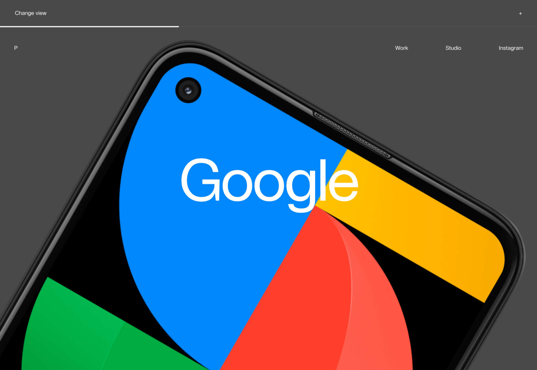


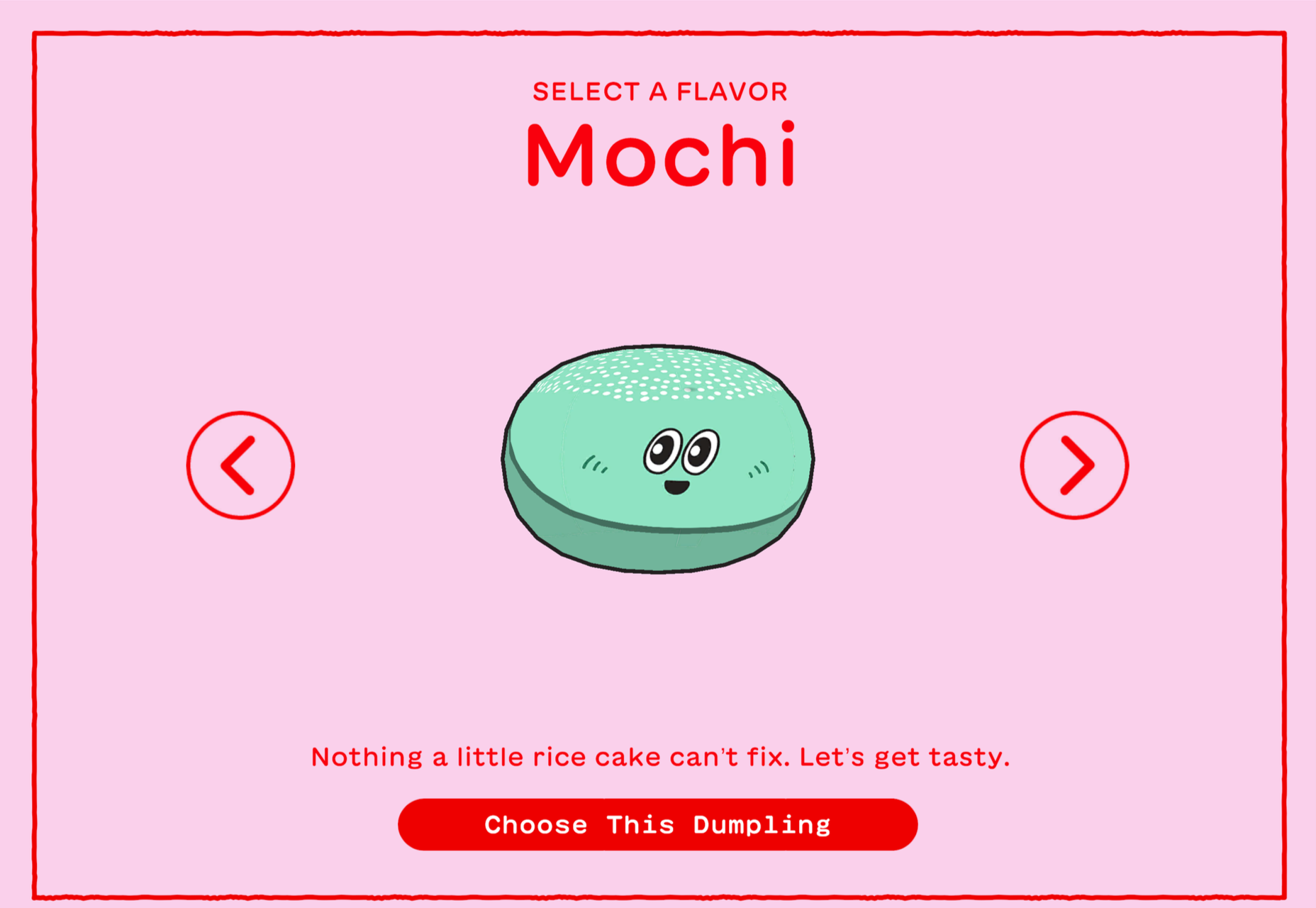
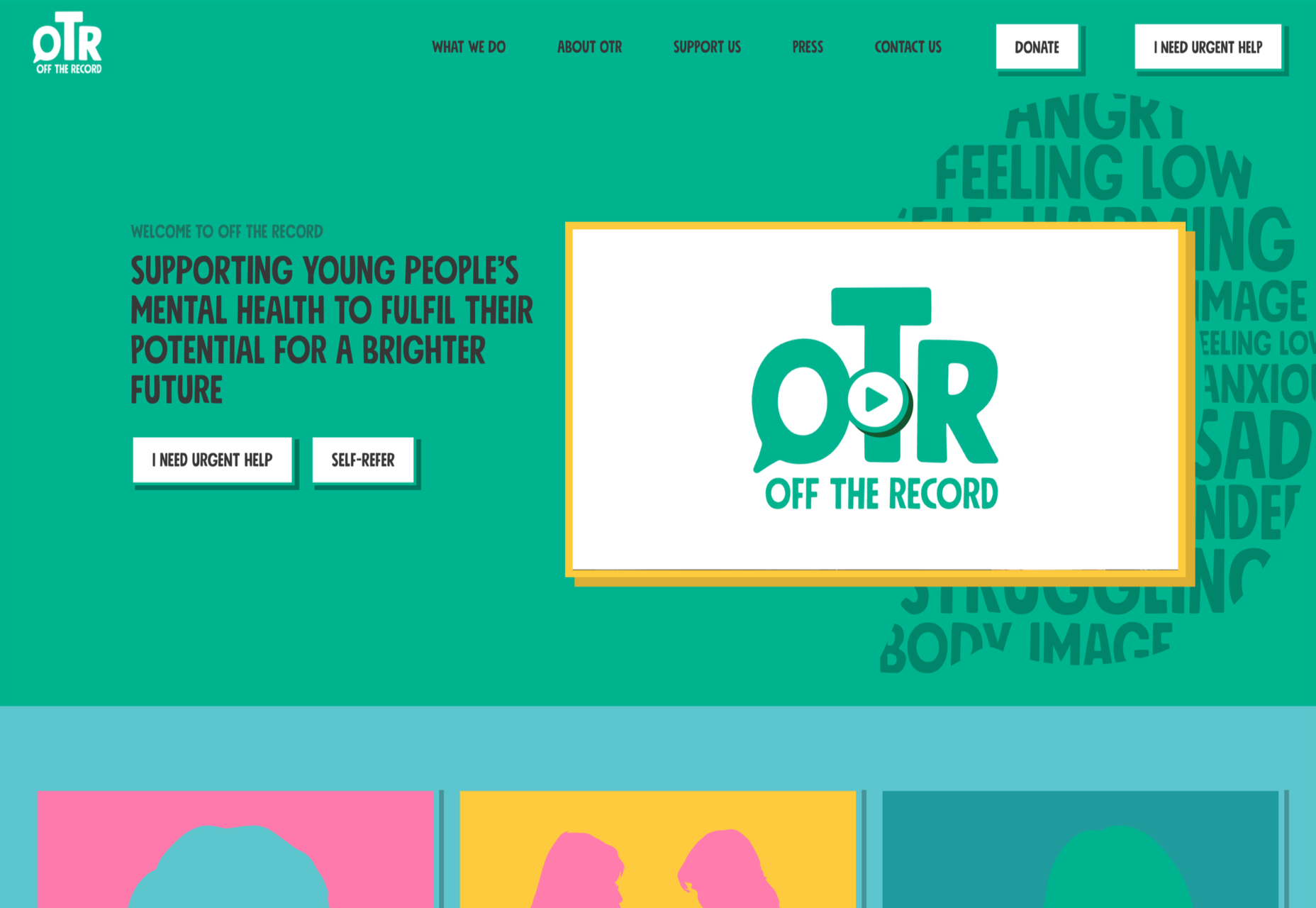












 Apolo Multimedia is a Shopify Expert, but they already had a website portfolio prior to joining the marketplace