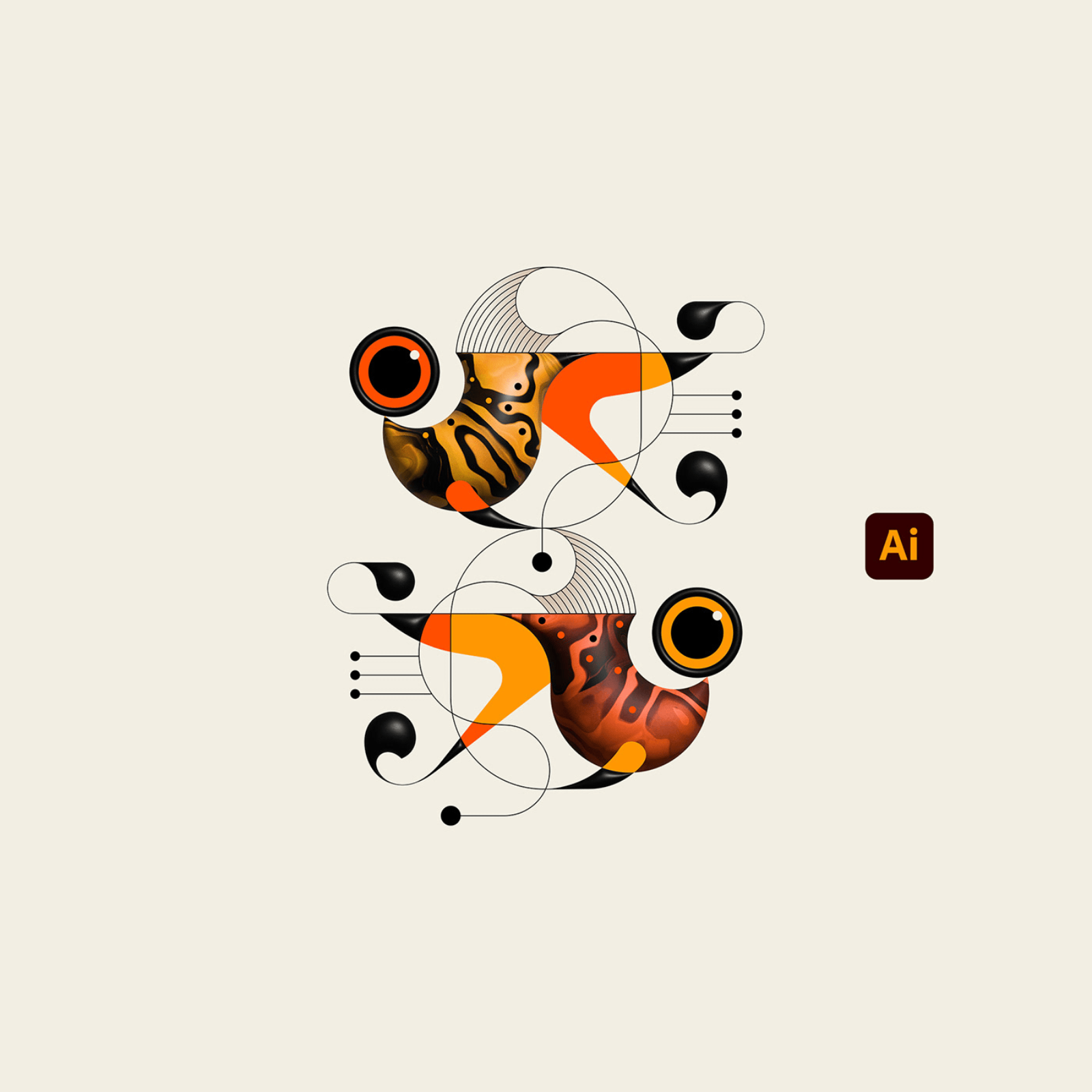
Adobe Illustrator 2025 Splash Screen Illustration: TRÜF’s “Weird Fishes”
Original Source: https://abduzeedo.com/adobe-illustrator-2025-splash-screen-illustration-trufs-weird-fishes
Adobe Illustrator 2025 Splash Screen Illustration: TRÜF’s “Weird Fishes”

abduzeedo1104—24
Discover how TRÜF’s “Weird Fishes” splash screen for Adobe Illustrator 2025 celebrates creativity with vibrant, minimalist illustration.
The Adobe Illustrator 2025 splash screen opens with a statement: creativity meets minimalism. Designed by TRÜF Studio, the “Weird Fishes” artwork that greets users embodies Adobe’s tools while making an instant visual impact. This splash screen not only excites users about the app but also showcases Illustrator’s dynamic possibilities, creating a memorable start to the creative process. Here’s a look at the creative vision, tools, and collaboration behind this unique splash screen update.
“Weird Fishes”: A Showcase of Creative Tools
TRÜF’s “Weird Fishes” centers on playfully stylized fish, created using Adobe Illustrator’s updated typography and 3D tools, which highlight the 2025 release’s expanded capabilities. This splash screen is a celebration of how Illustrator can bring out unique textures, gradients, and typographic designs, making it feel like a blend of traditional and digital artistry. The design follows Adam G’s distinctive style—minimal yet quirky, with each element purposefully crafted to show off Adobe’s creative potential.
The splash screen, as Adobe intended, isn’t just a loading screen. It’s a reminder of what Illustrator users can “Dream Up.” As Alex Fernald and Gleren Meneghin, Adobe’s staff designers, emphasized, the splash screens are not only entry points into the app but connections to Adobe’s creative community. They bring in commissioned art, linking Illustrator users to other creators while inviting exploration of the software’s capabilities.
Balancing Art and Function in the Design
This splash screen’s journey began the old-fashioned way—on paper. This initial sketching phase gave TRÜF the freedom to experiment with the composition, exploring the balance of shapes and lines. Once refined, the concept moved into Illustrator, where TRÜF fully explored the software’s features to enhance the digital version. In a brief, 90-second process video, TRÜF showcased their workflow from sketch to the finished splash screen, a rare peek into how minimalist, impactful design comes together.
A User-Centric Approach to Illustration
Adobe’s splash screens, including “Weird Fishes,” are a result of ongoing feedback from users. Through surveys sent to product teams, Adobe designers Alex and Gleren learned the nuances that users valued in the loading screen—like minimal launch delays and artist recognition. This feedback shaped the design, ensuring the new splash screens would spotlight the artist while maintaining the program’s efficiency.
To make the splash screen visually immersive, Adobe made adjustments based on past feedback. The artwork was enlarged, and the artist’s name appears in a larger, bold typeface, creating a clearer hierarchy that celebrates both the art and artist. As the Adobe Spectrum design system evolved, so did the splash screens, aligning with modern standards while preserving Adobe’s commitment to showcasing diverse creative voices.
Reflecting Adobe’s Evolution with Modern Minimalism
Historically, Illustrator splash screens have evolved alongside the Adobe brand. From early versions in the 1980s, featuring iconic art references, to today’s community-focused pieces, these screens highlight a shift from static visuals to dynamic creative introductions. Adobe’s recent redesign, led by Fernald and Meneghin, reimagined this format to center both the artist and the Adobe brand, using clean type and colors while expanding the visual space for the artwork. This shift reaffirms Adobe’s mission to foster connections within its creative ecosystem.
The splash screens across Adobe products are meant to offer a consistent brand experience, but each one also tells a unique story, showcasing the latest in illustration and design through collaboration with Studio team artists. Adobe’s team expanded the artwork’s size, adjusting its specs back to 2019 dimensions to create a more immersive user experience. The Adobe wordmark in red stands beside the product name in black, emphasizing the connection between Adobe and its creative community.
The Legacy and Future of Adobe Splash Screens
“What’s next?” is a question Adobe’s designers are always answering. With the 2025 Illustrator splash screen’s debut at Adobe MAX 2024, Adobe introduced the latest evolution in Creative Cloud. These splash screens remain essential touchpoints, showcasing new work, enhancing user experience, and connecting each user to Adobe’s creative network.
TRÜF’s “Weird Fishes” invites Illustrator users to think beyond the ordinary. It’s a nod to the creative possibilities the software enables, a tribute to digital and analog techniques, and a reminder that every creative journey begins with opening Adobe Illustrator.
This splash screen illustration is a subtle invitation for creatives to make the most of Illustrator’s tools and capabilities, setting the stage for inspired design from the moment they open the app.
Illustration artifacts
Pillow manufactured by Adobe. Photo courtesy of Adobe

Leave a Reply
Want to join the discussion?Feel free to contribute!