Adobe Experience Manager vs. WordPress: The Authoring Experience Compared
Original Source: https://www.smashingmagazine.com/2019/01/adobe-experience-manager-comparison-wordpress/
Adobe Experience Manager vs. WordPress: The Authoring Experience Compared
Adobe Experience Manager vs. WordPress: The Authoring Experience Compared
Kevin Weber
2019-01-30T13:45:55+01:00
2019-01-30T17:20:05+00:00
Thanks, WordPress and Gutenberg, for making block-based editing the standard for authoring web pages. In this article, I’m going to compare the new authoring experience in WordPress with the experience from Adobe Experience Manager (AEM), an enterprise content management system that also embraces block-based editing. I’ve implemented both WordPress and AEM for multiple companies (such as Informatica and Twitter) and had to realize that despite the authoring experience is critical for non-technical authors, it is often neglected by developers.
Note: With the term “authoring experience” I’m referring to the user experience for those people whose goal it is to create and publish content on a website. I’m not referring to the people that are going to consume the published content. If you haven’t thought about the authoring experience before, here’s a primer by Eileen Webb who was also featured in Smashing Book 5.
Adobe Experience Manager is, compared to WordPress, a complex system with a steep learning curve, especially for developers. At the same time, AEM is easier to use than more established and more expensive content management solutions, placing AEM somewhere in between free and very costly solutions.
From a technical perspective, AEM is a conglomerate of open source technologies with several touches from Adobe, placing AEM somewhere in between open-source and proprietary software. It is those touches from Adobe that make the system shiny and usable. For example, a visual drag and drop page builder has been the standard way for creating pages in AEM — long before WordPress Gutenberg was born.
Let’s take a look at some of the features that elevate the authoring experience above average.
Our new book, in which Alla Kholmatova explores
how to create effective and maintainable design systems to design great digital products. Meet Design Systems, with common traps, gotchas and the lessons Alla has learned over the years.
Table of Contents →
Components (Blocks)
One of the most significant ideas for websites is the concept of a component (or block in WordPress lingo). A component represents a piece of content that follows specific rules instead of being a blob of anything. For example, you can have a video component where the author can only paste in a Youtube link and control Youtube-specific settings. Or you can have a quote component where the author adds a quote to one text field and the name of the person being quoted to another text field. You can even have a layout component that contains other components and displays them below each other on a mobile device, whereas on a large screen, those components get spread across three columns.
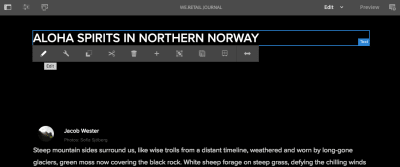
Authors can update components right in the visual editor. Available editing options get displayed based on the selected component. (Image source) (Large preview)
An author knows exactly what to expect from a specific component and can easily fill it with the appropriate content. Equally important are the long-term benefits and new opportunities that wouldn’t be feasible for the old school “one text field fits all content” approach that has been prevalent for the past decades:
If a component requires a date input, the component authoring dialog can display a date picker instead of a plain text field, making it easier for the author to pick a date with the right format.
If a designer wants the name of a quoted person to be displayed above the quote instead of below the quote, the developer can easily rearrange the code because the quote and the name are stored separately. If the quote and name would be stored the old-fashioned way, the developer would have to manually extract the name from the text blob and move it in front of the quote.
If a quote needs to be translated from English to German, the quote can be submitted to a translation service. If the translation service has translated this quote before already, it can return the saved translation. If the quote would be part of a longer paragraph instead of being standalone, the translation would be much harder and probably require a human translator.
If a video lacks a transcript and therefore prevents deaf users from consuming it, the component can be complemented with a summary text that makes the video more accessible to deaf users.
Component-based editing has been embraced by users of AEM for a while already, and because of the arrival of Gutenberg in WordPress 5.0, component-based editors are now the de facto standard for authoring web pages.
Note: Leonardo Losoviz dives deeper into the implications of blocks in the context of WordPress.
Fragments
Content fragments and experience fragments are new terms that have been dominating the AEM scene for the past year. I’ll summarize those two concepts simply as fragments. In essence, fragments allow authors to create neutral content that can be used across web, mobile, social media and other channels.
Fragments are created outside of a page editor and are, compared to a component, less opinionated about how their data is going to be used. Let’s imagine a fragment called “Quote of the day” that authors update once a day with a new quote. Now the quoted text of this fragment can be used in a variety of places:
A footer widget displays the quote of the day at the bottom of every page. As soon as an author updates the fragment, the footer updates as well. The fragment determines what is going to be displayed whereas the footer widget determines how the quote is going to be displayed.
A quote component allows authors to import a quote from past “Quotes of the day” and add it to the blog post.
A plugin adds a “Share quote of the day” button to the homepage. Whenever someone clicks on that button, the plugin takes the quote of the day and formats it to meet best practices for sharing via Facebook, Twitter, and email.
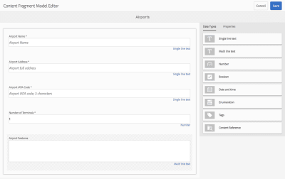
Using an editor for fragments, authors focus on related data without having to know how exactly it is going to be displayed on websites and in apps. (Image source) (Large preview)
In WordPress, widgets and menus resemble fragments: Authors create menu items in a neutral interface, then developers display those items as part of the theme in a way that makes sense for the theme. If the theme gets replaced with a new theme, those menu items persist and can be displayed in the new theme as well, even though the new theme might look very different from the previous one.
I expect fragments to become more widely used, even though the concept has different names in different systems. Indeed, Matt Mullenweg already announced that his team is currently focusing on “expanding the block interface to other aspects of content management [including the creation of] a navigation menu block [and] porting all widgets over to blocks.”
Page Templates
Pages templates can be described as higher-level components because they include several other components. In AEM, authors can create templates that lock components such as a header component into a fixed position while also defining flexible areas where components can be added on a per page basis.
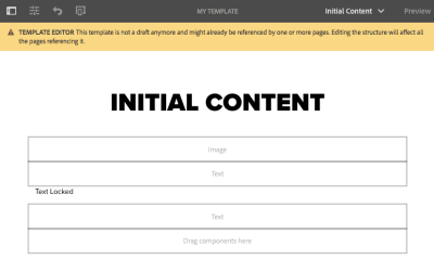
The template on this screen provides a heading, image and text component by default. It prevents authors from removing the “Text Locked” text and allows authors to add more components below that text. (Image source) (Large preview)
One important aspect of this is that such a flexible area can limit which components can go into it. That way you can create page templates for different purposes:
Template #1: Article page template
Header, title, content area and footer are fixed. The author can update the title component but can’t remove it. The author can drop text, image and video components into the content area.
Template #2: Landing page template
Only a logo and a title component at the top of the page are fixed. The author can choose among a set of landing page-specific components that are optimized for converting visitors into customers.
Permissions And Workflows
It’s unlikely that every author in a large team should be able to modify critical templates such as the article page template. In order to prevent people from being able to accidentally and irrevocably break the site, it is important to define who can modify which part of the site. Welcome to the concept of permissions and workflows. This concept is neither new nor special, but it’s important for large teams.
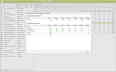
Yes, AEM’s interface for handling permissions could need a facelift. Anyhow, it works. (Image source) (Large preview)
A typical AEM site includes the actual production website and at least one production-like site, aka staging. Authors can publish content to a private staging site before publishing it to the public production site. The process of publishing content to staging followed by publishing content to production can be called a workflow. Another common type of workflow is that the content must go through an approval process before it can be published to the production site, and only certain people are able to hit the “publish to production” button.

This page indicates that a workflow has been initiated and the author can either complete or delegate the “Request for Activation”. (Image source) (Large preview)
Permissions and workflows are features that are negligible on small teams. However, as a team grows, those features become critical for the productivity and success of the team. Despite AEM comes with the basics for creating workflows and developers can make AEM work for any specific need, it requires quite some code changes and isn’t implemented with the snap of a finger. This is even more true for WordPress. It would be nice to have an authoring-friendly tool to create custom workflows.
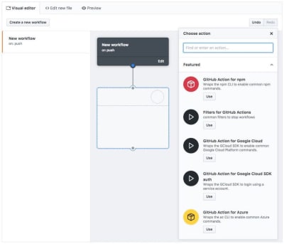
Imagine how a user-friendly tool could simplify the creation of workflows. Here is how the creation of workflows in Github will look like once Github Actions are out of beta. Unfortunately, AEM doesn’t offer such a tool. (Large preview)
Editing Modes
In AEM, authors can quickly edit and view each page in different modes. The author switches between modes based on what job needs to get done:
To arrange components and edit their content, choose Edit mode.
To change how components should be arranged on an iPad, choose Layout mode.
To look at the content as if you were a visitor, choose Preview mode.
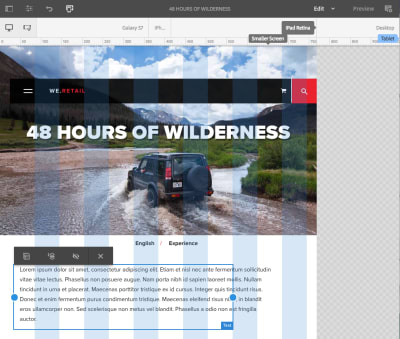
On this page responsive layout mode is active. The author can emulate different device sizes and adjust the position of components within a responsive grid. (Image source) (Large preview)
There are a few more modes that show up based on how the site is set up. One ideal scenario is that A/B testing and personalization is set up by integrating AEM with Adobe Target. Using Targeting mode, authors can define when to show certain components based on a visitor’s location, age, referral page, the time of the day, etc.
Integrations in AEM are comparable to plugins in WordPress but with the difference that AEM integrations are more complex and usually custom-tailored. Especially integrating AEM Target can be more painful than salespeople make it sound. ?
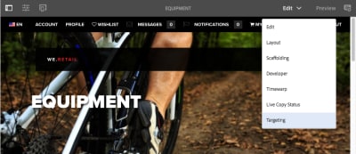
Switch the mode through a dropdown. (Image source) (Large preview)
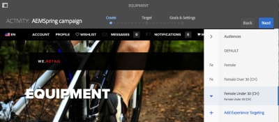
In targeting mode, content can be personalized and tested right from the page editor. (Image source) (Large preview)
Putting development complexity and money aside, the consequence of such an effort can result in a superb authoring experience. The concept of editing modes demonstrates how a simple dropdown creates an opportunity for authors to get a range of jobs done while staying on a single page.
Visual Single-Page Editor
Looking at the screenshots in this article, you must have realized that AEM’s page editor is not just component-based but also visual: If a component gets updated, the change becomes visible immediately and the author doesn’t have to open a preview in a new window. Quite a feature. Even though page builders are omnipresent in the WordPress ecosystem, the team behind WordPress has yet to define a best practice for visual editing. Let me take this one step further and ask: What happens if you marry visual editors with single-page applications (SPAs)?
SPAs are websites where navigating from one page to another feels seamless because the browser doesn’t have to reload the whole page. Some popular websites such as Gmail and Facebook are SPAs but most of the sites on the internet are not. One reason for rather low adoption is that creating SPAs is hard, and maintaining SPAs with thousands of pages is even harder. There are currently two major ways for managing content in SPAs:
The content of a site gets updated by updating code. That’s obviously not authoring-friendly.
The content is managed in a CMS that is decoupled from the visitor-facing part of the website. The content from the CMS is consumed via an API, for example by a React app. The authoring interface looks different from the assembled site that the visitor will see.
Implementing a visual editor and an SPA each by itself is already a tough technical challenge. Having a visual editor that works with an SPA is nearly unheard. Adobe’s team is working on supporting SPAs in AEM while trying not to compromise any benefits of their existing system. Even though promising first versions have been released to the AEM community in 2018, there’s still a lot of work to be done.
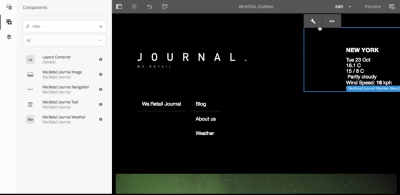
This page shows a React app. Note how AEM has added a layer on top of the weather component so authors can edit its properties. (Image source) (Large preview)
Summary
Adobe Experience Manager comes with several useful features that have already made or will make their way into popular open-source projects. AEM didn’t necessarily invent the concepts highlighted in this article, but it certainly commercializes well as one of the most authoring-friendly systems on the market.
The concept of components became mainstream with the introduction of blocks in WordPress. The concept of fragments, page templates, permissions and workflows are at least partially implemented in WordPress and are important for teams with many authors that serve content to multiple channels.
The authoring experience can be improved even more using a visual editor with edit modes and support for single-page applications. Such an editor is difficult to implement but as the efforts by Adobe indicate, the improved experience might be worth the effort and eventually make it into WordPress as well.
Further Reading
“Building A Better Authoring Experience,” Eileen Webb
“Authoring: The Environment And Tools,” Adobe Help Center
“Designing A User-Friendly Web Content Management System,” Christopher Hallahan
“Authoring Experience,” Rick Yagodich

(dm, ra, il)


Leave a Reply
Want to join the discussion?Feel free to contribute!