ADCOLOR FUTURES: A Study in Circles in Graphic Design
Original Source: https://abduzeedo.com/adcolor-futures-study-circles-graphic-design
ADCOLOR FUTURES: A Study in Circles in Graphic Design

abduzeedo1123—23
Explore the simplicity and vibrancy in the editorial design and graphic design project for ADCOLOR FUTURES 23, where circles create a dynamic visual language.
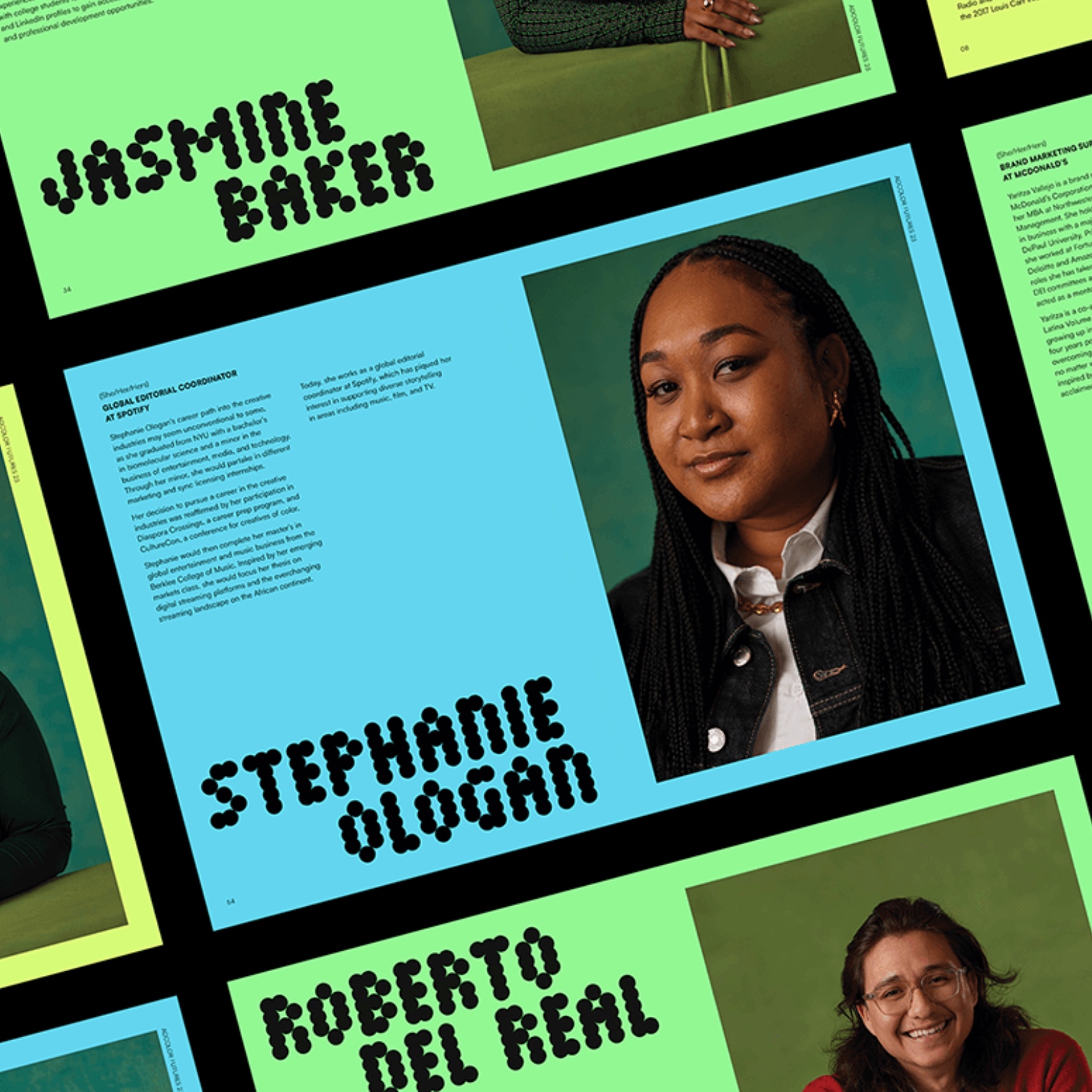
Deutsch LA, shared by Kenneth Kegley and Vanissa Wong, have unveiled a striking project for ADCOLOR FUTURES 23 that stands as a testament to the power of minimalist design in conveying complex concepts. This project showcases the potential of circles not just as shapes but as the foundation of an entire visual language. Through this motif, the designers explore various compositions, transforming the circular form to craft iconography and patterns that communicate the themes of “futures” and “adcolor.”
The design’s simplicity belies its sophistication. It evolves a single geometric shape into a series of patterns, each serving a distinct function within the broader narrative of the piece. The words “futures” and “adcolor,” rendered in this circular pattern, are not just text but become integral elements of the design itself, harmonizing seamlessly with the graphic elements.
Color plays a pivotal role in this narrative. The choice of a light lime green against a cyan accent tone is both vibrant and intentional, creating a visual experience that is fresh and contemporary. This color scheme not only elevates the design but also imbues it with a sense of optimism and forward-thinking—apt for an initiative like ADCOLOR FUTURES.
This editorial design project is a study in restraint and intention. Every element, from the color palette to the use of shapes, is thoughtfully chosen to create an editorial piece that is both functional and aesthetically compelling. Kegley and Wong demonstrate that with a clear vision and a refined approach, even the most basic elements of design can be woven into something extraordinary.
The result is a cohesive and elegant editorial design that stands out in its field. The designers have achieved an equilibrium where form meets function, delivering a message that is both clear and visually engaging. This project is a reminder that in graphic design, sometimes less is indeed more, and that the most minimalistic approach can often be the most impactful.
Editorial design and graphic design artifacts
Credits
Client: ADCOLOR
Agency: Deutsch LA
Studio: Steelhead
SVP, Director of Experiential: Acacia May
EVP, Head of Advocacy and Communications: Ayn Howze
Associate Producer: Sydney Smith
EVP, Chief Design Officer: Adhemas Batista
SVP, Director of Design: Talin Baharian
Design Director: Kenneth Kegley
Designer: Vanissa Wong
SVP, Director of Assets and Content: John Cluckie
Photographer: Ben Morris
For more information make sure to check out Deutsch LA, Kenneth Kegley and Vanissa Wong website.

Leave a Reply
Want to join the discussion?Feel free to contribute!