Brutalist Branding for Synticate©
Original Source: http://feedproxy.google.com/~r/abduzeedo/~3/ryOWNdLblJE/brutalist-branding-synticatec
Brutalist Branding for Synticate©

abduzeedo1103—21
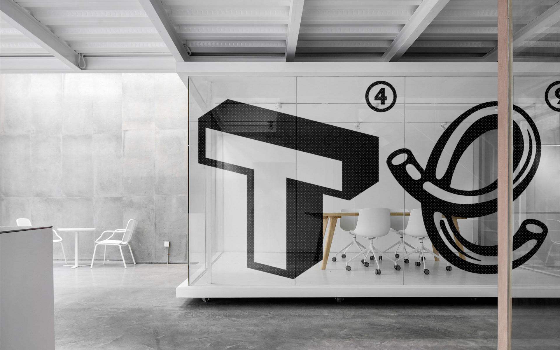
Stepan Solodkov shared a branding and graphic design project created for a Moscow based CGI studio that has a portfolio of very large clients. The target audience of the studio are creative and art directors of large advertising agencies, therefore, the identity wanted to invoke a bright, modern and memorable look. The name of the Synticate is a symbiosis of the two names Synthesis and Syndicate. The identity was inspired by vivid images of futuristic Asian megacities in the spirit of Blade Runner, with typography of neon signs, and eclecticism of big cities – mentions Stepan. The result is a quite brutalist design with clear references from the 90s graphic design scene.
The uniqueness of the studio lies in the fact that they select a new unique team for each project, therefore the logo is dynamic and each time each team can quickly have its own unique logo that remains in the general concept. As a result, 16 unique typographic logos were drawn and animated. All characters reflect or are inspired by various areas related to computer graphics, cinema and pop culture. Unique animated typographic compositions have been developed that also metaphorically complement the idea of integration, flirting with the idea of the Syndicate.
Branding and graphic design


Leave a Reply
Want to join the discussion?Feel free to contribute!